23 Radiant Summer-Inspired Color Palettes Bursting with Bright, Cheerful Hues
When the sun is shining and the days stretch long, nothing captures the essence of summer quiet like a vibrant splash of color. Whether you’re refreshing your wardrobe, redecorating a space, or planning a creative project, the right palette can infuse your work with the seasonS unmistakable energy and joy.In this listicle,we’ve gathered 23 radiant summer-inspired color palettes bursting with shining,cheerful hues that evoke everything from tropical sunsets to blooming gardens.Dive in to discover harmonious combinations that will inspire your next design, brighten your mood, and bring a touch of summer’s magic to any creative endeavor.
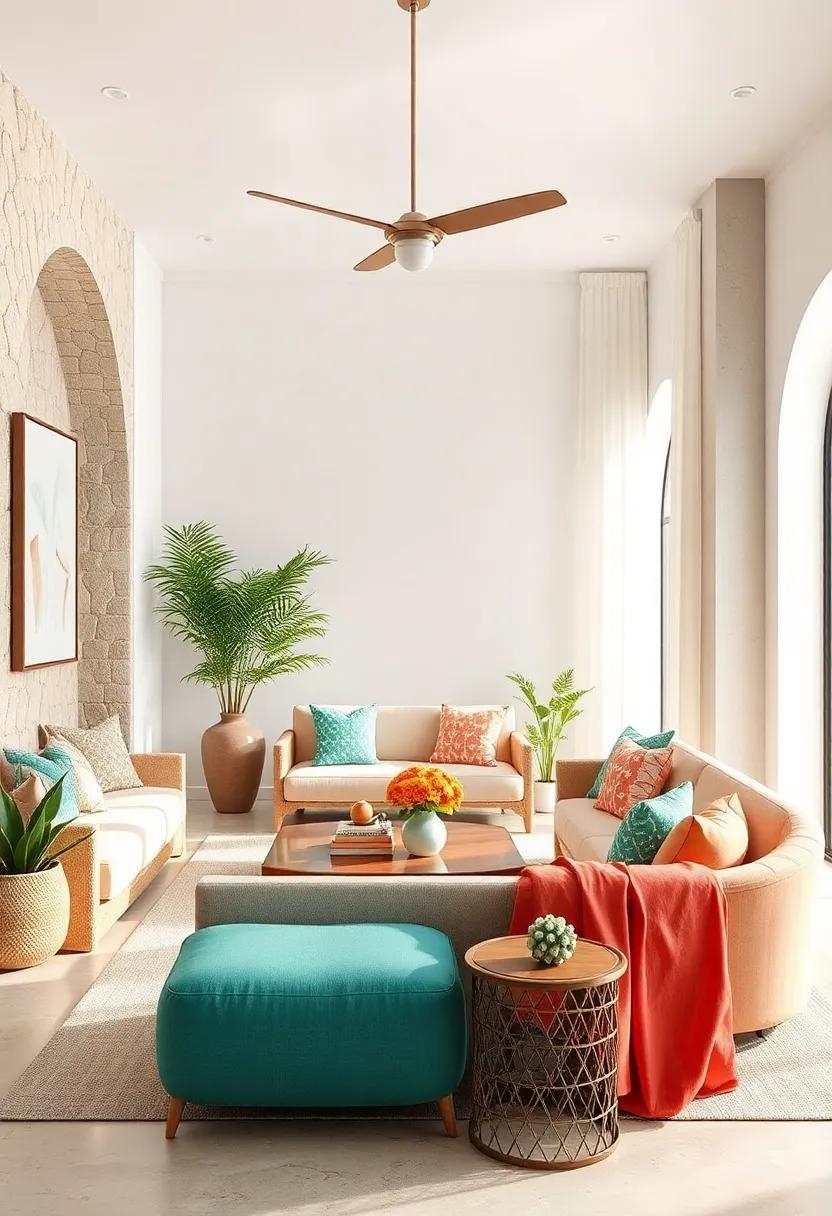
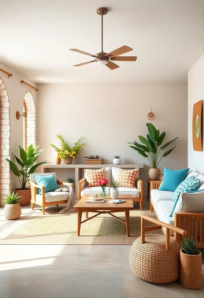
Tropical Sunrise: Vibrant coral, sunny yellow, ocean blue, palm green, and soft sandy beige

Imagine the first light of dawn breaking over a tropical beach,where the sky blushes with vibrant coral hues,perfectly balanced by the warmth of sunny yellow. This palette captures that very essence, evoking a sense of joy and fresh beginnings. The marine-inspired ocean blue brings a cooling contrast to the warmth, mirroring the endless horizon where sea and sky meet. Meanwhile, palm green injects a natural, leafy vitality that grounds the composition, while the soft sandy beige provides just the right neutral tone to tie everything together without overpowering the vibrant colors.
This harmonious blend is ideal for designs seeking to infuse a cheerful yet tranquil vibe,from beachfront resorts and summer apparel lines to lively social media graphics. Use the colors in unexpected combinations-perhaps a coral header paired with palm green accents, or a sandy beige background offset by sunny yellow highlights-to create a dynamic and inviting atmosphere. Whether it’s for branding or decor, this palette invites you to bask in the warmth and energy of a tropical sunrise, radiating positivity and light.
| color | Hex Code | Usage Idea |
|---|---|---|
| Coral | #FF6F61 | Call-to-action buttons |
| Sunny Yellow | #FFD93B | Headers and highlights |
| Ocean Blue | #1CA9C9 | Backgrounds and banners |
| Palm Green | #2E8B57 | Icons and accents |
| Soft Sandy Beige | #F5DEB3 | Body text and cards |
Citrus Splash: Zesty orange, lemon yellow, lime green, watermelon red, and crisp white
Infuse your projects with a burst of refreshing energy by blending the vibrant tones of zesty orange,lemon yellow,lime green,watermelon red,and crisp white. This electrifying palette channels the essence of sun-dappled afternoons and cool,fruity refreshments,striking a perfect balance between warmth and vibrancy. Ideal for summer branding, party invitations, or lively home décor, these colors radiate positivity and invite a playful yet elegant atmosphere.
Consider pairing these hues in dynamic combinations that allow each shade to shine independently while complementing the others harmoniously. As a notable example, let watermelon red pop against a backdrop of crisp white, while accents of lime green and lemon yellow add unexpected zest. Below is a simple guide to capture the citrus splash in your creative endeavors:
| Color | Hex Code | Usage Tips |
|---|---|---|
| Zesty Orange | #FFA500 | Use for bold headlines or accent borders |
| Lemon Yellow | #FFF44F | Perfect for backgrounds or playful icons |
| Lime Green | #32CD32 | Great as subtle buttons or decorative elements |
| Watermelon red | #FC6C85 | Ideal for calls-to-action and focal points |
| Crisp White | #FFFFFF | Use as a clean canvas to balance intensity |
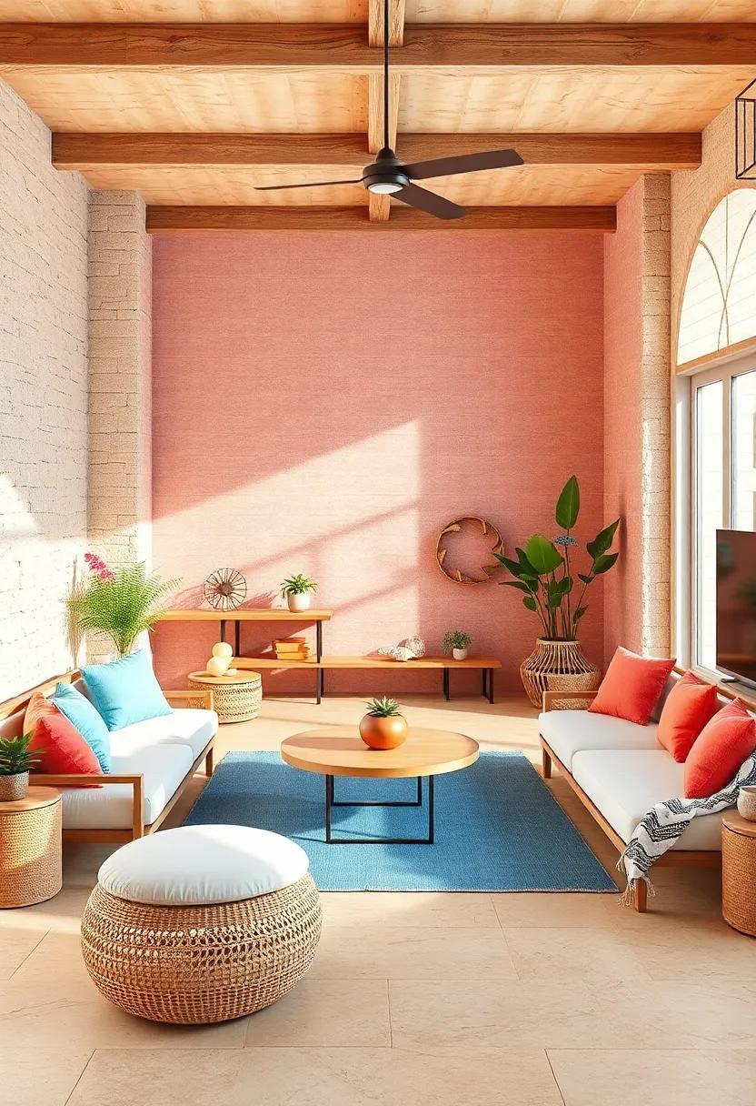
Beach Bonfire: Fiery red, warm amber, deep navy, sandy taupe, and whispering smoke gray
Imagine the cozy allure of a twilight beach gathering, where the sky melts from fiery red into warm amber, casting a glow that wraps you in gentle warmth. This palette captures the essence of that magical moment, pairing fiery red with a comforting warm amber to ignite a sense of vitality and relaxation all at once. the deep navy backdrop mimics the expanse of the ocean at night, grounding the brighter hues and adding depth and serenity to the collection. Together, these tones bring a harmonious balance that feels both energizing and calming, perfect for evoking memories of sandy feet and firelit smiles.
Complementing these vibrant colors are the subtle shades of sandy taupe and whispering smoke gray, which introduce a natural, earthy softness reminiscent of driftwood and the gentle sea breeze. These neutrals provide the perfect canvas to make the fiery and warm hues pop,while maintaining an organic flow.Whether you’re designing coastal-inspired interiors or crafting a summer lookbook, this palette inspires a serene yet spirited atmosphere, blending nature’s contrasts into a radiant celebration of summer’s twilight moments.
Seaside Pastels: Powder blue, blush pink, mint green, lavender haze, and creamy ivory

Dive into the gentle embrace of coastal charm with this serene palette that channels the soothing vibes of a sun-drenched shoreline. Powder blue mimics the clear summer sky, while blush pink adds a soft whisper of warmth, reminiscent of seashells kissed by the morning tide. Mint green injects a refreshing coolness, like a crisp ocean breeze, perfectly balanced by the dreamy allure of lavender haze, evoking delicate twilight moments. To ground the palette, creamy ivory delivers a smooth, natural base, echoing sandy beaches warmed by golden light.
- Use case ideas: beach wedding themes, seaside-inspired home decor, and airy, feminine fashion collections.
- Texture pairing: linen fabrics, rattan accents, and light-washed driftwood elements enhance the palette’s organic feel.
- Accent colors to try: soft coral or subtle gold for contrast and visual interest.
| Color | Hex Code | Vibe |
|---|---|---|
| Powder Blue | #B0D1E6 | Calm & airy |
| Blush Pink | #F4C6C6 | Soft & warm |
| Mint Green | #A8D5BA | Refreshing & crisp |
| Lavender Haze | #C4B7D0 | Dreamy & tranquil |
| Creamy Ivory | #FFF6E5 | Natural & grounding |
Golden Hour Glow: Mustard gold, peachy apricot, terracotta, sky blue, and soft cream

Immerse yourself in a palette that captures the magical light of sunset with shades that radiate warmth and serenity. From the rich, earthy depth of mustard gold to the tender blush of peachy apricot, this color combination evokes a natural glow that feels both inviting and vibrant. The addition of terracotta grounds the palette with its rustic charm, while sky blue introduces a refreshing contrast that reminds you of endless summer skies. Wrapping this visual story together is the gentle repose of soft cream, offering balance and a soft canvas that enhances every other hue’s brilliance.
| Shade | Mood | Best Used for |
|---|---|---|
| Mustard Gold | Warmth & Energy | Accent walls, statement pieces |
| Peachy Apricot | Softness & Optimism | Textiles, cushions, light decor |
| Terracotta | Earthy & grounded | Pottery, flooring, outdoor spaces |
| sky Blue | Freshness & Calm | Artwork, accent details, linens |
| Soft Cream | Neutrality & Softness | Backgrounds, walls, large surfaces |
This palette perfectly captures the essence of golden hour-the fleeting moment when everything glows with a soft, luminous light. Use these tones together to create spaces, outfits, or designs that feel effortlessly harmonious and evocative of those long summer evenings. Whether you layer them in home decor or fashion,the blend is a celebration of natural beauty and timeless warmth.
Flamingo Fizz: Bubblegum pink,electric teal,bright magenta,sunshine yellow,and fresh mint

The perfect burst of bubbly energy, this palette is all about capturing the effervescent spirit of summer days. Bubblegum pink adds a playful sweetness, while electric teal injects a vibrant jolt reminiscent of ocean waves crashing under a dazzling sun. This combination instantly elevates any design or space, sparking joy and youthful exuberance. Balanced with bright magenta, the colors create undeniable visual intrigue-each hue bold and unapologetically cheerful, yet working harmoniously together to paint a picture of spirited warmth.
Complementing these vivid, high-energy tones are the softer shades of sunshine yellow and fresh mint. Sunshine yellow radiates optimism and light, brightening the mood and inviting feelings of comfort and happiness. Fresh mint cools the palette slightly with a refreshing breath of calm, preventing the vibrancy from becoming overwhelming. This interplay makes the palette versatile,ideal for everything from summer-themed weddings and children’s party decor to vibrant branding that seeks to capture a sense of youthful optimism and playful sophistication.
| Color | Mood | Use Case |
|---|---|---|
| Bubblegum Pink | Playful, Sweet | Party Invitations, Kids’ Rooms |
| Electric Teal | Vibrant, Energetic | Outdoor Branding, Swimwear |
| Bright Magenta | Bold, Magnetic | Fashion Accents, Graphic Design |
| Sunshine Yellow | Optimistic, Warm | Summer Events, Home Decor |
| Fresh Mint | Calm, Refreshing | Wellness Branding, Stationery |
Island Breeze: Turquoise, coral pink, sunny gold, coconut white, and palm leaf green

Imagine a palette that instantly transports you to a sun-soaked tropical paradise-where the sky meets the sea in shimmering turquoise, and coral pink blooms echo the vibrant energy of exotic flowers. This combination blends turquoise with soft coral pink, balanced by the warmth of sunny gold, creating an uplifting harmony reminiscent of golden afternoon light. The addition of coconut white brings in a refreshing crispness that softens the intensity, much like the gentle caress of a coastal breeze.
To ground this sunburst collection, palm leaf green introduces a lush, natural touch that evokes swaying fronds and tranquil island retreats.This palette works brilliantly across interiors, fashion, and graphic design projects where you want to evoke relaxation and positivity. Considering applications, pairing these hues in textiles or accent walls can infuse any space or product with a breezy, vacation-ready vibe.
| turquoise | Coral Pink | Sunny Gold | Coconut White | Palm Leaf Green |
|---|---|---|---|---|
| Refreshing & Inviting | vibrant & Warm | Bright & Radiant | clean & Calm | Natural & Grounding |
Lemonade Stand: Pale yellow, raspberry red, sky blue, mint green, and frosty white

Imagine the perfect summer day captured in a palette that feels as refreshing as a chilled glass of lemonade. This combination blends pale yellow with the juicy sparkle of raspberry red, the serene calm of sky blue, the cool touch of mint green, and the crisp clarity of frosty white. together, these colors evoke sunlit sidewalks, garden-fresh treats, and the playful energy of a neighborhood lemonade stand on a warm afternoon.
Whether you’re designing a cheerful website, freshening up your home décor, or crafting eye-catching summer fashion, this palette offers versatile inspiration. Use the brighter hues to energize and highlight, and let the softer shades provide balance and rejuvenation. Here’s a quick guide to balance these colors effectively:
| Color | Suggested Use |
|---|---|
| Pale Yellow | Backgrounds & Accents |
| Raspberry Red | Call-to-Action & Highlights |
| Sky Blue | Headers & borders |
| Mint Green | Secondary Buttons & Icons |
| Frosty White | Whitespace & Typography |
Coral Reef: Bright coral, turquoise, sandy beige, seafoam green, and shell white
Imagine a palette that captures the essence of a tropical shoreline,where bright coral bursts with energy,perfectly offset by the calm serenity of turquoise waves. This combination beautifully evokes the feeling of sunlit days and gentle ocean breezes. Soft sandy beige tones ground the colors, offering a natural warmth comparable to sun-warmed shores. Complemented by refreshing seafoam green hues, this set whispers of coastal plants swaying in the wind, while a crisp shell white brings a clean, airy touch – like the delicate inside of a seashell catching the light.
Use this harmony of colors to inspire designs that feel both invigorating and tranquil, perfect for spaces or projects craving summer’s radiant glow without overwhelming the senses. Think about pairing the vibrant coral with seafoam and shell white in textiles or wall accents to create a balanced habitat. Meanwhile, turquoise and sandy beige invite the eye to linger, mirroring the gentle dance between land and sea.
| Color | hex Code | Mood |
|---|---|---|
| Turquoise | #40E0D0 | Refreshing |
| Bright Coral | #FF6F61 | Energetic |
| Sandy Beige | #F4E1C1 | Warm |
| Seafoam Green | #9FE2BF | Calming |
| Shell White | #F0EFEF | Clean |
Sun-Kissed Meadow: Buttercream yellow, wildflower orange, grass green, sky blue, and soft taupe
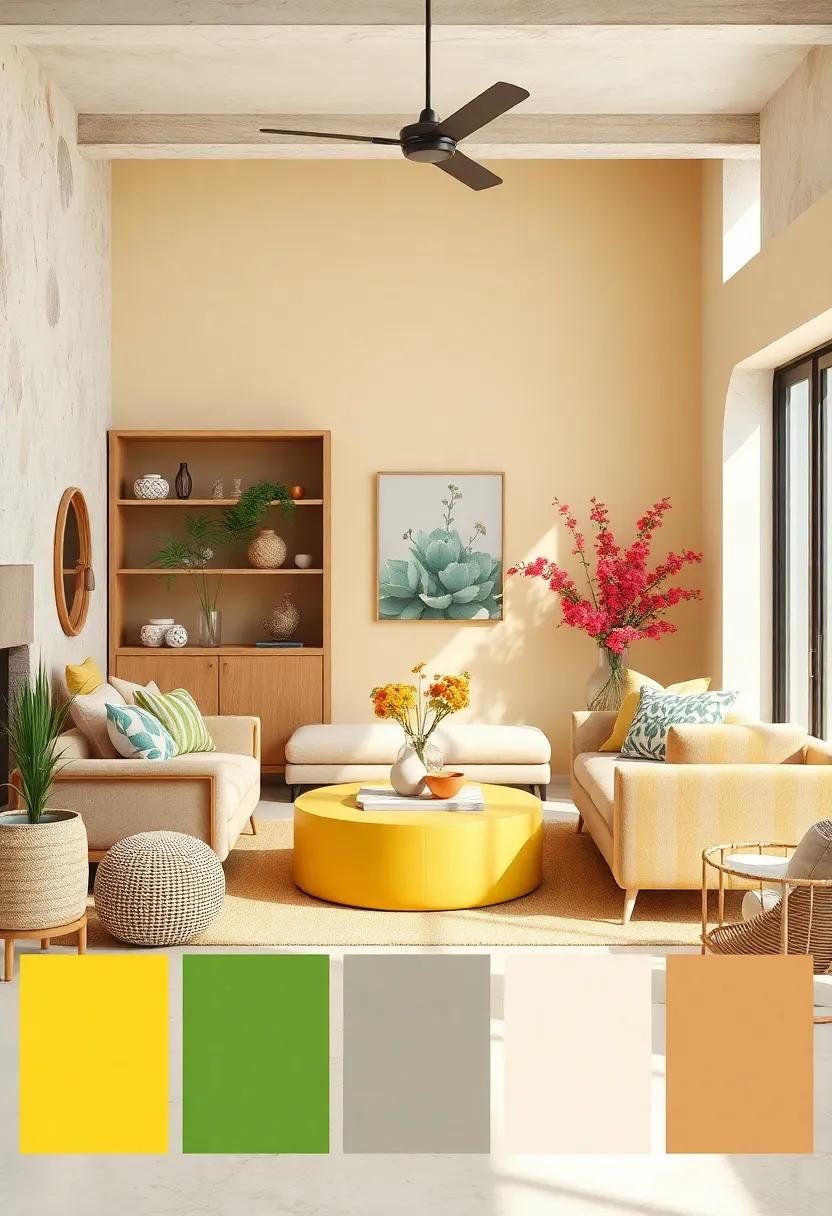
Immerse yourself in the serene beauty of a sun-drenched meadow with this vibrant palette that captures the essence of summer’s gentle embrace. Buttercream yellow brings a warm, creamy softness reminiscent of morning light filtering through petals, while wildflower orange adds a burst of energetic contrast, echoing the cheerful blooms scattered across grassy fields. This combination evokes a feeling of endless days basking in gentle sunshine, where every glance awakens a sense of joyful calm.
The grounding grass green balances the warmth with fresh vibrancy, mirroring the lush blades swaying lightly in the breeze. Above, the cool sky blue stretches wide, inviting thoughts of open horizons and soft clouds drifting lazily, while soft taupe anchors the composition with subtle earthiness, mimicking sandy pathways weaving through nature’s canvas.Together, these hues create a harmonious tableau perfect for designs craving a touch of natural, radiant energy that feels both uplifting and comfortably familiar.
Papaya punch: Juicy orange, pineapple yellow, kiwi green, ocean blue, and creamy vanilla
Step into a tropical daydream with this invigorating blend that captures the essence of sun-drenched paradise. The juicy orange sets a vibrant base, reminiscent of freshly squeezed papaya nectar, complemented perfectly by the tangy zing of pineapple yellow. Together, they bring warmth and energy, evoking lazy afternoons framed by swaying palms. Nestled among these bright staples, the kiwi green introduces a refreshing burst of vitality, while the ocean blue cools the palette with its serene whisper of the sea’s endless horizon.
To round out this luscious mix, a creamy vanilla shade provides a velvety softness that balances the boldness. This subtle neutral acts as a bridge, smoothing transitions between the intense hues and adding a layer of sophistication. Perfect for summer fashion, interiors, or branding that seeks to embody cheerfulness and tropical allure, this palette invites you to infuse #vibrancy and relaxation in an irresistible splash of color.
| Color | Hex Code | Vibe |
|---|---|---|
| Juicy Orange | #FF6F3C | Energetic & Warm |
| pineapple yellow | #FFD54F | Cheerful & Bright |
| Kiwi Green | #7ED957 | Fresh & Invigorating |
| Ocean Blue | #4A90E2 | Calm & Serene |
| Creamy Vanilla | #F3E6D8 | Soft & Balanced |
Cool Poolside: Aqua blue, lime punch, watermelon pink, sunny gold, and cloud white
Imagine the invigorating splash of aqua blue mingling effortlessly with the zesty kick of lime punch, setting the stage for a palette that’s as refreshing as a summer breeze by the pool. This combination evokes the essence of cool waters and vibrant cocktails, perfect for evoking both relaxation and energy. Accents of watermelon pink add a playful sweetness, reminiscent of juicy fruit slices and sunset reflections on the rippling surface.
Balancing these vivid hues,sunny gold beams warmth and cheer,capturing the radiant glow of sunbeams dancing on tiles. Simultaneously occurring, cloud white offers a soft, clean canvas that lightens the mood, giving the entire palette an airy, breezy feel-ideal for summer settings where brightness and comfort converge.
Firefly Glow: Neon green, electric orange, spotlight yellow, midnight blue, and pearl white

Imagine a palette where twilight meets the vibrant pulse of urban nights. This color collection ignites the senses with neon green and electric orange, hues that practically shimmer with energy, perfect for injecting a dose of lively warmth into any summer design. Spotlight yellow brings a sunlit glow that feels both inviting and bold, while midnight blue adds a mysterious depth like a cooling breeze after sunset.To balance the intensity, pearl white offers soft, iridescent highlights that catch the eye without overwhelming.
- Neon Green: Vibrant and refreshing, evokes summer’s electric buzz.
- Electric Orange: Warm and fiery, sparks creativity and fun.
- Spotlight Yellow: Bright and cheerful, like sunlight captured in color.
- Midnight Blue: Calm and grounding, echoes the twilight sky.
- pearl White: Delicate and luminous, softens and uplifts the combo.
| Hue | mood | Summer Vibe |
|---|---|---|
| Neon Green | Energetic | Fresh rainforest |
| Electric Orange | Playful | Sun-drenched Streets |
| Spotlight Yellow | Optimistic | Golden Hour Glow |
| Midnight Blue | Serene | Starry Sky |
| Pearl white | Elegant | moonlit Pearls |
Melon Medley: Cantaloupe orange, honeydew green, watermelon red, blueberry blue, and cloud cream

Infuse your summer projects with the juicy vibrancy of Melon Medley. This palette bursts with the ripe sweetness of cantaloupe orange, the fresh zest of honeydew green, and the bold splash of watermelon red. to balance the warmth, add the subtle, cool tones of blueberry blue and the soft, creamy whisper of cloud cream. Together, these hues evoke a cheerful picnic on a sun-dappled afternoon, where every color tastes as delightful as the fruit itself.
Perfect for branding, summery web designs, and lively interiors, this palette offers a refreshing mix of energy and calm. Whether you’re painting a vibrant mural or curating a seasonal lookbook, the colors harmonize effortlessly. Use watermelon red for eye-catching calls to action, honeydew green for natural elements, and the gentle cloud cream to soften layouts and create inviting breathing space.
| Color | Hex Code | Usage Suggestion |
|---|---|---|
| Cantaloupe Orange | #FFA500 | Headline highlights |
| Honeydew Green | #8FBC8F | Backgrounds & accents |
| Watermelon Red | #FF4D4D | Call to action buttons |
| Blueberry Blue | #4169E1 | Links and icons |
| Cloud Cream | #F5F5DC | Whitespace and borders |
surf and Sand: Deep navy, sandy beige, coral pink, seafoam green, and driftwood gray
Immerse yourself in the serene embrace of coastal charm with this palette inspired by the harmonious dance of ocean and shore. The deep navy mirrors the vast, calming depths of the sea, grounding the ensemble with its profound richness. Complementing this is sandy beige, a warm, inviting tone that evokes sun-kissed beaches and soft, golden grains beneath your feet. Together, they create a timeless foundation that is as soothing as a gentle sea breeze.
Adding spirited pops of color, coral pink introduces a lively splash reminiscent of playful sunsets, while seafoam green offers a refreshing coolness, like a refreshing tide rolling in. The muted driftwood gray rounds out the palette, providing an organic, weathered texture that recalls handcrafted driftwood and natural shoreline elements. This collection is perfect for designs seeking both tranquility and vibrancy, balancing nature’s nuanced shades with cheerful energy.
Mango Tango: Bright mango orange, tropical teal, sunny lemon, palm green, and chalky white
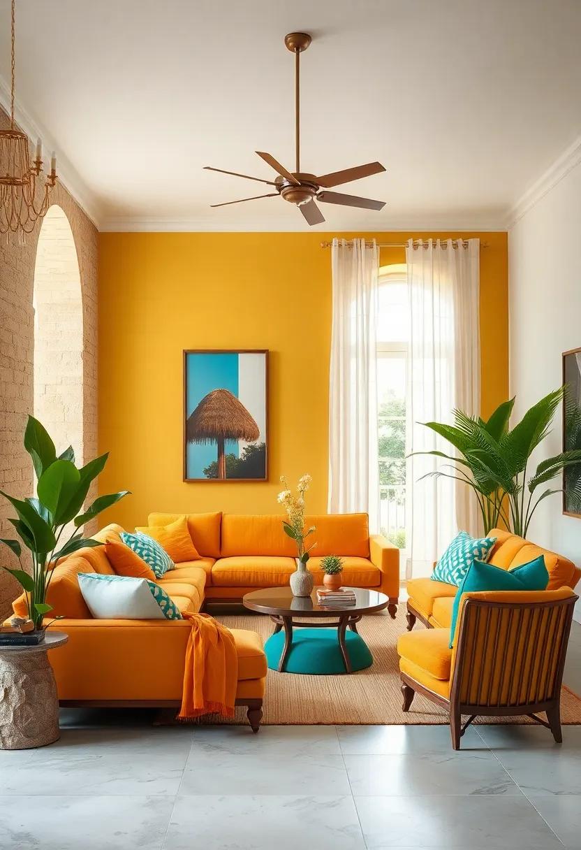
Ignite your summer vibe with a cocktail of bright mango orange and tropical teal, balanced perfectly by sunny lemon and the grounded calm of palm green. This palette is a radiant celebration of the tropics, evoking images of sun-dappled beaches and lush, leafy canopies. The interplay between the warm, energizing hues and the cooling, refreshing tones creates a dynamic yet harmonious feel-ideal for layouts and designs craving a splash of fun with sophistication.
The addition of chalky white softens the vibrancy, offering space to breathe and highlighting the intense colors like precious gems. Use this palette to bring fresh energy to branding, summer campaigns, or even home décor themes. Whether you lean into the zesty punch of mango and lemon or the calming oasis provided by teal and green, this combination sparks a sense of adventure and sunny optimism.
| Color | Mood | Use case |
|---|---|---|
| Mango Orange | Energizing, Warm | Accent Walls, Call to Action Buttons |
| Tropical Teal | Refreshing, Calm | Backgrounds, Navigation Bars |
| Sunny Lemon | Bright, cheerful | Highlights, Iconography |
| Palm Green | Natural, Grounded | Typography, Borders |
| Chalky White | Neutral, Clean | Backgrounds, Negative Space |
Hibiscus Heat: Hot pink, tangerine, lush green, sunset yellow, and warm sand
Dive into the vibrant energy of summer with a palette that sings tropical rhythms through every shade. Imagine the bold burst of hot pink petals basking under the sun, seamlessly intertwined with the juicy zest of tangerine. These colors evoke the playful spirit of a hibiscus bloom on a warm, breezy day, while lush green leaves offer a soothing balance, reminding you of nature’s alive vibrancy. The inclusion of sunset yellow mimics golden hour’s glow-soft yet radiant-bringing warmth to the composition. Grounding this lively mix, warm sand acts as the perfect neutral, casting an inviting, earthy whisper to the entire palette.
This harmonious blend works wonders beyond just visuals; it’s a mood lifter and a summer escape in color form. Perfect for interiors craving a tropical flourish or fashion lines seeking a splash of beachy brightness,this combination speaks of sunny afternoons,laughter-filled gardens,and endless horizon views. Below is a simple look at how each tone contributes to the overall feel:
| Color | Mood | Use Case |
|---|---|---|
| Hot Pink | Vibrant & Playful | Accent Walls, Accessories |
| Tangerine | Energetic & Fresh | Textiles, Graphic Elements |
| Lush Green | Calming & Grounding | furniture, Plants |
| Sunset Yellow | Warm & Cheerful | Lighting, Art Pieces |
| Warm Sand | Neutral & Cozy | Backgrounds, Flooring |
Picnic Patch: Cherry red, sky blue, grassy green, creamy yellow, and soft white
Imagine a summer day where every shade invites you to bask in nature’s purest joy. This lively blend wraps you in the warmth of cherry red, igniting excitement and passion with its vibrant punch.Nestled alongside, the calm of sky blue conjures wide-open horizons and gentle ocean breezes, balancing the intensity with serene coolness.Grassy green injects a fresh, earthy vitality, reminiscent of picnic blankets sprawled under the sunshine, while creamy yellow adds a soft glow-like the perfect sun-kissed lemonade-bringing warmth without overpowering. the presence of soft white lifts the palette, providing clean simplicity and breathing space that highlights every accompanying hue.
- Cherry Red: Energetic and inviting
- Sky blue: Refreshing and tranquil
- Grassy Green: Earthy and vibrant
- Creamy Yellow: Warm and tender
- Soft White: Clean and airy
| Use Case | Ideal For | Emotional Effect |
|---|---|---|
| Outdoor Party Decor | Picnics & Garden Gatherings | Cheerful, Inviting |
| Graphic Design | Summer Campaigns | Refreshing, Energetic |
| Fashion | Casual Wear | Playful, Lighthearted |
Whether you’re designing a sunlit outdoor soiree or crafting vibrant summer visuals, this collective of hues speaks a language of optimism and ease. It’s a color story that evokes childhood memories of carefree days on the grass, laughter under blue skies, and the sticky sweetness of cherry-filled treats. Its radiant but balanced spectrum helps to create environments or visuals where joy feels tangible and every glance invites you to smile a little wider.
Ocean Glow: Deep aqua, bright coral, sunny gold, seafoam green, and pearl gray
Imagine the serene depths of the ocean mingling with the warmth of a sunlit beach-this palette captures that perfect balance. Deep aqua sets a calming yet invigorating foundation, reminiscent of tranquil waves beneath a midday sun. The punch of bright coral adds an energizing spark,evoking vibrant seashells and tropical blooms. complementing these hues, sunny gold brings a dash of radiant optimism, illuminating the palette like golden rays dancing on the water’s surface.
The softer shades of seafoam green and pearl gray round out this collection with subtle freshness and understated elegance.Seafoam green mimics the gentle lapping of frothy surf, while pearl gray reflects the shimmer of smooth stones along the shore. Together, these colors create a harmonious blend that’s perfect for capturing the essence of summer’s coastal breezes-light, airy, and beautifully vibrant.
| Color | Mood | Summer Element |
|---|---|---|
| Deep Aqua | Calm & Refreshing | Ocean Depths |
| Bright Coral | Energetic & Bold | Tropical flowers |
| Sunny Gold | Warm & Radiant | sunlight Rays |
| Seafoam Green | Soft & Breezy | Foamy surf |
| Pearl Gray | Elegant & Calm | Smooth Shore Pebbles |
Sunset Sip: Raspberry red, golden amber, soft lavender, ocean blue, and creamy peach
Dive into an enchanting blend that captures the magic hour when day gracefully yields to night. This palette plays with raspberry red’s vibrant energy, fusing it effortlessly with the warm embrace of golden amber. the addition of soft lavender brings a twilight softness that soothes the senses,while ocean blue injects a refreshing hint of breeze off the shore. A creamy peach finish rounds out the spectrum with its subtle warmth,evoking the last light of the sun melting into the horizon.
Perfect for evoking calm yet lively atmospheres, this combination thrives in spaces and designs craving a balance between bold and gentle. Whether it’s an accent wall, textiles, or graphical elements, these shades work harmoniously to evoke memories of languid summer evenings. Try pairing them in layered textures or minimalist layouts to fully appreciate their radiant interplay:
| Color | Hex Code | Mood |
|---|---|---|
| Raspberry Red | #D32F2F | Energetic & Bold |
| Golden Amber | #FFC107 | Warm & Inviting |
| Soft Lavender | #B39DDB | Calming & Dreamy |
| Ocean Blue | #0277BD | Refreshing & Cool |
| Creamy Peach | #FDCBA6 | Gentle & Soothing |
Fresh squeeze: lime zest, grapefruit pink, sunny yellow, turquoise blue, and light cream
Imagine a palette where the zest of lime tangos with the juicy blush of grapefruit, creating an energetic burst of flavor and color. This vibrant combination invigorates any space or design, blending the tangy bite of pink grapefruit with a sunny yellow that radiates warmth and optimism. Turquoise blue slashes through the mix like a refreshing splash of ocean breeze, while the soft light cream acts as a gentle whisper, grounding the vivid hues without dulling their brilliance. Together, these colors evoke the carefree essence of summer, capturing playful afternoons spent under clear skies.
This union isn’t just visually striking; it’s a celebration of contrasts and harmony. The brightness sparkles with citrus-inspired energy, but the light cream balances the brightness with subtle calm, creating a palette versatile enough for fashion, interiors, and graphic design alike. Whether you’re painting a room, designing a brand, or curating a summer wardrobe, this fresh squeeze of colors promises to infuse every project with cheerful vitality and sunny sophistication.
Carnival Brights: Electric pink, neon orange, bright lemon, cobalt blue, and crisp white
Electrify your summer vibe with a palette that commands attention.Imagine the vivid pulse of electric pink set against the fiery kick of neon orange, igniting any outfit or space with instant energy.Bright lemon adds a refreshing zing, balancing the heat with its sunny radiance, while deep cobalt blue cools things down, grounding the exuberance with its rich, oceanic depths. Crisp white acts as the perfect canvas,allowing these tones to pop and dance with maximum brilliance.
This vibrant combination is perfect for everything from fashion to interiors, transforming the mundane into a carnival of color and light. Whether it’s a playful summer dress, bold accessories, or eye-catching wall accents, these hues bring a mood of celebration and warmth. use bold blocks of color or unexpected pops to create a dynamic look that feels both modern and evocative of endless sunshine and joyous festivities.
| Color | Hex Code | Vibe |
|---|---|---|
| Electric Pink | #FF3CAC | Vibrant & Playful |
| Neon Orange | #FF6F00 | Fiery & Energetic |
| Bright lemon | #FFF700 | Fresh & Zesty |
| Cobalt Blue | #0047AB | Deep & Calming |
| Crisp White | #FFFFFF | Clean & Bright |
- Fashion: Neon crop tops, cobalt shorts, and lemon accessories.
- Home Decor: Accent walls in electric pink, cobalt cushions, crisp white furnishings.
- Events: Festive table settings with bright lemon napkins and neon orange glassware.
Morning Dew: Soft aqua, pale peach, lemon chiffon, leafy green, and light gray
Imagine the gentle touch of dawn wrapped in a palette that whispers serenity and freshness. This blend of soft aqua, pale peach, lemon chiffon, leafy green, and light gray evokes the calm moments when sunlight first kisses dew-speckled leaves. The delicate balance between pastel warmth and verdant vibrancy makes it perfect for spaces or visuals seeking a tranquil yet inviting summer ambience. It’s a harmony that invites you to pause and breathe, capturing the essence of early morning light and nature’s quiet revival.
Key attributes of this palette include:
- Soft Aqua: A cool, refreshing base that sets a watery, peaceful tone.
- Pale Peach: Introduces gentle warmth without overpowering.
- Lemon Chiffon: Adds a cheerful, sunlit glow to brighten the mix.
- Leafy Green: Grounds the palette with lush, natural energy.
- Light Gray: Neutralizes and balances, offering subtle sophistication.
| Color | Mood | Usage Ideas |
|---|---|---|
| soft Aqua | Calming, Refreshing | Backgrounds, Water-inspired designs |
| pale Peach | Warm, Subtle | Accents, Soft text highlights |
| Lemon Chiffon | Bright, Cheerful | Call-to-actions, Highlights |
| Leafy Green | Natural, Vibrant | Elements, Buttons |
| Light Gray | Neutral, Balanced | Text bodies, Borders |
Final thoughts
there you have it-23 vibrant summer-inspired color palettes ready to infuse your projects with a burst of sunny energy and cheerful vibes. Whether you’re designing for a carefree beach day, a lively garden party, or simply craving a splash of warmth, these palettes offer endless inspiration to brighten your creative world. So go ahead,pick your favorites,and let these radiant hues fuel your next colorful adventure under the summer sun.
As an Amazon Associate I earn from qualifying purchases.