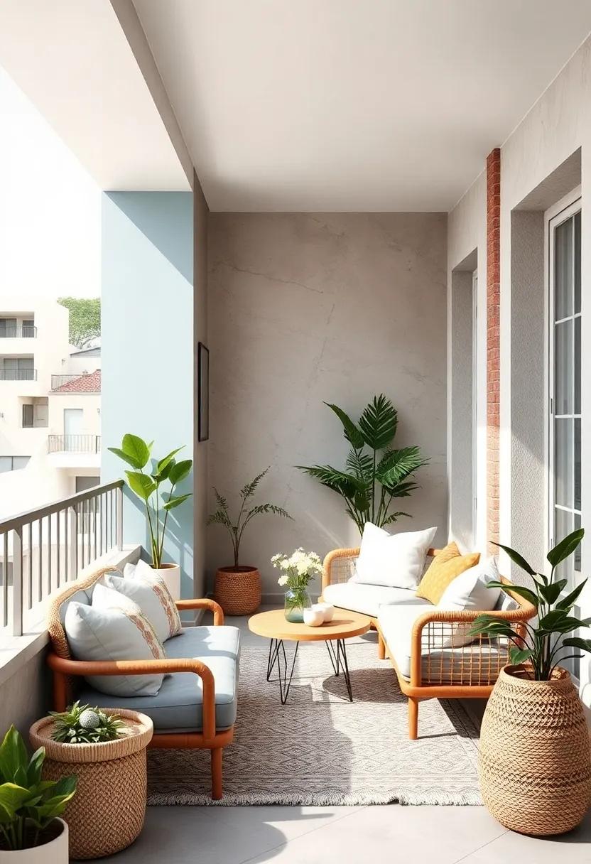
25 Inspiring Light and Neutral Color Palettes to Brighten Your Small Balcony Space
Transforming a small balcony into a serene retreat can be a delightful challenge, especially when working with limited space and natural light. Choosing the right color palette plays a pivotal role in making your outdoor nook feel open, airy, and inviting. In this listicle, we present 25 inspiring light and neutral color palettes thoughtfully curated to brighten and expand your small balcony space. From soft creams and sandy beiges to gentle greys and muted pastels,thes combinations not only enhance natural light but also create a soothing ambiance that invites relaxation. Whether you’re looking to refresh your existing décor or starting from scratch, you’ll discover fresh ideas and practical inspiration to elevate your balcony into a peaceful haven.
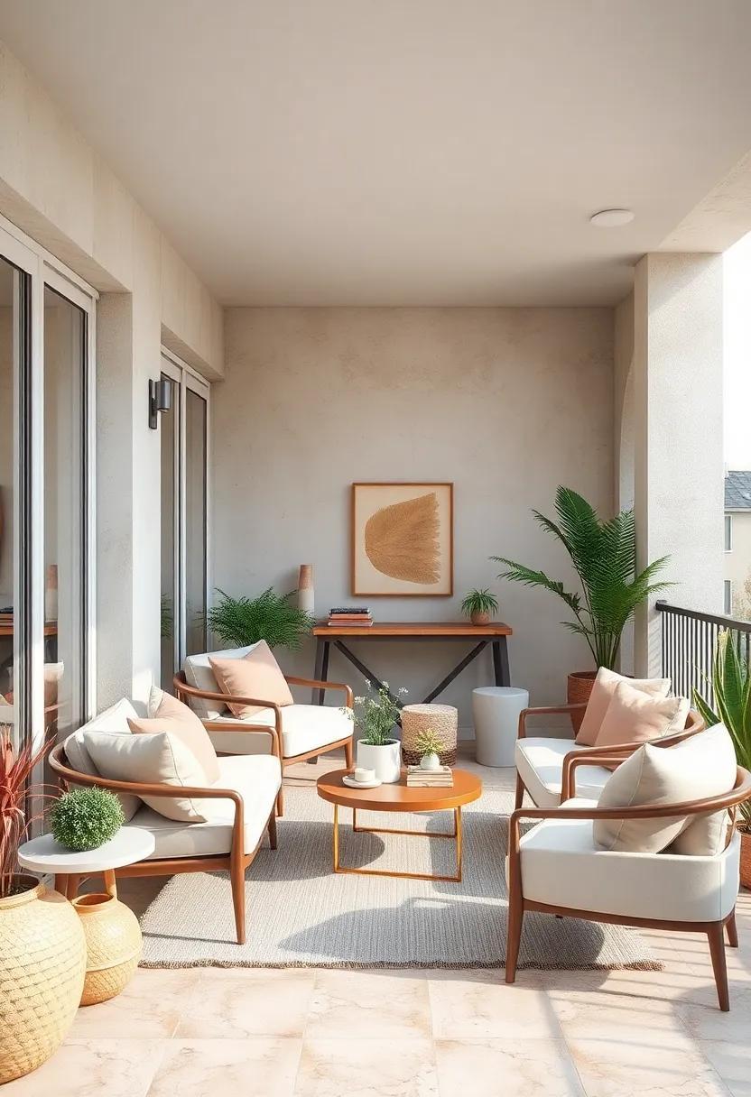
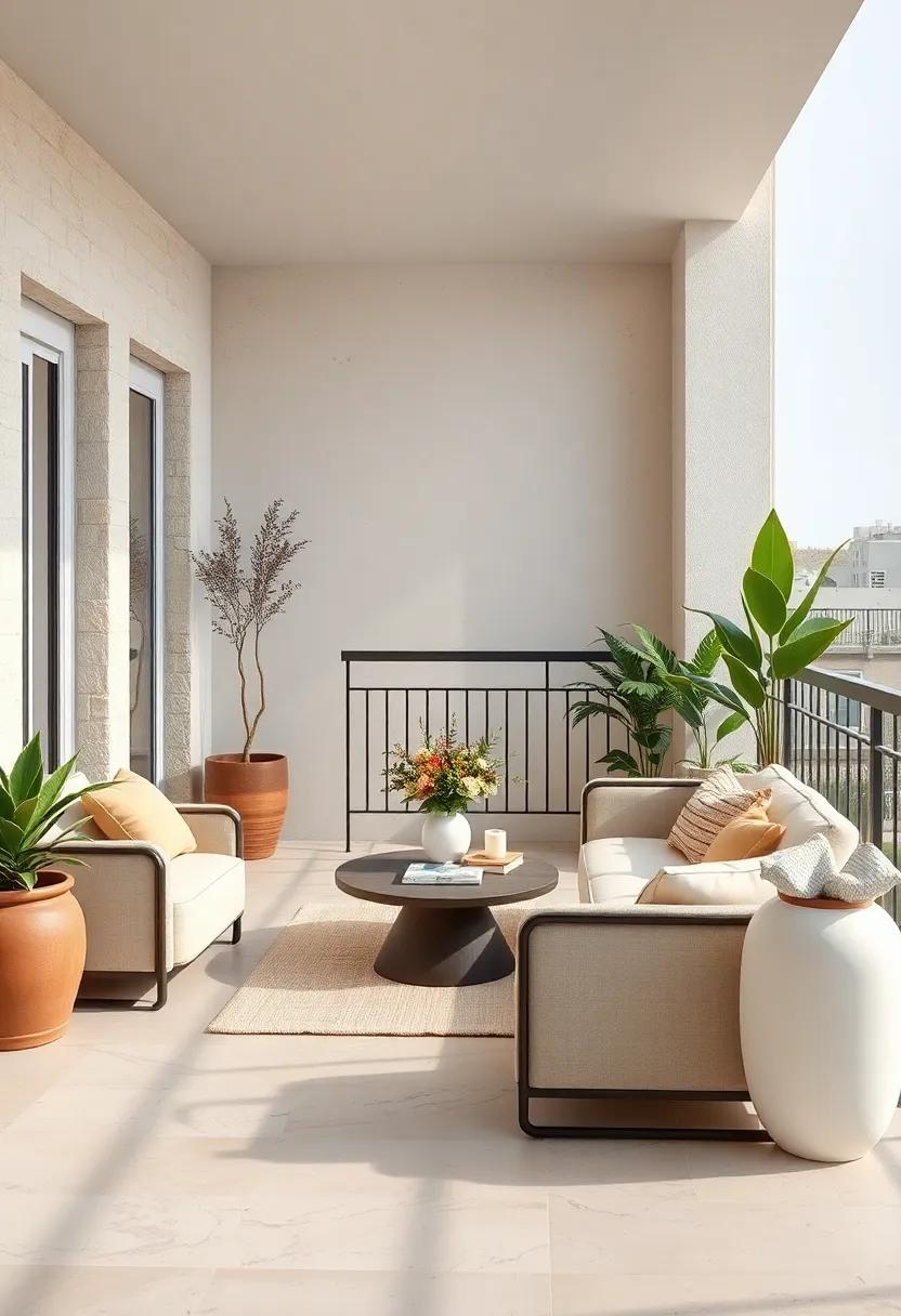
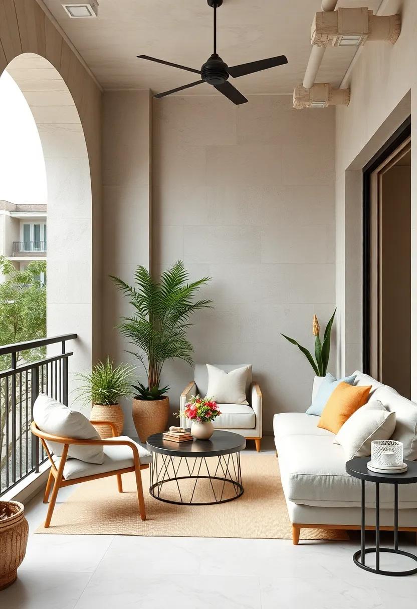
Soft Sand and Ivory: Embrace a serene palette that mimics the beach with warm sand tones paired with crisp ivory accents for a peaceful retreat
Transform your balcony into a tranquil sanctuary by blending soft sand tones with crisp ivory accents—a combination that evokes the soothing atmosphere of a gentle seashore. Imagine warm, muted beiges acting as the base color for your walls or floor, instantly creating a cozy and grounded habitat. Layered with off-white cushions, airy curtains, and delicate planters, this palette invites natural light to dance effortlessly across your space, enhancing the feeling of openness without overwhelming the senses. The subtle contrast between sand and ivory invites calmness, making it perfect for morning coffee rituals or evening unwinds.
To make the most of this serene palette, incorporate natural materials and textures that complement the color scheme. Think woven rattan chairs, linen throws, and light wooden accents to extend the beach-inspired vibe. Accessories in soft white ceramics or driftwood finishes will complete the look while keeping the atmosphere fresh and uncluttered. Below is a speedy guide to pairing elements within this palette for your balcony oasis:
| Element | Suggested Colors & Materials | effect |
|---|---|---|
| Seating | Woven rattan, sand beige cushions | Natural texture, warm intent |
| Textiles | Ivory linen throws, sheer curtains | Softness & light diffusion |
| Decor | White ceramic pots, driftwood accents | Organic and coastal touch |
Misty Gray and Pale Taupe: A sophisticated blend of gentle grays and taupe hues creates a modern yet cozy small balcony atmosphere
Embracing the subtle charm of misty gray paired with pale taupe envelops your balcony in a tranquil yet inviting ambiance.This palette offers a harmonious balance, where the coolness of gray softens the warmth of taupe, creating a serene backdrop that enhances natural light without overwhelming the space. Ideal for those who appreciate understated elegance,these hues lend themselves beautifully to modern furnishings crafted from natural materials like wicker,rattan,or light wood—accentuating texture while maintaining an airy feel.
To elevate this setting,consider incorporating elements that bring depth and dimension:
- Neutral cushions and throws blending taupe undertones with subtle gray patterns
- Matte ceramic planters in varying shades of gray for a layered,organic look
- Delicate fairy lights or lanterns in brushed metal finishes,echoing the softness of your palette
- Glass or light-stained wood furniture that doesn’t overpower the subtle color story
| Color | Effect | Best Use |
|---|---|---|
| Misty Gray | Calming,expansive | Walls,upholstery |
| Pale Taupe | Warm,grounding | Accessories,cushions |
| Soft White | Brightening,crisp | Trim,small decor |
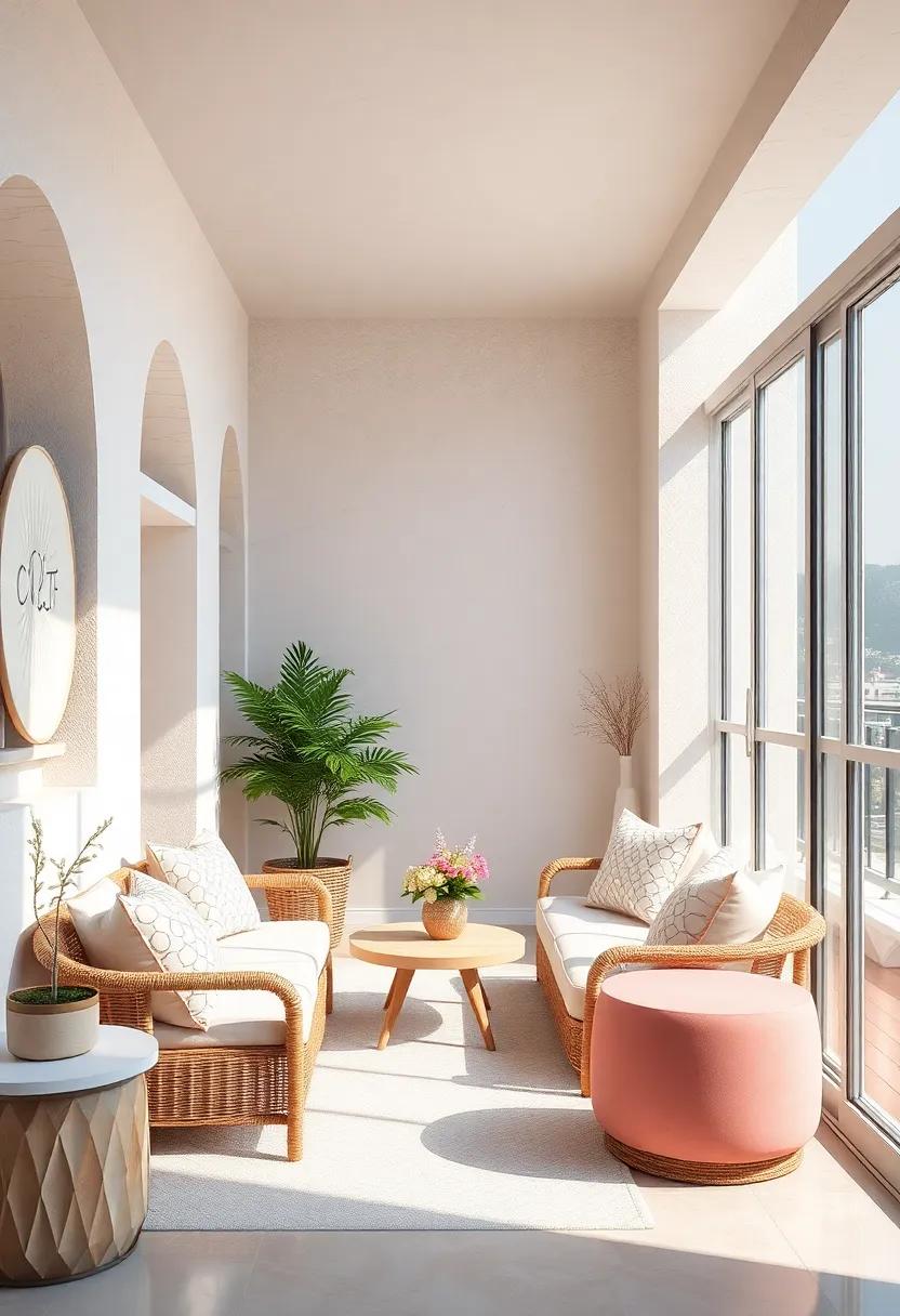
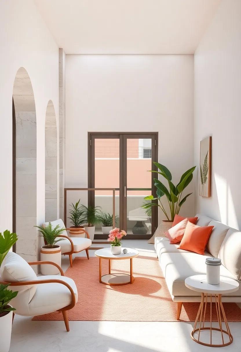
Blush Pink and Off-White: Introduce a subtle touch of romance with delicate blush pink complemented by clean off-white for an airy feel
Embrace the gentle charm of blush pink paired with the crisp purity of off-white to transform your balcony into a serene sanctuary. This delicate pairing evokes a sense of understated romance, perfect for creating an inviting outdoor nook where soft pastels feel warm and welcoming.Incorporate plush cushions, light throw blankets, or ceramic planters in blush pink tones to add subtle pops of color, while off-white flooring or furniture maintains a breezy, spacious ambiance that visually opens up the area.
To enhance the airy vibe, consider mixing textures that balance softness with clean simplicity:
- Woven rattan seats with blush pink cushions
- Off-white linen curtains fluttering in the breeze
- Delicate blush-hued floral arrangements in matte white vases
- Soft, neutral-toned rugs to anchor the space
| Element | Blush Pink Options | Off-White Complements |
|---|---|---|
| Seating | Blush velvet cushions | White wicker chairs |
| Textiles | Rose petal throw blankets | Cream linen curtains |
| Decor | Soft pink candles | Matte off-white ceramic vases |
cream and Light Oak: Warm, creamy shades combined with natural light oak details bring a calming organic vibe to your outdoor space
Imagine your balcony transformed into a serene retreat with the gentle embrace of creamy tones softly merging with natural light oak elements. These warm hues create a sanctuary that feels both inviting and refreshingly organic. The subtle grain of light oak not only adds texture but also echoes the beauty of nature, making your outdoor nook a perfect spot for morning coffee or an evening unwind. Embrace cushions in soft cream shades, paired with wooden planters and light oak furniture, to build a layered aesthetic that whispers calmness and subtle sophistication.
To achieve this effortlessly soothing palette, incorporate accessories and decor that highlight the neutral warmth of cream alongside the understated elegance of oak:
- Textiles: Linen throws and pillows in muted ivory and beige
- Planters: Light oak or bamboo pots to enhance the natural vibe
- Furniture: Compact light oak benches or stools with cream cushions
- Decor: Woven baskets and driftwood accents for an organic touch
This neutral pairing allows your balcony to remain bright and airy while inviting a tactile warmth that truly feels like an outdoor extension of your home’s cozy style.
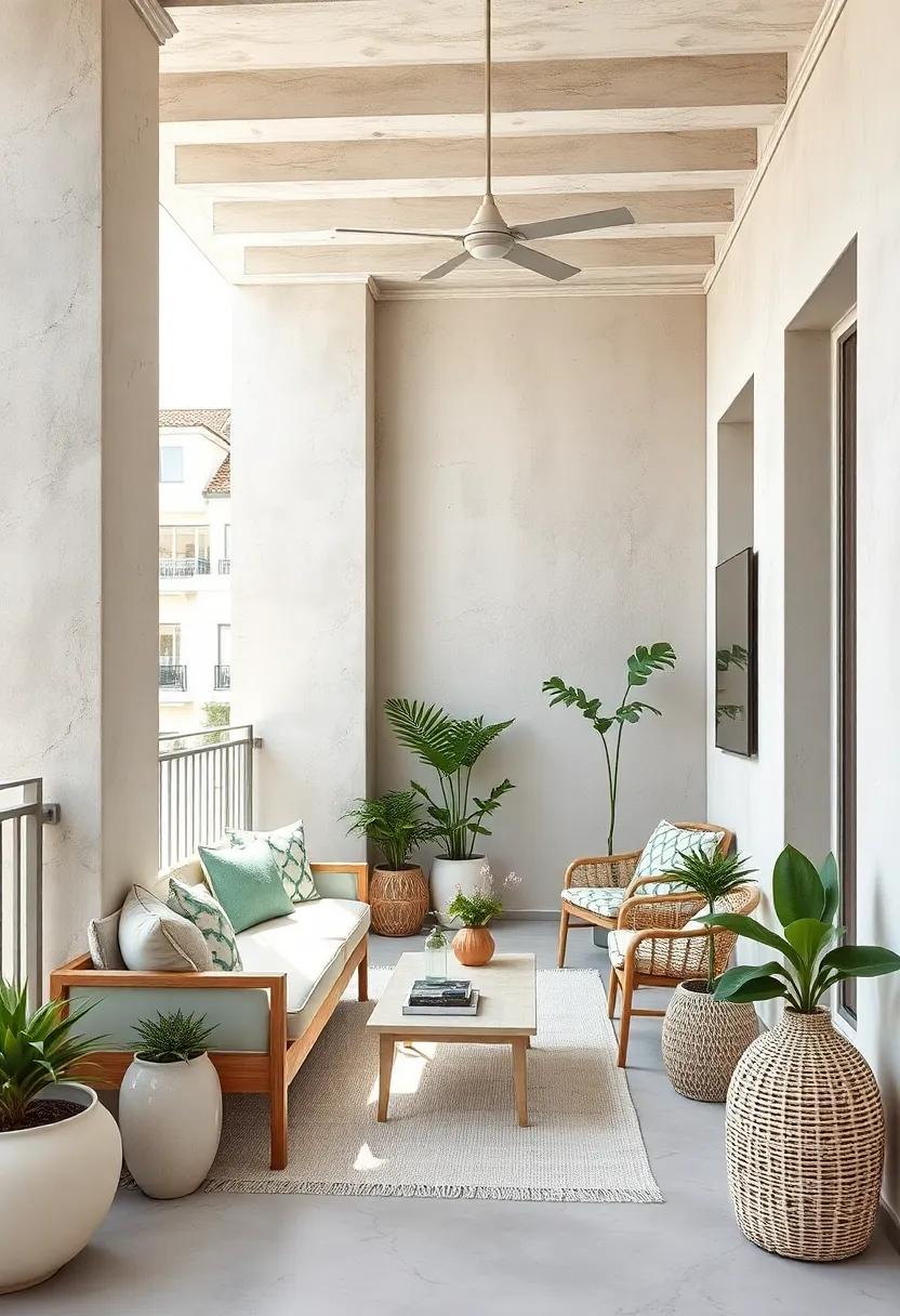
Pale Sage and Linen White: A fresh, botanical-inspired pairing that invites nature in while keeping the palette neutral and light
Pairing pale sage with linen white effortlessly conjures a serene, botanical vibe perfect for small balconies seeking a breath of fresh air. The gentle green undertones of pale sage echo leafy garden hues, while linen white offers a crisp, airy backdrop that keeps the space feeling open and welcoming. This duo not only enhances natural light but also creates a subtle canvas for adding textured elements like woven baskets,ceramic pots,or soft linen cushions—each piece helping to invite a tranquil outdoor ambiance into your home.
To balance the palette with warmth and depth without overwhelming, consider incorporating these natural touches:
- Light wooden furniture with visible grain
- Neutral-toned rugs in jute or sisal
- botanical prints framed in white or light wood
- Soft throws in muted earth tones
| Element | Suggested Material | Benefit |
|---|---|---|
| Planters | Ceramic in white or pale green | Reflect light; emphasize botanical theme |
| Seating | Rattan or light oak | Maintain warmth without darkening space |
| Textiles | Linen or cotton in cream tones | Add softness and tactile interest |
Warm Beige and Dove Gray: Neutral warmth balanced with soft gray hues results in a versatile and inviting balcony look
Soft,enveloping warmth meets gentle sophistication in this palette,creating an atmosphere that feels both cozy and contemporary. Warm beige acts as the perfect foundation, evoking natural textures like sand and linen, while dove gray introduces subtle depth without overpowering the space. This combination enriches a small balcony with a calm, inviting aesthetic that works beautifully with natural wood furniture, rattan accents, or even sleek metal fixtures. The colors effortlessly balance one another,making your outdoor retreat feel both snug and spacious.
To elevate the look, consider layering in light textiles and planter pots in muted earth tones. The versatility of this duo means you can easily swap in seasonal accents or vibrant greenery to keep the space fresh year-round. Below is a simple guide to help you incorporate these hues:
| Element | Color Suggestion | Effect |
|---|---|---|
| Flooring | Warm beige sandstone tiles | Enhances warmth and natural appeal |
| seating | Dove gray cushions with beige throws | Soft contrast and inviting comfort |
| Planters | Matte gray ceramic or light terracotta | Adds subtle structure without distraction |
| decor | Natural jute rugs and wicker accessories | Strengthens the cozy, earthy vibe |
Chalk White and Soft Mocha: Brighten your balcony with bright whites offset by gentle mocha tones for a welcoming and grounded feel
Transform your balcony into a serene retreat by combining chalk white with soft mocha hues. The crispness of chalk white instantly reflects natural light, making the space feel larger and more open, while gentle mocha tones introduce warmth and depth without overwhelming. Picture plush mocha cushions resting atop freshly painted white railings, paired with light wood decking or rattan furniture that nods to earthiness. This peaceful palette encourages relaxation and invites you to unwind amidst subtle contrasts that never compete but harmonize beautifully.
- Textiles: Use textured beige throws and cushions to add softness without darkening the scheme.
- Plants: Incorporate greenery in white ceramic pots to bring freshness while maintaining the light aesthetic.
- lighting: Warm-white fairy lights or mocha-hued lanterns create a cozy evening ambiance.
| Element | Suggested Shade | Effect |
|---|---|---|
| Wall paint | chalk White | Brightens and enlarges |
| Seating cushions | Soft Mocha | Adds warmth and comfort |
| Flooring | Light Wood Beige | grounds and balances |
Ivory and Seashell Pink: evoke coastal charm with an elegant duo of ivory and delicate seashell pink shades, perfect for airiness
Transform your balcony into a serene coastal nook by blending the warmth of ivory with the soft blush of seashell pink. This gentle pairing creates an airy ambiance that instantly invites relaxation,reminiscent of sandy shores kissed by the morning sun. Use ivory as your backdrop—think walls, railings, or large furniture pieces—to establish a clean, bright foundation. then, accentuate with seashell pink through cushions, planters, or delicate textiles that add subtle pops of color without overwhelming the space.
Design tips to embrace this palette:
- Incorporate natural textures like rattan or wicker in a light finish to complement the softness of the shades.
- Add lush greenery to enhance the fresh, coastal vibe while maintaining balance with the muted tones.
- Choose lightweight fabrics such as linen or cotton in complementary neutral hues to keep the space feeling breezy and comfortable.
- Consider pale wood decking or floor tiles that blend seamlessly with the ivory base, enhancing the overall airiness.
| Element | Color/Material | Effect |
|---|---|---|
| Walls & Larger Surfaces | Ivory | Brightens & opens space |
| Textiles & Cushions | Seashell Pink | Softens & adds warmth |
| Furniture | Light Rattan/Wood | Natural texture & coastal feel |
| Flooring | Pale wood or neutral tile | Enhances spaciousness |
Powder Blue and Frosty White: Cool powder blue mixed with frosty white accents adds a refreshing breeze to small balcony corners
Cool powder blue acts as a tranquil foundation, evoking the soothing hues of a clear sky or calm ocean waves. When paired with crisp frosty white accents, this palette crafts a serene atmosphere that feels airy and expansive—perfect for those cozy balcony nooks where you want to unwind after a long day. Imagine soft, powder blue cushions resting on whitewashed wooden chairs, accompanied by delicate white planters that hold lush greenery. This contrast not only brightens the corner but also visually amplifies the limited space, making every inch feel like a refreshing breeze.
To truly embrace this color combo, integrate textural elements that echo a light, breezy vibe. Use woven fabrics, airy curtains, and light-reflecting surfaces such as glossy ceramics or glass details. Consider this simple style guide to harmonize your space:
| Element | Suggested powder Blue | Frosty White Detail |
|---|---|---|
| Furniture | Matte-painted metal or wood | White cushions or throw blankets |
| Decor | Blue-tinted glass vases | White ceramic pots with succulents |
| Flooring & Rugs | Soft blue outdoor rugs | White pebbles or decking |
- Layer soft fabrics in powder blue to add calmness and texture.
- Incorporate frosty white lighting elements like lanterns or string lights to glow softly after sunset.
- Mix natural greenery to enliven the palette with fresh, organic contrasts.
Light Cream and Pale Peach: A cozy and understated palette that infuses subtle warmth and softness into compact balcony designs
Embracing light cream and pale peach tones in your balcony transforms the space into a tender retreat flooded with gentle warmth. These hues work harmoniously to reflect natural light,enhancing the sense of openness without overwhelming the senses. Paired with minimalist furniture in natural textures—think rattan chairs or soft linen cushions—the palette fosters a serene atmosphere where every moment feels like a soft embrace. This subtle interplay of colors makes even the smallest corners inviting and luminous.
To further elevate this palette, incorporate accents like woven baskets, delicate planters, or lightweight throws in complementary neutrals such as muted taupe or ivory. These elements anchor the space while preserving its understated charm. Below is a quick reference table to help you mix and match with ease:
| Element | Recommended Shades |
|---|---|
| Furniture | Natural wood, light rattan |
| Textiles | Ivory, soft beige, blush pink |
| Decor | Woven baskets, pale terracotta |
| Planters | Off-white, sand |
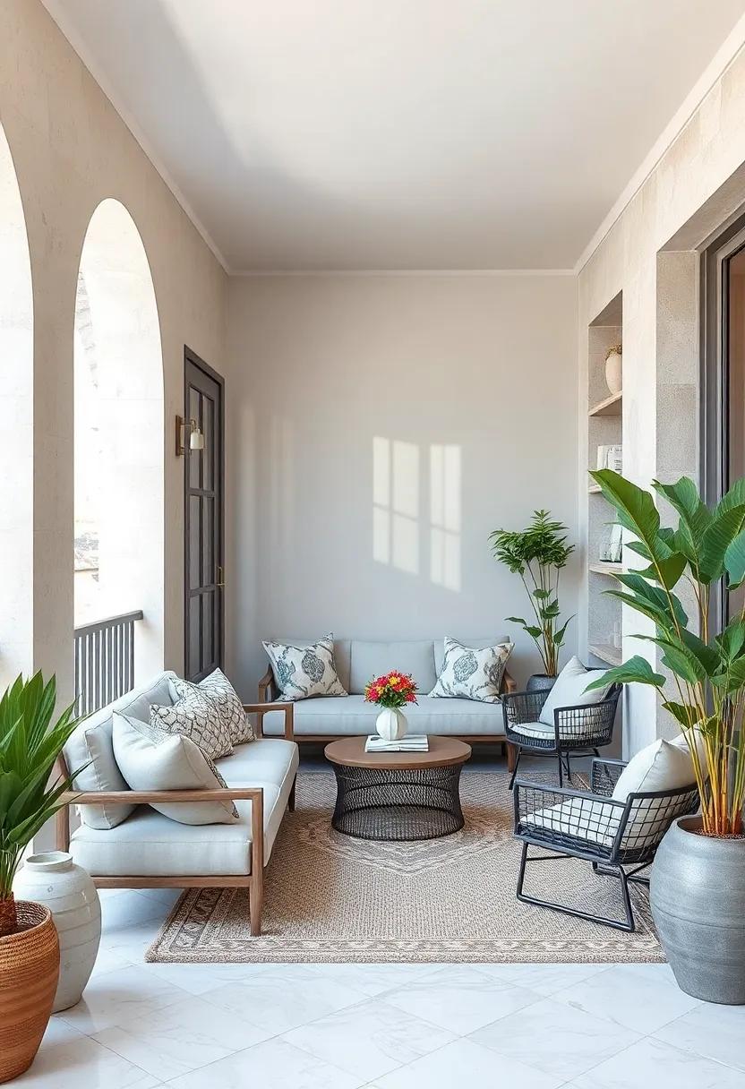
Oyster Gray and Nimbus Cloud: Sophisticated oyster gray paired with light cloud-like whites creates a serene and sophisticated setting
Blending the subtle strength of oyster gray with the airy softness of nimbus cloud whites evokes a calming ambiance that feels both modern and timeless. This palette invites natural light to dance across your balcony,highlighting textures without overwhelming the senses. The oyster gray acts as a grounding anchor, perfect for structural elements like planters or seating, while the nimbus whites uplift and expand the visual space, making small balconies feel larger and effortlessly chic.
- Furniture: Choose matte-finished gray wood or metal pieces complemented with soft white cushions or throws.
- Accents: incorporate light-washed linen fabrics or woven baskets in cloud hues to add warmth and texture.
- Botanicals: Opt for green plants with silvery foliage that harmonize beautifully with the muted palette.
| Element | Color Suggestion | Effect |
|---|---|---|
| Planters | Oyster Gray | creates depth and structure |
| Wall paint or panels | nimbus Cloud White | Enhances brightness and openness |
| Soft furnishings | Mixed light neutrals | Adds texture without color clutter |
Vanilla and Soft Olive: Natural vanilla tones combined with muted olive greens enhance an earthy yet refined outdoor space
Embrace the subtle sophistication of natural vanilla hues paired with soft olive greens to create an outdoor sanctuary that feels both grounded and graceful. This palette draws inspiration from the gentle warmth of vanilla bean and the calming depth of muted olive, offering a harmonious backdrop that invites relaxation. Use vanilla tones for larger surfaces like walls or flooring to amplify natural light, while introducing olive accents through potted plants, cushions, or woven textiles to add texture and organic charm. The gentle contrast between these colors produces an earthy elegance that doesn’t overwhelm smaller balcony spaces, making them feel open yet intimately cozy.
To balance the palette, incorporate natural materials such as light wood, rattan, and linen in neutral shades. These elements reinforce the connection to nature while enhancing the palette’s understated beauty. Here’s a simple guide to layering these colors effectively for your outdoor retreat:
| Element | Color Suggestion | Texture/Material |
|---|---|---|
| Walls & Floor | Soft Vanilla | Matte or plaster finish |
| Accent Pieces | Muted Olive Green | Linen cushions, ceramic pots |
| Furniture | Natural Wood | Light oak or bamboo |
| Accessories | Off-white & beige tones | Woven rugs, throws |
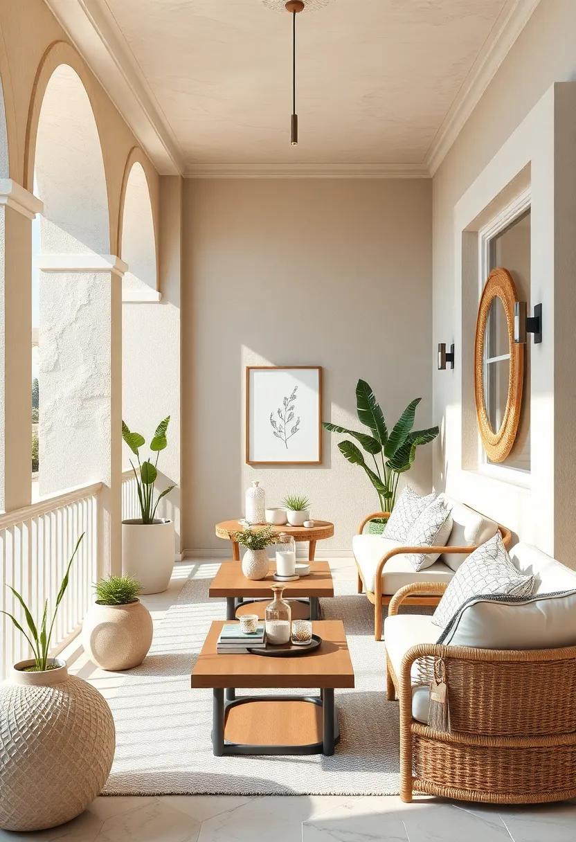
Almond and Chalky beige: A warm almond base with chalky beige uplifts your balcony while maintaining subtle elegance
Embracing a warm almond base creates a cozy and inviting atmosphere on your balcony, perfect for those quiet moments or casual gatherings. This rich yet subtle hue acts as a gentle foundation, providing depth without overwhelming the space. The beauty of almond lies in its versatility—it pairs seamlessly with an array of natural materials like rattan, wood, and linen to enhance a grounded, organic vibe. Incorporate plush cushions,soft throws,or even terracotta pots to elevate the tactile experience,making your balcony a warm retreat bathed in soft,natural hues.
To balance the almond warmth,chalky beige accents serve as delicate uplifters that brighten and expand the visual field without losing sophistication. This pale, muted shade reflects light softly, making your small balcony feel airier and more open. Use chalky beige in painted surfaces, minimalist planters, or lightweight furniture frames to add subtle contrast. The combination of these tones results in a harmonious palette that exudes understated elegance and timeless charm,transforming even the coziest balcony into a serene sanctuary.
Whitewash and Driftwood Gray: Emulate coastal textures with a crisp whitewash coat paired with weathered driftwood gray features
Embrace the breezy elegance of coastal living by painting your balcony walls with a crisp whitewash finish that instantly brightens and enlarges the space. This soft, muted white acts as a perfect canvas, reflecting natural light while maintaining a subtle texture that hints at sun-bleached wood. Complementing this with weathered driftwood gray accents—such as railings,planters,or outdoor furniture—introduces a timeworn charm reminiscent of shoreside cottages. The pairing evokes a tactile experience where smooth whites contrast against the rugged, grainy appeal of gray, bringing a harmonious balance between crisp cleanliness and rustic authenticity.
To enrich the ambiance,layer in natural materials and accessories that reinforce the coastal narrative. Think woven baskets, linen cushions in muted neutrals, and small succulents nestled in driftwood-style pots. These elements not only enhance the color story but also introduce varied textures that help underline the theme without overwhelming the delicate palette. Here’s a quick guide to some effortless design moves:
- Whitewashed walls: Use matte finish for a softer, natural light effect.
- Driftwood gray elements: Choose weathered wood or textured paint for furniture and trims.
- Natural fibers: Incorporate jute rugs or wicker accessories for added depth.
- Soft,neutral textiles: Linen or cotton cushions in off-white and warm gray tones.
light Taupe and Creamy White: Effortlessly chic, this pairing lends itself to simple decorating with timeless appeal
embracing the subtle elegance of light taupe with the crisp freshness of creamy white creates a space that feels both inviting and timeless. This understated duo works beautifully on balconies where limited space calls for simplicity and clarity. Incorporate natural textures like woven rattan furniture or soft linen cushions in these hues to add depth without overwhelming your small outdoor retreat. The neutral tones also act as a perfect backdrop for vibrant potted plants or delicate fairy lights, making the atmosphere cozy yet sophisticated.
To elevate the design, consider layering different shades within the taupe and cream spectrum—matte ceramic planters paired with glossy white trays, or a light taupe rug softening the floor beneath ivory-colored seating. This palette works harmoniously with metallic accents like brushed brass or matte black,which add a modern contrast without stealing the spotlight. Below is a simple guide to elements that bring out the best in this serene color combination:
| Element | Recommended Texture | Effect |
|---|---|---|
| Furniture | Woven Rattan or light Wood | Warmth & Natural Charm |
| Textiles | linen or Cotton | Softness & Breathability |
| Decor | Matte Ceramic Pots | Subtle Contrast & Texture |
| Accents | Brushed Brass or Matte Black | Modern Edge & Balance |
Pale Mint and Pearl White: Fresh and invigorating, pale mint accents tossed with clean pearl white brighten tight balcony spaces
Transform your cozy balcony into a breath of fresh air by pairing pale mint hues with a crisp pearl white backdrop. This combination evokes the calm feel of early morning dew and open skies, offering a subtle pop of color that doesn’t overwhelm small spaces. Imagine pale mint cushions scattered on pearl white furniture or delicate mint plants swaying gently in white pots—these elements together infuse the area with lightness while maintaining a serene, airy vibe.
To maximize the uplifting effect, incorporate natural textures like light wood or rattan to balance the coolness of mint and white. Consider accent pieces such as:
- Sheer white curtains billowing softly in the breeze
- Pale mint ceramic lanterns for gentle nighttime glow
- Soft area rugs in off-white shades with subtle mint patterns
| Element | Color | Effect |
|---|---|---|
| Furniture | Pearl White | Brightens and opens space |
| Textiles | Pale Mint | Soft fresh accent |
| Decor | Natural light wood | Warm balance |
Soft Lilac and Ivory: Introduce a refined hint of lilac to your neutral backdrop for a delicate and uplifting atmosphere
Elevate your small balcony with the subtle charm of soft lilac woven gently into an ivory canvas. This pairing breathes a refined elegance into the space, where the muted purple hints add a refreshing twist without overwhelming the senses. Think of plush lilac cushions resting against ivory-painted railings, or delicate lilac blooms peeking from neutral pots, introducing an air of tranquility that feels both soothing and stirring. The balance between these hues cultivates a serene nook, perfect for morning coffees or quiet evening reflections.
To fully embrace this palette, incorporate textures and materials that play well with your colors. Matte ceramic planters in ivory and lavender tones can complement smooth linen throws dyed in subtle lilac shades. Adding a few light wood elements creates warmth,while whitewashed accents amplify the airy feel,making your balcony feel larger and more open. Here’s a quick reference to harmonize your décor choices effectively:
| Element | Recommended Shade | Material Suggestion |
|---|---|---|
| Planters | Soft Lilac | Matte ceramic |
| Seating | Ivory | Linen cushions |
| Side Tables | natural Wood | Light oak or ash |
| Decor Accents | Muted Lavender | Woven baskets, throws |
Sandstone and Light Gray: Earthy sandstone textures with complementary light grays create a grounded and airy balance
Pairing the warm, sandy hues of natural sandstone with soft, subtle light gray tones brings out a sophisticated blend of grounded comfort and airy freshness. This combination invites a serene atmosphere to your balcony,making it feel both cozy and expansively bright. Imagine textured sandstone planters and rustic tiles accented by sleek light gray cushions, offering tactile diversity that complements the visual calm. The interplay of these shades opens up opportunities for layering with various natural materials like wood, linen, and ceramic to keep the space feeling organic yet modern.
To perfect this balanced look, consider incorporating these elements:
- Stoneware pots: Embracing the sandy palette, these add depth with their natural imperfections.
- Light gray textiles: Cushions,throws,or even an outdoor rug can lift the ambiance gently without overpowering.
- Soft lighting: Matte gray or sandstone-colored lanterns cast warmth and highlight textures beautifully.
| Element | Material | Effect |
|---|---|---|
| Flooring | Sandstone tiles | Warm, earthy foundation |
| Seating | Light gray cushions | Soft, airy comfort |
| planters | Textured stoneware | Natural & tactile appeal |
Biscuit Beige and Snow White: Timeless and clean, this combo maintains brightness while adding a cozy warmth
Balancing fresh brightness with a hint of warmth, this inviting palette leverages the soft, earthy appeal of biscuit beige paired with crisp snow white accents. The beige introduces a grounded,natural feel,evoking cozy afternoons and subtle sophistication,while the snow white elements keep the space feeling open,airy,and pristine. This harmonious duo is perfect for small balconies, reflecting sunlight to maximize light without overwhelming the senses. Use biscuit beige on larger surfaces like walls or decking to create a nurturing backdrop, then contrast with snow-white furnishings or planters to inject a clean, contemporary flair.
- Textiles: Consider neutral linen cushions or throws to add texture without overpowering the palette.
- Materials: Incorporate natural wood or rattan accessories to enhance warmth and organic vibes.
- Plants: Add greenery in simple white pots for a crisp, refreshing contrast.
| Element | Color Choice | Effect |
|---|---|---|
| Walls | Biscuit Beige | Warm, inviting foundation |
| Furniture | Snow white | Bright, clean accents |
| textiles | Natural Linen | Soft, tactile comfort |
| Planters | snow White Ceramic | Fresh, minimalist vibe |
Ivory Lace and Stone Gray: Blend soft lace-like ivory tones with muted stone gray for a textured, elegant balcony backdrop
Transform your balcony into a serene sanctuary by pairing soft ivory hues reminiscent of delicate lace with the cool, muted tones of stone gray. This combination evokes a tactile richness that plays beautifully with natural light, casting subtle shadows and highlighting texture without overwhelming the senses. Imagine ivory cushions with intricate patterns against stone-gray planters and railings—the interplay creates an inviting elegance that feels both cozy and refined.
To balance the palette,incorporate natural elements such as weathered wood accents or soft,woven fabrics that carry the ivory tone throughout your space. Subtle metallic details in brushed silver or matte nickel can add just the right amount of shimmer without disrupting the calm ambiance.Here’s a simple guide to layering these colors effectively:
| Element | Ivory Lace | Stone Gray |
|---|---|---|
| Textiles | Delicate lace cushions, sheer curtains | Wool throws, durable outdoor rugs |
| Planters & Pots | Soft ceramic finishes | Concrete or matte stoneware |
| Furniture | Wicker chairs with ivory cushions | Metal frames or gray-painted wood |
| Accessories | Ivory lanterns, ceramic vases | Brushed metal candle holders |
Creamy Almond and Mist Gray: A mellow duo that merges cream richness with misty gray freshness for an inviting nook
Combining the rich warmth of creamy almond with the subtle freshness of mist gray creates a serene and sophisticated haven perfect for small balcony spaces. This palette evokes the cozy feel of a sunlit café corner where the rich cream brings a gentle glow, while mist gray softly balances the scene with cool, calming undertones. The duo’s understated elegance invites you to linger, making even a compact outdoor spot feel expansive and welcoming.
To maximize this inviting atmosphere, consider incorporating textures and materials that emphasize this interplay. Soft, woven cushions in almond hues contrast beautifully with sleek, matte gray planters or metal accents. Accentuate with:
- Light wood furniture for an organic touch
- Neutral linen throws to enhance tactile warmth
- Delicate, pale greenery to echo the misty freshness
| Element | Color/Material | Effect |
|---|---|---|
| Cushions | Creamy Almond Linen | Soft warmth and comfort |
| Planters | Mist Gray Matte Ceramic | cool elegance and balance |
| Flooring | Light oak Wood | Natural warmth and continuity |
| Accents | brushed Silver | subtle sophistication |
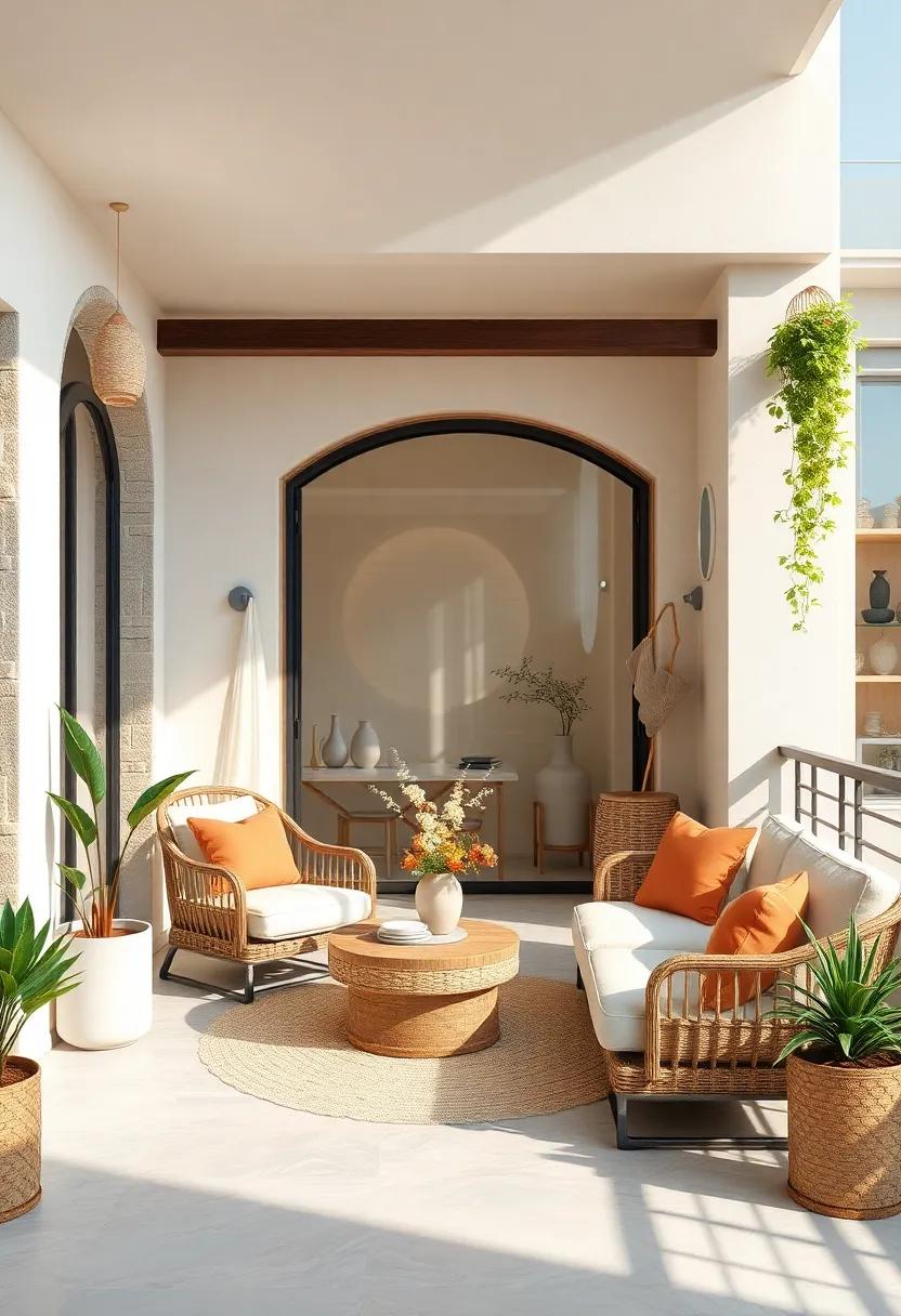
Pale Coral and Off-White: Infuse gentle energy with soft coral hues balanced by off-white neutral grounds
Transform your small balcony into a serene sanctuary by combining gentle pale coral tones with the understated elegance of off-white. This color duo invites a soothing ambiance that feels both refreshing and warm, perfect for maximizing natural light and creating an inviting outdoor nook. Incorporate pale coral cushions, delicate planters, or a soft throw to infuse subtle vibrancy without overwhelming the space. The off-white backdrop acts as a clean canvas, allowing these soft coral accents to breathe and shine, while maintaining an airy atmosphere that prevents the area from feeling cramped.
To complement the palette, opt for natural materials like light wood or rattan, which resonate beautifully with the soft coral and off-white hues. Accessories in muted gold or brushed brass can add a hint of understated sophistication without detracting from the gentle energy. Consider mixing these elements into your furniture choices and décor for layered texture and warmth.
| Element | Color/Material | Effect |
|---|---|---|
| Cushions & Throws | Pale Coral | Soft warmth and subtle color pop |
| Walls & Flooring | Off-White | Bright, open, and neutral base |
| Furniture | Light wood / Rattan | Natural texture and visual warmth |
| Accents | Muted Gold / Brushed Brass | Elegant highlights without overpowering |
Cloud White and Pebble Gray: Crisp cloud white paired with the stability of pebble gray makes for a fresh and balanced space
Imagine stepping into a serene sanctuary where crisp cloud white walls instantly lift the ambiance, inviting natural light to bounce freely and make your small balcony feel more spacious. Paired with the grounded tones of pebble gray—think soft stones smoothed by time—this palette achieves an elegant balance that calms the mind and soothes the senses. Use cloud white as the primary backdrop on walls or ceilings,while incorporating pebble gray in flooring,cushions,planters,or even sleek metal railings to anchor the space without overwhelming it.
To maintain a cohesive look, consider layering texture-rich materials like woven rattan, smooth ceramics, and plush textiles all within this palette.This blend creates a tactile experience that feels fresh yet comfortably familiar. here’s a quick breakdown of key elements to integrate:
- Cloud White Walls: Amplify natural light and visually expand the balcony.
- Pebble Gray Accents: Choose for furniture frames,pots,or floor tiles.
- Natural Textures: Add woven rugs or cushions to soften the sleek palette.
- Greenery: Opt for leafy plants and succulents in white or gray pots for a lively contrast.
| Element | Color | Material/Use |
|---|---|---|
| Walls | Cloud White | Matte paint for brightness |
| Flooring | Pebble Gray | Stone tiles or concrete |
| Planters | Pebble Gray | Ceramic or cement finish |
| cushions & Rugs | Cloud White & Gray Mix | Textured fabrics |
Lightweight Beige and Soft Taupe: Combining lightweight beige with soft taupe tones gives a layered, naturally bright feel
When working with a light and soothing color scheme, lightweight beige acts as the perfect canvas, offering warmth without overwhelming the space. It reflects natural light beautifully, making your small balcony feel open and airy. Pairing this with gentle soft taupe accents adds depth and elegance, creating a layered look that’s understated yet sophisticated. From wall paint to furnishings, this neutral duo allows you to introduce textures like woven rattan, linen cushions, and ceramic planters without clashing, maintaining a harmonious flow that enhances the natural brightness.
To elevate the palette with minimal effort,consider mixing these tones through varied finishes and materials. A matte taupe planter alongside glossy beige tiles can bring subtle contrasts, while soft taupe throw pillows on a lightweight beige loveseat invite comfort and style. Below is a helpful guide to integrating these colors into your balcony design, combining textures and finishes that feel organic and inviting.
| Element | Lightweight Beige | Soft Taupe | Suggested Material |
|---|---|---|---|
| Flooring | Natural Stone Tiles | Matte Finish | Sandstone or Limestone |
| Seating | woven Fabric Upholstery | Soft Cushions | Linen Blend |
| Planters | Light Ceramic | Textured Surface | Terracotta or Stoneware |
| Decor | Light Wood Accents | Matte Vases | Bamboo or Oak |
Frosted Almond and Warm White: A frosted almond base embellished with warm white highlights exudes understated coastal elegance
Imagine your balcony wrapped in the soft embrace of frosted almond, a subtle off-white with a whisper of beige that instantly refreshes the space without overwhelming it.This gentle hue creates a tranquil, airy canvas that feels like an open coastal breeze, perfect for small, intimate outdoor areas. Accents of warm white—think creamy whites with a touch of warmth—add dimension and highlight architectural details or furnishings, giving your balcony a well-balanced and inviting glow throughout the day and into the evening.
To elevate this palette further, consider incorporating natural textures such as driftwood or rattan in your furniture, and soft linen cushions in creamy tones. Light, neutral planters in shades of almond and white will blend seamlessly, allowing your greenery to take center stage without distraction. This harmonious mix promotes a calm, understated elegance that feels effortlessly coastal, making your balcony an ideal sanctuary for both quiet mornings and relaxed twilight gatherings.
- Wall color: Frosted almond matte finish
- Trim and accents: Warm white satin or eggshell
- Furniture materials: Natural wood, rattan
- Textiles: Linen, cotton in cream and beige tones
- Decor: Neutral planters, soft lighting
Future Outlook
With these 25 inspiring light and neutral color palettes, your small balcony can transform into a serene retreat bathed in soft, uplifting hues. Whether you prefer airy whites, gentle beiges, or subtle pastels, these combinations invite a breath of fresh air and a touch of calm to your outdoor space. Embrace the simplicity and elegance of neutral tones to brighten your balcony, proving that even the smallest corners can hold the biggest moments of peace and inspiration. Now, all that’s left is to pick your favorite palette and watch your balcony bloom into a luminous haven.
As an Amazon Associate I earn from qualifying purchases.