25 Stunning Seasonal Color Palettes to Refresh Your Style All Year Long
Looking to breathe new life into your wardrobe or home decor? Colors have the power to transform not just spaces and outfits, but moods and moments too. In this listicle, we’ve curated 25 stunning seasonal color palettes designed to refresh your style all year long. From the soft pastels of spring blooms to the warm, earthy tones of autumn leaves, each palette captures the essence of its season while offering versatile combinations you can easily incorporate. Whether you’re seeking inspiration for fashion, interior design, or creative projects, these thoughtfully selected color schemes will help you embrace the changing seasons with confidence and flair. Get ready to explore a vibrant spectrum that keeps your style fresh every month of the year.
Spring Blossom: Soft pastels like blush pink, mint green, and lavender create a fresh and delicate vibe perfect for renewing your wardrobe
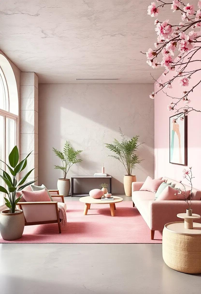
Delicate hues reminiscent of a tranquil spring morning, soft pastels like blush pink, mint green, and lavender bring an airy, rejuvenating aura to any wardrobe. These shades are perfect for layering light fabrics and creating effortless looks that feel both refreshing and romantic. Whether you’re slipping into a mint green blouse or pairing a blush pink skirt with a cozy lavender knit, these colors invite a subtle sophistication that breathes new life into your closet staples.
To fully embrace this gentle palette, consider mixing textures and silhouettes that enhance the softness of the colors. Think flowing chiffon dresses, lightweight cotton tees, or even tailored linen pieces. Below is a simple guide to styling these pastel tones and achieving the ultimate spring blossom vibe:
- Blush pink: Ideal for blouses, scarves, and soft accessories that add warmth.
- Mint green: Great for statement pants or light outerwear, evoking freshness.
- Lavender: Perfect in dresses or cardigans for a touch of dreamy elegance.
| Color | Best Fabric | Seasonal Occasion |
|---|---|---|
| Blush Pink | silk & Chiffon | Daytime Brunch |
| Mint Green | Linen & Cotton | Casual Outings |
| lavender | Knitwear | Evening Gatherings |
Summer Sunset: Warm hues such as coral,golden yellow,and deep orange capture the vibrant energy of long,sun-soaked evenings
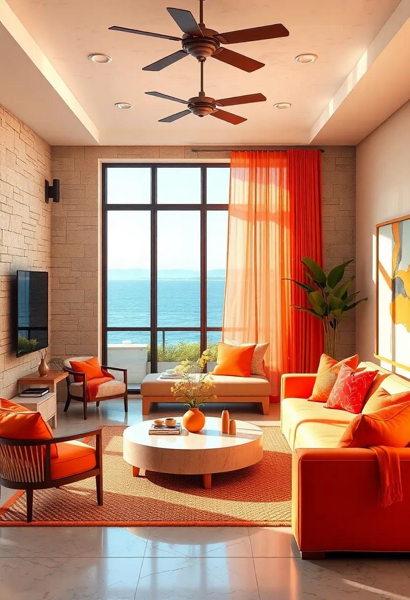
Summer Sunset brings an irresistible warmth that lingers on the skin and in the air. imagine basking in the glow of coral blushes blending seamlessly with golden yellows and the intense fire of deep orange, all melting into one another like a perfect brush stroke across a summer sky. These tones not only evoke the slow fading light of day but also channel a vibrant, energetic spirit that inspires bold fashion choices and cheerful home accents. Whether layered in lightweight fabrics or splashed across your living space, these colors invite a joyful embrace of the season’s endless evenings.
- Coral: A lively pink-orange that sparks playful creativity.
- golden Yellow: Warm and inviting, perfect for adding a sunny glow.
- Deep Orange: Rich and commanding, it grounds the palette with earthy vibrancy.
| Shade | Best Use | Complementary Colors |
|---|---|---|
| Coral | Accessories & accents | Teal, Navy Blue |
| Golden Yellow | Statement Pieces & Walls | Soft Gray, Olive Green |
| Deep Orange | Outerwear & Rugs | Chocolate Brown, Cream |
Autumn Harvest: Rich earth tones like burnt sienna, olive green, and mustard yellow evoke the cozy spirit of fall foliage and pumpkin patches
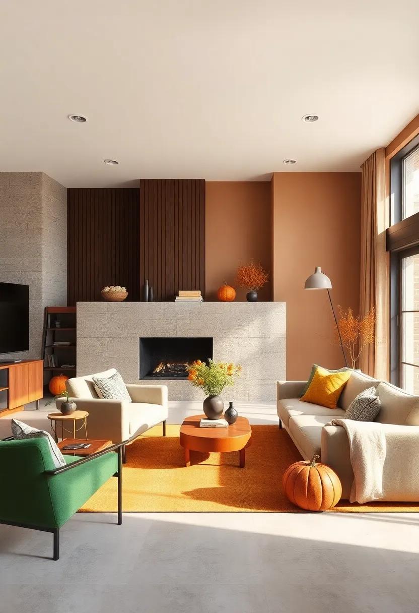
Step into the warm embrace of fall with a palette that channels the essence of crisp leaves and golden sunsets. Burnt sienna brings a deep, earthy vibrancy reminiscent of gathered autumn leaves, pairing effortlessly with the muted yet rich olive green that echoes the lingering shades of woodland canopies. Complemented by pops of mustard yellow, this combination conjures images of sun-dappled pumpkin patches and cozy harvest celebrations. These hues work beautifully in clothing layers,home décor accents,or even makeup looks that seek to capture the season’s inviting charm.
Incorporate these colors through a variety of textures and fabrics to truly celebrate the season’s tactile qualities. Think chunky knit scarves in olive green, suede boots in burnt sienna, or mustard yellow cardigans that brighten any outfit. For a subtle yet impactful way to balance this color scheme, use cream or soft taupe shades as grounding neutrals. The versatility of this group lends itself well to mix and match styling, with each hue enhancing the others in a harmonious, nature-inspired dance.
| Color | Hex Code | Best For |
|---|---|---|
| Burnt Sienna | #E97451 | Outerwear & Leather Accessories |
| olive Green | #808000 | Layered Knitwear & Pants |
| Mustard Yellow | #FFDB58 | Sweaters & Statement Scarves |
winter Frost: Icy blues, crisp whites, and silvery grays offer a sleek, cool palette that reflects the quiet elegance of snowy landscapes

Embrace the serene beauty of chilly days with a palette that conjures the stillness of freshly fallen snow and frost-kissed mornings. Icy blues evoke a sense of calm and clarity, perfect for injecting a cool, composed vibe into your wardrobe or living space. Pair these shades with crisp whites to bring a sense of purity and freshness that feels both modern and timeless. the interplay between these hues creates a space where light reflects softly, enhancing the understated elegance of any setting.
To deepen this look, introduce silvery grays that add texture and sophistication without overwhelming the subtlety of the palette.whether layered in fabrics, accents, or statement pieces, these colors channel the quiet strength of winter’s hush. imagine a cozy sweater in frosty gray paired with icy blue accessories or pristine white ceramics accented by silver detailing—each combination whispers refined tranquility,inspired by nature’s most minimalist season.
- Icy Blue: #A9D6E5
- Crisp White: #FFFFFF
- Silvery Gray: #C0C0C0
Tropical Paradise: Bright turquoise, sunny coral, and leafy green bring a playful, vacation-ready feel to your seasonal style
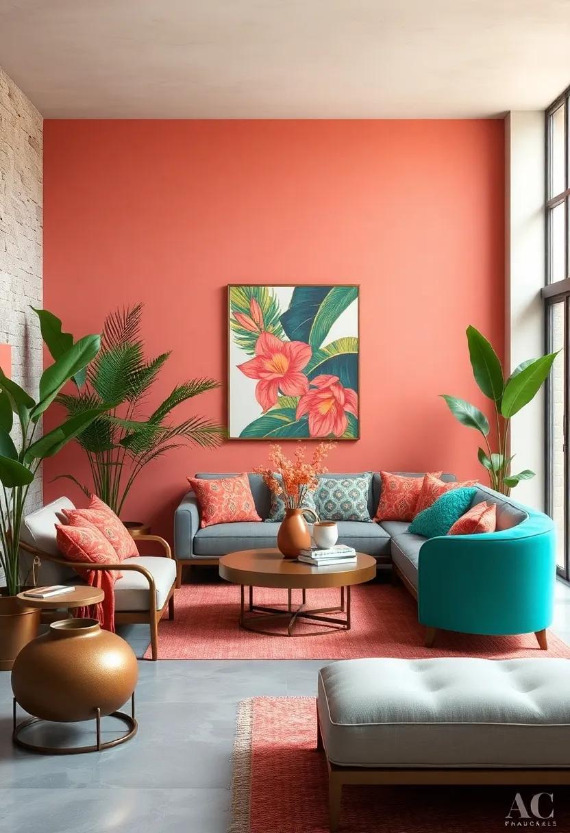
Inject a dose of sunshine into your wardrobe with this vibrant trio of bright turquoise, sunny coral, and leafy green. Each hue captures the essence of a tropical escape, blending playful energy with natural freshness. Imagine the sparkle of turquoise waves, the warmth of a coral sunset, and the lush vitality of dense palm fronds — these shades invite you to carry that vacation-ready spirit everywhere you go. Perfect for mixing and matching, these colors add a pop of zest to your everyday ensembles or your beachside getaway outfits.
To play with this palette effectively, layer textures and contrasts that highlight each shade’s unique charm. Pair a turquoise blouse with coral accessories, or balance leafy green pants with a soft coral top for a balanced yet eye-catching look. Consider these styling tips to bring the tropical vibe home:
- Use bright turquoise as your statement piece — think bold dresses or standout handbags.
- Accent with sunny coral in makeup or shoes for subtle warmth.
- Leafy green works wonderfully as a grounding color, ideal for jackets or trousers.
| Color | Style Suggestion | Best For |
|---|---|---|
| Bright Turquoise | Statement tops or accessory pops | Daytime events, beach outings |
| Sunny Coral | Soft cardigans or shoes | Casual brunches, garden parties |
| Leafy Green | Structured pants or lightweight jackets | Workwear, evening strolls |
Urban Neutrals: Shades of taupe, charcoal, and cream blend effortlessly for a sophisticated, city-inspired look all year long
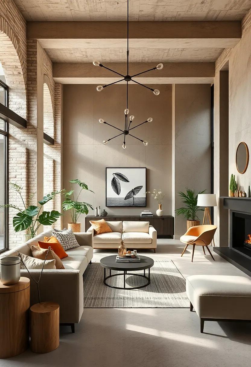
Embrace the understated elegance of urban neutrals by mixing taupe, charcoal, and cream in your wardrobe and living spaces. These colors harmonize beautifully, creating an effortlessly chic foundation that adapts seamlessly from crisp mornings to dim evening lights. Taupe offers a warm,earthy base that grounds your look,while charcoal introduces depth and a hint of mystery. Cream acts as the perfect counterbalance, adding softness and light that keeps the palette fresh and inviting throughout the seasons.
To master this sophisticated city-inspired aesthetic, experiment with textures and layers.Think plush wool sweaters, smooth leather accessories, and sleek ceramics in complementary tones. the interplay of matte and glossy finishes enhances the subtle contrasts without overpowering the neutral harmony. Here’s a rapid guide to styling your urban neutrals:
- Spring: Lightweight taupe trench coats paired with cream linen shirts.
- Summer: Charcoal shorts and breathable cream tees for cool urban strolls.
- fall: Chunky charcoal knit scarves layered over taupe sweaters.
- Winter: Cream wool coats with charcoal boots for understated warmth.
Vintage Romance: Dusty rose,muted mauve,and antique gold create a nostalgic,timeless palette full of soft charm
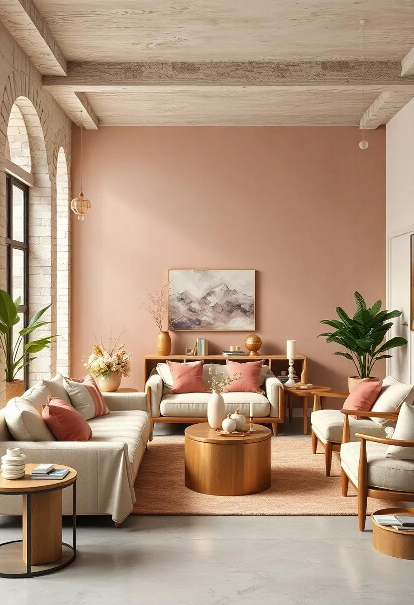
step into a world where warmth meets subtle sophistication with a palette that whispers tales of days gone by. Dusty rose sets a tender, blushing tone reminiscent of vintage roses pressed between book pages, while muted mauve adds a layer of quiet elegance, evoking the faded velvet of an antique armchair. Together, these soft hues form a serenade of gentle beauty, ideal for creating romantic wardrobes and interiors that invite nostalgia without overwhelming the senses.
The finishing touch is the touch of antique gold, which injects a soft shimmer and a hint of opulence, grounding the palette in timelessness. This combination works wonders across garments,décor,and stationery—perfect for those seeking a look that’s both classic and effortlessly charming. Consider pairing these hues with natural textures, like weathered wood or delicate lace, to amplify their storybook appeal.
Coastal Breeze: Seafoam green, sandy beige, and ocean blue evoke the calm and refreshing energy of a day by the shore
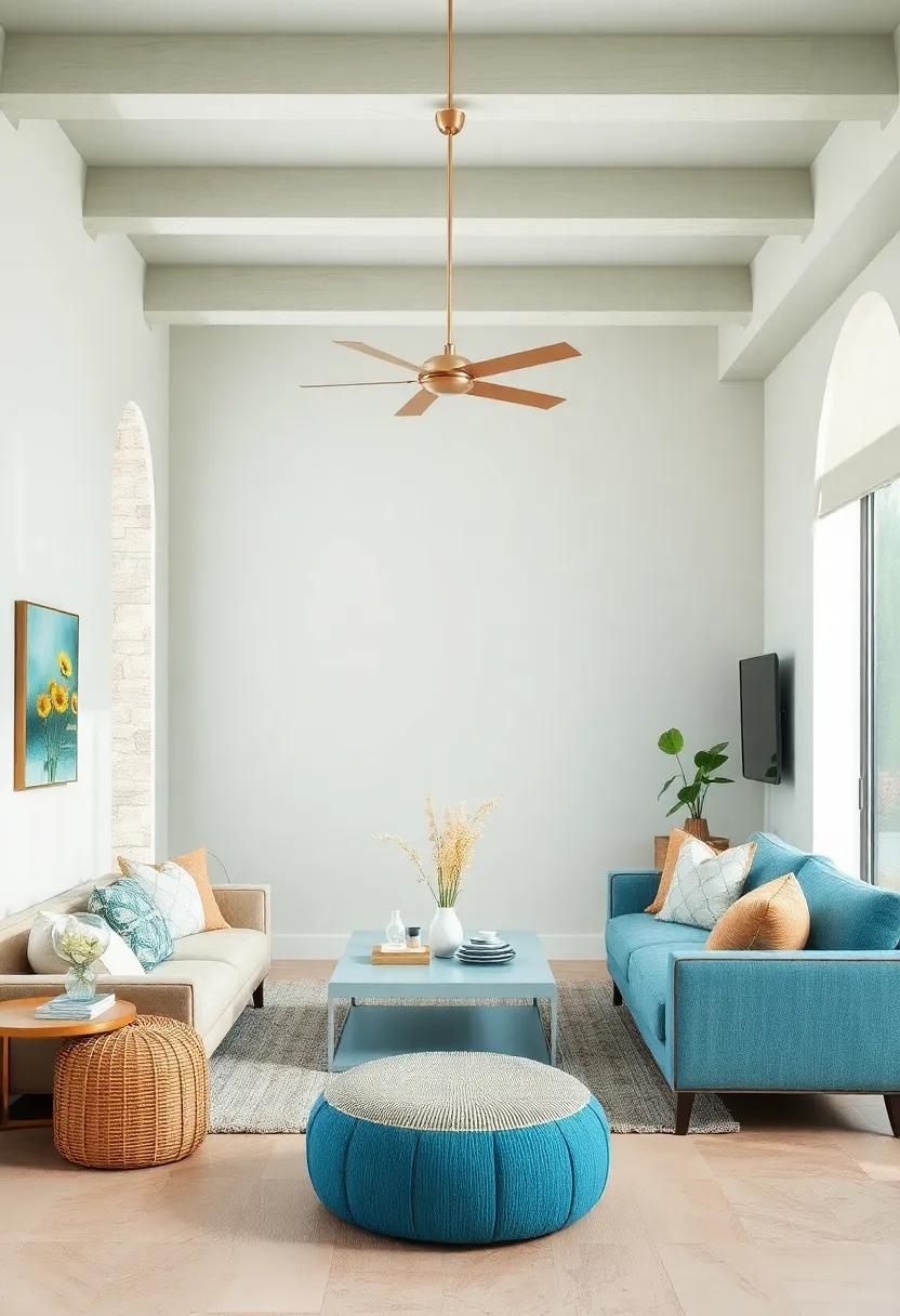
Immerse yourself in a palette that instantly transports you to the tranquil shores where the sea meets the sand. The subtle seafoam green whispers of gentle waves kissing the coastline, while sandy beige grounds your look with the warmth of sunlit beaches. Complementing these, the deep ocean blue adds a touch of depth and serenity, mirroring the endless horizon.Together, these hues create a harmonious blend perfect for evoking a refreshing coastal vibe, whether in your wardrobe, home decor, or graphic designs.
This soothing palette thrives on natural contrasts and effortless elegance. Pairing light seafoam tones with textured sandy neutrals makes for understated sophistication, while accents of ocean blue bring in a crisp, invigorating freshness. Consider using these color combinations to infuse a sense of calm and renewal into your style:
- Seafoam Green for flowy summer dresses or accent walls.
- Sandy Beige in woven accessories or soft upholstery.
- Ocean Blue as statement pieces or accent pillows.
| Color | Hex Code | Uses |
|---|---|---|
| Seafoam Green | #9FE2BF | Light garments, spring decor |
| Sandy Beige | #D6C5A8 | neutral basics, rugs & cushions |
| Ocean Blue | #1E5673 | Outerwear, accent walls |
Desert Sunset: Warm terracotta, deep plum, and sandy tan combine to mirror the dramatic hues of a desert dusk
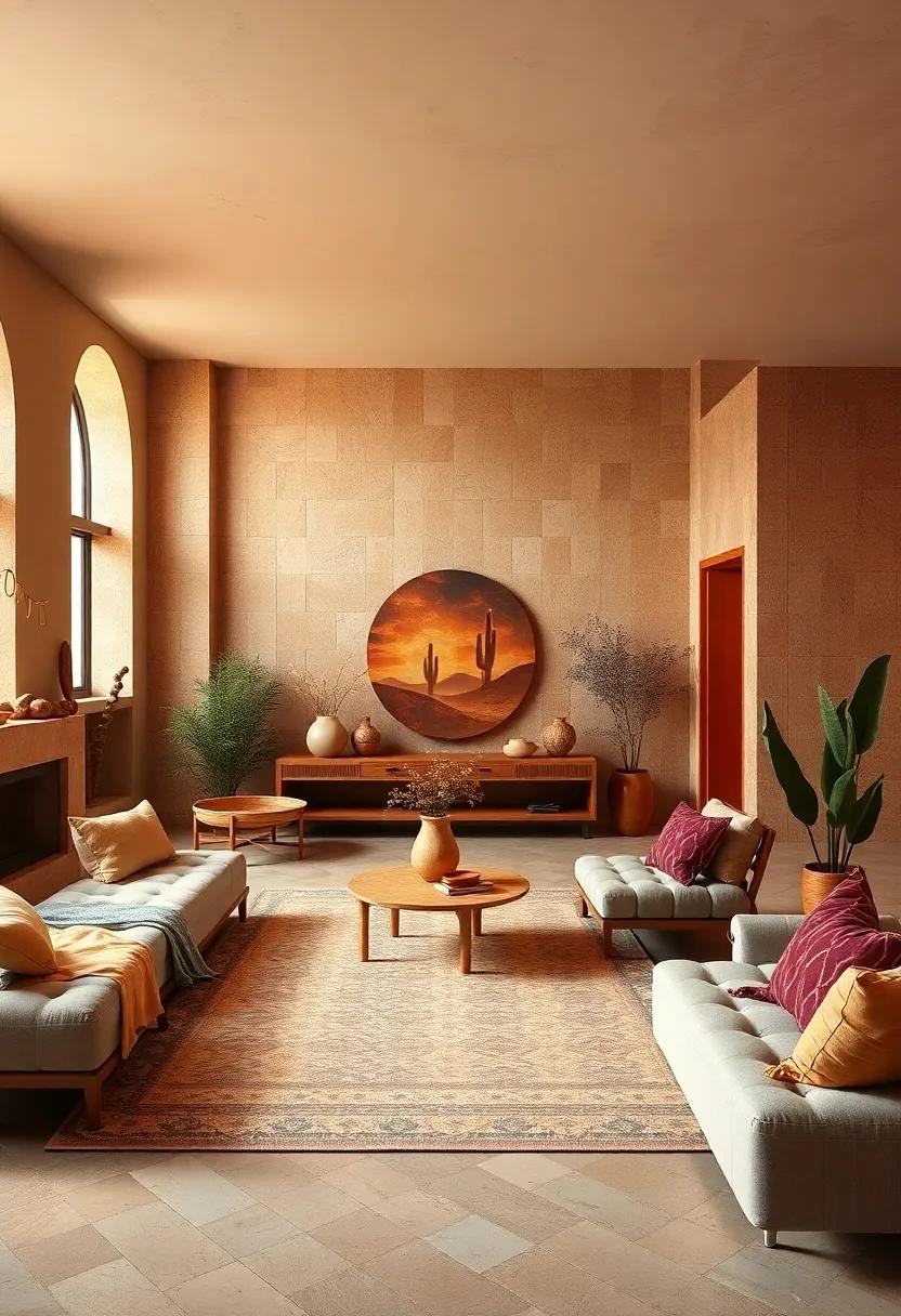
Invoke the essence of a blazing desert horizon by weaving together the rich, earthy tones of warm terracotta, deep plum, and sandy tan. These hues capture the fleeting beauty of a sunset melting into twilight, perfect for adding a touch of rugged elegance to your wardrobe or interior spaces. Mix a soft sandy tan base with pops of deep plum accessories or accents to create a balanced, grounded look that feels both exotic and approachable. This palette embodies warmth without overwhelming,evoking the calm,dramatic energy of dusk settling over endless dunes.
For styling, consider pairing:
- Terracotta leather jackets with plum knit scarves for a cozy yet striking contrast
- Sandy tan trousers accented by deep plum footwear or handbags
- Textured fabrics that highlight the organic nature of this color story, like woven linens or suede
| Color | vibe | Styling Tip |
|---|---|---|
| Warm Terracotta | Earthy warmth | Use as statement outerwear |
| Deep Plum | Intense drama | Perfect for accessories and layers |
| Sandy Tan | Soft neutral | Great as a base for outfits |
Winter Warmth: Cozy shades of cranberry, pine green, and cocoa brown bring inviting comfort to cold-weather outfits

Wrap yourself in the rich, comforting hues of cranberry, pine green, and cocoa brown this chilly season. These colors evoke the cozy warmth of a fireside evening,blending seamlessly into any winter wardrobe. Cranberry offers a bold, festive pop that energizes your look, while pine green channels the tranquility of snow-dusted forests, grounding your outfit with nature’s calm. Cocoa brown ties the palette together, adding a soft, earthy base that invites tactile textures like cable-knit sweaters and suede boots.
Incorporate these shades through layered pieces and accessories to maximize warmth without sacrificing style. Think oversized scarves in cranberry,tailored pine green coats,and cozy cocoa brown sweaters. Mix and match textures—a chunky knit in cocoa brown with smooth pine green velvet separates, punctuated by glossy cranberry leather boots—to create a season-ready ensemble that feels as inviting as your favorite cup of hot cocoa.
Botanical Garden: Fresh fern green, soft lilac, and pale peach celebrate the lush beauty of blooming gardens in full bloom
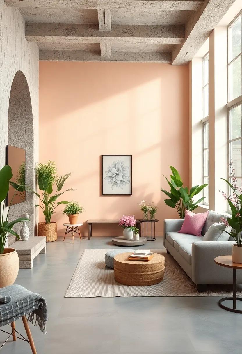
Step into a world where nature’s artistry sets the perfect backdrop for your wardrobe or home decor. This palette draws inspiration from the tender hues found in an early morning garden: fresh fern green captures the vibrant yet soothing essence of newly unfurled fronds, while soft lilac whispers a delicate floral sweetness that invites calm and reflection. The subtle pale peach acts as a warm, glowing accent—think sun-dappled petals catching the light. Together,these shades evoke the serene,rejuvenating vibe of an eternal spring day,making them ideal for those who crave understated elegance with a natural touch.
- Fresh Fern Green: Evokes renewal and growth, perfect for grounding color schemes.
- soft Lilac: Adds gentle sophistication, reminiscent of blossoming wisteria and spring violets.
- Pale Peach: Brings warmth and a subtle blush, reminiscent of sunlit garden blooms.
| Usage | Style Tip | Decor Idea |
|---|---|---|
| Fashion | Pair a fern green jacket with lilac accessories for balanced contrast. | Use peach throw pillows alongside leafy green plants. |
| Interior Design | Soft lilac curtains create dreamy window treatments. | Fresh fern green walls with peach accents brighten up reading nooks. |
bold Monochrome: Classic black, stark white, and varying shades of gray create a striking minimalist palette for a clean-cut look
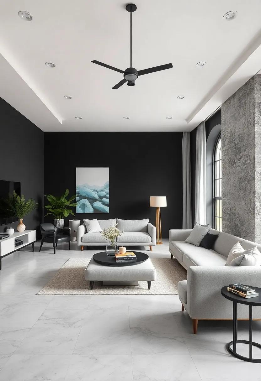
Embrace the timeless elegance of a monochrome palette that brings sharpened sophistication to your wardrobe and interiors alike. The interplay between deep black, crisp white, and a spectrum of grays adds depth without overwhelming the senses, creating a balanced canvas that highlights form and texture. Whether you’re dressing for a high-stakes meeting or refreshing your living space,these shades convey confidence and clarity with minimalist grace.
To get the most from this palette, mix matte and glossy finishes or layer fabrics like wool, silk, and leather for a dynamic yet restrained effect. Consider pairing essentials like a structured black blazer with a soft white blouse and charcoal trousers for a chic office look. Or, in your home, combine pale gray walls, ebony furniture, and white accents with geometric art to achieve a visually striking environment that feels both modern and inviting.
Candy Shop: Sweet pinks, baby blue, and lemon yellow offer a fun, youthful color story filled with playful energy

Step into a world where colors bubble with joy and personalities shine bright. This palette combines sweet pinks, soft baby blue, and zesty lemon yellow, crafting a visual feast that instantly uplifts any outfit or design.Perfect for those who crave an injection of playfulness, these hues evoke the carefree nostalgia of childhood candies and sunny afternoons, making every moment feel lighthearted and fun. Mix and match pieces in these colors to create looks that are both vibrant and approachable, adding a youthful spark to your seasonal wardrobe.
Whether you’re sprucing up your living space or refreshing your daily ensemble,this trio is incredibly versatile. Use candy pink as a bold statement, balanced with the calming influence of baby blue, while lemon yellow adds pops of cheerful contrast. The pairing invites experimentation—think color-blocked dresses, pastel accessories, or playful prints that break the mold of conventional palettes. here’s a quick look at how these candy-inspired colors harmonize:
| color | Mood | Best Use |
|---|---|---|
| Sweet Pink | Cheerful, Romantic | Accent pieces, Lips & Nails |
| baby blue | Calm, Refreshing | Backgrounds, Outerwear |
| Lemon Yellow | Energetic, Playful | Accessories, Statement Tops |
Rustic Charm: Muted brick red, sage green, and warm beige evoke countryside coziness with an artisanal touch
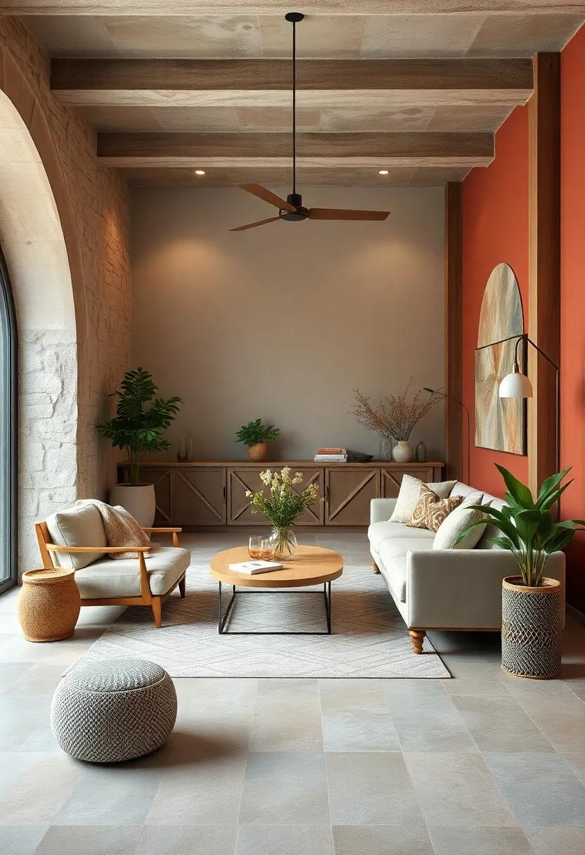
Embrace a cozy ambiance with a palette inspired by sunbaked cottages and meandering country paths. The muted brick red serves as a rich, earthy anchor, evoking the weathered charm of rustic fireplaces and terracotta rooftops. Paired with a soft, herbal sage green, this color melds nature’s gentleness with aged elegance, offering a soothing contrast that transports you to serene garden walks. Warm beige completes the trio by wrapping the space in a subtle glow, reminiscent of linen curtains kissed by afternoon light, providing a versatile neutral that harmonizes the bolder hues.
This artisanal-inspired blend excels in both fashion and interiors, inviting creativity through texture and material. Imagine a chunky knit sweater in sage green layered beneath a brick-red jacket,complemented by beige suede boots for a thoughtful,tactile outfit. In home décor, incorporate hand-thrown pottery, woven baskets, and natural wood accents to enhance the handcrafted feel. The palette’s restrained vibrancy lends itself beautifully to spaces or styles seeking a quietly sophisticated yet inviting statement.
| Color | Hex Code | Use |
|---|---|---|
| Muted Brick Red | #9B4D3C | Accent walls,outerwear |
| Sage Green | #8B9A78 | Soft furnishings,knitwear |
| Warm Beige | #D7C4A3 | Background,neutrals |
- Texture tip: Pair the colors with tactile fabrics like linen,wool,and raw cotton to amplify artisanal vibes.
- Mix & Match: use sage green as a calming base and layer with brick red accessories or décor pieces for visual interest.
- Seasonal versatility: These tones transition naturally from rustic fall looks into spring’s garden-inspired retreats.
Ocean Depths: Deep navy, seaweed green, and stormy gray capture the mysterious allure of the deep sea
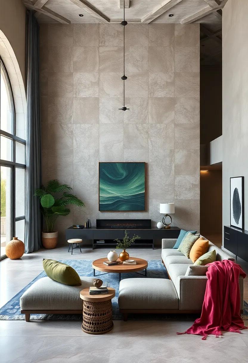
Embrace the enigma of the ocean’s abyss with a palette that evokes both serenity and intrigue.Deep navy serves as the foundation, mirroring the boundless midnight waters where sunlight fades. This core shade pairs effortlessly with seaweed green, a muted verdant hue that whispers of underwater flora swaying in unseen currents.To balance these, stormy gray introduces a cool, atmospheric element reminiscent of tempestuous skies and churning waves, adding depth and a subtle edge.
This combination is perfect for those who seek a style that is both bold and sophisticated. The interplay of colors can be used to craft outfits that feel rooted in nature yet modern—think tailored navy blazers softened by lush green accessories, or cozy stormy gray knits that ground more vibrant accents. This palette invites you to channel the mysterious allure of the ocean’s depths without ever feeling cold or distant.
Golden hour: Soft gold, peachy coral, and warm amber mimic the magical glow of sunset light on your wardrobe
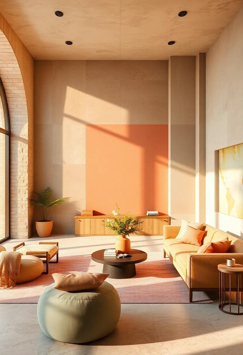
Embrace the enchanting hues of the day’s end with a palette inspired by the soft kiss of sunlight before dusk. Imagine cozy sweaters in soft gold that gleam like the last rays filtering through autumn leaves, paired effortlessly with peachy coral scarves that add a gentle pop of warmth. This palette invites you to layer textures and tones that feel both inviting and luminous, perfect for crafting outfits that evoke the serene magic of golden hour, no matter the season.
To truly bring this palette to life, balance the warmth of amber accessories—think leather bags, belts, or even subtle jewelry—with neutral staples that let these glowing shades shine. Whether you’re dressing up for a casual brunch or aiming for sophisticated everyday elegance, the interplay of these colors creates a harmonious glow that flatters every skin tone.
| Color | Style Tip |
|---|---|
| Soft Gold | Chunky knit sweaters or satin blouses for daytime radiance |
| Peachy Coral | Light scarves or statement shoes to brighten your look |
| Warm Amber | Leather boots, bags, or delicate jewelry accents |
- Fabric Ideas: Silk, cashmere, and brushed cotton for a rich tactile experience
- Mix & Match: combine matte and glossy textures to mimic sunlight’s shimmer
- Seasonal Versatility: Layer these hues in summer linen or winter wools for year-round allure
Frosted Berry: Cool berry tones paired with soft gray and pale pinks bring a fresh, modern twist to winter palettes
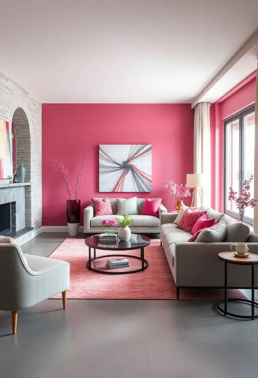
Embrace the serene charm of a winter wonderland with this palette that marries the crispness of cool berry tones with the understated elegance of soft gray and pale pinks. These colors evoke the subtle beauty of frost-kissed mornings, infusing your style with a sense of calm sophistication. Whether in fashion, interior decor, or graphic design, the interplay of these hues creates a balanced yet vibrant atmosphere that feels both fresh and timeless. Ideal for those seeking a modern update to traditional winter colors, this combination softens the chill without losing its seasonally cool edge.
- Berry Blue: A deep, cool berry shade that adds depth and richness.
- foggy Gray: Soft, muted gray tones that provide a neutral anchor.
- Blush Pink: Pale pink hues that introduce warmth and a hint of romantic flair.
| Color | Hex Code | Use Case |
|---|---|---|
| Cool Berry | #6B4F7B | statement pieces, accents |
| soft Gray | #B0B0B0 | Backgrounds, neutrals |
| Pale Pink | #F6D1C1 | Details, layering colors |
Minimal Earth: Sandstone, clay, and soft olive form a grounded, understated palette perfect for effortless elegance
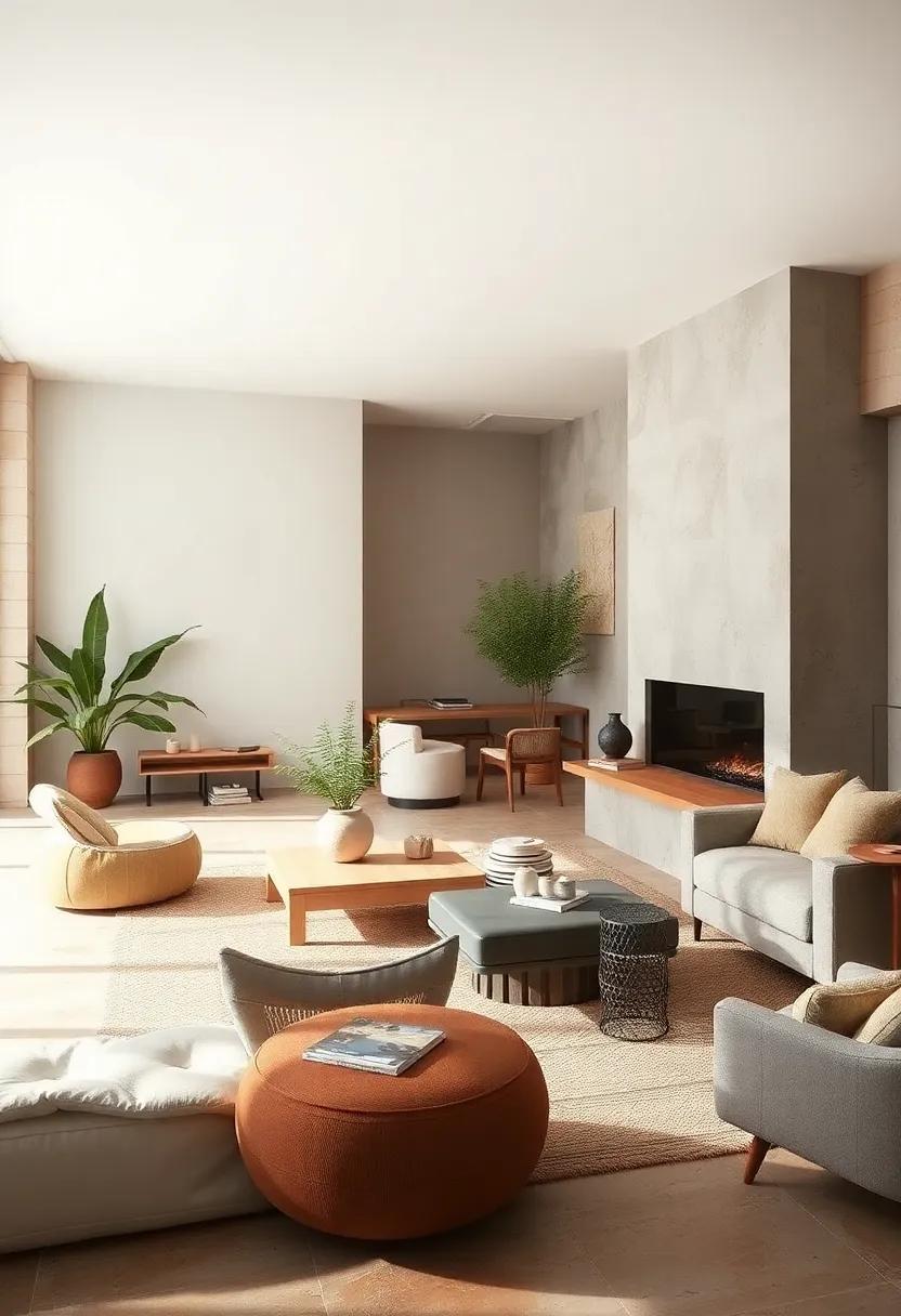
Immerse yourself in a soothing blend of sandstone’s warm neutrality, the rich texture of sun-kissed clay, and the muted calm of soft olive. this triad conjures a natural, organic atmosphere that feels both effortless and refined.Ideal for those who appreciate subtle sophistication, these hues work beautifully across wardrobes and interiors alike, encouraging a transition to a style that whispers rather than shouts. Whether incorporated into cozy knits or minimalist decor, the palette lends itself to layering and pairing with ease, providing a versatile canvas for personal expression.
- Sandstone: A gentle beige that grounds the palette in warm earthiness.
- Clay: Adds depth with its soft, terracotta-inspired embrace.
- Soft Olive: Brings a whisper of green that softens and balances.
| Application | Features | Mood |
|---|---|---|
| Fashion | Layered neutrals & textured fabrics | Understated elegance |
| Home | Natural materials & matte finishes | Calm, welcoming |
| Accessories | Leather, linen, and muted metals | Effortless sophistication |
Carnival Brights: Electric blue, fire engine red, and sunshine yellow add a lively, energetic punch to any outfit

Inject a dose of high-voltage vitality into your wardrobe with a trio of hues that scream party. electric blue sparks cool intrigue, evoking the buzz of neon lights and endless summer nights, while fire engine red commands attention with its bold, fearless energy. To balance the intensity, sunshine yellow beams warmth and optimism, creating an irresistible combination that’s perfect for day-to-night transitions. This palette thrives on contrast and confidence, inviting you to mix and match pieces like a vibrant parade of personality.
- Styling Tip: Pair an electric blue blazer with a yellow blouse and red accessories to make every detail pop.
- Fabric Focus: Lightweight linens and silky satins enhance the brightness while adding texture.
- Occasion: Ideal for outdoor festivals, casual Fridays, or anywhere a spark of joy is called for.
| Color | Vibe | Pair With |
|---|---|---|
| Electric Blue | Cool & electric | Sunshine Yellow, White |
| Fire Engine Red | Bold & Energetic | Electric Blue, Denim |
| Sunshine Yellow | Warm & Cheerful | Fire Engine Red, Navy |
Misty Morning: Pale lavender, misty gray, and blush pink combine for a dreamy, ethereal start to your seasonal style
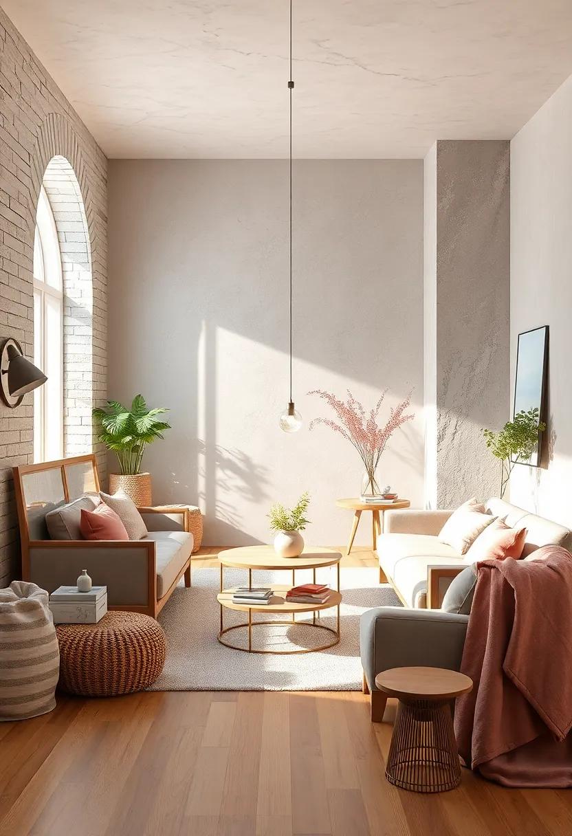
Embrace the soft allure of a fog-kissed dawn with this palette that blends pale lavender, misty gray, and blush pink into a harmonious symphony of color. These shades evoke the gentle calmness of early morning light filtering through a quiet landscape, perfect for creating a wardrobe that feels both fresh and serene. Whether it’s a flowing blouse in delicate lavender or a cozy sweater in misty gray, these hues invite a subtle romanticism that whispers rather than shouts.
To style this dreamy trio, consider pairing blush pink accessories with neutral-toned basics. Here’s a simple guide to balancing the trio throughout your look:
- Pale lavender: Use as your main clothing piece—think dresses, cardigans, or scarves.
- Misty Gray: Ideal for layering; jackets, trousers, or knitwear work beautifully.
- Blush pink: Perfect for accents in bags, shoes, or delicate jewelry to add a warm glow.
| Color | Ideal Material | Style Tip |
|---|---|---|
| Pale Lavender | silk & Chiffon | Soft, flowing silhouettes for ethereal effect |
| Misty Gray | Wool & Cashmere | Layer with texture for cozy sophistication |
| Blush Pink | Leather & Satin | Use in accessories for subtle warmth |
Woodland Walk: Deep forest green, mushroom brown, and rust orange paint a cozy, nature-inspired picture for fall
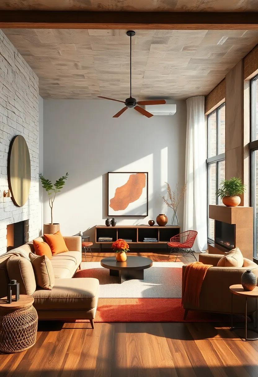
Immerse yourself in the rich hues of the forest floor with this earthy,autumnal palette.Deep forest green evokes the tranquility of towering evergreens, creating a grounding backdrop for any outfit or interior space. Complementing this is mushroom brown, a subtle, neutral tone that softens the boldness of green while adding warmth and texture reminiscent of woodland mushrooms peeking through foliage. rust orange brings a fiery touch, mimicking the radiant blaze of fallen leaves and autumn sunsets, perfect for injecting a cozy glow into your seasonal style.
This combination lends itself beautifully to layering both in fashion and décor. For your wardrobe,consider pairing a forest green sweater with rust orange accessories,like scarves or boots,while neutral mushroom brown adds sophistication to the mix.In interiors,think textured cushions,plush throws,and rustic wooden accents that echo these tones,creating inviting spaces where the essence of a crisp forest walk is captured year-round.
Candy Apple: Glossy red, crisp white, and dark navy create a fresh, vibrant palette with classic appeal
dark navy create a fresh, vibrant palette with classic appeal”>
Step into a world where boldness meets timeless charm. This palette pairs a glossy, vibrant red reminiscent of fresh candy apples with a crisp, clean white that breathes light and purity into the mix. Anchoring the combination,a rich,dark navy adds depth and sophistication,making it as versatile as it is indeed visually striking. Whether you’re updating your wardrobe, redecorating a space, or curating a fresh social media aesthetic, this trio delivers a refreshing yet classic statement that never fades.
Key elements to embrace this palette:
- Red: Think shiny, lacquered finishes and attention-grabbing accents.
- White: Crisp textiles, seamless lines, and minimalist backgrounds.
- Dark Navy: Deep hues in accessories, denim, or even outerwear for grounding balance.
| Use Case | recommended Style | Why It Works |
|---|---|---|
| Casual Chic | Glossy red sneakers + white tee + navy jeans | Bright pops meet classic comfort |
| Office Ready | Red blazer + white blouse + navy trousers | Dynamic professionalism with a fresh edge |
| Home Decor | Red cushions + white walls + navy accents | Inviting warmth with clean contrasts |
Soft Denim: Powder blue, soft cream, and gentle taupe bring a laid-back, versatile vibe perfect for casual days
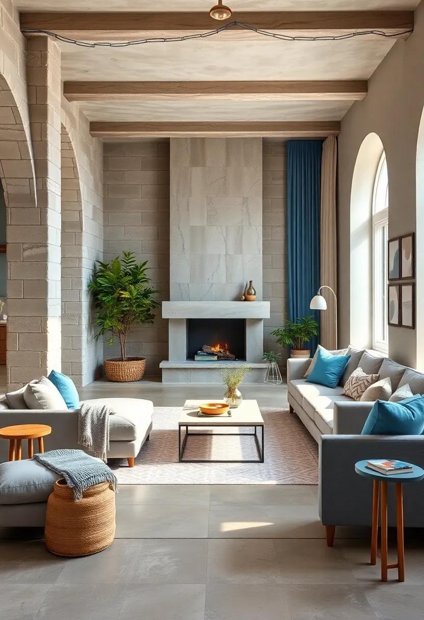
embrace the effortless charm of this palette where powder blue evokes serene skies, soft cream drapes you in understated warmth, and gentle taupe grounds your look with subtle earthiness. These hues harmonize beautifully, offering a tranquil yet stylish foundation that’s ideal for weekend brunches, casual office days, or relaxed strolls in the park. The coolness of powder blue combined with neutral accents encourages a sense of calm and versatility, making it simple to mix and match pieces without ever feeling overdone.
- Powder Blue: Soft and airy, perfect for denim jackets or chambray shirts.
- Soft Cream: A light, neutral base that brightens layers and adds a touch of elegance.
- Gentle Taupe: Earthy with a modern twist, ideal for trousers and accessories that anchor any outfit.
Pair these colors with natural textures like linen, cotton, or suede for an organic feel that’s effortlessly stylish. Whether you’re dressing for a coffee date, casual meetings, or simply lounging, this palette adapts smoothly to manny occasions. Plus, it plays beautifully with simple gold or silver jewelry, enhancing the laid-back mood without overpowering your ensemble.
Jewel Tones: emerald green, sapphire blue, and amethyst purple add luxurious depth and richness to winter and fall wardrobes
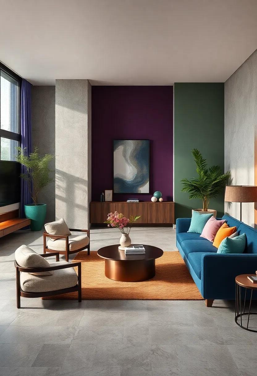
Embrace the allure of jewel tones this fall and winter for a wardrobe that feels both elegant and inviting. Rich hues like emerald green, sapphire blue, and amethyst purple create a sense of opulence that elevates even the simplest ensemble. These colors evoke the deep, vibrant shades found in precious gems, making your outfits stand out with an unmistakable glow. whether it’s a velvet blazer in sapphire blue or a cozy cashmere sweater in amethyst, these tones pair beautifully with classic neutrals, creating a balanced and sophisticated aesthetic perfect for chilly months.
- Emerald green: Ideal for statement coats and accessories, providing a fresh yet regal touch.
- Sapphire blue: Perfect for eveningwear or denim pieces,offering a versatile pop of color.
- Amethyst purple: Adds softness and depth to knitwear and scarves, making cozy feel luxurious.
| color | Best Fabrics | Styling Tip |
|---|---|---|
| Emerald Green | Velvet,Wool,leather | Pair with warm browns for earthy richness |
| Sapphire Blue | Silk,Denim,Cashmere | Contrast with crisp whites for sharp elegance |
| amethyst Purple | Knits,Suede,Velvet | Layer with greys for subtle sophistication |
Harvest Moon: Warm ochre,rich burgundy,and soft gray mimic the serene glow of autumn nights under the full moon
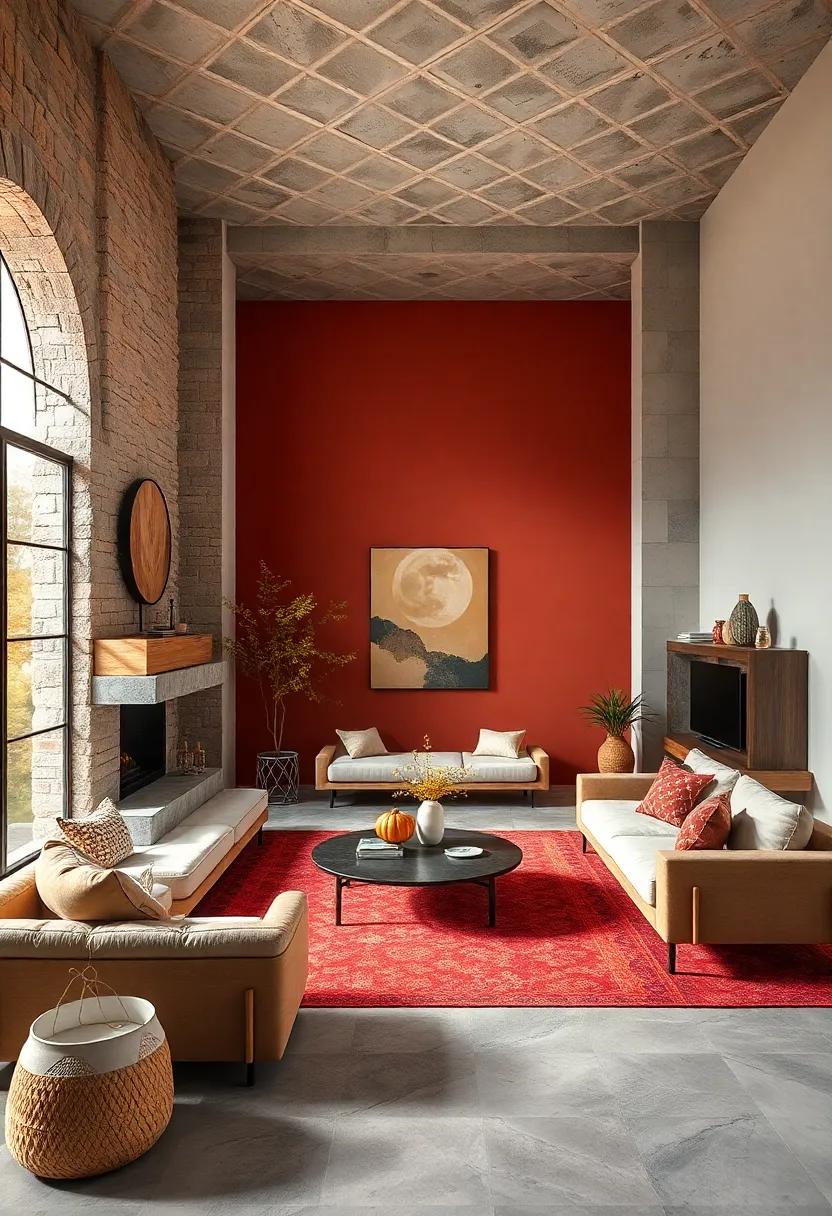
Embrace the mesmerizing harmony of warm ochre, rich burgundy, and soft gray to evoke the tranquil allure of autumn evenings bathed in moonlight. This palette captures the essence of crisp air and glowing harvests, offering a subtle yet striking combination that is both cozy and sophisticated. Whether you’re refreshing your wardrobe, redecorating your home, or crafting seasonal designs, these colors unite to create a timeless aesthetic that soothes and enchants.
Use these tones to build versatile looks and settings with:
- Ochre accents that bring warmth and energy—think knit scarves, linens, or accent pillows.
- Burgundy staples anchoring the palette with depth—perfect for rich velvet jackets, ceramic vases, or statement rugs.
- Soft gray touches adding calm and balance—ideal for sleek outerwear, minimalist artwork, or smooth ceramic surfaces.
| Color | Hex Code | Best Use |
|---|---|---|
| Warm Ochre | #D9903D | Warm accessories / accents |
| Rich Burgundy | #6D1B2F | Bold wardrobe pieces |
| Soft Gray | #B0B3B8 | Neutral backgrounds / bases |
To Conclude
No matter the season, a fresh splash of color can breathe new life into your style. These 25 stunning seasonal color palettes offer a year-round guide to keep your wardrobe vibrant, versatile, and perfectly in tune with the changing moods around you. Whether you’re welcoming the warm hues of autumn or embracing the cool pastels of spring, let these palettes inspire you to express yourself boldly and beautifully every day. Here’s to a colorful journey that refreshes your look and invigorates your style throughout the seasons.
As an Amazon Associate I earn from qualifying purchases.

