Dining in Style: Top Wall Paint Colors to Transform Your Dining Room Vibe
The dining room is more than just a place to share meals—it’s where conversations flow, memories are made, and ambiance sets the tone for every gathering. Choosing the right wall paint color can elevate this space from ordinary to extraordinary, transforming it’s vibe to match your personal style and the mood you want to create. Whether you’re aiming for cozy intimacy, vibrant energy, or elegant sophistication, the palette you select holds the power to redefine your dining experience. In this article, we explore the top wall paint colors that can inspire and rejuvenate your dining room, helping you dine in style every day.
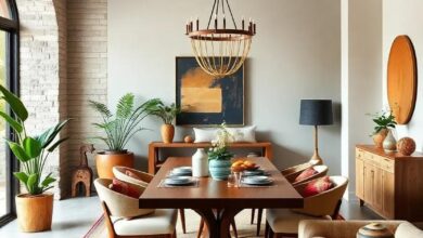
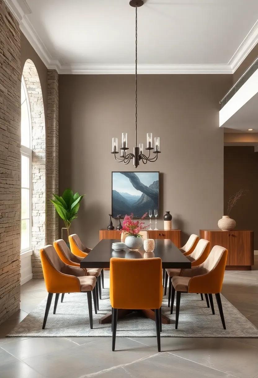
Elevate Your Dining Room Ambiance With warm Earthy Tones That Invite Comfort And Conversation
Infusing your dining space with warm earthy hues creates an inviting atmosphere where every meal feels like a shared celebration.Colors like terracotta, burnt sienna, and deep olive don’t just warm up the room—they cultivate a sense of grounded comfort that encourages lingering conversations and genuine connections. These shades harmonize effortlessly with natural materials such as wood, leather, and linen, enhancing the tactile richness of your dining experience without overwhelming the senses.
To master the art of a cozy yet stylish dining room, consider incorporating:
- deep Clay Red: Sparks energy and appetite while promoting warmth.
- Mossy Green: Connects the indoors with nature,calming and refreshing.
- Soft Mustard: Adds a subtle glow that invites happiness and optimism.
| Shade | Emotional Impact | best Complementary Elements |
|---|---|---|
| Burnt Sienna | Warmth & Stability | Raw Wood, Clay Pottery |
| Olive Green | Calm & Connection | Linen Textiles, Brass Accents |
| Warm Taupe | Neutral Comfort | Woven Baskets, Soft Lighting |
Bold Jewel Tones Decorating Your Dining Space To Create A Luxurious and Dramatic Atmosphere
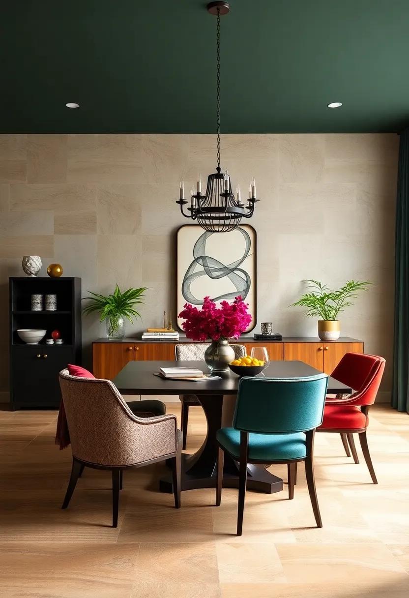
Incorporating rich jewel tones like emerald green, sapphire blue, and amethyst purple can instantly elevate your dining room, infusing it with an air of opulence and depth. These colors work beautifully on walls to create a captivating backdrop that complements both modern and traditional decor. When paired with metallic accents—think gold or brass light fixtures and mirrored surfaces—jewel tones reflect light and add a regal touch, making every meal feel like a special occasion.
To balance these intense hues without overwhelming the space, consider layering textures and introducing neutral elements. Here’s a handy guide to styling your space with bold jewel tones:
- Wall Paint: Deep emerald or rich sapphire for dramatic, inviting walls.
- Complementary Fabrics: Velvet cushions or silk drapes in muted gold or soft cream.
- Accent Pieces: Brass candle holders, crystal chandeliers, and dark wood furniture.
- Artwork: Abstract prints or classic portraits framed in black or gold.
| Jewel Tone | Suggested Accent Colors | Ideal Furniture Materials |
|---|---|---|
| Emerald Green | Gold, Cream, Charcoal | Dark Wood, Velvet Upholstery |
| Sapphire Blue | Brass, white, Walnut | Leather, Glossy Lacquer |
| Amethyst Purple | Silver, Blush Pink, Black | Polished Metal, Silk |
Soft Pastel Shades Enveloping The Dining Area In Calmness And subtle Elegance

Embracing soft pastel shades in your dining area effortlessly fosters an ambiance of tranquility and restrained sophistication. these gentle hues, ranging from muted blushes to delicate mint greens, offer a serene backdrop that encourages lingering conversations and shared meals. Their understated charm doesn’t demand attention but rather invites a peaceful atmosphere where every gathering feels intimate and thoughtfully curated. When paired with natural wood accents or delicate metallic finishes, pastels create a balance that is both inviting and elegantly subtle, perfect for modern and traditional dining spaces alike.
To effectively incorporate these calming tones, consider a palette that includes:
- Powder Blue: Adds a refreshing touch without overpowering the senses.
- Soft Lavender: Evokes a gentle and romantic air to enhance mealtime moods.
- Muted Peach: Infuses warmth while maintaining a cool sophistication.
- Creamy Beige: Acts as a neutral base that complements almost any décor element.
| Shade | Mood Effect | Ideal Pairing |
|---|---|---|
| Powder Blue | Calm and Refreshing | Light Wood & Soft Textiles |
| Soft lavender | Romantic and Relaxing | Brushed Gold & Plush Velvet |
| Muted Peach | Warm and Inviting | natural Linen & Earthy Accents |
| Creamy Beige | Neutral and Versatile | Clay Pottery & Greenery |
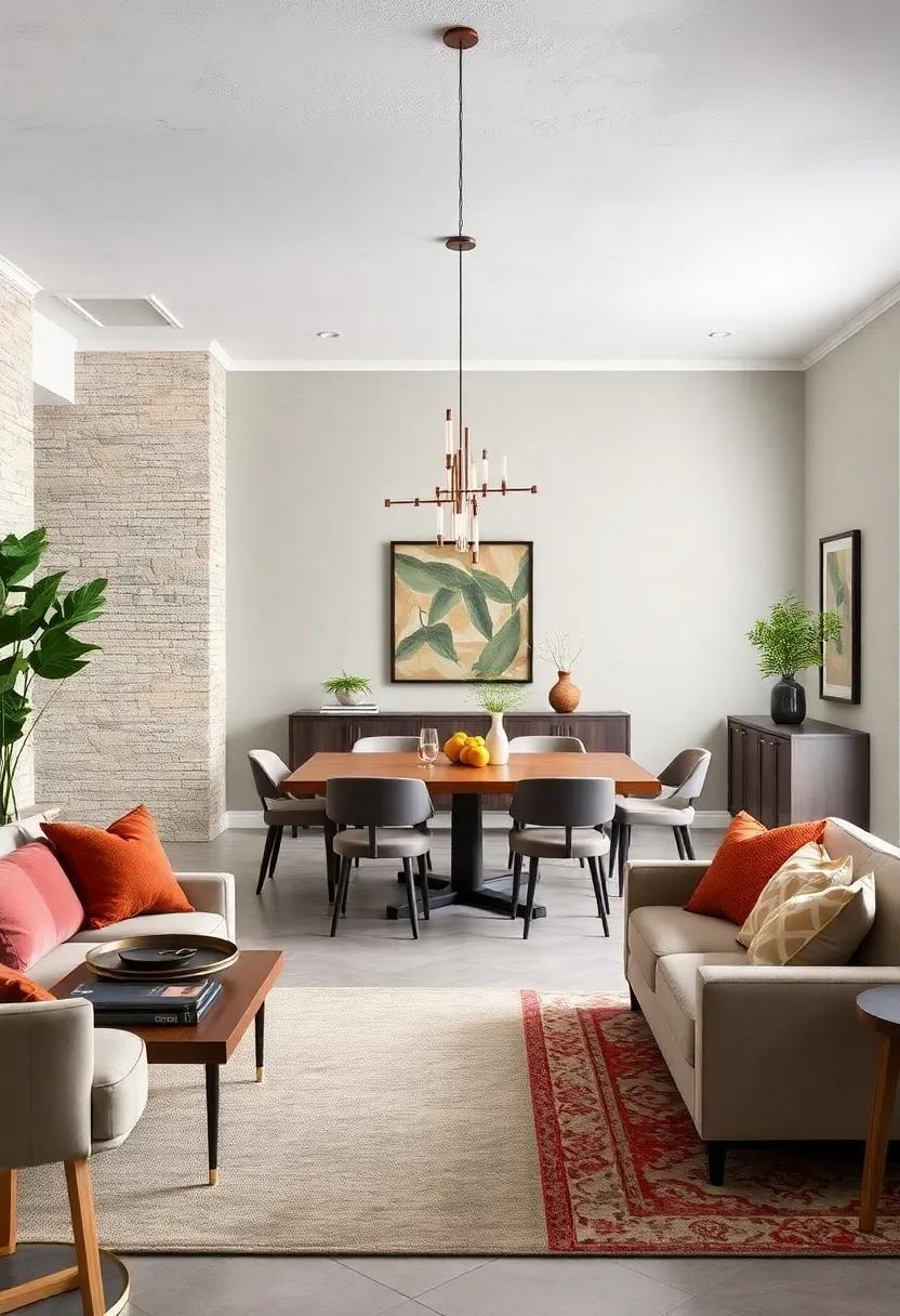
Monochromatic Grey Walls Offering A Sleek Modern Backdrop For Minimalist Dining Design
Embracing a monochromatic grey palette for your dining room walls can instantly cultivate an atmosphere of understated sophistication and modern elegance. this subtle shade acts as a versatile canvas, allowing minimalist dining furniture and décor to take center stage without overwhelming the space. The cool, calming tones of grey create a serene environment, perfect for intimate dinners or casual gatherings alike, striking a gorgeous balance between contemporary charm and welcoming warmth.
When styling a dining room with grey walls, consider incorporating these elements to enhance the minimalist vibe:
- Matte finishes – to reduce glare and maintain a smooth, refined look.
- Natural textures – like wooden or stone dining tables to add depth without distraction.
- Monochrome accessories – such as black or white ceramic pieces that complement without overpowering.
| Grey Shade | Ambiance | Best Pairings |
|---|---|---|
| Light Dove Grey | Airy & Bright | Natural wood, white chairs |
| Mid-tone Slate | Calm & Balanced | Concrete, black metal accents |
| Charcoal | Bold & Dramatic | Glass, chrome fixtures |
Deep Navy Blue Hues Contrasted With Bright Accents To Bring Depth and Sophistication

Channeling elegance into your dining space becomes effortlessly achievable with the intricate layering of deep navy blue tones. This profound shade acts as a plush backdrop, invoking a sense of calm and luxury that instantly elevates the atmosphere. To prevent the room from feeling overly somber, incorporate bright accent colors such as crisp whites, vibrant golds, or striking corals. These striking pops of hue add vitality and dimension, making the room feel inviting without sacrificing sophistication. The contrast between the deep blue and bold accents visually stretches the space,enhancing both warmth and depth.
To perfectly balance this refined palette, consider pairing the walls with natural textures and materials. Wood finishes, rattan elements, and metallic décor can work harmoniously, adding tactile interest that complements the color scheme. Here’s a rapid guide on accent suggestions to complement deep navy:
- Warm Gold: For a regal and cozy touch
- Bright Coral: To inject modern vibrancy
- Pure White: For crisp, clean contrasts
- Soft Blush Pink: To soften the boldness subtly
| Accent Color | Effect | Recommended Use |
|---|---|---|
| warm Gold | Adds warmth and luxury | Light Fixtures & Accessories |
| Bright Coral | Creates lively energy | Artwork & Cushions |
| Pure White | Sharp definition and freshness | Trim & Tableware |
| Soft Blush Pink | Softens and balances | Textiles & Flowers |
Creamy Neutrals Paired With Natural Wood Elements For A Timeless And Inviting Feast Setting

Embracing a palette of creamy neutrals allows your dining space to exude warmth and subtle sophistication, setting the perfect scene for memorable meals. Shades like soft beige, warm ivory, and delicate taupe create a harmonious backdrop that enhances natural wood tones without overpowering them. These colors have the unique ability to reflect light softly, lending a gentle glow that invites guests to linger. When paired with the rich grains and organic textures of wood furniture—be it a rustic oak table or sleek walnut chairs—the result is a timeless ambiance that feels both curated and effortlessly inviting.
To elevate this look further, consider incorporating tactile accents and layered lighting that enhance the natural elements at play. Think woven linen table runners, hand-thrown pottery, and softly glowing pendant lamps in muted metals. Here’s a quick guide to complementary neutrals and woods that excel together:
| Neutral Wall Color | Recommended Wood Pairing | Vibe Created |
|---|---|---|
| Warm Ivory | Honey Maple | Bright & Inviting |
| Soft Beige | Natural Oak | Cozy & Classic |
| Delicate Taupe | Charred Walnut | Modern Rustic |
| Creamy Almond | Reclaimed Pine | Earthy & Warm |
- Tip: Opt for matte or eggshell paint finishes to maintain a soft, organic feel.
- Decor twist: Add greenery in natural woven baskets for depth and life.
Vibrant Autumnal Colors Inspired By Falling Leaves To Warm Up Any Dining Experience

Infuse your dining space with the rich, warm hues of autumn that mirror nature’s breathtaking foliage. Shades like deep burnt orange, rustic copper, and golden ochre evoke the cozy sensation of leaves gently drifting to the ground, creating an inviting atmosphere perfect for lingering conversations and hearty meals. These colors do more than just brighten walls—they bring a tactile warmth, like the comforting embrace of a cashmere throw on a crisp fall evening, transforming every dining experience into a celebration of seasonal charm.
To craft a dynamic yet balanced environment, consider pairing these radiant tones with complementary accents that enhance their natural vibrancy without overwhelming the senses. Soft creams, muted taupes, and subtle olive greens provide the perfect backdrop, allowing autumnal colors to shine while maintaining a sophisticated atmosphere. Here’s a quick guide to mixing these warm tones:
- Burnt Orange Walls: Complement with beige linens and dark wood furniture to ground the room.
- Rustic Copper Accents: Pair with cream or soft grey for elegant contrast.
- Golden Ochre Highlights: Balance with olive green rugs or cushions for a natural touch.
Matte Black Walls Enhancing A Chic And Intimate Dinner Party Environment
Matte black walls create an alluring backdrop that instantly turns your dining room into a sanctuary of sophistication and intimacy. This bold choice absorbs light subtly, enhancing the glow of candlelight and pendant fixtures, making every meal feel like a special occasion. The soft, non-reflective surface invites guests to engage more deeply, fostering conversation and connection without distractions. It’s a design statement that plays beautifully with textures—think plush velvet chairs, natural wood tables, and gleaming metallic accents, all offering contrast and depth against the rich matte finish.
To master the art of a chic black wall, balance is key. Incorporate warm elements and layered lighting to soften the mood and prevent the space from feeling too heavy or enclosed.Here’s a quick guide to complementing matte black walls in your dining area:
- Warm wood tones: Walnut or oak dining tables add inviting warmth.
- Soft textiles: Velvet cushions or linen curtains to enhance coziness.
- Metallic accents: Brass or copper fixtures bring subtle glamour.
- Greenery: Potted plants add life and break the darkness.
| Feature | Effect on Dining Atmosphere |
|---|---|
| Matte Finish | Soft, light-absorbing surface enhances intimacy |
| Dark Color | Creates a cozy, enveloping environment |
| Contrasting Textures | Adds depth and visual interest |
| Accent Lighting | Highlights key features and mood |
Rich Burgundy Tones Setting The Mood For Elegant And Romantic Dining Evenings

Embracing deep,rich burgundy hues can instantly infuse your dining space with an air of sophistication and passion. This bold shade strikes the perfect balance between warmth and elegance, making your dining room not just a place to eat, but a destination to savor moments. Burgundy walls serve as a luxurious backdrop, enhancing candlelight and the natural glow of wood or metallic accents, creating a setting that feels both intimate and inviting.
When paired thoughtfully, these tones can elevate the décor, providing a canvas for accent pieces and textiles in complementary shades. Consider incorporating:
- Gold or brass lighting fixtures to add sparkle and refinement
- Soft champagne-colored linens to soften the intensity
- Velvet upholstery in deep jewel tones for a tactile richness
This harmonious combination sets the stage for elegant dinners or romantic evenings, turning everyday meals into unforgettable experiences.
| Element | Recommended Colors |
|---|---|
| Wall Paint | Rich Burgundy, Merlot |
| Accent Fabrics | Champagne, Dusty Rose, Deep Plum |
| Metallic Accents | Gold, Antique brass |
Sage Green walls bringing A Fresh And Organic feel To The Heart Of Your Home

Embracing sage green in your dining space introduces a subtle yet profound connection to nature, creating an atmosphere that is both calming and invigorating. This muted, earthy tone pairs effortlessly with natural wood accents and neutral textiles, offering a backdrop that enhances the sensory experience of every meal. The color serves as a versatile canvas, allowing you to play with contrasting elements such as crisp white china, brass fixtures, or even pops of vibrant florals—each adding layers of depth and personality to the room.
If you’re considering sage green walls, keep in mind a few key styling tips to maximize its organic elegance:
- Incorporate natural textures like linen, jute, and rattan for added warmth
- Use lighting with warm undertones to soften the space and enhance cozy vibes
- Balance with creamy whites or soft greys for a fresh, airy feel
- Introduce greenery and plants to amplify the earthy, garden-inspired mood
Soft Lavender Shades Creating A Quiet And Inviting Space For Relaxed Dining Occasions

Embracing soft lavender hues can effortlessly transform your dining room into a tranquil oasis, perfect for unwinding and enjoying leisurely meals. These delicate shades invoke a sense of calm and elegance,making the space feel both inviting and intimate. Lavender’s subtle versatility pairs beautifully with warm wood tones, muted metallic accents, and natural greenery, offering a balanced backdrop that complements a variety of décor styles without overpowering the senses.
The charm of lavender lies in its ability to create a soothing atmosphere that encourages conversation and connection. When choosing furnishings and accessories, consider incorporating:
- Creamy linen tablecloths for a soft contrast
- Brushed brass candle holders to add warmth
- Textured pillows or seat cushions in complementary pastel shades
- Delicate floral centerpieces that echo the wall color
Such thoughtful touches emphasize the quiet sophistication lavender walls bring, ensuring every dining occasion feels special and serene.
Bright Coral Paints Injecting Energy And Playfulness Into The Gathering Space
Inject a burst of vitality into your dining area with bright coral hues that effortlessly blend energy and charm. This captivating color not only enlivens the atmosphere but also encourages lively conversations and a joyful dining experience. Coral’s warm undertones complement both modern and eclectic decor styles, making it a versatile choice for those looking to add a little zest without overwhelming the space.
When styling your coral-painted walls, consider incorporating natural textures and light wood accents to balance the boldness with calming elements. Soft linens,rattan furniture,and greenery work beautifully to create a space that feels playful yet grounded.Here’s a quick guide to coral pairings that amplify its charm:
- Mint Green: Adds a refreshing contrast
- Warm Beige: Keeps the room cozy and inviting
- Matte Black: Offers modern edge and sophistication
- Gold Accents: Elevates the coral with a touch of luxury
| Hue | Mood | Best With |
|---|---|---|
| Bright coral | Energetic & playful | Natural Wood, Mint Green |
| Coral Pink | Soft & Inviting | Warm Beige, Pastel Greens |
| Coral Red | Bold & Dramatic | Matte Black, Gold Accents |
classic White Walls Amplifying Natural Light And Creating A Crisp Dining Environment

opting for pristine white walls in your dining space does more than just create a canvas for your décor—it breathes life into every corner by maximizing the intrusion of natural light. This brilliant amplification results in a glowing, airy ambiance that energizes the room without overwhelming the senses. White surfaces reflect sunlight seamlessly, illuminating your dishes and décor alike, enhancing the overall dining experience by connecting indoor charm with the outdoors.
beyond their luminous qualities, white walls serve as the perfect backdrop to highlight textures, patterns, and vibrant dining accessories. From sleek modern tableware to rustic wooden chairs, the contrast conjures a crisp, clean environment that feels both timeless and inviting. Consider these benefits in your next renovation:
- Versatility: Easily pairs with any accent color or design theme.
- Spaciousness: White makes small dining areas feel larger and open.
- Focus: Draws attention to key elements like artwork or centerpiece arrangements.
| Feature | effect in Dining Room |
|---|---|
| White Walls | Reflects Light, Creates Open Feel |
| Natural Light | Enhances Mood and Visibility |
| Minimalist Décor | Keeps Space Crisp and Clear |
Smoky Taupe Paints offering A Neutral Yet Intriguing Canvas For Dining Room Decor
Infusing your dining room with smoky taupe introduces a sophisticated balance between warmth and subtle mystery. This hue’s muted gray-brown undertones create a grounding atmosphere that feels both cozy and contemporary, ideal for fostering intimate conversations around the table. Pairing smoky taupe with light wood furniture and soft textiles enhances its understated elegance, while metallic accents in gold or brass add a touch of refined glamour without overpowering the neutral base.
Versatility is another virtue of this shade, easily adapting to various decor styles—be it rustic charm or modern minimalism.Consider complementing smoky taupe walls with:
- Deep green plants for a refreshing organic contrast
- rich leather chairs to introduce texture and depth
- Soft cream or beige fabrics that brighten the setting without clashing
Below is a quick guide to styling elements that harmonize beautifully with smoky taupe:
| Element | complementary Detail | Effect |
|---|---|---|
| Lighting | Warm amber bulbs | Emphasizes coziness |
| Artwork | Black and white photography | Creates focal interest |
| Floors | Neutral-toned rugs | Softens the overall look |
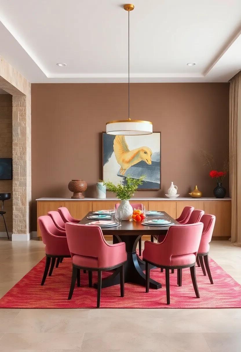
Dusty Rose Walls Infusing The Room With Romance And Vintage Charm

Embracing dusty rose tones on your dining room walls is like wrapping the space in a soft, nostalgic embrace. This muted pink shade balances warmth and subtlety, creating an atmosphere that’s both inviting and sophisticated. The gentle hue flatters natural light beautifully, casting a romantic glow that enhances every meal and conversation. Whether paired with vintage wooden furniture or contemporary metallic accents, dusty rose lends itself effortlessly to a timeless, elegant setting that feels both fresh and comfortingly classic.
Incorporating dusty rose also opens an array of complementary styling options. Consider accentuating the walls with:
- Antique brass fixtures for a touch of regal charm.
- Soft linen curtains to maintain an airy, inviting vibe.
- Floral or vintage-inspired tableware to echo the romantic theme.
| Complementary Elements | Effect |
|---|---|
| Velvet Upholstery | Luxurious texture, adds depth |
| Gold Rimmed Glassware | Elegant sparkle, vintage flair |
| Soft Beige Rugs | Neutral grounding, cozy feel |
Muted Mustard Tones Bringing Retro Warmth and A Touch Of Boldness To Meals
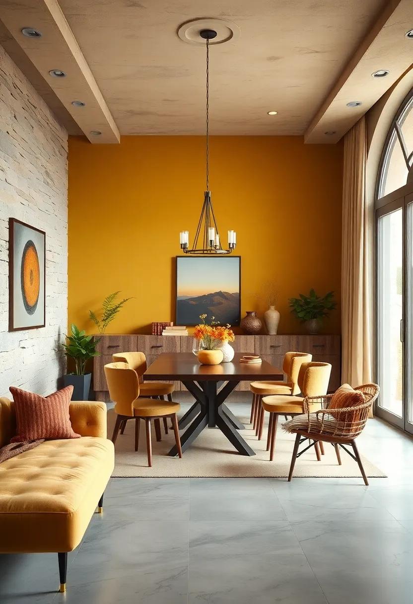
Muted mustard tones effortlessly bridge the gap between vintage charm and modern sophistication, making them a perfect choice for those looking to inject warmth and personality into their dining spaces. This hue offers a distinctive boldness without overwhelming the senses, creating an inviting atmosphere that encourages conversation and comfort. When paired with natural wooden furniture or brass accents, muted mustard infuses the room with a nostalgic glow reminiscent of retro interiors, while still feeling fresh and current.
To maximize the impact of muted mustard walls, consider complementing them with these accent choices:
- Earthy greens: Olive or sage create a harmonious, nature-inspired palette.
- Creamy whites: Soft, neutral tones help balance the richness of mustard and maintain brightness.
- Deep blues: Navy or indigo add striking contrast and a regal touch.
| Element | Effect | Pairing Suggestion |
|---|---|---|
| Muted Mustard Walls | Warm,retro boldness | Natural wood & brass |
| Olive Green Accents | Earthy calmness | Textile cushions or plants |
| Creamy White Trim | light balance | Molding & ceiling |
| Indigo blue Decor | Rich contrast | Artwork & tableware |
cool Slate Blue Colors Delivering A Balancing Contrast To Warm Wooden Furniture
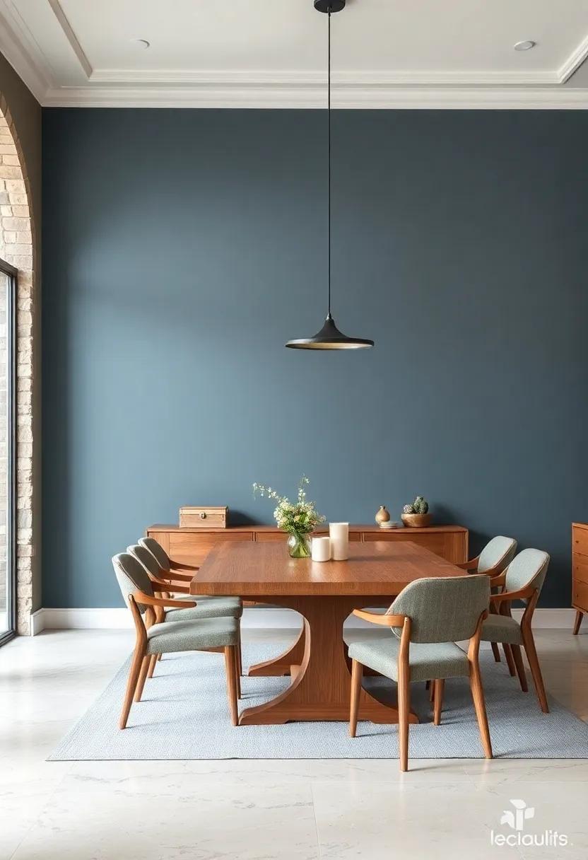
slate blue is a sophisticated shade that strikes the perfect balance between serene and striking, making it an ideal choice when paired with the natural warmth of wooden furniture. This cool tone brings a calming ambiance to your dining space, gently grounding the vibrant warmth of earthy wood grains. The subtle blend of blue and gray undertones in slate blue enhances the texture and richness of wooden pieces, creating a harmonious interplay between color and material. whether you have hand-carved oak chairs or sleek walnut tables, slate blue walls act like a gentle canvas that accentuates these timeless elements, making your dining room feel both inviting and refined.
to elevate the visual interest when incorporating slate blue, consider complementing it with accessories and accents in these hues:
- Crisp whites for a clean, modern contrast
- Soft metallics like brushed nickel or brass to add subtle shine
- Muted sage greens to introduce an organic, layered vibe
- Creamy beige textiles for warmth without overpowering the palette
| Wood Type | Ideal Slate Blue Shade | Effect |
|---|---|---|
| Oak (light, golden) | Slate Blue Gray | Softens, adds cool sophistication |
| Walnut (rich, dark) | Deep Slate Blue | Enhances depth, creates drama |
| Pine (lighter, rustic) | Muted Slate Blue | Balances warmth, casual charm |
Charcoal Accents Combining With Lighter Walls To Frame The Dining Area With Subtle Sophistication

Introducing charcoal accents alongside lighter walls creates a balanced interplay of light and shadow that effortlessly elevates your dining space. The deep, moody hues of charcoal provide a grounding effect, while the lighter walls expand the area visually, inviting warmth and openness. This combination works wonders in framing the dining zone, drawing attention without overwhelming the senses. Choosing charcoal for elements like chair cushions, cabinetry, or even a statement wall adds a subtle edge of sophistication that feels both modern and timeless.
To master this refined aesthetic, consider these complementary touches:
- Matte charcoal trim paired with creamy off-white walls for a soft contrast.
- Charcoal-painted built-ins to anchor the space and highlight lighter wall shades.
- Accents in charcoal textiles or artwork to bring depth and texture without overpowering the room.
- warm wood tones that bridge charcoal and light walls, adding organic warmth and balance.
| Element | Charcoal Accent Idea | Suggested Light Wall Shade |
|---|---|---|
| Dining Chairs | Charcoal fabric upholstery | Soft linen white |
| Walls | Charcoal feature wall | Muted dove gray |
| Cabinetry | charcoal matte finish | Warm cream |
| Artwork Frames | Thin charcoal metal frames | Off-white textured walls |
Terracotta Shades Bringing A Rustic Mediterranean Vibe To Your Dining Space
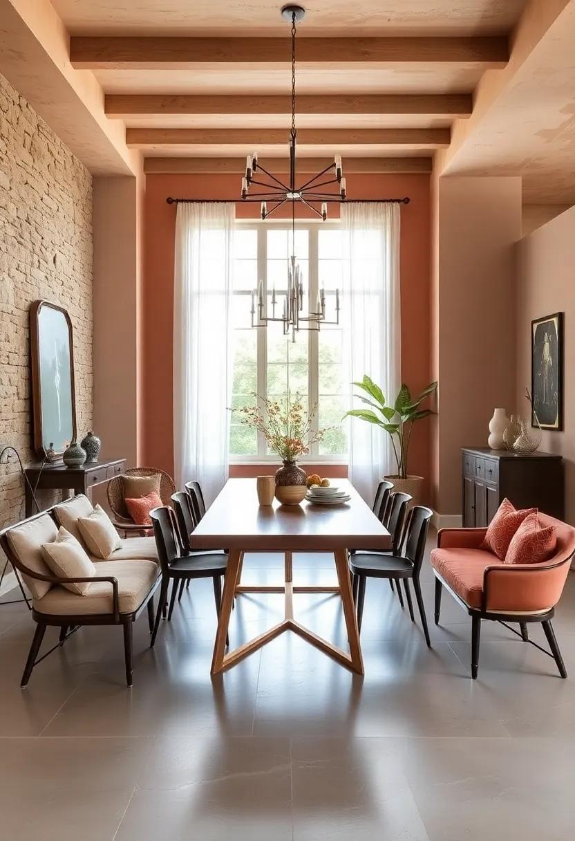
Infuse your dining area with the warm, earthy allure of terracotta shades to evoke a rustic Mediterranean charm that feels both timeless and inviting. These hues, ranging from soft clay tones to deeper burnt oranges, create an intimate atmosphere perfect for gatherings and leisurely meals. Pairing terracotta walls with natural wood furnishings and textured fabrics amplifies the cozy, grounded vibe, while accents in olive green or sun-kissed yellow can add zest and freshness to the space.
To effortlessly balance this warm palette, consider these styling tips:
- Soft lighting: Use pendant lamps or sconces with amber tones to complement the terracotta warmth.
- Natural elements: Incorporate rattan chairs, woven baskets, and terracotta pots to deepen the rustic feel.
- Contrasting finishes: Matte walls contrasted with glossy ceramic tableware add visual interest without overpowering the warmth.
| Terracotta Tone | best Pairing Colors | Suggested Materials |
|---|---|---|
| Soft Clay | Olive Green, Cream | Raw Linen, Light Wood |
| Burnt Sienna | Mustard Yellow, Deep Teal | Wicker, Terracotta Pottery |
| Rust Red | Cobalt Blue, White | Textured Ceramic, Leather |
Soft Mint Greens Evoking Freshness And Serene Energy In The Dining Environment
Introducing a palette of soft mint greens can breathe new life into your dining room, wrapping the space in a calming yet invigorating atmosphere. This subtle shade combines the refreshing qualities of green with the tranquility of pastel, making it a perfect choice for a room where both relaxation and conviviality converge. When paired with natural wood tones or crisp white accents, soft mint green offers a serene backdrop that encourages both leisurely meals and engaging conversations.
To enhance this tranquil vibe, consider incorporating elements that complement the cool undertones of mint green. Here’s how to create a harmonious dining environment:
- Natural textures: Woven rattan chairs, linen table runners, or jute rugs amplify the organic feel.
- Metallic accents: Brushed brass or matte gold light fixtures add warmth without overpowering the gentle hue.
- botanical décor: Fresh herbs or potted succulents bring subtle pops of greenery, reinforcing the fresh energy.
| Element | effect |
|---|---|
| Soft Mint Green Walls | Calm, cool, spacious feel |
| Light wood Furniture | Natural warmth, visual balance |
| Gold Pendant Lights | Elegant contrast, subtle shine |
Ivory And Beige Layered Tones Creating A Spacious, Airy, And Calm Dining Setting
Draping your dining room in a palette of ivory and beige layered tones invites a serene ambiance that feels both spacious and inviting. These soft,neutral colors work in harmony to reflect natural light,enhancing the room’s airy feel while providing an elegant backdrop for your dining experience. By blending subtle variations of these hues—from creamy ivories to warm beige undertones—you create depth and dimension without overwhelming the senses. This layered approach transforms even the simplest dining setup into a tranquil retreat where every meal feels relaxed and refined.
To accentuate this calming aesthetic, consider incorporating textures and materials that complement the paint layers. Soft linens, natural wood finishes, and matte ceramics in matching or slightly contrasting shades can add visual interest without disturbing the balance. Here’s a quick guide to elements that pair beautifully with ivory and beige to maximize your dining space’s peaceful vibe:
- Light oak or ash wood furniture: Enhances warmth and natural charm.
- Sheer curtains or blinds: Maintain brightness with a soft diffusion of sunlight.
- Neutral-toned area rugs: Anchor the space with subtle patterns or plain textures.
- Brushed gold or matte brass accents: Add understated luxury and softness.
Rich Chocolate Browns Offering A Grounded And Cozy Feel Perfect For Family Dinners

Embracing deep chocolate browns in your dining room walls creates an atmosphere that feels inviting and warm, making every meal feel like a cherished occasion. These rich hues effortlessly ground the space, fostering a cozy sanctuary where conversations flow as freely as the wine. Pairing chocolate browns with soft, ambient lighting enhances the warmth, while natural wood furniture and textured fabrics like linen or velvet add layers of tactile comfort that encourage lingering around the table.
To balance the intensity of such profound tones, consider incorporating accents in the following shades:
- Creamy ivory for ceiling and trims to brighten and open up the space
- Burnt orange accessories for a subtle dash of vibrancy
- Olive green plants or décor elements to introduce a natural freshness
- Brushed gold hardware or light fixtures to add a touch of understated luxury
| Element | Recommended Style | Effect |
|---|---|---|
| Wall Color | Dark Chocolate Brown | Warmth & Grounding |
| Furniture | Natural Wood | Organic texture |
| Fabric | velvet or Linen | Soft & Inviting |
| Lighting | Warm Ambient | Cozy Glow |
Pale Peach Walls Infusing Warmth And Softness While Brightening The Dining Space

Pale peach walls create an inviting ambiance that subtly envelops your dining space in a gentle warmth. This delicate hue strikes the perfect balance between cozy and fresh, offering a soft luminosity that enhances natural light without overwhelming the senses. Whether paired with rustic wooden furniture or sleek modern accents, pale peach acts as a versatile canvas that complements a wide range of styles while subtly elevating the room’s mood.
Beyond its aesthetic charm, pale peach enriches the dining experience by promoting a relaxed and welcoming atmosphere, ideal for both intimate family meals and lively dinner parties. Consider pairing this color with:
- Creamy whites for a crisp, clean contrast
- Warm metallics like gold or bronze to add richness
- Soft greens to invoke a natural, earthy vibe
| Feature | Impact |
|---|---|
| Light Reflection | Brightens space naturally |
| Emotional Tone | Creates warmth and tranquility |
| Versatility | Suits various decor styles |
Final Thoughts
As the final brushstroke in your dining room’s transformation, the right wall color sets the stage for countless meals and memories. Whether you seek the warmth of cozy gatherings or the elegance of refined soirées, choosing the perfect hue is more than a design decision—it’s an invitation to dine in style. With these top paint colors as your palette, your dining space can become a true reflection of your taste and atmosphere, ready to inspire every shared moment around the table.
As an Amazon Associate I earn from qualifying purchases.