Harmonizing Hues: Creative Dining Room Color Schemes to Inspire Your Space
The dining room is more than just a place to enjoy meals—it’s a canvas where color and ambiance blend to create memorable experiences. Choosing the right color scheme can transform this space from ordinary to remarkable, setting the perfect tone for every gathering.In this article, we explore a range of creative dining room color combinations that harmonize hues in inspiring ways, helping you craft an inviting atmosphere that reflects your personal style and elevates every meal. Whether you prefer bold contrasts or subtle blends, these ideas offer fresh perspectives to invigorate your dining space.
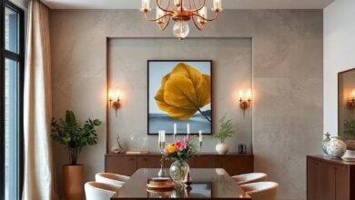
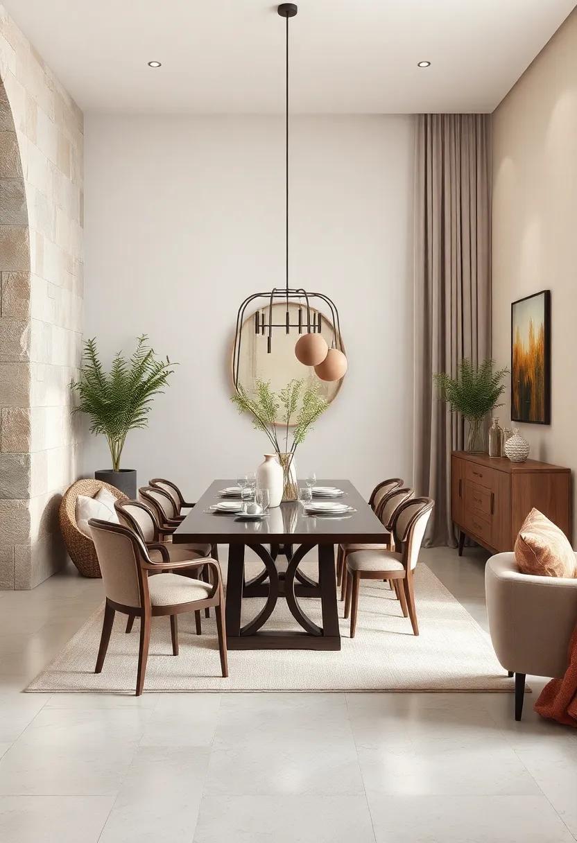
Harmonious Blends of Warm earth Tones bringing Cozy Elegance to Modern Dining Rooms
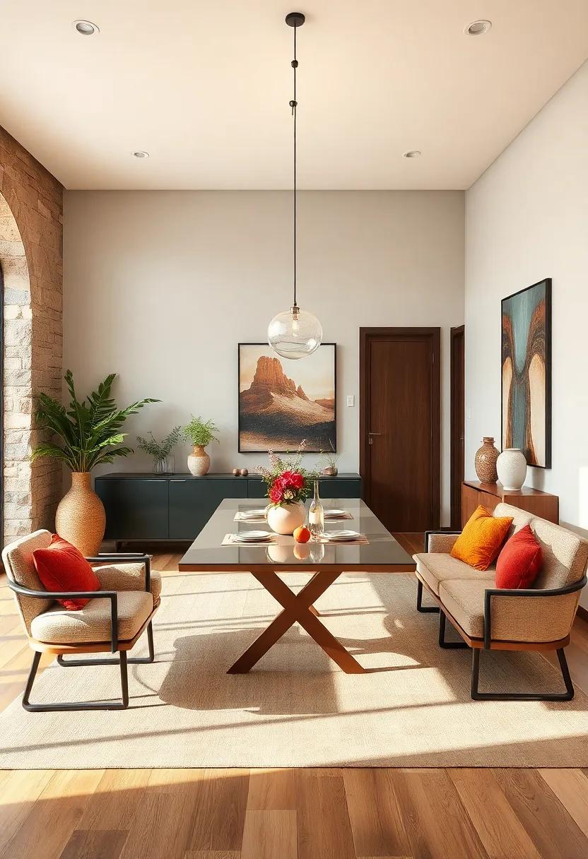
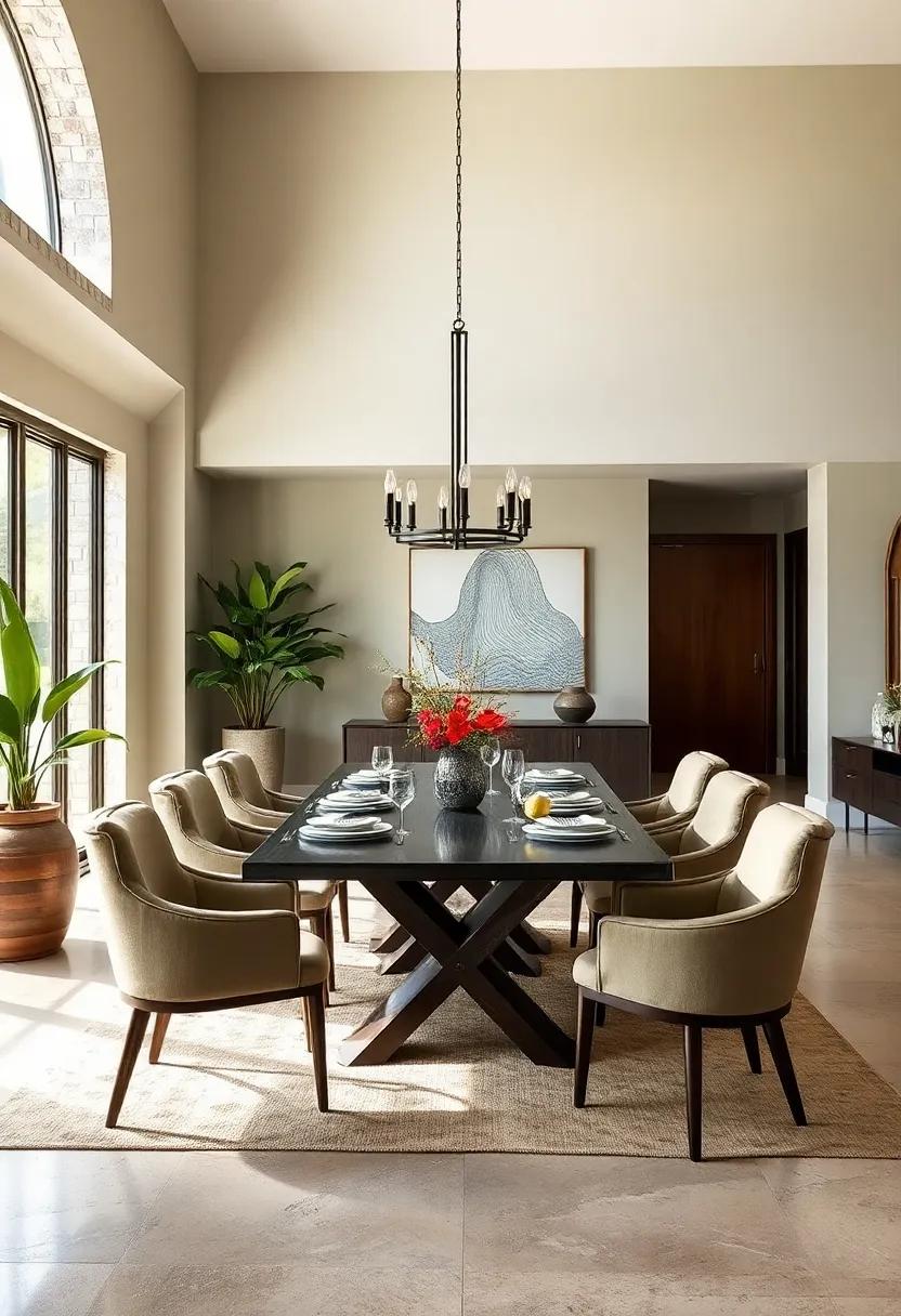
Embracing warm earth tones in your dining room introduces a natural, inviting atmosphere that effortlessly balances comfort with sophisticated style. imagine walls painted in soft terracotta or muted clay hues,paired with rich wooden furniture and plush fabrics in shades of caramel and ochre. These colors create a seamless flow that evokes feelings of warmth and grounding, transforming a mere meal into an intimate experience. Accents such as woven baskets, linen napkins, and rustic ceramic tableware complement the palette, adding tactile richness and depth to the space.
To achieve this cozy elegance, consider integrating a variety of textures and finishes that play well with warm tones. Layering materials like matte stone tiles,distressed leather chairs,and brass light fixtures amplifies the welcoming vibe without overwhelming the modern simplicity of the room. The following guide highlights key elements that bring harmony to such dining rooms:
- Color Palette: burnt sienna, warm taupe, soft amber
- Natural Materials: Reclaimed wood, terracotta pottery, jute rugs
- Textural Contrast: Velvet cushions, woven basketry, linen curtains
- Metals: Aged bronze, brushed brass, copper accents
| Element | Material/Color | Effect |
|---|---|---|
| Dining Table | Reclaimed Walnut Wood | Rich warmth & natural texture |
| Wall Color | Soft Terracotta | Inviting backdrop, cozy ambiance |
| Accent Chair | Burnt Orange Velvet | Bold softness & color pop |
| Light Fixture | Brushed Brass Pendant | Elegant warmth & subtle shine |
Vibrant Jewel Tones Infusing Dining Spaces with Luxury and Depth
Infusing your dining area with deep, radiant jewel tones creates a stimulating habitat that radiates both luxury and warmth. Think of rich emerald greens, bold sapphire blues, and luscious amethyst purples weaving through walls, upholstery, or accent pieces.These colors add unexpected depth and invite guests to linger longer around the table, sparking conversation and connection. When balanced with warm metallics like gold or brass, jewel tones elevate everyday meals into memorable experiences, bridging classic elegance with contemporary vibrancy.
To harmonize jewel tones without overwhelming the room, consider pairing these intense hues with soft neutrals or subtle textures. A velvet navy chair against a muted stone wall or a ruby-red table runner atop a rustic wooden table creates an inviting contrast that feels both rich and approachable. Here are some ideas to play with these luxurious hues effectively:
- Accent walls: Paint one wall in a jewel tone to anchor your space.
- Textiles: Incorporate jewel-colored cushions, curtains, or table linens.
- Decorative objects: Use jewel-toned vases, bowls, or artwork for pops of color.
| Jewel Tone | Suggested accent | Mood Created |
|---|---|---|
| Emerald Green | Brass light fixtures | Elegant, calm |
| Sapphire Blue | Velvet chairs | Rich, inviting |
| Amethyst Purple | Gold-rimmed glassware | Luxurious, creative |
Soft Pastel Palettes Creating Serene and Inviting Ambiances for Family Meals
Embracing soft pastel palettes in your dining room transforms the space into a tranquil haven that encourages meaningful family connections.Shades of gentle blush, muted sage, and powder blue meld effortlessly, wrapping the room in a warm yet airy embrace. These hues not only soften harsh lines and shadows but also subtly enhance natural light, creating an inviting atmosphere where every meal feels like a restful retreat. Layering pastels with warm woods or neutral textiles amplifies the sense of calm, balancing color with tactile comfort that invites lingering conversations and shared moments.
Beyond aesthetics, pastel tones have a profound psychological effect, calming the mind and reducing dining distractions. Consider combining these colors with accents in creamy whites,soft greys,or sandy beiges to build depth and dimension while maintaining cohesion. Here’s a simple guide to harmonious pastel combinations perfect for dining areas:
| primary Color | Complementary Accent | Ideal Material |
|---|---|---|
| Blush Pink | Creamy White | Light Oak Wood |
| Muted Sage | Soft Gray | Linen Upholstery |
| Powder Blue | Sandy Beige | Rattan Elements |
- tip: Incorporate pastel-colored dinnerware or glassware to subtly echo the palette without overwhelming the senses.
- Tip: Balance the softness with matte or natural finishes to keep the ambiance grounded and approachable.
monochromatic Color Schemes Elevating Dining Areas with Subtle Sophistication
Delving into a single hue and exploring its various tones can transform a dining area into a serene yet striking retreat.By layering shades of the same color, from the palest whispers on your table linens to deep, velvety accents on walls or chairs, you invite a quiet elegance that feels both intentional and effortlessly chic.Texture becomes your ally here — think matte and gloss finishes, plush fabrics against sleek surfaces — creating depth without overwhelming the senses. This subtle sophistication proves that complexity doesn’t always require a vibrant palette; sometimes, it’s the harmony within simplicity that captivates the most.
To master this approach, consider the balance between light and shadow within your chosen color family. Here’s a concise guide to pairing tones for a seamless monochromatic effect:
| Color Base | Light Accent | Midtone Element | Dark Contrast |
|---|---|---|---|
| Soft Blue | Powder blue Curtains | slate Blue Chairs | Indigo Table Runner |
| Warm Taupe | Beige Walls | Mocha Upholstery | Chestnut Wood Table |
| Moss Green | Celadon Napkins | Fern Green Cushions | Olive planters |
Pairing these tones thoughtfully ensures your dining space feels cohesive and inviting. Incorporate natural elements like wood or woven fibers to imbue warmth and prevent the scheme from feeling too flat. Ultimately, embracing one color spectrum with varied intensity encourages an atmosphere that’s both restful and refined, allowing your meals—and conversations—to truly take center stage.
Rich Burgundy and Deep Navy Combinations Conveying Dramatic and Bold Statements
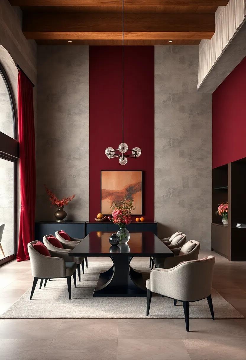
Pairing rich burgundy with deep navy creates a dining room palette that brims with sophistication and intensity. This duo offers a stunning contrast that feels both luxurious and inviting,perfect for spaces where memorable meals and meaningful conversations unfold. To balance these strong hues, consider integrating soft neutrals like cream or warm taupe through upholstery, rugs, or accent pieces. Metallic accents in brushed gold or antique brass can add a subtle sheen, elevating the overall ambiance without competing with the bold color story.
- Wall paint: Deep navy as a feature wall,paired with burgundy curtains or an accent rug.
- Furniture: Velvet chairs in burgundy surrounding a dark wood dining table with navy placemats.
- Lighting: Warm Edison bulbs or brass chandeliers to enhance the warmth of the burgundy.
| Element | Burgundy Accent | Navy Accent |
|---|---|---|
| Textiles | Plush velvet cushions | Woven linen curtains |
| Decor | Porcelain vases | Abstract wall art |
| Furniture Finish | Mahogany wood | Matte black metal |
Nature-Inspired Greens Paired with Natural Wood Textures for Organic Dining Vibes
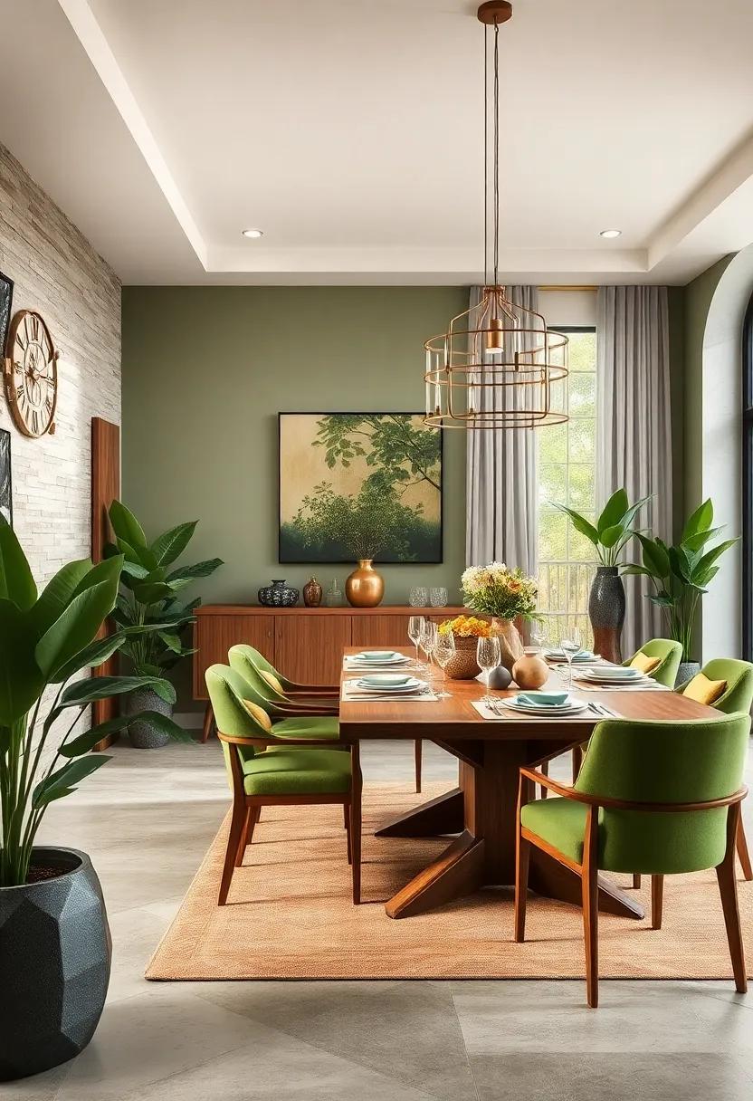
Embracing the soothing essence of nature indoors can transform your dining experience into a tranquil retreat. Combining lush, earthy greens like olive, sage, and fern with the rich, tactile appeal of natural wood textures creates a space that feels both grounded and inviting. whether it’s through a statement wooden dining table with visible grain or handcrafted wooden chairs complemented by green upholstery, this blend brings an organic warmth that fosters connection and calm during meals. Accenting these hues with soft, linen-based textiles and subtle ceramic tableware reinforces the harmony between nature’s palette and artisanal craftsmanship.
To perfectly balance this organic duo, consider incorporating elements that echo the natural world without overwhelming the senses. Use potted plants or hanging greenery to add life and dimension, while woven baskets and driftwood accessories introduce varied textures that play off both the greens and woods. Here’s a swift guide to pairings that evoke serene,nature-inspired dining vibes:
- earthy Green Shades: Moss,Olive,Sage,Fern
- Wood Textures: Oak,Walnut,Teak,Reclaimed Barn wood
- Complementary Touches: Linen,Rattan,Ceramic,Jute
| Element | Effect | Style Tip |
|---|---|---|
| Fern Green Walls | Creates lush,refreshing backdrop | Pair with light oak furniture for balance |
| Reclaimed Wood Table | Adds rustic,textured contrast | Combine with soft green cushions for coziness |
| Woven Rattan Pendant | Introduces natural,airy lighting | use with neutral linen curtains |
Neutral Shades Mixed with Metallic Accents Reflecting Timeless and Sleek Dining Designs
Embracing a palette dominated by gentle taupes, soft greys, and creamy ivories creates a foundation of calm sophistication within the dining area. These neutral hues offer an adaptable backdrop that effortlessly balances both modern and classic interior elements. When paired with the subtle shimmer of metallic touches—like brushed brass cabinet handles, polished chrome light fixtures, or copper-accented tableware—the space is elevated to a realm of refined elegance. This interplay between matte neutrals and gleaming metals crafts a cohesive ambiance that feels simultaneously warm and contemporary, perfect for intimate dinners or lively gatherings.
To achieve a perfect blend, consider integrating metallic accents thoughtfully through a curated selection of décor pieces and furniture finishes. Below is a simple guide outlining key neutral shades paired with complementary metallic tones that resonate well in dining spaces:
| Neutral Shade | Ideal Metallic Accent | Effect |
|---|---|---|
| Warm Taupe | Brushed Brass | Inviting warmth & understated luxe |
| Soft Grey | Polished Chrome | Clean, sleek, modern edge |
| Muted Ivory | Copper | Subtle glow & vintage charm |
- Texture matters: matte walls and plush fabrics balance metallic gloss.
- Lighting is key: reflective accents brighten and expand the space.
- Keep it balanced: let neutrals dominate while metals accent.
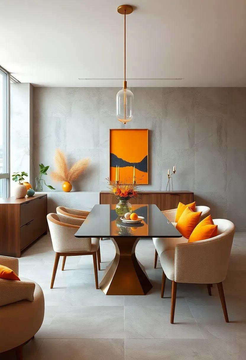
Sun-Kissed Yellows and Oranges Evoking Warmth and Cheerfulness in Social Dining Spaces
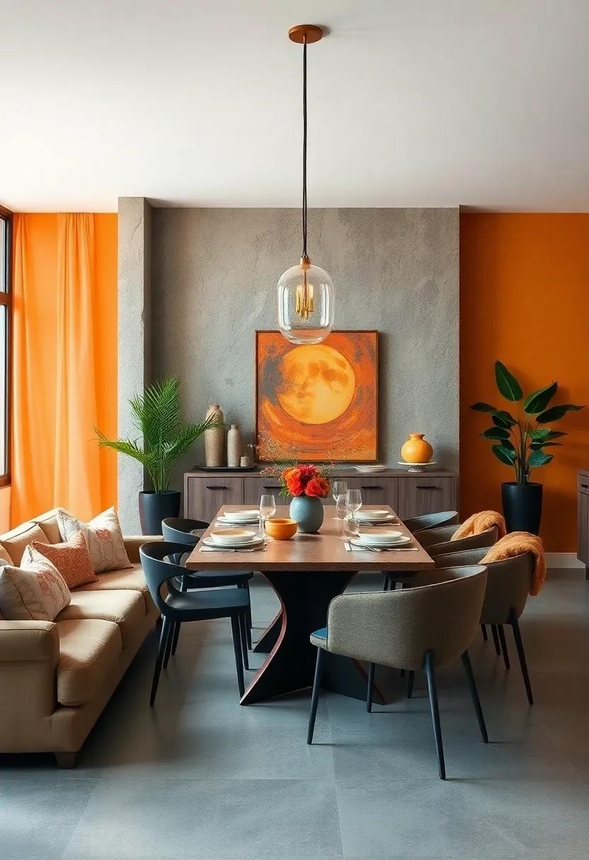
Injecting your dining space with radiant yellows and vibrant oranges can transform the atmosphere into an inviting sanctuary of warmth and vitality. These sun-kissed tones naturally stimulate appetite and conversation, making them perfect allies for social dining areas. Whether you opt for a soft, buttery yellow on the walls or bold tangerine accents in textiles and artwork, these hues breathe life and energy into the room without overwhelming the senses.
To balance the intensity of these colors and create a harmonious vibe, consider layering with complementary neutrals and natural textures.Here are some creative pairing ideas to get started:
- Warm Woods: Rich oak or walnut furniture enhances the golden glow and adds grounding earthiness.
- Crisp Whites: White trim, cabinetry, or table linens offer contrast and keep the space feeling fresh.
- Accents of green: Incorporate lively houseplants or olive-green details for visual respite and organic freshness.
| Color | Effect on Mood | Suggested Use |
|---|---|---|
| golden Yellow | Inviting & Cheerful | Accent wall, light fixtures |
| Luminous Orange | Energetic & Stimulating | Throws, cushions, art pieces |
| Soft Apricot | comforting & Warm | Upholstery, dinnerware |
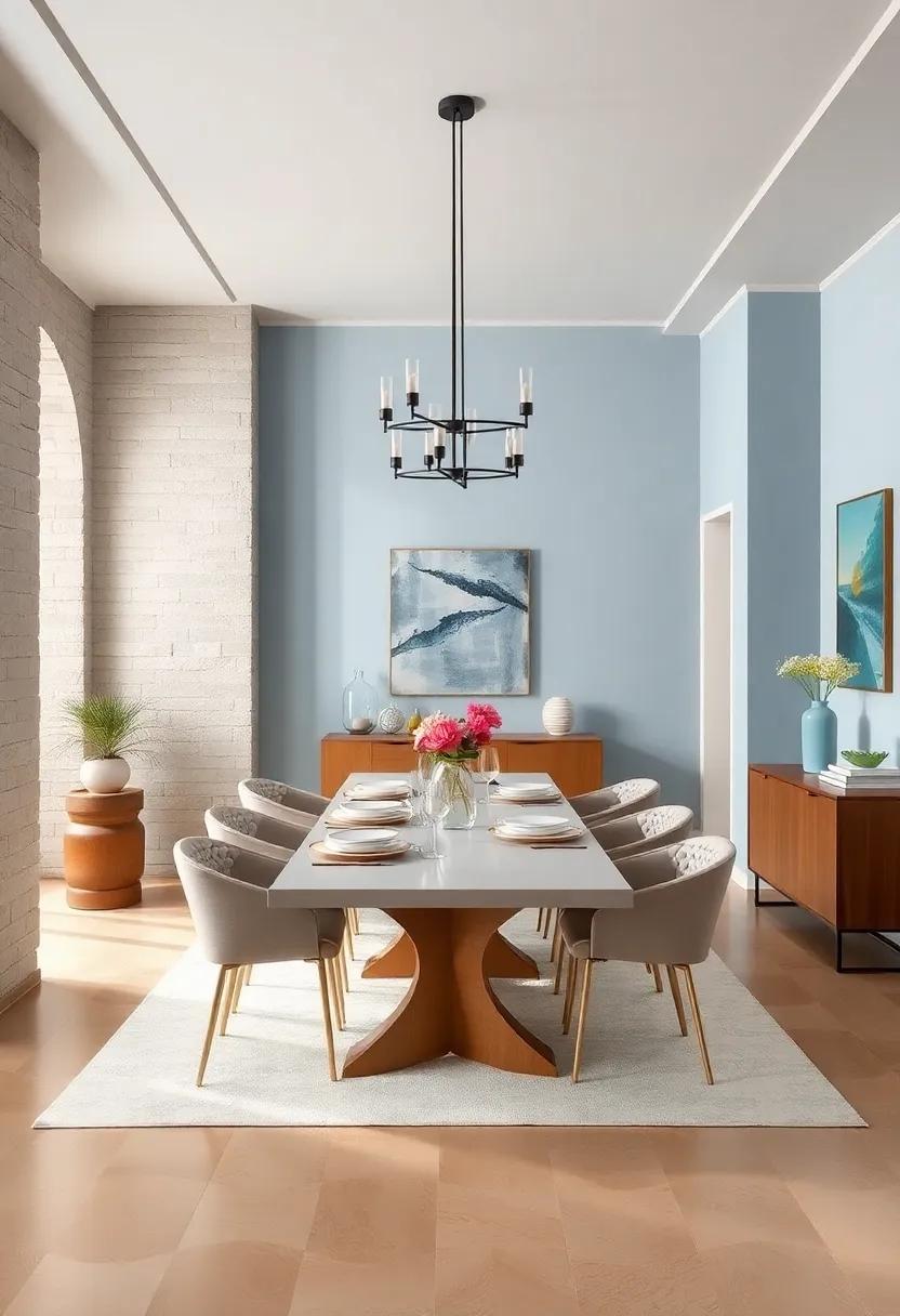
Cool Blues Harmonizing with Crisp Whites for Fresh and Airy Dining Room Feelings
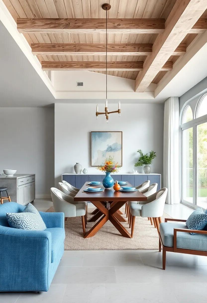
Imagine stepping into a dining room where cool blues gently envelop you like a soothing ocean breeze, perfectly balanced by the invigorating purity of crisp whites. This color combination does more than just please the eyes—it breathes life into the space, creating an ambiance that feels both refreshing and calm. Whether it’s the soft powder blue of an accent wall or delicate navy hues in upholstery, these tones invite relaxation while maintaining a sophisticated edge. Paired with bright,clean whites—think fresh linens,minimalist tableware,and gleaming furniture—the room exudes an airy openness,enhancing natural light and making every meal feel like a serene retreat.
To nail this harmonious palette, consider layering textures alongside colors to add depth without overpowering the senses. Use a mix of materials such as:
- Lightwood dining tables to introduce warmth without disrupting the cool tones.
- Soft cotton or linen cushions in muted blues for comfort and subtle contrast.
- Glossy white ceramics or minimalist white lighting fixtures to amplify brightness.
Complement these with touches of silver or chrome accents to maintain a clean, contemporary feel. The beauty of this combination lies in its versatility: it can be tailored to suit both minimalist modern styles and coastal cottage vibes, making it an inspiring choice to uplift your dining experience.
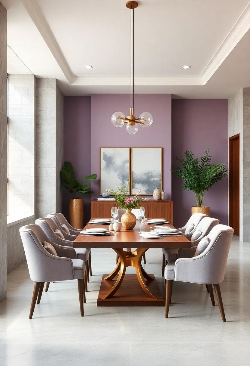
Muted Mauves and Dusty Roses introducing Romantic and Vintage Dining Room Moods
Transform your dining area into a serene retreat with a palette that whispers of elegance and nostalgia.By blending muted mauves with dusty roses, you can craft an ambiance that feels both romantic and timeless. These soft hues work beautifully on walls and textiles alike, creating layers of subtle color that invite intimate conversations and leisurely meals. Complement these shades with vintage-style accessories—think aged brass candlesticks, lace runners, and antique mirrors—to elevate the space and deepen the charm.
To balance the warmth of mauves and roses, consider adding touches of muted greens or soft grays to the mix. Here’s a quick guide to mix and match these colors effectively:
| Element | Recommended Shades | Textural Ideas |
|---|---|---|
| Wall Color | Soft Mauve, Dusty rose | matte finish or Venetian plaster |
| Accent Pieces | Muted Sage, Warm Gray | Velvet cushions, linen curtains |
| Decor | Antique Gold, Cream | Brass candleholders, vintage porcelain |
Experiment with contrasts and textures to find your perfect balance. Remember, the goal is to create an inviting space where color harmonizes seamlessly with vintage-inspired decor, encouraging memorable moments and timeless style.
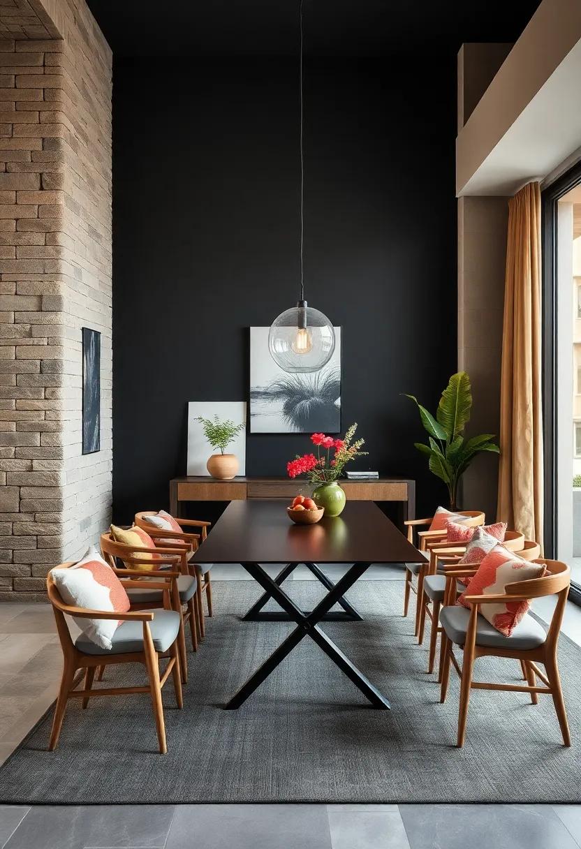
Dynamic Contrasts of Black and White Defining Modern Minimalist Elegance in Dining Areas
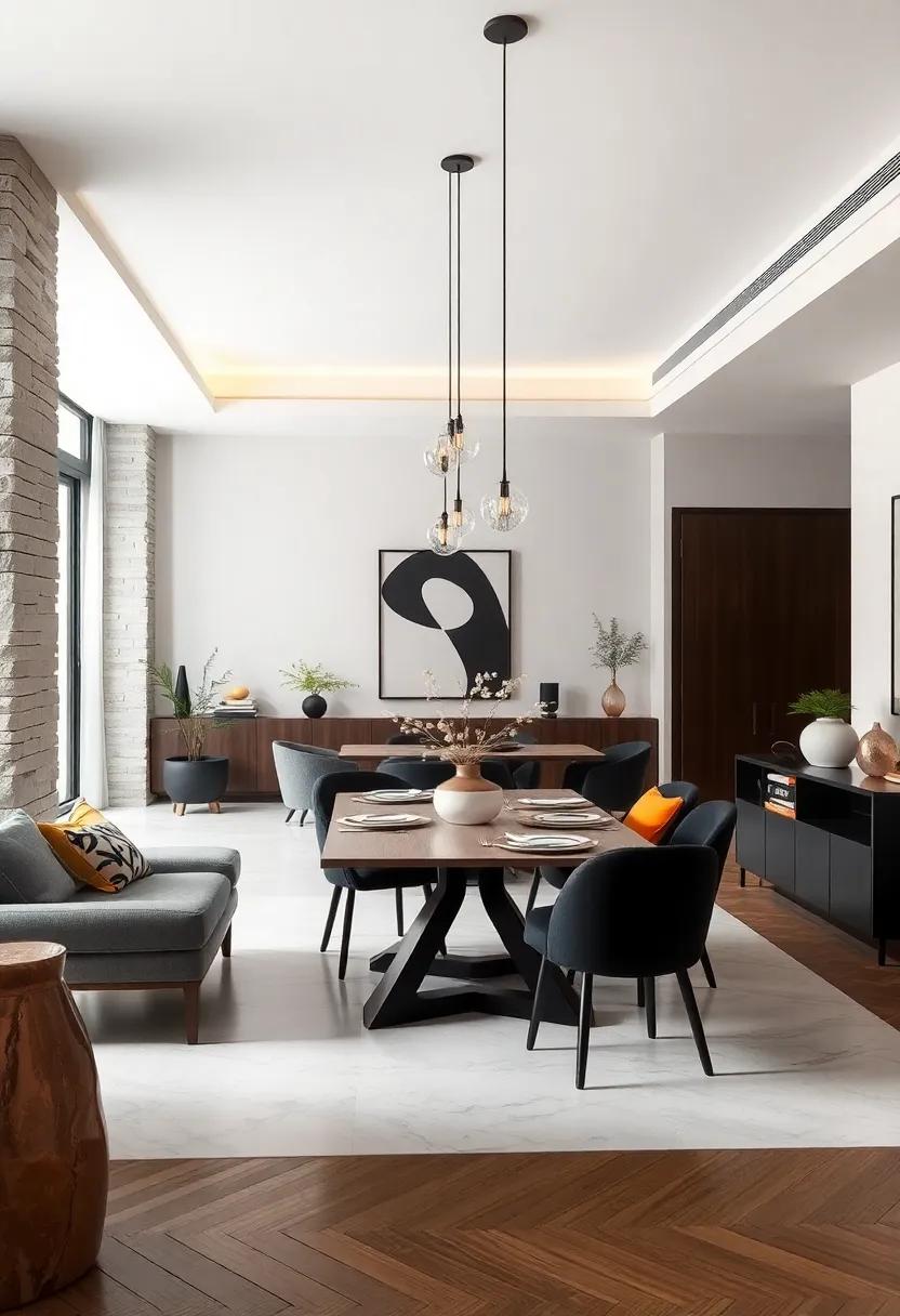
In the realm of modern minimalism, the interplay between black and white orchestrates a visual symphony that epitomizes sophistication and clarity. This striking duo doesn’t merely contrast; it creates a dynamic balance where each element defines the other. By integrating matte black chairs with sleek white tables, or alternating monochrome patterns in textiles, the dining area becomes a canvas for bold simplicity. The absence of color distraction channels focus toward form and texture, making every design choice purposeful and potent.
To elevate this paradigm of elegance, consider incorporating these key elements:
- Sharp silhouettes: Geometric furniture and clean lines amplify the minimalist ethos.
- Layered textures: Contrasting materials like smooth lacquer and raw wood introduce subtle depth.
- Light manipulation: Using strategic lighting to cast soft shadows enhances the black-and-white interplay.
- Accent simplicity: Minimalist black and white artwork or monochrome ceramics punctuate the palette without overwhelming.
| Element | Effect |
|---|---|
| Black matte finishes | absorb light, add depth |
| White gloss surfaces | Reflect light, create space |
| Minimal decor pieces | Maintain uncluttered harmony |
| Monochrome textiles | Introduce subtle pattern complexity |
Blended Shades of Gray with Pops of Mustard for Urban Chic Dining room Settings
Embracing a sophisticated blend of soft grays with vibrant mustard accents creates an undeniably chic vibe, perfect for modern urban dining areas. The gentle gray backdrop acts as a neutral canvas, allowing the mustard pops to infuse warmth and personality without overwhelming the senses. This subtle interplay supports an inviting yet contemporary atmosphere where every meal feels like a stylish affair. Using various textures—matte walls, velvet cushions, and metallic light fixtures—adds depth, making the space visually compelling and cozy.
Incorporating key design elements brings this color scheme to life effortlessly:
- Textured gray rugs to ground the space while adding tactile contrast
- Mustard dining chairs as bold focal points that energize the room
- Concrete or matte black table surfaces enhancing the industrial-modern aesthetic
- Gold or brass accessories echoing mustard’s warmth and adding a refined glow
| Element | Recommended Shade | Texture/Finish |
|---|---|---|
| Wall Paint | Soft Dove Gray | Matte |
| Accent Chairs | Mustard Yellow | Velvet |
| Dining Table | Charcoal | matte Wood |
| Light Fixtures | Brass | Polished |
Soft Cream and Taupe Layers Offering Subtle Comfort and Understated Style in Eating Spaces
Embracing a palette of soft cream and muted taupe allows dining spaces to emanate a quiet warmth that soothes the senses. These gentle hues provide an ideal canvas for layered textures—think plush linen cushions, matte ceramic dinnerware, and woven rattan accents—that invite guests to linger longer.The subtle interplay of these tones creates an environment that is both relaxed and refined, allowing natural light to dance effortlessly across surfaces without overwhelming the space. This blend fosters a sanctuary-like vibe, where every meal feels like a peaceful retreat.
To heighten this understated elegance, consider layering these colors with touches of soft metallics or natural wood finishes to bring depth and dimension. Maintaining a minimalist approach is key—let the textures do the talking through:
- Velvet seat cushions that offer luxurious comfort.
- Matte taupe ceramics that add visual grounding.
- Light wooden tabletops that enhance tactile warmth.
- Sheer cream curtains that soften incoming light.
| Element | Material | Effect |
|---|---|---|
| Seat Cushions | Velvet | Softness with subtle sheen |
| Dinnerware | Matte Taupe Ceramic | Grounding visual interest |
| Curtains | Sheer Cream Linen | Diffuse, gentle lighting |
| Tabletop | Light Wood | Natural warmth and texture |
deep Forest Greens Coupled with Gold Details Presenting Luxurious and Inviting Dinner Settings
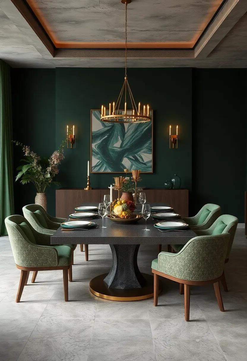
Embracing the richness of deep forest greens creates a dining atmosphere that exudes both luxury and warmth. These verdant tones evoke the tranquility of nature indoors, setting a peaceful backdrop that encourages relaxed conversation and memorable meals.When paired with accents of gleaming gold, the space is instantly elevated—gold details catch the light, adding a sophisticated shimmer without overwhelming the calming base color. Whether it’s through gold-rimmed dinnerware, elegant flatware, or subtle lighting fixtures, these metallic highlights punctuate the setting with refined elegance.
to bring this concept to life, consider combining deep greens and gold with complementary textures and elements that enrich the inviting vibe:
- velvet upholstery in moss or emerald shades for chairs
- Matte forest green walls contrasted by gold-framed artwork
- Natural wooden tables that add organic warmth and balance
- Soft, layered lighting mixing gold-accented sconces and candles
| Element | Color/Finish | Effect |
|---|---|---|
| Dining Chairs | Velvet Forest green | Comfort & Plush Texture |
| Tableware | Gold Rimmed Porcelain | Elegant Detailing |
| Lighting Fixtures | Brushed gold Metal | Subtle Warm Glow |
| Floor Rug | Neutral Beige with Green Accents | Grounding & Unified Look |
This harmonious blend not only defines luxury but makes every meal feel like a special occasion, inviting guests to linger longer and savor the experience in a stunning yet cozy setting.
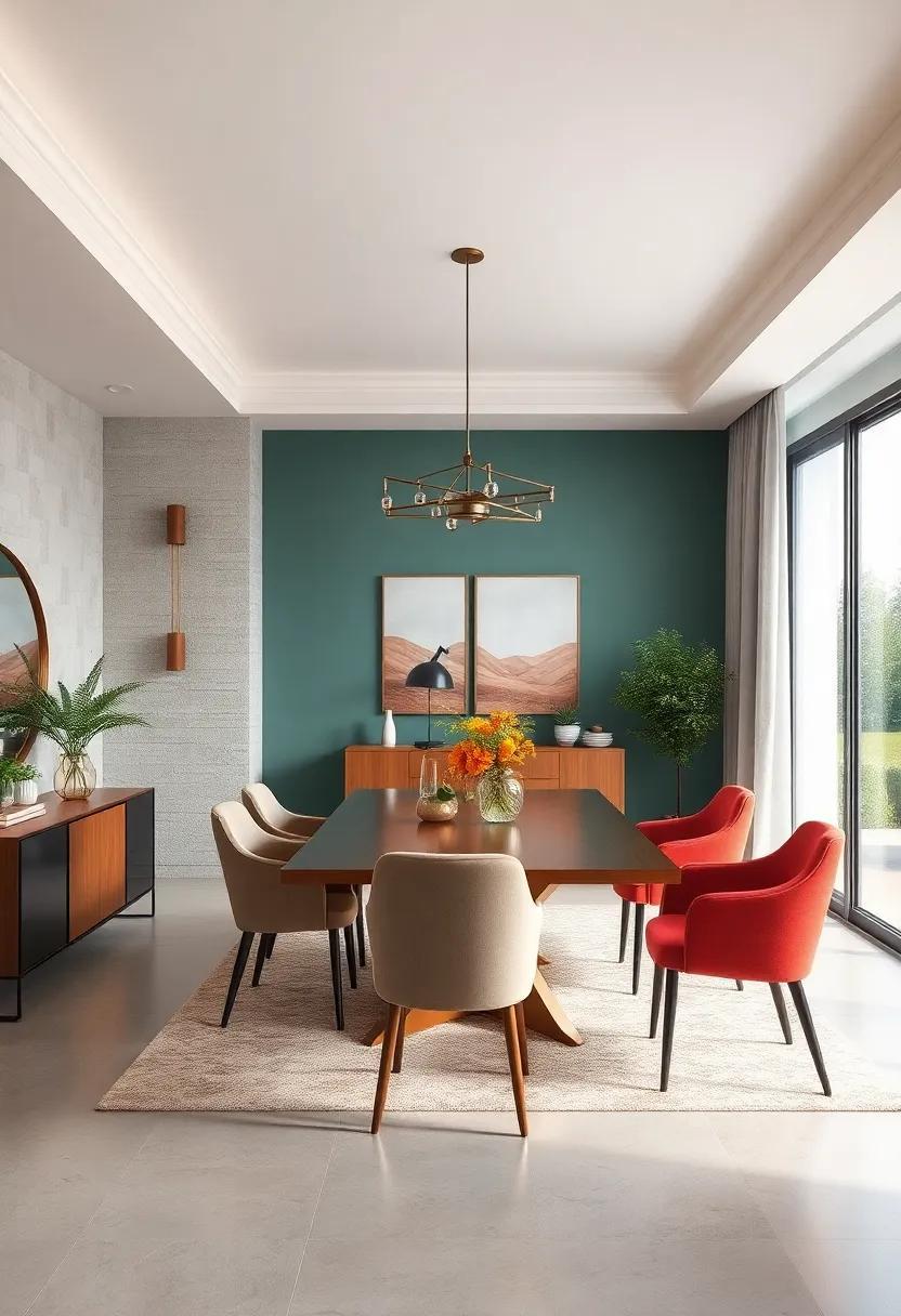
Playful Mixes of teal and Coral Energizing Contemporary Dining Room atmospheres
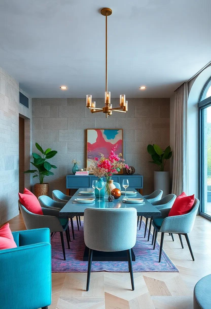
Infuse your dining space with a refreshing burst of energy by pairing teal’s cool sophistication with the lively warmth of coral. This dynamic duo strikes a harmonious balance, creating an atmosphere that is both inviting and invigorating. Consider walls painted in a soft, muted teal as a canvas for coral-accented chairs or cushions, where the pop of coral brings vibrancy without overwhelming the senses. The subtle contrast energizes the space while maintaining an elegant, contemporary vibe perfect for both casual meals and celebratory gatherings.
To elevate this color interplay, layer textures and patterns that embrace the spirit of playfulness in moderation. Incorporate accessories such as coral-hued ceramic vases or teal glassware to subtly repeat the palette, crafting a cohesive yet spontaneous look. Below is a quick guide on how to balance these colors effectively in your dining room:
- Walls: Soft teal or off-white with teal undertones
- Furniture: Neutral wood tones or white with coral cushions
- Textiles: Mix coral-patterned throws with teal rugs
- Decor: Coral art pieces paired with teal ceramics
| Element | Recommended Teal Shade | Recommended Coral Accent |
|---|---|---|
| Walls | #4C8C8A (Muted Teal) | — |
| Upholstery | #2E6E6C (Deep Teal) | #FF6F61 (Vibrant Coral) |
| Decor | #5BB3B0 (Bright Teal) | #FF8C7A (Soft Coral) |
Warm Terracotta Walls Balanced with cool Gray Furniture for Earthy modern Dining Experiences
Immerse your dining area in the warmth of terracotta walls, where deep orange undertones bring a rustic yet refined charm. This earthy backdrop naturally complements sophisticated gray furniture, creating a tranquil balance between warmth and coolness. The juxtaposition of these tones doesn’t just please the eye; it invites diners to linger longer,soaking in an ambiance that’s both grounding and contemporary. Consider incorporating textured gray upholstery or sleek matte finishes on tables and chairs to deepen the modern sensibility without overwhelming the inviting warmth of the walls.
To elevate this color combination, think beyond furniture and explore accents that bridge both palettes seamlessly.Metallic lighting fixtures in brushed brass or matte black can provide subtle contrast, while natural materials like jute rugs or woven baskets add layers of tactile interest. Below is a quick guide to accent options that harmonize with terracotta and gray, perfect for creating that signature earthy modern dining vibe:
- Soft linen curtains in dove gray or cream
- Stoneware dinnerware with matte glaze
- Organic wood centerpieces with greenery
- Charcoal or graphite ceramic vases
| Element | Material/Finish | Effect |
|---|---|---|
| Dining Table | Concrete or matte gray wood | Grounded, minimalist base |
| Seating | Charcoal fabric or leather | Comfort with sleek sophistication |
| Lighting | Brushed brass pendants | Warm metallic glow |
| Textiles | Natural fibers in soft gray tones | Subtle layering of texture |
oceanic Blues and Sandy Beige Tones Bringing Coastal Calm to Dining environments
Blending rich oceanic blues with soft sandy beiges creates a tranquil backdrop that invites relaxation and conversation in your dining area. These colors echo the soothing rhythm of the sea and shore, evoking a sense of peaceful retreat no matter where your home is located. Incorporate deep navy or teal walls paired with beige upholstery or light wood furniture to strike a balanced harmony between bold and neutral elements. Touches of brass or matte gold accents can add warmth without overpowering the serene palette,making your dining space both sophisticated and inviting.
To effortlessly pull this look together, consider incorporating natural textures and finishes that complement these coastal-inspired hues:
- Rattan or wicker chairs offer a breezy, organic feel
- linen table runners evoke softness and simplicity
- driftwood-inspired centerpieces connect your décor directly to nature
- Sea glass-colored glassware adds subtle pops of translucent blue
| Color | Mood | Request Ideas |
|---|---|---|
| Deep Ocean Blue | Calm & Depth | Feature wall, cabinetry |
| Soft Sandy Beige | Warmth & Neutrality | walls, textiles |
| seafoam Green | Freshness & Light | Accent decor, cushions |
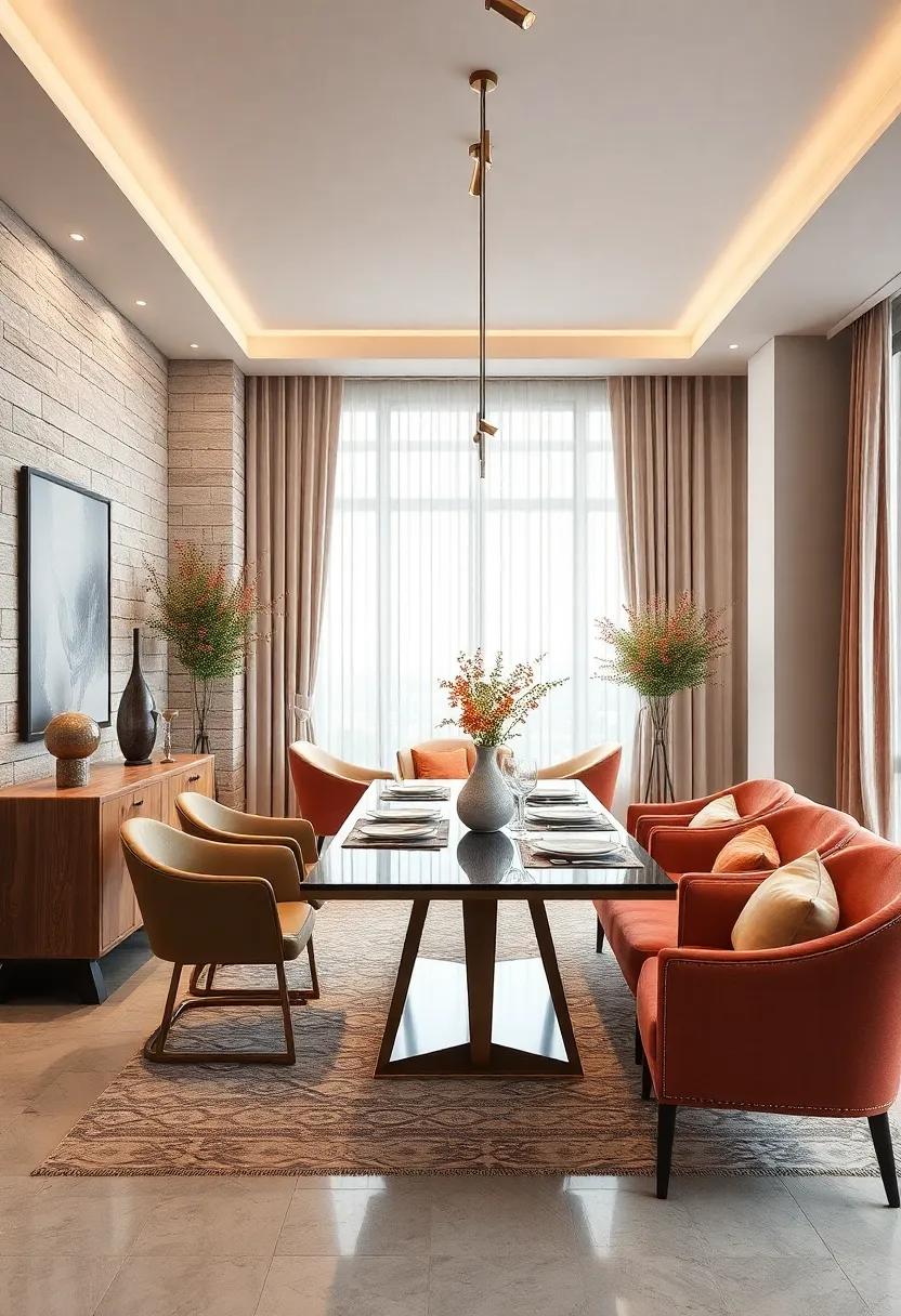
sunset-Inspired Gradient Hues Enhancing Vibrancy and Movement within a Dining Space
Infusing a dining area with the warm, dynamic palette of a sunset breathes life and a sense of rhythm into the space.By blending rich oranges, soft pinks, and deep purples, you can create a gradient that naturally guides the eye around the room, simulating the gentle progression of dusk. This approach not only warms up the atmosphere but also introduces a visual flow that mimics movement, making every meal feel like a vibrant, shared experience. The interplay of these hues works beautifully whether on walls, accent pieces, or textured fabrics, evoking a cozy yet invigorating environment where dining becomes a daily celebration.
To effectively balance these radiant tones without overwhelming the senses, consider layering complementary neutrals or subtle metallic accents. These provide a grounded backdrop, enhancing the saturation of the gradient while preventing any color clash. The following table highlights ideal accent pairings to amplify the sunset gradient’s effect:
| Sunset Hue | Complementary Accent | Material Suggestions |
|---|---|---|
| Burnt Orange | Soft Beige | Linen, rattan |
| Blush Pink | Warm Gray | Velvet, Ceramic |
| Deep Purple | Brushed Gold | Metal, Silk |
- Layered lighting: Use warm ambient and accent lights to enhance the gradient’s natural glow.
- Textural contrast: Combine smooth finishes with tactile fabrics to add depth.
- Artful accents: Choose artwork or décor that echoes the sunset’s natural hues for cohesion.
lavender and Sage Combinations Encouraging Relaxed and Peaceful Dining Experiences
Pairing the gentle tones of lavender with the muted greens of sage creates an atmosphere steeped in tranquility and subtle sophistication. This combination draws inspiration from nature’s calmest palettes, inviting diners to unwind effortlessly while savoring their meals.Whether applied to walls, cabinetry, or accent décor, these hues soften the overall space, encouraging an environment where conversations flow easily and culinary experiences become moments of peaceful indulgence.
To enhance this serene pairing, consider incorporating complementary textures and elements that echo organic harmony:
- Soft linen tablecloths in muted cream tones
- Matte ceramic dinnerware in pastel neutrals
- Natural wood finishes with light grain
- Subtle metallic accents in brushed gold or antique brass
| Element | Ideal Color/Tone | Effect on Space |
|---|---|---|
| Wall Paint | soft Lavender | Calming backdrop, invokes serenity |
| Accent Walls or Furniture | Muted Sage | Adds depth & natural freshness |
| Textiles | Cream & Pale Green | Enhances softness and warmth |
| Accessories | Brushed Gold/Antique brass | Infuses understated elegance |
Muted Blues and Soft Browns Offering Calming and Grounded Dining Room Environments
imagine a dining room where serenity meets sophistication.Muted blues, reminiscent of tranquil waters and gentle skies, paired with soft browns inspired by earth and wood, create an atmosphere that feels both calming and grounded. these hues not only set a peaceful tone but also encourage lingering conversations and mindful meals. When walls are painted in soft blue-gray tones and accented with warm taupe or beige furnishings, the result is a balanced environment that soothes the senses while maintaining an inviting warmth.
To elevate this harmony, consider incorporating natural textures and simple patterns. Fabrics in linen or cotton with subtle stripes or checks complement the color scheme without overwhelming the space. Wooden dining tables with matte finishes and muted metal fixtures bring in depth and richness. Here’s a quick guide to combining these colors and textures effectively:
- Wall Color: Soft slate blue or pale denim
- Furniture: Light to mid-tone walnut or oak
- Textiles: Beige linens with subtle textured weaves
- Accents: Matte ceramics and brushed bronze lighting
| Element | Recommended Hue | Texture/Material |
|---|---|---|
| Walls | Muted Blue (Slate, Denim) | Matte Paint |
| Furniture | Soft Brown (Walnut, Oak) | Natural Wood |
| textiles | Warm Beige | Linen, Cotton |
| Decor | Brushed Bronze, Matte Ceramics | Metal, Earthenware |
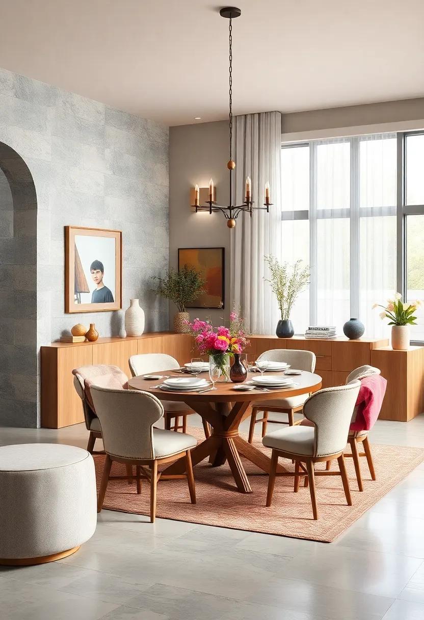
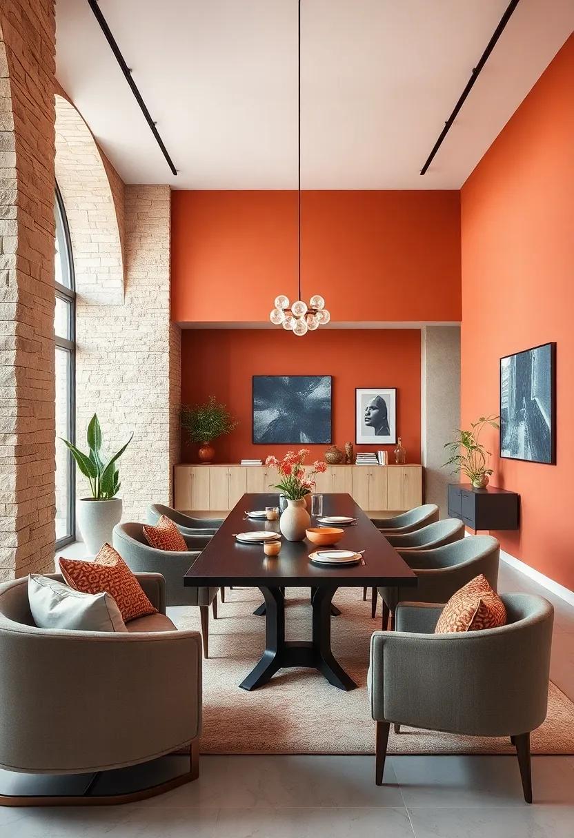
Bright Citrus Accents Against Neutral Backdrops Creating Cheerful and Balanced Dining Areas
Introducing bursts of bright citrus hues within a dining room anchored by soft, neutral tones creates an atmosphere that’s simultaneously lively and serene. Imagine luscious splashes of tangerine, lemon zest, and lime greens elevating classic beige, creamy whites, or subtle greys. This palette doesn’t just enliven the space; it also brings a refreshing balance,making every meal feel like a sunny,invigorating experience. The key is to let these vibrant accents act as focal points without overwhelming the senses—think cushions, artwork, or a statement centerpiece that invites conversation and warmth.
To keep the look cohesive, consider integrating textures that harmonize with both the bright and neutral elements. Linen table runners, woven placemats in natural fibers, and glazed ceramics in citrus-inspired tones will tie the scheme together artistically.The table below outlines simple combinations that achieve this luminous balance effortlessly:
| Citrus Accent | Neutral Backdrop | Suggested Textures |
|---|---|---|
| Lemon Yellow | Warm Beige | Linen,Rattan |
| Tangerine Orange | Soft Grey | ceramic,Wool |
| Lime Green | Off-White | Woven Cotton,Wood |
- Accent pieces: Citrus-hued napkins or glassware.
- Wall décor: Subtle artworks featuring bright fruits or geometric patterns.
- Lighting: Warm, soft bulbs that enhance both colors.
elegant Plum and Soft Blush Pairing Crafting Sophisticated and Inviting Dining Spaces
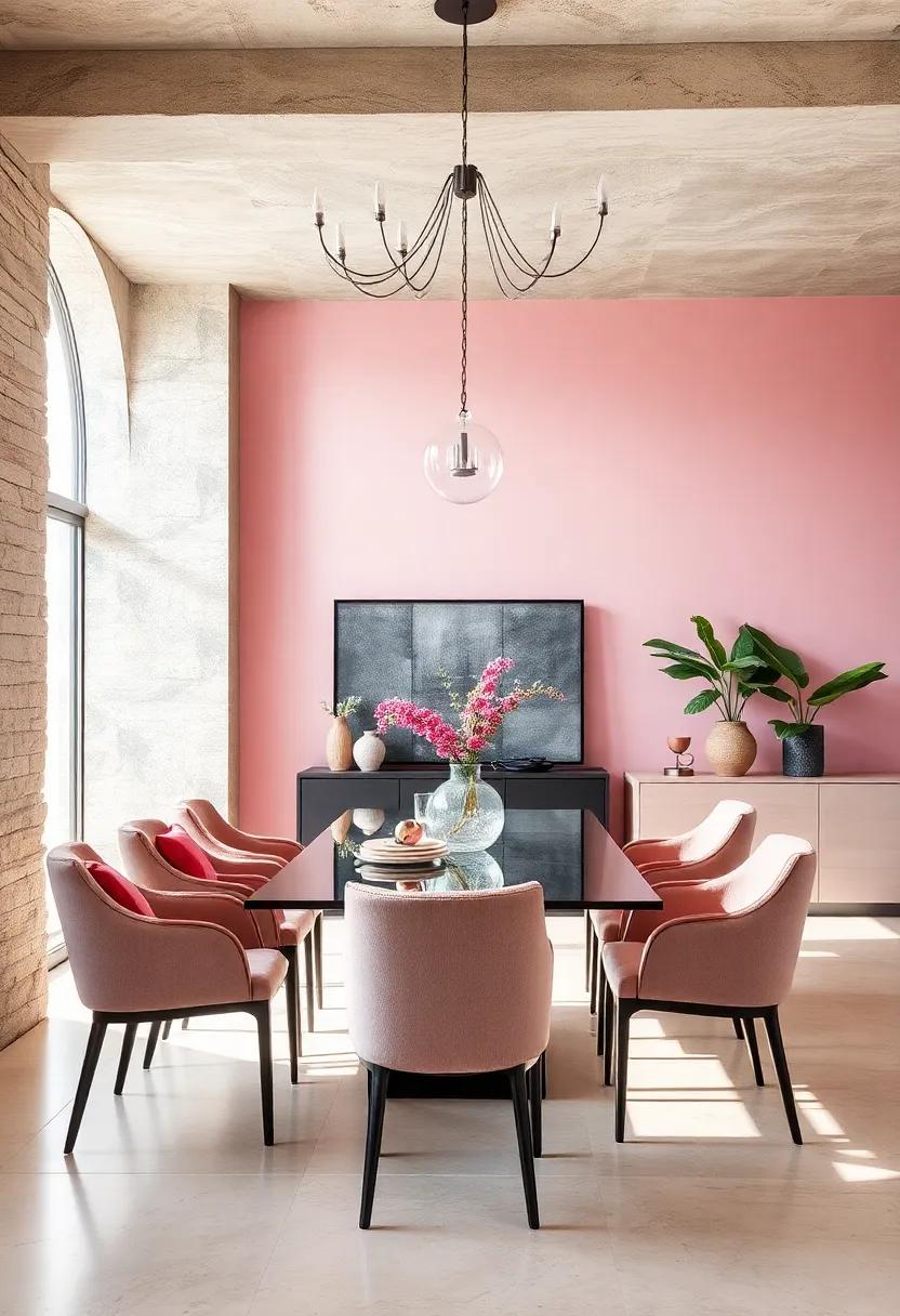
Marrying the deep, regal tones of plum with the gentle warmth of soft blush creates a balanced ambiance that radiates both charm and elegance. This pairing brings depth without overwhelming the senses, making it perfect for dining areas meant to foster intimate conversations and memorable moments. Incorporate plush velvet chairs in rich plum hues alongside blush-toned table linens or wall accents to strike an effortless balance between boldness and subtlety. The interplay of these shades encourages a cozy yet refined atmosphere, inviting guests to linger longer over a meal.
To enhance this sophisticated palette, consider integrating the following key elements:
- Metallic Gold or Brass Accents: Light fixtures and decorative pieces in warm metals complement both plum and blush tones beautifully.
- Natural Wood Finishes: Mid-tone woods add an organic texture and prevent the space from feeling too formal.
- Layered Textures: Mix silk cushions, linen napkins, and ceramic dishware to bring tactile richness to the dining experience.
| Element | Color/Material | Effect |
|---|---|---|
| Wall Paint | Soft Blush | Creates warmth and openness |
| Accent Chairs | Velvet Plum | Adds depth and sophistication |
| Lighting | Brass Pendant | Introduces subtle glamour |
Deep Charcoal Walls with Light Wood Furnishings for Urban Industrial Dining Styles
Contrasting textures and tones come alive when you pair deep charcoal walls with light wood furnishings in your dining space.The darkness on the walls creates a dramatic backdrop that amplifies the natural warmth and softness of pale timber. This interplay evokes an urban industrial vibe while maintaining an inviting atmosphere, perfect for intimate dinners or lively gatherings. Incorporate raw metal accents or leather chairs to further anchor the aesthetic, while letting the light wood breathe life into the room with its organic hues and grains.
To amplify this style, consider these subtle yet impactful additions:
- Matte black lighting fixtures to complement the walls without overpowering the wood
- Textured area rugs in neutral shades to soften the floor and add visual interest
- Minimalist tableware in whites or muted metals for a chic balance
| Element | Suggested Materials | Effect |
|---|---|---|
| Wall Finish | Matte charcoal paint | bold, moody foundation |
| Furniture | Light oak or maple wood | Natural warmth and balance |
| Accents | Blackened steel, leather | Industrial edge and texture |
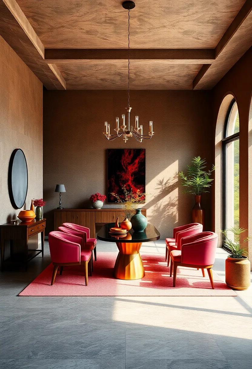
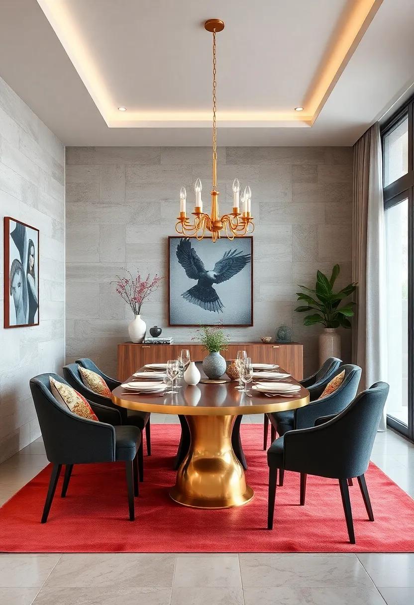
Saturated Reds and Golds Combining to Create Opulent and Festive Dining Settings
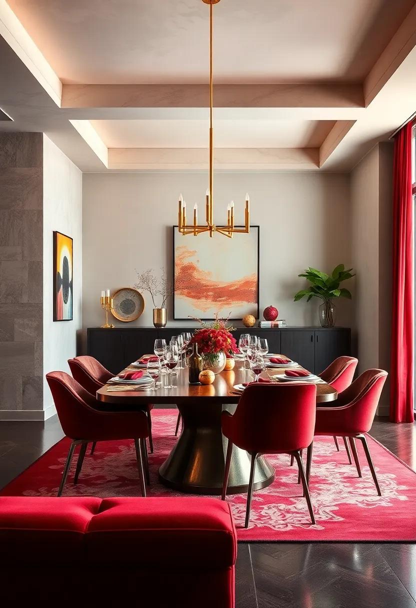
Infusing your dining space with saturated reds paired with gleaming gold accents instantly elevates the atmosphere to one of grandeur and celebration. These colors bring warmth and richness, mirroring the vibrancy of festive gatherings and the timeless elegance of opulent décor. Deep red walls or velvet drapes create an intimate,cozy backdrop while reflective gold elements in lighting fixtures,cutlery,or mirror frames add sparkle and sophistication.
To balance this bold palette, consider incorporating textures and finishes that enhance both hues without overpowering the senses. A mix of matte and metallic surfaces together fosters depth and interest. Here’s a simple guide to harmonize these shades successfully:
- Textiles: Plush red cushions with gold embroidered details.
- Furniture: Dark wood furniture with gold leaf inlays or brass handles.
- Table Settings: Red chargers paired with gold-rimmed glassware.
- Lighting: Chandeliers or pendant lamps with antique gold finishes.
| Element | Recommended Style | Color Emphasis |
|---|---|---|
| Wall paint | Deep Ruby or Crimson | Red |
| Accent pieces | Gold Leaf Mirrors / Frames | Gold |
| Dining Accessories | Red Linen with Gold Thread Details | Red + Gold |
| Lighting | Antique Gold Chandeliers | Gold |
Earthy Olive Greens with Cream Tones Infusing Dining Spaces with Organic Warmth and Balance
Blending the rich, earthy depths of olive green with soft cream tones creates a dining atmosphere that radiates both warmth and serenity. This palette evokes a connection to nature, grounding the space while offering a gentle brightness that softens and balances the overall mood. Imagine olive-hued walls or accent pieces paired with creamy upholstery and light wood textures — the result is an inviting sanctuary where every meal feels like a nourishing experience.The organic warmth from these hues encourages lingering conversations, fostering a sense of calm and togetherness.
To experiment with this pairing, consider incorporating natural materials like linen tablecloths or terracotta ceramics that complement the palette’s earthy character. The key to mastering this look lies in layering shades that stretch from deep forest olives to pale creams, allowing for subtle contrasts without overpowering the room’s tranquility. Below is a quick reference for balance and texture options to weave this harmony effortlessly into your dining design:
| Element | Olive Green Variation | Cream Tone Accent |
|---|---|---|
| Walls | Muted Olive Matte | Light Cream Trim |
| Furniture | Distressed Olive Wood | Soft Cream Cushions |
| Accessories | Moss Green Vases | Ivory Ceramic Plates |
| Textiles | Olive Linen Drapes | Woven Cream rug |
In Retrospect
As your dining room becomes the backdrop for memorable meals and meaningful conversations,the colors that surround you play a silent yet powerful role in setting the tone. Whether you lean toward bold contrasts or subtle blends, harmonizing hues can transform your space into a canvas of comfort and creativity. Let these inspired color schemes guide your palette choices, inviting both warmth and style into your dining experience. after all, the perfect shade isn’t just seen—it’s felt.
As an Amazon Associate I earn from qualifying purchases.