24 Cool and Cozy Winter Color Palettes to Warm Up Your Interior Spaces
When winter’s chill sets in, our interiors become sanctuaries where warmth and comfort take center stage. But beyond blankets and fireplaces, the very colors that surround us play a powerful role in crafting that cozy atmosphere. In this listicle, we explore 24 cool and cozy winter color palettes designed to transform your living spaces into inviting retreats. Whether you’re looking for subtle neutrals with a frosty edge or rich hues that echo the season’s glow,these thoughtfully curated combinations will inspire you to refresh your home’s mood and embrace winter with style. Dive in and discover the perfect palette to warm up your interior all season long.
Soft taupe and Cream: Embrace subtle warmth with soft taupe walls and creamy accents for a timeless, inviting space
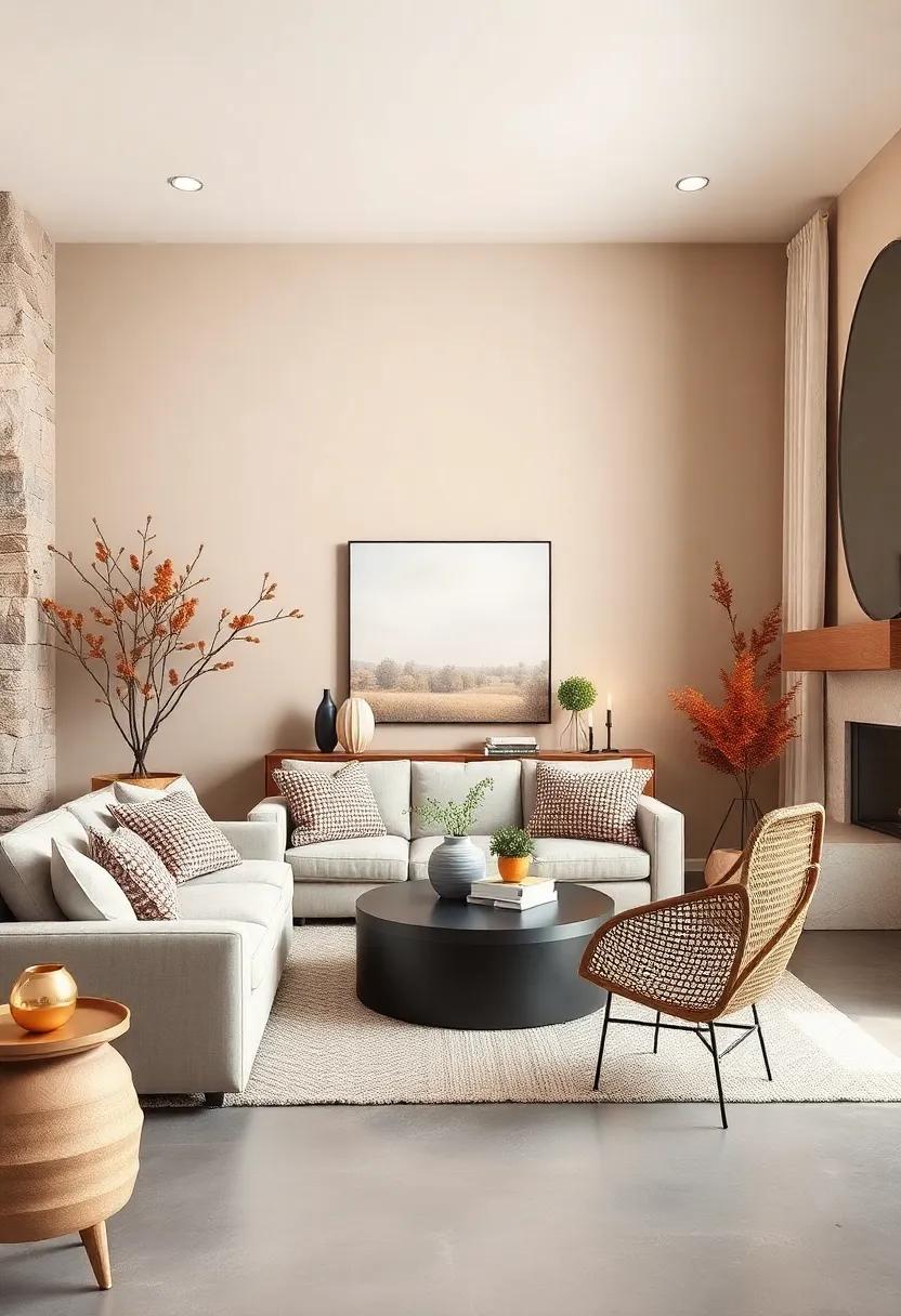
Wrap your rooms in the understated elegance of soft taupe walls—a gentle hue that whispers warmth and sophistication without overpowering the senses. Paired effortlessly with creamy accents, this palette transforms any space into a haven of cozy refinement. Think plush cream-colored throws draped over a taupe sofa, or delicate ivory lampshades softening the evening light. The combination highlights textures beautifully, from velvet cushions to woven rugs, inviting you to sink into a soothing atmosphere that feels both fresh and timeless.
To enhance this serene setting, incorporate natural elements and subtle metallic touches. A basket of dried botanicals, a taupe ceramic vase, or brushed gold candleholders amplify the organic warmth while adding depth and interest. This palette is remarkably versatile—perfect for living rooms, bedrooms, or even home offices that crave a calm yet inviting vibe. Consider the following styling essentials to complete the look:
- Soft taupe walls: Choose matte or eggshell finishes for subtle sophistication.
- Creamy textiles: Lace curtains, knit blankets, and plush pillows create layers of comfort.
- Natural wood accents: Light oak or maple furniture maintain airy balance.
- Warm metallics: Brass or antique gold lighting fixtures add a cozy glow.
| Element | Color/Material | Effect |
|---|---|---|
| Walls | Soft taupe (Matte) | Subtle warmth and sophistication |
| Throw Pillows | Cream Velvet | Layered texture and softness |
| Furniture | Light oak Wood | Natural, airy contrast |
| Lighting | brass Fixtures | Inviting, warm ambiance |
Sage Green and Mustard Yellow: Bring nature indoors with earthy sage paired with pops of mustard to add cheerful energy
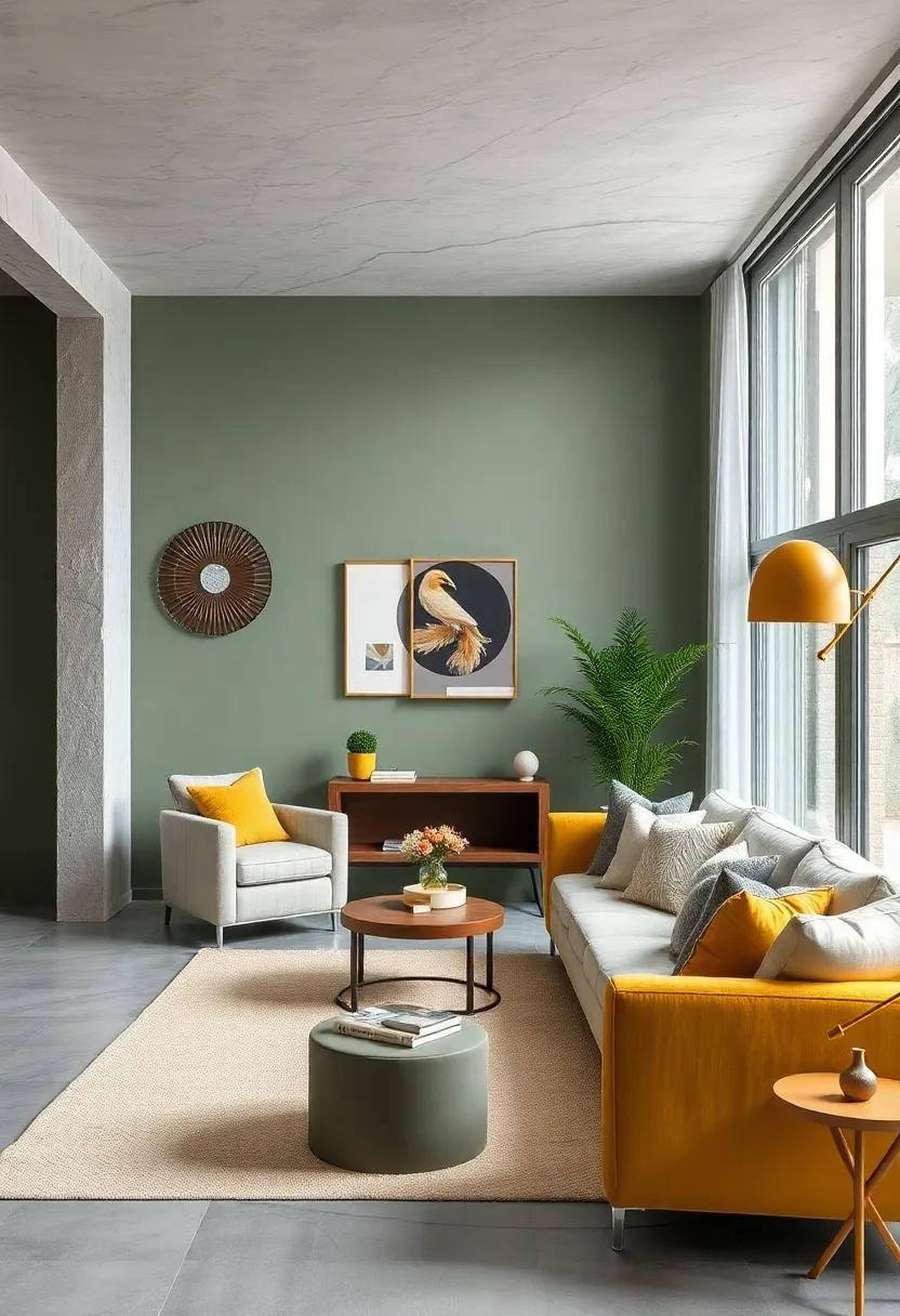
Embrace the calming spirit of the great outdoors with sage green, a shade that instantly brings tranquility and groundedness to any room. This soft, muted green serves as the perfect backdrop, invoking the gentle embrace of leafy forests and moss-covered paths. When complemented by vibrant pops of mustard yellow, the palette springs to life, infusing your space with cheerful energy and warmth. Whether its mustard-hued cushions, throws, or accent pieces, these bursts of color break the subtlety of sage and create a dynamic, inviting atmosphere.
To effortlessly incorporate this palette, consider layering textures and materials that echo nature’s diversity:
- Natural linens and cottons in sage tones for upholstery or drapery
- Woven baskets and rattan accessories to add earthy texture
- Mustard velvet cushions for a touch of luxe warmth against matte sage surfaces
- Wooden furniture with warm undertones that ground the palette
| Element | Recommended Material | Color Focus |
|---|---|---|
| throw Pillow | Velvet | Mustard Yellow |
| Curtains | linen | Sage Green |
| Accent Rug | Wool Blend | Neutral with Mustard Patterns |
| Decorative Vase | Ceramic | Muted Mustard |
Deep Burgundy and Blush Pink: Create romantic corners by blending rich burgundy with gentle blush tones
Imagine sinking into a cozy nook where the luxurious depth of deep burgundy wraps around you like a warm velvet throw, softly kissed by the understated elegance of blush pink accents. This palette brings a sophisticated yet tender feel to any space, perfect for crafting intimate corners in your living room or bedroom.Combining a palette of lush burgundy cushions with blush pink throws and delicate floral patterns creates layers of visual and tactile comfort. The richness of burgundy grounds the space while blush injects a light, airy softness that prevents the area from feeling heavy or overdone.
To balance these tones effectively, incorporate natural wood elements or brushed gold details that enhance the warmth without competing for attention. Consider pairing this duo with textures like velvet, cashmere, and soft knits to elevate the sense of tactile coziness. Here’s a rapid guide to infuse the charm of this palette:
- Burgundy: Velvet cushions,painted accent wall,or plush area rugs.
- Blush Pink: Sheer curtains, soft throws, and delicate ceramic décor.
- Metallic Accents: Gold candleholders or brass picture frames for subtle glam.
- Natural Textures: Raw wood coffee tables or woven baskets bring grounding warmth.
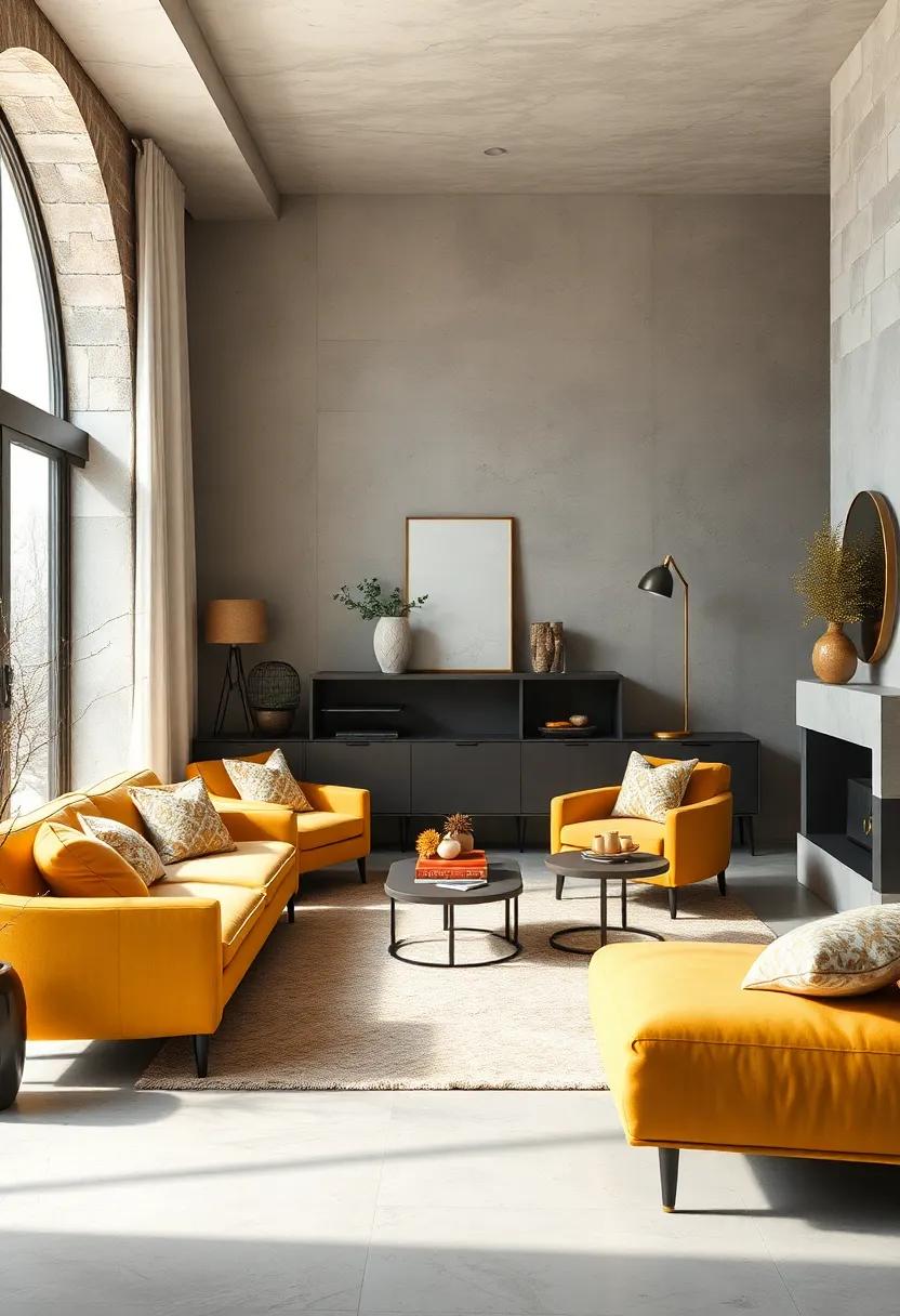
Charcoal Gray and Burnt Orange: Mix modern sophistication and cozy vibes with dark gray backdrops and vibrant orange highlights
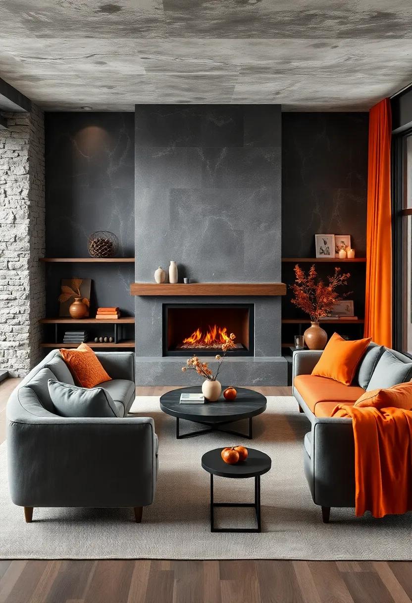
Embracing the depth of charcoal gray creates a contemporary canvas that exudes sophistication while subtly inviting warmth.This dark, neutral backdrop anchors your space, allowing any accent to shine without overwhelming. When paired with bursts of burnt orange, the combination strikes a perfect balance between modern elegance and cozy comfort. Think charcoal gray walls adorned with plush burnt orange cushions, or a sleek charcoal sofa enhanced by vibrant orange throws and art pieces. This pairing not only warms up minimalist spaces but also brings a refined energy to any room, ideal for those chilly winter evenings.
- Charcoal Gray: Perfect for large surfaces like walls or rugs to create depth.
- Burnt Orange: Best used in accent furniture,pillows,or decorative elements to inject vibrancy.
- Materials to consider: Velvet, wool, and leather for textural warmth and visual richness.
- Metallic accents: Bronze or matte black enhance the modern yet cozy atmosphere.
| Element | Charcoal Gray Usage | Burnt Orange Usage |
|---|---|---|
| Walls | matte charcoal paint for deep, moody ambiance | Accent wall or artwork |
| Furniture | Sectional sofa or lounge chairs | Accent chairs or ottomans |
| Textiles | Woolen rugs and heavy drapes | Throw pillows and blankets |
| Accessories | Black metal lamps and frames | Ceramic vases and candle holders |
Navy Blue and Warm Beige: Anchor your room with classic navy while soft beige balances the coolness for a comforting mood

embrace timeless elegance by pairing deeply saturated navy blue with a warm, muted beige to create a serene and inviting atmosphere. Navy’s rich intensity grounds your space, offering depth and a sense of stability, while warm beige tones gently soften the overall palette, preventing any cold or sterile feelings. This classic duo works beautifully across various textures and finishes—from plush velvet cushions and soft wool throws to matte ceramics and smooth wooden surfaces—inviting tactile contrast that amplifies the cozy vibe.
To enhance this harmonious blend, consider layering elements that leverage the palette’s natural warmth and coolness:
- Textiles: Combine beige linen curtains with navy patterned rugs or cushions for a balanced visual rhythm.
- Furniture: Opt for navy upholstered chairs paired with light wood or beige leather sofas to anchor your seating area.
- Accent décor: Integrate brass or copper accents to add a subtle sparkle and warmth, enhancing the comforting mood.
- Wall finishes: Choose a navy feature wall complemented by soft beige surrounding walls to expand depth without overwhelming the senses.
| Element | Navy Blue | Warm Beige |
|---|---|---|
| Mood | Stable, Elegant | Comforting, Soft |
| Material | Velvet, Wool | Linen, Leather |
| Finish | Matte, Satin | Matte, Natural |
olive Green and Rust Red: Evoke autumnal warmth all winter long with foliage-inspired olive and rust hues
Infuse your living spaces with the rich, earthy tones of olive green and rust red, a duo that channels the cozy essence of autumnal landscapes year-round. These hues bring a grounded, natural vibe, perfect for creating intimate nooks or warm, inviting communal areas. Imagine plush olive throw pillows paired with rust-colored wool blankets or velvet armchairs—each element reflecting the foliage’s subtle variations and adding depth to your décor. Pairing these colors with neutral textures like soft linens or raw wood accents amplifies the comforting aura without overwhelming the senses.
This palette is wonderfully versatile and works effortlessly across different materials and finishes. Consider integrating:
- Matte olive ceramics for understated elegance
- Rust-toned leather accessories that age beautifully
- Textured olive wallpapers with leaf-inspired patterns
- Rust area rugs to anchor your room’s warmth
Use these rich shades alongside accents of cream and deep charcoal to maintain balance while evoking that enduring, woodland-inspired coziness that puts the chill of winter at ease.
Powder Blue and Soft White: Lighten up gray winter days with serene powder blue walls and crisp white furnishings

Powder blue walls evoke a sense of calm reminiscent of clear winter skies, offering a gentle backdrop that effortlessly brightens those shorter, gray days. When paired with soft white furnishings, the combination creates an airy, peaceful vibe, allowing your space to feel both fresh and inviting. The subtle contrast between the cool blue tones and crisp white accents invites natural light to bounce around the room, enhancing a sense of spaciousness and tranquility. Think plush white throws, linen cushions, and delicate ceramics that echo the clean, serene charm of a frost-kissed morning.
To enhance this soothing palette, incorporate textures and natural elements that add warmth without overpowering the subtle colors. Light wood finishes, fluffy rugs, and woven baskets balance the coolness, while tactile metals like brushed nickel or soft brass introduce a quiet sophistication. This palette is perfect for living spaces or bedrooms where relaxation is paramount, transforming even the chilliest days into moments of cozy serenity.
Cocoa Brown and Caramel: Wrap your space in chocolatey browns softened by golden caramel accents for rich warmth
Immerse your room in the irresistible embrace of deep,velvety cocoa brown—a hue that envelops your space with a grounded,earthy richness reminiscent of thriving forest floors and decadent desserts. When paired with the subtle shimmer of golden caramel accents, this palette creates a harmonious balance, softening the darkness with a warm, glowing touch. Think plush sofas in chocolate tones,accented by throw pillows and rugs that catch the light with amber hues,inviting relaxation and a cozy sense of indulgence. Dark wood furniture also naturally complements this scheme, creating an organic sanctuary perfect for chilly winter evenings.
To amplify the warmth and add layers of texture, consider incorporating materials like brushed brass, honey-toned woods, or softly glowing lanterns. These elements reflect the golden highlights and add a subtle sophistication that keeps the room feeling inviting rather than heavy. Accent pieces such as caramel-colored ceramics,woven baskets,or even toasted nuts in decorative bowls deepen the sensory experience. Here’s a quick guide to balance the palette effortlessly:
| Element | Suggested Colors & materials | Effect |
|---|---|---|
| Walls | Soft cocoa brown paint or textured wallpaper | Creates cozy,enveloping background |
| Furniture | Dark wood,chocolate leather | Grounds the space with depth |
| Accents | Golden caramel cushions & brass hardware | Add subtle warmth and shimmer |
| Accessories | Woven baskets,amber glassware | Introduce texture and natural appeal |
Muted Plum and Soft Gray: Add depth and elegance to interiors by blending muted plum shades with gentle grays
Marrying the sultry richness of muted plum with the understated calm of soft gray creates a sanctuary-like atmosphere perfect for winter interiors. This pairing offers a delicate balance between warmth and tranquility,making rooms feel enveloped yet open. The muted plum serves as a subtle accent that brings a whisper of drama without overpowering, while soft grays provide a versatile backdrop that highlights the plum’s depth. Consider incorporating plush plum throw pillows or velvet curtains against pale gray walls to introduce a nuanced sophistication that invites cozy evenings and quiet reflections.
To further elevate the aesthetic, mix different textures within this palette—think matte gray ceramics paired with glossy plum vases or plush wool cushions contrasting with sleek gray furnishings. this tactile play enriches the visual experience, ensuring the space never feels flat or monotonous. Here’s a quick reference for blending these tones effectively:
| Element | Muted Plum | Soft gray |
|---|---|---|
| Walls | Accent wall or artwork | Main wall color or ceiling |
| Fabrics | Velvet cushions, curtains | Linen upholstery, rugs |
| Accessories | Decorative vases, lampshades | Picture frames, shelving units |
Forest Green and Creamy Ivory: Capture the coziness of a woodland cabin using deep greens paired with creamy ivory tones
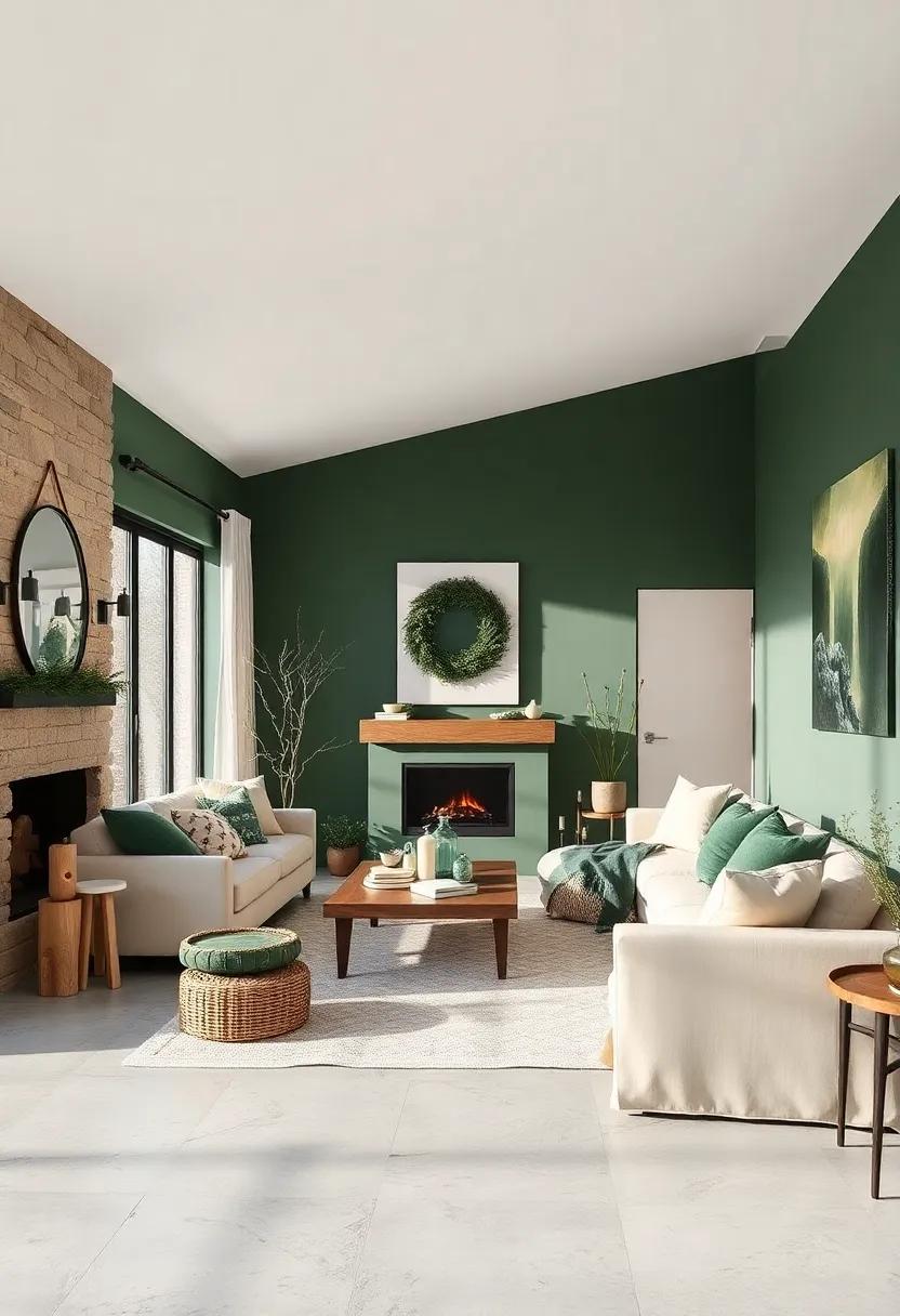
Infuse your living space with the tranquil spirit of an evergreen forest by combining rich forest green hues with soft, creamy ivory shades. This pairing creates an inviting atmosphere reminiscent of a cozy woodland cabin, where the deep green echoes the dense canopy of pine trees and the ivory brings in gentle light and warmth. Ideal for living rooms or bedrooms,this palette balances nature’s depth with subtle comfort,allowing accent pieces like woven throws,rustic wooden furniture,and plush cushions to truly shine.
To enhance the vibe, consider layering textures that mimic natural elements—think chunky knit blankets, velvet upholstery, and ceramic pottery in matte finishes. Small bursts of warm metallics, such as brushed brass lamps or copper candle holders, can add just the right touch of glow without overpowering the serene balance. A simple guide to the color interplay is shown below, helping you to strategize where to place your dominant, secondary, and accent hues within your interior:
| Role | Color | Examples |
|---|---|---|
| Dominant | Forest Green | Feature walls, sofas, rugs |
| Secondary | Creamy Ivory | Walls, curtains, bedding |
| Accent | Burnt Orange / Brass | Throw pillows, lamps, vases |
Warm Terracotta and Sand: Infuse mediterranean warmth through terracotta walls complemented by sandy neutrals
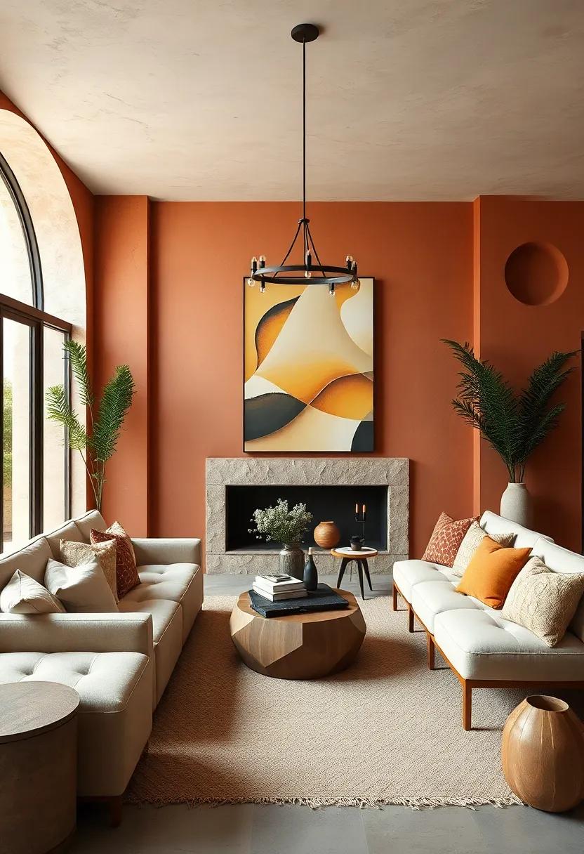
Embrace the sun-soaked charm of the Mediterranean by painting your walls in a deep, warm terracotta hue. This rich earthy tone instantly adds a cozy and inviting atmosphere to any room, making it perfect for those chilly winter months. Paired with sandy neutrals—think soft beiges, creamy ivories, and muted taupes—this palette beautifully balances boldness with calm, creating a space that feels both grounded and luminous. Use sandy tones for larger surfaces like rugs, upholstery, or curtains to soften the intensity of terracotta, allowing the warmth to radiate without overwhelming the senses.
To elevate this cozy combo, incorporate natural textures such as woven baskets, terracotta pots, and rustic wooden furniture. Add accents in muted gold or bronze for a touch of understated luxury that complements the earthen foundation. This palette works wonderfully in living rooms, bedrooms, or kitchens, where the connection to nature and warmth can be fully appreciated. Here’s a quick palette guide to get you started:
| Color | Shade | Recommended Use |
|---|---|---|
| Terracotta | Warm brick red | Feature walls, accent pieces |
| Sandy Beige | Soft sandy taupe | Upholstery, curtains |
| Ivory | Creamy off-white | Trim, ceiling, cushions |
| Muted gold | Antique brass tone | Accessories, fixtures |
Smoky Lavender and Pale Beige: Introduce a subtle twist with smoky lavender tones contrasted by pale beige for softness

Infuse your winter interiors with the unexpected charm of smoky lavender, a hue that balances muted sophistication and subtle intrigue. This gentle purple shade evokes a sense of calm and mystery, perfect for creating cozy nooks and inviting living areas without overpowering the senses. Pairing smoky lavender with a soft, pale beige instantly lightens the palette, adding warmth and an airy touch that feels grounded yet refined. This combination invites relaxing moments by the fireside or quiet mornings with a cup of tea, making your space both stylish and soothing.
- Accent walls: Use smoky lavender to highlight a single wall,enriching the depth of the room.
- Textiles: Incorporate plush throws and cushions in pale beige to soften the stronger purple undertones.
- Natural elements: Complement the palette with wooden furniture in light oak to enhance warmth and balance.
- Lighting: Soft amber lighting enhances the earthy tones and creates an intimate ambiance.
Brick Red and Off-White: Channel rustic charm with brick red hues and clean off-white detailing for balance
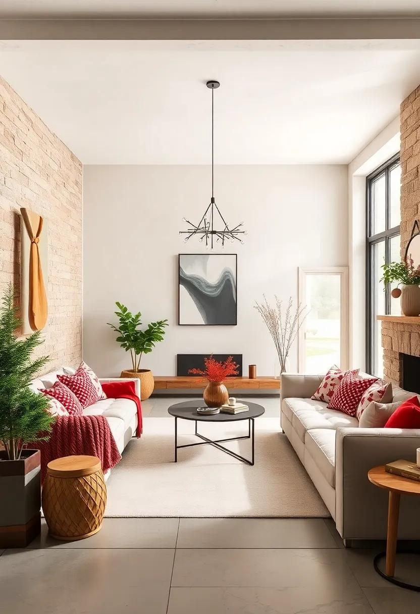
Warm, earthy brick red hues evoke a cozy, rustic ambiance reminiscent of countryside cottages and roaring fireplaces. Combining these rich, reddish tones with crisp off-white accents instantly breathes life into any room—providing a grounded yet refreshed surroundings. Think exposed brick walls paired with soft, linen drapes or brick red cushions resting against off-white sofas. This pairing not only adds warmth but also creates a natural contrast that balance boldness with subtlety,inviting comfort without overwhelming your senses.
To pull off this inviting duo effortlessly, consider layering textures alongside the colors. A few ideas to inspire your winter makeover might include:
- Clay pottery and earthenware in brick red tones
- Light wooden furniture finished in creamy off-white
- Cozy knitted throws and wool rugs with subtle red flecks
- Matte off-white ceramics for table settings
| Design Element | Suggested Material/Item |
|---|---|
| Walls | Brick red accent wall or exposed brick |
| Furnishings | Off-white slipcovers or distressed wood |
| Accessories | Terracotta vases & wool cushions |
| flooring | Neutral jute or sisal rugs |
Steel Blue and Mocha Brown: Cool steel blue meets comforting mocha for a palette that calms yet invites
Imagine a living room where the serene depth of cool steel blue gracefully balances the comforting warmth of mocha brown. This duo works wonders by creating a space that feels both tranquil and inviting—perfect for those chilly winter days when you want your home to offer a gentle embrace. Use steel blue on larger surfaces like walls or sofas to evoke calm and clarity, while mocha brown accents in wooden furniture, throw pillows, or rugs add grounded warmth and richness. Together, these hues foster an ambiance where relaxation and warmth coexist in flawless harmony.
To enhance the effect, layer in textures that mirror the palette’s dual nature: a cozy mocha wool blanket draped over a sleek steel blue velvet armchair, or brushed metal lamps paired with earthy ceramic vases. this balance of cool and warm creates depth and interest without overwhelming the senses.Below is a quick reference table for integrating these colors with complementary neutrals, perfect for styling your space effortlessly:
| Color | Use | Effect |
|---|---|---|
| Steel Blue | Walls, upholstery | Calming, expansive |
| Mocha Brown | Wood accents, textiles | Warmth, grounding |
| Soft Cream | Trim, cushions | Lightness, balance |
Creamy Mustard and Soft Charcoal: This combo sparks retro warmth balanced by moody charcoal undertones
Infusing your space with the richness of creamy mustard creates an inviting warmth that’s instantly reminiscent of vintage charm. This shade, drenched in golden undertones, evokes nostalgic coziness without feeling overwhelmed by brightness. When paired with soft charcoal, a deep and moody gray, the effect is a sophisticated dance of light and shadow that grounds the vibrancy, lending a balance that’s both retro and modern. The charcoal acts as a neutral,but its smoky depth adds a subtle edge that keeps the palette from feeling too saccharine or overly rustic.
To achieve a harmonious look with this combination, incorporate textures and materials that amplify their unique personalities:
- Velvet mustard cushions for plush comfort and color pop
- Charcoal wool throws to add softness and warmth
- Brushed metal accents in muted gold or blackened steel, creating contrast with reflective warmth
- Matte charcoal walls or cabinetry offering a moody yet elegant backdrop
| Element | Color Role | Effect |
|---|---|---|
| Creamy Mustard Upholstery | Accent | Retro warmth & focal highlights |
| Soft Charcoal Walls | Base | Moody depth & balanced atmosphere |
| Gold-Brushed Fixtures | Accent | Luxurious shimmer & nuance |
Walnut Brown and Dusty Rose: Blend rich wood browns with muted rose to achieve understated elegance
Infuse your living area with a gentle warmth by pairing the deep, organic tones of walnut brown with the soft blush hues of dusty rose. This palette strikes a perfect balance between grounded naturalism and delicate femininity, giving your space an effortlessly sophisticated vibe.Walnut’s rich, chocolatey depth brings a luxurious texture to wooden furniture and flooring, while dusty rose subtly hints at romance and softness without overpowering the room.Together, they create a serene atmosphere that’s inviting yet refined — ideal for cozy nooks, elegant dining rooms, or tranquil bedrooms.
To maximize this duo, consider layering in tactile fabrics like velvet cushions or linen curtains in dusty rose to complement walnut’s sleek, polished surfaces.accentuate with brass hardware or soft gold accessories to add a warm metallic glow that highlights both colors’ richness. For a harmonious touch, throw in neutral creams and muted greys to keep the overall look airy and balanced, preventing heavier browns from dominating. It’s a timeless combination that feels both contemporary and classic, perfect for those seeking understated elegance during the colder months.
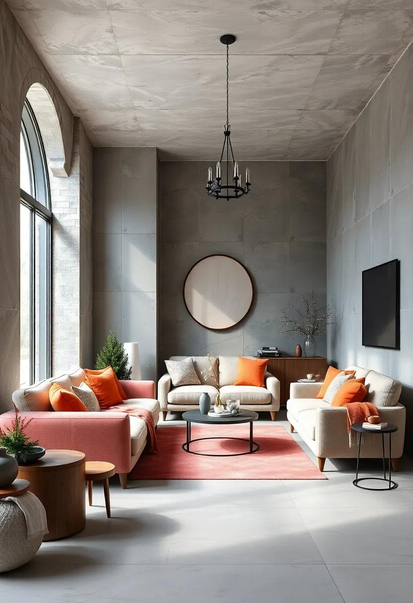
Icy Mint and Warm Gray: Cool mint greens refresh while warm grays prevent a sterile feel, perfect for layered coziness

Mint green carries a breath of fresh air through your interiors—all the crispness of a cool winter morning without the bite. Its delicate, icy tone energizes your space while remaining soft enough to blend seamlessly with richer hues. Pairing it with a spectrum of warm gray shades grounds this airy palette, avoiding the clinical chill that often haunts lighter colors. Think plush charcoal sofas or taupe wool throws placed alongside minty accent pillows or frosted glass vases, creating a harmonious balance between invigorating and inviting.
Layering texture is essential here to amplify the cozy vibe. Consider mixing velvet cushions and knitted blankets in various shades of gray and pale green to add depth and tactile warmth. Below is a quick guide to integrating this palette through materials and finishes:
| Element | Suggested Finish | Visual Impact |
|---|---|---|
| Walls | Matte warm gray paint | Soft backdrop, prevents starkness |
| textiles | Velvet & chunky knits in mint & gray | Inviting texture & layered warmth |
| Accents | Mint ceramic pottery or glass | Fresh pops of cooling color |
| Furniture | wood with warm undertones | Adds organic coziness & contrast |
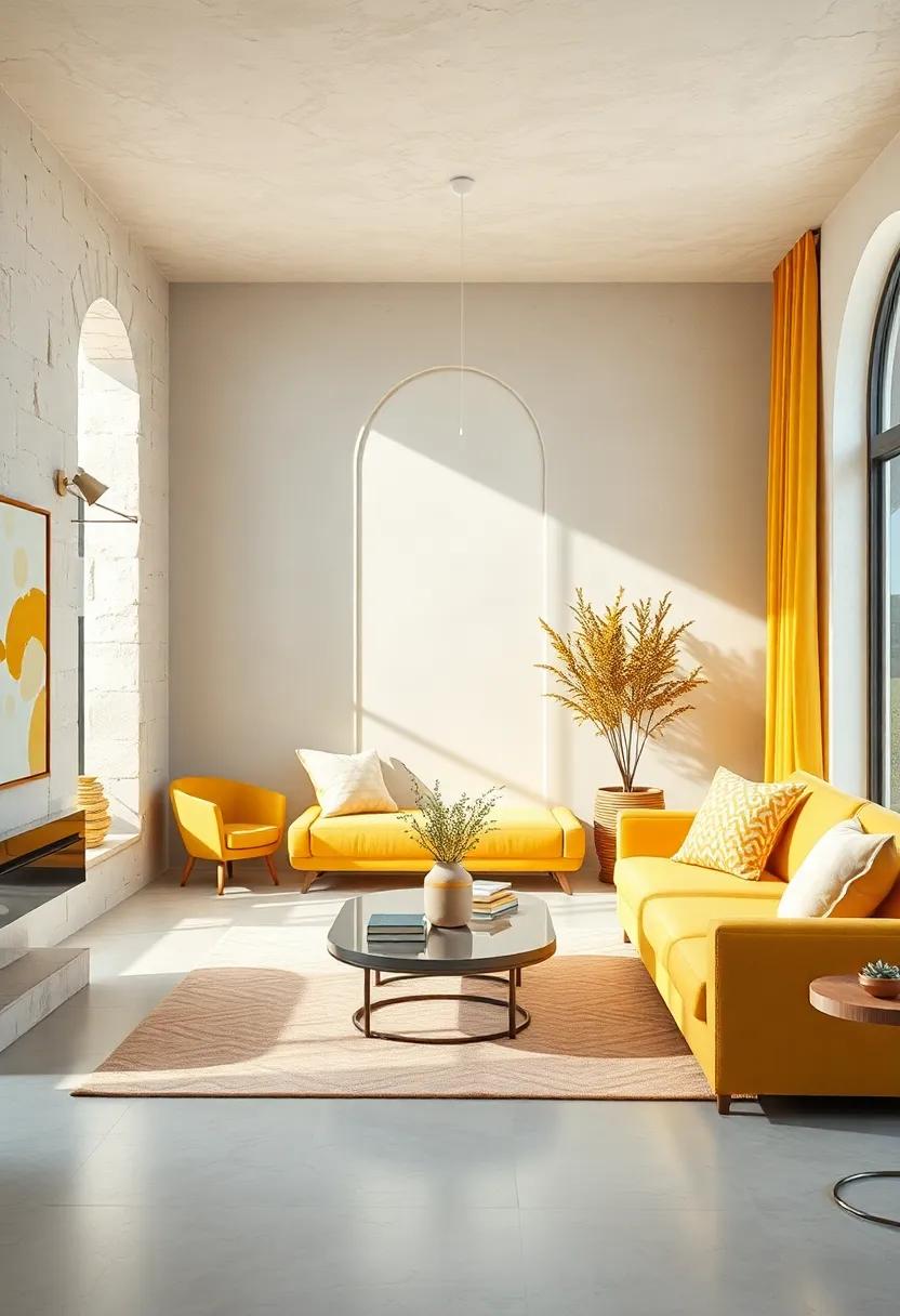
Goldenrod Yellow and Soft White: Radiate sunshine indoors with goldenrod highlights softened by ivory hues
Goldenrod yellow acts as a vibrant spark, injecting rooms with a cheerful glow that mimics the gentle warmth of winter sunshine. When paired with soft white tones reminiscent of freshly fallen snow, it creates a delicate balance—shining yet soothing. This palette invigorates living spaces without overwhelming the senses, making it ideal for cozy reading nooks, kitchens, or sunrooms where natural light is limited during colder months.
- Use goldenrod accent pillows or throws on soft white sofas for a subtle pop.
- Incorporate ivory ceramics and light wood furniture to enhance warmth.
- Add botanical prints or dried flowers in muted yellows to celebrate nature indoors.
| element | Recommended hue |
|---|---|
| Walls | Soft ivory (#FDF6E3) |
| Accent Details | Goldenrod yellow (#DAA520) |
| Textiles | Creamy White (#FFFDD0) |
Heather Gray and Blush Peach: Combine quiet grays with gentle peach to soften winter interiors with subtle color
Bring a serene yet inviting atmosphere to your winter interiors by pairing heather gray with blush peach accents. The quiet sophistication of heather gray provides a calming foundation, ideal for walls, large furniture pieces, or textured throws.This muted shade becomes the perfect backdrop, allowing the gentle warmth of blush peach to subtly awaken the space without overpowering it. Think plush cushions, soft curtains, or elegant vases that add delicate bursts of color, creating a harmonious balance between cool and warm tones.
To maximize this palette’s cozy appeal, integrate natural materials and soft fabrics that emphasize texture alongside the colors. Consider:
- Heather gray wool rugs or knitted throws
- Blush peach silk or linen cushions
- Light wood furniture to amplify warmth
- Matte metallic accents in rose gold or brushed brass for subtle shimmer
| Element | Color | Effect |
|---|---|---|
| Walls | Heather Gray | Calm,Neutral Base |
| Soft Furnishings | Blush Peach | Warmth & Softness |
| Accessories | Rose Gold | delicate Shine |
Mahogany and Cream Gold: Deep mahogany wood tones meet creamy gold accents for a regal and warm atmosphere
Rich and enveloping,this palette marries the deep,luxurious hues of mahogany wood with the soft glow of creamy gold accents,creating an ambiance that feels both elegant and inviting. Imagine thick,woven throws in warm mahogany shades draped over plush cream sofas,while brass lamps shine golden halos across rustic wooden floors. This combination not only reflects warmth but also adds an undeniable sense of sophistication, making it ideal for living rooms and dens where comfort meets class.
- Wall treatments: Deep mahogany paneling or wallpaper with subtle gold flecks
- Textiles: Velvety cushions and curtains in cream and gold tones
- Furniture: Solid wood pieces with polished mahogany finishes complemented by golden fixtures
- Accessories: gold-framed mirrors, candleholders, and vases to catch the light
| Element | Recommended Shade | Texture |
|---|---|---|
| wood | Rich Mahogany | Polished & Smooth |
| Accent | Creamy Gold | Metallic & Soft |
| Upholstery | Warm Beige | Velvet |
Soft Coral and Taupe: Brighten your space with a soft coral splash anchored by grounding taupe shades
Inject a breath of fresh air into your winter interiors with the delicate dance between soft coral hues and timeless taupe undertones.The gentle blush of coral brings warmth and cheer without overwhelming the senses, creating a subtle yet uplifting ambiance perfect for cold days. Anchoring this brightness,taupe’s earthy neutrality offers balance and depth,making your space feel grounded and inviting. Whether it’s through plush throws, accent pillows, or painted walls, this harmonious duo embraces sophistication while maintaining a cozy, lived-in vibe.
- Soft Coral: Think blushy pinks with a hint of orange to brighten corners and add a cheerful touch.
- Taupe: A versatile base color that complements coral’s vivacity with calming, muted beige and gray tones.
- Texture Tips: Incorporate velvets and nubby linens to amplify warmth and tactile appeal.
- Accents: Use bronze or brushed gold finishes to subtly enhance the richness of the palette.
| Element | Color Shade | Effect |
|---|---|---|
| Walls | Taupe Gray | Creates a neutral, calming backdrop |
| Accent wall | Soft Coral | Brightens the room with subtle warmth |
| Textiles | Coral Blush | Adds cozy, tactile interest |
| Metallic Accents | Brushed Gold | Enhances warmth and depth |
Eggplant and Beige Linen: Rich purples paired with neutral linens create a sophisticated yet inviting environment

elevate your winter interiors by blending the deep, regal tones of eggplant with the understated warmth of beige linen.This palette strikes a lovely balance between opulence and comfort, making any space feel both luxurious and approachable. Imagine plush eggplant velvet cushions nestled on soft, beige linen sofas, accented by natural wood details and subtle brass fixtures—this contrast effortlessly transforms rooms into havens of elegance without sacrificing coziness.
to fully embrace this pairing, consider layering textures and finishes. Linen’s breathable, tactile surface softens the intensity of eggplant’s rich hue, while incorporating accessories like chunky knit throws, woven rugs, or ceramic vases in muted tones adds dimension without overwhelming the senses. Below is a simple guide to harmonize these colors throughout your space:
| Element | Suggested Color/Material | Effect |
|---|---|---|
| Upholstery | Beige Linen | Neutral base,tactile warmth |
| Accent Pillows | Eggplant Velvet | Rich color pop,plush texture |
| Rugs | Natural jute or wool in soft beige | Earthy grounding,textural layering |
| Decor | Matte gold or antique brass | Understated glamour |
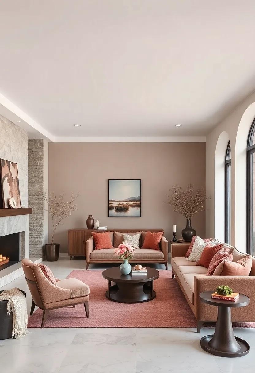
Warm Gray and Terracotta Pink: Earthy terracotta pinks animated by soothing warm grays bring balanced warmth

Imagine a cozy living room where the rich,earthy hues of terracotta pink gently embrace the space,softened perfectly by the presence of warm gray tones. This palette invites comfort and calm,creating an ambiance that feels both inviting and grounded. The muted warmth of terracotta pinks resonates with natural elements—think clay pots and sunbaked bricks—while warm grays act as a serene canvas that highlights the vibrancy without overwhelming it. Together,these shades craft an environment that’s not only visually appealing but also emotionally soothing,perfect for chilly winter days when wrapping up in softness matters most.
To bring this balance into your interiors, consider mixing textural contrasts and materials that complement the palette’s organic feel:
- Velvet cushions in terracotta pink for tactile warmth
- Wool throws in varying warm gray shades to add layers of comfort
- Natural wood furniture with reddish undertones to echo the earthy vibe
- Matte ceramic planters or vases in muted terracotta hues
| Color | Hex Code | Best Use |
|---|---|---|
| Terracotta Pink | #D99075 | accent walls, throw pillows |
| Warm Gray | #A69F98 | Large furniture, rugs |
| Soft Cream | #F7F3E9 | Ceilings, trim |
Cream and Walnut Accents: Keep things classic with creamy walls accented by deep walnut furnishings for cozy simplicity
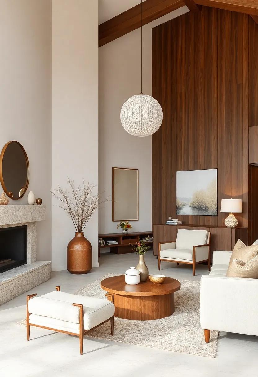
Embrace the timeless charm of creamy walls that offer a soft, neutral backdrop perfect for any room seeking warmth without overwhelming the senses. These gentle hues invite natural light to bounce around, creating an airy yet snug atmosphere that’s ideal for winter months. Pairing this soothing palette with deep walnut furnishings introduces an elegant contrast that grounds the space, mixing cozy warmth with classic sophistication. Whether it’s a walnut coffee table with rich grain or a plush armchair framed in dark wood, these accents reinvigorate the simplicity of the walls and bring a tactile, organic texture into the mix.
To enrich this palette further, consider layering with subtle accessories in shades of muted gold or soft beige, enhancing the understated luxury without cluttering the eye. This combination is perfect for creating inviting living rooms or bedrooms where calm meets comfort. Here’s a quick guide to key elements that work beautifully with this style:
- Textiles: Cashmere throws, linen curtains, and wool rugs in neutral tones
- Lighting: warm-toned table lamps or amber-hued pendant lights
- Decor: Ceramic vases, brass accents, and nature-inspired artwork
| Element | Color/Material | Effect |
|---|---|---|
| walls | Creamy White | Brightens and softens the space |
| Furniture | Walnut Wood | Adds rich texture & warmth |
| Textiles | Beige, Gold | Enhances cozy sophistication |
Future Outlook
As the chilly months settle in, wrapping your interiors in the right colors can transform any space into a comforting haven. Whether you’re drawn to deep, rich hues or soft, muted tones, these 24 winter color palettes offer something to inspire every style and mood. So go ahead—embrace the season by infusing your home with warmth and personality,one shade at a time. Your cozy retreat awaits.
As an Amazon Associate I earn from qualifying purchases.