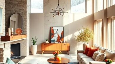
Embrace Warmth: Cool and Cozy Winter Color Palettes to Transform Your Interiors
As winter’s chill settles in, our living spaces become more than just shelters—they transform into havens of comfort and style. Embracing the season’s unique charm means surrounding ourselves with colors that evoke warmth and serenity, balancing the cool crispness outside with a cozy refuge within. “” explores the art of blending soothing hues and rich tones to create interiors that invite relaxation and reflect the quiet beauty of winter. Whether you seek subtle elegance or bold contrasts, discover how thoughtfully chosen colors can redefine your home’s atmosphere throughout the colder months.
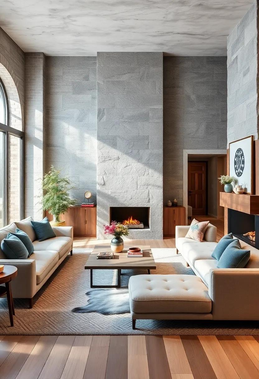
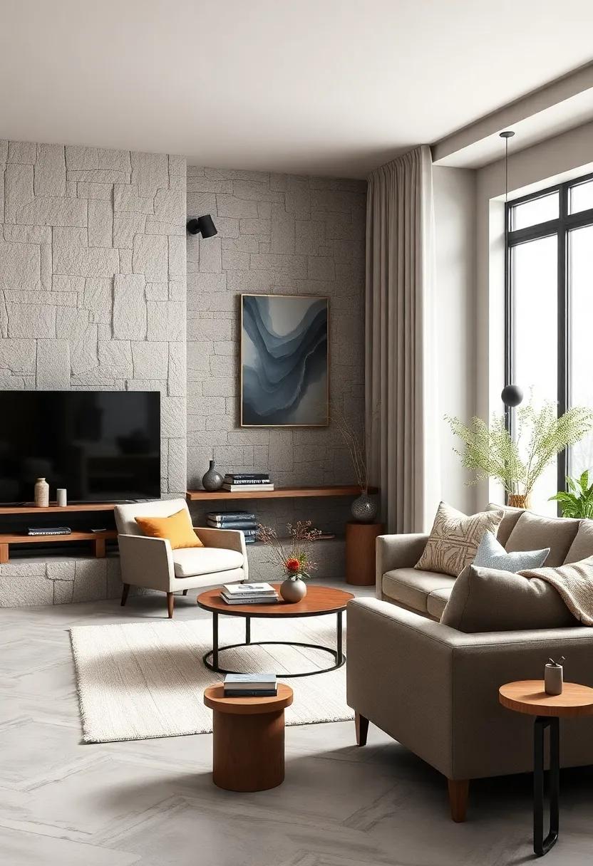
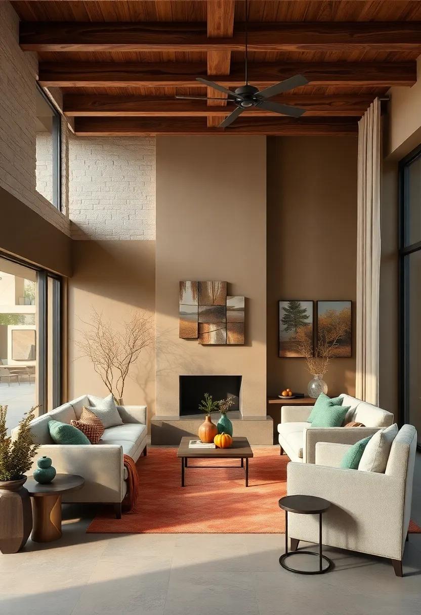
Embracing Soft Neutrals and Earthy Browns to Create a Warm Inviting Winter Sanctuary
Harnessing the subtle charm of soft neutrals combined with rich earthy browns creates a comforting cocoon that feels both grounded and elegant during the colder months. Imagine curling up in a space where linen, taupe, and sandy beige walls meet deep chestnut and walnut accents—this color marriage naturally invites warmth without overwhelming the senses. These hues work harmoniously to reflect natural light, making any room feel cozy yet open, perfect for those long winter evenings spent with a book or good company.
To cultivate this welcoming ambiance, consider integrating:
- Textured throws and cushions in camel and oatmeal wool
- Rattan or wooden furniture with a matte finish to enhance tactile warmth
- soft ambient lighting with amber or soft white bulbs to deepen the brown hues
- Natural elements like dried pampas grass or woven baskets for added earthiness
| Color | Affect | Best Used In |
|---|---|---|
| Warm Taupe | Creates a calming, neutral base | Walls, rugs, curtains |
| Chestnut Brown | Adds richness and depth | Accent furniture, pillows |
| Soft Cream | Brightens and balances darker hues | Throws, lampshades, bedding |
Layering Deep Jewel Tones with Warm Metallic Accents for Luxurious Seasonal Interiors
infuse your living space with the rich allure of deep jewel tones like emerald, sapphire, and amethyst, which evoke a sense of opulence and warmth during the colder months. These colors serve as a breathtaking backdrop when layered thoughtfully, creating a visual depth that invites comfort and elegance. Elevate these hues with warm metallic accents—think brushed golds, antique coppers, and burnished bronzes—that shimmer subtly, catching light and adding a glowing richness.The interplay between the cool intensity of jewel tones and the inviting warmth of metallics crafts a balanced, luxurious ambiance ideal for cozy retreats or elegant gatherings alike.
To seamlessly incorporate this palette, consider combining textured fabrics like velvet or silk in saturated colors with metallic accessories such as lamps, trays, or picture frames. Use these pieces to punctuate your rooms without overwhelming them. Incorporating natural materials like dark wood and leather alongside this palette brings grounding earthiness, offering an organic complement to the jewel and metal duo. Below is a simple guide to mix and match tones and accents effectively:
| Jewel Tone | Warm Metallic Accent | Material Suggestion |
|---|---|---|
| Emerald Green | Brushed Gold | Velvet Cushions |
| Sapphire Blue | Antique Copper | metallic Lamps |
| Amethyst Purple | Burnished Bronze | Decorative Trays |
- Balance textures: Mix matte and glossy surfaces for dynamic layering.
- Strategic pops: Use metallic accents sparingly to highlight key areas.
- Natural complement: Add earth tones and materials to soften jewel vibrancy.
Integrating Frosty Blues and Cool Grays to Balance Warm Wood Elements in Your Living Spaces
When incorporating warm wood accents into your living space, the key to achieving a harmonious balance lies in the subtle introduction of frosty blues and cool grays.These colors act as calming counterpoints, softening the natural warmth of wood while adding depth and sophistication. Imagine a plush, cool-gray rug beneath a honey-toned oak coffee table or delicate frosted-blue cushions resting against a walnut sofa. Such pairings invite a serene ambiance that feels both fresh and inviting, evoking the tranquility of a winter morning without sacrificing coziness.
To master this balance, consider layering textures and shades with intention. Here are a few design approaches that effortlessly tie the cool and warm elements together:
- Textile Layers: Mix wool throws in steel gray with velvet cushions in pale blue to add contrast and tactile interest.
- Wall Accents: Opt for frosty blue accent walls or cool gray wallpaper with subtle patterns to provide a muted backdrop for wooden furniture.
- Metallic Highlights: Incorporate silver or brushed nickel fixtures to enhance the cool palette while complementing wood grains.
The interplay between these hues can also be visualized in this simple palette guide:
| Element | Color | Effect |
|---|---|---|
| Wood Furniture | Warm Honey / Walnut | Foundation of warmth and natural texture |
| Soft Furnishings | Frosty Blue | Soothing contrast and visual calm |
| Walls | Cool Gray | Neutral canvas that enhances warmth |
| Accents | Brushed nickel / Silver | Light-reflecting cool touches for balance |
Blending Creamy Whites and Burnt Orange Hues for a Cozy Fireside Ambiance
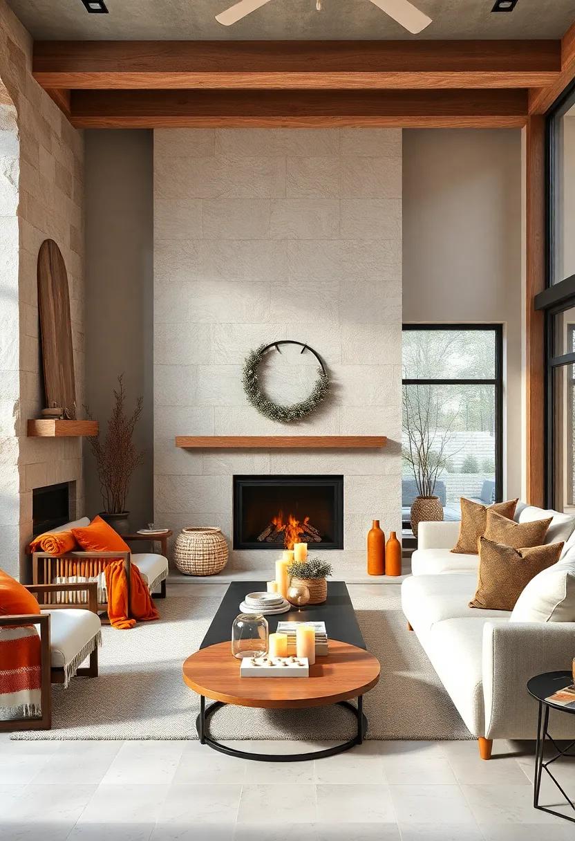
Infusing your living space with the delicate charm of creamy whites paired with the deep, inviting glow of burnt orange creates an ambiance that feels both luxurious and comforting. These tones work in harmony to evoke the warmth of a flickering fire, inviting you to linger longer in cozy nooks scattered throughout your home. Soft, textured fabrics in eggshell and ivory provide the perfect backdrop, allowing vivid splashes of burnt orange—from plush cushions to handwoven throws—to catch the eye and ignite the senses. this palette strikes a beautiful balance,blending neutrality with bursts of fiery energy that transform interiors into intimate retreats.
To master this look, consider layering:
- Velvety creams and off-whites on walls and larger furnishings for a light, airy feel.
- Burnt orange accents in decorative items,such as ceramic vases or patterned rugs,to add depth.
- Natural materials like weathered wood or woven wicker that anchor the space with rustic charm.
| Element | Recommended Shade | Texture suggestion |
|---|---|---|
| Wall paint | Creamy Ivory | Matte finish |
| Accent fabric | burnt Orange | Soft velvet or wool |
| Furniture | neutral woods | Rough-hewn or polished |
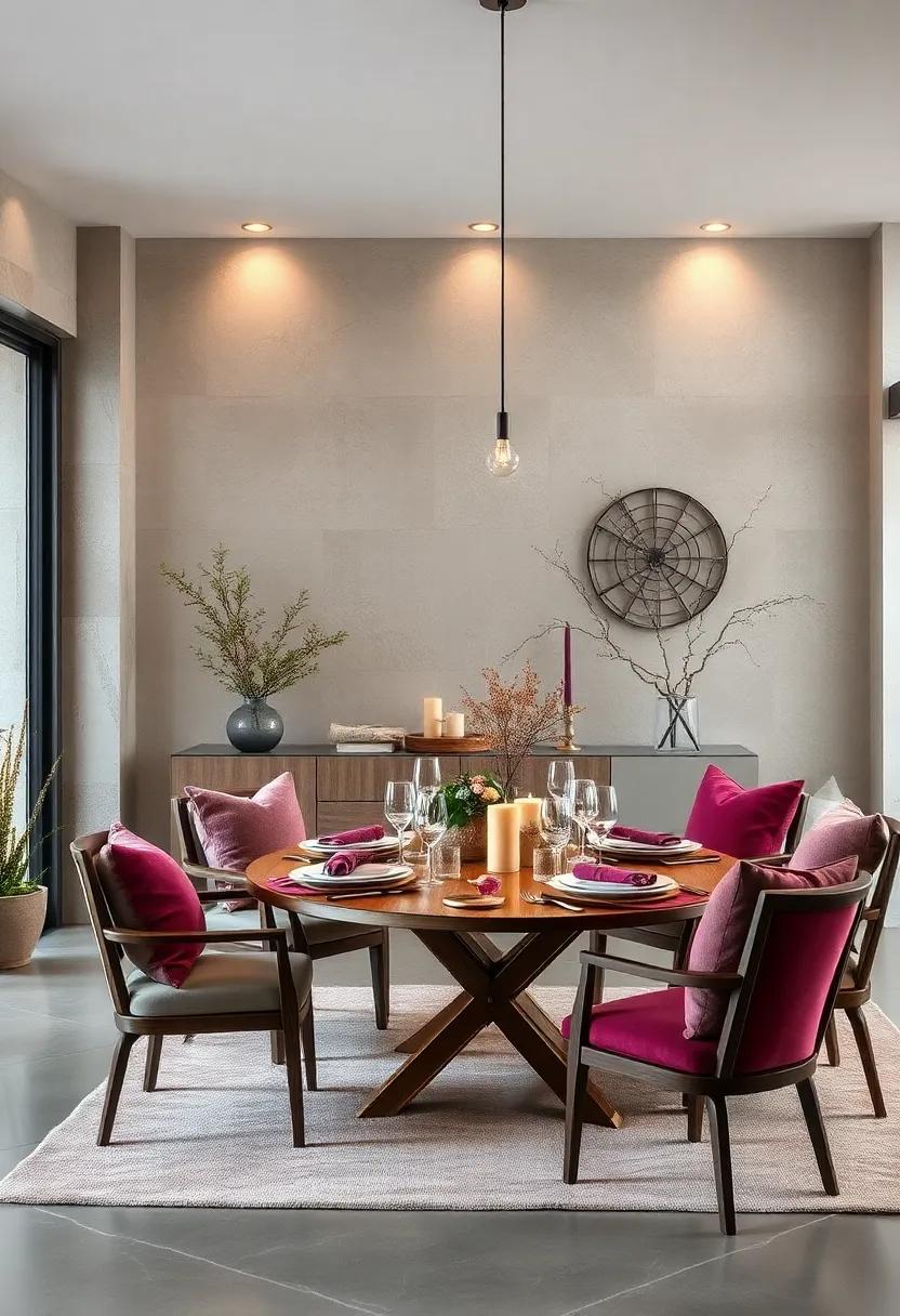
Rich Burgundy and dusty Rose Palette Enveloping a Romantic Winter Bedroom Setting
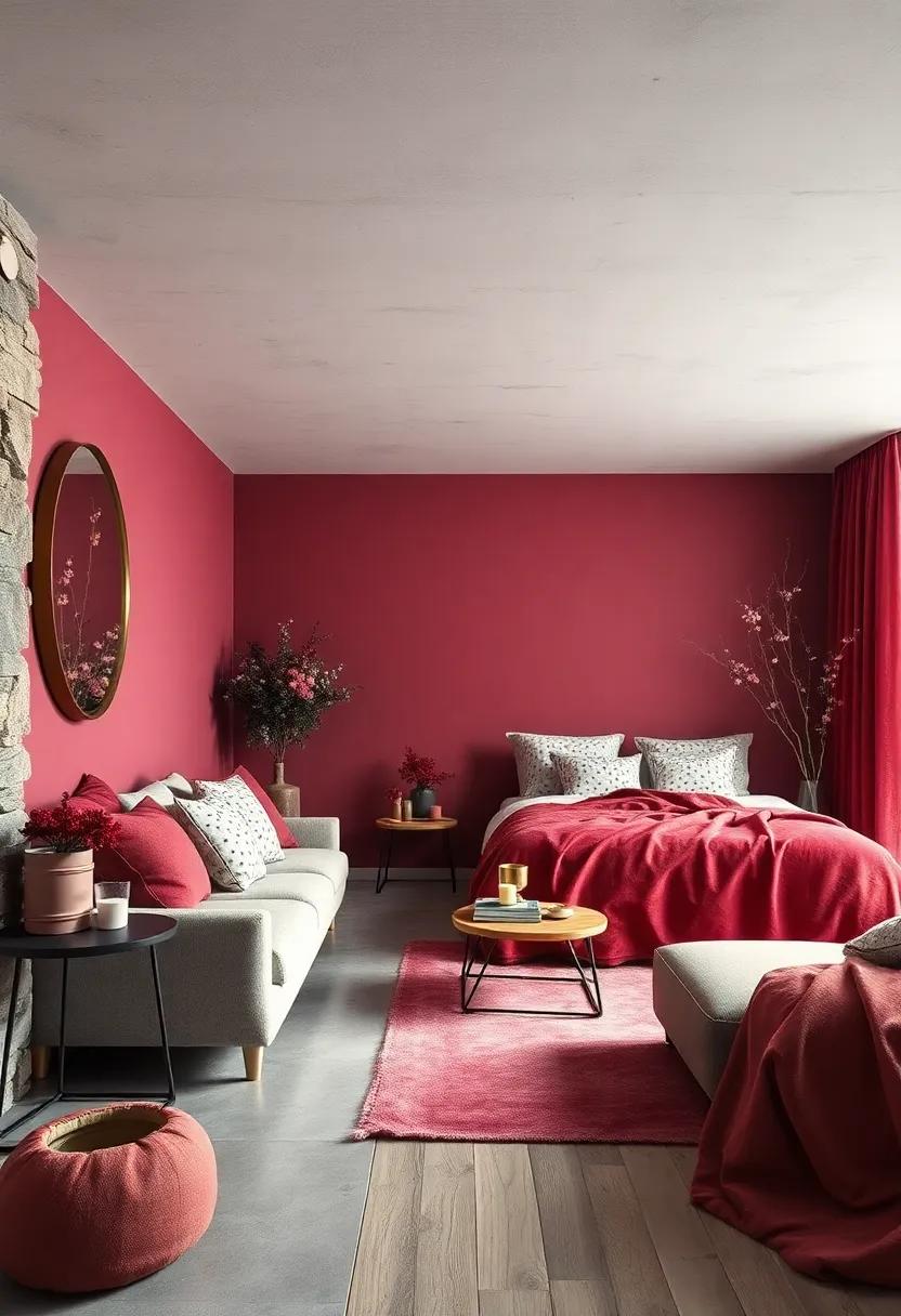
Immerse yourself in a sanctuary of comfort where the deep allure of rich burgundy converges with the soft whisper of dusty rose to evoke a timeless romance. This intimate pairing crafts a layered, sumptuous atmosphere perfect for the winter months. The warmth of burgundy, with its velvety depth, acts as a dramatic backdrop, while dusty rose adds an air of delicate softness—together enveloping your bedroom in a cocoon of cozy elegance.introduce this palette through plush velvet throws, silk cushions, and textured wall art to create tactile contrast that invites your senses to linger.
To balance the intensity while maintaining visual harmony, consider integrating these complementary elements:
- Antique brass accents: light fixtures or drawer handles to add warm metallic glows
- Creamy ivory linens: softening the rich hues and keeping the space airy
- Natural wood tones: furniture with deep cherry or walnut finishes to enhance the palette’s earthy vibe
- subtle floral patterns: incorporating dusty rose in wallpaper or throw pillows for gentle romantic hints
| Element | Color/Material | Effect |
|---|---|---|
| Velvet Throw | Burgundy | Rich warmth & texture |
| Accent Pillow | Dusty Rose | Soft romantic accent |
| Bedside Lamp | Antique Brass | Warm metallic glow |
| Wooden Bed Frame | walnut | Earthy grounding tone |
Combining Muted greens and Warm Mustard Tones for a Retro Inspired Winter Vibe
Harness the nostalgic charm of retro aesthetics by blending muted greens with warm mustard tones, creating a winter palette that feels both inviting and timeless. Muted greens,reminiscent of frosted evergreens and mossy textures,bring a gentle coolness to your space,while the rich,golden hues of mustard introduce a cozy glow that mimics the flicker of candlelight. Together, they evoke memories of vintage armchairs, woolen throws, and soft velvet cushions—elements that make a room feel lived-in and cherished throughout the chilly season. To emphasize this synergy, incorporate natural materials like aged wood and brushed metals, which amplify the warmth and depth inherent in these colors.
When styling your interiors with these hues,consider balancing textures and contrasts to keep the look modern yet inviting. Softer fabrics in mustard yellows can be paired with matte ceramic vases in muted green shades, while patterned wallpaper or rugs featuring geometric retro motifs tie the palette together with subtle complexity. Below is a fast guide to mixing these tones effectively within your space:
| Element | Muted Green | Warm Mustard |
|---|---|---|
| Walls | Soft sage green paint | Accent stripes or trims |
| Furniture | Velvet armchairs or ottomans | Wool cushions or throws |
| Decor | Ceramic pots & vases | Brass candle holders |
| Pattern | Leaf motifs or abstract prints | geometric designs |
- Contrast softly: Avoid stark differences; aim for harmonious blending between the tones.
- Bring in nature: Evergreen branches or dried flowers complement this palette beautifully.
- Light it well: Warm lighting enhances mustard hues and softens muted greens.
Using Warm Taupe and Slate Gray to Build a Minimalist Winter Palette with Comfort
In minimalist winter interiors, warm taupe acts as the perfect neutral foundation that radiates subtle warmth without overwhelming the space. This muted, earthy tone envelops a room with a gentle embrace, setting a tranquil backdrop that complements colder months beautifully. When paired thoughtfully with the deep,smoky presence of slate gray,the combination creates a harmonious balance between warmth and coolness. slate gray introduces a sleek, modern edge, anchoring the palette and adding depth without sacrificing coziness. Together,these colors foster an atmosphere that feels uncluttered yet inviting,perfect for calming winter retreats.
To maximize the effect, create layers of texture and form by incorporating natural fabrics and materials that resonate with these hues:
- Wool throws and velvet cushions in taupe shades soften hard surfaces and enhance tactile warmth.
- Slate gray ceramics and matte metals provide understated sophistication and contrast.
- Light wood finishes gently uplift the palette and prevent it from becoming too somber.
this intentional layering amplifies comfort while maintaining clarity and simplicity—a hallmark of minimalist design. Below is a quick reference to help visualize the palette’s key elements:
| Element | Material | Color Tone |
|---|---|---|
| throw Blanket | Cashmere | warm Taupe |
| Floor Rug | Wool | Slate Gray |
| accent Vase | Ceramic | Slate Gray Matte |
| Side Table | Light Oak Wood | Natural Wood Tone |
Warm Feathers and Plush Fabrics Paired with Soft Pastels for a Hygge Winter Retreat
Imagine stepping into a space where every touch invites comfort and serenity. The combination of warm feathers—think of fluffy down pillows and plush throws—and irresistibly soft fabrics like velvet or chenille creates a tactile harmony that soothes the senses. Pair these textures with a palette of soft pastels, such as muted lavender, powder blue, and gentle blush, to balance warmth with lightness. This contrast not only brightens your winter retreat but wraps it in a quiet, calming embrace reminiscent of the hygge beliefs. It’s about crafting a living environment that feels like a gentle hug after a frosty day.
To layer this cozy yet airy atmosphere, consider integrating natural accents such as driftwood, woven baskets, and candles with subtle scents like vanilla or pine. Soft pastel hues work beautifully on walls, cushions, and rugs, serving as a delicate backdrop that lets warm textiles and fixtures shine. below is a quick reference to blend plush coziness with pastel serenity effectively:
| Texture | Pastel Shade | Decor Idea |
|---|---|---|
| Feather Pillow | Blush Pink | Layered on soft gray sofas |
| Velvet Throw | Powder Blue | Draped over a wooden armchair |
| Chenille Rug | Muted Lavender | Placed beneath a minimalist coffee table |
- Mix textures to add depth—feathers, velvet, and chenille bring warmth and visual interest.
- Choose pastels that feel soft and inviting rather than stark or overly shining.
- Incorporate natural elements to ground the light palette and add hygge-inspired coziness.
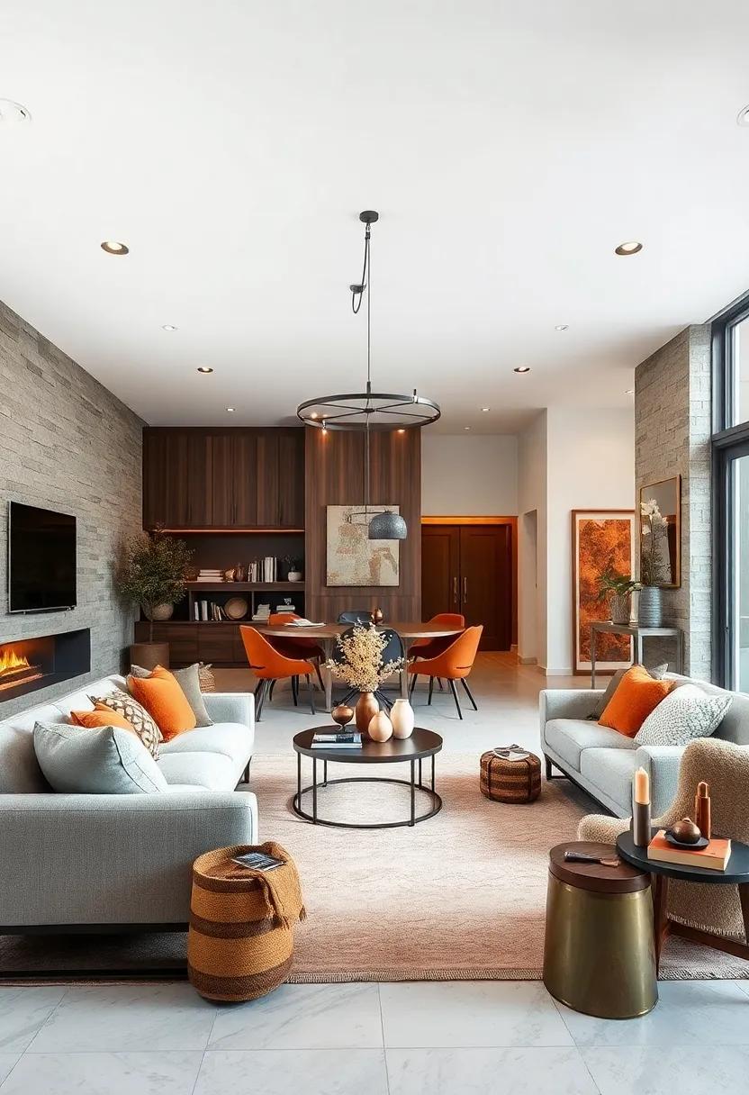
Cinnamon and Chestnut Accents Highlighting Rustic Charm in Modern Open Plan Homes
Incorporating cinnamon and chestnut hues into modern open plan homes introduces a captivating blend of rustic charm with contemporary design. These rich, earthy tones act as grounding elements, bringing warmth and texture that softly contrast with sleek lines and minimalist furniture. Think of textured chestnut wooden beams, cozy cinnamon-hued textiles, or accent walls painted in warm spice shades—each detail creates an inviting depth without overwhelming the airy openness that defines modern living spaces.
To achieve a balanced look, layer complementary elements such as:
- Soft cream walls to keep spaces light and breathable
- Matte black metal fixtures adding a modern edge
- Natural linen curtains weaving in subtle warmth and softness
- Terracotta pots and rustic ceramics for authentic artisanal touches
Together, these accents build a coherent story of warmth and sophistication, inviting you to experience comfort without sacrificing a clean, modern aesthetic.
| Element | Effect | Ideal Placement |
|---|---|---|
| Cinnamon Throw Pillows | Adds cozy pops of color | living room sofa |
| Chestnut Wood Flooring | creates natural warmth | Main living area |
| rustic Light Fixtures | Balances modern and rustic | Dining space |
Vivid Scarlet and Smoky Charcoal Contrasts Framed by Soft Wool Textures in the Living Room
Inject bold energy into your living space by juxtaposing vivid scarlet accents with the deep, grounding presence of smoky charcoal. this dynamic pairing awakens any room, creating a compelling visual narrative that balances passion with calm. Think plush scarlet throw pillows resting against charcoal sofas or an abstract crimson artwork framed by velvety charcoal walls. The resulting contrast is not just striking—it invites warmth amid the cooler winter days, making your living room both inviting and energized.
To soften these intense hues, incorporate layers of soft wool textures that add tactile comfort and subtle elegance. Woolen blankets, cushions, and area rugs in muted greys and off-whites serve as perfect counterpoints, diffusing the bold colors while enhancing coziness. Consider the following wool textural elements to bring this look together:
- Chunky knit wool throws
- Handwoven woolen cushions with subtle patterning
- Layered wool rugs with a plush finish
| Feature | Scarlet Elements | Charcoal & Wool Elements |
|---|---|---|
| Furniture | Scarlet accent chairs | Charcoal wool sofas |
| Textiles | Scarlet cushions | Gray wool throws & rugs |
| Decor | Crimson vases & artwork | Soft grey wool wall hangings |
Golden Amber and Deep Olive Shades Invoking Autumn’s Last Embrace in Cozy Interiors
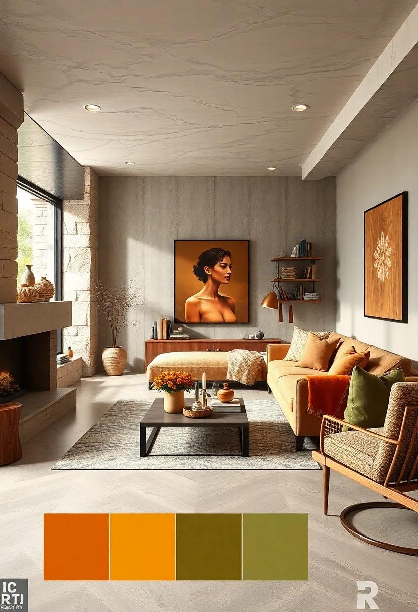
Infusing your living spaces with golden amber and deep olive tones creates an inviting sphere where the final whispers of autumn linger warmly. These hues blend seamlessly to evoke a rich natural tapestry, reminiscent of sun-dappled leaves and forest floor mysteries. By integrating plush throws or velvet cushions in these colors,you introduce a tactile coziness that invites relaxation and long,contemplative evenings by the fireplace. The warmth of amber acts as a gentle glow under soft lighting, while olive grounds the palette with its earthy depth, offering a balanced yet vibrant foundation for any cozy interior.
Consider layering textures and materials alongside these shades to maximize their impact.Pairing amber-painted walls with deep olive accents in furnishings or rugs, complemented by natural wood elements, enhances the feeling of autumn’s lingering embrace. use the following guide for easy inspiration:
- Accent Pillows: Deep olive velvet or corduroy
- Wall Art: Landscapes with amber highlights
- Throws: Chunky amber knits or plaid patterns
- decorative Vases: Matte olive ceramics
| Element | Recommended Material | Impact |
|---|---|---|
| Throw Blanket | Wool Knit (Amber) | Softens space, adds warmth |
| Accent Chair | Velvet Upholstery (Deep Olive) | creates visual anchor, cozy seating |
| Area Rug | Jute with Amber & Olive Weave | Textural grounding |
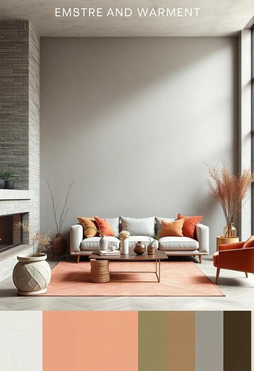
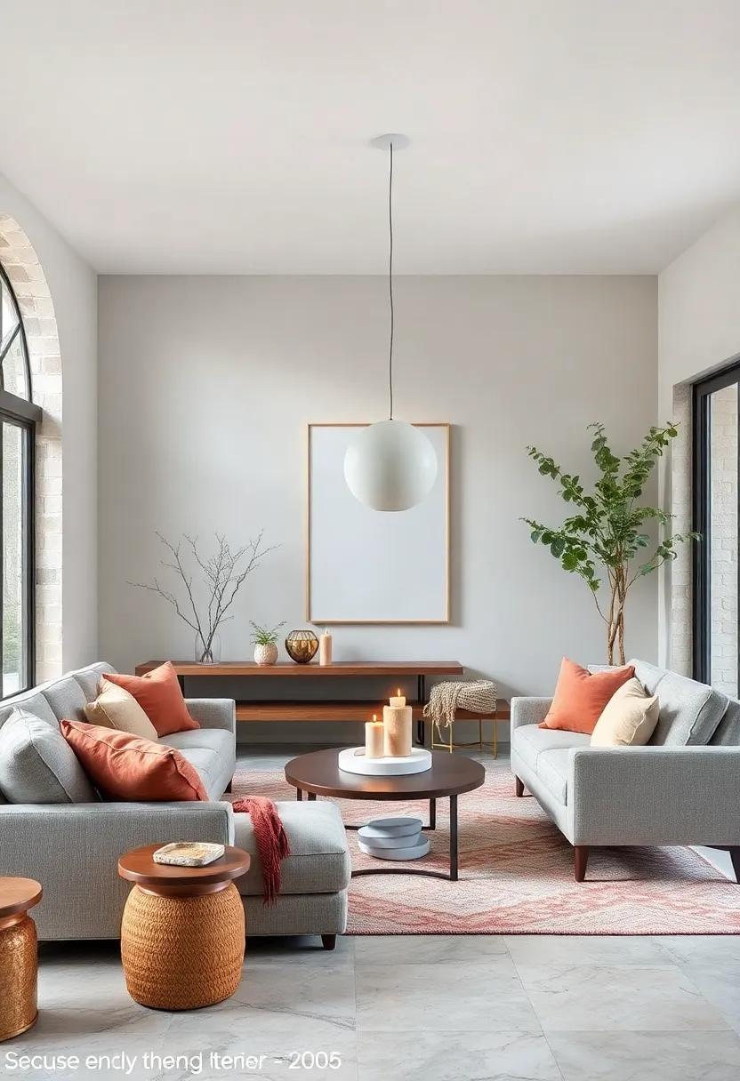
snowy White Walls Enhanced by Coral and Terracotta Furnishings for a Seasonal Pop
Brightening up your living space with crisp, snowy white walls creates the perfect canvas for injecting warmth and character during chilly months. By introducing coral and terracotta furnishings, you create a lively contrast that breathes enthusiasm into every corner. These earthy tones,with their subtle orange undertones,evoke a sense of cozy fireside comfort while keeping the ambiance fresh and inviting. Think plush coral throw pillows, terracotta ceramic vases, or rustic armchairs that invite you to unwind and soak up the snug atmosphere.
Key benefits of adding coral and terracotta accents:
- Warmth: These hues naturally bring a sense of heat and coziness.
- Versatility: They complement a variety of design styles,from modern minimalist to bohemian chic.
- Visual Interest: they add depth and texture without overwhelming a light backdrop.
| Furniture Piece | Ideal Coral/Terracotta shade | Suggested Material |
|---|---|---|
| Accent Chair | Burnt terracotta | Suede or leather |
| Throw Pillows | Soft Coral | Linen or Cotton |
| Rug | Muted Terracotta | Wool or jute |
Warm Sandstone and Muted Teal Infused Spaces Creating Cool Yet Cozy Winter Vibes
Infusing interiors with the rich tones of warm sandstone creates an inviting foundation that radiates subtle heat and earthiness throughout your space. This tone, reminiscent of sun-kissed desert rocks, works beautifully as a primary wall color or in textured décor elements like cushions and rugs. When paired with muted teal, a calm, oceanic hue, the combination achieves a harmonious balance—melding warmth with a whisper of cool sophistication. This palette draws the eye and soothes the spirit, perfect for a winter sanctuary where softness meets style without overwhelming the senses.
To deepen the cozy yet refreshing atmosphere, consider layering different materials and finishes within this palette. Below is a curated guide to complementing your space that will effortlessly enhance the aesthetic and tactile experience:
| element | Warm Sandstone | Muted Teal |
|---|---|---|
| Textiles | Linen throws, wool cushions | velvet pillows, knitted blankets |
| Furniture | Oak wood, rattan chairs | Matte-painted cabinets, ceramic stools |
| Accent decor | Terracotta pots, brass candleholders | glass vases, abstract wall art |
- Balance boldness with calm: Use sandstone as a solid base and teal as soft accents to retain intimacy.
- Vary textures: Blend rough with smooth to add depth and tactile warmth.
- Layer lighting: Soft amber and cool white lights enhance the fusion of these hues and elevate mood.
Cozy Layers of Cocoa Brown, Cream, and Sage Green evoking Woodland Winter Scenes
Imagine wrapping your living space in the gentle embrace of nature’s quietest moments. Deep cocoa brown acts as a grounding force,anchoring the room in rich,earthy warmth while creamy hues soften the atmosphere,creating inviting pockets of light. Sweeping sage green adds a whisper of woodland freshness, invoking a serene, wintry canopy beneath the frost-kissed treetops. Together, these colors form a harmonious triad that feels both timeless and comforting, perfect for spaces that crave subtle elegance alongside natural inspiration.
To bring this palette to life, consider layering textures and materials that echo their organic roots. Think plush wool throws in soft cream, velvet cushions in deep brown, and ceramic planters in muted sage. Introduce accents such as wooden picture frames, woven baskets, and brushed brass fixtures to deepen the woodland narrative. Below, a simple guide illustrates how to balance your hues for maximum coziness and visual appeal:
| Color | Suggested Use | Complementary Texture |
|---|---|---|
| Cocoa Brown | Main furniture pieces, statement walls | Suede, leather |
| Cream | Walls, rugs, soft furnishings | Linen, knitwear |
| Sage Green | Accent walls, decorative elements | Matte ceramics, soft mossy fabrics |
- Balance: Use cocoa brown sparingly to create warmth without overwhelming the space.
- Light: Cream helps amplify natural light, keeping rooms airy despite the darker tones.
- Nature-inspired: Sage green connects these warm neutrals with refreshing organic energy.
Draping Interiors in Dusty Blue and Warm Ivory to Mimic a Serene Snowy Landscape
Invoking the stillness of a winter morning, the subtle pairing of dusty blue and warm ivory can instantly transform your living space into a sanctuary of calm. Dusty blue,with its muted and slightly gray undertones,mirrors the soft glow of a winter sky,while warm ivory envelops the room with a gentle,inviting warmth reminiscent of fresh snow bathed in morning light. Together, these hues create a balanced atmosphere that soothes the senses without sacrificing sophistication, perfect for those seeking tranquility amidst the cold season.
To amplify this serene landscape, consider layering textures and materials that reflect the natural environment:
- Velvet cushions in dusty blue evoke plush, frost-kissed petals.
- Ivory wool throws add cozy depth and softness.
- Matte ceramic accents echo ice-coated stones.
| Element | Color & Texture | Effect |
|---|---|---|
| Walls | Dusty Blue Matte Paint | Creates calming depth,mimicking winter skies |
| Soft furnishings | Ivory Wool & Velvet | Warmth & tactile comfort like snow fluff |
| Accents | Brushed Nickel & Frosted Glass | Reflective shimmer,simulating icy sparkle |
Rich Plum and Soft Cinnamon Pairings Creating Sophisticated yet Inviting Atmospheres
Combining the deep allure of rich plum with the gentle warmth of soft cinnamon introduces an inviting balance that instantly elevates any space. These hues work harmoniously to create interiors that feel both sophisticated and cozy, making them perfect for winter settings. Rich plum,with its luxurious,velvety depth,brings a regal element,while cinnamon adds an earthy softness that grounds the palette.Together, they craft an ambiance that’s equally apt for intimate gatherings or tranquil evenings, enveloping your home in both style and comfort.
- Accent Walls: Use rich plum on feature walls to add drama without overwhelming the space.
- Textiles: Incorporate soft cinnamon through plush throws and cushions for warmth.
- Wood Tones: Opt for medium to dark woods that complement both colors effortlessly.
- Metallic Touches: Bronze or brushed gold accessories amplify the sophistication of the pairing.
| Color | Mood | Best Application |
|---|---|---|
| Rich Plum | Elegant, Mysterious | Upholstery, Accent Wall |
| Soft Cinnamon | Warm, Inviting | Rugs, Curtains |
Warm Clay and Charcoal Combinations Featuring Plush Rugs and Soft Knit throws
Embracing the richness of warm clay tones paired with the grounding depth of charcoal creates a sophisticated yet inviting atmosphere in any living area. These earthy hues invite a sense of comfort without overwhelming the senses,providing the perfect backdrop for layering textures that enhance coziness. When accented with plush rugs that mimic the softness of fallen leaves or sun-warmed soil, the space instantly feels more tactile and lived-in. The interplay between rough and smooth surfaces becomes an unspoken dialogue of warmth and texture, transforming a room from simply functional to utterly welcoming.
Soft knit throws in muted shades such as burnt sienna, warm greys, or dusty taupes bring additional tactile richness, inviting you to wrap yourself in comfort during cold days. Consider incorporating these texture points through:
- Chunky knitted blankets that add visual bulk and warmth
- Layered cushions in complementary charcoal and clay tones
- Natural fiber rugs with geometric or organic patterns for subtle contrast
Below is a quick guide to pairing the perfect rug and throw combinations with your clay and charcoal palette for a flawlessly cozy aesthetic:
| Rug Style | Recommended throw | Color Accent |
|---|---|---|
| Teppanyaki Wool Rug | Bouclé Knit Throw | Deep Charcoal Gray |
| Jute Braided Rug | Fuzzy Alpaca Throw | Warm Clay |
| Flatwoven Wool Rug | Chunky Merino Knit Throw | Smoky Taupe |
Honey Gold and Mulberry Inspired Palettes for a Glowing Winter Dinner Setting
Infuse your winter dinner setting with the radiant charm of honey gold and the rich depth of mulberry.These hues conjure a sense of both warmth and elegance, creating an atmosphere that invites lingering conversations and joyful gatherings. Imagine a table dressed in glowing amber linens offset by deep mulberry napkins—this pairing brings a captivating contrast that’s both regal and inviting. Accentuating the spread with natural wood textures or golden candle holders enhances the cozy visual story, while adding a subtle shimmer that catches the eye without overpowering the scene.
To achieve the perfect balance,consider incorporating key elements that complement these colors effortlessly. Here’s a selection to spark your creativity:
- Centerpieces: Dried florals featuring burnt orange, rust, and maroon shades
- Tableware: matte black or deep plum plates to contrast with the warm palette
- Textiles: Velvet cushions and throws in muted mulberry or golden ochre
- Lighting: Soft fairy lights or warm-hued lanterns for a gentle glow
These elements weave together a tapestry of warmth that feels at once intimate and sophisticated, making your winter dinners not just meals, but memorable experiences.
Ivory Lace and Deep Pine Green Textures Blending classic and Cozy Holiday Styles
Soft ivory lace evokes a sense of timeless elegance, inviting a delicate sophistication to your living spaces. When paired with the rich, earthy tones of deep pine green, it creates a harmonious blend of classic refinement and natural warmth. This combination works beautifully on textured fabrics, cozy throws, and accent pillows, offering a tactile experience that feels both luxurious and welcoming. Emphasizing layers of texture—from the intricate weave of lace to the lush depth of pine-inspired velvets—this palette transforms interiors into serene retreats perfect for intimate winter gatherings.
Incorporating these tones into furniture, decor, and seasonal accessories encourages a seamless transition from autumn’s fading warmth to the crisp embrace of winter. Consider integrating:
- Ivory linen curtains to soften windows and diffuse light
- Deep pine green velvet cushions for plush, tactile comfort
- Textured knit throws in neutral shades complementing the main colors
- Natural wood finishes to enhance the organic vibe
| Element | Material | Effect |
|---|---|---|
| Ivory Lace drapes | Sheer cotton blend | Light and airy elegance |
| Pine Green Velvet Sofa | Soft velvet | Inviting depth and warmth |
| Cream Knit Throw | Wool blend | Comfort and cozy texture |
Amber Glow and Frost-White Accents with Natural Pine Elements for Winter Warmth
Wrapping your living space in the soft embrace of amber glow tones instantly conjures the feeling of winter warmth, reminiscent of a gentle firelight radiating through frosty evenings. Pairing this rich warmth with frost-white accents adds an elegant contrast that brightens the room while maintaining a sense of serene calm. Incorporate textures like plush throws or velvet cushions in amber hues to invite comfort, while crisp white ceramics, linens, or minimalist decor elements elevate the space with a fresh, wintry sophistication.
To complete the look, natural pine elements bring an organic, rustic charm that grounds the palette with earthy warmth and subtle woodland inspiration. Think sleek pinewood furniture, handcrafted ornaments, or simple branches arranged in glass vases — these elements add texture and depth, tying together the warm ambers and cool whites into a harmonious, cozy retreat. Below is a quick guide to incorporate these key pieces effectively:
- Amber Glow: Cushions, candles, ambient lamps
- Frost-White Accents: Rugs, throws, wall art
- Natural Pine: Furniture, frames, decorative greenery
| Element | Material/Item | Effect |
|---|---|---|
| Amber Glow | Velvet Cushions, Amber Glass Lamps | Creates cozy warmth and inviting glow |
| Frost-White Accents | Wool Throws, Linen Curtains | Adds lightness and crisp freshness |
| Natural Pine | Pinewood Side Table, Pine Branches in Vase | Injects natural texture and rustic charm |
Dusky Rose and stormy Sky Blue to Reflect Soft Winter Evening Mood Lighting
Imagine the gentle embrace of a winter evening where dusky rose hues mingle effortlessly with the calm of stormy sky blue, creating a visual symphony that soothes and comforts. This palette captures the subtle warmth while maintaining that crisp, cool edge synonymous with the season’s twilight moments. Integrating these tones into your living spaces can transform rooms into cozy retreats where softness prevails without sacrificing a modern, serene aesthetic. fabrics with velvet or matte finishes in dusky rose add that inviting softness, while stormy blue accents—perhaps in cushions, throws, or statement walls—ground the space with a tranquil, airy feeling.
- Dusky Rose: Ideal for upholstery and soft furnishings, it evokes a comforting warmth without overwhelming.
- Stormy Sky Blue: Perfect for walls or statement decor pieces, bringing in a cool, peaceful atmosphere.
- Metallic Accents: Consider subtle hints of brushed brass or muted gold to enhance the softness.
- Natural Textures: Incorporate wood grain or stone to balance the palette’s romantic and moody undertones.
| Element | Color | Suggested use |
|---|---|---|
| Accent Wall | Stormy Sky Blue | Creates depth and serenity in living spaces |
| Throw Pillows | Dusky Rose | Adds warmth and soft contrast |
| Decorative Vases | Muted Gold | Enhances elegance with subtle shine |
| Area Rug | Soft Gray | Neutral base to unify palette elements |
Mixing Warm Copper and Cool Slate in Modern Winter Kitchens for Balanced elegance
Combining warm copper tones with the subtle charm of cool slate creates a captivating synergy that breathes life into modern winter kitchens. Copper’s rich, glowing hues introduce a comforting warmth that visually counters the chilly ambiance outside, while slate’s muted, cool gray-blue undertones ground the space with understated sophistication. This duet not only elevates the kitchen’s aesthetic appeal but also fosters a balanced environment where warmth and coolness coexist harmoniously,perfect for those slow winter mornings and festive gatherings. Accents such as copper pendant lights, handles, or backsplashes paired with slate countertops and cabinetry create a tactile and visual interplay that engages the senses with every glance.
To keep this elegant balance intact,consider layering textures and finishes that emphasize contrast without overwhelming the space. A matte slate island can anchor glossy copper fixtures, while natural wood elements add a third dimension of warmth and organic authenticity. Here’s a quick reference to blend these elements effectively:
- Copper: hammered or brushed finishes for subtle shine
- Slate: honed or leathered for a soft, tactile surface
- Wood: light oak or walnut for warmth and texture contrast
- Accents: neutral linens and ceramic accessories to tie it all together
| Element | Recommended Finish | Effect |
|---|---|---|
| Copper Hardware | Brushed | Adds warmth & subtle glow |
| Slate Countertop | honed | Soft matte balance |
| Wood Flooring | Light Oak | Natural warmth |
| Textiles | Neutral linens | Softens overall look |
delicate Lavender and Warm Cocoa Hues Creating a Calm Winter Reading Nook
Infusing your winter reading nook with delicate lavender and warm cocoa hues creates a serene haven where tranquility and comfort intertwine. The soft lilac undertones of lavender bring a whisper of calm,balancing perfectly against the cozy,earthy richness of cocoa tones. Together, these colors evoke a soothing atmosphere that invites you to curl up with your favorite book, transforming an ordinary corner into a peaceful retreat. Consider layering plush mauve cushions on a cocoa-toned armchair, complemented by lightweight throws in muted purples to add texture and depth without overpowering the senses.
To enhance this calming palette, incorporate natural elements like wooden side tables or wicker baskets that echo the warm cocoa shades, enhancing the organic feel of the space. Lighting plays a crucial role—opt for soft,amber-toned lampshades that diffuse light gently,further amplifying the cozy ambiance. Below is a simple guide to balance these hues and textures in your nook design:
| Element | Recommended Hue | suggested Material |
|---|---|---|
| Seating | Warm Cocoa brown | Velvet or Suede |
| Textiles | Soft Lavender | Chenille or Knit |
| Furniture | Natural Wood | Oak or Walnut |
| Lighting | Amber Glow | Fabric Lampshades |
Earthy Olive and Pumpkin Spice Accents Bringing Rustic Warmth to Contemporary Homes
Incorporating earthy olive and pumpkin spice shades into your home decor offers a subtle yet profound way to introduce rustic charm that feels both modern and inviting.These warm, muted tones evoke the natural beauty of autumn landscapes, creating a sanctuary that blends seamlessly with contemporary aesthetics. whether it’s a statement olive velvet sofa or pumpkin spice throw pillows scattered across a neutral-toned rug, these accents bring an understated richness that quietly commands attention.
To balance sophistication with coziness, consider layering textures and materials that complement these colors:
- Raw wood finishes: Reclaimed oak or walnut furniture enhances the organic vibe.
- Soft linens and knits: Textured cushions and blankets add tactile warmth.
- Matte black or brushed brass fixtures: Modern metallics ground the palette in contemporary elegance.
| Accent | Ideal Use | Mood Effect |
|---|---|---|
| Earthy Olive | Upholstery, wall paint, or area rugs | Grounding, calming, organic |
| pumpkin Spice | Throw pillows, ceramics, accent walls | Inviting, warm, cheerful |
Warm Sand and Misty Blue Tones Set Against Cozy Fireplace Backdrops
Imagine the gentle contrast of sandy beige hues flowing effortlessly into soft, misty blues—creating an ambiance that feels both serene and inviting. When these colors interplay around the flicker of a fireplace, they evoke the comforting essence of winter evenings spent curled up with a good book or sharing quiet conversations. The warmth of natural sand tones grounds the room, while the subtle blue accents bring a cooling, tranquil balance, making your space a perfect refuge from the chilly outdoors.
Layering textures and patterns in this palette heightens the cozy effect. Think plush wool throws in muted blues draped over sandy-toned sofas, accompanied by natural wood accents and flickering candles. To help you bring this dreamy setting to life, here’s a simple guide to combining textures and elements that harmonize effortlessly:
- Textile Choices: Linen in sand shades, chunky knit throws in misty blue
- Furniture Finishes: Weathered oak or driftwood-inspired pieces
- Accent Elements: Soft blue ceramics, stoneware, or glass candles
| Element | Warm Sand | Misty Blue |
|---|---|---|
| Wall Color | Soft beige | Light gray-blue |
| Accent Pillows | Caramel suede | Powder blue velvet |
| rugs | Natural fiber jute | Muted denim |
| Candle Holders | Brass or copper | Frosted glass |
Combining Oatmeal and Wine Red Shades Layered with Textured Throws and Cushions
Infuse your living space with an inviting balance of serenity and depth by pairing the gentle neutrality of oatmeal tones with the rich vibrancy of wine red shades. This color combination is perfect for creating a warm yet sophisticated ambiance that feels both fresh and comforting during the cooler months. Layer these hues through textured throws and cushions to add dimension and tactile interest, turning every corner into a cozy retreat.The soft, natural feel of oatmeal acts as a grounding backdrop while the deep wine accents provide bursts of passionate energy that avoid overwhelming the senses.
To elevate the effect, consider a mix of materials such as chunky knits, velvet, and woven fabrics. These textures not only enhance comfort but also create visual intrigue that complements the color pairing. Here’s a quick guide to layering for maximum impact:
- Base Layer: Oatmeal-knit throws or wool blankets for warmth and neutrality.
- accent Cushions: Wine red velvet or embroidered cushions to add lush detail.
- Additional Elements: Introduce subtle patterns or metallic threads to catch the light and elevate the space.
| Item | Material | effect |
|---|---|---|
| Throw | Chunky knit wool | Soft, inviting warmth |
| Cushion | Velvet with embroidery | Rich texture and color depth |
| Accent | Metallic thread details | Delicate shimmer and dimension |
Soft Blush and Deep Charcoal Hues Highlighting Winter’s Quiet Elegance in Bedrooms
Bedrooms cloaked in a palette of soft blush and deep charcoal create an ambiance of understated sophistication, perfect for the winter months. The muted warmth of blush tones introduces a gentle, inviting glow that wraps around the space like a cozy whisper, while charcoal hues anchor the room with a subtle strength, evoking the quiet calm of winter nights. Together, they form a harmonious contrast that enhances textures such as velvet throws, plush rugs, and matte ceramics, making each element feel both luxurious and grounded.
To bring this delicate balance to life, consider layering with the following elements:
- Blush-hued linens: Soft cotton or linen bedding in dusty pink adds a calming softness.
- Charcoal accent walls: Matte charcoal paint or textured wallpaper for depth and drama.
- Mixed metal accessories: Rose gold or brushed nickel lamps and frames to complement the warmth of blush.
- Natural fibers: Wool or jute rugs to introduce earthy, tactile contrast.
| Element | Suggested Material | Effect |
|---|---|---|
| Throw Pillows | Velvet in muted blush | Softens charcoal’s intensity |
| wall Art | Abstract charcoal sketches | Adds subtle drama and focus |
| Rugs | Woven wool blends | Creates cozy, tactile warmth |
Warm Rosewood and Pearly Gray with Soft Woolen Fabrics for a Nordic Winter Feel
Infuse your living space with the gentle embrace of warm rosewood, paired elegantly with the understated charm of pearly gray. This duo conjures a serene and inviting atmosphere reminiscent of Nordic winters — a perfect blend of coziness and sophistication. incorporating soft woolen fabrics, from chunky throws to plush cushions, enhances this tactile warmth, encouraging relaxation and comfort during the coolest months. the subtle contrast between the deep, earthy hues and delicate gray tones creates a balanced harmony, transforming any room into a snug retreat.
When designing with these colors and textures, consider layering with natural elements to complete the look.Here are some simple ideas to get started:
- Rosewood wooden accents such as side tables or picture frames to ground the palette.
- Woolen blankets and knit cushions in varying shades of gray for dimension.
- Soft lighting with warm bulbs to enhance the richness of rosewood tones.
- Minimalist ceramics in muted whites or soft grays as décor essentials.
| Element | Material | Benefit |
|---|---|---|
| Throws | Alpaca Wool | Softness & Warmth |
| Furniture | Rosewood | Rich Depth |
| Rugs | Handwoven Wool | Textural Contrast |
| Lamps | Matte Ceramic | Subtle Illumination |
To Wrap It Up
As winter’s chill settles in, the colors that surround us have the power to redefine our spaces and moods. By embracing warm hues and thoughtfully curated palettes, you can create interiors that invite comfort and calm amidst the cold. Whether it’s the subtle glow of muted earth tones or the rich depth of jewel-inspired shades, these winter color palettes offer a gentle reminder that warmth is not just a temperature—it’s a feeling cultivated through color and design. so, as you transform your home this season, let your walls and textiles tell a story of cozy refuge and quiet elegance, turning every corner into a welcoming embrace against the winter gray.
As an Amazon Associate I earn from qualifying purchases.