Serene Spaces: Embracing the Modern Pale Blue and Gray Color Palette
In a world that often feels chaotic and overwhelming, the quest for tranquility in our living spaces has never been more essential.Enter the modern pale blue and gray color palette—an elegant fusion that evokes calmness and sophistication. This serene combination transforms interiors into tranquil retreats, offering a gentle balm for the mind and soul. Whether you are designing a cozy nook or reimagining an entire room, these understated hues provide a versatile backdrop that enhances natural light and accentuates textures. In this article, we will explore the allure of pale blue and gray, uncovering how to effectively incorporate these shades into your home to create harmonious spaces that inspire peace and reflection.Join us as we delve into the art of embracing serenity through color, revealing tips, inspirations, and the profound impact of thoughtful design.
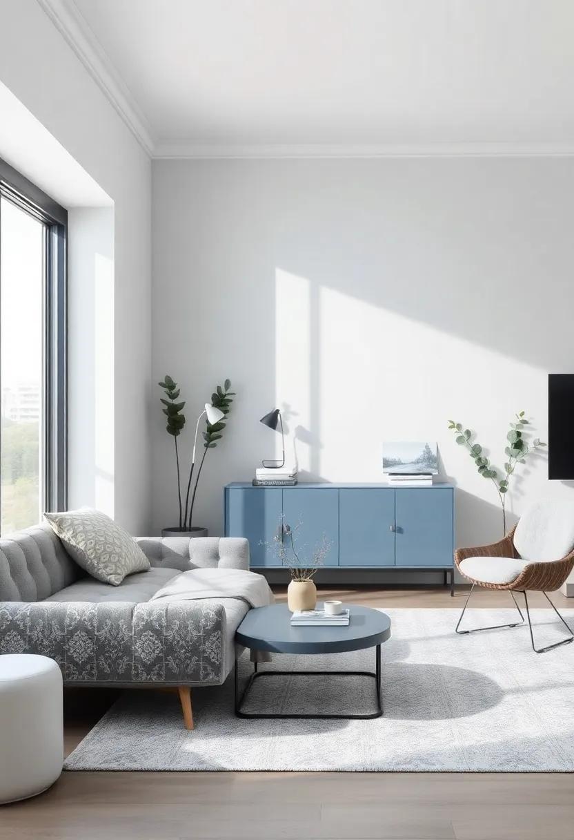
Serene Spaces Inspired by Modern Pale Blue and Gray Aesthetic Harmony
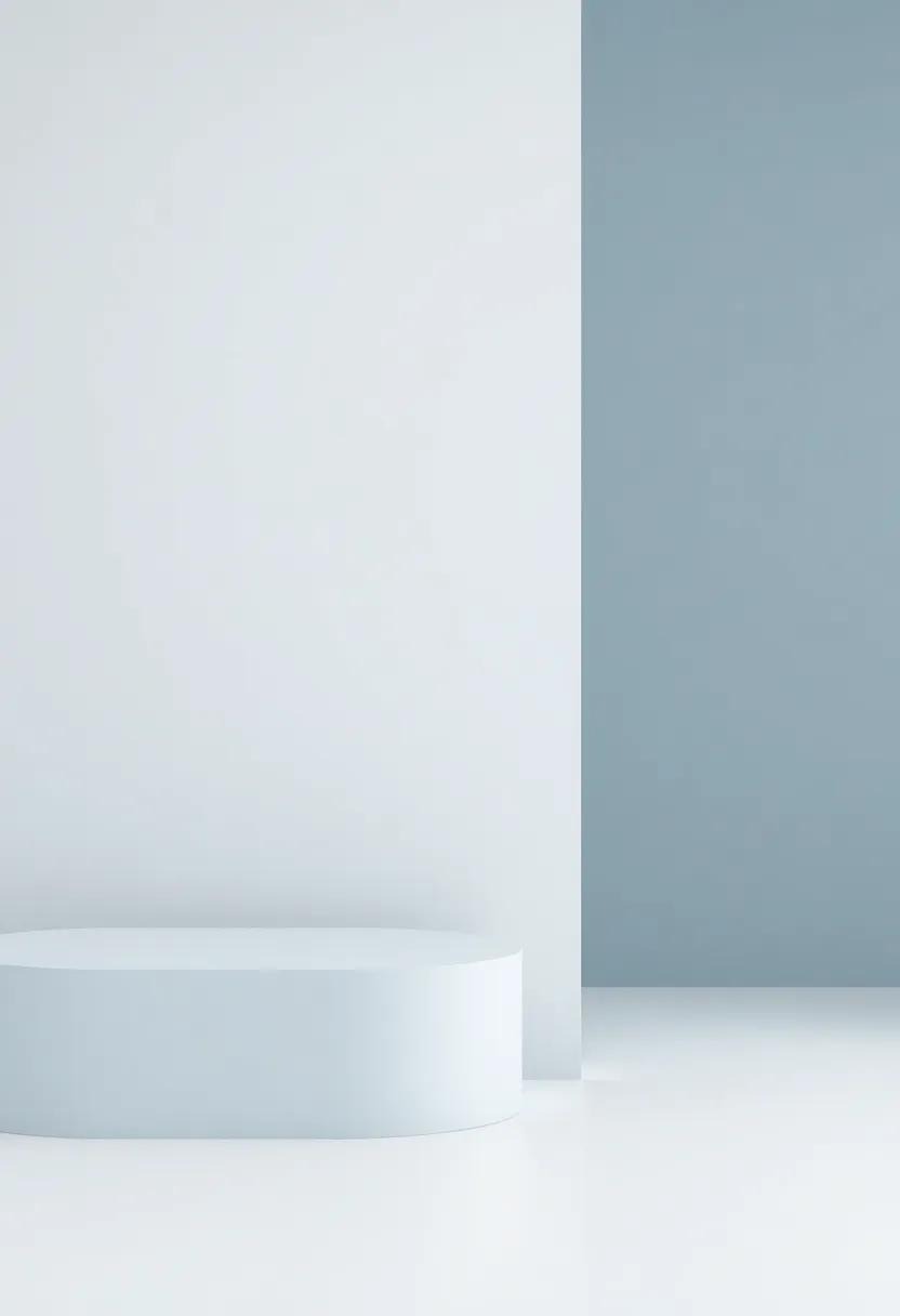
The modern combination of pale blue and gray creates a tranquil atmosphere that invites relaxation and introspection. This palette resonates with nature’s calmness, bringing an ethereal quality to interiors. The subtle interplay of these colors can be enhanced through the careful selection of materials and textures. Consider the following elements to embody this serene aesthetic:
- Soft linens: Use pale blue bedding and curtains to create a dreamy focal point in the bedroom.
- Natural Materials: Incorporate gray stone or wooden accents that ground the space while adding warmth.
- Artistic Touches: select artwork and decor pieces that feature abstract patterns in both colors for visual interest.
To further harmonize your space, think about the lighting and how it interacts with these gentle hues. Soft, ambient lighting can dramatically enhance the serene quality of pale blue and gray, creating an inviting atmosphere. Complement this setup with some stylish furniture options displayed in the table below:
| furniture | Description | Color |
|---|---|---|
| Sectional Sofa | Comfortable and stylish, perfect for relaxation. | Pale Blue |
| Accent Chair | A pop of chic design that invites you to sit and unwind. | Light Gray |
| Coffee Table | Simple elegance that ties the room together. | White with Gray Accents |
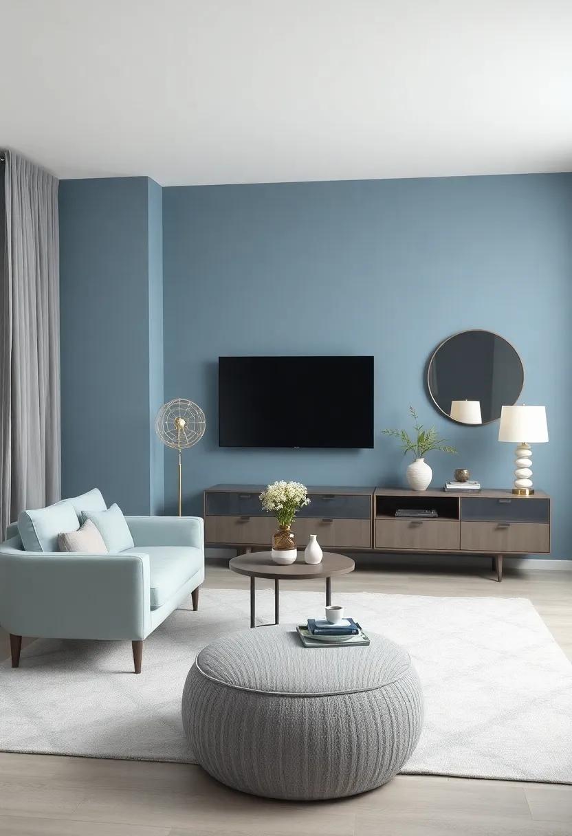
Exploring the Calming Effects of Pale Blue and Gray in Interior Design
The soothing hues of pale blue and gray work harmoniously to create interiors that exude tranquility. These colors serve as a canvas, allowing for a versatile design that can evoke feelings of peace and relaxation. By incorporating these shades into your space, you invite a serene atmosphere that promotes well-being. Textures play a significant role in enhancing this calming effect; consider the following elements for optimal results:
- Soft textiles: Velvet cushions, linen drapes, and plush rugs in pale blue or gray can soften the space.
- natural light: Maximizing sunlight can enhance the effects of these colors, making rooms feel airy.
- Contrasting accents: Integrate darker shades or natural wood tones to create depth and interest without overwhelming the calming palette.
A strategic approach to blending pale blue and gray can lead to delightful results.One popular method is to balance the proportions of each color, ensuring neither dominates. Below is a simple guide to help you achieve this balance:
| Color | Usage | Effect |
|---|---|---|
| Pale Blue | 60% walls and larger surfaces | Fosters relaxation and tranquility |
| Gray | 30% furniture and accessories | Adds sophistication and depth |
| Accent Colors | 10% decorative elements | Injects personality and vibrancy |
textures that Complement the Modern Pale Blue and Gray Color Palette
Incorporating the right textures into a pale blue and gray color palette can elevate your space, infusing it with warmth and depth.Consider using natural fibers like linen and cotton for soft furnishings, as they create an inviting atmosphere that balances the calming hues. Pair these with geometric patterns in throws or cushions to add visual interest while maintaining a sense of cohesion. You might also explore woven textiles that add an organic touch, or incorporate materials such as stone or wood accents, offering a grounding effect that harmonizes beautifully with the serene color scheme.
Furthermore, layering different textures invites a tactile experience that enhances the overall aesthetic. Options to consider include:
- Velvet: Adds luxury and a touch of glam.
- Brushed Metals: Infuses a modern edge without overwhelming the palette.
- Sisal or Jute: Brings in a natural element, perfect for rugs and baskets.
- Glass: Offers a sleek contrast while reflecting light effectively.
utilizing a blend of these textures creates a rich,layered environment that invites relaxation. Choose a balance of smooth and rough finishes to appeal to the senses and to accentuate the tranquil tones of your color palette. Such combinations not only enhance the visual dynamics of your decor but also convey a deep sense of comfort and style.
Creating Cohesion with Pale Blue and Gray in Multi-Room Spaces
integrating pale blue and gray across multiple rooms can create a seamless flow that unites distinct spaces while enhancing the overall aesthetic. consider using pale blue as a primary color for larger areas: walls or statement furnishings, as it evokes calmness and tranquility. In contrast, gray can serve as a grounding element through accents, such as trim, upholstery, or smaller decorative pieces. To bring vitality into the design, add elements of texture or pattern—think plush throws, woven rugs, or even artwork that incorporates both shades. these choices imbue the space with depth without overwhelming the serene color palette.
In practice, balance is key to achieving a cohesive look. Here are several effective ways to harmonize pale blue and gray:
- Use pale blue for larger furniture pieces, like sofas, paired with gray accent chairs.
- Incorporate gray linens and accessories against pale blue backdrops in bedrooms.
- Enhance transitions with complementary decor items, such as cushions featuring both colors.
- Consider a statement wall in one shade and use the other for adjacent rooms to create connection.
By thoughtfully layering these colors and coordinating various elements, the entire space can transform into a serene retreat that promotes tranquility and style.
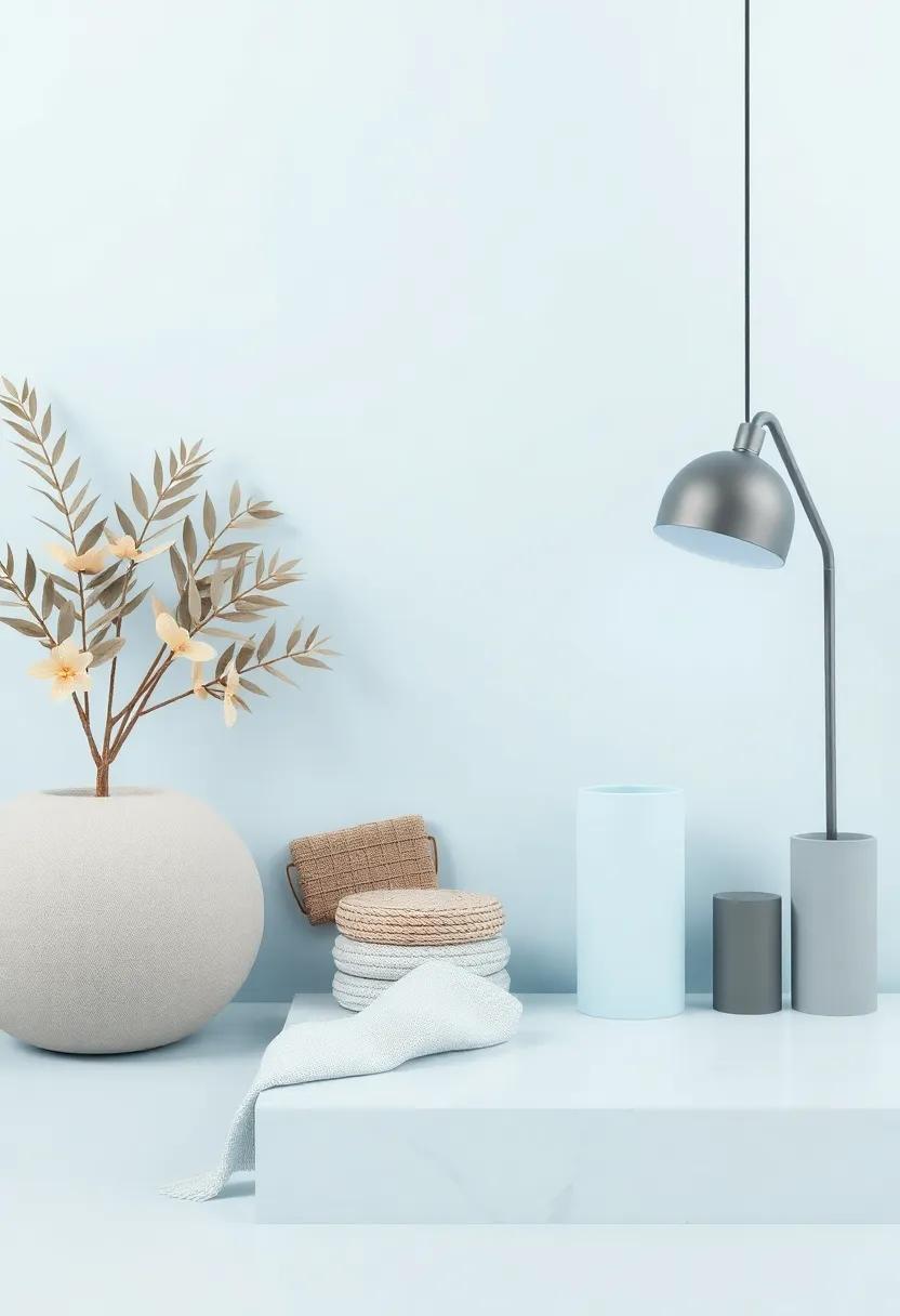
Artistry in Fabrics: Choosing Textiles for a Serene blue and Gray Environment
When it comes to establishing a tranquil ambiance within a blue and gray environment, the choice of textiles plays a pivotal role. Opt for natural fibers such as cotton, linen, or wool, which exude comfort and elegance while allowing the serene color palette to shine.Consider mixing textures to create depth; as a notable exmaple, pair soft cotton cushions with a chunky wool throw. This combination fosters visual interest without overwhelming the senses. Incorporating materials that interact beautifully with light, such as silk or satin, can accentuate the subtle tonal variations inherent in soft blues and cool grays.
In terms of patterns, look for designs that embody simplicity and sophistication. Geometric prints or subtle botanical motifs can add a touch of personality while maintaining the soothing aesthetic. A well-chosen area rug can anchor the room, providing warmth and ensuring cohesion among the various elements. When selecting curtains or drapes, opting for sheer fabrics in pale blue or gray can enhance natural light flow, creating an ethereal atmosphere that perfectly complements the serene environment.
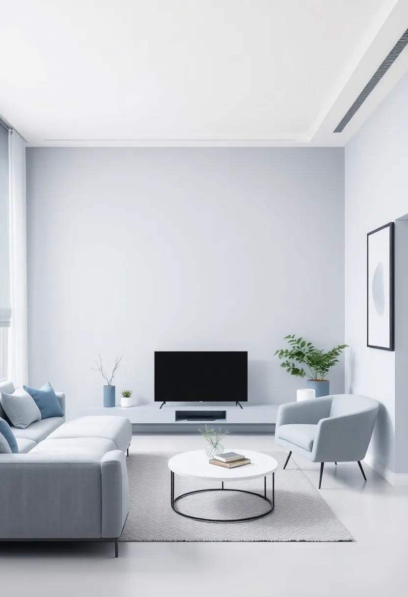
Statement Pieces: Furniture That Enhances Pale Blue and gray Elegance
In the realm of interior design, selecting furniture that resonates with the tranquil hues of pale blue and gray can transform a space into a serene haven. Pieces that serve as statement items can effortlessly pair with this color palette, complementing its soft elegance while adding depth and character. Consider incorporating textured fabrics like velvet or linen in shades that echo or contrast with your walls; a light gray chaise lounge or a pale blue accent chair can become focal points that draw the eye and invite comfort.
To elevate your living environment further, explore options such as artistic coffee tables and bold light fixtures that play well with the calm undertones of the room. A sleek marble-top table can bring in a touch of luxury and reflects the soft tones beautifully, while sculptural lighting can add dimension and interest. Here’s a speedy look at some recommended statement pieces that can enhance your space:
| Furniture Piece | Color/Material | Effect |
|---|---|---|
| velvet Armchair | Pale Blue | Adds elegance and comfort |
| Marble Coffee Table | White/Gray | Creates a sophisticated centerpiece |
| Artistic Floor Lamp | brushed Brass | Infuses style and character |
| Textured Throw Pillows | Soft Gray | Offers warmth and coziness |
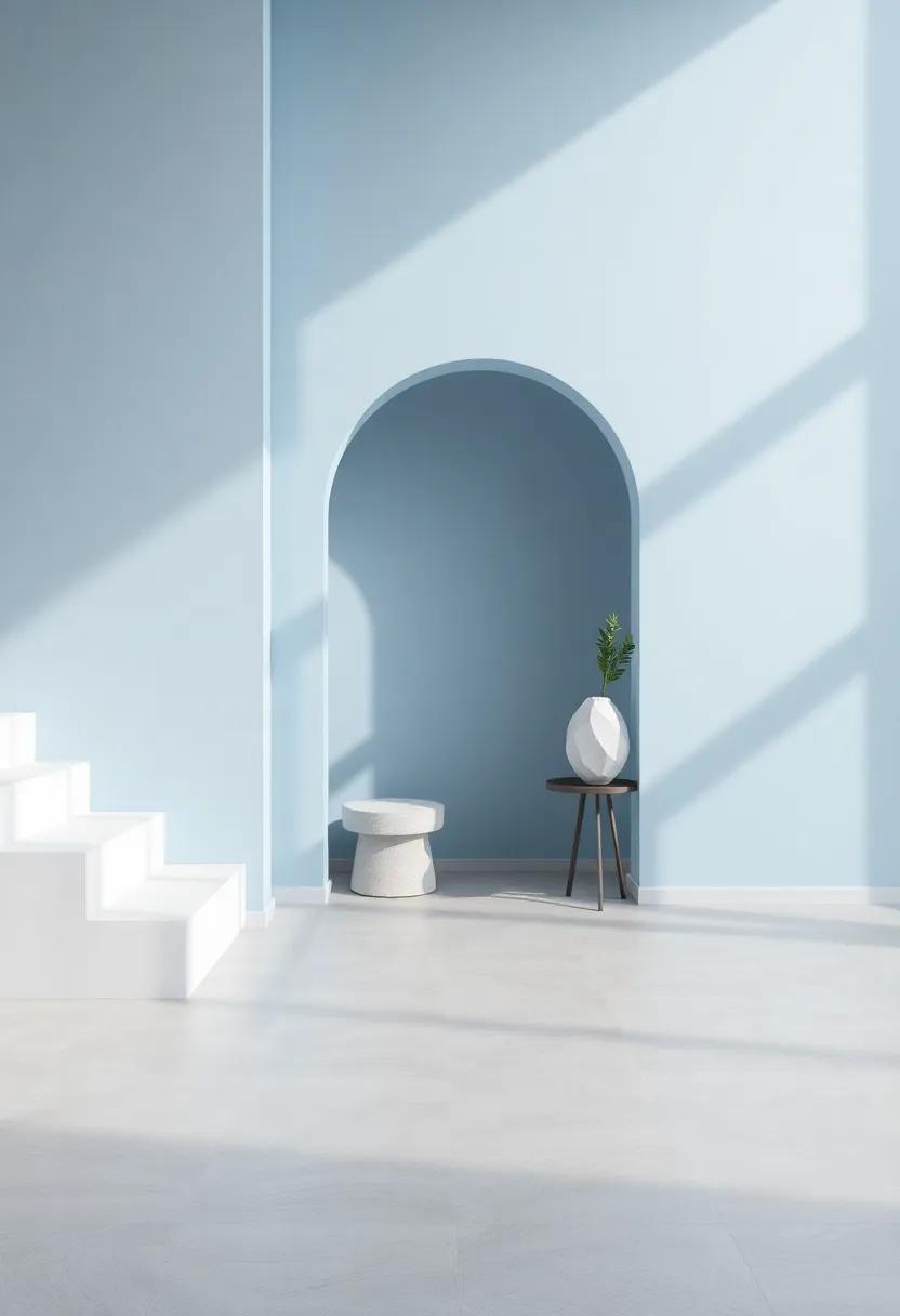
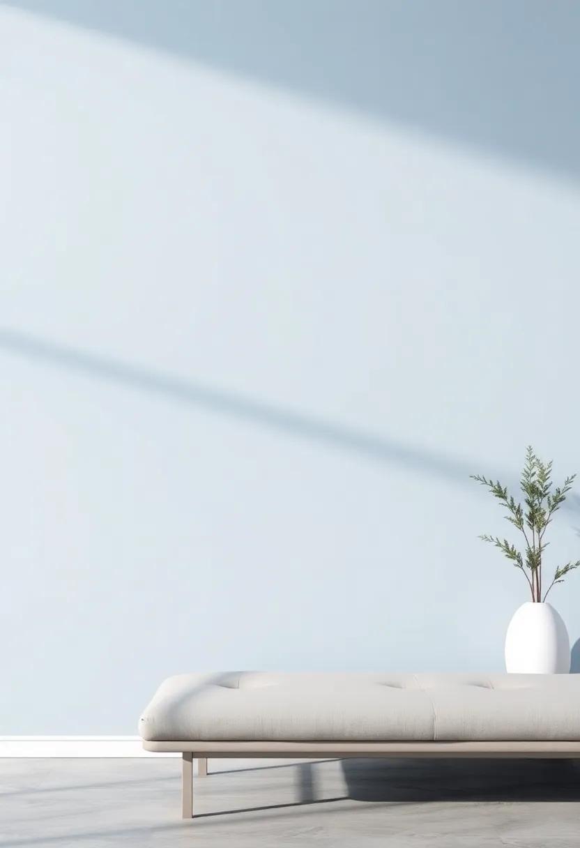
Capturing Natural Light: How Pale Blue and Gray Transform Spaces
Natural light has an extraordinary ability to enhance the beauty of colors, and when paired with pale blue and gray, it creates an atmosphere of tranquility and calm. This subtle palette works harmoniously in spaces where sunlight filters through, casting gentle shadows that dance across the walls. the cool undertones of pale blue infuse rooms with an airy feel, while soft gray adds depth and sophistication. Together, they evoke a serene environment that invites relaxation and mindful contemplation. Consider incorporating this color scheme in spaces such as:
- Living Rooms: Create an inviting ambiance perfect for unwinding.
- Bedrooms: Foster a peaceful retreat that encourages restorative sleep.
- Home Offices: Cultivate a focused working area free from distractions.
The balance these hues bring is further amplified by the way they respond to daylight. Pale blue reflects sunlight, making a small room feel larger, while gray absorbs light, giving richer character to open spaces. When utilized thoughtfully, the interplay between these colors can be transformative. Consider the following elements to enhance the use of natural light in your designs:
| Design element | Effect on Space |
|---|---|
| Large Windows | Maximize natural light intake, enhancing color vibrancy. |
| Mirrors | Reflect light,creating an illusion of depth. |
| Light Fabrics | Softly diffuse light, adding warmth and atmosphere. |
Accentuating Minimalism with Pale Blue and Gray Decor Elements
Incorporating pale blue and gray decor elements into a minimalistic design fosters an atmosphere of calm and clarity. these soft hues can transform a space without overwhelming it, allowing for a serene and spacious feel. Consider the following decor choices to accentuate this color palette:
- Textiles: Use light gray or pale blue throw pillows to add a touch of warmth to sleek furniture.
- Artwork: Choose abstract pieces that blend both colors, creating a focal point that harmonizes with the minimalist theme.
- Lighting: Opt for simple fixtures in brushed steel or white with pale blue lampshades,which can soften the ambiance.
To enhance the coherence of your design, think about the interplay of these colors across various elements. As an example, pale blue can serve as the primary shade on walls or larger furniture items, while accents of gray can pop in smaller decor items like vases or picture frames. Below is a simple overview of how these colors can be effectively balanced:
| Element | Pale Blue | Gray |
|---|---|---|
| Walls | Soft, airy backgrounds | Nestled accent walls |
| Furniture | Comfortable sofas or chairs | Elegant coffee tables |
| Accessories | Decorative cushions | Minimalist candle holders |
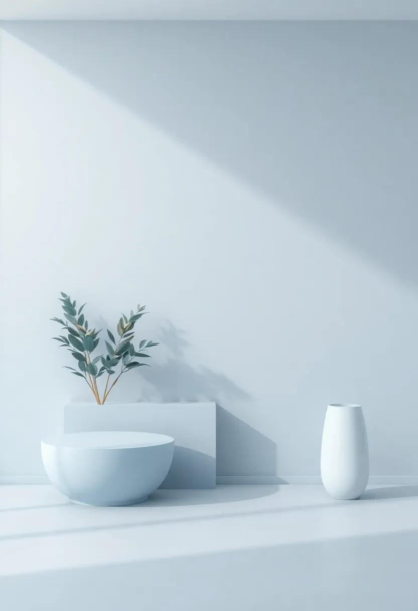
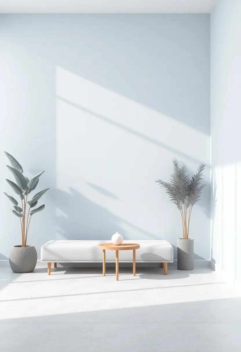
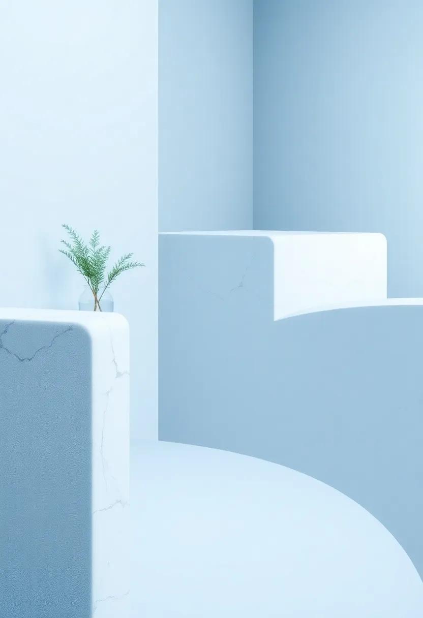
Bringing Nature Indoors: Incorporating Plants into a Serene Color Palette
Incorporating plants into a tranquil environment defined by pale blue and gray creates a harmonious balance that invigorates the senses while promoting relaxation. Choosing the right greenery is crucial; opt for varieties that thrive in low-light conditions, enhancing the serene atmosphere without overwhelming it. Consider delicate ferns, calming eucalyptus, or sophisticated snake plants for thier adaptability and aesthetic appeal.When positioning these natural elements, remember to create layered textures—placing taller plants like fiddle-leaf figs in the corners of your space and cascading philodendrons on shelves produces a gorgeous visual dynamic that engages without distracting.
To further complement the calming color palette,select planters that echo the hues of your walls or flooring. Soft ceramics in muted tones or weathered wood finishes can unify the space and enhance the overall vibe. Consider creating a small plant corner to draw focus, using a variety of heights and styles to create interest. Here’s a simple guide to help you organize your indoor plants seamlessly:
| Plant Type | Light Preference | Ideal Pot Color |
|---|---|---|
| snake Plant | Low Light | Pale Gray |
| Pothos | Indirect Light | Soft Blue |
| Fiddle Leaf Fig | Luminous Indirect Light | Natural Wood |
By thoughtfully incorporating plants into your space, not only do you breathe life into the design, but you also establish a natural serenity that encourages mindfulness in your daily routines.
Flooring Choices that Harmonize with Pale blue and Gray Ambiance
Choosing flooring that complements a soft palette of pale blue and gray can elevate the overall aesthetics of your space, creating an atmosphere of tranquility and elegance. Here are some exquisite options to consider:
- Light Gray Wood Flooring: The gentle warmth of light gray wood adds natural texture while harmonizing effortlessly with both colors.
- Soft Beige Tiles: A neutral option that balances the cool tones, these tiles provide a versatile base and a sense of calm.
- Classic White Marble: For a touch of luxury, white marble with subtle gray veining can create a sophisticated foundation for pale blue accents.
- Dusty Blue Carpeting: This choice can introduce a cozy element while enriching the color scheme with a monochromatic twist.
To visualize the combinations, here’s a quick comparison of potential flooring styles, their textures, and how they resonate with pale blue and gray hues:
| Flooring Type | Texture | Color Harmony |
|---|---|---|
| Light Gray Wood | Smooth | Warm Gray |
| Soft Beige Tiles | Matte | Neutral contrast |
| White Marble | Polished | Cool Elegance |
| Dusty Blue Carpeting | cozy | Monochromatic depth |
Sculptural Lighting: Enhancing the Mood with Soft Glows in Serene Spaces
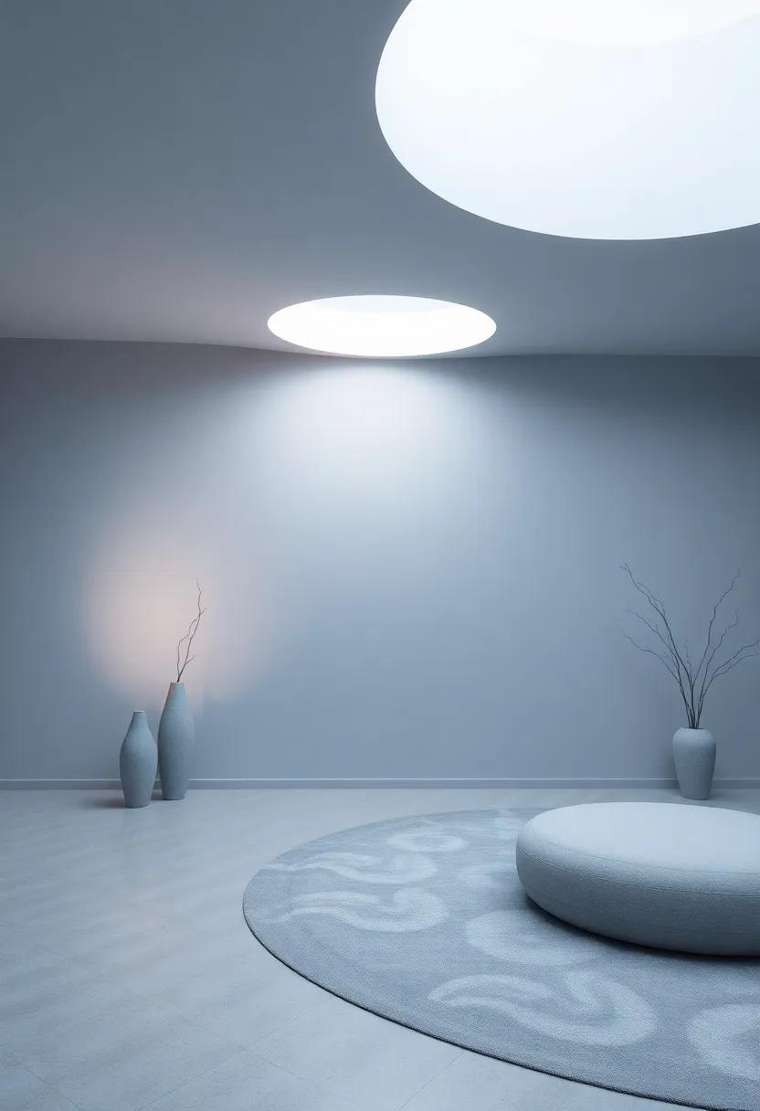
In modern interiors, sculptural lighting serves as more than just a source of illumination; it transforms spaces into tranquil retreats. The interplay between shadow and light creates a captivating environment that enhances the overall aesthetic. Opting for fixtures that feature flowing lines and organic forms can add a sense of movement and grace, while the soft glow they emit works harmoniously with the serene hues of pale blue and gray.This careful integration not only uplifts the ambiance but also encourages relaxation, making it ideal for living rooms, bedrooms, or peaceful nooks.
When selecting lighting elements, consider the following aspects to amplify the serene atmosphere:
- Material Choice: Natural materials like wood, glass, and metal can add warmth and texture.
- Layering Light: combine ambient, task, and accent lighting for depth and versatility.
- Dimmer Switches: Integrate dimmer switches to easily adjust the mood as needed.
- Color Temperature: Warm white tones often work best, emphasizing the calming palette.
| Lighting Type | Ideal Style |
|---|---|
| Pendant Lights | Organic and flowing designs |
| Wall Sconces | Soft-glow fixtures with minimalistic forms |
| Table Lamps | Artistic bases with soft shade colors |
Custom Wall Treatments: Painting Techniques for Pale Blue and Gray
Transforming your walls with custom treatments using pale blue and gray paints can create a tranquil atmosphere in any room. Consider using techniques like ombre, where shades gradually blend into each other, producing a soft gradient effect that enhances the calming nature of these colors. Additionally,experimenting with sponging or rag rolling can introduce texture and depth,allowing these hues to reflect light beautifully. This ensures that your space feels both airy and grounded, perfect for modern interiors.
To elevate your wall treatment further,incorporating patterns and stencils can add a personal touch. You might explore these options:
- Chevron Stripes: A bold choice that can make a statement while keeping the palette serene.
- Floral Stencils: Soft, nature-inspired designs that bring warmth to the cool tones.
- Geometric shapes: Modern and chic, perfect for a contemporary look.
Below is a simple table outlining various painting techniques and their effects:
| Technique | Effect |
|---|---|
| Ombre | Smooth gradient blend of colors |
| Sponging | Textured, soft appearance |
| Rag Rolling | Dynamic depth with layered colors |
| Stenciling | Patterns that add character and detail |
Finding Balance with Accents: Adding Pops of Color to Your Palette
Integrating bold accents into a serene color palette can transform a space from tranquil to invigorating. To achieve a harmonious balance, consider incorporating vibrant hues that provide just the right amount of contrast to your modern pale blue and gray backdrop. Choose accents that resonate with your personal style while bringing warmth and energy to the room. Some delightful options include:
- Crisp White: Creates a fresh and clean contrast.
- Deep Navy: Adds sophistication and depth.
- Bright Coral: Offers a cheerful pop without overwhelming the palette.
- Mustard Yellow: Infuses a touch of sunshine and vibrancy.
When selecting accent pieces such as throw pillows, artwork, or decorative items, it’s essential to maintain a cohesive aesthetic. Each colorful element can contribute to a unified theme while allowing the bold accents to stand out. A simple yet effective way to choose the right shades is by using a color wheel or an accent table:
| Accent Color | Complementing Shade |
|---|---|
| Coral | Pale Blue |
| navy | Light Gray |
| Mustard | Soft White |
By selecting a few key accent colors that resonate with the overarching theme of your serene space, you can evoke a balanced atmosphere that feels both serene and unapologetically lively. Your modern pale blue and gray palette can serve as the perfect backdrop to create a dynamic yet calming environment.
Dreamy Outdoor Spaces: Extending Pale Blue and Gray to Your Patio
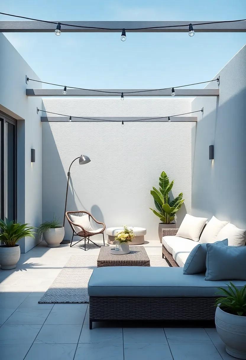
Transform your patio into a dreamy outdoor retreat by embracing the ethereal charm of pale blue and gray. These soft tones create a soothing environment, perfect for relaxation or entertaining. To enhance the ambience, consider incorporating a variety of elements:
- Textiles: lightweight throws and plush cushions in pale blue prints can invite comfort, while gray fabrics offer a touch of sophistication.
- Furniture: Opt for sleek, modern furniture in gray hues that complement these soft shades, ensuring a harmonious balance.
- Planters: Use pale blue or gray ceramic pots to house your favorite succulents and flowers, adding nature’s charm to your serene space.
To enhance your outdoor experience further, consider adding subtle lighting elements. String lights or lanterns in soft white can create a magical evening atmosphere.Pair these with a selection of outdoor decor to complete the look:
| Decor Element | Description |
|---|---|
| Candle Holders | Opt for pale blue glass or metallic gray holders to add softness and warmth during twilight. |
| Outdoor Rugs | Choose patterned rugs in pale blue or gray to define your space while adding comfort underfoot. |
| Wall Art | Incorporate weather-resistant wall art in coordinating colors to personalize your outdoor area. |
Serene Spaces Through Art: Selecting Artwork that Complements a Calm Color Palette
Choosing artwork that enhances a serene atmosphere requires thoughtful consideration of the color palette. for spaces adorned with a modern pale blue and gray scheme, seek out art pieces that echo these tranquil tones. Consider works that feature subtle washes of blue,soft grays,and even hints of white or pastel shades. Abstract art can be particularly effective, offering fluid forms that mimic the calmness of the color palette. Look for pieces that invoke feelings of peace, such as abstract landscapes or gentle, flowing shapes that resonate with your chosen hues.
Furthermore, aim for a balance between the scale of the artwork and the space it occupies. Large, statement pieces can anchor a room, while smaller, delicate works can add a touch of intimacy. Here are some suggestions for types of artwork that harmonize beautifully with a pale blue and gray backdrop:
- watercolor Prints: Their light, airy quality complements serene spaces effortlessly.
- Soft landscape Photography: Captures the essence of tranquility in natural settings.
- Minimalist Line Art: Simple yet striking designs that echo the calmness of your palette.
| Artwork Type | Color Influence | Vibe |
|---|---|---|
| Abstract Painting | Pale Blue, Gray | Soothing |
| Textured Canvas | Soft Pastels | Dynamic |
| Nature Portraits | Natural Hues | Inviting |
Innovative Storage Solutions that Maintain Serenity in Pale Blue and gray
transform your living space with innovative storage solutions that not only enhance institution but also complement the calming aesthetics of pale blue and gray. Consider multifunctional furniture like storage ottomans and built-in benches that offer a serene place to sit while discreetly hiding away clutter.A well-placed bookshelf, painted in a soft hue, can display your favorite reads while providing a backdrop for decorative items, creating a harmonious balance between functionality and tranquility.
To further embrace this soothing color palette, integrate floating shelves in pale blue or gray, which allow for personalized displays of art and plants without overwhelming the space. utilize decorative baskets in complementary tones for decorative storage solutions that blend seamlessly with your decor. Here are a few other options to consider:
- cabinet organizers: Keep your essentials neat and tidy.
- Under-bed Storage: Create hidden spaces for seasonal items.
- Wall-mounted Hooks: Perfect for bags and hats, maintaining an airy feel.
Creating Inviting Nooks: Cozy Spaces for Relaxation using a Soft Color Palette
To create spaces that invite relaxation and tranquility, it’s essential to focus on a soothing color palette that incorporates pale blues and soft grays. These hues evoke a sense of calm, making them ideal for those quiet corners of your home. Start by selecting a comfortable seating option, such as a plush armchair or a cushioned bench, upholstered in textured fabrics that complement the color scheme. Layer this with a few decorative pillows in varying shades of blue and gray, incorporating patterns like gentle stripes or subtle florals for added interest. Consider adding a warm throw blanket draped over the arm, inviting you to settle in for a moment of respite.
surround your nook with elements that enhance the peaceful atmosphere. incorporate a small, minimalistic side table to hold a cup of tea or a good book, ensuring it aligns with the soft aesthetic. Make space for greenery; introduce a few potted plants or delicate floral arrangements that resonate with the palette, bringing a touch of nature indoors. Lighting plays a pivotal role as well—opt for soft-glow lamps or string lights that create an enchanting ambiance,further accentuating the calming environment. To encapsulate this idea, here’s a simple table showcasing key elements for an inviting nook:
| Element | Color/Material | Purpose |
|---|---|---|
| Seating | Pale Blue Fabric | Comfort |
| Pillows | Soft Gray & Patterns | Add Texture |
| Side Table | Natural Wood | Functionality |
| Lighting | Warm Glow | Ambiance |
| Plants | Green Foliage | Decoration & Air Quality |
The Power of Accessories: How Small Details Impact Overall Design
when we think of interior design, large elements such as furniture, flooring, and wall colors may take center stage. However, it’s the accessories that weave the final threads into the tapestry of a room, accentuating the overall aesthetic. In a serene space adorned in a modern pale blue and gray palette, accessories serve as the delicate brush strokes that define style and character. Elements such as throw pillows, wall art, and ceramic vases in varying shades enhance the soothing atmosphere, inviting warmth and personality into an elegantly understated environment. The interplay of textures, be it a cozy knit or sleek ceramics, provides dimension, ensuring that each selection complements not just the color scheme, but also the mood of the space.
Small yet impactful, these finishing touches bring life to areas that might otherwise feel incomplete. Consider how the placement of decorative objects or the choice of a minimalist lamp can dramatically alter a room’s feel.Essential accessories like framed pictures and stylish bookshelves allow individuals to express personal stories within the broader narrative of design.Here’s a quick overview table to illustrate how different accessories can complement a pale blue and gray color scheme:
| Accessory Type | Suggested Color | Impact on Room |
|---|---|---|
| Throw Pillows | Pale Gray | Adds comfort and supports the color palette. |
| Wall Art | Vibrant Blue Accents | Creates focal points and visual interest. |
| Ceramic Vases | Soft White | brings elegance and a touch of sophistication. |
The Way Forward
the serene combination of pale blue and gray offers a refreshing canvas for modern living. This color palette transcends mere aesthetics,inviting a sense of calm and tranquility into our spaces. As we navigate the complexities of everyday life, incorporating these soothing hues can create a sanctuary where both mind and spirit can find peace. Whether through soft furnishings, thoughtfully selected artwork, or architectural elements, embracing this versatile palette has the power to transform any environment into a haven of relaxation. So, as you embark on your design journey, consider the quiet elegance of pale blue and gray—a harmonious blend that embodies serenity in its purest form.
As an Amazon Associate I earn from qualifying purchases.


