Stylish Living Room Painting Ideas: Modern Color Schemes and Inspiring Designs
Are you searching for fresh, practical, and straightforward living room painting ideas that harmonize perfectly with your lighting and furnishings? This comprehensive guide is designed to help you understand how to thoughtfully select colors, finishes, and their placement, enabling you to transform current trends into a welcoming home environment. You’ll discover techniques such as accent walls, two-tone designs, and horizontal color breaks that enhance high or vaulted ceilings. Additionally, learn how various color palettes—from neutrals to vibrant hues—can influence mood, whether calming or energizing, and how DIY canvas art can enrich your walls without clutter. Along the way, I share insights on creating flow in open-plan kitchens and living rooms, and how approaches differ for large versus intentionally compact spaces.
Mastering Living Room Painting: A Strategic Approach
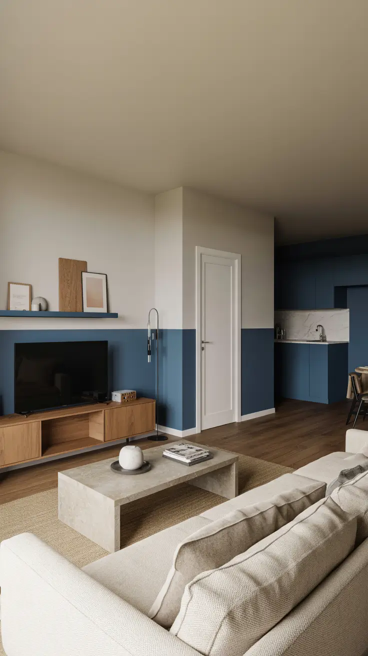
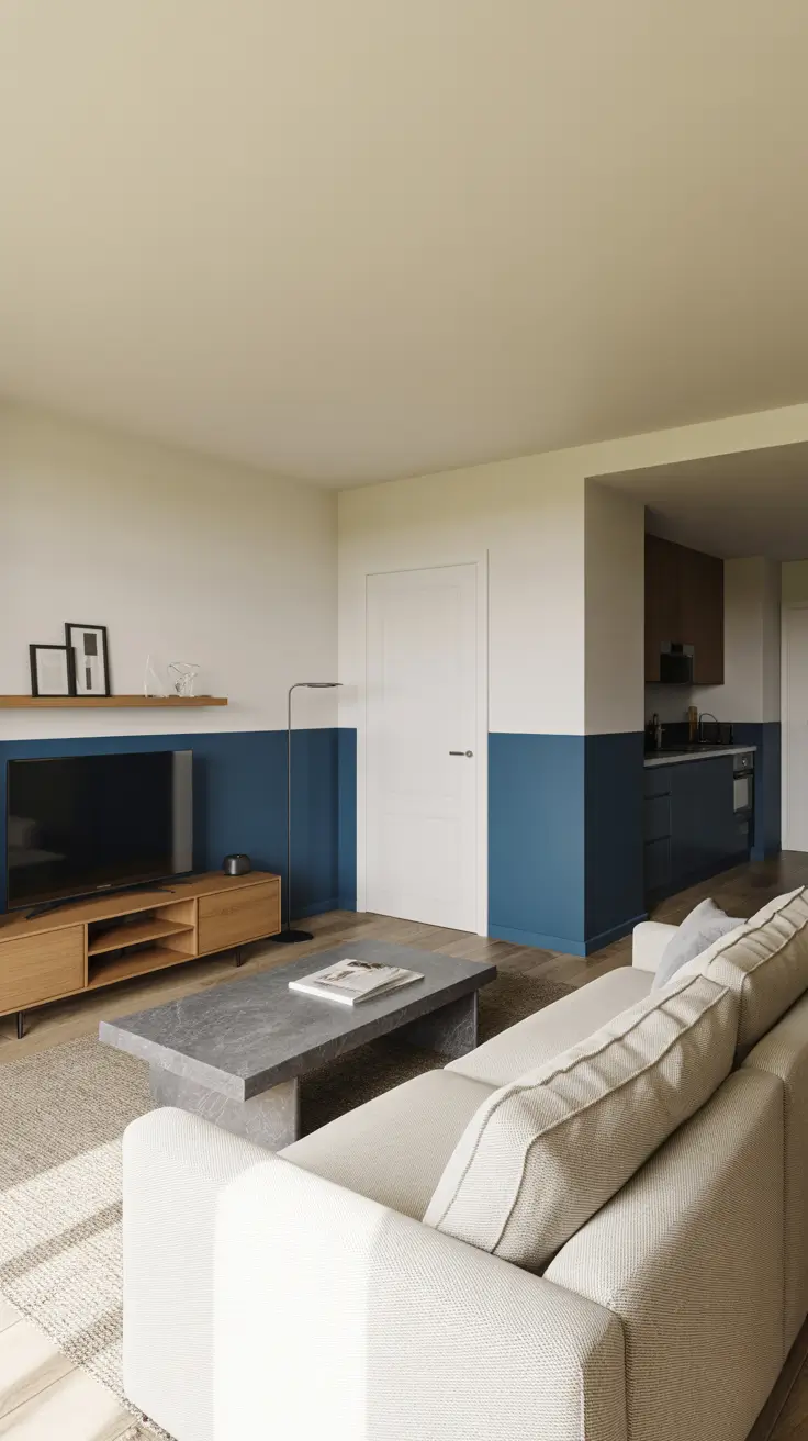
Every painting project begins with analyzing natural light, sightlines, and how the living room connects to adjoining areas like the kitchen and dining space. I develop a color palette that gracefully transitions between neutral and vibrant tones, anchored by a bold mid-tone shade. For rooms with tall or vaulted ceilings, I often paint the upper section slightly lighter to maintain architectural warmth without detaching from the space. On flat ceilings, extending the wall color a few inches onto the ceiling softens edges and creates a cozy atmosphere. Strategic placement of accent walls or horizontal color breaks aligned with built-in shelves or door frames ensures the room’s geometry reads as intentional and balanced.
Choosing the right finish is crucial for functionality. I prefer satin finishes on trims and shelving for a crisp look, while walls benefit from matte or washable matte to minimize glare and withstand daily wear. In high-traffic areas, washable matte ensures that wall art swaps don’t leave unwanted sheen. For larger rooms, I manipulate color temperature to differentiate conversation zones from media areas, guiding movement naturally. In smaller spaces, repeating the same color from adjacent hallways visually expands the living room, integrating it into a larger whole.
Experience shows that viewing large paint samples in multiple locations is more effective than small swatches, as changing light throughout the day reveals undertones. I always compare samples alongside major furnishings like sofas, rugs, and wood finishes to avoid surprises. Many designers recommend a palette of three complementary colors plus one accent to create visual rest while maintaining uniqueness. I follow this rule, allowing plants and books to introduce additional natural tones. When artwork is the focal point, I opt for low-contrast wall colors to let canvases and frames narrate the story.
Before painting, ensure thorough wall preparation, including stain-blocking primer and careful taping around built-in shelves. Photographing test areas at consistent times daily helps maintain accurate color comparisons. For seamless transitions at inside and outside corners, use precise taping and cutting techniques to achieve professional results. This methodical approach benefits both novices and seasoned painters alike.
Contemporary Color Palettes for Living Rooms
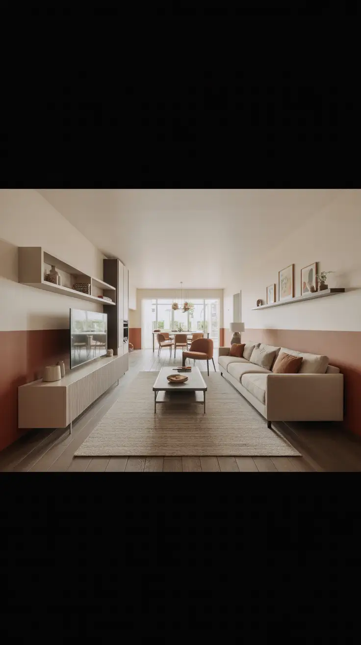
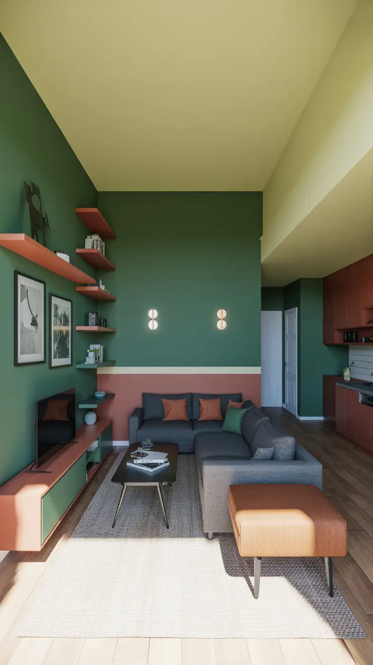
To craft a modern color scheme, I blend warm greige tones, gentle pastels, and grounding shades like charcoal or deep green to prevent the space from feeling cold. In open-plan kitchens and living areas, I echo the kitchen island or backsplash color subtly on adjacent walls to unify the spaces. Two-tone walls—with a darker base stabilizing seating areas and a lighter upper section—help balance long rooms by visually shortening horizons. For rooms with vaulted ceilings, I keep ceilings pale and focus the color narrative on the walls.

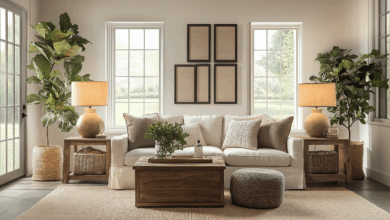
Furniture and décor complete the palette. For example, a cool grey sofa pairs beautifully with warm natural oak tables and linen curtains, complemented by creamy off-white trims. When rugs are colorful, I repeat one accent color on a media wall or niche to create cohesion. Modern furnishings blend comfort and style with black metal lamps, simple oak coffee tables, and textured cushions. Built-in shelves painted slightly darker than walls highlight books and small artworks effectively.
Contemporary palettes succeed because contrasts are deliberate. I ask clients where they want drama or softness and adjust contrast accordingly. Many experts suggest painting doors the same color as walls to reduce visual clutter, especially in minimalist rooms. For bolder edges, painting the interior of window returns in a darker shade adds depth without overwhelming. All these choices are valid as long as they feel right daily.
For easy application, I recommend three ready-to-use palettes, each with light, mid, and deep shades. Sampling pastels in two intensities prevents chalkiness under bright light. Align two-tone breaks with mantle tops or shelf levels to maintain clean lines, and add a swatch card in open kitchens to unify the floor plan.
Color Schemes to Match Every Mood
I organize color choices based on desired moods throughout the day. For calm, I favor misty greens, soft greys, and sandy neutrals paired with natural textures. To energize, I incorporate vibrant citrus accents anchored by bold blues or greens. Cozy atmospheres emerge from compressed contrasts, mushroom walls, caramel leather, and dimmable lighting that softens edges. For airy feelings in any room size, I use pale walls with depth created by painted niches and a single accent wall.
Furniture supports the mood: calm spaces feature boucle or linen sofas, low-pile rugs, and wooden side tables reflecting nature. Energized rooms embrace graphic pillows, modern floor lamps, and curated wall art echoing accent tones. Cozy rooms favor rounded forms, layered throws, and warm metal finishes that softly reflect candlelight. Airy spaces use leggy furniture and open-base tables to maintain flow.
Paint and lighting dimmers are the most cost-effective mood changers. Neutral walls allow seasonal mood shifts without repainting. Painting inside shelving or backs of built-ins deepens color and anchors furniture visually. Darkening the lower third of a wall behind a sofa is a sophisticated way to resist scuffing and add depth.
To enhance this, a mood-to-color-and-finish matrix helps readers select palettes and sheens. Pairing grey with warm woods avoids flatness, and considering sensory elements like scent and sound alongside color enriches the atmosphere, offering a holistic design toolkit.
Indian-Inspired Living Room Painting Concepts
Indian-style living rooms often feature rich, layered colors, traditional patterns, and metallic accents that shimmer in evening light. Jewel tones like emerald green, saffron, and indigo work beautifully as bold wall fields or accent panels. Horizontal borders inspired by textile trims elegantly define seating areas. In spacious rooms, I keep ceilings light to let walls shine, while in smaller spaces, mid-tone washes paired with reflective brass maintain brightness. In open kitchen layouts, I echo a muted version of the primary wall color in the kitchen to unify the space.
Furnishings include carved wood, cane, and handwoven fabrics that keep the space light. A neutral linen sofa allows colorful walls to take center stage. Patterned cushions, brass side tables, and carved consoles nod to tradition while maintaining clean lines. Built-in shelves painted darker than walls showcase books, ceramics, and Indian-inspired canvas art, grounded by a natural jute rug for contrast.
Balance between saturation and breathing space is key to elegance. I concentrate bold colors on one or two surfaces, sampling saturated hues at about 75% strength for livability in bright rooms. Stenciled jaali or paisley borders on chair rails add subtle cultural references without overwhelming. Warm white ceilings keep the room cheerful yet soothing.
For added flair, use metallics sparingly—one brass and one antique bronze piece—to maintain a curated look. Align horizontal motifs with door frames for clean lines. A rangoli-inspired accent wall using tape and levels offers a bold, approachable DIY project.
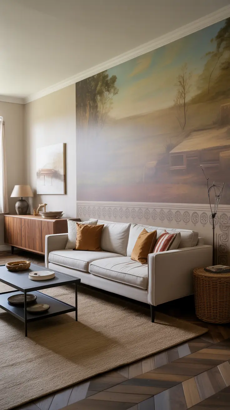
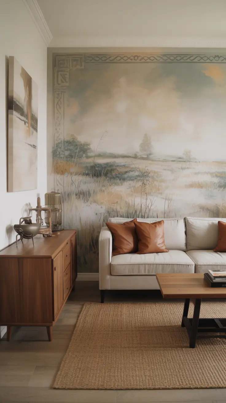
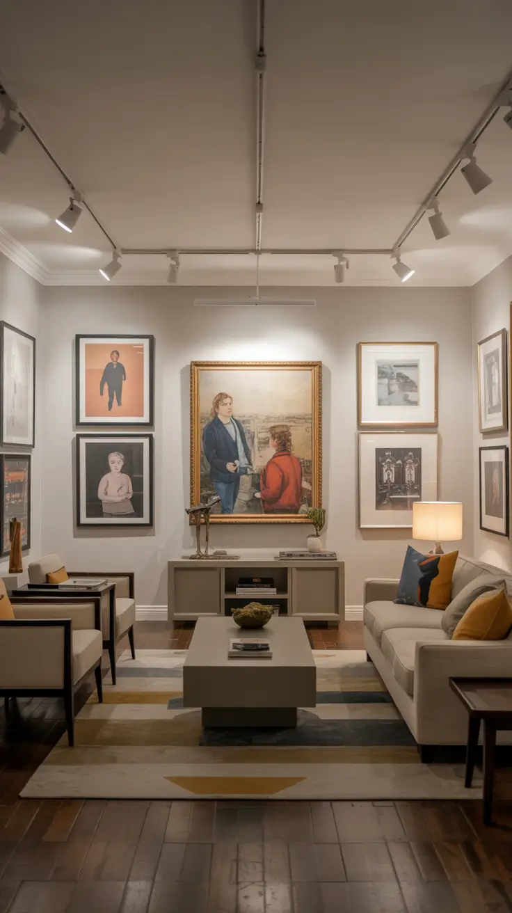
DIY Canvas Art Ideas for Living Rooms
Designing walls as gallery spaces allows canvases to shine while keeping walls visually complete. I select neutral wall colors that complement warm tones, with more intense hues inside niches to frame artwork. Horizontal picture ledges enable easy rotation of art, creating a dynamic yet uncluttered cultural space. DIY enthusiasts can create canvas art that fits seamlessly into this setting.
Furniture is kept simple and serene: low-profile oatmeal or grey sofas, rounded wood coffee tables, and slim black floor lamps maintain open sightlines to the art. Two-tone built-in shelves hold ceramics and books that echo canvas colors. Kilim or dhurrie rugs ground the palette on the floor. Accent walls behind sofas can be deepened easily to enhance the backdrop.
For DIY canvases, I recommend abstract forms like large blocks, arches, or motifs in three correlated hues plus a neutral to maintain cohesion. Warming off-white backgrounds work well in evening light. Spaced templates hung on walls create a deliberate, gallery-like effect.
To get started, gather primed canvases, painter’s tape, a level, acrylic paints in your chosen colors, and frames matching your lamp metals. Use a layout diagram to space canvases proportionally above sofas. Photograph walls before hanging to facilitate future swaps, keeping your gallery evolving.
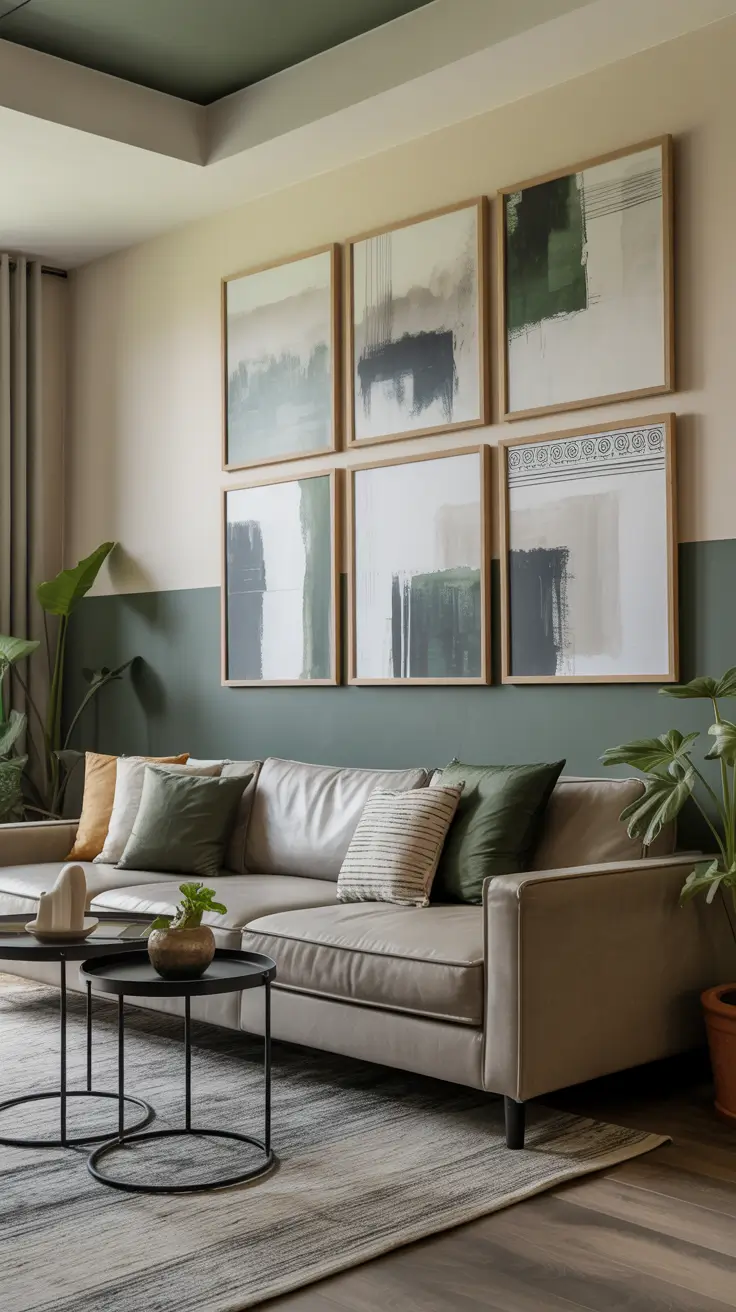
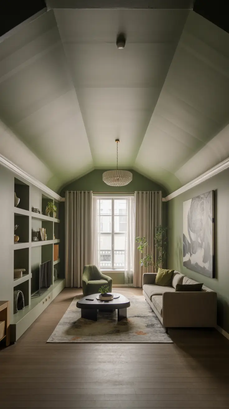
Serene Green Shades for Tranquil Living Rooms
Green is a versatile choice for calming interiors, offering visual neutrality with vitality. In large rooms with high or vaulted ceilings, laminated greens create a balanced volume. I often use two-tone walls with softened mid-tones and lighter pastel ceilings. When connected to kitchens and dining areas, I extend the palette subtly to unify open spaces. This approach grounds grey sofas, natural oak, and built-in shelves without visual noise.
Mapping paint to surfaces alongside furniture and finishes is essential. For tall ceilings, I pair satin mid-tone greens on walls with matte lighter greens above picture rails or cornices. Warm white trims and built-ins, grey wool rugs, and linen drapes maintain a cozy neutral base. Brass task lamps, black metal side tables, and abstract canvas art add subtle contrast. Plants echo the palette, enhancing a healthy, natural vibe.
Shades like sage, bay leaf, and laurel perform well under warm LED lighting, maintaining vibrancy day and night. Testing multiple samples on different walls helps reveal undertones in varying light. I keep sheens consistent for visual calm. Colorful accents are best limited to pillows or a single ceramic lamp, letting green remain the hero without clutter.
To deepen the palette, paint built-in shelf backs a shade darker than walls to highlight books and ornaments. Repeat this darker tone on lower media consoles to create a cohesive loop, balancing uniqueness with relaxation.
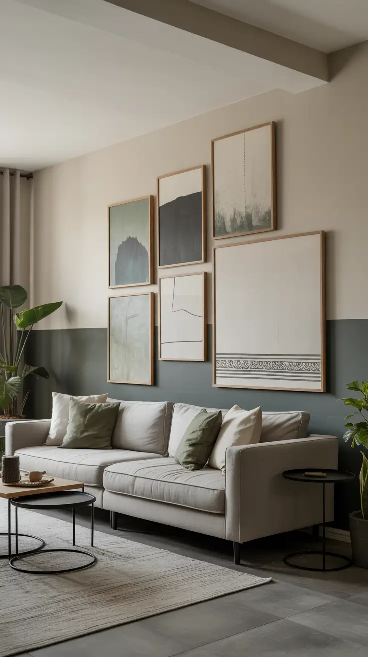
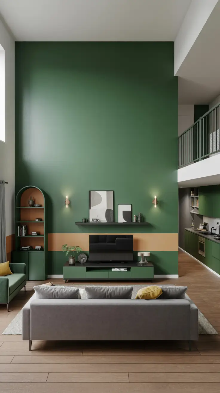
Horizontal Color Breaks for Balanced Living Rooms
Horizontal painting techniques are ideal for rooms with disproportionate height or narrowness, visually widening and leveling the space. I often apply a horizontal color break around the room at chair rail height or just above sofa backs. The lower band is a stable dark neutral or grey, while the upper is lighter and airy. In vaulted ceiling rooms, this softens oblique angles and frames art collections, creating harmony especially where living rooms flow into kitchens and dining areas.
For materials, I pair mushroom tones with warm white above, separated by a fine painted line for precision. Long, low sofas, linear consoles, and wide rugs reinforce the lateral pull. Built-in shelves follow the stripe logic with darker bases and lighter tops. Wider curtain rods than window frames add horizontal emphasis. Rustic benches or Bohemian kilims placed lengthwise echo the effect.
The key is subtle contrast—two close tones in the same family—to avoid harshness. Art frames or picture ledges softly accentuate the band. Accent walls maintain the horizontal band continuous to avoid visual breaks. In standard ceiling rooms, a 1:1.2 ratio between lower and upper bands feels natural; in taller rooms, the band is slightly reduced to human scale.
Adding coordinating stripes to doors or cabinet fronts near the living area connects circulation elements to the design, enhancing cohesion without drawing undue attention.
DIY Living Room Painting Projects for Beginners
For approachable DIY painting projects, I focus on forgiving, budget-friendly, and reversible ideas. Repainting trims, doors, and a single accent wall refreshes the space without a full overhaul. Color-blocking geometric shapes behind sofas stabilizes seating areas. When living rooms adjoin kitchens or breakfast bars, painting the bar front in the same color unifies zones without repainting all walls, maintaining momentum and confidence.
My toolkit includes high-quality rollers, angled sash brushes, fine painter’s tape, and low-odor acrylic paints suitable for lived-in homes. Two-tone mantles or media walls with shelves painted in contrasting colors create custom looks without carpentry. Horizontal lines are kept precise using small step ladders and laser levels. Professional finishes require drop cloths, sanding sponges, and caulk.
Success hinges on preparation and sequence: washing, renewing, sanding, priming, cutting in manually, and rolling evenly. I evaluate colors in daylight and evening light with warm 2700K bulbs to avoid surprises. For subtle style updates, I paint baseboards and door casings in sharp satin finishes. When uncertain about bold colors, start with a small wall to live with it for a week.
To aid decision-making, I create a mini test board library using foam boards painted with candidate colors, labeled and moved around the room. This mess-free method helps objectively audition color schemes.
Canvas Art DIY Techniques to Enliven Living Rooms
Canvas art breathes life into rooms without overwhelming with color. DIY pieces allow repetition of wall tones and fabrics, creating harmony. I favor acrylic paints for quick application, painter’s tape for sharp edges, and modeling paste for subtle texture visible across large rooms. Triptychs above sofas complement high ceilings. Two-tone walls pair well with gradients, soft stripes, or low-contrast grids. Floating natural oak or black frames complete the look. To avoid glare, canvases are placed away from direct sunlight or coated with matte varnish.
My most successful DIY canvases use two room colors plus a surprise accent—perhaps a pastel blush or a green echo tied to plants. Designs are planned on paper before painting. Clean edges and generous proportions give a designer finish. Bohemian rooms benefit from hand-drawn linework to soften geometry without overworking.
Before painting, I pin paper templates on walls to test size and spacing, ensuring balance with sofas and sconces. This prevents undersized artwork, a common DIY pitfall.
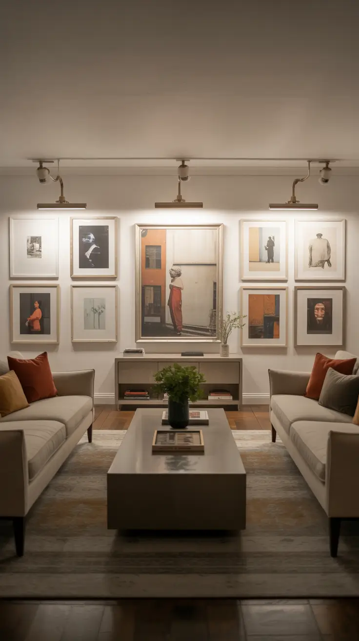
Creative Canvas Walls for Dynamic Living Spaces
For creative living rooms, I design adaptable gallery walls that evolve with seasons or tastes. In open-plan kitchens and living areas, large canvases create subtle separations without physical barriers. Vaulted ceilings benefit from oversized vertical canvases to anchor height, with smaller horizontal pieces stitching seating zones. The rest of the palette remains neutral with one or two colorful accents for a curated, uncluttered look. Art installations become focal points, allowing surrounding walls to stay calm.
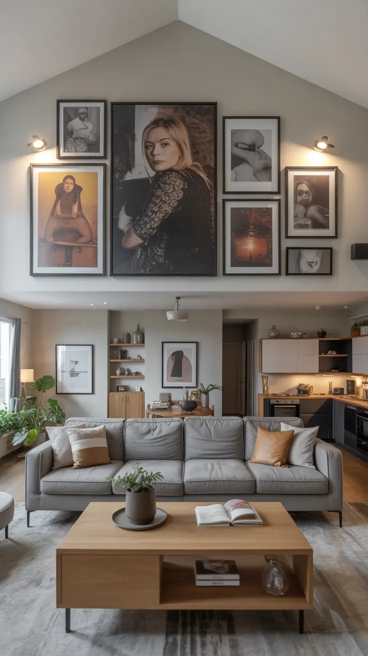
I select a mix of sizes—one large hero piece, two medium supports, and several small studies—to allow flexible rehangs. Frames share materials, and art ranges from abstract canvases to minimal landscapes and line work, maintaining energy variation. Built-in shelves echo the art grid, creating a unified wall. Grey sectional sofas, oak coffee tables, and textured rugs provide a solid base. Gallery lighting with picture lights or track heads enhances clarity.
Creative walls resonate best when reflecting the room’s color palette. Drawing colors from pillows and throws integrates artwork into the home. Including green notes ties in plants, refreshing the composition. Rustic styles benefit from warm clay and sage tones, softened by organic shapes and freehand stripes for a Bohemian touch.
Maintaining a rotation plan with extra canvases swapped seasonally keeps the room feeling fresh and encourages ongoing creative expression.
Elevate Your Home with Aesthetic Living Room Painting
For an aesthetic living room, I view color, light, and proportion as a harmonious dance enhancing architecture. The goal is a balanced composition where one accent wall draws the eye while other surfaces remain neutral and breathable. I start with low-saturation hues that photograph well and complement colorful fabrics and art without overpowering. Soft contrasts define zones in open kitchens or high-ceilinged rooms. Two-tone pairings and horizontal breaks are subtle, making the space feel designed yet uncluttered.
Furnishings include cozy neutral sofas paired with natural wood tones under soft-white textured walls. A single abstract canvas above the sofa echoes accent colors, with smaller frames adding secondary notes. Matching hardware finishes in brass or matte black unify lighting and cabinetry. Built-in shelves painted a shade darker than walls showcase books and ceramics without visual noise. A subdued rug anchors the conversation area, creating serenity.
The most beautiful aesthetic designs come from restraint and testing large swatches under various lighting to avoid surprises. Ceilings are kept slightly lighter than walls to lift the room, especially when ceilings are not very high. For drama, deep tones on far walls add depth without enclosing seating. Sheens are practical—washable matte on walls and satin on trim—to maintain crisp edges.
Adding a library of accent textiles after painting helps the palette settle. Framed canvas art repeating accent wall colors creates harmony. For subtle glamour, incorporate mirrored trays or glazed planters instead of extra metallics. Matching rugs and large art pieces in the same color thread ensures a cohesive flow from entry to sofa.
Soft and Dreamy Pastel Living Room Ideas
Pastel palettes aim for a soft-focus effect that feels sophisticated rather than juvenile. I start with light hues like pastel green, misty grey, or blush, which look comfortable in natural light. Keeping trims crisp and limiting the palette to two related colors prevents sweetness from becoming childish. Walls support layers of texture—boucle, linen, rattan—without stark contrasts, creating a light, airy atmosphere perfect for relaxing mornings and evenings.
Furniture is key: low-profile oatmeal linen sofas, pale oak coffee tables, and smooth curtains filtering light complement pastel walls. Abstract canvas art with white space and pastel strokes ties the scheme together. Green plants add life and natural contrast. Built-in shelves painted in matching or lighter pastels blend seamlessly.
Pastels benefit from grounded elements like charcoal rug stripes or dark metal lamps to provide visual rest. Design experts note that contrast prevents pastel rooms from feeling floaty. For Bohemian layers, a single colored kilim pillow balances silent walls. On high ceilings, whisper-soft ceiling shades reduce bulkiness. Warm 2700–3000K bulbs flatter pastels and prevent graying at night.
Enhance with small canvas galleries echoing wall colors, woven throws matching pastel greens, and warm wooden side tables to balance cool tones. Align curtain headers with architectural lines for neat compositions.
Expansive Living Room Painting Ideas for Large Spaces
In spacious rooms, painting controls scale and proportion to avoid cavernous feelings. Color zoning defines seating, dining, and circulation without physical barriers. Two-tone walls with neutral bases and lighter upper sections rest the volume. Long, low accent walls or horizontal color blocks complement tall ceilings, humanizing the space. Vaulted ceilings remain light to preserve airiness, with walls carrying the color narrative.
Furniture and art scale up accordingly: oversized abstract canvases above central sofas, sectional seating, large coffee tables, and substantial lamps prevent paint from bearing all visual weight. Built-in shelves painted slightly darker than walls add rhythm and storage. Accent cushions and throws provide focused color, guiding the eye through the room.
Horizontal painting techniques are invaluable for balancing tall or echo-prone spaces. Painting a neutral band mid-wall visually lowers the room’s perimeter. Testing band height against window headers and artwork helps find the ideal placement. For color lovers, a single long splash of color is less overwhelming than multiple patches. Washable matte finishes reduce glare on large surfaces.
Adding a second layer of wall art along the length maintains rhythm. Console tables with lamps create cozy light pools at night. Acoustic issues can be addressed with textured panels or tapestries matching the color scheme. Wall-to-wall curtain rods extend horizontal lines, enhancing scale and cohesion.
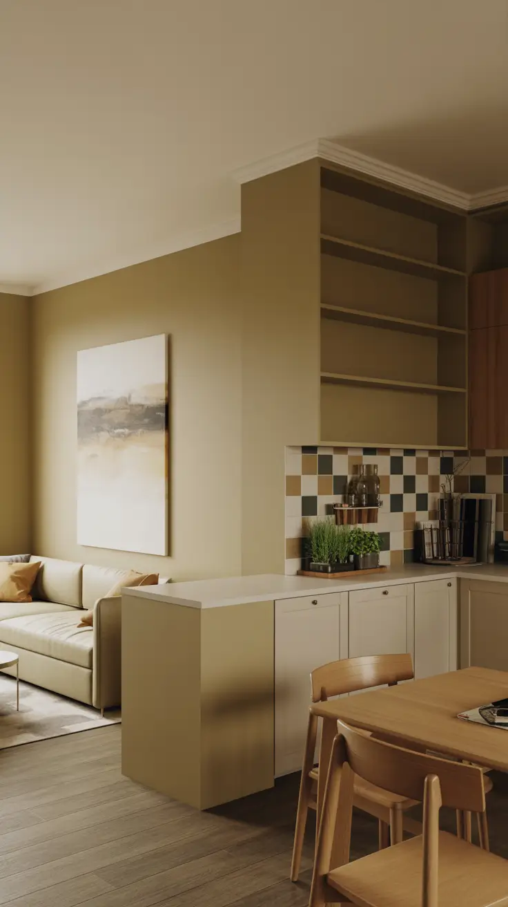
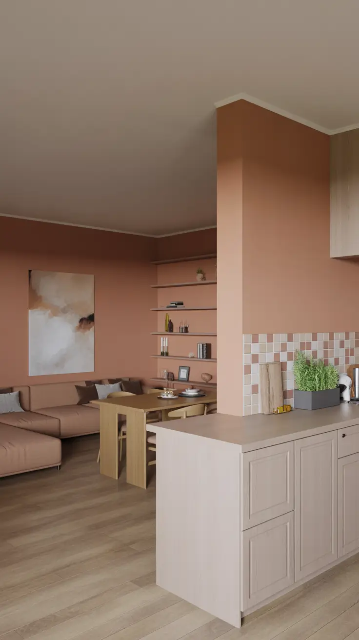
Seamless Kitchen and Living Room Painting Ideas
Open layouts benefit from color continuity with subtle identity distinctions. I start by sampling cabinet finishes, countertops, and flooring, then develop a palette bridging these elements. When kitchens have cool tones and living rooms need warmth, I balance with neutral walls and accent walls facing seating areas. Horizontal alignment is key, with consistent wall colors across shared planes and color shifts at architectural breaks, ensuring smooth visual flow.
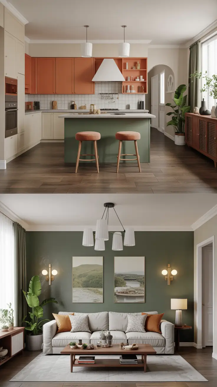
Kitchen walls remain simple to showcase cabinetry, tile, and metal finishes. Living rooms gain personality through accent walls or fresh greens. Coordinated canvas art near entrances repeats kitchen colors, unifying spaces. Shared colors appear in stools, dining chairs, and sofa pillows. Lighting is carefully balanced or deliberately contrasted to avoid visual noise.
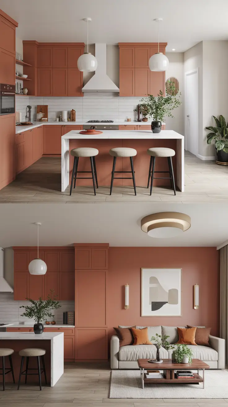
Unity is easiest with one color repeated thrice across kitchen and living areas. Paint should complement fixed elements, not compete. Ceilings are kept white, with walls defining zones. For extra energy, use colored backdrops or neutral living rooms, not conflicting colors. Matching paint sheens across pendant and sconce lighting ensures consistent appearance.
Adding a paint map for stops and starts at inside corners helps manage open plans. Area rugs traversing circulation paths and repeating island colors in art or trim create cohesion. Plants visible from both rooms enhance continuity.
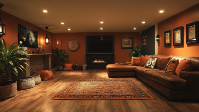
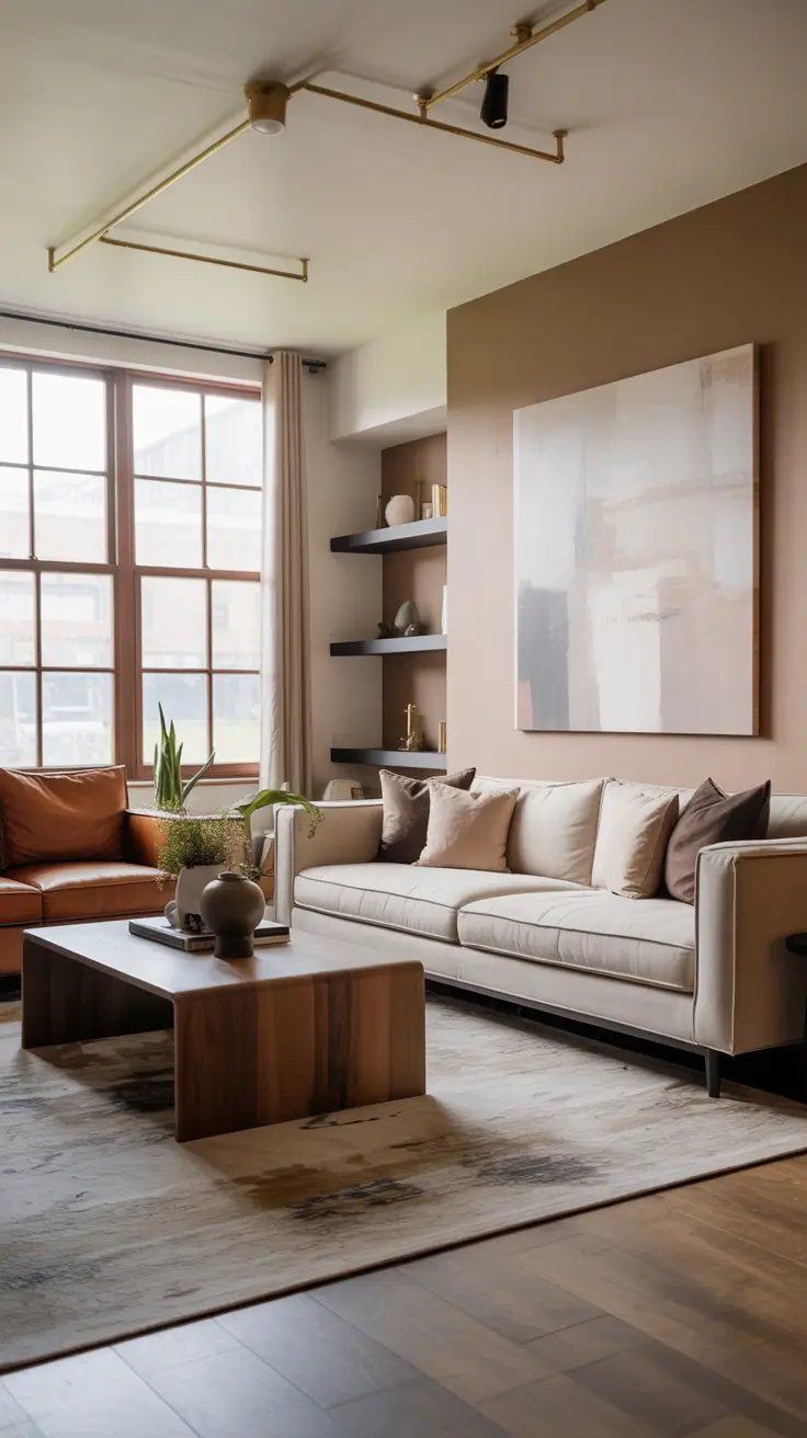
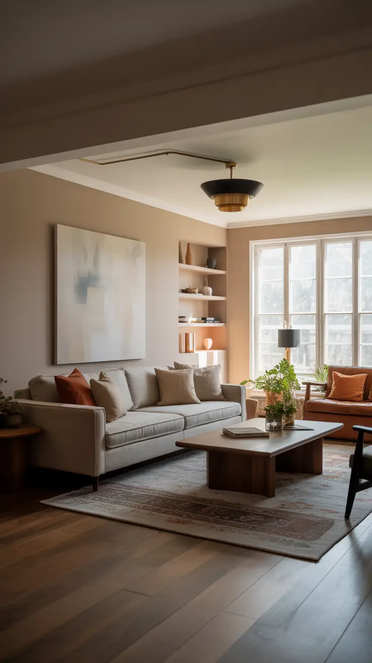
Warm and Inviting Cozy Living Room Painting Ideas
To cultivate warmth, I favor mid-value colors that envelop without shrinking space. Shades like brown terracotta, muted olive, or cozy grey offer elegance and comfort. Painting walls, trim, and doors in similar hues creates a cocoon effect, especially in rooms used primarily at night. Fireplaces are highlighted with darker shades to draw focus, fostering intimate, lounge-like atmospheres ideal for reading and conversation.
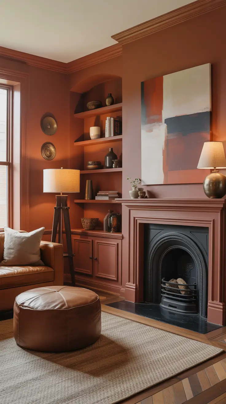
Furniture supports comfort with tactile warmth: chunky knit throws, velvet pillows, wool rugs over wood floors. Muted abstract canvas art fits perfectly. Western elements like leather ottomans add grounding. Fabric-shaded lamps provide softer light than exposed bulbs. Shelves painted to match walls minimize visual noise, creating continuous, curated displays.
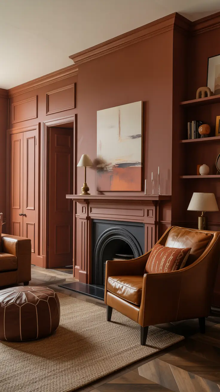
Cozy palettes thrive with layered lighting and low contrast. Dimmable fixtures and warm 2700K bulbs enhance inviting warmth. Bohemian touches like patterned textiles add energy without overwhelming. Plants and dried stems maintain harmony. Matte or eggshell finishes preserve softness without excessive gloss.
Adding a reading nook with slightly darker ceilings enhances intimacy. Framed canvas art with warm undertones revisits the palette subtly. Extending paint onto kitchen sides of shared columns fosters continuity. Floor-length curtains complete the relaxed, tailored look.
Two-Tone Walls for Structured Modern Living Rooms
Two-tone walls offer mood and structure with minimal planning, ideal for zoning open kitchen and living combos. Typically, a darker base anchors the space, with a lighter upper section lifting ceilings. In open kitchens, the darker band continues across shared walls to maintain clean sightlines. Horizontal divisions align with sofa or console heights, creating dialogue between architecture and furniture, resulting in contemporary serenity regardless of color choice.
Heavier furniture like sofas and built-ins pair with the darker base, while art and lighting frame the lighter upper color. Oak media stands and stone coffee tables rest confidently against saturated lower walls, balanced by linen curtains and light carpets. Accent walls are reserved for problem-solving, such as anchoring fireplaces or off-center windows. Matte finishes minimize glare, making splits appear intentional. Thin black or brass frames unify colors and maintain cohesion.
Two-tone walls are among the quickest DIY upgrades, perfect for weekend projects. Paint brands often offer matching sets, which I use as starting points. Maintaining splits at chair-rail or door-top height achieves pleasing proportions that photograph well. Concealing seams with micro-rails or thin picture ledges provides display space and a polished finish.
For first-timers, I recommend checklists on taping straight lines, roller nap selection, and planning corner transitions. Additional color pairs like neutral taupe with warm white or deep blue with pale grey offer cozy or energetic alternatives. Sampling colors on both upper and lower halves prevents surprises from undertones at night.
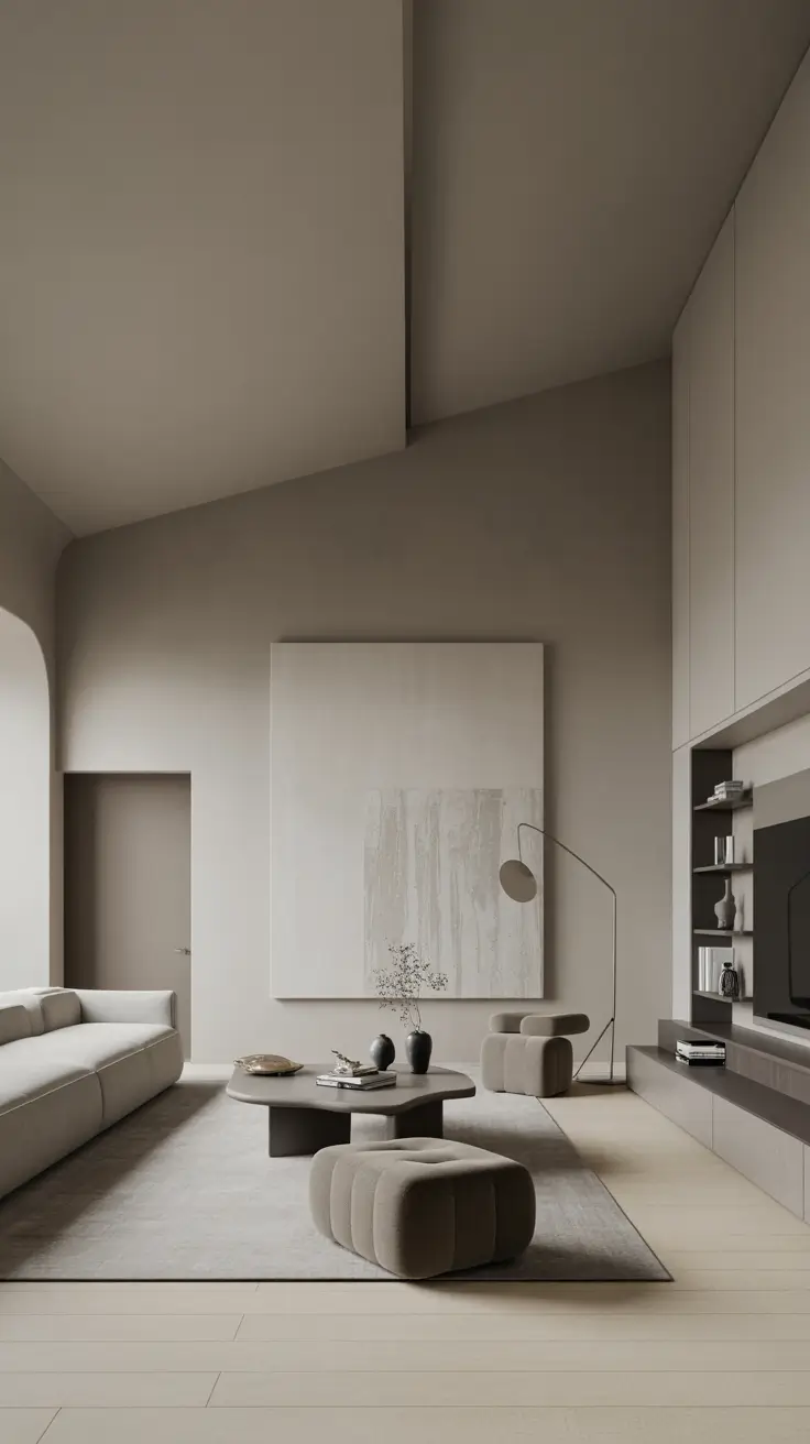
Dramatic Tall Ceiling Living Room Painting Ideas
In rooms with high or vaulted ceilings, paint helps balance scale and comfort, preventing cavernous impressions. My favorite approach is color-drenching walls, trim, and ceilings in one shade, especially in large vaulted spaces. Extending wall color onto ceilings by 12–18 inches brings walls down visually, or using a ceiling tint two shades lighter than walls adds subtle contrast. For rooms spanning dining or kitchen areas, repeating ceiling shades ensures visual flow, glorifying height while maintaining warmth.
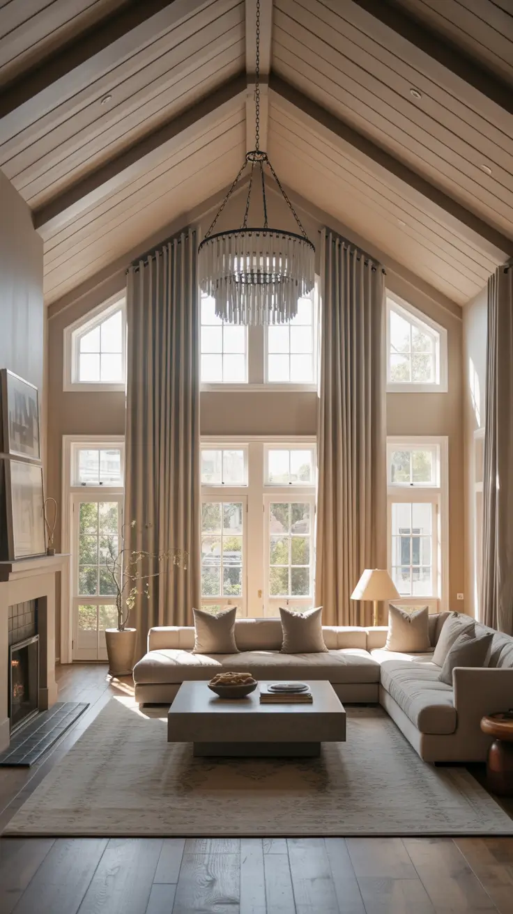
Scaled lighting and furniture—multi-drop chandeliers, tall floor lamps—connect lower seating to ceilings. Long drapery panels hung high and wide soften acoustics. Deep sofas, wide coffee tables, and rugs anchor the space, preventing the eye from drifting upward. Tone-on-tone mantels blend with walls, while slim picture rails or tall bookcases emphasize sightlines.
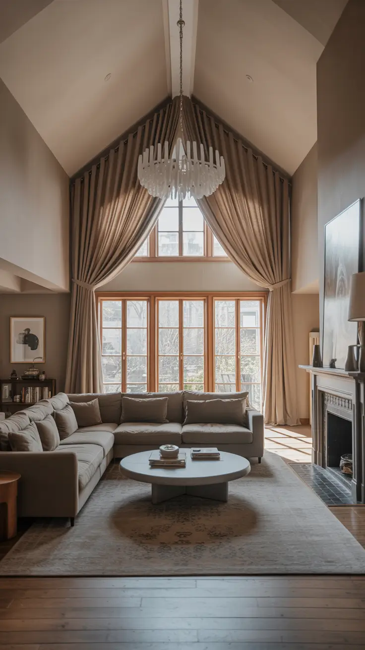
Avoid pure white ceilings and grayish tones in cool climates; colored ceilings add richness. Test large samples with peel-and-stick sheets and portable lamps to observe color behavior. Warm greys with green or violet undertones prevent coldness at night. Nonjudgmental palettes allow art and textiles to shine. The result is dramatic yet peaceful, ideal for tall rooms.
Ensure sheen continuity across walls, trim, and ceilings to avoid uneven appearance under evening lighting. Align vertical art stacks with architectural mullions or doors for rhythmic purpose. Use scrubbable finishes on lower walls where fingerprints accumulate.
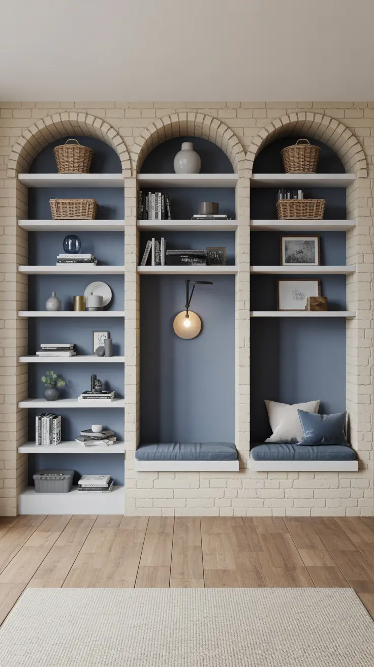
Enhancing Built-In Shelves and Nooks with Paint
Built-in shelves and nooks offer natural canvases to add depth without overwhelming. Painting back panels a few shades darker than walls frames objects clearly. For shelves enclosing doors or window benches, extending wall color over trim simplifies visual reading. Alternatively, light backs with darker shelf frames create subtle graphic contours. This approach feels custom and intentional in both classic and modern homes.
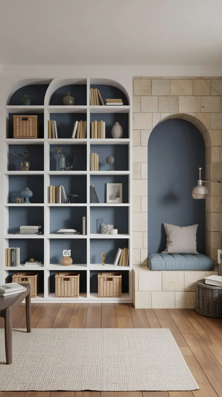
Styling involves selecting larger objects to reduce clutter: tall vases, plain-jacket books, woven baskets, and a few sculptures. Reading nooks benefit from wall-mounted sconces and cushions matching shelf colors, connecting micro-spaces to the palette. Small canvases on shelves avoid drywall holes and allow evolving compositions, perfect for budget-friendly DIY art.
Seasonal shelf back painting is popular for easy refreshes without moving heavy furniture. Indian-themed textiles or ceramics can subtly nod to cultural motifs without overwhelming. The art lies in restraint and repetition, creating a clean, sophisticated look.
Include sketches for shelf spacing to accommodate large art books and tall objects. Plan cleaning routines as darker backs show dust more quickly. Mini palettes like warm neutral linen walls with olive backs or pale stone walls with midnight blue backs offer inviting contrasts.
Personalized Living Room Painting Ideas for Unique Spaces
For truly unique designs, I base ideas on client stories, letting paint tell the narrative in clever, livable ways. Gentle mixed murals create atmospheric backdrops without tying to trends. Broken-color effects on accent walls add texture and serenity. Cultural patterns like small stenciled borders or framed panels nod to Indian motifs without feeling dated. The goal is sustainable personality.
Furniture remains simple to let paint take center stage: natural fiber rugs, clean-lined sofas, and natural sideboards provide a solid base. Art—abstract canvases or colorful prints—repeats wall colors. Mixed metal lamps and hand-thrown ceramics add tactile interest without clashing. Dimmable lighting ensures subtle paint reading at night.
Prototyping is essential: sketch ideas with painter’s tape or chalk to check proportions before painting. Contrast and repetition make creative moves feel complete. Repeat wall colors in pillows, throws, or decor to unify. For rustic or Bohemian styles, balance patterns with ample negative space to keep rooms breathable and fashionable.
Include checklists for tools and steps, especially for multi-layer finishes. Seal high-contact areas like switches to protect delicate finishes. Testing removable panels before committing allows flexibility without repair hassles.
Green Living Room Painting Ideas for Natural Harmony
Green is a versatile, accommodating color that pairs well with wood, stone, and textiles. Shade selection depends on light: pastel sages for darker rooms, mid-tone olives for balanced light, and deeper greens for sunny spaces. Keeping ceilings and trims light enhances clarity. For enveloping effects, paint walls, doors, and trim in one green, with ceilings slightly lighter, creating a relaxed, unified atmosphere.
Warm materials like oak floors, wool rugs, linen curtains, and boucle sofas prevent clinical vibes. Brass or black metal lamps add edge, while stone or plaster coffee tables cool the palette. Built-in shelves painted darker than walls add depth and enclosure. Botanical or landscape art fits naturally, with small canvas abstracts echoing wall colors to create a museum-like feel.
Mid and deep greens conceal wear better than very light shades, ideal for busy homes. For neutral schemes, soft green greys act as subtle backgrounds, with color introduced via pillows and books. Testing greens in morning and evening light reveals undertone shifts. Sampling near furnishings avoids surprises.
Reliable palettes include olive with warm clay and sand textiles, or silvery green with charcoal, cream, and oak. Simple striped or checked pillows add vibrancy. Cultural touches like carved stools or block-printed cushions nod to Indian crafts without literalness, creating layered, comfortable spaces.
Canvas Indian Living Room Painting Ideas with Cultural Flair
Starting with canvas Indian motifs and earthy patterns, I use neutral wall foundations with warm terracotta, dark green, and subtle saffron overlays to avoid theme-heavy spaces. This works well in tall or vaulted ceiling rooms, grounding colors. In open kitchen-living layouts, repeating accent colors on small walls or kitchen islands ties spaces together, blending traditional inspiration with modern aesthetics.
Furniture includes small grey or natural linen sofas, carved wooden coffee tables, and wool rugs reflecting canvas palettes. Shelves painted in muted clay or stone shades display hand-thrown ceramics and textile samples, extending canvas painting ideas. Blackened metal floor lamps, cane chairs, and sideboards add texture without clutter. Wall art features horizontal arrangements of Indian-inspired canvases, blending modern narratives.
This approach feels sophisticated rather than costume-like due to authentic textures. Large paint samples on various walls reveal how natural light affects saturated colors. Trims and ceilings in crisp or warm off-white frame art elegantly. For more color, desaturated teal or olive serve as neutral-adjacent hues, maintaining elegance over symbolism.
Adding DIY canvas art with simple block-printed motifs keeps palettes lean, personalizing spaces without overwhelming.
Accent Walls to Infuse Character
Accent walls quickly add personality. Horizontal two-tone or color-blocking techniques widen rooms visually. In large spaces, painting shorter end walls darker creates tunnel effects. Neutral mid-depth backgrounds behind sofas support design without overwhelming. In open kitchens, repeating accent tones on floating shelves or island stools makes palettes purposeful. This style suits contemporary, Bohemian, and rustic western interiors.
Furniture should not compete with accent walls. Plain couches, layered rugs, and media storage complement colors. Picture ledges or built-ins painted to blend with walls reduce visual noise. Wall sconces add height. Position darker bands at sofa-back height to elongate rooms. Mixed framed art keeps compositions dynamic; skinny coffee tables preserve negative space.
Accent colors should complement existing materials. Colored bands with putty or warm grey bases work well, with greens, navy, or subtle burgundy accents. For tall ceilings, balance vertical scale with low wainscots or picture rails in accent colors. Low ceilings benefit from lower accent placement and light ceilings. Matte finishes minimize roller marks and enhance polish.
For layered effects, add a second accent wall with lighter related shades or textured paints like limewash, avoiding one-note statements.
Family-Friendly Living Room Painting Ideas
Palettes should support daily life and withstand wear. I prefer subdued neutrals that borrow tones from kitchen and dining finishes, creating integrated floors. Cream, mushroom, and warm grey walls with green or pastel blue undertones provide comfortable backdrops. Consider sound, lighting, and traffic flow, choosing easy-to-clean paints in high-touch areas. The result is inviting, not precious.
Furniture focuses on deep, comfortable seating in performance fabrics, rounded coffee tables, and storage sideboards to hide clutter. Shelves near media areas painted to match walls reduce noise. Large soft rugs cover seating zones. Layered lighting with table lamps and dimmable overheads creates cozy evenings. Wall art is intimate, featuring family photos and DIY canvas paintings that echo kitchen palettes, unifying the home.
Families appreciate limited accent strategies updated seasonally. Green accents in pillows or plant walls offer easy refreshes. Starting with rug colors and matching wall undertones is a reliable method. Washable matte or eggshell finishes allow seamless touch-ups. Soft, play-safe décor like fabric Roman shades and lightweight wood frames keep rooms flexible and harmonious.
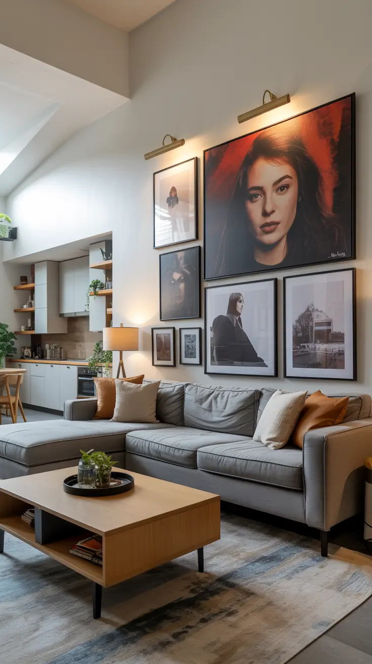
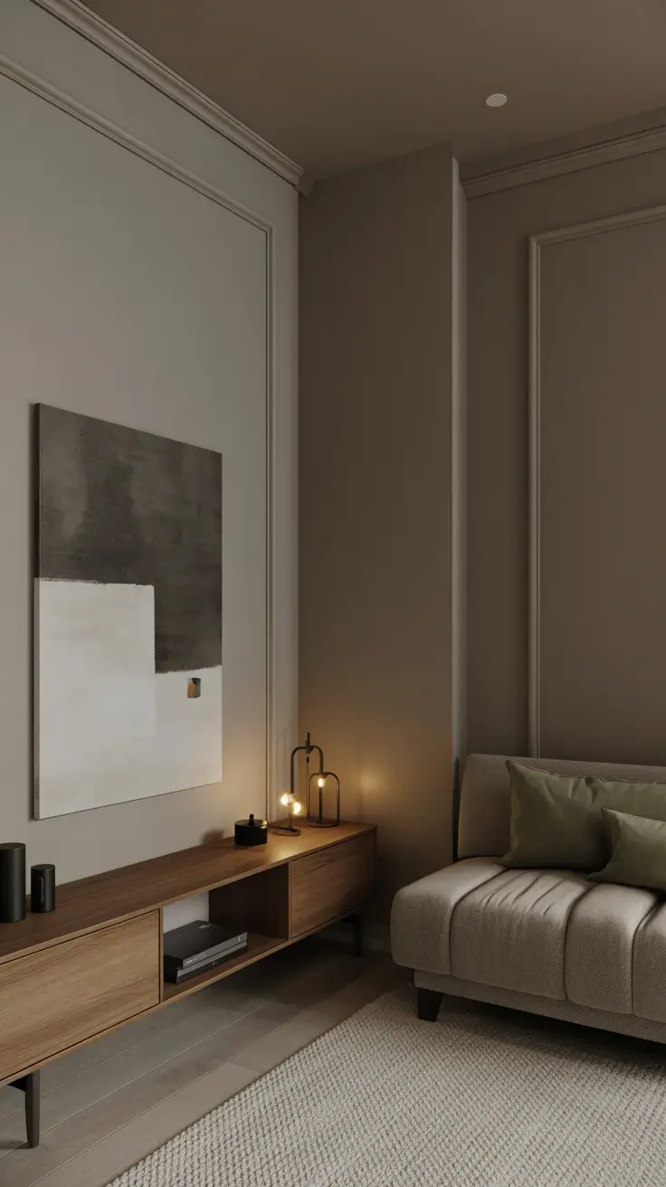
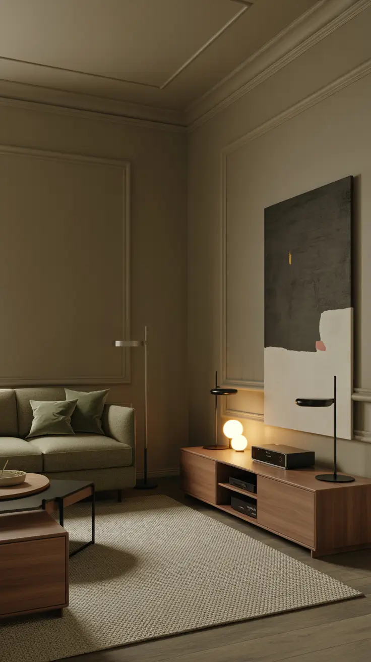
Abstract Canvas Art for Modern Living Rooms
Abstract canvas art inspires edge and revelation. I use neutral backdrops with two or three artwork colors echoed in textiles to maintain balance. Clean edges, negative space, and subdued materials suit high or vaulted ceilings where large canvases feel proportionate. The atmosphere is contemporary without coldness.
Furniture is minimal: low modular sofas, thin-profile coffee tables, and legged media units. Bold art shapes repeat in sculptural lamps or statement chairs. Shelves painted like walls let canvases shine. Two-tone schemes with soft neutrals and light greys introduce subtle horizons behind art. Art placement varies between horizontal and staggered.
Try saturated colors in thin bands or painted reveals on door openings to evoke gallery vibes. Soft-sheen finishes photograph well without glare. Negative space prevents overcrowding, allowing structures to breathe. For dimension, add textural paints or microcement consoles in neutral tones, enhancing abstract language without visual noise.
Bright and Colorful Living Room Painting Ideas
To brighten rooms, I consider natural light, size, and kitchen connections to select suitable color combos. Positive palettes of green, coral, and powder blue or light trios enliven north-facing spaces. Horizontal banding visually lengthens small rooms; full-color envelopes suit large spaces. Ceilings painted half-tone darker than walls avoid cavernous effects, maintaining joyful moods without chaos.
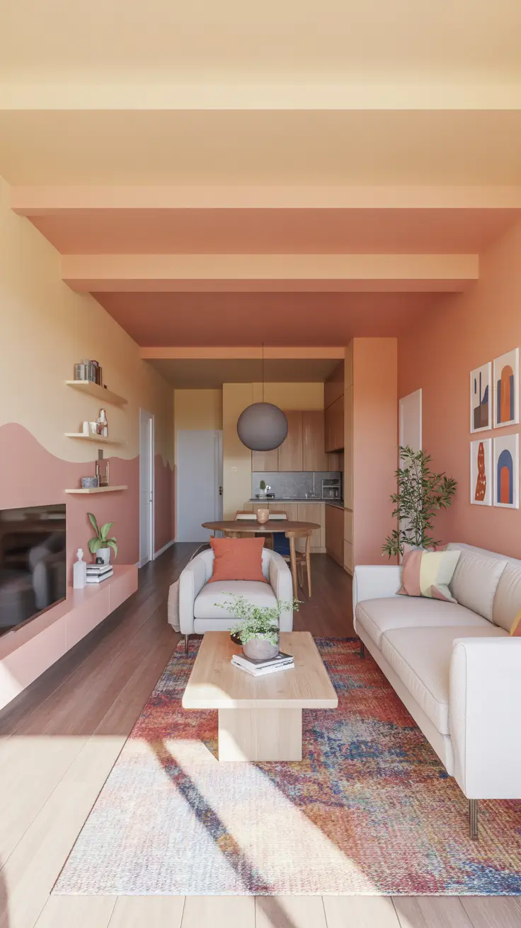
Furniture balances color and neutrals: light sofas, natural wood coffee tables, and colorful rugs complete schemes. Shelves painted in lighter related shades reduce visual density. Drum side tables add roundness. Wall art combines colorful prints and small DIY canvas paintings to customize palettes. Plants add irreplaceable green life.
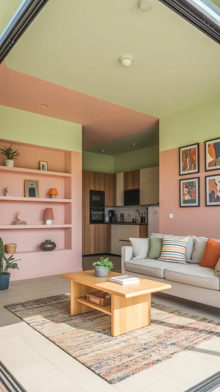
I avoid painting all surfaces bold unless rooms are very large. Contrasting vivid bottoms with neutral tops keep spaces light and dynamic. Reflected light from floors and countertops alters perceived hues, so sampling is essential. Door and window trims maintain cohesion with playful walls.
To boost brightness, add satin finishes on strategic walls, reflective side tables, and layered lamps, preserving style and daily function.
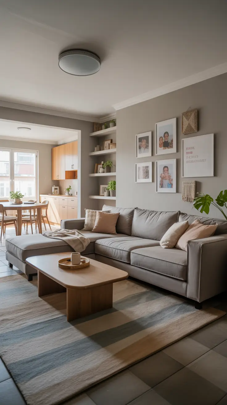
Timeless Neutral Living Room Painting Ideas
Neutral palettes provide peaceful foundations adaptable to changing décor and daily life. Light off-whites, soft greiges, and warm stone shades keep lines open and blend with open kitchens. Ideal for small apartments or large homes with built-ins, neutrals reflect natural light shifts and resist yellowing or pinking. The result is inviting, versatile, and ready for seasonal changes.
Anchors like putty-colored linen sofas, pale wood coffee tables, and low-sheen jute rugs add depth. Abstract canvas art introduces motion. Black metal floor lamps, soft brass hardware, and bone pottery create subtle punctuations. Curtains slightly darker than walls frame windows without blocking light.
Testing undertones in various light exposures is critical. Large swatches observed morning to evening prevent surprises. Eggshell finishes balance wipeability and low gloss, ideal for family rooms. Trims painted a shade lighter sharpen edges subtly, maintaining clean, photo-ready spaces.
Adding a single accent wall in shallow rooms or low ceilings grounds art and provides focus. Horizontal picture rails matching trim offer neat frame arrangements and future refresh ease.
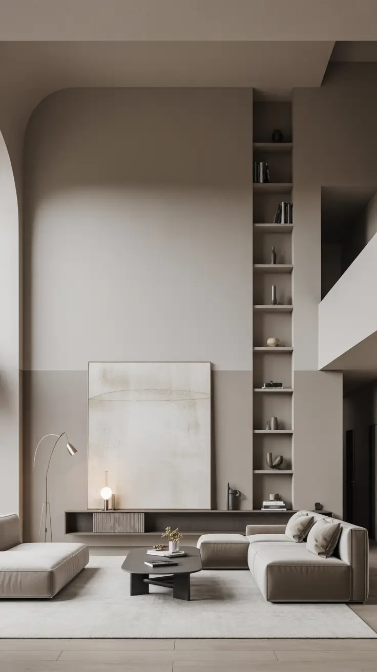
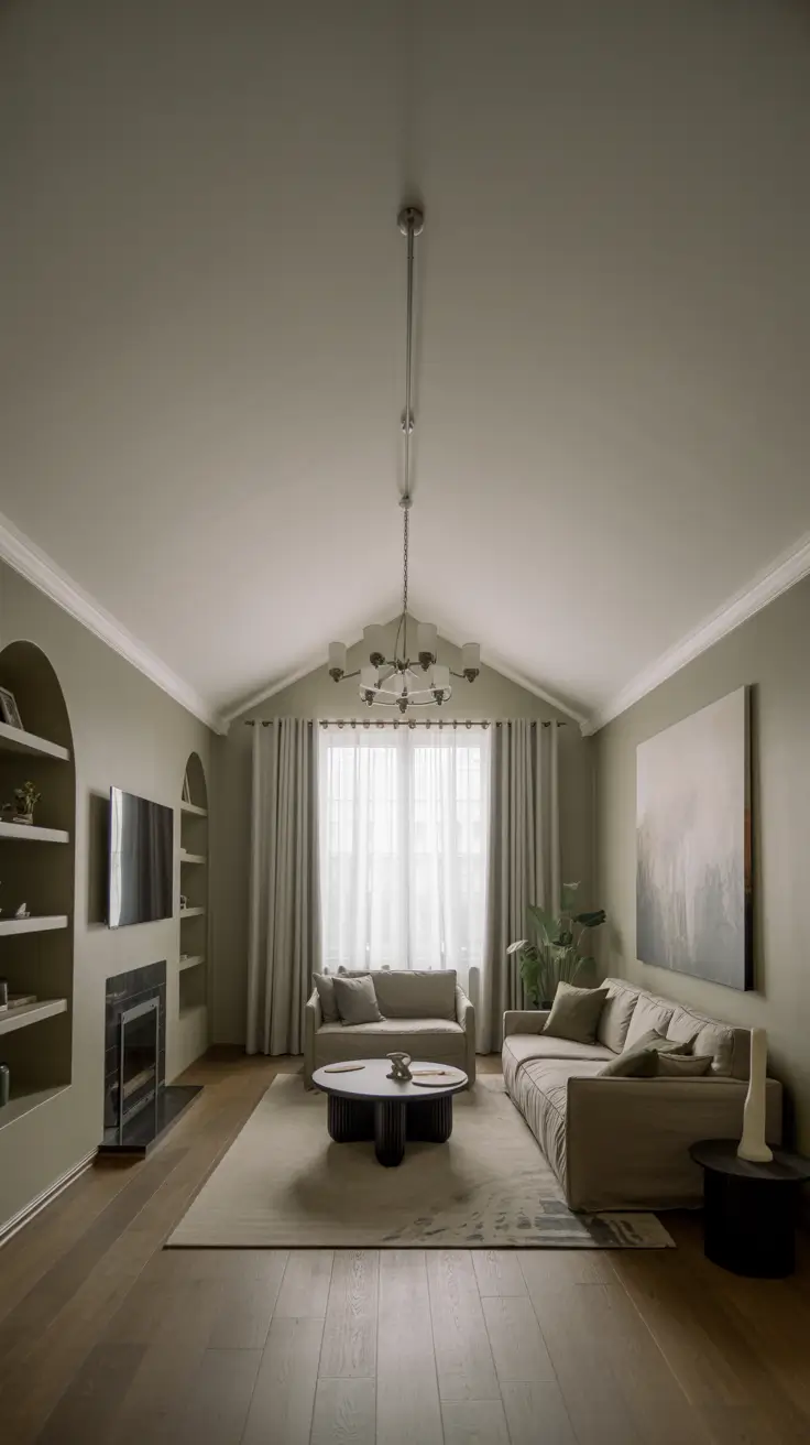
Grand High Ceiling Living Room Painting Ideas
Tall or vaulted ceilings require color planning to balance human scale and vertical grandeur. I analyze architectural features like beams and clerestory windows to emphasize lines. To reduce cavernous effects, ceilings may be painted darker than walls or walls tinted near ceilings. Open kitchen connections maintain clean transitions, preserving majesty and comfort.
Furniture is scaled to fit: tall bookcases painted like walls extend eye movement upward, heavy floor lamps, large rugs, and oversized wall art prevent disjointedness. Natural wood beams add warmth; painted beams a shade darker than ceilings create custom lines. Window treatments hung near ceilings enhance openings.
Color blocking manages height without trendiness. Horizontal bands below door height create datum lines, giving eyes rest. Designers agree this relaxes towering rooms. In very high spaces, extending ceiling color onto walls seals the space visually. Track lighting and uplights enhance this effect.
Two-tone walls that respect beams, warm neutrals with dull gray ceilings, and textured fabric panels mute acoustics. Upholstered walls in matching palettes further soften sound.
Stylish Wall Art Integration in Living Rooms
When art is central, paint supports rather than competes. Low-chroma backgrounds make colors vivid and true. Uniform wall colors across living and kitchen areas create cohesive galleries with rotating displays. Large art anchors seating views; smaller pieces recede. This selective style feels aesthetic, not staged.
Furniture complements art stories: tailored sofas, clean armchairs, and quiet-finish coffee tables keep frames and canvases in focus. Picture lights and track heads highlight paintings, including DIY frames or quality prints. Consoles beneath statement pieces painted to match walls avoid visual gaps. Art colors echo in rugs and pillows, not entire palettes.
Warm whites or light grays best back colorful or monochrome collections. Using one color across display spaces avoids patchwork. Matte finishes reduce glare on glass. Accent walls reflect dominant artwork colors, maintaining flow.
For hanging, use consistent centerlines at seated eye level for horizontal rhythm. Tight grids with uniform spacing unify mixed-size displays into single design gestures.
Minimalist Grey Living Room Painting Ideas
Grey’s warmth or coolness depends on undertones and lighting. In cool, north-facing rooms, warm greys with beige soften sterility. Sunny rooms handle darker greys for sleekness. Grey walls complement technology, metal, concrete, or stone, fitting contemporary or neutral foundations.
Furniture adds warmth: oak or walnut case goods, woven wool throws, and looped pile rugs. Minimal silhouettes with black metal lamps and slim media units avoid clutter. Large charcoal and off-white abstract canvases with accent colors break monotony. Window treatments in darker greys maintain minimalism.
Right contrast sizing is key. Painting trims in the same grey but different finish softens edges. Matte walls and satin trims create gentle architectural definition. Deep graphite accent walls anchor layouts without overpowering. Flexible lighting with warm bulbs and dimmable overheads prevents greys from flattening. Faded green or clay pillows add human warmth.
Bohemian Living Room Painting Ideas with Artistic Flair
Bohemian style embraces curated, livable stacked colors. Starting with neutral plaster bases, I add accent walls in terracotta or olive green to evoke travel and craftsmanship. Base walls extend into open kitchens, with accents reserved for reading areas or built-ins. The goal is warm, personal, expressive interiors.
Furniture carries the palette: low cotton or linen sofas, older kilim or flatweave rugs, and wood-metal side tables. Rattan or leather chairs add texture. Art layers DIY canvas painting with Indian motifs or block prints, combined with handmade ceramics and plants. Picture rails or ledges allow rotation without excessive holes.
Bohemian rooms succeed with medium-value earthy tones, avoiding extreme saturation. Repeating colors thrice in pillows, art, and decor creates conscious palettes. Patterned accent walls are balanced by tranquil neighboring walls. Plants provide green repetition, binding the story.
Adding horizontal color stripes behind sofas organizes frames and textiles. Two-tone walls with neutral bases and earthy tops echo traditional wainscoting in modern ways. Dimmable string or lantern lighting enhances intimacy and texture display.
Rustic Western Living Room Painting Ideas for Warmth
Rustic western palettes start with warm neutrals evoking clay, saddle leather, and sun-baked wood, grounding rooms in inviting comfort. Walls often feature textured limewash or suede-like finishes for cozy surfaces. Two-tone horizontal breaks with darker adobe or caramel bases and lighter oat tops create rhythm and shorten long walls. Accent walls highlight fireplaces or built-ins with muted terracotta, blending classic and modern aesthetics.
Furnishings include tobacco leather sofas, wool or jute rugs with subtle patterns, heavy oak coffee tables with rounded corners, iron-clad cabinets, and weathered consoles. Wall art features rust, sand, and sage abstracts, with DIY canvas projects echoing rustic themes. Indian-inspired block prints add cultural depth. Layered pottery, woven baskets, and plants enliven palettes.
Balancing heavy elements with neutral creamy ceilings and off-white linen curtains lifts spaces. Tall ceilings maintain visual balance on all sides. Testing postcard-sized paint samples by day and night reveals warm paint shifts. Favorite undertones include red-based taupe for warmth, green-beige to balance brick, and mushroom for quiet connectors, keeping rustic rooms authentic, not costume-like.
Adding unique accents like faded turquoise lamp bases or side tables introduces contemporary western flair. Slim built-in shelves painted to match walls highlight soothing textures. Textured plaster-like accent walls and layered rugs expand color depth without overwhelming, creating collected, lived-in homes.
Unified Open Kitchen and Living Room Painting Ideas
Open kitchens connected to living areas benefit from palettes derived from fixed finishes like countertops, backsplashes, and flooring. Warm whites or soft greiges with green or grey undertones blend stainless steel, white oak, and stone, forming reliable foundations. Two-tone strategies assign slightly darker neutrals to living areas and lighter tones to kitchen edges. Island colors repeated on adjacent living room walls create cohesion and coziness.
Furnishings include sleek sofas, low media cabinets, and dining tables matching kitchen wood tones. Shelves painted to minimize visual noise display wall art matching cabinetry. Large canvases with color gradients near dining areas continue kitchen tile colors into living rugs. DIY canvas projects can create smooth gradients or geometric patterns connecting finishes. Green herbs and potted plants form botanical links between zones.
Too many whites or irrelevant greys cause choppiness; I select one leading neutral and one accent, repeating intentionally. Sheens are practical: washable matte or eggshell on walls, satin on bases, flat on ceilings to hide imperfections. Light two-tone walls with darker marks at sofa height visually stretch rooms without extra furniture. Matching lighting temperatures between kitchen and living areas prevents color shifts, a professional touch beyond simple DIY bulb replacements.
Adding accent walls reflecting island colors at half strength avoids dense blocks. Runners borrowing threads from both rooms enhance flow. Textured boards or cloth pinboards in matching colors hide useful objects and reduce noise. Large canvas abstracts replace multiple small frames to ease visual strain, completing calm, purposeful designs from cooking to relaxing.
Vaulted Ceiling Living Room Painting Ideas for Light and Depth
Vaulted ceilings create dramatic spaces where paint can emphasize light and proportion. I use stratified treatments: mid-light neutral walls, lighter ceilings, and contrasting beams or trim that either blend or stand out. Two-tone walls with darker lower parts and lighter upper sections restore balance and add subtle movement. Low horizontal bands behind sofas stretch perception and serve as gallery rails, blending architecture with art.
Furniture remains low-profile but generous: deep sofas, wide lounge chairs, and large coffee tables anchor centers. Long curtains hung below peaks soften acoustics and unify color transitions. Oversized abstract canvases match wall heights, supporting palettes. Built-in shelves extend halfway up walls without dominating. Upright green plants add life to neutral envelopes.
Color-drenching walls and trim simplifies vaulted room lines, avoiding patchwork effects. Flat ceilings reduce glare; washable matte walls reveal textures without reflection, especially near beams. Layered lighting with dimmable chandeliers and adjustable art lamps creates depth. Warm greys with green or violet undertones prevent coldness at night. These serene palettes transition from day to opulent evenings.
Adding gentle sage accents on lower cabinets or niches anchors seating. Broad rugs with subtle patterns break long floor planes without distracting. Clustering tall, simple wall art complements ceiling angles, guiding eyes through spaces.
As an Amazon Associate I earn from qualifying purchases.