Transform Your Space: A Guide to Choosing the Perfect Bathroom Paint Colors
when it comes to home design, few areas are as intimate and personal as the bathroom. This often underappreciated space serves as a sanctuary for relaxation and rejuvenation, a private retreat where we wash away the day’s troubles. Yet, despite its importance, choosing the right paint color for your bathroom can feel like a daunting task. With an overwhelming array of hues, shades, and finishes at your fingertips, the decision can easily become more stressful than soothing. Fear not! In this guide, we’ll dive into the transformative power of color and explore how to select the perfect bathroom paint palette to elevate your space. whether you’re envisioning a tranquil oasis or a vibrant splash of personality, we’ll provide insights, tips, and inspiration to help you create a bathroom that reflects your style and meets your needs. So grab your paint swatches and let’s embark on a colorful journey to revitalize one of your home’s most essential spaces!
Inspiring Color Palettes for a Tranquil Bathroom Oasis

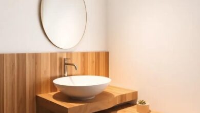
Creating a serene habitat in your bathroom can greatly influence your mood and overall well-being. To achieve this tranquil oasis, consider palettes that blend soothing tones and soft textures. light blues and gentle greens evoke a sense of calm, reminiscent of a tranquil ocean or lush landscape. Pairing these colors with white or soft beige accents can enhance brightness and create an airy feel. Think about complementing the palette with natural materials,such as wooden fixtures or stone accents,to ground the design and add an organic touch. Using these serene hues will turn your bathroom into the peaceful retreat you deserve.
Another refined approach is to combine muted pastels with deeper,richer shades to create depth and balance. Imagine a soft lavender paired with a charcoal gray; this combination not only exudes elegance but also promotes relaxation and harmony. Additionally, consider earthy tones like warm taupe, sandy beige, or moss green, which work beautifully with gold or brass fixtures for an added touch of luxury. Don’t forget about the importance of lighting—soft lighting enhances the tranquility of these colors and creates a soothing atmosphere, making your bathroom feel like a true sanctuary. For more ideas and inspiration,explore houzz.com.
Embracing Nature: Earthy Tones to Transform Your Space

Incorporating earthy tones into your bathroom can create a serene oasis reminiscent of nature’s beauty. Shades like moss green, sandy beige, and terracotta not only provide a sophisticated backdrop but also evoke a calming atmosphere that is perfect for relaxation. Imagine your bathroom adorned in a soft olive hue, complemented by warm wooden accents and natural stone finishes. This combination not only enhances the space but also fosters a deep connection with the earth, allowing you to unwind after a long day.
To effectively use earthy tones, consider the following elements:
- accent Features: Introduce vibrant plant life or woven baskets for storage.
- Textures: Play with various textures like linen curtains or a jute rug to add dimension.
- Lighting: Incorporate soft, natural lighting to compliment the warm hues.
For further inspiration on how to blend these tones harmoniously, check out Architectural Digest. It’s a treasure trove of ideas for creating a bathroom that feels as inviting as a forest retreat while still reflecting your personal style.
Emotional Impact of Colors: Creating a Harmonious Atmosphere

Colors hold a profound psychological influence that can transform the emotional landscape of any space, including your bathroom. Choosing the right hues can evoke feelings of tranquility, energy, or even happiness, making it essential to understand the emotional impact of each color. For instance, shades of blue can create a calming oasis reminiscent of clear skies and peaceful waters, while greens can bring in a refreshing vibrancy that mimics nature. Conversely, warm colors like yellows and oranges can infuse your bathroom with warmth and positivity, encouraging relaxation and comfort as you scrub away the day’s stresses.
To carefully curate a harmonious atmosphere, consider incorporating these color families into your design:
- Soft Neutrals: Whites, beiges, and greys create an inviting backdrop that promotes serenity.
- Earthy Tones: Browns and deep greens enhance the space with a grounded,organic feel.
- Vibrant Accents: Pops of rich colors can add depth and excitement without overwhelming the senses.
Each of these palettes offers a unique emotional palette while maintaining a cohesive theme in your bathroom. For more data on color psychology, you can explore resources at Color Matters.
Light and Bright: How Pastel shades Enhance Small Bathrooms

Pastel shades create an airy and inviting atmosphere, perfect for small bathrooms that often feel cramped. Colors like soft mint, pale lavender, and delicate peach can instantly brighten the space, making it feel more open and welcoming. These hues reflect light beautifully,which not only helps to visually expand the room but also enhances its overall aesthetics. For a cohesive look, consider pairing your pastel walls with white or light-colored fixtures and accessories. This combination promotes a seamless flow and minimizes visual clutter.
To achieve a harmonious design, think about incorporating various textures and patterns that complement pastel tones. Here are a few ideas to enhance the decor:
- Subtle Wallpaper: Use wallpaper with soft patterns that add interest without overwhelming the space.
- Natural Elements: Incorporate wooden accents or greenery, which juxtapose beautifully with pastel colors.
- Mirrors: Strategically placed mirrors can amplify light and create an illusion of depth.
Ultimately, when you select the right pastel colors, you’ll not only create a chic and serene environment but you’ll also turn your small bathroom into a refreshing retreat. For more tips on interior design, visit House Gorgeous.
Bold Choices: Incorporating Dark Colors for Dramatic Flair

Using dark colors in your bathroom can create an atmosphere of sophistication and intimacy that lighter shades simply can’t match.These bold choices not only evoke feelings of luxury but can also transform a mundane space into a striking retreat. Consider deep hues like navy, charcoal, or even a rich plum. You may also blend them with softer accents for balance:
- Contrast with whites: Pairing dark walls with crisp white fixtures can create a timeless look.
- Metallic touches: Gold or brass elements will pop against darker backgrounds, adding a touch of glam.
- Textured materials: Incorporating textures, such as matte finishes or slatted wood, can soften the overall aesthetic.
When choosing dark colors, consider their impact on light and space.Small bathrooms can benefit from dark tones, creating a cozy, enveloping feel; though, it’s vital to enhance the space with good lighting or reflective surfaces. Compare options like matte, satin, and glossy finishes in a carefully curated table:
| Finish Type | Pros | Cons |
|---|---|---|
| Matte | Soothing appearance, hides imperfections | Less durable, harder to clean |
| Satin | versatile, easy maintenance | May show prints and streaks |
| Glossy | Reflective, makes space appear larger | Can highlight imperfections, slippery |
For further tips on interior styling with dark colors, you can explore resources at House Beautiful.
Timeless Classics: Popular Neutral Shades for Lasting Appeal
When designing a bathroom, selecting neutral shades can create an enduring style that remains appealing across trends. Soft grays, beige, and warm taupes can serve as a versatile backdrop, making your space feel both calm and inviting. These colors not only provide the perfect canvas for brighter accents but also help in achieving a cohesive look with various fixtures and materials,from sleek chrome to rustic wood. The right neutral can balance the frequently enough clinical nature of bathroom tiles and vanities, transforming the room into a serene retreat.
As you contemplate your paint choices, consider how light interacts with your selected shades—warm whites reflect sunlight beautifully and expand smaller spaces, while cool grays lend a sophisticated edge. To further enhance your design,think about incorporating texture through paint finishes or wall coverings. Here’s a quick reference table of timeless neutral colors that can elevate your bathroom aesthetics:
| Color | Best For | Hex Code |
|---|---|---|
| Soft Gray | Contemporary Spaces | #D3D3D3 |
| Warm Beige | Cozy Environments | #F5F5DC |
| Rich Taupe | Rustic Designs | #8B5B29 |
Experimenting with these shades can transform your bathroom into a timeless haven. Additionally, for style tips on neutral shades and their application, consider visiting House Beautiful.
Selecting the Right Finish: Matte vs. Glossy in Bathroom Paint

When it comes to choosing a finish for your bathroom paint, understanding the distinct characteristics of matte and glossy options can significantly impact the final result. Matte finishes are known for their soft, non-reflective quality, making them perfect for hiding imperfections in walls and creating a warm, welcoming atmosphere.This finish absorbs light rather than reflecting it, making for a cozy space but can be more challenging to clean. Consider using matte paint in areas less prone to moisture, or for a relaxing backdrop that promotes tranquility. On the other hand, glossy finishes are ideal for high-traffic areas and spaces exposed to humidity, as they are easier to wipe down and maintain, resisting mildew and water stains effectively. The shiny surface can also lend a modern touch to your decor, reflecting light and making smaller bathrooms feel more spacious.
Ultimately, the choice between matte and glossy finishes should come down to your bathroom’s specific needs and your personal aesthetic preferences. To aid in your decision-making process, consider the following factors:
- Moisture Levels: Glossy finishes are more water-resistant.
- Maintenance: Glossy is easier to clean; matte requires more care.
- Lighting: Matte absorbs light, while glossy reflects it.
- Imperfections: Matte can conceal problems better than glossy.
for those looking for a balance, satin finishes offer a middle ground between matte and glossy, providing some sheen without the glare. By weighing these considerations, you can select a finish that complements not only the overall aesthetic of your bathroom but also addresses practical needs. For additional insights on paint finishes and their applications, explore House Beautiful for expert advice.
Ceiling Colors: Elevate Your Space with Unexpected Hues

When it comes to bathroom design, most homeowners focus on the walls, but the ceiling is a canvas waiting to be explored. Choosing an unexpected hue can create a stunning focal point that enhances your space in remarkable ways. Consider soft pastels like mint green or pale lavender, which can soften harsh bathroom lighting while imparting a serene atmosphere.Conversely, daring choices such as a rich navy or deep charcoal can add a dose of drama, making your ceiling feel like a luxurious sky overhead.
To make the most of your bathroom ceiling, think about the overall mood you wish to set. Go for vibrant shades like coral or sunny yellow if you aim to energize the space. Alternatively, neutral tones like creamy beige or soft greys can provide a more calming backdrop, allowing for decorations and accessories to shine. Incorporating textures and finishes, such as a matte or satin look, can also heighten the impact of your color choice. Don’t forget to embellish your unique ceiling color with coordinating fixtures and decor,ensuring a cohesive and inviting ambiance in your sanctuary. For more inspiration, check out house Beautiful for a plethora of stylish design ideas.
Accent Walls: Adding depth and Interest to Your Bathroom

Creating an accent wall in your bathroom can be a transformative design choice that introduces visual interest and depth. Whether you opt for a bold color or a dynamic pattern, an accent wall can serve as a statement piece, drawing the eye and enhancing the overall aesthetics of the space. Consider using materials such as shiplap, tile, or wallpaper to add texture and sophistication. A well-placed accent wall behind the vanity or in the shower area can make the entire room feel more inviting and stylish.
When selecting colors for your accent wall, think about harmonizing with the existing tones in your bathroom. consider these tips to elevate your design:
- Choose complimentary colors to enhance light fixtures and decor.
- Incorporate geometric or organic patterns for a modern twist.
- Experiment with different finishes like matte or glossy to create different effects.
If you’re uncertain about color pairings, a simple table can help clarify your choices:
| Wall Color | Accent Color |
|---|---|
| Soft Gray | Deep Aqua |
| Warm Beige | Rich Plum |
| Crisp White | Charcoal Black |
For further inspiration on color choices and designs, explore resources such as Houzz, which showcases a variety of bathroom styles and trends.
Creating Illusions: Using Color to Alter Perceptions of Space

Utilizing color in your bathroom can dramatically reshape the way the space is perceived, turning the ordinary into the remarkable. As an example,shades of blue and green evoke a serene,spa-like atmosphere,encouraging relaxation. conversely, vibrant hues such as yellow or coral can inject energy and vibrancy, transforming a dull bathroom into a lively retreat.When selecting your paint color,consider the following elements that can influence perception:
- Light Reflection: Light colors can enhance natural light,making a small space feel larger.
- color Temperature: Warm colors tend to bring a room closer, while cool colors project a sense of openness.
- Accent Walls: Strategic use of an accent wall can create depth and focus, drawing the eye to architectural features.
Furthermore, it’s crucial to think about how the colors interact with your existing fixtures and fittings. A light, creamy white can beautifully complement dark cabinetry, creating a balanced contrast, while deeper shades like navy or charcoal can instill sophistication and elegance in a larger bathroom. Below is a quick reference table that summarizes popular bathroom colors and their effects on space:
| Color | perception Effect |
|---|---|
| Soft Blue | Calming and spacious |
| Crisp White | Bright and airy |
| warm Beige | Inviting and cozy |
| Muted Green | Natural and refreshing |
| Bold Charcoal | Sleek and modern |
To dive deeper into the psychology of color in design, you can visit Color Psychology for a comprehensive understanding.Armed with the right knowledge, you can craft a bathroom that not only meets aesthetic goals but also transforms your daily rituals.
Complementing Fixtures: Selecting Colors that Harmonize with Hardware

Choosing the right paint color for your bathroom is paramount, but it doesn’t stand alone. To achieve a cohesive look, the selected hues should beautifully complement your fixtures and hardware. Typically, this starts with identifying the finish of your hardware—be it chrome, brushed nickel, or oil-rubbed bronze—as each undertone can influence your color choices. For instance,warm metallics like oil-rubbed bronze pair splendidly with rich,earthy tones such as terracotta or deep olive greens. Alternatively, chrome’s cool sheen shines against softer pastels, such as mint green or powder blue.
When harmonizing colors, consider the overall aesthetic you wish to create. A minimalist approach can be achieved by sticking with a monochromatic palette where various shades of a single color are used. If you’re feeling adventurous, you might want to play with contrasting colors that maintain balance. For example, a striking navy blue can offer a dramatic backdrop for brass fixtures, creating a luxurious feel. It’s essential to choose the right accent colors as well to tie everything together, allowing the bathroom to exude a sense of unity without sacrificing style. Consider visiting Houzz for more inspiration on color palettes that synergize beautifully with different hardware styles.
Seasonal Swaps: Refreshing Your Space with Color trends

As the seasons change, so do the colors that can bring new life into your bathroom. This is the perfect prospect to refresh areas that often go unnoticed, providing a soothing and rejuvenating atmosphere. Consider using a palette that reflects nature’s cycles, such as soft pastels for spring, warm neutrals for summer, earthy tones for fall, and cool hues for winter.Each of these schemes not only enhances your space but also influences mood and well-being. For example,light blues and greens evoke calmness,while warm yellows and terracotta can add inviting warmth.
Another approach is to introduce accent colors to complement your primary choice. By incorporating shades such as gold or deep navy, you can create a stunning contrast that elevates your overall design. Here are some popular color combinations to consider:
- blush and Gold: A chic pairing that adds elegance.
- turquoise and Coral: A vibrant option perfect for a beachy feel.
- Greige and Forest Green: A modern take with a natural touch.
For inspiration and resources on color psychology and trends, visit Color.com.
Sustainable Choices: Eco-Friendly Paints for Conscious consumers

When it comes to refreshing your bathroom, selecting eco-friendly paints can make a meaningful difference not just for aesthetics but for the environment as well. Opting for low-VOC or no-VOC paints ensures that toxins released during the painting process are minimized, creating a healthier space for you and your family. Many brands now offer a variety of color palettes that do not compromise on quality or style while maintaining eco-conscious standards. Consider choosing paints that are made from natural, sustainable materials, such as plant-based oils or minerals, which contribute to a safe and sustainable living environment.
Explore the vibrant options that eco-friendly paints offer, ranging from calming pastels to bold statement colors.Here are some additional benefits of selecting these sustainable choices:
- Durability: Many eco-friendly paints have superior durability, reducing the need for frequent repainting.
- Reduced Health Risks: Low-emission paints can significantly lessen headaches and respiratory issues often caused by customary paint fumes.
- Better for the Planet: Sustainable paints frequently enough use recycled materials and environmentally safe production processes.
| Brand | Type | Features |
|---|---|---|
| Benjamin Moore | Regal Select | Low VOC,Excellent washability |
| Behr | Premium Plus | Zero VOC,Mildew resistant |
| Eco Paints | Interior Paint | Non-toxic,Plant-based |
For those looking to dive deeper into the world of sustainable living,resources like EPA provide valuable insights into the impact of paint choices on indoor air quality and overall health. By making informed choices, you’re not just redecorating your space; you’re paving the way for a greener future.
Lighting Effects: Understanding How Light Influences Color Perception

The way light interacts with color is a fascinating, often overlooked aspect of interior design, especially in spaces like bathrooms where natural light can be limited. The direction, intensity, and type of light—be it warm, cool, or neutral—can dramatically alter how paint colors appear on your walls. As an example,a shade that looks soothing and serene in daylight can transform into something entirely different under incandescent bulbs,which tend to amplify warm tones and create a cozy atmosphere. Conversely, cooler LED lights can make warm shades appear more muted, leading to a potential mismatch between your chosen palette and the desired ambiance.
When planning your bathroom color scheme, consider these influential factors:
- Natural Light: South-facing windows bring in warmer light, while north-facing ones provide cooler tones.
- Artificial Lighting: The type of bulbs used (LED, incandescent, fluorescent) can significantly affect how colors are perceived.
- Reflective Surfaces: Metallic fixtures and glossy surfaces can bounce light,enhancing the vibrancy of colors.
To help visualize the impact of different lighting on paint colors, here’s a simple comparison table:
| Lighting Type | Effect on Colors |
|---|---|
| Natural Light | Brings out true color vibrancy and contrast. |
| Incandescent Light | Enhances warm tones, creating a cozy vibe. |
| LED Light | Can mute warm tones, emphasizing cooler shades. |
Understanding how various lighting conditions affect color perception is essential in creating the perfect bathroom sanctuary. For further insights on color theory and design, check out color.org.
Balancing Warm and Cool Tones for Bathroom Serenity

Creating a serene bathroom environment can be achieved through the careful balance of warm and cool tones. warm tones, such as soft creams, warm taupes, and earthy browns, evoke comfort and coziness. These shades can be beautifully complemented by cool tones such as calming blues, tranquil greens, and serene grays which offer a refreshing contrast. The interplay between these color groups establishes a relaxing atmosphere while ensuring the space feels welcoming. To enhance the calming effect, consider using warm-toned fixtures like brass or gold, paired with cool-toned accessories such as sea-glass vases or ocean-themed artwork.
When selecting the perfect color palette, think about applying these combinations in layers.You might opt for warm-toned walls to envelop the space, while cool-toned accents in the decor and accessories provide a refreshing pop. Here are a few combinations to consider:
- Soft Cream walls with Deep Teal towels
- Warm Taupe paint paired with Light Aqua decor
- Dusty Rose shades accented by Muted Gray elements
| Warm colors | Cool colors |
|---|---|
| Soft Peach | Beachy Blue |
| Golden Honey | Pale Mint |
| Rustic Terracotta | Calming Lavender |
Along with choosing the right hues, consider how lighting affects your color choices. Natural light can enhance both warm and cool tones, while artificial lighting may change their appearance. always test paint samples in the actual space before making a final decision. For more insights on color theory and design principles, explore resources like colorpsychology.org.
incorporating Textures: Paint Techniques for Added Dimension

Adding dimension to your bathroom walls can transform the space into a visually intriguing oasis. Using various paint techniques can significantly enhance the depth and character of your chosen colors. Consider the following methods to achieve a textured effect:
- Sponging: This technique uses a damp sponge to apply a second color over the base coat, creating a soft, mottled appearance.
- Rag Rolling: Involves rolling a rag with paint across the wall, producing a subtle, textured finish that adds interest without overwhelming the senses.
- Brushed Pearl: A beautiful method where a lustrous sheen is applied with a brush, creating a pearl-like effect that catches the light beautifully.
Additionally,experimenting with two-tone techniques can lead to a splendid interplay of colors and textures.You can opt for a vertical or horizontal split, allowing you to introduce complementary hues that highlight the unique features of your bathroom.For example, combining a calming blue below with a crisp white above creates a classic yet fresh look. Don’t forget to consider the contrast between matte and glossy sheens, as these can play a significant role in how the light reflects and interacts within the space, enhancing the overall ambiance. For more creative ideas,you can explore Better Homes & Gardens.
Personalizing Your Space: Choosing Colors that reflect Your Style

When it comes to enhancing the atmosphere of your bathroom, color plays a pivotal role in mirroring your personal taste and creating a sanctuary suited to your needs. Consider how different shades evoke emotions: for instance, soft blues and greens can impart a sense of tranquility, while vibrant yellows and oranges bring warmth and energy. Think about your daily routines and how you want to feel within this space; selecting colors that reflect your personality ensures that each visit to the bathroom is a refreshing experience. To guide your choices, contemplate the following options:
- Pale Neutrals: Subtle taupes and creams for a calming, classic look.
- Soft Blues: reminiscent of ocean waves, ideal for relaxation.
- Bold Accents: A striking coral or deep navy can energize the space.
- Earthy Tones: Warm grays and browns that connect you with nature.
Once you narrow down your preferred colors, the next step is to visualize them in your bathroom. Using swatches or digital tools can significantly aid in this process. Test colors in various lighting conditions to see how they interact with your fixtures and fittings. Additionally, consider the harmony of the overall design by referencing existing materials, such as tiles, countertops, and cabinetry. A simple chart might help you compare your options:
| Color Choice | Emotional Effect | Complementary Styles |
|---|---|---|
| Soft Blue | Relaxing | Modern, Coastal |
| Bright Yellow | Cheerful | Vintage, Eclectic |
| Earthy Green | Grounding | Rustic, Zen |
| charcoal Gray | Elegant | Contemporary, Industrial |
For additional inspiration and guidance, you can explore resources on color psychology through websites like colorpsychology.org.
Color psychology: how Colors Influence Mood in Your Bathroom

Colors play a vital role in setting the atmosphere of your bathroom, influencing both your mood and well-being. Soft blues and greens evoke a sense of calm and tranquility, mimicking the serene qualities of nature.These tones can help to transform your bathroom into a personal sanctuary,perfect for unwinding after a long day. Conversely, warm colors like soft yellows and peach can add a cheerful and uplifting vibe, creating a welcoming space that energizes you each morning.
Additionally, neutral shades such as beige and taupe can provide a timeless elegance while allowing for versatility in décor.They effortlessly complement various styles, from contemporary to traditional, and can be accented with vibrant accessories to add character. For a bolder approach,deep hues like navy or emerald green can create a luxurious and sophisticated backdrop. Remember to consider natural lighting, as it can significantly alter how a color appears at different times of the day. To explore more about the effects of colors on human psychology, check out verywell Mind.
Future Outlook
selecting the perfect paint color for your bathroom is not just about aesthetics; it’s about transforming a functional space into a sanctuary that reflects your personality and style. By considering factors such as lighting, size, and the overall mood you wish to convey, you can create an atmosphere that rejuvenates and relaxes. whether you opt for soothing neutrals, vibrant hues, or timeless classics, the right color can enhance your experience and bring new life to your bathroom. Now that you’re equipped with the insights and inspiration needed, it’s time to roll up your sleeves and let your creativity flow. Remember, your bathroom is more than just a place for daily routines—it’s an opportunity to express yourself. Happy painting!
As an Amazon Associate I earn from qualifying purchases.