25 Bright and Bold Summer Color Palettes to Energize Your Interior Spaces
Summer is the perfect season to breathe new life into your interior spaces, and nothing does that quite like a splash of vibrant color. Whether you’re looking to refresh a single room or reimagine your entire home, choosing the right palette can transform your surroundings from dull to dazzling. In this listicle, we’ve curated 25 bright and bold summer color palettes that will energize your interiors with warmth, brightness, and a touch of playfulness. From sun-soaked yellows to striking corals and lively blues,each palette offers a unique combination to inspire your next design project. Dive in to discover fresh ideas, expert pairings, and creative ways to infuse your living spaces with the carefree spirit of summer.
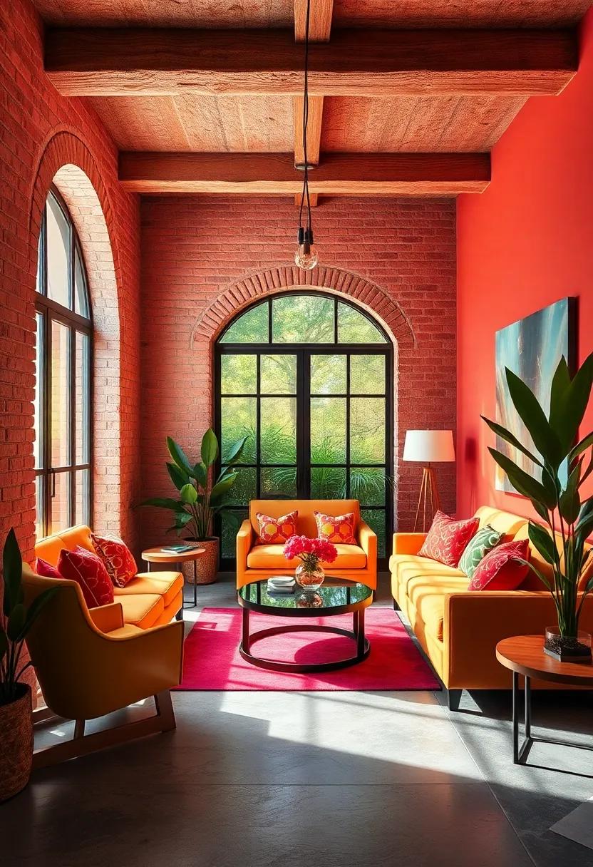
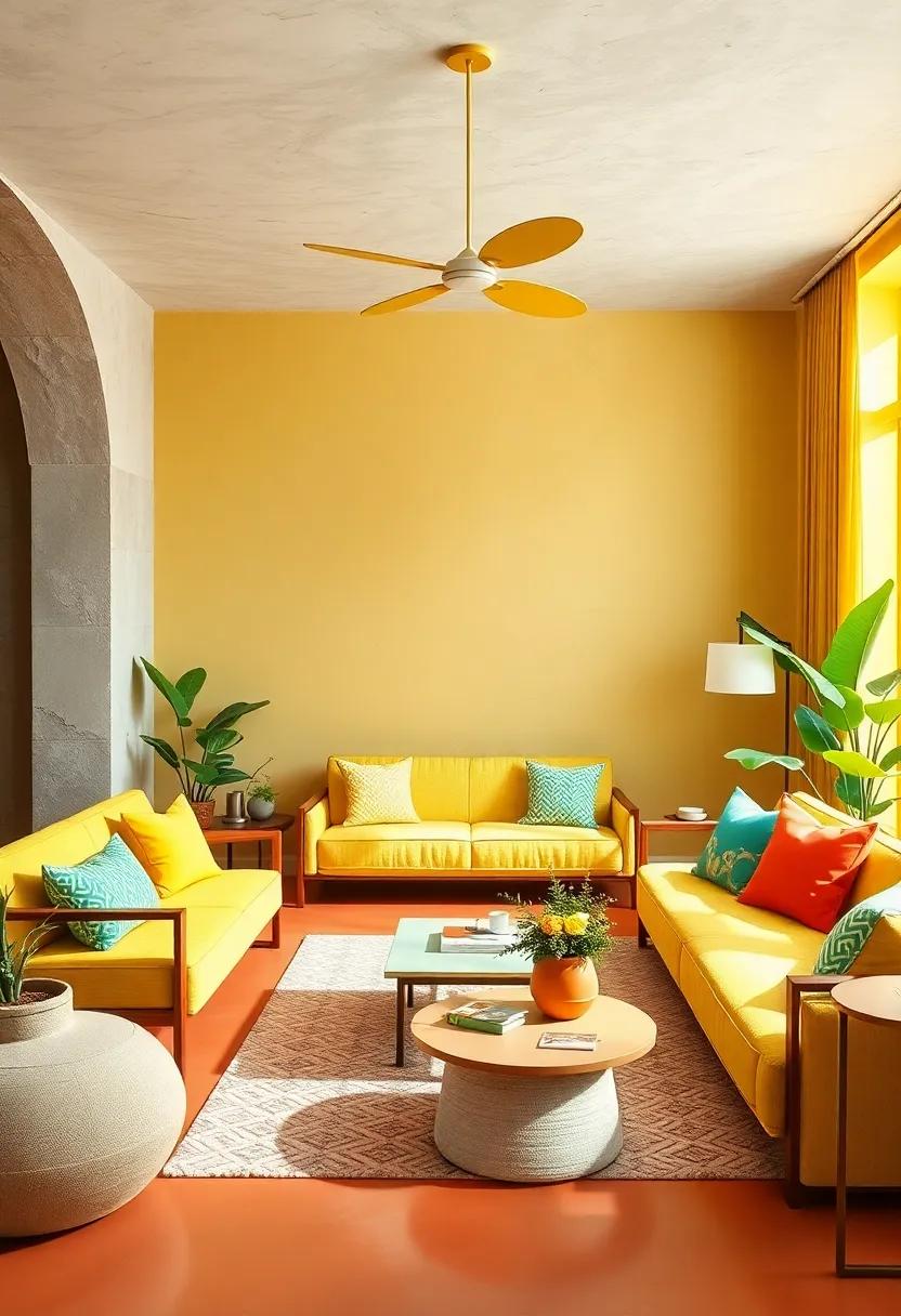
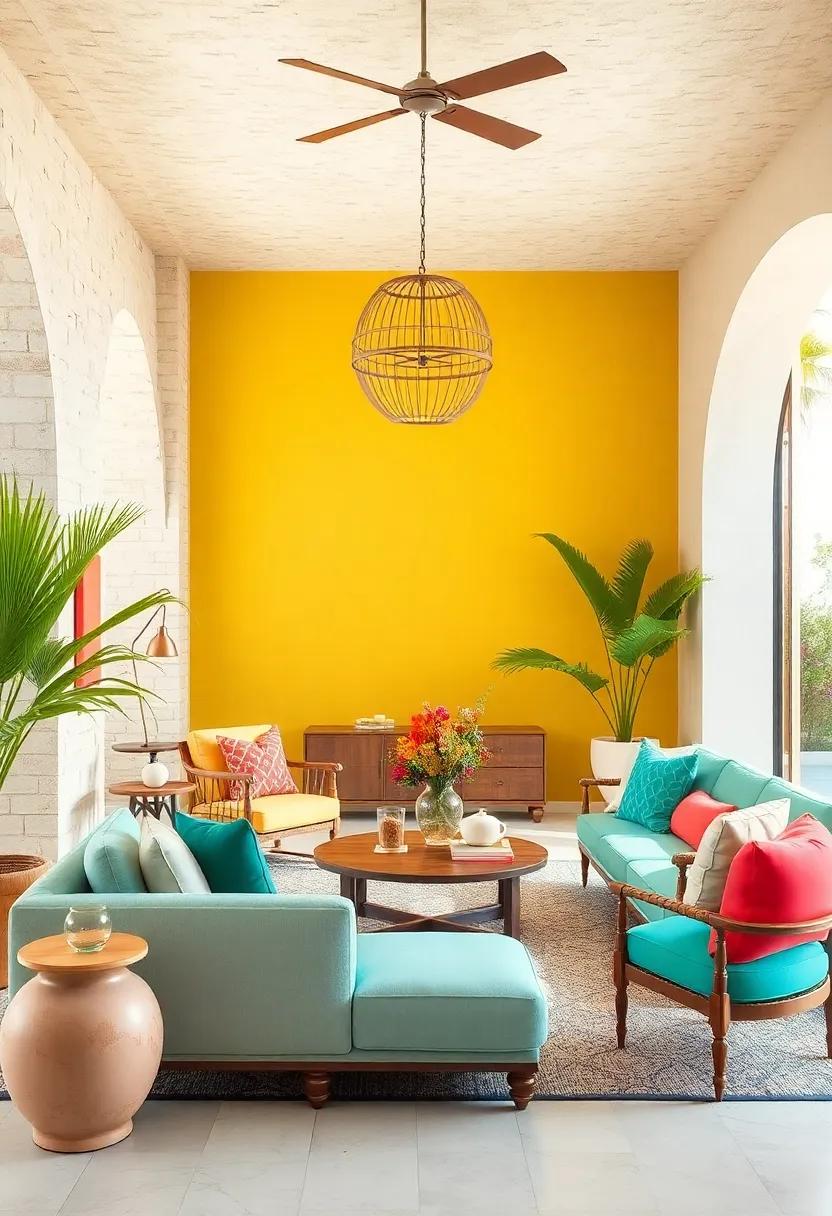
Tropical Sunrise: Vibrant coral, sunny yellow, lush green, and aqua blue for a lively and refreshing atmosphere
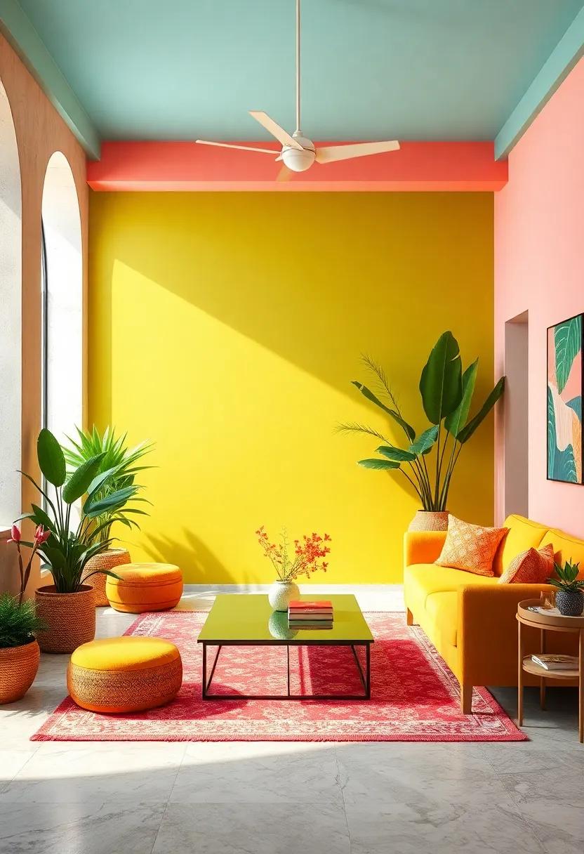
Immerse your space in the energizing hues of a tropical sunrise where vibrant coral sets the stage with its warm and inviting glow. This shade acts as a bold anchor, creating a sense of warmth and passion that instantly lifts the mood. Complementing coral’s vivacity is the sunny yellow, radiating positivity and cheer, evoking the golden light of early morning. together, thay bring a dynamic balance, making any room feel lively and optimistic.
The palette is grounded by lush green and aqua blue, which infuse freshness and calm. Lush green channels the richness of tropical foliage, introducing an organic, rejuvenating vibe, while aqua blue mimics tranquil ocean waves, adding a soothing contrast to the warmer tones. Use this combination across accents like cushions, rugs, or wall art to effortlessly transform your interior into a vibrant yet serene retreat.
| Color | Hex Code | Mood |
|---|---|---|
| Vibrant Coral | #FF6F61 | Warmth & Energy |
| Sunny Yellow | #FFD54F | Optimism & Cheer |
| Lush Green | #4CAF50 | Freshness & Growth |
| Aqua Blue | #00BCD4 | Calm & clarity |
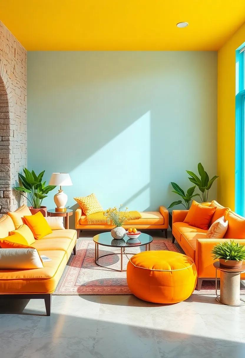
Citrus Burst: Zesty orange, lemon yellow, lime green, and crisp white to energize any room with a playful vibe
Inject an instant burst of energy into your living space with this lively combination of zesty orange, sunny lemon yellow, vibrant lime green, and crisp white. These colors work harmoniously to evoke the refreshing spirit of a summer citrus grove, creating an atmosphere that is both invigorating and playful. Use bright orange as an accent wall to capture attention, while lemon yellow cushions or throws add a dash of sunshine without overwhelming the senses. to balance the warmth, integrate lime green potted plants or side tables for that natural, earthy zest, and allow clean white backgrounds or furniture to serve as a calming canvas that amplifies the brightness around it.
This palette thrives on contrast and freshness,perfect for rooms that crave personality and dynamism. Consider layering these colors across different textures—think smooth, glossy ceramics, soft cotton linens, and matte painted surfaces—to create depth and movement. Here’s a swift guide to incorporating these hues:
- Zesty Orange: Accent wall, artwork, decorative vases
- Lemon Yellow: Cushions, rugs, table linens
- Lime Green: Indoor plants, small furniture, lampshades
- Crisp White: Walls, ceilings, larger furniture pieces
| Element | Recommended Use |
|---|---|
| Zesty Orange | Feature wall or statement decor |
| Lemon Yellow | soft furnishings (pillows, throws) |
| Lime Green | Natural accents and accent furniture |
| Crisp White | Backgrounds and structural elements |
Ocean Wave: Deep navy, turquoise, seafoam green, and sandy beige evoke the calming yet invigorating spirit of the sea
Dive into a palette that captures the serene yet dynamic essence of the ocean. Deep navy anchors the space with its profound depth, providing a rich backdrop that soothes the soul.Complementing this, turquoise brings a vibrant splash of life, reminiscent of sparkling sunlit waves. Seafoam green adds a refreshing twist, balancing the boldness of navy and turquoise with its gentle, airy presence. sandy beige grounds the palette with natural warmth, evoking sun-kissed shores and soft coastal sands that invite relaxation and comfort.
Incorporate these hues to create interiors that feel both invigorating and peaceful, perfect for summer living spaces that need a touch of nature’s calm energy. Use deep navy on accent walls or statement furniture pieces for visual weight, while turquoise and seafoam green can enliven textiles like throw pillows or rugs. Sandy beige shines in wooden furnishings or linen curtains, tying the palette together into a cohesive, coastal-inspired sanctuary that breathes fresh air and light into any room.
Flamingo Fling: Hot pink, flamingo coral, buttery cream, and teal turquoise combining boldness with tropical charm

Inject tropical vitality into your living space with a daring fusion of hot pink, flamingo coral, buttery cream, and teal turquoise. This palette dazzles with its spirited contrast between the bright warmth of pinks and corals and the cooling serenity of turquoise, all balanced by soft, creamy tones that bring a soothing touch. Perfect for accent walls, throw pillows, or statement art, these colors evoke sun-soaked beaches and lush island getaways, making every room feel like a vibrant escape.
To make the most of this palette, consider combining flamingo coral upholstery with teal turquoise décor accessories such as vases or lamps.Meanwhile,buttery cream walls or rugs provide a neutral ground that lets the bolder hues shine without overwhelming the senses. Use hot pink sparingly for pops of energy—think bold cushions or eye-catching artwork. This dynamic blend not only invites joy and adventure but also offers versatile options from lively kitchens to chic lounges.
Sunshine Meadow: Bright daffodil yellow, grass green, soft peach, and sky blue bring the freshness of a summer field indoors
Step into a space infused with the effervescent charm of a sunlit meadow. Bright daffodil yellow pulses with energy, instantly lifting moods and igniting creativity. Paired with grass green, this palette channels the lush vibrancy of nature, evoking images of fresh blades swaying gently in a summer breeze. Soften the intensity with a whisper of soft peach, adding warmth and approachability, while sky blue balances the ensemble with its serene, airy presence. together, these hues craft an ambiance that feels both alive and inviting, perfect for breathing vitality into living rooms, kitchens, or sunrooms.
To harmonize these colors effectively, consider playful arrangements and layering in your interiors:
- Daffodil yellow: Accent walls, throw pillows, or statement art pieces.
- Grass green: Upholstery, plant pots, or patterned rugs.
- Soft peach: Soft furnishings like curtains or cushions for a gentle, calming touch.
- Sky blue: Ceramics,lighting fixtures,or light linens that echo clear skies.
| Color | Mood | Best Use |
|---|---|---|
| Daffodil Yellow | Cheerful, Energetic | Accent Wall, Artwork |
| Grass Green | Fresh, Natural | Upholstery, rugs |
| Soft Peach | Warm, Soothing | Curtains, Cushions |
| Sky Blue | Calm, Airy | Lighting, Ceramics |
Watermelon Wonder: Juicy red, watermelon pink, mint green, and white for a fun, fruity palette that’s both bright and bold
Inject a burst of playful energy into your interiors with a palette inspired by the luscious hues of watermelon. The rich juicy red ignites passion, while the soft watermelon pink adds a delicate sweetness, perfect for creating inviting focal points or accent walls. Mint green sweeps in with a refreshing breeze, balancing the heat with a cool, calming vibe. crisp white acts as a clean canvas, allowing these bold tones to pop without overwhelming the senses. Together, these shades create a vibrant, fruity atmosphere that feels both lively and light—ideal for kitchens, sunrooms, or any space craving a touch of summer’s zest.
To bring this palette to life, consider mixing textures and finishes that play up the color contrasts: glossy surfaces in watermelon pink tiles, matte mint green cabinetry, and plush white fabrics provide depth and interest. Incorporate pops of metallic gold or brass in fixtures to elevate the look with a subtle sparkle. Here’s a simple guide to experimenting with these shades in your décor:
| Color | Use Ideas | Mood Impact |
|---|---|---|
| Juicy Red | Accent wall, cushions, artwork | Bold, passionate |
| Watermelon Pink | Upholstery, rugs, ceramics | Sweet, soft |
| Mint Green | Cabinetry, throw pillows, plants | Refreshing, calming |
| White | Walls, ceilings, trim | Clean, balanced |
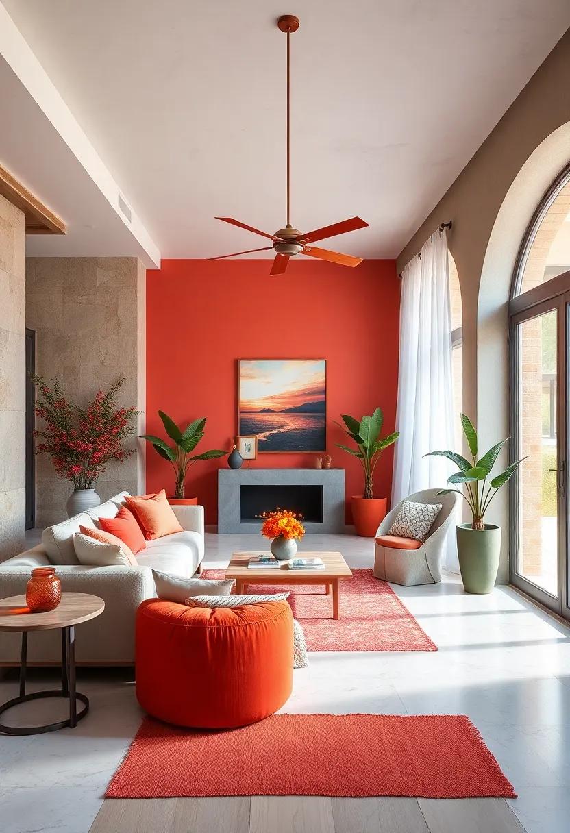
Sunset Glow: Fiery red, tangerine, golden yellow, and muted mauve capture the warm intimacy of a summer dusk
Embrace the comforting warmth of a summer dusk with a palette that radiates the sky’s final fiery kiss. This palette brings together fiery red flames, tangerine zest, golden yellow rays, and a subtle blush of muted mauve. Ideal for living rooms or cozy nooks, these colors create an inviting atmosphere that feels both vibrant and intimate. The bold reds and oranges energize the space, while the golden hues add a gleaming softness, capturing that perfect glow of twilight. Muted mauve balances the intensity, introducing a gentle sophistication that keeps the palette grounded yet dynamic.
Using these shades in textiles, wall accents, or decorative accessories can instantly transform any interior into a refuge of summer’s lasting warmth. Think plush cushions in tangerine, warm yellow throws, or artwork featuring sweeping sunset-inspired gradients. To orchestrate harmony in your space, here’s a simple guide to pairing these colors:
| Primary Shade | Complementary Accent | Best Used For |
|---|---|---|
| fiery Red | Muted Mauve | Statement walls or rugs |
| Tangerine | Golden Yellow | Throw pillows and lampshades |
| Golden Yellow | Fiery Red | Accent furniture or vases |
| Muted Mauve | Tangerine | Bed linens or curtains |
Lemonade Stand: Soft pastel pink, bright lemon yellow, cool mint, and crisp white for a cheerful and nostalgic feel

Imagine stepping back into a sun-drenched summer afternoon, where the sweet tang of freshly squeezed lemonade dances on the breeze. this palette mixes soft pastel pink with bright lemon yellow, evoking a playful, vintage vibe reminiscent of neighborhood lemonade stands. The pink offers a gentle, nostalgic backdrop, while the yellow sparks energy and optimism, creating an inviting atmosphere perfect for kitchens, dining rooms, or casual living spaces that yearn to feel both cozy and full of life.
To balance the warmth and vivid hues, cool mint provides a refreshing, calming contrast, cooling down the intensity and adding dimension. Meanwhile, crisp white injects brightness and clarity, ensuring the space remains airy and light. Consider incorporating these tones in striped cushions, wall art, or even ceramic accents. The interplay of these cheerful colors gently hints at sunlit summertime memories, inspiring creativity and smiles throughout your interior.
| Color | Use Cases | Feel |
|---|---|---|
| Soft Pastel Pink | Accent walls, throw pillows | Warm, nostalgic |
| Bright Lemon Yellow | Kitchenware, rugs | Energetic, uplifting |
| Cool Mint | Furniture, vases | Refreshing, calming |
| Crisp White | Trim, ceilings | Bright, clean |
Electric Garden: Neon fuchsia, lime green, electric blue, and bright orange make a dynamic and energetic statement
inject your living space with an undeniable surge of vitality using a palette that buzzes with neon fuchsia, lime green, electric blue, and bright orange. This quartet of vivid hues doesn’t just brighten a room—it electrifies it, weaving a tapestry of dynamic energy that keeps the atmosphere lively and full of movement. Whether it’s through accent walls,throw pillows,or sleek furniture,each color commands attention while harmoniously bouncing off one another,creating a rhythm that feels both modern and playful. Mix and match these daring tones for a space that feels like a continuous celebration of summer’s most dynamic vibes.
- neon Fuchsia: Perfect for bold upholstery or statement art pieces, it adds a touch of glamorous intensity.
- Lime Green: Refreshing and zesty, ideal for plants’ pots, rugs, or quirky decor elements.
- Electric Blue: Deep and vibrant, works beautifully as wall accents or sleek lighting fixtures.
- Bright Orange: Energizing and warm, great for cushions, throws, or tableware that pop.
| Color | Use Suggestion | Effect |
|---|---|---|
| Neon Fuchsia | Accent Wall | Focal Point Glamour |
| Lime Green | Indoor Planters | Fresh, Natural Pop |
| Electric Blue | Lighting Fixtures | Cool, Invigorating Glow |
| Bright Orange | Throw Pillows | Warmth & Energy |
Coral Reef: Coral pink, sea blue, sandy beige, and deep turquoise inspired by vibrant underwater life and summer adventures

Dive into a palette that captures the essence of sun-soaked beaches and the mesmerizing hues of coral reefs. Coral pink adds a lively warmth that instantly uplifts any room, while sea blue introduces a calming wave-like serenity. Complement these with sandy beige, which grounds the space with its natural, earthy tone, creating a perfect balance between boldness and subtlety.The rich deep turquoise injects depth and mystery, reminiscent of the ocean’s hidden treasures, making your interiors feel like an escape to an underwater paradise.
Use this palette to style living areas with textured fabrics and organic materials, evoking the tactile beauty of seashells and coral branches.For an added visual punch, incorporate organic shapes in your décor—think rounded vases, driftwood accents, and soft, flowing curtains. Here’s a quick look at how these colors work together to energize your space:
| Color | mood | Best Use |
|---|---|---|
| Coral Pink | Vibrant & uplifting | Accent walls, cushions |
| Sea Blue | Calm & refreshing | Furniture, rugs |
| Sandy Beige | Warm & grounding | Base walls, flooring |
| Deep Turquoise | Rich & mysterious | Decor accessories, artwork |
Jungle Jam: Emerald green, bright orange, sunny yellow, and warm brown bring a tropical rainforest vibe inside
Inject a burst of life into your interiors with a palette inspired by the lush vibrancy of a tropical rainforest. The rich emerald green evokes dense foliage, creating a refreshing backdrop that breathes serenity into any room. complementing this are strokes of bright orange and sunny yellow, reminiscent of exotic flowers and glowing sunlight filtering through the canopy. These hues add playful energy and warmth without overwhelming the senses, making your space feel both inviting and invigorating. Ground this lively combination with touches of warm brown, mimicking the earthy tones of tree bark and jungle soil, to add balance and organic depth.
To make the most of this palette, consider incorporating natural textures like bamboo, rattan, or jute in your furniture and accessories. Use emerald green for statement walls or plush upholstery, paired with bright orange throw pillows or art pieces to catch the eye. Sunny yellow accents in ceramics or lighting can brighten corners and invite optimism. The warm brown acts as an anchor, ideal for wooden floors or rustic shelving. Together, these colors create an immersive jungle jam that brings the outdoor wildness inside, energizing your summer living spaces with a fresh, tropical spirit.
Fiesta Fresh: Bold magenta, sunflower yellow, royal blue, and bright green for a festive, celebratory mood
Inject exuberance into your living spaces with a palette that feels like a non-stop celebration. Combining bold magenta, sunflower yellow, royal blue, and bright green, this blend instantly lifts the atmosphere, bringing an energetic yet balanced vibrancy to any room. Think of magenta as the spirited heart, drawing the eye and energizing the senses, while sunflower yellow beams warmth like an endless summer day. Royal blue anchors the scheme with calm confidence, perfectly offsetting the lively accents, and bright green adds the refreshing touch of nature’s exuberance.
To incorporate this palette seamlessly, consider these dynamic pairing ideas:
- Accent Walls: Paint one wall in royal blue, then layer with magenta cushions and bright green planters.
- Textiles: Use sunflower yellow throws and curtains to brighten cozy nooks.
- Accessories: Mix vibrant ceramics or vases carrying all four hues for artistic cohesion.
| Color | Hex Code | Suggested Use |
|---|---|---|
| Bold Magenta | #D81B60 | Statement furniture or artwork |
| Sunflower Yellow | #FFC107 | Throw pillows, curtains |
| Royal Blue | #303F9F | Accent walls, rugs |
| Bright Green | #4CAF50 | Indoor plants, decorative accents |
Berry Bold: Raspberry red, blueberry blue, lime zest, and creamy white evoke freshness with a bold twist

Bring an invigorating punch to your rooms with a palette that dances between playful and complex. the deep, luscious hues of raspberry red paired with the serene, calming tones of blueberry blue create a dynamic contrast that instantly energizes any space. Add a splash of lime zest to awaken your senses, injecting a citrusy brightness that lifts the mood. This combination is balanced perfectly by creamy white accents, which soften the intensity and introduce an airy freshness, making it ideal for kitchens, living areas, or cozy reading nooks seeking a vibrant yet harmonious vibe.
To help you visualize this spirited ensemble, consider how these colors interplay in furniture and décor:
| Element | Color | Effect |
|---|---|---|
| accent Wall | Raspberry Red | Bold focal point, energizing atmosphere |
| Upholstery | Blueberry Blue | Calming backdrop with depth |
| Throw pillows & Accessories | Lime Zest | Bright pops of freshness and zest |
| Walls & Trim | Creamy White | Soft balance, expanding the space |
- Try pairing glossy raspberry red ceramics with matte blueberry cushions for tactile contrast.
- Fresh lime zest lamps or vases bring unexpected bursts of energy.
- Use creamy white in window frames and baseboards to keep the palette open and clean.
Pineapple Pop: Sunny yellow, tropical green, watermelon pink, and ocean blue create a playful, island-inspired space
Inject a burst of island energy into your rooms by combining sunny yellow with the refreshing hues of tropical green, watermelon pink, and ocean blue.This palette revitalizes any space with its playful vibrancy, creating an atmosphere reminiscent of sun-soaked beaches and lush rainforests. Use yellow as your primary wall color to evoke warmth and optimism,while accents in green and blue add depth and freshness,and pops of pink deliver that unexpected splash of fun.
Decor elements such as throw pillows, rugs, or artwork designed with these tones can easily transform a neutral room into a lively retreat. Balancing these bold colors with light, natural materials like rattan or bamboo enhances the tropical vibe without overwhelming the senses. Try mixing patterns inspired by palm leaves, waves, or fruit prints to complete the look — the essence of island life captured right at home.
- Sunny Yellow: walls or feature furniture
- Tropical Green: plants, cushions, and drapery
- Watermelon Pink: accent decor and soft furnishings
- Ocean Blue: artwork and ceramics
| Element | color Role | Material Ideas |
|---|---|---|
| Throw Pillows | Watermelon Pink, Tropical Green | Cotton, Linen |
| Area Rug | Ocean blue base with Yellow accents | Jute, Wool |
| Wall Art | Mixed Palette | Canvas, Wood Frames |
| Planters | Tropical Green | Ceramic, Terracotta |
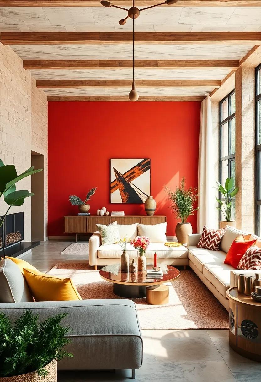
Flaming Sunset: crimson red, burnt orange, peach, and dusty violet channel the mesmerizing hues of a summer twilight
Infuse your interiors with the radiant intensity of a summer twilight by embracing a color palette that dances between crimson red, burnt orange, peach, and the subtle depth of dusty violet. These hues combine to evoke the warmth of a flaming sunset, transforming any room into a sanctuary where boldness meets serenity. Imagine a living room where a plush crimson sofa anchors the space,accented with peach throw pillows and drapes in a smoky violet shade. the burnt orange tones, introduced through rustic wooden furniture or artisan ceramics, add an inviting earthiness that balances the vibrancy without overwhelming your senses.
To create harmony and visual interest within this vivid spectrum, consider integrating textures and finishes that play off the colors’ natural warmth. For example:
- Crimson velvet cushions: Add plush sophistication and tactile contrast.
- Burnt orange terracotta pots: Bring an element of artisanal charm.
- Peach linen curtains: Infuse soft light with a hint of warmth.
- Dusty violet area rug: Ground the palette with subtle depth.
| Element | Color | Tip for Use |
|---|---|---|
| Walls | Peach | Soft base that amplifies warm tones and natural light |
| Accent Furniture | Crimson Red | Statement pieces that command attention |
| Decor | Burnt Orange | Textured accessories for warmth and rustic appeal |
| Textiles | Dusty Violet | Subtle grounding with understated sophistication |
Lime Light: Radiant lime green, cool turquoise, bright white, and sunny gold energize interiors with fresh vitality
Inject an irresistible burst of energy into your living spaces by blending radiant lime green with the calming hues of cool turquoise. This dynamic duo dances effortlessly across walls and accents, creating a vibrant backdrop that stimulates positivity and creativity. Pair these with crisp,bright white elements to ground the palette,enhancing clarity and amplifying the feeling of spaciousness. The interplay of these colors crafts a refreshing atmosphere reminiscent of summer breezes and sparkling waters.
To complete this lively environment, introduce touches of sunny gold through decorative pieces or subtle furnishings. Its warm glow adds a rich contrast that elevates the palette, infusing interiors with joyful brightness without overpowering the cool tones. Whether it’s a golden pendant light or a vase catching the sunlight, these accents seal the composition with a harmonious pop of sophistication.
| Color | Usage Suggestions | Mood Impact |
|---|---|---|
| Lime Green | Accent walls, throw pillows | Invigorates, energizes |
| Cool Turquoise | Soft furnishings, rugs | calms, refreshes |
| Bright White | Trim, ceilings, furniture | Clarifies, expands |
| Sunny Gold | Lighting, decorative accents | Warms, uplifts |
Candy Crush: Bubblegum pink, tangerine orange, mint green, and soft sky blue for a whimsical and vibrant setting

Dive into a world where playful hues meet energetic ambiance—a palette that turns any room into a candy-coated dream. Bubblegum pink charms with its sweet, rosy glow, setting a cheerful tone, while tangerine orange injects warmth and zest, creating a lively atmosphere that feels like an endless summer carnival. Soften the brightness with mint green, a refreshing whisper of nature that balances the vibrancy, making spaces feel both fun and fresh. To complete this enchantment, soft sky blue floats above like a gentle breeze, adding calm and clarity amid the vivid hues.
- Accent walls or cushions in bubblegum pink for a pop of bubbly joy
- Use tangerine orange accessories to energize kitchens or dining areas
- Mint green works beautifully in bathrooms and bedrooms for its soothing vibe
- Soft sky blue creates the perfect backdrop in living rooms and reading nooks
| color | Mood | Best Use |
|---|---|---|
| Bubblegum Pink | Playful & Cheerful | Accent Walls, Pillows |
| Tangerine orange | Warm & Energetic | Decor, Kitchenware |
| Mint Green | Refreshing & Calming | Bathrooms, Bedrooms |
| Soft Sky blue | Tranquil & Airy | Living Rooms, Reading Areas |
Starfruit Spark: bright yellow, chartreuse, light teal, and soft coral for a refreshing and modern tropical feel
Inject your space with the effervescent charm of this vibrant palette where bright yellow ignites the senses and chartreuse adds a zesty punch. The interplay between light teal and soft coral balances the brightness with soothing, tropical coolness, creating an inviting atmosphere that feels both modern and refreshing. This color combination channels the effortlessly playful spirit of sun-soaked beaches and exotic fruits, encouraging lively conversations and a breezy mood in any room.
Perfect for accent walls, accessories, or upholstery, these hues work beautifully when layered, offering depth without overwhelming.Use bright yellow sparingly to spotlight architectural features, while chartreuse energizes smaller decor pieces. the subtle contrast of light teal cushions or drapes paired with soft coral throws or artwork adds warmth and harmony.Embrace this palette to transform your home into a dynamic oasis that celebrates summer’s vibrancy year-round.
Papaya Punch: Rich orange, hot pink, lime green, and sky blue inspired by tropical fruits and warm summer days

Bring a burst of tropical energy into your home with this lively blend of rich orange, hot pink, lime green, and sky blue. Drawing inspiration from sun-soaked beaches and the juicy vibrancy of papayas, this palette is a celebration of summer’s most inviting hues. Imagine walls drenched in sky blue that open up your space like a clear summer sky, while accents in bold lime green and hot pink add playful pops of life and movement. Rich orange tones ground the room with warmth, echoing the leftover glow of a tropical sunset. This combination effortlessly energizes any living room or kitchen, inviting a sunny, carefree atmosphere that feels like an endless summer day.
Styling with these colors encourages mixing textures and patterns reminiscent of tropical fruits and flora. Use woven linens, glossy ceramics, or even glossy painted furniture in these shades to create spaces that are both vibrant and balanced.Consider incorporating elements like:
- Bold throw pillows in hot pink and lime green
- accent rugs featuring sky blue and orange geometric patterns
- Decorative vases or planters in glossy finishes for a fresh,summery vibe
- Wall art echoing tropical fruit shapes or palm leaf silhouettes
| Color | Usage Tips | Effect |
|---|---|---|
| Rich Orange | Statement wall or large accents | Creates warmth and cozy energy |
| Hot Pink | Soft furnishings and accessories | Adds playfulness and vibrancy |
| Lime Green | Plants,textiles,small decor | Invigorates the space with freshness |
| Sky Blue | Walls,furniture,expansive surfaces | Opens up and brightens rooms |
Electric Citrus: Neon yellow,bright orange,electric blue,and crisp white combine for an ultra-modern summer palette
Step into a realm where summer energy meets sleek sophistication. This palette merges neon yellow and bright orange with the unexpected edge of electric blue, all balanced by the purity of crisp white. Ideal for spaces craving a jolt of modernity,these colors strike a perfect harmony between bold zest and clean minimalism. Picture a living room pulsating with playful accents—throw pillows in neon yellow, a statement art piece splashed with electric blue, and sleek white furnishings that ground the electrifying warmth of bright orange cushions or vases.
Beyond aesthetics, this combination invites dynamic versatility. Use the palette to define zones within open-concept interiors or breathe life into minimalist kitchens and bathrooms. The unexpected blue adds a contemporary twist, while white maintains openness and light.Here’s a quick guide to incorporating these hues seamlessly in your design:
| Element | Suggested Color | Effect |
|---|---|---|
| Accent Walls | Neon Yellow | Invigorates and catches immediate attention |
| soft furnishings | Bright orange | Adds warmth and playful energy |
| Decor Accessories | Electric Blue | Offers contrast and modern sophistication |
| Main Structure | Crisp White | Creates a fresh, clean canvas |
Mango Tango: Deep mango orange, vivid coral, sunny yellow, and turquoise blue to energize any living space with tropical warmth
Immerse your home in a vibrant fusion where deep mango orange acts as the anchor, radiating a sultry tropical allure that instantly lifts the mood. complemented by vivid coral, this palette brings a lush, exotic touch that feels both fresh and inviting. Sunny yellow adds a ray of endless sunshine, brightening every corner with cheerful energy, while the unexpected pop of turquoise blue introduces a cool, refreshing contrast that balances warmth with tranquility.
To make the most of this lively palette, consider integrating these elements:
- Accent cushions: Mix coral and turquoise patterns for a playful vibe.
- Wall art: Choose abstract prints featuring mango and yellow hues to create focal points.
- Textiles: incorporate breezy fabrics that catch the eye in mango and turquoise shades.
- Plants: Add lush greenery to enhance the tropical ambiance.
| Color | Mood | Usage Idea |
|---|---|---|
| Deep Mango Orange | Warmth & Energy | Feature Wall or Sofa |
| Vivid Coral | Playful & Inviting | Throw Pillows & Curtains |
| Sunny Yellow | Bright & Cheerful | lamps & Decor Pieces |
| Turquoise Blue | Calm & Refreshing | Accent Rugs & Vases |
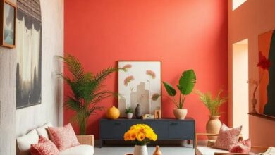
Firecracker red: Bold cherry red, sunshine yellow, bright turquoise, and neutral gray create a striking and balanced summer palette
Firecracker Red ignites any room with its daring cherry red, perfectly complemented by the radiant warmth of sunshine yellow. This vivacious duo instantly infuses energy and optimism, evoking the carefree spirit of summer days. Adding bright turquoise introduces a refreshing, cool contrast that balances the fiery red and sunny yellow, while neutral gray grounds the palette, lending subtle sophistication and preventing visual overload. Together, these hues form a harmonious blend that feels both lively and thoughtfully composed, ideal for spaces that celebrate bold expression without sacrificing elegance.
In practice, this palette works beautifully in living areas, kitchens, or creative studios where vibrancy fuels inspiration. Imagine a cherry red accent wall paired with turquoise cushions and sunshine yellow decor pieces—each element popping against a muted gray backdrop. To achieve balance, consider using gray for larger surfaces like rugs or sofas, letting the brighter colors shine through in accessories and artwork. This dynamic combination not only energizes interiors but also offers ample versatility, making it a perfect choice for those ready to embrace summer’s bold and playful character year-round.
coral Breeze: Soft coral, seafoam green, sky blue, and sandy beige for an airy yet lively coastal interior vibe
Inject a breath of fresh air into your interiors with a palette that effortlessly balances soft coral, seafoam green, sky blue, and sandy beige. This combination draws inspiration from coastal landscapes, where the gentle hues of coral reefs meet the calming shades of the sea and sky, all grounded by sun-kissed sandy tones. Imagine drifting driftwood furnishings paired with plush cushions in coral and blue,while accents of seafoam green plants add life and vibrancy to the space. The result feels both breezy and dynamic, perfect for creating a summer sanctuary that’s light, inviting, and undeniably uplifting.
To bring this palette to life, consider incorporating:
- Textured linen fabrics in coral and beige for a tactile warmth.
- Ceramic vases glazed in seafoam and sky hues to scatter across shelves and tables.
- Rattan or wicker furniture pieces as natural elements that echo sandy beaches.
- Abstract coastal art featuring swirling blues and greens for visual depth.
| Color | Suggested Use | Mood Effect |
|---|---|---|
| Soft coral | Accent walls, throw pillows | Warmth and energy |
| Seafoam Green | Plants, ceramics | Freshness and balance |
| sky Blue | Rugs, linens | Calm and openness |
| Sandy Beige | Furniture, curtains | Earthiness and grounding |
Island Escape: Turquoise, coral, sunny yellow, and palm green evoke the tranquil yet vivid spirit of island life
Transform your living space into a serene tropical retreat with a lively palette inspired by the vibrant hues of island life. Begin with turquoise, evoking the crystal-clear ocean waters, and pair it with coral—a refreshing splash of sunset warmth.sunny yellow accents breathe light and optimism into the room,reminiscent of sun-drenched sandy beaches.Palm green adds a grounding element, mirroring swaying fronds and lush foliage that invite calmness and relaxation.
This palette thrives in spaces where natural light floods in, enhancing the interplay of colors that feel both energizing and soothing. Combine these shades through statement cushions, woven baskets, and tropical prints or introduce them in painted accent walls and handcrafted ceramics to infuse every corner with island charm. Complementary neutrals like soft sand and sea foam can balance the vividness, making your interiors an effortless ode to tranquil yet vivacious island vibes.
Lemon Lime Splash: Zesty lemon yellow, tart lime green, fresh aqua, and crisp white make interiors pop with summer energy

Inject a burst of sunshine and zest into your living areas with this invigorating blend of lemon yellow, lime green, fresh aqua, and crisp white. This palette mimics the effervescence of a sparkling summer drink, turning your interiors into a lively oasis. Lemon yellow carries warmth and optimism, perfect for accent walls or statement furniture, while tart lime green adds a playful, refreshing contrast that energizes the space without overwhelming it. Complementing these is the soothing coolness of aqua, which balances vibrancy with calm, making it a fantastic choice for textiles or decorative accessories. Crisp white acts as a clean canvas, brightening the overall look and allowing these colors to truly pop with effortless summer vitality.
- Lemon yellow: Ideal for accent chairs, lampshades, or wall art to radiate warmth.
- Lime green: Use in cushions, vases, or planters for a fresh, playful twist.
- Fresh aqua: Perfect for rugs,curtains,or throw blankets to introduce a cooling vibe.
- Crisp white: best as a backdrop on walls, ceilings, and trims to enhance brightness.
| Element | Shade Use | Effect |
|---|---|---|
| Living Room Walls | Lemon Yellow | Energetic and inviting ambiance |
| Throw Pillows | Lime Green | Refreshing contrast and playfulness |
| Curtains | Fresh Aqua | Cooling, calming presence |
| Trim & Baseboards | Crisp White | Clean, bright framing |
In Summary
As the sun shines brighter and days grow longer, there’s no better time to infuse your interiors with the vibrant hues of summer.These 25 bright and bold color palettes offer endless inspiration to energize your spaces, transforming them into lively, inviting retreats. Whether you prefer tropical tones, citrus bursts, or ocean-inspired shades, let these palettes be your guide to creating interiors that celebrate the season’s warmth and vitality—all year round. Now, go ahead and splash a little summer sunshine into your home!
As an Amazon Associate I earn from qualifying purchases.