29 Invigorating Paint Colors to Transform Your Small Kitchen into a Cozy Haven
Introduction:
In the heart of every home, the kitchen serves as both a functional workspace and a gathering place for family and friends. However, when it comes to smaller kitchens, creating an inviting atmosphere can sometimes feel like a challenge. That’s where the transformative power of paint colors comes into play. In this listicle, we present 29 invigorating paint colors that have the potential to turn your compact kitchen into a cozy haven. From soothing pastels to vibrant shades, these color choices are designed to enhance the ambience, reflect your personality, and make the most of your space. Expect to discover not just a spectrum of hues,but also inspiration on how each color can impact your kitchen’s vibe,making it the cherished hub of your home. Get ready to unleash your creativity as we explore these stunning options!
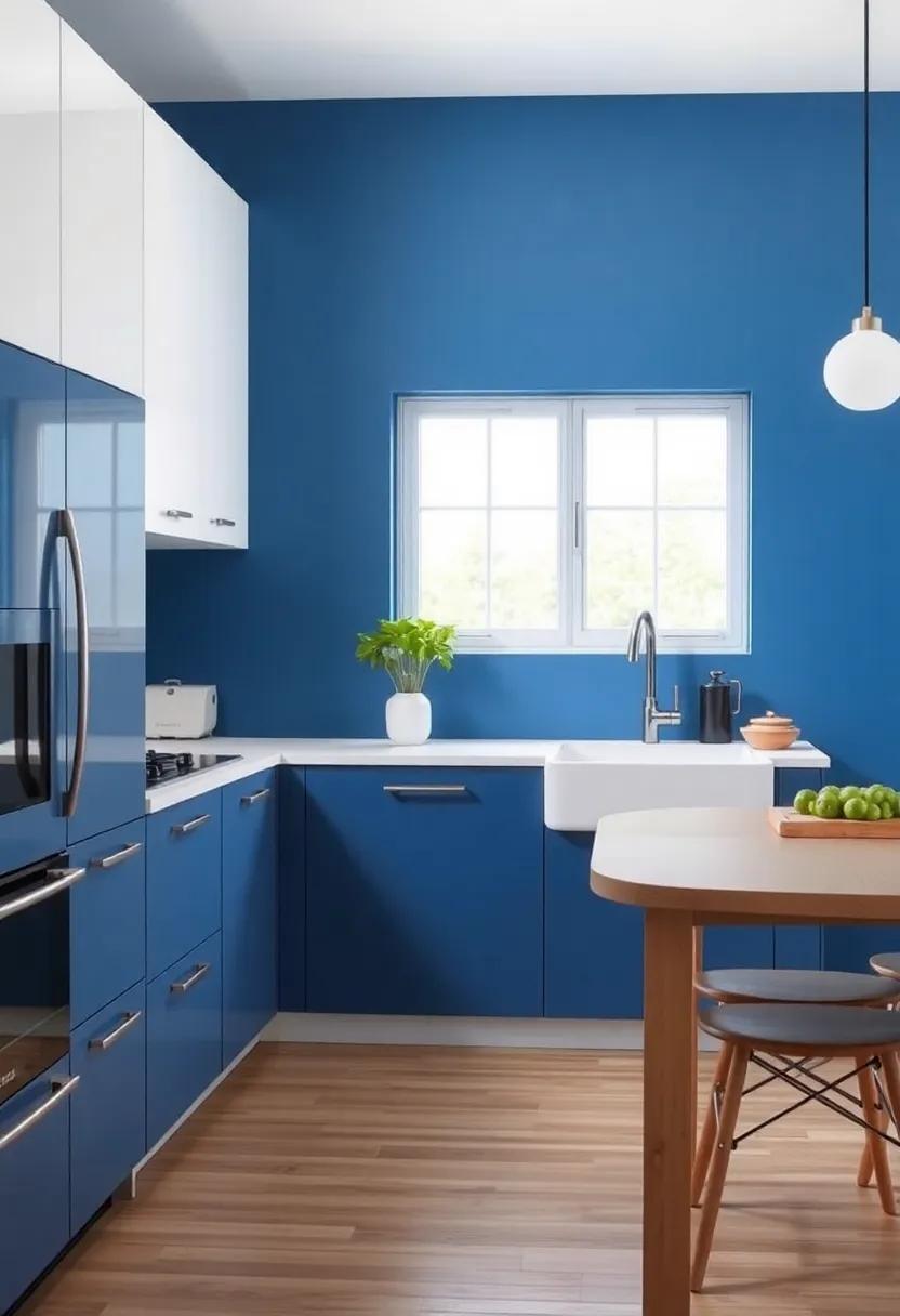
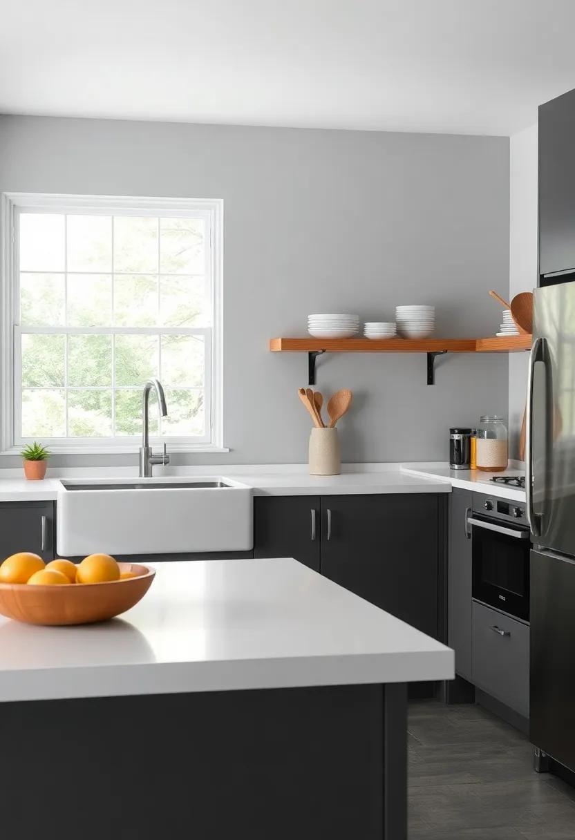
Bright White: A classic choice that opens up space, making even the tiniest kitchen feel airy and expansive
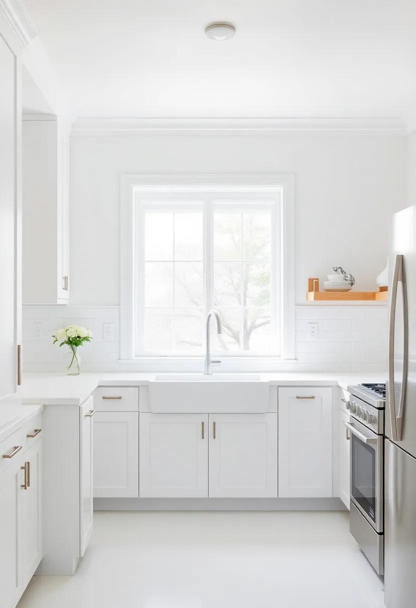
When it comes to selecting a color for your small kitchen, one cannot overlook the timeless appeal of a radiant white. This classic choice does wonders for creating an illusion of space, making your kitchen feel not just larger but also incredibly inviting. With each stroke of bright white paint, the walls seem to recede, allowing light to flood in and elevate the overall ambiance. A small kitchen can easily turn into a cozy haven, where friends and family will gravitate for shared meals and laughter.
To enhance the effect, consider incorporating other design elements that complement this crisp palette. Here are some ideas to elevate your bright white kitchen:
- Glossy finishes: Opt for high-gloss cabinetry to reflect light and bring about a touch of elegance.
- Bold accents: Introduce vibrant colors through small appliances or decorative items for a playful contrast.
- Open shelving: Display cherished dishware to add depth and personality, breaking the monotony of the white backdrop.
In a bright white kitchen, the strategic placement of soft hues in the decor can make a world of difference. Consider a delicate pastel for your curtains or a charming backsplash to balance the starkness of white. Even the smallest of kitchens can exude warmth and character by using white as a canvas, inviting you to experiment with textures and layers for an artistic finish.
Soft Sage: This gentle green pairs beautifully with wood accents, adding a touch of nature and tranquility to your cooking space
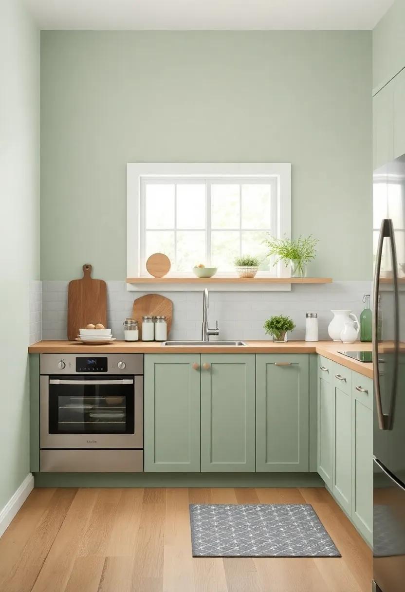
Soft sage brings a serene vibe to your kitchen, effortlessly evoking the ambiance of a tranquil garden. This gentle hue works harmoniously with wood accents, enhancing the natural beauty of your cooking space. Whether it’s the rich tones of a reclaimed wood countertop or the rustic charm of open shelving, soft sage creates a visually pleasing contrast that fosters an inviting atmosphere. Pair it with natural elements, such as ceramic dishware, foliage, and woven baskets, to amplify the earthly charm and promote a peaceful culinary experience.
To complement this soothing color while highlighting the warmth of your wooden features, consider incorporating various textures and finishes. A few design tips include:
- Artisanal accents: Handcrafted wooden utensils and cutting boards.
- Textured textiles: Opt for cozy linen dish towels and soft woolen rugs.
- Statement lighting: choose pendant lights with wooden elements to bring it all together.
The result is a cozy haven that not only promotes relaxation but also inspires culinary creativity, making every meal a delightful occasion in your rejuvenated space.
Warm Taupe: A cozy neutral that grounds your kitchen while complementing a variety of cabinet colors and styles
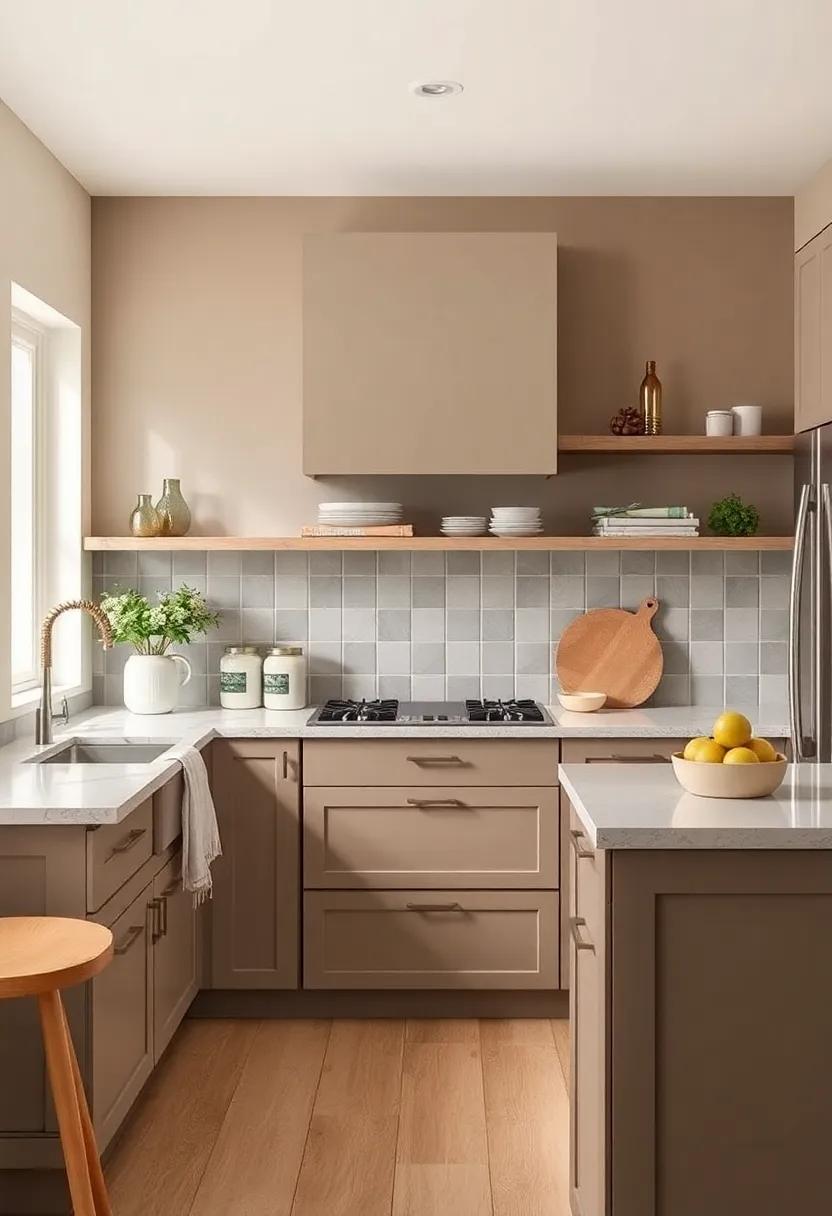
If your looking for a paint color that exudes warmth and sophistication, warm taupe is a delightful choice that can anchor your kitchen’s design. This delightful shade effortlessly harmonizes with various cabinet colors, creating a seamless blend that elevates your space. Whether your cabinets are painted in a crisp white, a deep navy, or even a vibrant green, warm taupe works as a flexible backdrop that highlights the beauty of each hue. Its subtle earthiness brings forth a cozy ambiance, making your kitchen a perfect place to gather with family and friends. The gentle neutrality of this color offers comfort, allowing the decor and cabinetry to take centre stage while still creating a cohesive look.
When considering warm taupe as your kitchen color, here are a few elements to explore:
- Countertops: Light-colored natural stone or quartz countertops can beautifully pop against taupe walls.
- Backsplashes: A mosaic tile backsplash in complementary tones adds visual interest without overwhelming the space.
- Accents: Incorporate brass or gold hardware to bring a touch of elegance and contrast to the warmth of taupe.
Pairing this soft hue with textured materials such as reclaimed wood or brushed metals enhances the layered, inviting atmosphere. You can create a dynamic contrast that draws the eye and adds depth to your kitchen’s design. Not only does warm taupe ground the space, but it also invites a sense of relaxation, making it the perfect backdrop for your culinary adventures.
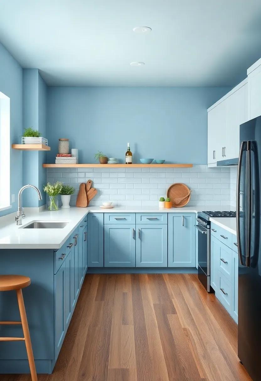
Powder Blue: Evoking a sense of calm, this light hue brings a refreshing pop of color that is both cheerful and serene
Envelop your small kitchen in a soothing embrace with this delicate hue,perfect for those seeking a tranquil atmosphere while cooking and entertaining. Powder blue not only brings a refreshing pop of color but also promotes a sense of calm, making meal prep feel less daunting. This soft shade pairs beautifully with natural materials, allowing for seamless integration of elements like wooden countertops or bamboo shelving. The charm lies in its versatility; you can use it as a primary wall color or accent it through decor, ensuring your kitchen remains a cozy haven.
Consider incorporating powder blue into various aspects of your kitchen design:
- Cabinetry: A powder blue paint finish adds a modern twist to traditional wood cabinetry, making your space feel airy and inviting.
- Backsplash: Using tiles in this serene tone can create a stunning focal point, reflecting light and expanding the visual space.
- Accessories: From dishware to curtains, small touches of powder blue can uplift the color palette without overwhelming it.
| Element | Suggested Colors | Complementary Styles |
|---|---|---|
| Cabinetry | Powder Blue, Soft White | Rustic, Modern |
| Backsplash | Powder Blue, Light Gray | Minimalist, Coastal |
| Accessories | Powder Blue, Beige | Chic, Vintage |
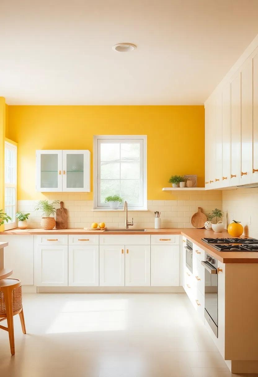
Creamy Yellow: Infuse your kitchen with sunshine; this happy shade is perfect for creating a welcoming atmosphere
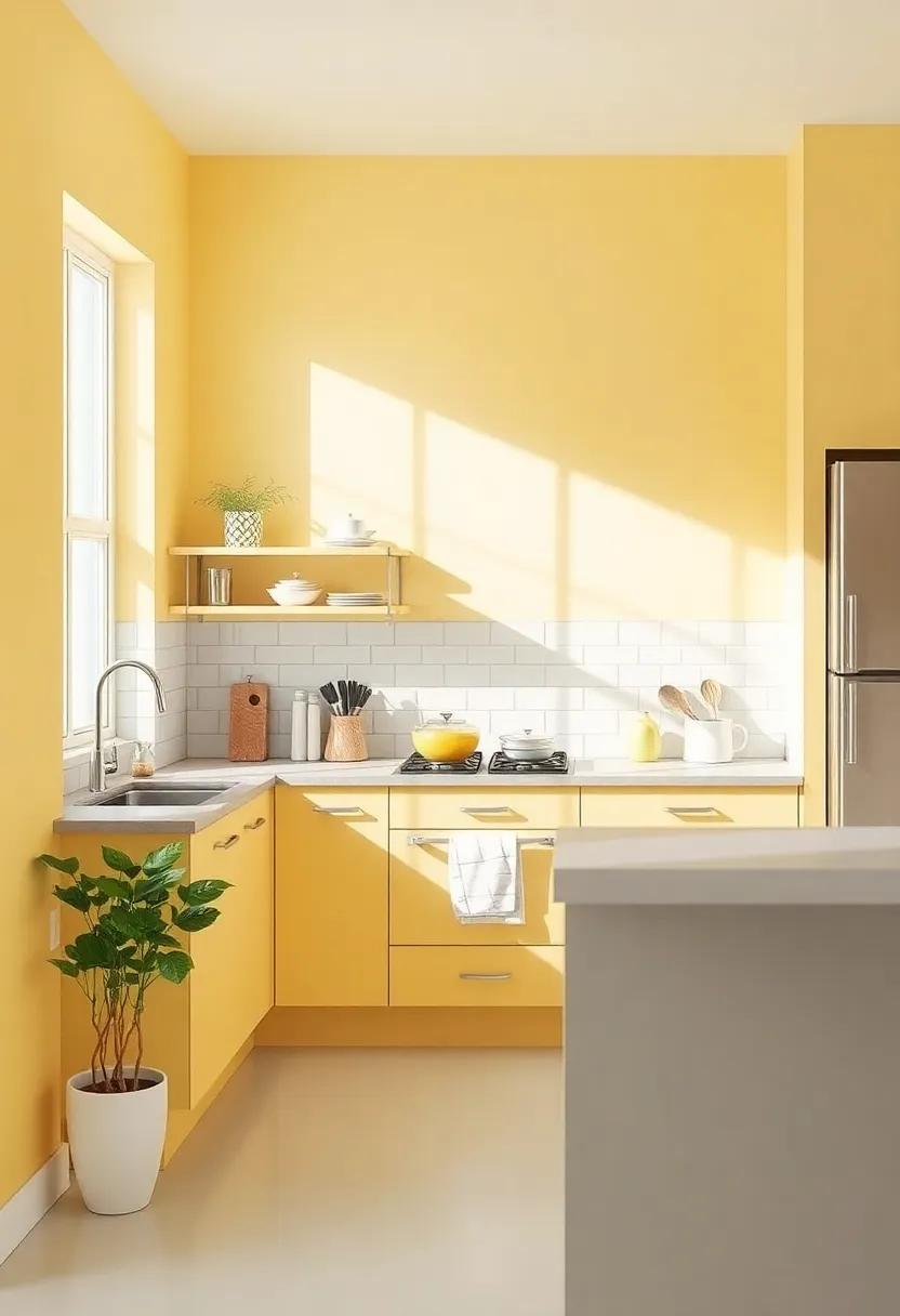
embrace the warmth of your kitchen by selecting a creamy yellow paint that radiates positivity and light. This cheerful hue evokes feelings of happiness and comfort, making your cooking space feel inviting and lively. It’s an ideal backdrop for a cozy haven, encouraging both family gatherings and kind conversations. Pair this color with natural wood accents to enhance its warmth, or complement it with neutral tones like soft grays and whites to create a balanced and harmonious look.
To maximize the uplifting atmosphere, consider adding vibrant decor that plays off the sunny walls. Here are some ideas:
- Brightly colored kitchen utensils: Incorporate jars and bowls in bold reds and greens to create visual interest.
- artistic wall hangings: Display colorful artwork or family photos in frames that pick up on your yellow kitchen theme.
- Fresh herbs or plants: adding potted herbs on the windowsill not only enhances the decor but also invites the fresh scents of nature indoors.
| Element | Recommended Shade |
|---|---|
| Paint Color | creamy Butter Yellow |
| Cabinets | Soft White |
| Accent Decor | Sunset Orange |
Dusty Rose: A warm, muted pink that adds sophistication and charm, softening the edges of your modern space
Embrace the charming allure of a warm, muted pink that effortlessly elevates your kitchen’s ambiance. This soft hue introduces a sense of calm and sophistication, seamlessly blending with contemporary decor while softening the sharp edges often found in modern designs. This color finds its home in various elements, from wall paint to cabinetry, and it pairs beautifully with materials like polished metal and natural wood, creating a balanced aesthetic. Visual interest can easily be enhanced by incorporating contrasting elements, such as crisp white trim or bold accessories, allowing this gentle shade to act as a backdrop for culinary creativity.
One of the most appealing aspects of this hue is its versatility. Whether your kitchen boasts a minimalist design or embraces bohemian intricacies, a dusty rose palette can harmonize with your style. It works beautifully with accents in a variety of shades, including:
- Muted Greens – for a serene, organic feel
- Deep Charcoal – adding dramatic depth
- Soft Creams - enhancing warmth and light
By mixing textures and finishes, such as matte walls with glossy ceramic tiles, you can create a cohesive and inviting space that welcomes both family and friends.
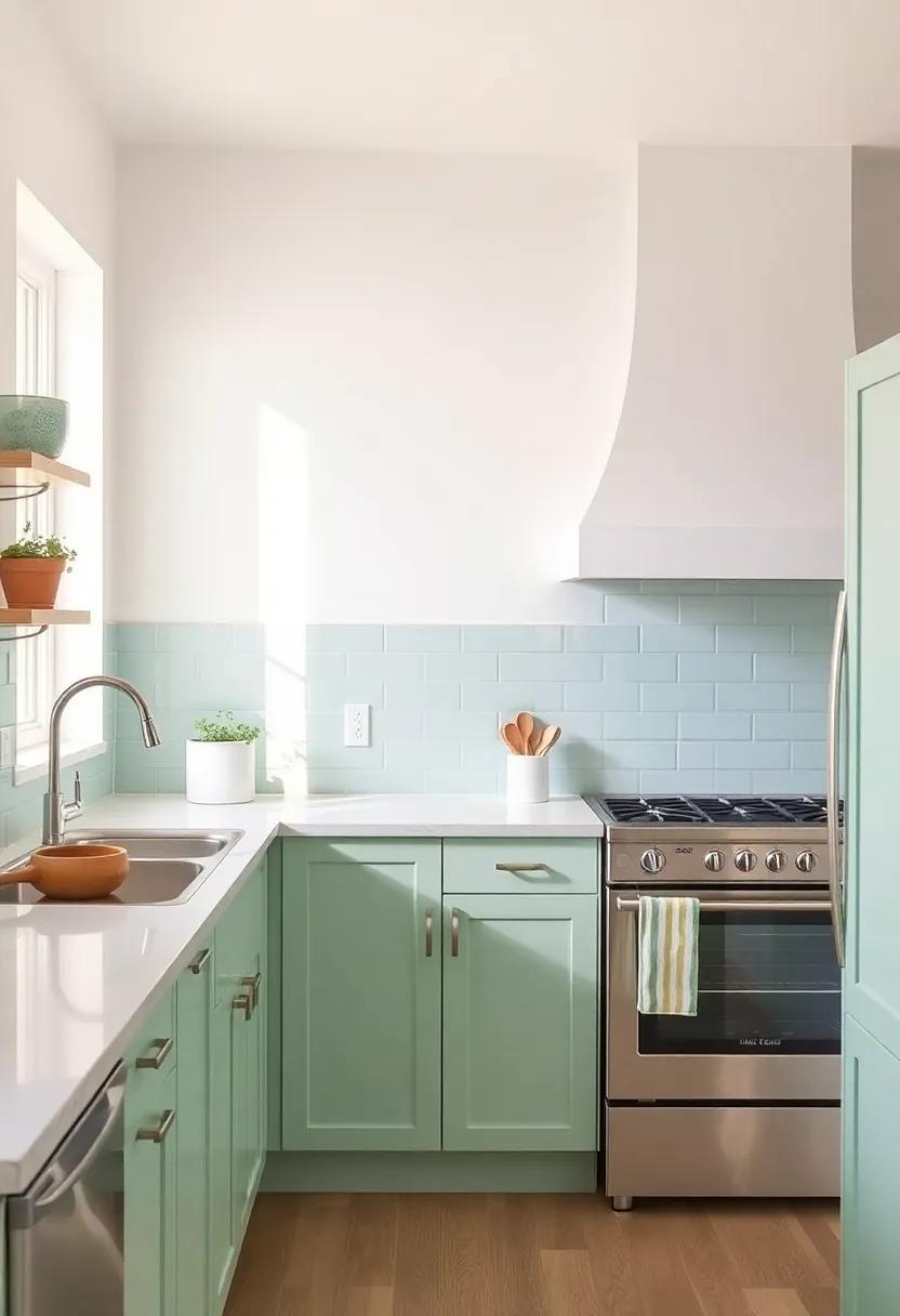
Seafoam Green: Reminiscent of coastal retreats, this soothing color pairs perfectly with nautical decor and light wood tones
Imagine stepping into your kitchen and immediately feeling transported to a serene coastal retreat. The soft embrace of seafoam green brings a refreshing and tranquil vibe, reminiscent of sun-kissed shores and gentle ocean breezes. This captivating hue harmonizes beautifully with nautical decor, enhancing the essence of seaside living. Incorporating light wood tones in cabinetry or shelving can create an inviting balance, evoking the warmth of driftwood washed ashore. Pairing this soothing color with white accents will amplify the airy feel,making your small kitchen a bright and welcoming space to gather.
to fully embrace the coastal theme, consider adding elements such as naval-inspired fixtures, textured fabrics, and artisanal tableware. These thoughtful decor choices will create visual intrigue while complementing the soothing seafoam backdrop. Experiment with combinations and accessories,like:
- Weathered rope elements for a nautical touch
- Subtle patterns in dish towels or tablecloths
- Oceanic artwork to reinforce the coastal vibe
Here’s a quick glimpse of compatible accents that enhance your kitchen’s seafoam charm:
| Accent Color | Material | Suggested Use |
|---|---|---|
| Soft White | Paint/Tile | Cabinetry and Backsplash |
| Muted Coral | Fabric | Cushions and Curtains |
| Driftwood Brown | Wood | Shelving and Furniture |
by embracing this color palette,you can effortlessly transform your small kitchen into a cozy haven that captures the essence of peaceful coastal living,where every meal prepared feels like a party by the sea.
Charcoal Gray: A bold yet versatile choice,this deep gray can add drama while still keeping the vibe cozy and modern
Charcoal gray is a striking choice that adds a touch of sophistication to any small kitchen. Its deep, rich tone creates an atmosphere of elegance while managing to retain a cozy feel. When paired with lighter elements,such as white cabinetry or bright backsplash tiles,it can make the space feel more expansive and inviting. This color works particularly well with natural wood accents, creating a gorgeous contrast that balances warmth with modernity. It’s a color that effortlessly adapts, allowing you to incorporate a variety of styles, from industrial to contemporary.
In addition to its aesthetic appeal, charcoal gray offers practicality in a bustling kitchen surroundings. It is less prone to showing dirt and stains than lighter shades, making it a smart choice for high-traffic areas. With the right lighting—think warm LED or soft pendant fixtures—you can highlight its depth, transforming your kitchen into a cozy haven where you love to cook and entertain. Consider complementing charcoal gray with soft creams, sage greens, or even gold accents to create a harmonious palette that feels both modern and inviting.
Rustic Red: Perfect for creating a homey, inviting feel, this hue works beautifully with vintage or farmhouse-style kitchens
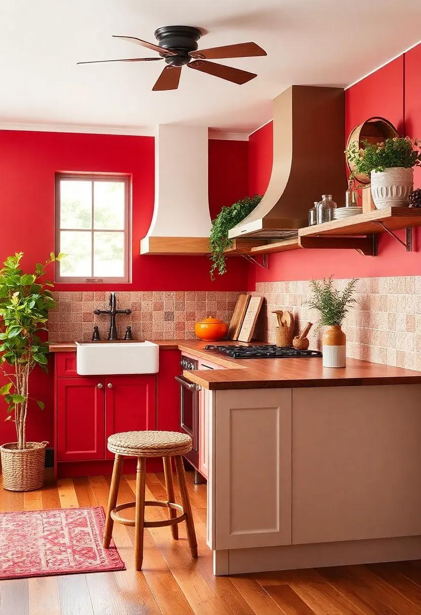
Embrace the warmth of a hue that exudes comfort and charm.This rich, earthy color sets a foundation for a kitchen atmosphere that feels both welcoming and lived-in. Pair this vivid shade with natural wood accents, such as reclaimed barn wood shelves or a farmhouse-style dining table, to create a cohesive look that tells a story. Consider incorporating vintage pieces,like antique dishware or a classic,farmhouse sink,that resonate with this color palette and enhance the nostalgic appeal. A few carefully chosen decor items in muted tones will allow the rustic red to shine without overwhelming the space.
To amplify the cozy ambiance,think about including accessories that complement the overall aesthetic. Opt for textiles like woven throw blankets or plaid kitchen towels, which add layers of texture while harmonizing with the rich red backdrop. Additionally, consider soft illumination through vintage-inspired fixtures that cast a warm glow, inviting you and your guests to linger in the kitchen. Adding live plants, such as herbs or succulents in terracotta pots, can infuse life into your culinary space and enhance the organic warmth of the rustic red, making it the perfect setting for gathering and creativity.
Golden Mustard: A rich and cheerful yellow that can act as a statement color,infusing energy into your meal prep area
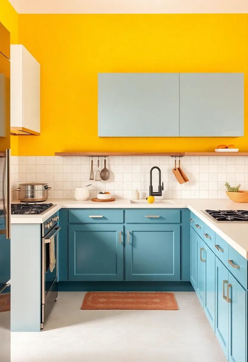
Brighten your culinary workspace with a splash of personality using golden mustard,a color that captures the warmth of sunshine and the zest of culinary creativity. This captivating hue is perfect for those who wish to create a vibrant atmosphere while preparing meals.Its rich undertones not only provide a joyful contrast to more muted palettes but also stimulate the senses, inspiring a cheerful mood every time you step into your kitchen.
Pair golden mustard with a mix of earthy tones and whites for a balanced look that feels both cozy and invigorating. Consider the following complementary hues to create a harmonious color scheme:
- Charcoal Grays: Offers a grounding effect.
- Soft Whites: lighten the space without overpowering the mustard.
- Warm Terracottas: Enrich the overall warmth.
- Olive Greens: Adds a natural element, complementing the vibrant yellow.
To visualize the impact of this cheerful shade, check out the following simple palette overview:
| Color | Emotion |
|---|---|
| golden Mustard | Joy and Energy |
| Charcoal Gray | Stability |
| Soft White | Calmness |
| Warm Terracotta | Comfort |
| Olive Green | Nurturing |
Lavender Mist: This gentle, whimsical shade adds a playful touch, perfect for a kitchen with character and charm
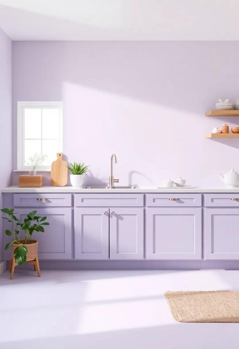
If you’re looking to imbue your kitchen with a sense of playfulness and serenity, consider the enchanting hue of lavender mist.This soft, whimsical shade effortlessly strikes a balance between relaxation and cheer, making it an ideal choice for a culinary space that reflects your personality. Imagine starting your day surrounded by the gentle tones of lavender,where every meal prep feels like an inspired journey. Whether paired with sleek white cabinets or rustic wooden shelves, lavender mist brings out the best in both modern and vintage aesthetics.
Accent your kitchen with bold décor elements that harmonize beautifully with this magical shade. Consider these delightful options:
- Bright Artwork: Hang vibrant art pieces featuring kitchen themes to create visual interest.
- Complementary accents: Use soft yellows or greens in textiles like dish towels or curtains to maintain harmony.
- Natural Elements: Incorporate plants in terracotta pots that contrast with lavender’s softness.
To see how lavender mist can complement various materials and finishes, check out the following color pairings:
| Material/Finish | Complementary Colors |
|---|---|
| white Marble | Soft Sage, Pale Peach |
| Rustic wood | dusty Rose, Cream |
| Stainless Steel | Teal, Light Gray |
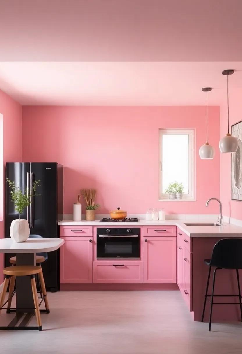
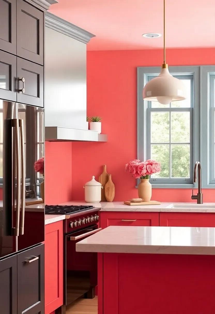
Soft coral: A lively yet soft choice that can brighten up your space, making cooking feel like a joyous occasion
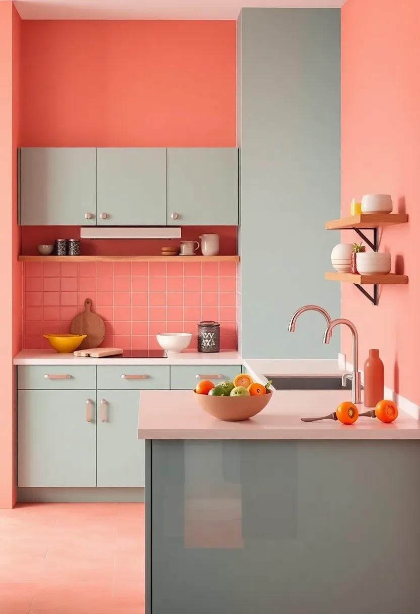
Transform your kitchen into a vibrant oasis with the use of soft coral. This hue, often associated with warmth and warmth, meshes seamlessly with various design elements. Its gentle undertones bring a vibrant yet soothing atmosphere, making every cooking session feel like a delightful experience. Whether it’s flecks of coral appearing in your kitchen accessories, or a complete wall makeover, this lively color can invigorate the heart of your home.
Incorporating soft coral into your culinary space can be achieved through various methods. Consider these delightful approaches:
- Accent Walls: Choose one wall to splash with coral while keeping the others neutral for balance.
- Cabinet Refresh: Give your cabinets a fresh coat of soft coral paint for a chic update.
- Accessorize: Use coral in dishware,curtains,and rugs to tie the look together.
To help you visualize, here’s a simple comparison of colors paired with coral:
| Color | Description |
|---|---|
| teal | creates a stunning contrast that energizes the space. |
| Grey | offers a elegant tranquility that complements the vibrancy. |
| Sunny Yellow | Adds a cheerful touch that harmonizes beautifully with coral’s warmth. |
Mint Green: A fresh and invigorating color that brings a retro flair to your kitchen, reminiscent of classic diner aesthetics
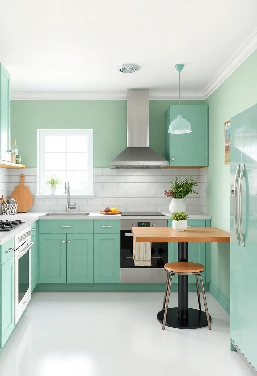
Mint green is more than just a color; it’s a mood that can transform your kitchen into a vibrant yet soothing space. This fresh hue channels the essence of classic diners, evoking feelings of nostalgia while providing a modern twist. Its soft, pastel quality brightens up the area, creating an inviting atmosphere perfect for everything from family breakfasts to casual dinners with friends. Imagine mint green cabinetry paired with sleek, stainless steel appliances; it’s a delightful mix of retro charm and contemporary flair.
To enhance the mint green theme, consider incorporating complementary elements that celebrate its fresh vibe. Think about adding brass fixtures for a vintage touch, or crisp white countertops to keep the space feeling light and airy. You might also want to introduce pops of color through accessories such as:
- Vintage diner-style barstools
- Colorful dishware
- Charming retro clocks
These additions not only enrich the mint green foundation but also foster a cheerful energy, making every moment spent in your kitchen an enjoyable experience. Embrace the full potential of mint green, and watch as your small kitchen evolves into a cozy haven that pays homage to the elegance of yesteryears.
Snowy Gray: A cooler alternative to stark white, this shade provides a sleek backdrop for colorful decor and appliances
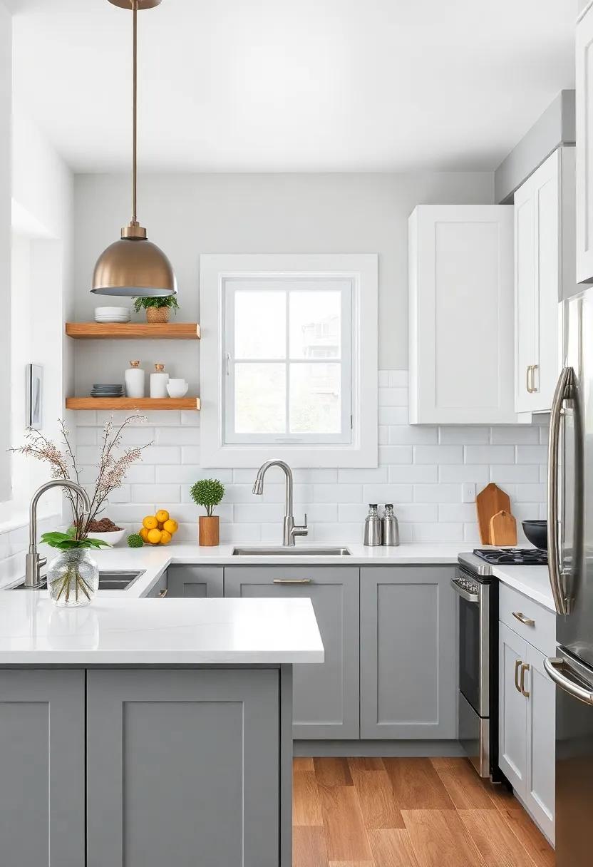
For homeowners looking to escape the blinding brightness of stark white, a shade like Snowy Gray emerges as a refreshing option that envelops the space in a calming embrace. this soft and sophisticated hue serves as a versatile canvas that allows vibrant decor and chic appliances to take center stage. Whether your kitchen features rustic wood accents or sleek modern finishes, Snowy Gray provides the perfect backdrop that complements a variety of styles without overwhelming the senses.
To enhance the allure of this shade,consider incorporating wall art,unique lighting fixtures,or even colorful dishware that pops against the muted tones. Here are some fantastic elements to experiment with:
- Brightly colored appliances
- Artisan pottery with bold glazes
- Whimsical wall decals
- colorful textiles like curtains and table runners
Creating a cozy haven is all about balance, and Snowy Gray seamlessly marries softness with style, establishing a welcoming atmosphere in your small kitchen.
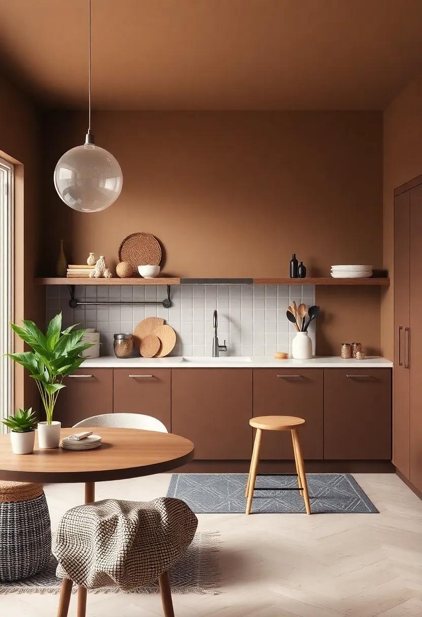
Terra Cotta: With its warm earthy tones, this color can create a Mediterranean vibe, perfect for kitchens with rustic elements
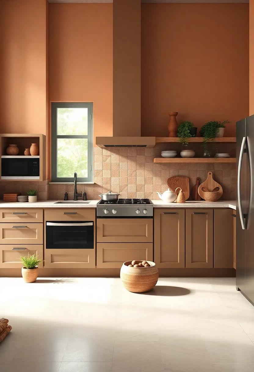
Infusing your kitchen with the warm, earthy tones of terra cotta can instantly evoke the essence of Mediterranean living. This hue, reminiscent of sunbaked clay and rustic pots, complements wooden cabinets and terracotta tiles beautifully. the soft, inviting shade pairs wonderfully with natural materials, allowing you to create a harmonious space that feels both cozy and elegant. Consider incorporating accents that highlight its rich, warm quality:
- Wooden Shelves: Displaying rustic crockery on open wooden shelves against a terra cotta backdrop adds depth and personality.
- Woven Textiles: incorporate linen tablecloths or wicker baskets that contrast and enhance the warmth of the walls.
- Greenery: Potted herbs or trailing plants will pop against the terracotta, bringing the outdoors in.
This color can also work wonders in creating a welcoming atmosphere. The warm undertones foster a sense of comfort and intimacy, ideal for small kitchens where family and friends gather. To maximize the impact of terra cotta, consider pairing it with complementary colors and textures:
| complementary Colors | Suggested Combinations |
|---|---|
| Soft Creams | Use as accents to lighten the overall palette and add brightness. |
| deep Greens | Introduce rich leafy tones for a fresh, garden-like vibe. |
| Muted Blues | Balance out the warmth with cool undertones for a serene feel. |
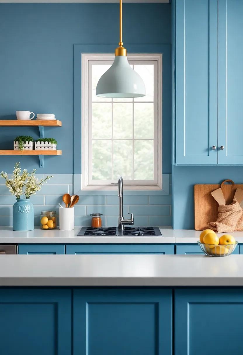
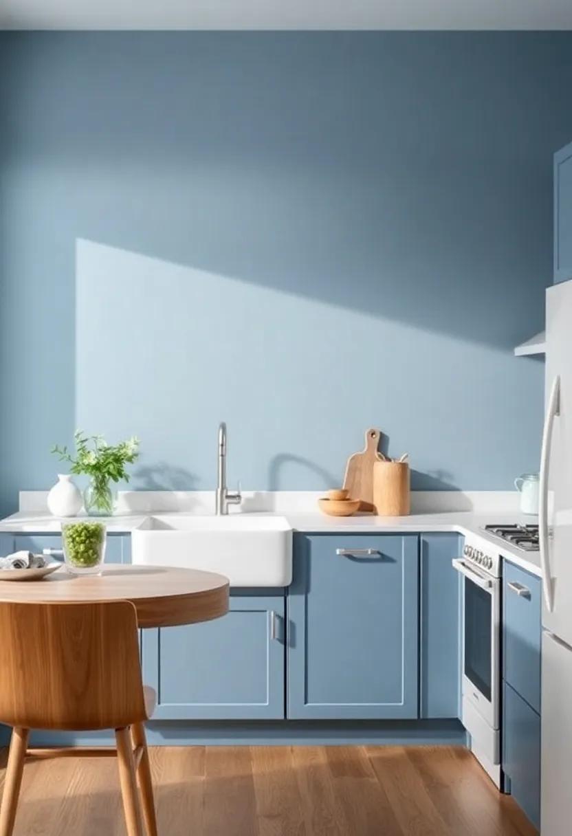
Ocean Blue: Inspired by the sea, this inviting shade evokes a sense of peace and relaxation in even the busiest kitchens
Imagine stepping into your kitchen and being instantly transported to a serene coastal retreat with the gentle wave of a soothing color.Ocean Blue is not just a mere color; it encapsulates the essence of tranquility, creating an inviting atmosphere perfect for both culinary adventures and quiet family moments.Infusing this shade into your kitchen can be as simple as painting an accent wall or refreshing cabinetry, instantly giving the space a breezy, relaxed feel. The subtle hints of green and muted tones within Ocean Blue evoke the mesmerizing hues of ocean waters,ensuring your kitchen feels open,airy,and revitalizing.
To enhance the peaceful aura, consider pairing Ocean Blue with complementary decor elements. Here are some ideas to harmonize the color scheme:
- Soft whites: Crisp white trims or cabinets highlight the serenity of blue.
- Natural woods: Wooden accents warm up the space and add organic textures.
- Coral accents: Pops of coral or peach can energize the calm while mimicking marine life.
To help visualize your transformation, here’s a simple color palette you could consider:
| Element | Color |
|---|---|
| Walls | Ocean Blue |
| Cabinets | Crisp White |
| Countertops | Light natural Wood |
| Accents | Coral or Peach |
Peachy Beige: A subtle blend of peach and tan that creates warmth without overwhelming the senses, ideal for small spaces
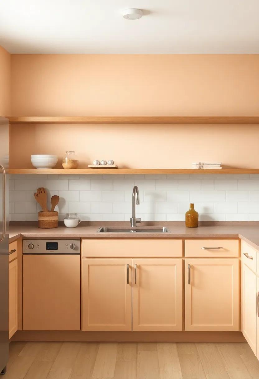
Imagine stepping into your small kitchen and feeling instantly embraced by a warm, inviting atmosphere. The gentle hue of peachy beige serves as the perfect backdrop to create this cozy ambiance. This delightful color offers a subtle fusion of peach and tan, striking a balance that feels both refreshing and comforting. Its understated elegance can make your compact space feel larger while infusing it with a sense of warmth that invites gatherings and culinary adventures. The transformative power of this shade is particularly noteworthy in areas where natural light plays a significant role, as it reflects light beautifully and enhances the overall brightness.
Utilizing peachy beige in your kitchen opens up endless possibilities for complementary accents and decor. Consider the following elements to enhance this lovely hue:
- Wood Elements: Rich wooden cabinets and shelves can beautifully contrast against the soft walls.
- metal Touches: Incorporate copper or brass hardware for a touch of elegance that sparks interest.
- Textiles: Soft peach or creamy table linens and barstools can tie the room together, making it feel cohesive.
- Artwork: Use framed pictures or wall art that includes hints of peach to reinforce the color scheme.
Feeling inspired by this captivating shade? Here’s a quick comparison of how peachy beige can complement various design styles in your kitchen:
| Design Style | Complementary Colors | Key Features |
|---|---|---|
| Modern | Whites, Grays, Black Accents | sleek lines and minimal décor |
| Farmhouse | Soft Whites, Pastels | Rustic charm with wooden accents |
| Vintage | Muted Blues, Soft Greens | Eclectic décor and retro patterns |
Rich Burgundy: A deep, luxurious color that adds a touch of elegance while maintaining a cozy atmosphere
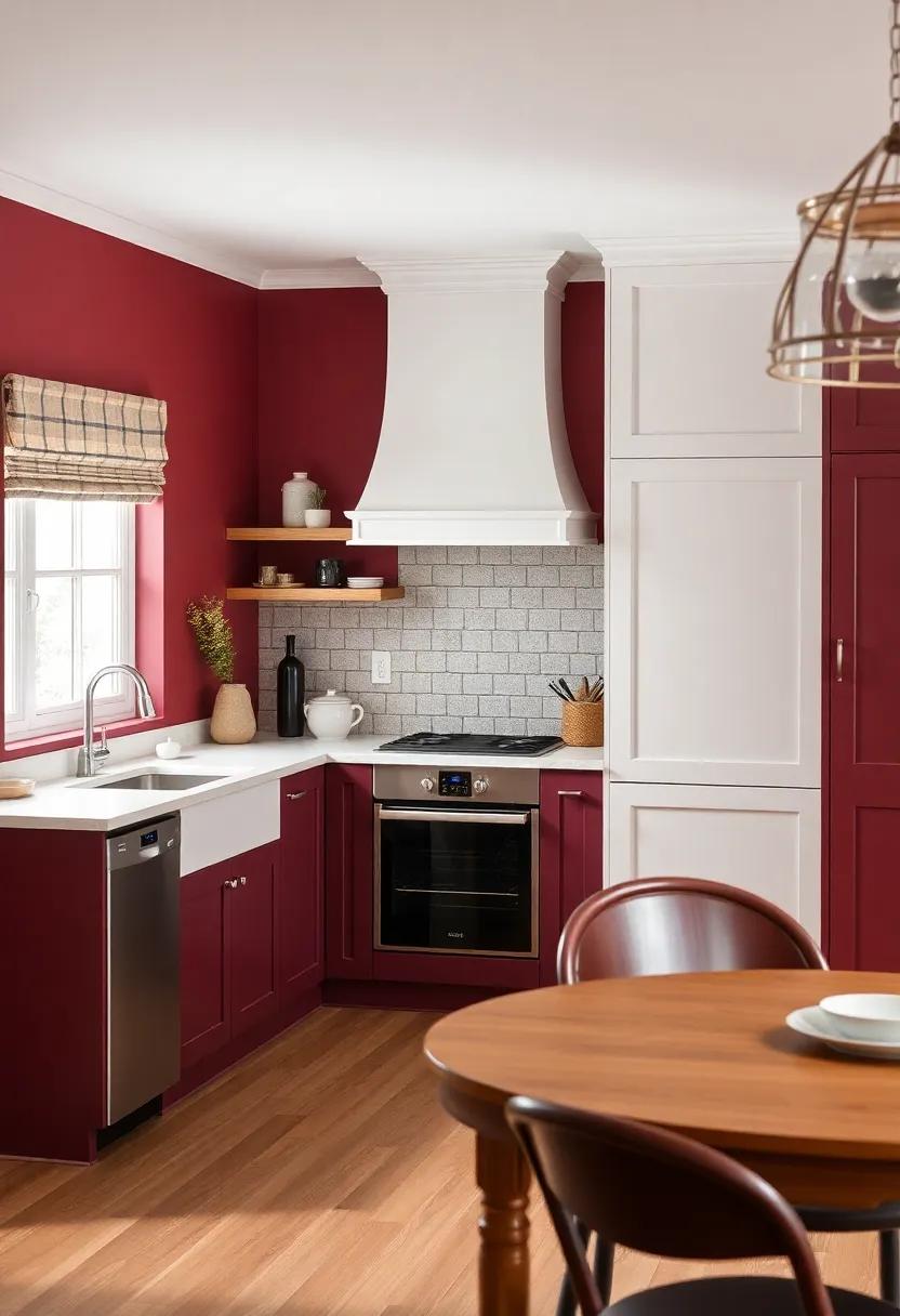
Rich burgundy evokes a sense of luxury that can effortlessly elevate your kitchen’s aesthetic while wrapping the space in a soothing embrace. This deep, opulent hue not only adds sophistication to your decor but also exudes warmth, making it an ideal choice for smaller kitchen areas where intimacy is key. Picture deep burgundy accent walls adorned with soft, muted cabinetry, creating a stunning contrast that draws the eye without overwhelming the senses.
Incorporating rich burgundy into your small kitchen can transform it into a refined sanctuary. Consider the following elements to complement this sumptuous color:
- Contrast with Neutral Tones: Pairing burgundy with whites and grays can create a balanced look.
- Metallic Accents: Incorporate brass or gold fixtures for a touch of glam.
- Natural Textures: Add wooden elements to soften the richness of burgundy.
- Artwork and Decor: Choose art pieces that either compliment or harmonize with this deep shade.
Here’s a quick reference table on how to enhance your rich burgundy look in the kitchen:
| Element | Recommended Pairing |
|---|---|
| Cabinets | Soft White |
| Backsplash | Creamy Beige |
| Countertops | Marble with Gold Veining |
| Accessories | Brushed Nickel |
Sunny Lemon: A bright and cheerful color that’s sure to uplift your spirits every time you step into the kitchen
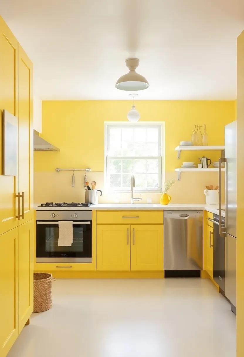
Bright and bubbly, the essence of this color instantly brings warmth and joy to your cooking space. Imagine walking into your kitchen every morning surrounded by a cheery hue that radiates positivity. This color reflects the sunlight as it pours through your windows, engaging all your senses and enhancing the overall ambiance.The refreshing allure of yellow can create a welcoming atmosphere that transforms even the simplest of cooking endeavors into uplifting experiences.
When paired thoughtfully with complementary shades and decor, this color can truly shine.consider accents in white, gray, or soft blues to highlight the joyful tones without overwhelming your space. Here are a few ideas to inspire your palette:
- Cabinetry: Paint your cabinets this sunny hue for a striking focal point.
- Backsplashes: Use tiles in this color for an eye-catching design element.
- Accessories: Incorporate small appliances and kitchenware in this cheerful shade for playful accents.
| Color Pairing | Effect |
|---|---|
| White | Brightens and opens up the space. |
| Soft Gray | Balances warmth and sophistication. |
| Pale blue | creates a refreshing and calm environment. |
Slate Blue: This deep, muted shade brings sophistication and pairs wonderfully with stainless steel appliances
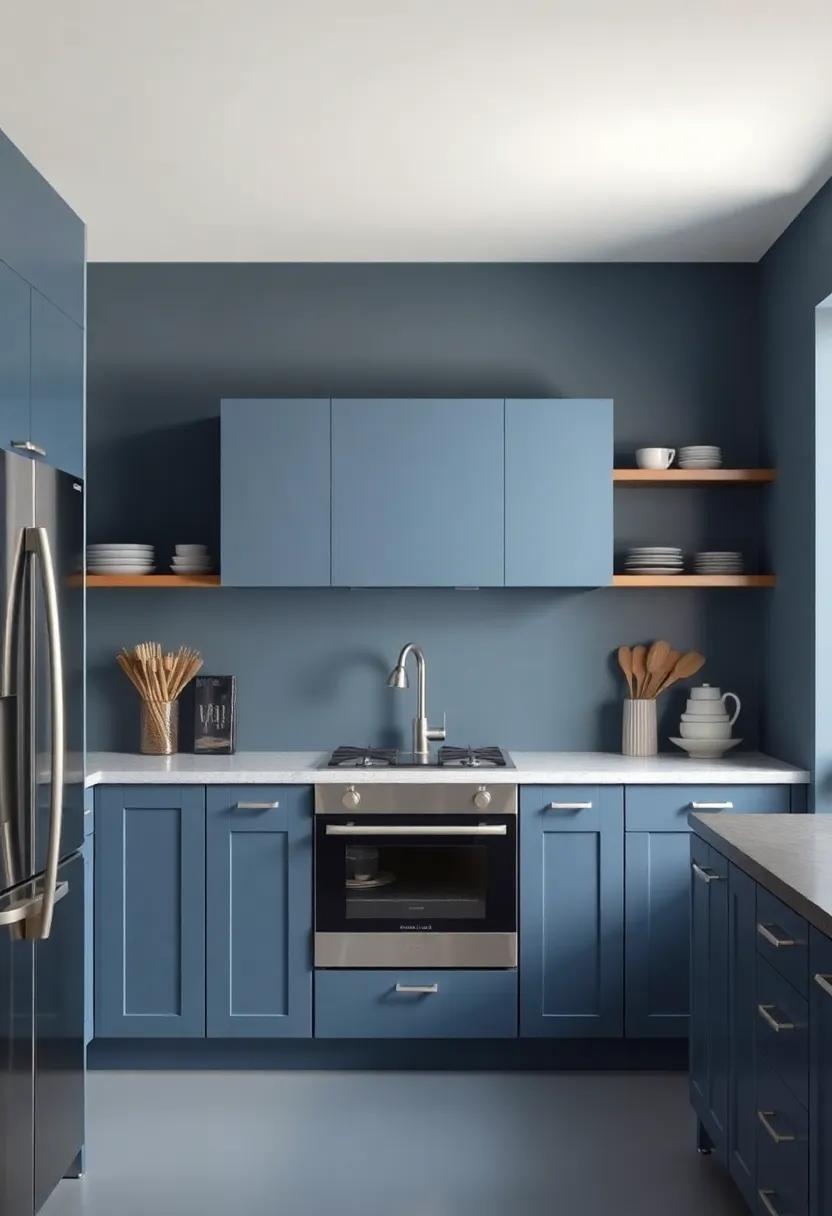
The allure of a deep, muted hue like this can instantaneously enhance the elegance of a small kitchen space. When choosing this sophisticated color, consider incorporating various textures to enrich the visual experience. Picture the way it harmonizes beautifully with stainless steel appliances, offering a contemporary contrast that feels both inviting and modern. This shade acts as a serene backdrop, allowing your kitchen tools and accessories to shine without overwhelming the senses. pair it with natural wood elements,such as butcher block countertops or wooden shelves,to add warmth and balance,creating a cozy atmosphere ideal for cooking and entertaining.
To maximize the impact of this sophisticated shade, consider the following design tips:
- Accent Walls: paint one wall to serve as a feature, drawing the eye and making the space feel larger.
- Open Shelving: Showcase white dishware or colorful kitchen gadgets that pop against the muted background.
- Lighting Fixtures: Choose contemporary lighting in brass or matte black to complement the depth of the paint color.
Additionally, here’s a simple table to highlight complementary colors and materials:
| Color/Material | Effect |
|---|---|
| White | Brightens and expands the space |
| Warm Wood | Adds a cozy and inviting touch |
| Matte black | Creates dramatic contrast and sophistication |
Almond Blossom: A soft, warm neutral that complements many styles, providing a clean and inviting base for your kitchen
For those looking to create a cozy kitchen atmosphere, Almond Blossom is an exquisite choice that brightens the space while maintaining a warm, inviting feel.This soft hue draws inspiration from nature, making it a timeless addition to your home. Whether you have a traditional, rustic, or contemporary aesthetic, its versatility allows it to harmonize beautifully with various design elements. Consider pairing Almond Blossom with complementary accents, such as:
- Warm wood tones for a rustic flair
- Soft greys to add a modern twist
- Cool whites for a crisp, clean finish
- Pastel accents like mint or peach for a playful vibe
In addition to its adaptability, the color helps to maximize natural light, making even the smallest of kitchens feel airy and spacious. Imagine countertops adorned with fresh herbs, vibrant fruits, or handcrafted pottery set against a backdrop of Almond Blossom.This color creates an inviting canvas where culinary creativity can thrive.To enhance its effect, consider incorporating textures through:
- textured backsplash tiles for visual interest
- Layered textiles, such as linen curtains and cotton towels
- Handcrafted decor to add personal flair
By embracing Almond Blossom, you are not only elevating your kitchen style but also fostering a space where warmth and comfort reign supreme.
Berry Purple: A bold pop of color that infuses your kitchen with energy and creativity, inspiring culinary adventures
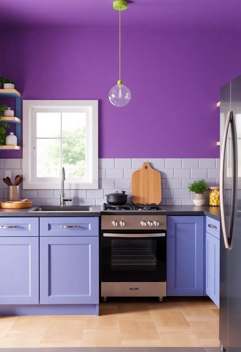
Imagine stepping into your kitchen and being greeted by a vibrant burst of berry purple. This lively hue not only energizes the space but also serves as a canvas for culinary creativity. The deep, rich tones of berry purple can stimulate the appetite and encourage adventurous cooking, making it an inspiring backdrop for your culinary exploits. You might find yourself whipping up new recipes or daring to play with unusual spices simply because your environment persuades you to think outside the box.
to complement this exhilarating color, consider incorporating accessories and decor that enhance the berry vibes. A few suggestions include:
- Bright kitchenware: Think mugs, plates, and cutting boards in contrasting colors like crisp white or sunny yellow.
- Textiles: Opt for curtains, dish towels, or rugs with fun patterns that play off the berry tones to maintain a cohesive look.
- Plants: Fresh herbs in vibrant green pots can create a refreshing contrast, while vibrant flowers can add a touch of natural beauty.
A well-planned color palette mixing berry purple with complementary shades can make your kitchen feel both welcoming and invigorating.Consider using a simple table layout to visualize potential combinations:
| Color Pairing | Effect |
|---|---|
| Berry Purple + Cream | Soft and welcoming, creating a balanced look. |
| Berry Purple + Sunflower Yellow | Bright and cheerful, sparks joy in cooking. |
| Berry Purple + Aqua blue | Refreshing and cool, adds a sense of calm. |
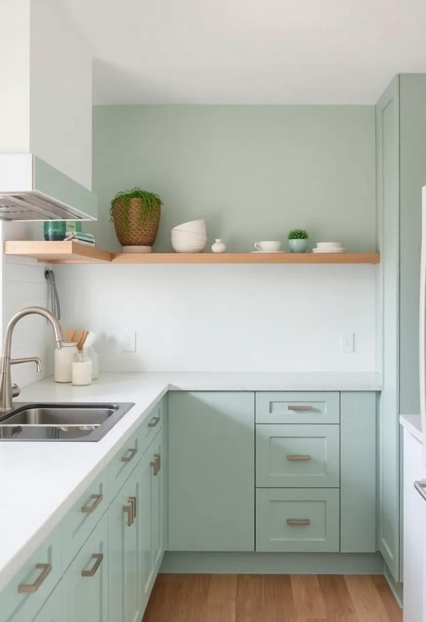
Light Olive: A subtle twist on green that works harmoniously with natural wood and white accents for a fresh look
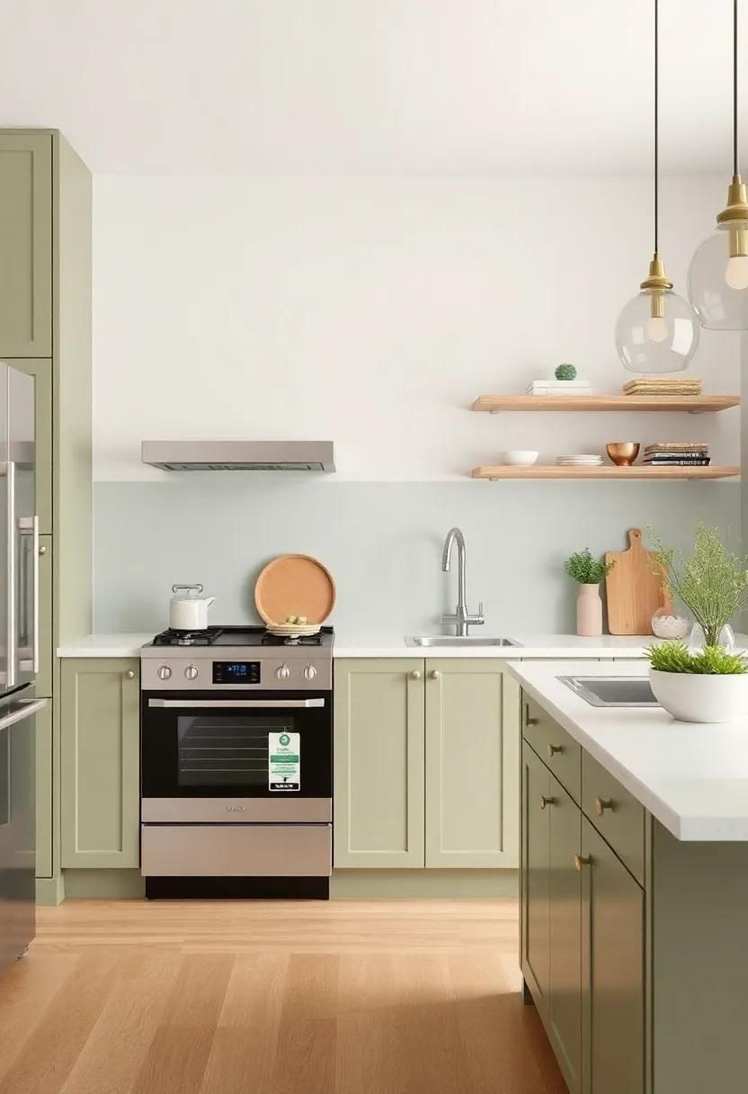
Embracing light olive in your small kitchen introduces a gentle, earthy vibe that instantly connects the space to the lushness of nature. This subtle shade of green brings a refreshing quality that feels both tranquil and invigorating, perfect for starting your day with a burst of energy. By pairing it with natural wood elements—like open shelving, cabinetry, or even well-crafted wooden utensils—the warmth of the olive green creates a cozy atmosphere. the combination allows for a harmonious balance, as the richness of wood tones complements the pastel hue, resulting in a kitchen that feels alive and welcoming.
To enhance the space further, introducing white accents, such as countertops, backsplashes, or even decorative items, contributes a sense of brightness and airiness that counterbalances the richness of the light olive. This palette not only opens up the kitchen but also creates a clean, modern look that feels effortlessly chic. The overall effect is one of sophistication and comfort; the light olive acts as a perfect backdrop for colorful kitchen accessories, fresh produce, and herb pots, making your small kitchen both a functional haven and a delightful visual feast.
Coral Reef: A vibrant coral shade that injects fun into your kitchen space, perfect for the modern home chef
The vibrancy of coral can truly breathe life into your kitchen, transforming it from a mundane cooking area into an inviting social hub. With its warm undertones, this shade encourages creativity and culinary exploration, making it perfect for the modern home chef. Incorporate coral in your kitchen through beautiful cabinetry or striking accent walls to create a lively atmosphere that is both functional and aesthetically appealing. Pair it with white or gray to achieve a fresh, contemporary look, and don’t shy away from adding a touch of greenery to provide a refreshing contrast.
To complete the coral-inspired kitchen transformation, consider the following decor tips:
- Use coral Accessories: Incorporate coral-colored kitchen gadgets and textiles, like dish towels and table runners, to tie the space together.
- Contrast with neutral elements: Opt for basic white dishes or stainless-steel appliances to balance the brightness of coral.
- Layer Lighting: Add pendant lights in soft gold or brass to enhance the warmth of coral while creating cozy nooks for cooking or dining.
Here’s a quick reference table for the best complementary shades that can elevate your coral kitchen:
| Color | Effect |
|---|---|
| White | Brightens and opens up the space. |
| gray | Offers a modern, sophisticated touch. |
| Teal | Creates a cool contrast and adds depth. |
Espresso Brown: Pair this rich shade with lighter colors for a cozy,inviting look that feels like a warm embrace
Espresso Brown not only provides a signature richness to your kitchen walls but also creates the perfect backdrop to play with light and airy accents. To embrace the cozy ambiance that this deep hue offers, consider pairing it with soft cream, dove gray, or pale blush.These lighter shades not only contrast beautifully with Espresso Brown but also reflect light, making the space feel more open and inviting.Accent pieces in these lighter tones, such as kitchenware, curtains, or even a backsplash, can create a harmonious interplay between dark and light, ensuring that your kitchen remains a warm and welcoming environment.
Additionally, textures can elevate the appeal of your cozy kitchen haven. Incorporate elements like a woven jute rug or a light wood dining table to enhance the warmth and tactile interest in the space. Consider adding a white ceramic backsplash or a subtle patterned tile that not only complements the dark walls but also adds depth and character. By blending these elements, you can create a kitchen that feels both chic and comforting, making it the perfect place to gather and enjoy life’s simple moments.
Faded Denim: This versatile blue brings an element of casual chic,making your kitchen feel both stylish and relaxed
Faded denim captures the essence of a relaxed yet stylish atmosphere, making it an alluring choice for enhancing your kitchen space. Its soft, muted hue evokes a sense of calm, perfectly complementing the often bustling activity of cooking and dining. Imagine pairing this soothing blue with warm wooden cabinetry or sleek stainless steel appliances, creating a harmonious balance that feels inviting.
To elevate the faded denim experience, consider incorporating thoughtful decor elements that highlight its chic nature.Here are some inspiring ideas to enhance the look of your kitchen:
- Textured textiles: Opt for soft, linen tablecloths or patterned kitchen towels that incorporate shades of blue.
- Artwork: Hang framed prints or paintings that feature blue hues to tie the room together.
- Plants: Add greenery to contrast the cool tone of the walls, introducing a fresh, vibrant vibe.
For a quick reference on complementary colors and materials, consider the following:
| Complementary Color | Material |
|---|---|
| Soft Gray | Marble countertops |
| Warm White | Classic subway tiles |
| Earthy Terracotta | Clay pottery |
Cool Aqua: A bright and refreshing option that brightens up the room and pairs beautifully with white cabinetry
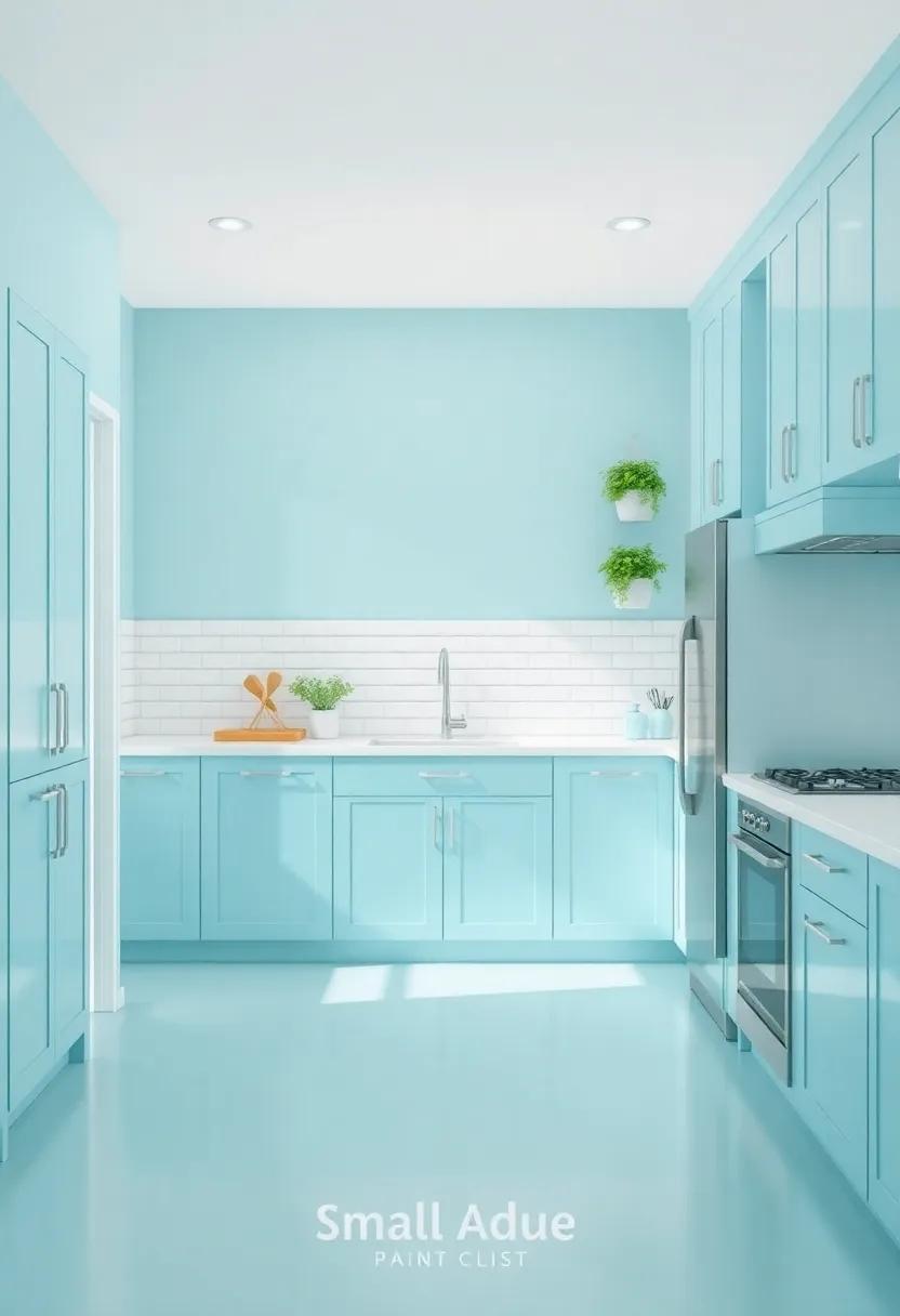
For those looking to infuse their kitchen with a sense of tranquility and vibrancy, a bright aqua shade emerges as a standout choice.This invigorating hue captures the essence of tropical waters and complements the crispness of white cabinetry, creating a visually stunning contrast that feels both modern and inviting. Whether your kitchen is outfitted with sleek, minimalist designs or embraces a more rustic charm, aqua adds a playful touch that harmonizes beautifully with various decor styles.
Incorporating this lively color can also enhance the overall ambiance of the space. When paired with natural light, aqua can reflect brightness and cheerfulness, making the room feel larger and more open. consider accentuating this palette with elements such as:
- Wooden accents for warmth
- Metal fixtures for a contemporary edge
- Soft textiles like cushions and curtains to balance the vibrant walls
Here’s a simple guide to help visualize how aqua can work in your kitchen:
| Color Pairing | Effect |
|---|---|
| White | Brightens the space |
| Wood | Adds warmth and depth |
| Brass | Introduces elegance |
Honey Yellow: A warm, golden hue that creates a cheerful yet relaxing kitchen environment, perfect for family gatherings
Incorporating honey yellow into your kitchen palette can transform the heart of your home into a lively yet serene space. This golden shade evokes a sense of brightness that pairs beautifully with natural light, creating a welcoming atmosphere ideal for family gatherings. Consider using honey yellow on your walls or as an accent color on cabinets to invoke a sense of warmth and comfort. It invites laughter and conversation, making it the perfect backdrop for cherished moments spent cooking and sharing meals together.
To enhance the honey yellow theme, introduce complementary colors and textures throughout your kitchen.Some great options include:
- Soft Grays: balance the warm tones with a calming gray for countertops or backsplashes.
- Creamy whites: Brighten cabinets and trim to keep the space feeling open and airy.
- Warm Wood Tones: Incorporate wood elements such as shelves or furniture to add depth and richness.
With the right accents, honey yellow creates a harmonious environment that is both cheerful and relaxing, making your kitchen not just a place for cooking, but a cozy gathering space for family and friends.
Vintage Mint: A nostalgic color that evokes memories of classic kitchens, bringing charm and personality to your culinary space
Step into a world where charming nostalgia meets modern convenience with the soothing hue of vintage mint. This enchanting color whispers memories of classic kitchens, transporting you to simpler times filled with laughter and flavorful home-cooked meals. By adorning your culinary space with vintage mint, it not only celebrates your love for retro aesthetics, but it also creates a serene backdrop that encourages creativity in your cooking.Pair it with whitewashed cabinetry and subtle wood accents for that perfect balance of elegance and cozy warmth.
To enhance this nostalgic vibe, consider integrating vintage-inspired elements that resonate with the color’s charm. Think about the following features:
- Classic Appliances: Opt for retro-style refrigerators and stoves that seamlessly blend functionality and style.
- Textiles: Incorporate striped or polka-dotted kitchen linens to add a playful touch of yesteryears.
- Wall Art: Hang vintage culinary posters or framed family recipes on the walls to create a personalized gallery.
this palette acts as a backdrop for both fond memories and new culinary adventures, creating an engaging atmosphere to share stories and meals with loved ones.Consider using mint in unexpected places,such as a vibrant backsplash or even cabinetry accents,to infuse your kitchen with life and personality.no matter how big or small your space is, vintage mint is sure to transform your kitchen into a cozy haven bursting with charm.
Wrapping Up
As we wrap up our exploration of these 29 invigorating paint colors, we hope you’ve found inspiration to breathe new life into your small kitchen. Each hue has the potential to transform your space into a cozy haven, fostering warmth and inviting creativity into your daily culinary adventures. Remember, the right color can enhance not only the aesthetics of your kitchen but also the ambiance, making it a place where memories are cooked up and shared. So go ahead, take the plunge, and let your walls reflect your unique personality. whether you opt for bold and invigorating or soft and serene, your small kitchen is just waiting for that perfect splash of color. Happy painting!
As an Amazon Associate I earn from qualifying purchases.