25 Inspiring Ways to Master Eclectic Style with Painted Furniture for Every Room
Looking to infuse your home with personality and charm? Embracing eclectic style through painted furniture is a brilliant way to create spaces that are uniquely yours—vibrant, inviting, and full of character. In this listicle, we explore 25 inspiring ways to master eclectic style with painted furniture for every room in your home. From bold pops of color to subtle distressed finishes, you’ll discover creative ideas that blend textures, hues, and eras effortlessly. Whether you want to refresh a tired dresser or reimagine a dining set, these tips and projects offer practical inspiration to help you transform ordinary pieces into stunning focal points that reflect your individuality. Get ready to unlock the art of mixing and matching painted furniture to elevate your interior style in fresh, unexpected ways.
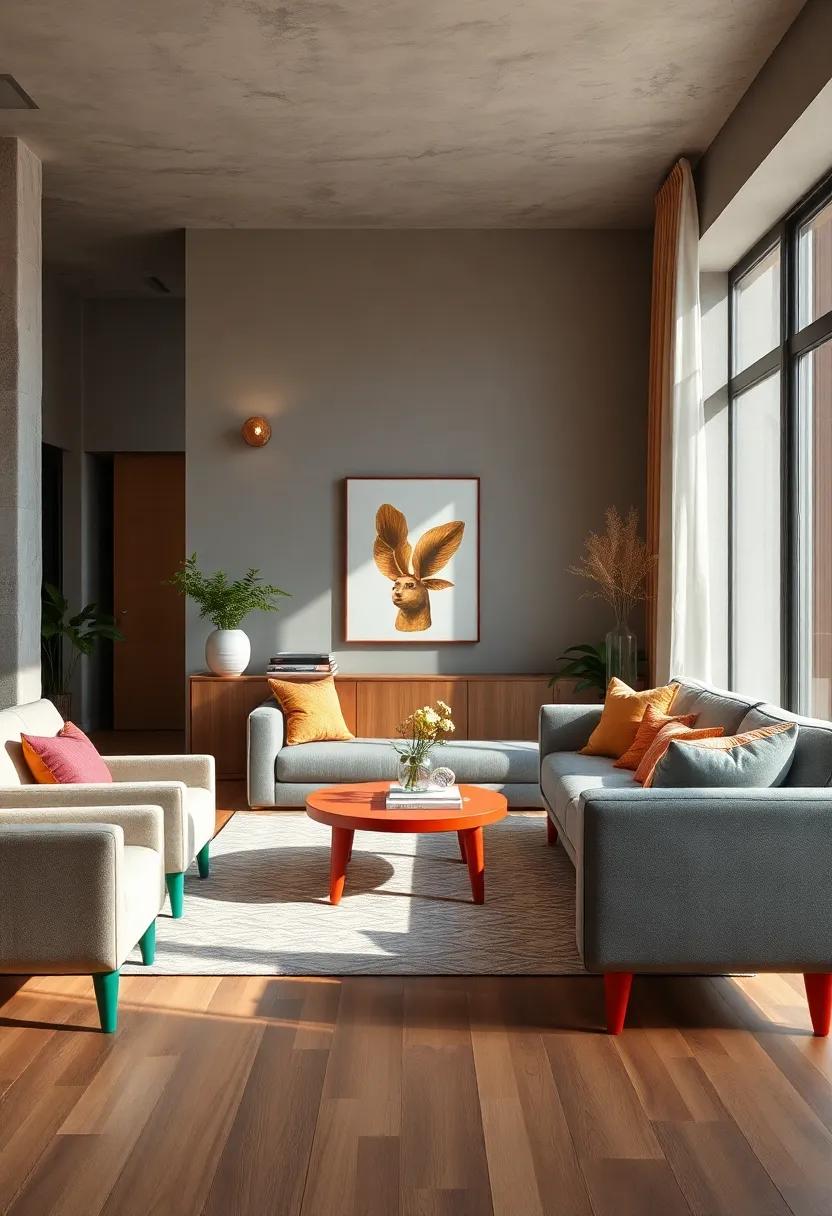
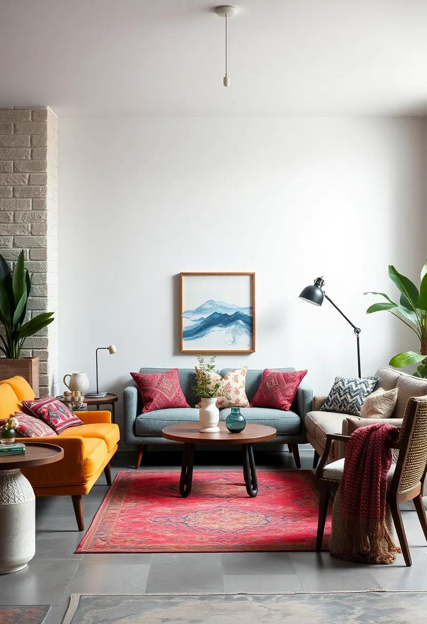
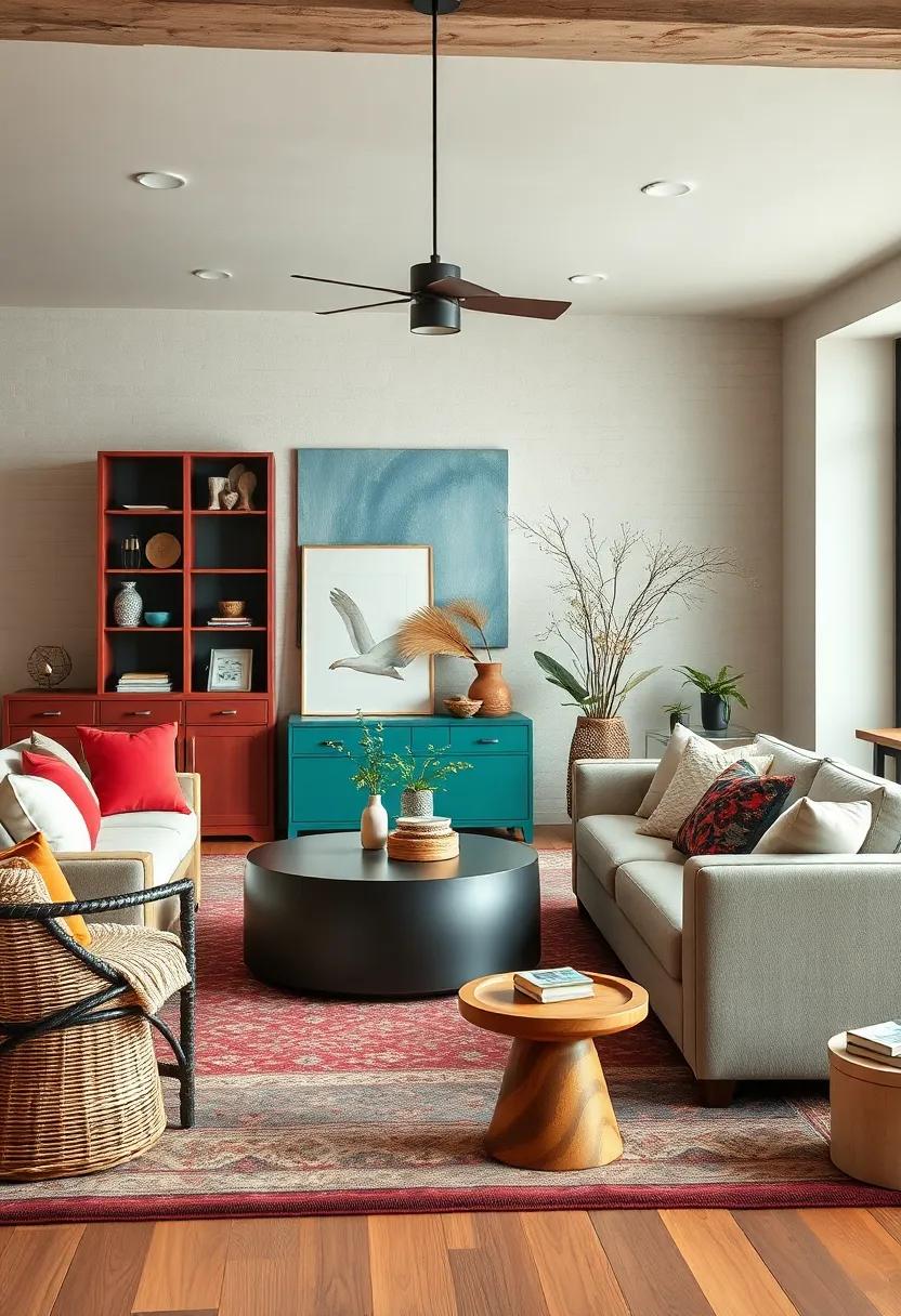
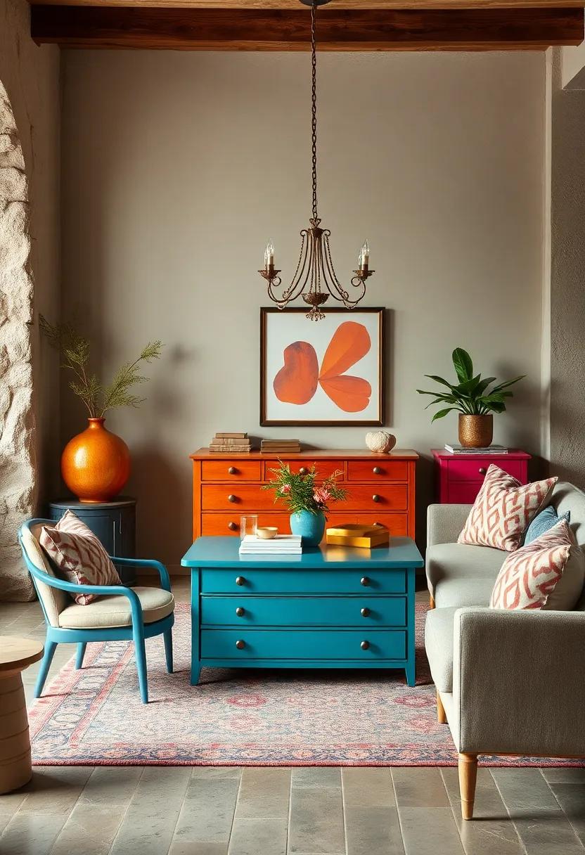
Embrace Bold Color Blocking to Transform Old Furniture into Striking Room Focal Points
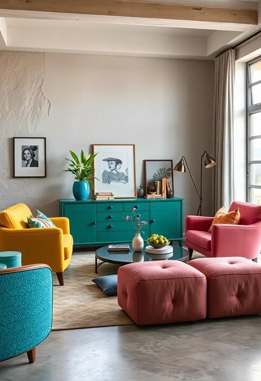
Inject life into tired, outdated furniture by applying blocks of bold, contrasting colors that command attention and spark imagination. Think beyond a single shade: combine jewel tones like emerald green with sunny mustard, or vibrant coral paired with deep navy.These unexpected color mash-ups create a visual rhythm that transforms pieces from merely functional into captivating art forms. Utilize painter’s tape to carve out geometric patterns—triangles, rectangles, or abstract shapes—that emphasize the furniture’s silhouette while adding dynamic flair. Every brushstroke becomes a statement, turning your dresser, coffee table, or bookshelf into a captivating centerpiece that elevates the entire room’s eclectic vibe.
Pro tips for flawless color blocking:
- Choose two to three contrasting colors to maintain balance without overwhelming.
- Matte finishes often enhance the boldness of color blocks, minimizing glare and emphasizing shape.
- Incorporate metallic accents or subtle stenciling within the blocks to add dimension and texture.
| Furniture Piece | Suggested Color Blocks | Effect |
|---|---|---|
| Mid-century Sideboard | Turquoise / Mustard / White | Retro vibrancy with modern edge |
| Vintage Bookshelf | Coral / Navy / Gold Accent | Bold focal point with luxe appeal |
| Rustic Coffee Table | Forest green / Shining orange | Earthy yet energetic centerpiece |
Mix Vintage and Modern Paint Finishes for a Layered, Eclectic Look
Blending vintage charm with sleek modernity creates an irresistibly layered aesthetic that adds personality and depth to any space. Imagine pairing a distressed chalk paint finish on a classic dresser with glossy,high-shine lacquered chairs nearby. This juxtaposition not onyl highlights the history embedded in the vintage pieces but also adds a contemporary edge that keeps the overall vibe fresh and dynamic. using diverse paint textures invites the eye to explore each element individually, while the mix anchors the look in eclectic sophistication.
To successfully balance vintage and modern finishes, consider contrasting matte and glossy surfaces within the same room. Here’s a quick visual guide that showcases how these finishes complement each other strikingly:
| Finish Type | Typical piece | Effect in Room |
|---|---|---|
| Chalk Paint (Matte) | Antique side table | Soft, worn character |
| High-Gloss Lacquer | Modern dining chairs | Bright, reflective contrast |
| Milk Paint (Textured) | Vintage bookshelf | Rustic, timeworn appeal |
| Satin Finish | Contemporary cabinet | Elegant, subtle sheen |
- Layer colors mindfully – muted tones for vintage with vibrant hues for modern accents.
- Test swatches to ensure finishes complement rather than clash under your room’s lighting.
- Incorporate metallic or mirrored details to bridge the gap between eras visually.
Use Chalk Paint for a Matte, Distressed Effect That Adds Character and Charm
Chalk paint is a brilliant choice when you’re aiming for that effortlessly worn look that feels both vintage and trendy. It’s naturally matte finish creates a soft, powdery surface that instantly transforms ordinary furniture pieces into charming focal points. Whether you’re reviving an old dresser or a tired coffee table, chalk paint allows you to build layers of color and character with minimal sanding or priming required. Plus, it’s incredibly versatile—easy to distress with a bit of sanding after drying, revealing subtle hints of base colors or original wood, adding an authentic touch of time-worn elegance.
Embracing this style encourages you to explore creative distressing techniques and combine unexpected hues. Such as, try pairing soft pastels like dusty rose or mint green with deeper, earthy undertones for a dynamic contrast. Use waxes or matte sealers to protect your work without compromising that signature dusty finish.Here’s a quick guide to some popular finishes using chalk paint and their impact:
| Finish | effect | Recommended Application |
|---|---|---|
| Single Coat Matte | Soft, smooth color with subtle texture | Ideal for minimalist eclectic pieces |
| Layered Distress | Visible underlying colors, vintage appeal | Perfect for statement furniture with character |
| Waxed Finish | Protects paint, enhances softness | Great for daily-use surfaces |
- Experiment with color combinations—mix muted shades to avoid overpowering the room.
- Use sandpaper sparingly to reveal natural textures without over-distressing.
- Finish with clear or dark wax for different aging effects and surface protection.
Combine Patterned Stenciling with Hand-Painted details to Personalize Each Piece
Layering patterned stencils with delicate hand-painted accents breathes unparalleled life into your furniture,turning every piece into a bespoke masterpiece. Start by choosing a bold geometric or floral stencil in muted tones, then amplify the charm by adding freehand brush strokes or intricate motifs in complementary colors. This fusion imitates the unpredictability of eclectic style, where symmetry meets spontaneity, allowing each item to tell its own story.by doing so, your furniture becomes a tactile canvas, where repeating patterns ground the design, and hand-painted details inject a whimsical, personal touch.
For a harmonious yet dynamic effect, experiment with contrasting textures and scales within the same piece. For instance, a soft pastel stencil pattern paired with vibrant, metallic hand-painted highlights creates an eye-catching interplay of subtlety and boldness. Try incorporating unexpected elements like delicate borders, tiny florals, or playful dots that respond to the shapes within your stencil. This technique not only enhances the visual depth but also invites closer inspection, transforming ordinary furniture into intimate conversation starters that resonate with eclectic elegance.
Paint Only the Legs or Trim of Furniture for a Subtle Pop of Color
For those who appreciate a touch of creativity without overwhelming the senses, accentuating just the legs or trim of your furniture offers a subtle yet captivating way to introduce color. Imagine the sleek legs of a vintage side table dipped in a bold teal or the ornate trim of a dresser highlighted with a soft pastel shade. This technique allows you to play with hues that complement the rest of your room’s palette while maintaining the original character and texture of the piece. The contrast created by this selective painting draws the eye gently,adding personality and charm without locking you into a dominant color scheme.
perfectly suited for eclectic interiors, this approach can effortlessly bridge different styles and periods. It’s especially effective on furniture made from natural wood or neutral-toned upholstery. Consider the following benefits when opting for selective coloring:
- Easy refresh: Changing the color of just the legs or trim is quicker and less expensive than painting the entire piece.
- Versatility: It integrates seamlessly with both modern and vintage elements, providing an adaptive look.
- Layered Texture: The mix of painted and natural surfaces adds depth and visual intrigue.
- Subtle Statement: Adds just enough flair to make a statement without overpowering your room’s design harmony.
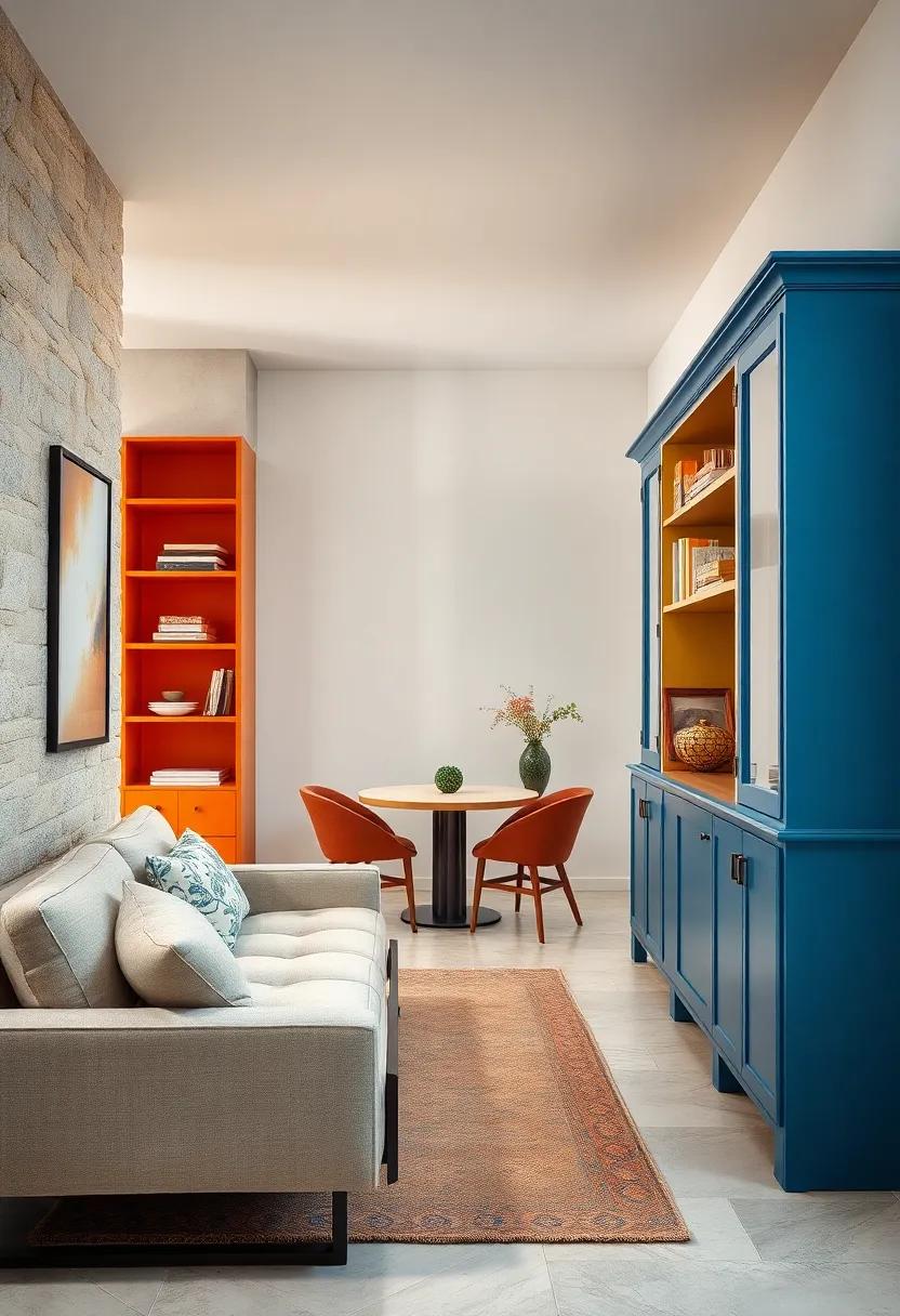
incorporate Metallic paint Accents to Add a Touch of Glam and Shine
Inject a splash of elegance and modern flair by highlighting your painted furniture with metallic paint accents. These shimmering touches, whether in gold, silver, or bronze, can elevate a simple dresser, nightstand, or bookshelf from ordinary to extraordinary. Metallic hues reflect light beautifully, creating dynamic focal points that catch the eye and add depth to your eclectic space. Try painting drawer handles, chair legs, or the edges of shelves in metallic shades to subtly introduce this glam factor without overwhelming the piece.
For a bolder statement, consider combining metallic paint with textured finishes or jewel-toned colors to create a luxurious, layered look. use painter’s tape to design geometric patterns or organic shapes, then fill in with your chosen metallic shade for precision and style. Here are some creative ideas to spark your imagination:
- Metallic Ombre: Blend metallic paint from top to bottom for a gradual shimmer effect on cabinets or desks.
- Accent Feet: Highlight the legs of chairs or tables with metallic paint to ground your eclectic mix with a sleek touch.
- Inlaid Details: Use metallic paint within carved furniture details for subtle shine that elevates craftsmanship.
- Drawer Handles & Knobs: Paint or replace hardware with metallic finishes to update furniture effortlessly.
Experiment with Ombre Effects to Create Smooth Color Transitions on Cabinets or Dressers
Adding an ombre effect to your cabinets or dressers transforms ordinary furniture into a stunning focal point that seamlessly bridges colors and styles. by blending hues from light to dark or vice versa, you create a visual flow that adds depth and sophistication to eclectic interiors. Whether you opt for bold, saturated colors or subtle pastels, this gradual color shift allows for a dynamic yet harmonious look, enhancing the personality of the piece without overwhelming the room. Experiment with complementary or contrasting shades to evoke different moods—from calming and serene to vibrant and energetic.
to achieve a flawless ombre transition, start with a well-prepared surface and use quality acrylic paints that blend easily. Use soft brushes or sponges and gently feather the colors into each other, working quickly before the paint dries. Here’s a quick reference guide to popular ombre color pairs and their typical applications:
| Color Combination | Ambiance Created | Best rooms |
|---|---|---|
| Soft Lavender to Dusty Pink | Calm and Romantic | Bedrooms, Dressing Rooms |
| Ocean Blue to Aqua Green | Fresh and invigorating | Bathrooms, Living Rooms |
| Sunset Orange to Warm Peach | Cozy and Energetic | Dining Areas, Entryways |
| Charcoal Gray to Soft White | Modern and Minimalist | Home Offices, Studios |
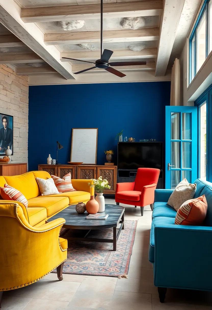
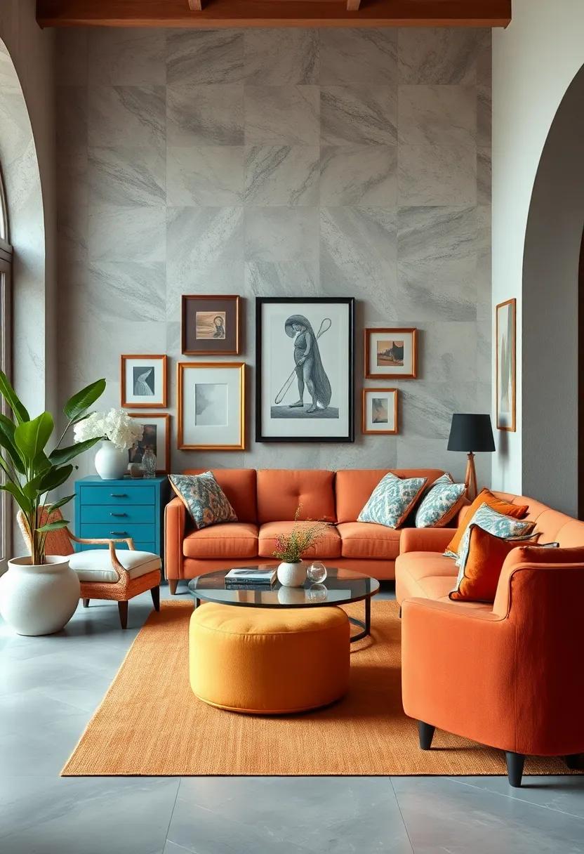
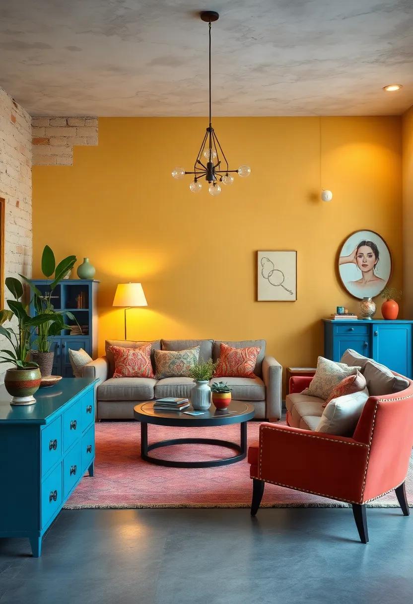
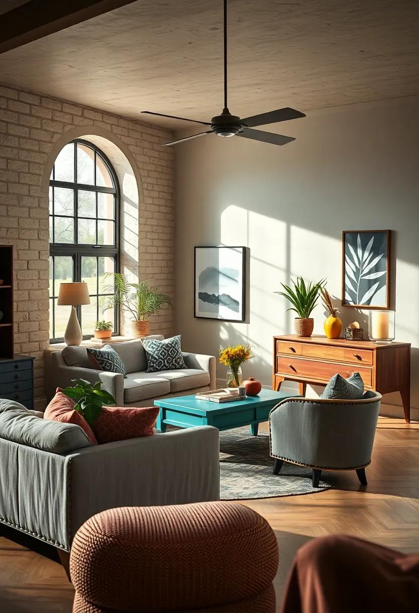
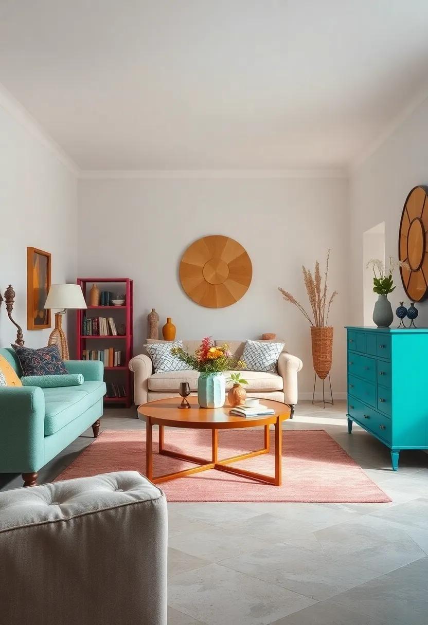
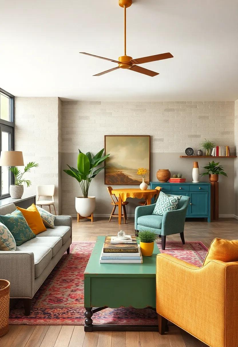
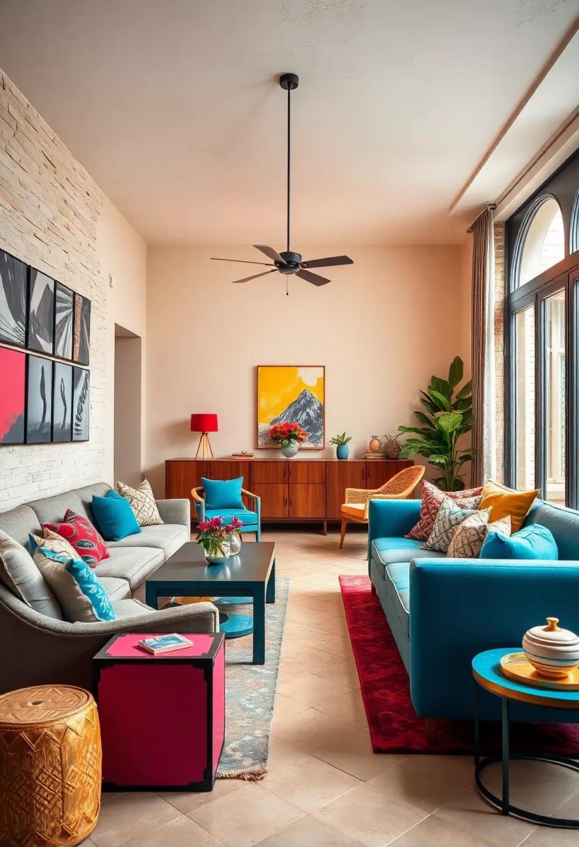
Contrast Brightly Painted Furniture with Neutral Walls for Balanced visual Interest

Brightly painted furniture has the power to become the star of any room, but pairing it with bold wall colors can sometimes overwhelm the space. By choosing neutral walls—think soft creams, gentle grays, or muted taupes—you create a calm backdrop that allows vibrant pieces to truly shine. This strategy not only highlights the unique character of your painted furniture but also maintains a harmonious balance, ensuring the room feels curated rather than chaotic. When the walls stay understated, your colorful dresser, chair, or side table transform into captivating focal points.
To keep this balance dynamic, consider accents that subtly tie your furniture to the room without competing for attention. Textiles in neutral tones with pops of color,such as throw pillows or rugs,can echo the vibrancy of your painted pieces gently. Here are some simple ways to achieve this balance:
- Use beige or light gray walls as a canvas for turquoise, coral, or mustard furniture.
- add metallic or wooden accessories to soften the contrast further.
- incorporate natural light to enhance the brightness of painted furniture against calming walls.
Use Whitewashing Techniques to Soften Bold Colors and Highlight Wood Grain
Whitewashing is an elegant method to temper the intensity of vivid painted furniture, creating a delicate balance between boldness and subtlety. This technique involves applying a translucent white paint wash over colorful surfaces, allowing the underlying hues to peek through while lending a dreamy, muted effect. It’s a particularly effective strategy when you want to preserve the energy of bright shades without overwhelming the senses. The slightly faded finish adds texture and depth, making each piece feel both timeless and artfully worn-in.
Moreover, whitewashing does wonders in highlighting the natural wood grain beneath, turning it into a key design feature rather than a hidden detail. Whether your furniture is crafted from oak,pine,or reclaimed wood,this technique accentuates knots,streaks,and imperfections,celebrating the material’s organic beauty. For best results, lightly sand the piece after whitewashing to enhance the grain’s visibility and create a tactile, authentic finish. This approach works beautifully on eclectic furniture, bridging the gap between rustic charm and modern flair.
Repurpose Old Doors or Panels into Painted Headboards for a Unique bedroom Touch
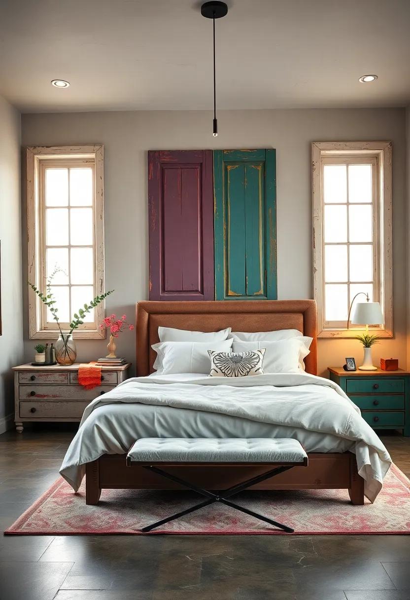
Give your bedroom a one-of-a-kind charm by transforming reclaimed doors or vintage panels into a stunning painted headboard. Whether you choose to highlight intricate woodwork, distressed textures, or classic panel designs, a fresh coat of paint can breathe new life into these pieces. Opt for bold colors or subtle pastels to complement your eclectic décor, or mix and match shades for a playful vibe. Adding stencils or hand-painted motifs will make the headboard a true focal point, marrying rustic allure with artistic flair.
Beyond aesthetics, repurposing saves resources and sparks creativity. To get started, consider these design ideas:
- Vintage Elegance: Soft cream or dusty blue with gold leaf accents for a regal feel
- Boho brights: Vibrant turquoise or coral enhanced with geometric patterns
- Modern Minimalist: Matte black or charcoal with crisp white details
- Shabby Chic: Distressed whitewashed finish paired with floral stenciling
| Door Type | Recommended Paint Finish | Eclectic Style Match |
|---|---|---|
| Paneled Wood | Satin | Vintage Elegance |
| Farmhouse Door | Chalk Paint | Shabby Chic |
| Slatted Panel | Matte | Modern Minimalist |
| Rustic Barn Door | Distressed Finish | Boho Brights |
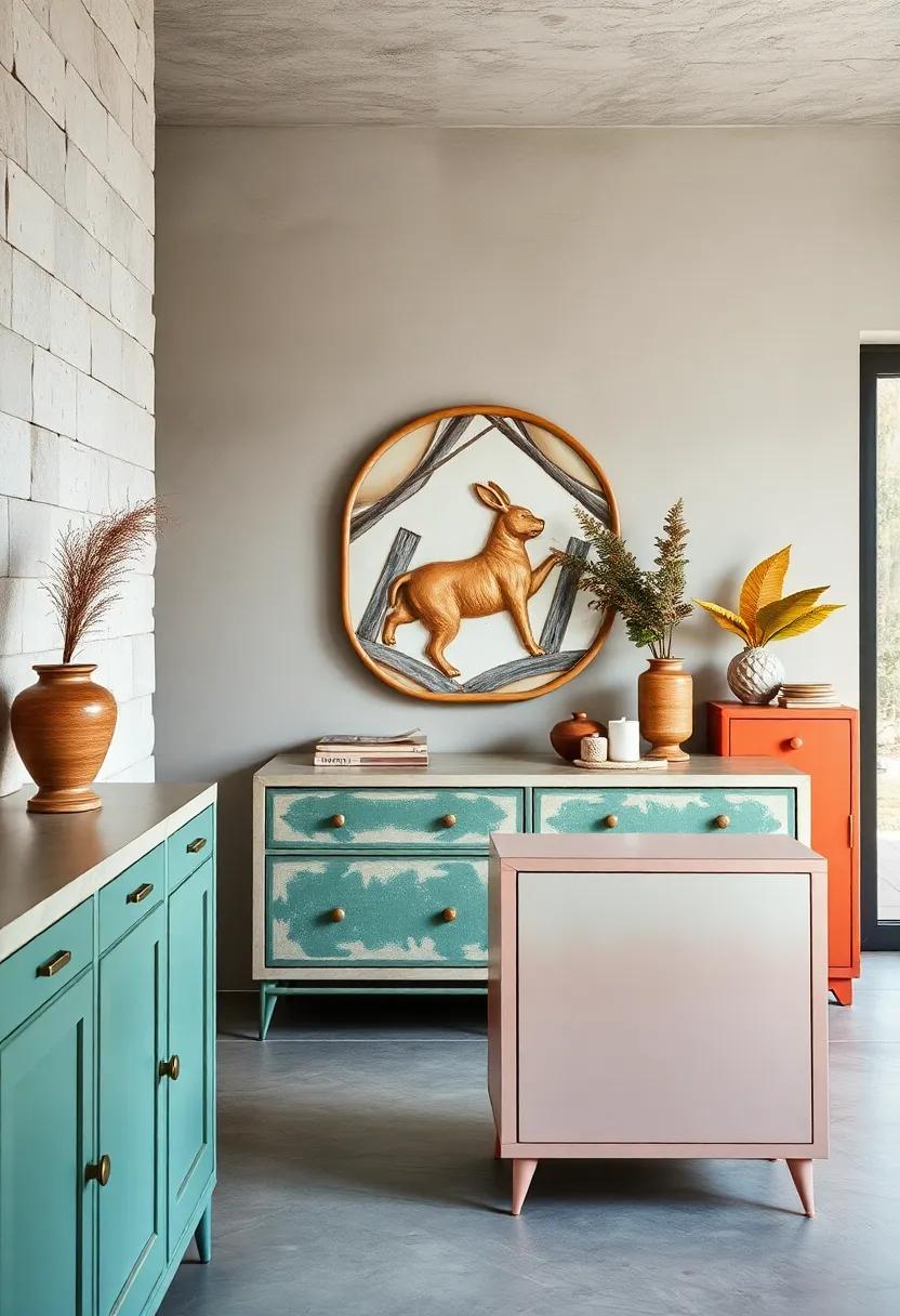
Highlight Intricate Carvings by Using Two-Tone Paint Combinations
Bring depth and drama to your intricately carved furniture by layering two-tone paint combinations that play with contrast and harmony. Select a base color that resonates with the room’s overall palette, then use a complementary or metallic shade to gently brush over raised details. This technique doesn’t just add visual intrigue—it breathes new life into heirloom pieces by emphasizing every twist and turn of the carving, turning functional furniture into true conversation starters. Whether it’s the gentle patina of a sage green paired with antique gold or a bold charcoal offset by creamy white, these combinations create dynamic textures that invite closer inspection.
Try experimenting with these striking pairs to accentuate different wood textures and styles:
- Deep Navy & Soft Coral: Perfect for vintage cabinets, evoking a refined nautical nostalgia.
- Matte Black & Burnished Copper: Ideal for industrial or rustic decor, drawing attention to ornate patterns with an edgy twist.
- Powder Blue & Crisp White: Fresh and airy for shabby chic pieces,highlighting delicate scrollwork.
- Olive Green & Brass highlights: Adds earthiness and a luxe sparkle,great for mid-century modern furniture.
| Base Color | Highlight Color | Ideal Furniture Type |
|---|---|---|
| Cobalt Blue | Silver Leaf | Accent Chairs |
| Warm Taupe | Pastel Pink | Vanities |
| Charcoal Gray | Lemon Yellow | Bookcases |
Apply graphic Shapes or Abstract Art to Small Accent Tables for a Modern Twist
Inject vibrancy and dynamic energy into your living space by incorporating graphic shapes or abstract art motifs onto small accent tables.These pieces serve as the perfect canvas to experiment with bold colors and unexpected patterns, instantly transforming a functional surface into a contemporary statement. Whether you opt for sharp geometric angles or fluid, whimsical lines, the contrast against a neutral backdrop will draw the eye and spark conversation. Using painter’s tape for crisp edges or hand-painted brush strokes for a more organic feel allows you to tailor the look precisely to your eclectic vision.
For ease of planning and execution, consider mixing and matching elements that resonate but don’t overpower. Below is a creative guide to pairing shapes and colors for different moods:
| Shape Style | Color Palette | Effect |
|---|---|---|
| Angular Triangles | Black,White & Neon Yellow | Futuristic & Energetic |
| Curved Organic Forms | Soft Pastels & Gold Accents | Calm & Elegant |
| Random Abstract Splotches | Bold Reds,Blues & Greens | Playful & Avant-Garde |
With a mix of creativity and simple techniques,these accent tables become miniature modern art installations that effortlessly anchor an eclectic room’s style,proving that sometimes the smallest details make the biggest statements.
Opt for Soft Pastel Paints in Kids’ Rooms to Foster a Playful Yet Calm Vibe
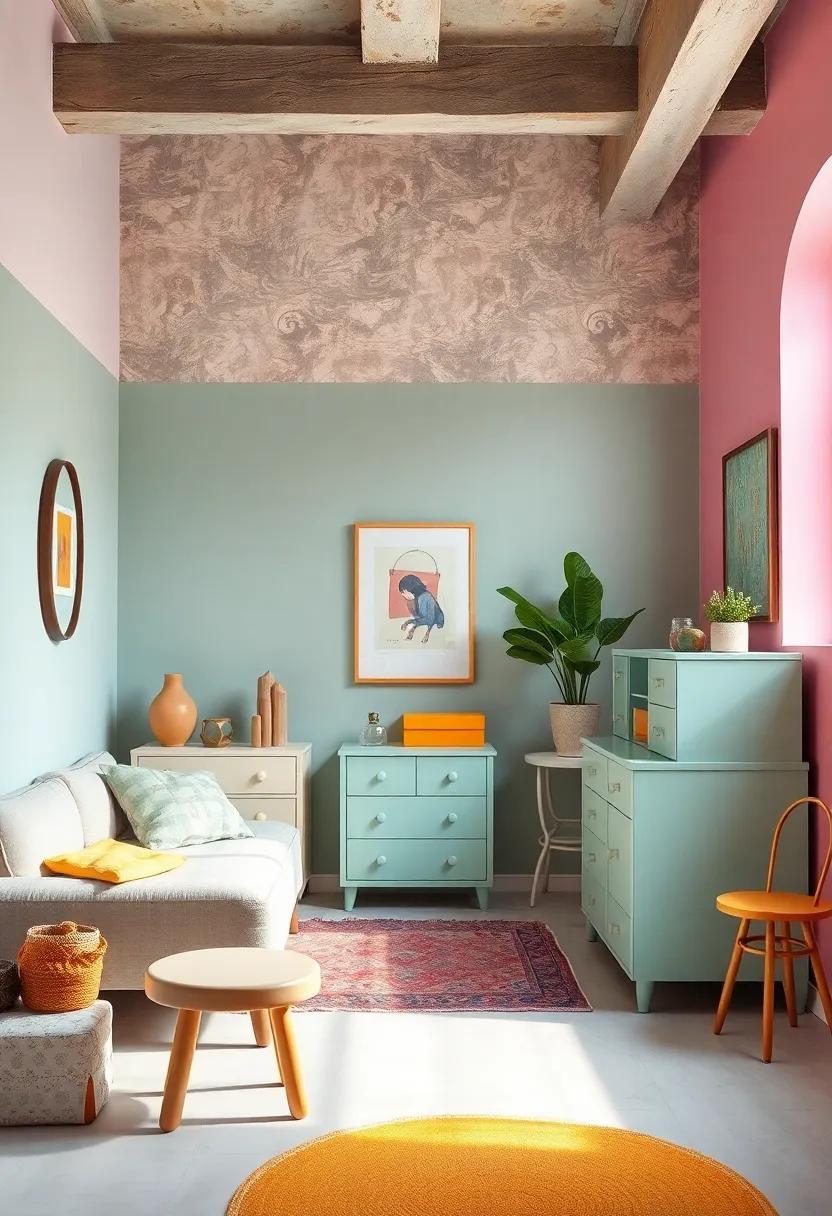
Soft pastel tones create the perfect backdrop for a child’s sanctuary, striking a harmony between whimsy and tranquility. Think gentle blush pinks, muted mint greens, and powdery blues that soften the senses while still sparking imagination. These hues can be applied to painted furniture pieces such as dressers, toy chests, or bed frames to introduce subtle pops of color without overwhelming the space. The delicate shades complement the vibrant patterns or quirky decor typically found in eclectic rooms, making the overall aesthetic playful yet serene.
Incorporating pastel-painted furniture also allows for easy adaptability as your child grows or their tastes evolve. Combine these muted tones with bold textures or vivid accessories to maintain visual interest while preserving a restful atmosphere. Explore pairing pastel finishes with natural wood or metal accents for a chic,layered look.Below is a quick reference to help you mix and match pastel paint colors with complementary painted furniture styles that enhance eclectic kids’ rooms:
| Pastel Hue | furniture Style | Effect |
|---|---|---|
| Blush Pink | Vintage dresser with distressed finish | Soft warmth adding a cozy charm |
| Mint Green | Mid-century modern toy chest | Fresh, lively vibe with retro flair |
| Powder Blue | Classic bed frame with ornate details | Cool calmness balancing ornate patterns |
| Lavender | Simplistic bookshelf | Subtle sophistication with a whimsical twist |
Pair Painted Furniture with eclectic Accessories Like Vintage Rugs and Bold Textiles
Elevate your painted furniture by introducing eclectic accessories that tell a story and spark conversation.vintage rugs with intricate patterns and vibrant hues create an unexpected foundation that complements the painted hues of your furniture. Layering bold textiles—think Moroccan poufs, Spanish throw pillows, or Indian block prints—adds texture and depth, transforming a simple piece into a centerpiece of style and personality. This tactile mix invites warmth and authenticity, ensuring each room feels collected over time rather than curated in a day.
Consider mixing unexpected color palettes and prints to bring your space alive without overwhelming it. A boldly painted dresser in muted teal juxtaposed with a saturated ruby-red vintage rug becomes a playful yet balanced contrast. Incorporate accessories like woven baskets, artisan ceramics, or fringe textiles to enhance the tactile experience, creating a seamless flow between the boldness of your painted furniture and the softness of your curated textiles. The key is harmony in contrasts—color, texture, and pattern coming together to tell a unique and eclectic story.
Create a Gallery corner by Painting Frames to match or Contrast Your Furniture Pieces
Transform an ordinary wall into a captivating gallery corner by thoughtfully painting picture frames to either blend harmoniously with your furniture or boldly stand out in contrast. For a cohesive look, match the frame colors to the hues of your painted furniture pieces—think soft pastels echoing a vintage dresser or deep jewel tones mirroring a velvet armchair. This technique creates a seamless narrative throughout your space,drawing the eye effortlessly between the furniture and art. Alternatively, contrasting frame colors can inject an unexpected pop of vibrancy, lifting the gallery wall and making each piece a statement in its own right.
Choosing between complement or contrast becomes even more exciting when you incorporate varied textures and finishes, such as matte chalk paints on frames alongside glossy lacquered furniture. Here’s a simple guide to spark your creativity:
| Frame finish | Furniture Match | Effect |
|---|---|---|
| Matte Pastel Blue | Distressed White Oak Table | Smooth,soothing |
| Glossy Crimson Red | Muted Gray Sofa | Bold,focal point |
| Antique Gold Leaf | Deep Green velvet Chair | Luxurious,rich |
| Black Chalk Paint | Natural Blonde Wood Shelves | Modern,edgy |
- Play with frame thickness for added dimension.
- Mix in mirror pieces or sculptural frames for eclectic flair.
- Don’t be afraid to layer frames for a dynamic, collected-over-time look.
Experiment with High-Gloss Paint to Add a Contemporary Edge to Classic Designs
Bring a sleek,modern sheen to your vintage pieces by opting for high-gloss paint finishes. This effortless twist transforms conventional silhouettes into statement-makers that radiate sophistication and urban flair. Whether it’s a mid-century dresser or an ornate side table, the reflective quality of high-gloss paint amplifies light and color, creating a dynamic contrast with classic wood grain or intricate carvings. Choose jewel tones like emerald, sapphire, or ruby for a bold pop that energizes any room. Alternatively, ultra-chic neutrals such as charcoal gray or pure white can elevate the furniture’s form, allowing its design to shine through with fresh clarity.
Pair these glossy finishes with textured accents to enhance their contemporary vibe without losing the essence of eclectic charm. Think velvet cushions, woven rugs, or brass hardware to add layers of tactile richness beside the lustrous paint. For the best results, prep your surfaces meticulously—sanding, priming, and layering multiple coats ensures a flawless, durable finish that resists scratches and scuffs. Here’s a quick guide to help you choose the right high-gloss paint for your project:
| paint Type | Best For | Dry Time | Durability |
|---|---|---|---|
| Acrylic | Indoor furniture, smooth surfaces | 1-2 hours | Moderate |
| Enamel | High-use pieces, outdoor furniture | 6-8 hours | High |
| Alkyd | Wood furniture, classic finishes | 4-6 hours | very High |
Paint Inside Shelves or Drawers in Unexpected Colors to Surprise and Delight
Transforming the unseen spaces of your furniture creates an enchanting surprise every time you open a drawer or peek inside a cabinet. Opting for vibrant hues like turquoise, mustard yellow, or even a rich magenta inside shelves and drawers adds a hidden pop of color that delights the senses and elevates everyday interactions. This subtle yet effective design trick breathes new life into vintage or plain pieces, turning functional storage into an artistic expression. Plus, it offers an easy way to infuse your room with eclectic flair without overwhelming the overall decor.
To make the most of these hidden pops of color, consider mixing finishes or combining colors that contrast with the exterior paint for maximum impact. For example, a classic white dresser with navy blue drawer interiors, or a rustic wood bookshelf lined with a deep emerald shade, instantly sparks curiosity and joy.Here are a few inspiring color combos to experiment with:
- Matte Black exterior with copper orange interiors
- Soft Pastel Pink outside, electric teal inside
- Antique White with vibrant chartreuse drawer bottoms
- Navy Blue exteriors paired with sunset coral interiors
Blend Colors Using Sponging or Rag-rolling Techniques for Textured, Layered Effects
Elevate your painted furniture by introducing depth and dimension through sponging or rag-rolling techniques. These methods involve delicately layering multiple paint hues with textured tools like natural sponges or soft rags, creating a captivating interplay of colors that breathe life into flat surfaces. Imagine swirling clouds of muted pastels or bold bursts of contrasting shades—each dab and roll adding a tactile richness that invites closer inspection. Whether you’re customizing a worn dresser or reinventing a side table, the subtle randomness of these textures cultivates an artful, never-to-perfect charm that defines eclectic style.
To effortlessly harmonize color blends, start with a base coat in your primary shade, then choose one or two complementary tones for layering. Here’s a quick guide:
| Technique | Recommended Tools | Color Approach | Effect |
|---|---|---|---|
| Sponging | Natural sea sponge | Monochromatic layers | Soft, organic texture |
| Rag-rolling | Crumbled cotton rag | Contrasting colors | Dynamic, crinkled finish |
Experiment by blending glossy and matte paints or incorporating metallic tones to amplify visual intrigue.Layering isn’t just about color—it’s about creating a tactile experience that transforms ordinary furniture into eclectic statements,uniquely yours.
Personalize Furniture with Hand-Lettered Quotes or Designs to Tell Your Story
Transform a plain dresser, nightstand, or bookshelf into a canvas that reflects your unique journey by adding beautifully hand-lettered quotes or custom designs. Whether it’s a favourite literary line, a mantra that sparks your soul, or even a whimsical doodle that captures your essence, these personalized touches infuse furniture with heartfelt meaning. Use varying fonts—from elegant scripts to bold block letters—to create visual interest, and complement the painted backdrop with metallic or chalk paint to enhance texture and depth. These one-of-a-kind statements don’t just decorate; they become daily reminders of what inspires you, turning everyday pieces into conversation starters.
To keep the look fresh and balanced, consider pairing your hand-lettered pieces with simple or solid-colored furniture surrounding them. Here’s a quick guide on pairing styles that works well with this personalized approach:
| Furniture Base Color | Lettering Style | Complementary Decor |
|---|---|---|
| matte Black | White calligraphy | Brass Handles, Neutral Rugs |
| Pastel Blue | Playful Handwriting | Wood Accents, Soft Throw pillows |
| Distressed White | Bold Sans-serif | Rustic Lanterns, Natural Plants |
| Bold Mustard | Monoline Script | Mid-century Chairs, minimalist Art |
- Experiment with layering: Combine painted backgrounds with subtle stenciling beneath your lettering for a rich, dimensional effect.
- Seal your message: Protect your art with a clear, matte varnish to ensure longevity without glare.
- Mix media: Consider adding tiny embellishments like studs or fabric patches to complement your message visually.
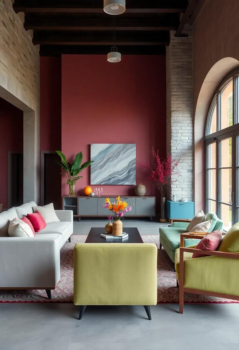
Use Color Psychology to Choose Paint Hues that Enhance Each Room’s Mood
When selecting paint hues for your eclectic painted furniture, tapping into color psychology can transform the atmosphere of any room. For spaces meant to energize and inspire, such as creative studios or lively living rooms, warm and vibrant shades like coral, mustard yellow, and burnt orange evoke enthusiasm and positivity. Conversely, bedrooms and reading nooks benefit from cooler tones—think calming blues, soft lavenders, or muted greens—that encourage relaxation and tranquility. Mixing these hues across different furniture pieces will not only add visual intrigue but also subtly influence the emotional flow within your eclectic space.
Consider pairing your paint choices with the intended function of each room to maximize their psychological impact. Below is a handy guide to color moods for different rooms, perfect for deciding which furniture pieces to highlight with certain paint hues:
| Room | Recommended paint Hues | Mood Enhanced |
|---|---|---|
| Living Room | Warm reds, sunlit yellows, rich teal | Inviting & energetic |
| Bedroom | Soft blues, lavender, pastel greens | Calm & restful |
| Home Office | Forest green, navy blue, warm neutrals | Focused & balanced |
| Dining Area | Deep reds, earthy tones, burnt orange | Appetite stimulant & cozy |
By thoughtfully layering these colors across your eclectic furniture pieces, you create curated, harmonious environments that resonate emotionally and visually with every corner of your home.
Distress Painted Finishes Lightly for a Timeworn look That Adds Depth and Interest
Embracing a timeworn aesthetic doesn’t mean settling for tired or dull; rather, it’s about layering character through subtle imperfections that tell a story. By gently distressing painted finishes, you add an organic depth that’s unachievable to achieve with a pristine, factory-smooth surface. The art of distressing involves softly sanding edges and select spots where natural wear and tear would occur, revealing glimpses of the underlying wood or base paint. This technique brings a tactile richness, inviting the eye to linger on each chip, crack, and brushstroke, making furniture a compelling focal point in any eclectic space.
Tips to achieve the perfect distressed finish:
- Use fine grit sandpaper to gradually remove paint from corners and raised details.
- Layer contrasting paint colors for depth—light base coats with darker top layers work beautifully.
- Apply wax or dark glaze in cracks and crevices to enhance the aged effect.
- Keep distressing inconsistent to mimic natural aging rather than mechanical wear.
| Distressing Technique | Effect | Best For |
|---|---|---|
| Edge Sanding | Subtle paint wear at corners | Frames, table edges, chair arms |
| Spot Sanding | Patchy, random faded areas | Drawers, doors, flat surfaces |
| Crackling Medium | Fine network of tiny cracks | Cabinets, sideboards |
| Dark Wax Application | Antique shadow in details | Carvings, molding, raised accents |
Mix Matte and Satin Finishes on One Piece to Play with light Reflection
Combining matte and satin finishes on the same piece of furniture allows you to create a subtle play of light that adds depth and intrigue to your design. Imagine a cabinet whose frame flaunts a soft matte texture, while its doors shimmer gently with a satin sheen. This contrast not only emphasizes the architectural details but also breaks the monotony, making the piece a captivating focal point in any room.By strategically pairing these finishes, you invite natural and artificial light to interact with the surface, enhancing the furniture’s character throughout the day.
To master this technique, consider these quick tips:
- Use matte finishes on larger, flat areas to create a grounded, understated canvas.
- Apply satin finishes on edges, trims, or raised panels where light naturally catches and highlights shapes.
- Choose complementary colors that enhance the effect—soft pastels with satin highlights look especially elegant.
| Finish Area | Effect | Best Colors |
|---|---|---|
| Large Surfaces (e.g., cabinet body) | Subdued, velvety base | Muted Gray, Cream, Soft Blue |
| Accents (e.g., trims, doors) | Reflective highlights, depth | Champagne Satin, Warm Taupe, Dusty Rose |
Combine Rustic Painted Pieces with Sleek, Modern Decor for Dynamic Contrast
Embrace the beauty of juxtaposition by pairing a rustic, hand-painted piece with sleek, modern decor to create a room that captivates with its dynamic contrast. imagine a weathered, distressed cabinet adorned with soft pastel hues balancing effortlessly alongside minimalist furniture featuring clean lines and polished finishes. This mix not only adds texture and warmth but also encourages your eyes to explore the space, drawing attention to the unique character of each item. Rustic painted furniture adds soulful history and handcrafted charm that sleek modern pieces often lack.
To master this eclectic balance, consider incorporating elements that bridge both worlds, such as metal accents or geometric lighting fixtures next to floral or nature-inspired painted motifs. Use a muted,cohesive color palette to harmonize vintage flair with contemporary sophistication. Here’s a quick style pairing guide to inspire your arrangement:
| Rustic Painted Piece | Sleek Modern Complement | Effect |
|---|---|---|
| Distressed teal dresser | Glossy white acrylic chair | Fresh & vibrant contrast |
| Soft blush floral side table | black metal floor lamp | Elegant yet grounded |
| Antique cream cabinet with chipped paint | Chrome geometric shelving | Timeless meets contemporary |
- Balance textures: Mix matte, rough surfaces with shiny, smooth finishes.
- Blend colors carefully: Use neutral bases to let painted pieces pop without clashing.
- Play with scale: Large rustic pieces paired with smaller modern accents create visual interest.
Use Painter’s Tape to Create Crisp Geometric Lines or Blocks of Color
Achieve flawless, eye-catching patterns by harnessing the precision of painter’s tape. this simple tool lets you carve out bold geometric shapes—triangles,squares,stripes,or unexpected angular designs—directly on your furniture surfaces. By carefully masking off areas, you ensure clean, sharp edges that transform plain pieces into dynamic works of art. Experiment with layering multiple colors or contrasting tones to truly elevate your eclectic look,making every furniture piece a personalized statement.
For best results, press the tape down firmly along edges to prevent color bleeding, and remove it while the paint is still slightly tacky for crispest lines. Pair your geometric blocks with distressed or matte finishes to balance modern precision with vintage charm.Consider using this technique on drawer fronts, cabinet doors, or chair backs to add pops of unexpected color and shape that instantly refresh your room’s vibe.
Refinish Heirloom Furniture with Playful Paint Colors to Reinvigorate Old Favorites
Give your cherished heirloom pieces a fresh lease on life by swapping out traditional wood finishes for unexpected, playful hues. Imagine an antique dresser transformed with a glossy teal or a vintage rocking chair revived in a sunny mustard yellow. These vibrant choices not only rejuvenate the furniture’s persona but also inject an eclectic charm into your space.Embrace contrast by pairing bright colors with the natural patina of aged wood, letting character peek through while embracing modern whimsy.Whether it’s a soft pastel or a bold jewel tone, playful paint colors offer a joyful way to honor the past while celebrating the present.
when selecting colors, consider how the piece will interact with your existing décor and the room’s mood. for a subtle yet captivating effect, try layering with chalk paint followed by distressing techniques to preserve some of the original texture beneath the fresh coat. To help decide, here’s a quick reference of hues and their impact on heirloom furniture:
| Color | Character Added | Best Room Match |
|---|---|---|
| Coral Pink | Cheerful and Inviting | living Room, Bedroom |
| Navy Blue | Elegant and Grounded | Office, Dining Room |
| Chartreuse | Bold and Energetic | Kitchen, Playroom |
| Lavender | Soft and dreamy | Bedroom, Reading Nook |
The Conclusion
No matter your personal aesthetic or the room you’re transforming, painted furniture offers a fresh canvas to express your eclectic style with endless possibilities. From subtle pastel accents to bold, artistic statements, these 25 inspiring ideas prove that mastering eclectic charm is all about blending creativity with personality. So go ahead—pick up that paintbrush, mix those colors, and let your unique vision breathe new life into every corner of your home.Your eclectic masterpiece is waiting to be discovered.
As an Amazon Associate I earn from qualifying purchases.