25 Light and Bright Color Palettes to Make Your Small Kitchen Feel Spacious and Cheerful
When it comes to designing a small kitchen, teh right color palette can work wonders—transforming cramped corners into airy, inviting spaces that feel both spacious and cheerful. In this listicle, we’ve gathered 25 light and radiant color combinations that are perfect for maximizing the sense of openness while adding a touch of personality to your kitchen. From subtle pastels to crisp neutrals with unexpected pops of color, each palette is carefully curated to inspire your next makeover. Whether you’re planning a full renovation or simply looking to refresh your space, these palettes will help you create a kitchen that feels bigger, lighter, and welcoming—no matter the square footage.
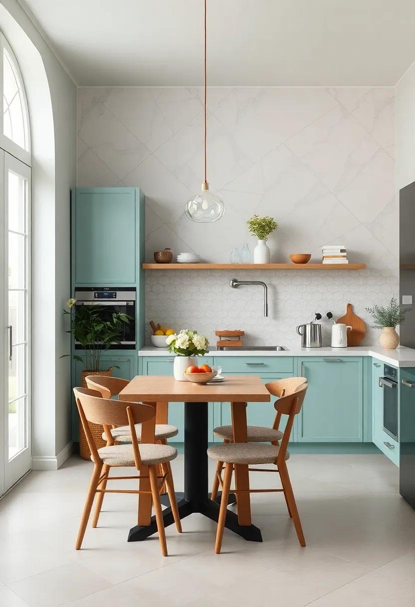
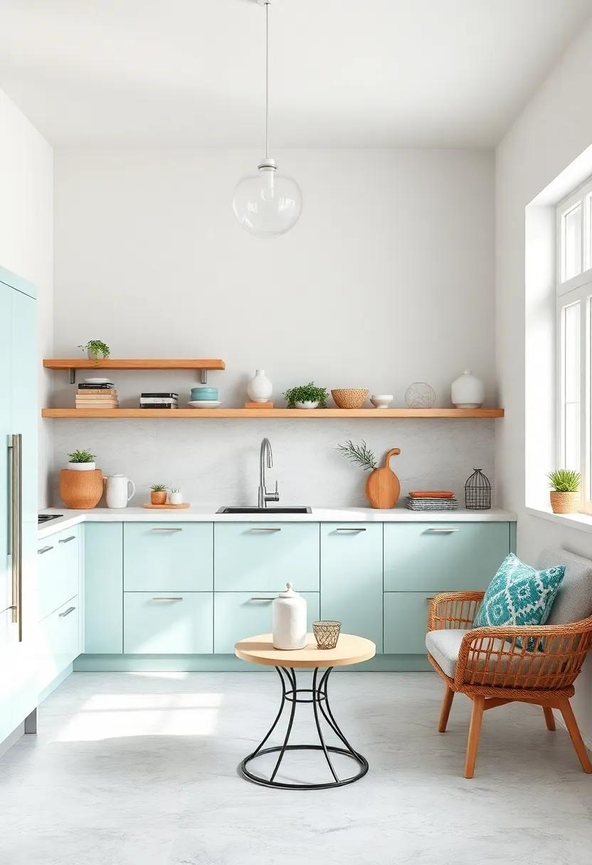
soft Mint and Warm White – A refreshing mint paired with warm white cabinetry creates an airy and inviting kitchen atmosphere
Nothing breathes fresh life into a compact kitchen quite like the gentle embrace of soft mint balanced by the cozy warmth of white cabinetry. This combination evokes a tranquil, airy vibe that feels both effortless and inviting, turning even the smallest culinary space into a serene retreat. The coolness of mint refreshes the senses, while warm white tones add a soft glow, lending depth and an understated elegance. Together, they create a balanced harmony that enhances natural light and invites you to linger.
To maximize the impact of this palette, consider incorporating natural wood accents or subtle brass hardware for a touch of sophistication.White marble or pale quartz countertops can amplify brightness, while mint-colored accessories — think dishware, textiles, or a backsplash — reinforce the palette without overwhelming. The result is a kitchen that feels effortlessly spacious, cheerful, and welcoming throughout the day.
| element | Color/Material | Effect |
|---|---|---|
| Cabinetry | Warm White | Softens and brightens space |
| Walls or Backsplash | Soft Mint | Adds freshness and light |
| Countertops | White Marble/Quartz | Reflects light, enhances airy feel |
| Accents | Natural Wood & Brass | Introduces warmth and texture |
Pale Yellow and Light Gray – This sunny yellow combined with subtle gray adds warmth without overwhelming the space
Infuse your kitchen with a gentle burst of optimism by blending pale yellow and light gray. The pale yellow, reminiscent of morning sunshine, brightens the room and injects a cheerful vibe, perfect for energizing your morning routine.Meanwhile, the light gray acts as a calming counterpart, grounding the palette and adding an elegant subtlety that prevents the yellow from overpowering the space.This combination not only visually expands your kitchen but also maintains a warm, inviting atmosphere where every corner feels welcoming.
When styling with this palette, consider mixing finishes and textures to add depth without compromising brightness. Think satin-finish gray cabinets paired with matte yellow backsplash tiles or pale yellow walls softened by brushed nickel hardware. To keep the balance poised, coordinate your accessories—like dishware and textiles—in muted grays or soft neutrals. The result is a harmonious kitchen that radiates warmth and light, making small kitchens feel airy and effortlessly spacious.
Sky blue and Cream – Gentle sky blue walls paired with creamy accents bring a calm and expansive vibe to your kitchen
Imagine waking up to the gentle embrace of a sky just before dawn—soft, endless, and pure. This serene backdrop,translated into kitchen walls painted in a delicate sky blue,instantly makes the room feel airy and open. That expansive feel is balanced beautifully by creamy accents—think smooth countertops, subtle beige cabinetry, and warm lighting—that add a cozy, inviting touch without overwhelming the senses. Together, these hues create a tranquil space perfect for both peaceful morning routines and lively family gatherings.
Complement your design with natural textures like light wood or woven baskets to add depth and warmth. Incorporate glass-front cabinets or open shelving with white dishware to keep the feeling bright and uncluttered. Here’s a quick guide for integrating this palette seamlessly into your kitchen:
| Element | Color/Material | Effect |
|---|---|---|
| Walls | Gentle Sky Blue | Expansive & calming atmosphere |
| Cabinetry | Creamy Off-White | Warmth and light reflection |
| Countertops | Soft Beige Quartz | Clean, subtle elegance |
| Accessories | Light wood/wicker | Textural contrast and natural vibe |
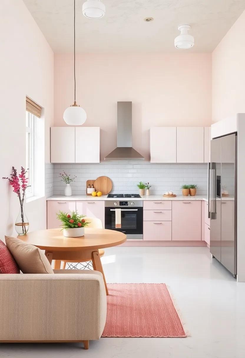
Blush Pink and Off-White – A delicate blush pink with off-white elements crafts a soft and cheerful ambiance
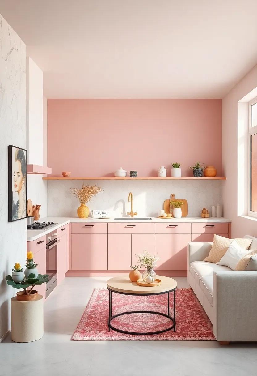
Infusing your kitchen with delicate blush pink hues set against crisp off-white creates an inviting space that feels both airy and joyous. This palette works wonders for small kitchens because the blush tones add warmth without overwhelming the senses, while off-white surfaces reflect light to expand the room visually. Consider soft blush cabinetry paired with sleek, off-white countertops and backsplash tiles to strike the perfect harmony between color and brightness.
To elevate this combination, incorporate natural textures and subtle metallic accents. Such as:
- light wood open shelving to add organic warmth
- Matte brass fixtures for a hint of understated elegance
- Off-white ceramic dinnerware with blush detailing to unify the palette
| Element | Recommended Hue | Effect |
|---|---|---|
| Cabinetry | Soft Blush pink (#F4C2C2) | Warmth and subtle color interest |
| Countertops & Backsplash | Off-White (#F8F8F8) | Brightness and spaciousness |
| Fixtures | Brushed Brass | Elegant contrast and warmth |
Lavender and Soft Beige – Light lavender tones mixed with beige create a soothing and spacious feel
Imagine stepping into a kitchen where every surface whispers calm and clarity—this palette achieves just that by pairing delicate lavender hues with the warm comfort of soft beige. the light lavender tones infuse the space with a subtle yet refreshing pop of color, evoking feelings of tranquility and openness. When combined with beige, the palette balances warmth with cool serenity, ensuring your small kitchen feels inviting without overwhelming the senses. This harmonious blend especially enhances natural light,bouncing it gently across walls and cabinets to create an airy,spacious atmosphere.
To complement this soothing duo,consider integrating natural textures and minimalist accents:
- light wood surfaces or bamboo detailing to ground the lavender-beige base
- Matte white countertops for a soft,seamless finish
- Textured linen window treatments in pale lavender or beige shades for layering depth
These elements together not only amplify the openness but also add tactile interest,making your kitchen both functional and beautifully cohesive.
Seafoam Green and Light Oak – Seafoam green paired with light oak accents evokes a natural, breezy environment
Imagine stepping into a kitchen where the soft, muted tones of seafoam green wash over the walls, creating a calm and airy backdrop that instantly soothes the senses. The gentle green hue brings a touch of coastal charm without overpowering the space, making your kitchen feel open and inviting. When complemented by light oak accents—think floating shelves, sleek cabinetry handles, or a butcher block countertop—the combination breathes life into the room with its warm, organic texture. These natural wood elements balance the coolness of seafoam green,adding a grounding effect that makes the kitchen feel both fresh and comfortably lived-in.
This palette thrives with subtle contrasts and thoughtful layering. To enhance the breezy vibe, incorporate accessories like white ceramic vases, linen dish towels, or woven baskets in neutral tones. Below is a quick guide to key elements that work harmoniously within this color story:
| Element | Material/finish | Effect |
|---|---|---|
| Cabinets | Seafoam green matte paint | Soft, refreshing backdrop |
| Countertops | Light oak butcher block | Warmth and natural texture |
| Shelving | Floating light oak shelves | Airy display, visual interest |
| Accents | White ceramics & linen textiles | Bright, minimal contrast |
By keeping finishes simple and textures natural, this light and bright palette turns a modest kitchen into a serene, breezy retreat that feels larger than it is—perfect for those looking to infuse a sense of effortless calm into their cooking space.
Peach and Snow White – Warm peach hues against a snow-white backdrop brighten up the smallest of kitchens
Introducing soft peach tones into your kitchen creates an inviting warmth that feels both fresh and lively. When paired with a pristine snow-white backdrop, this combination expertly balances cozy comfort with an airy expansiveness. Use peach for cabinetry or open shelving to add subtle color without overwhelming the space, allowing natural light to bounce off the white surfaces and brighten every corner. The contrast not only elevates the aesthetic but also visually expands the room, making even the smallest kitchens feel open and cheerful.
To maximize the impact of this palette,consider incorporating accents that complement both hues. think matte brass hardware, pale pine wood countertops, or soft gray backsplash tiles—each adding depth and texture without detracting from the lightness. Below is a quick reference table to help you integrate these colors seamlessly:
| Element | Peach Accent | Snow White Base | Complementary Touch |
|---|---|---|---|
| Cabinet Color | #FAD7B0 | #FFFFFF | Matte Brass Handles |
| Wall Paint | Soft Peach Wash | Bright Snow White | Pale Gray Artwork Frames |
| Countertops | Light Pine Wood | – | White Marble Salt and Pepper Shakers |
Pale Aqua and Chalk white – This combination promotes a fresh and clean sensory experience
Imagine stepping into a kitchen where the walls breathe a soft pale aqua, evoking a gentle breeze on a calm sea, paired with chalk white cabinetry that reflects crisp cleanliness. This serene palette instantly uplifts a small space, creating the illusion of openness without overwhelming the senses. The pale aqua’s subtle hint of color introduces a refreshing vibrancy,while the chalk white serves as a perfect canvas,making surfaces gleam and corners recede. Together, they foster an environment that feels airy and sleek, ideal for cooking and gathering without the claustrophobic drawbacks of darker tones.
To enhance this palette, consider incorporating natural textures and reflective surfaces. Materials such as washed oak countertops, frosted glass cabinet fronts, and brushed nickel hardware highlight the fresh and clean aesthetic. Accents like pale aqua dishware or chalk white ceramic pots can complete the look, tying every detail into a cohesive sensory experience.Here’s a quick guide to layering these colors beautifully in your kitchen:
| Element | Recommended Color/material | Effect |
|---|---|---|
| Walls | Pale Aqua Paint | Creates a calming,expansive backdrop |
| Cabinets | Chalk White Finish | Brightens and visually enlarges the space |
| Countertops | Light Washed Oak | Adds warmth without darkening |
| Hardware & Fixtures | Brushed Nickel | Modern touch,subtle shimmer |
| Accessories | matching Pale Aqua & White | Reinforces color harmony |
Butter Yellow and Ivory – Butter yellow introduces a cozy glow while ivory keeps the kitchen light
Butter yellow acts as a gentle embrace, infusing your kitchen with a warm, inviting glow that instantly uplifts the space. This mellow shade brightens cabinets, walls, or accents without overwhelming, creating a soothing atmosphere that’s perfect for morning coffee or evening chats. When paired with the clean, crisp balance of ivory, the kitchen’s natural light is reflected and enhanced, making every corner feel open and airy. This duo invites a timeless charm that’s both cheerful and calming, ideal for creating a cozy yet spacious environment.
To optimize the color combination, consider using butter yellow on focal points like open shelves or an island, while allowing ivory to dominate larger surfaces such as walls and ceilings. This approach encourages visual continuity and prevents the space from feeling cluttered. Complement the palette with natural wood tones or brushed metal fixtures to add subtle texture and depth.
| Element | suggested Color | Effect |
|---|---|---|
| Cabinets | Butter Yellow | Warmth & Focus |
| Walls | Ivory | Light & spaciousness |
| Countertops | Soft White or Light Quartz | Clean & Bright |
| Accessories | natural Wood / Brass | Texture & depth |
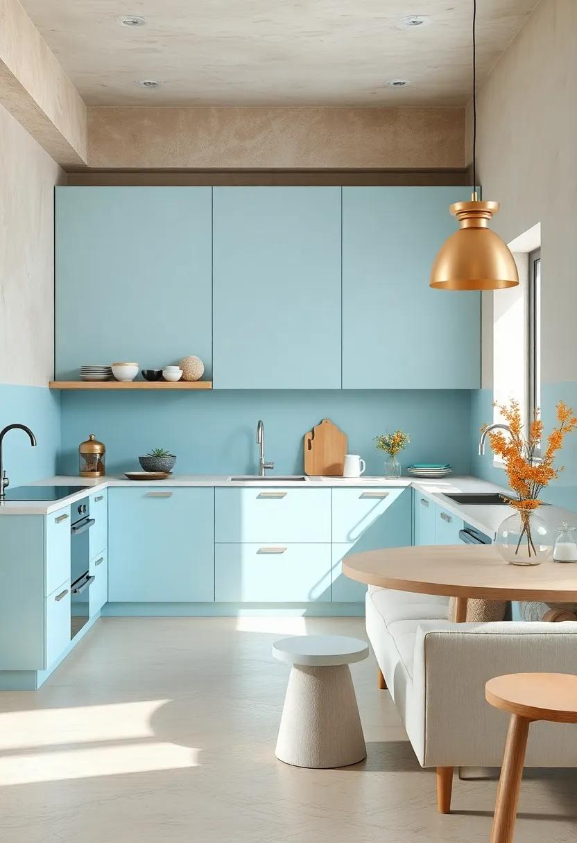
Powder Blue and Soft Sand – The powder blue and sandy beige combo feels tranquil and vast
Combining the tranquil essence of powder blue with the effortless warmth of soft sand creates a kitchen atmosphere that whispers calmness and openness. These hues naturally expand visual space, making even the coziest kitchen feel airy and inviting. Imagine powder blue cabinets paired with sandy beige countertops or walls—the subtle contrast offers a soothing backdrop that’s both timeless and refreshing. This palette effortlessly reflects daylight, bouncing soft, serene tones across every surface and enhancing the kitchen’s natural brightness.
To enrich this color combo,incorporate natural textures like light oak or woven baskets,which blend seamlessly with the sandy tones and highlight the blue’s crispness. accents in brushed nickel or matte brass fixtures add a modern flair without overpowering the gentle palette. For added inspiration, here’s a quick guide to perfectly balancing these colors:
| Element | Color Suggestion | Design Tip |
|---|---|---|
| Cabinets | Powder Blue | Choose matte finishes for a soft, muted look |
| Countertops | Soft Sand Beige | Opt for quartz or limestone for subtle texture |
| Backsplash | Off-white with blue speckles | Add visual interest without heavy contrast |
| Fixtures | Brushed Nickel or Matte Brass | Introduce warmth and modern elegance |
Mint Green and Pearl White – Mint’s vibrancy balanced with pearl white cabinetry makes the space both lively and open
Mint green injects a fresh, uplifting energy into your kitchen, making it feel both vibrant and inviting.When paired with pearl white cabinetry, the mint’s lively tone is perfectly tempered, creating a balanced atmosphere that feels airy rather than overwhelming. This combination plays with light beautifully, reflecting natural and artificial illumination to maximize the sense of space without sacrificing personality or charm. It’s an excellent choice for those who crave a pop of color yet desire an open, uncluttered look.
to enhance this harmony, consider incorporating subtle textures and complementary accents.Soft wood finishes, brushed brass hardware, and light-gray accents work wonderfully to add depth and sophistication without detracting from the crisp dynamic between mint and pearl white. Remember, in small kitchens, less is more—opt for minimalist décor and streamlined furniture to amplify the feeling of spaciousness while keeping the space cheerful and inviting.
| element | Recommended Shade | Effect |
|---|---|---|
| Cabinetry | Pearl White | Brightens and opens the space |
| Wall Paint | Mint Green | Adds vibrancy and freshness |
| Hardware | Brushed Brass | Warm, elegant accent |
| Countertops | Light Gray Quartz | Neutral balance, subtle texture |
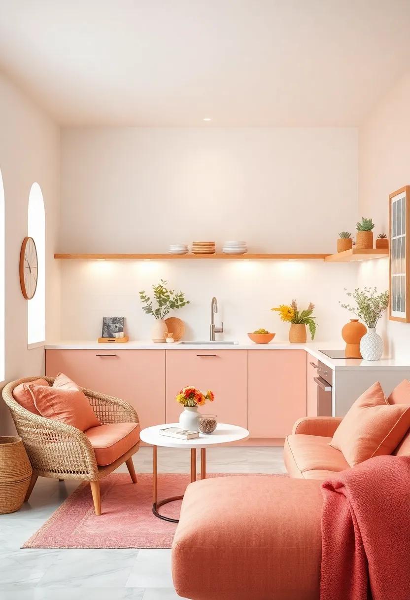
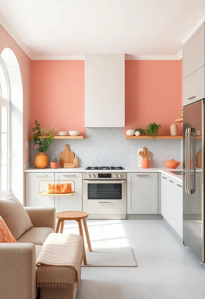
Coral and Light Taupe – Coral adds a cheerful pop while light taupe grounds the palette in warmth
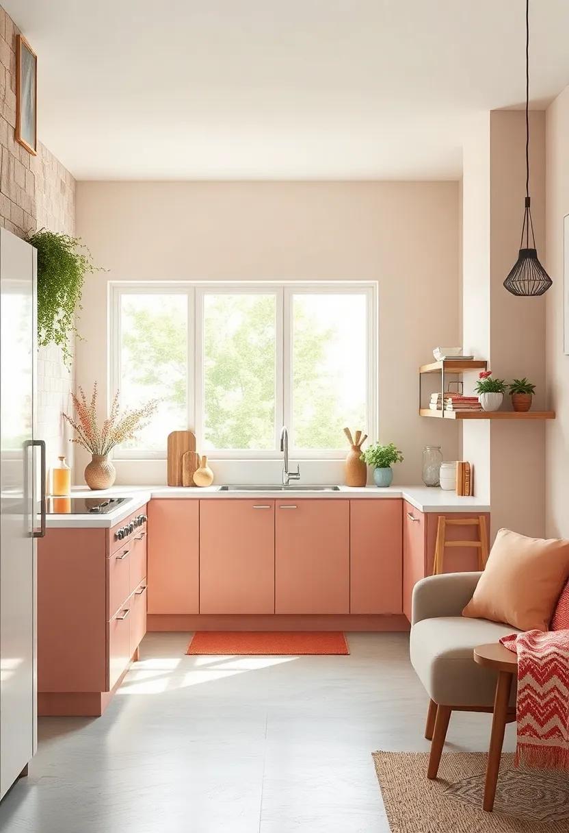
Coral breathes life into small kitchens by introducing a lively, unexpected burst of energy. Its vibrant hue brightens the space without overwhelming it, creating a focal point that instantly uplifts the room’s mood. Whether it’s coral-colored accessories, a backsplash, or accent walls, this shade brings warmth and cheerfulness, inviting you to cook and socialize with a smile.
Paired with light taupe, the coral’s intensity is perfectly balanced by a grounding neutral that adds subtle warmth. Light taupe’s soft, earthy undertone complements coral like a calming canvas, ensuring the palette stays elegant and cohesive. This combination makes the kitchen feel both airy and inviting, ideal for maximizing natural light and enhancing every corner of your compact culinary space.
- Coral pops enhance focal points without shrinking the room
- Light taupe provides a warm, subtle backdrop for versatility
- Mix coral textiles with taupe cabinetry for balanced contrast
- Perfect for natural materials like wood and stone accents
| Element | Coral | Light taupe |
|---|---|---|
| Best Use | Accent walls, accessories, backsplash | Cabinetry, walls, countertops |
| Mood | cheerful, energetic | Calm, warm |
| pairing Tips | Use sparingly to avoid overpowering | Use generously to anchor the space |
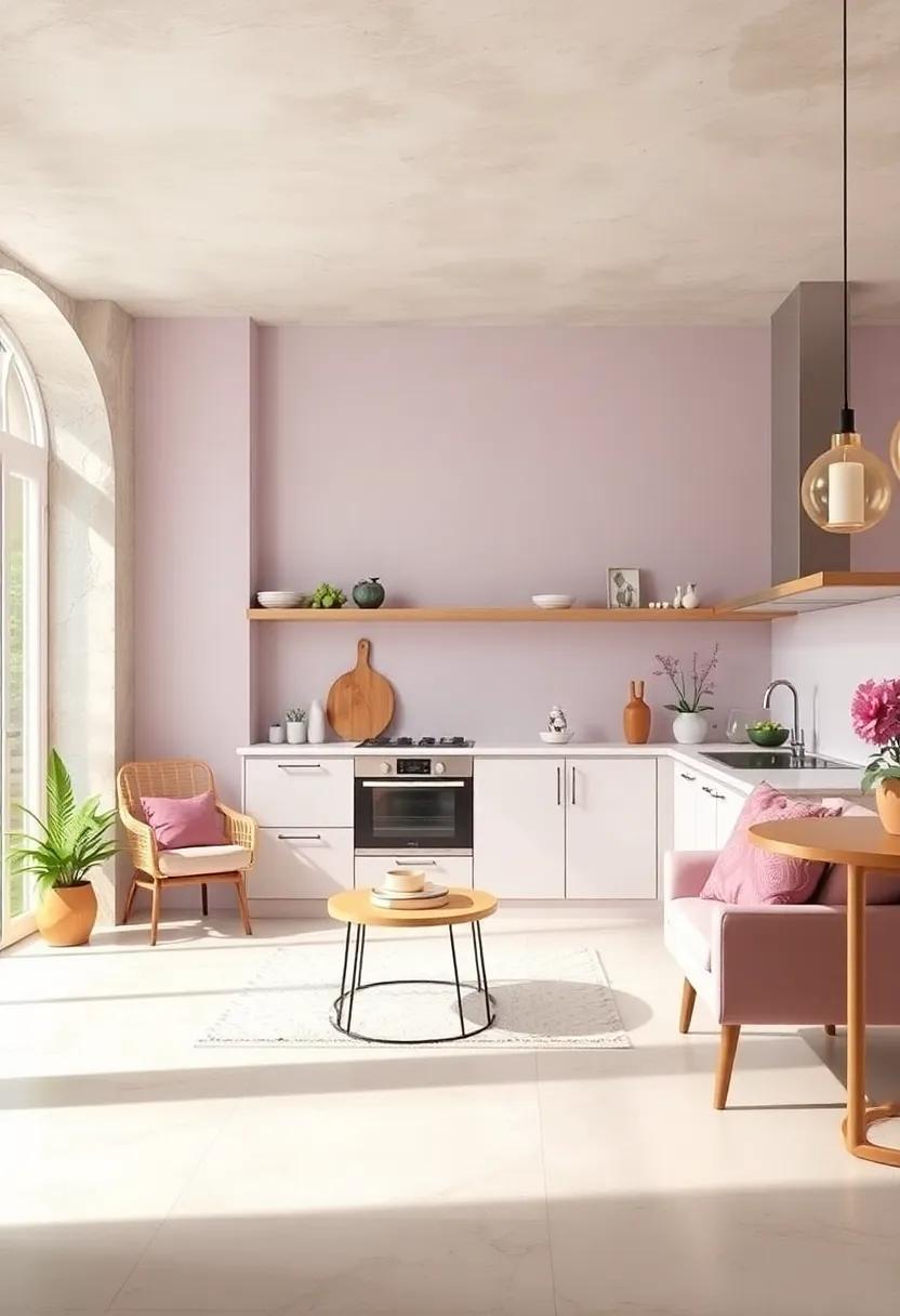
Creamy white and Soft Lilac – This pairing lends a subtle touch of color while maintaining brightness

Combining creamy white with a gentle shade of soft lilac creates an inviting kitchen atmosphere that feels both airy and warmly sophisticated. The creamy white acts as a bright, neutral canvas that maximizes light reflection, instantly making your kitchen seem larger and more open. Meanwhile,hints of soft lilac sprinkle in a whisper of color that’s delicate and serene,giving your space a subtle flair without overwhelming the senses. This understated palette balances brightness with a touch of personality, perfect for those who want their kitchen to feel fresh yet calming.
- Walls: Use creamy white for walls to keep the space luminous and neutral.
- Cabinets: paint lower cabinets in soft lilac for a gentle pop of color without cloaking the room.
- Accents: Incorporate lilac through accessories like dish towels, vases, or small appliances.
- lighting: Opt for warm, soft lighting to enhance both colors’ cozy qualities.
| Element | Color Treatment | Effect |
|---|---|---|
| Walls | Creamy White Paint | Amplifies natural light, enhancing space perception |
| Cabinetry | Soft Lilac Finish | Adds subtle color without overwhelming brightness |
| Accessories | Lavender/Hue Variations | Introduces texture and visual interest |
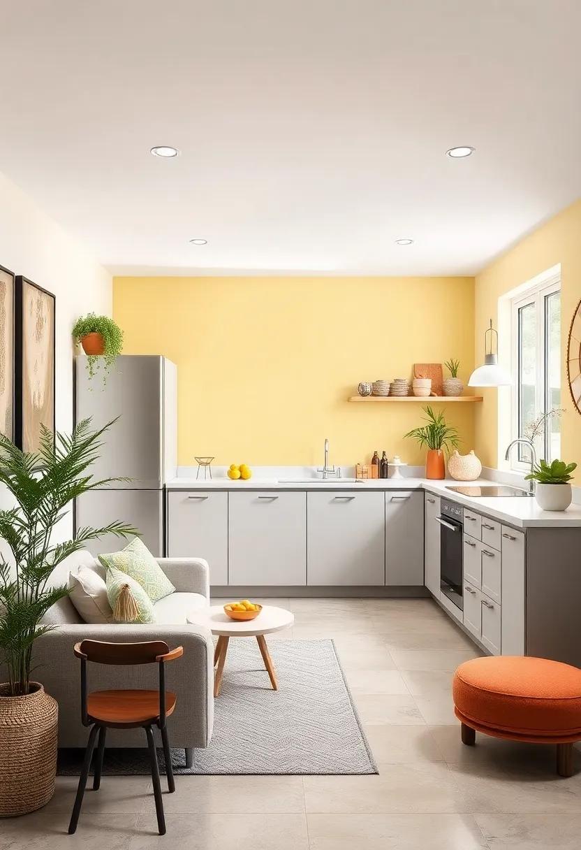
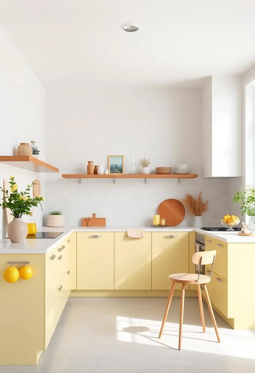
Lemon Chiffon and Pale Gray – Lemon chiffon energizes the space, complemented by cool pale gray for balance

Lemon chiffon radiates a sunny, inviting energy that instantly lifts the mood of any compact kitchen. Its soft, buttery yellow hue bounces natural light around the space, making walls and cabinets appear more expansive and welcoming. This vibrant but gentle color adds a cheerful warmth without overwhelming the senses, perfect for those early morning coffee rituals or lively weekend brunches.
Balancing this brightness, pale gray introduces a sophisticated, cooling contrast that keeps the palette grounded and elegant. Whether painted on countertops, backsplash tiles, or flooring, this subtle gray tone provides visual relief, preventing the yellow from feeling too intense. Together, they create a harmonious duet of warmth and calm, enhancing your kitchen’s openness while maintaining a clean, fresh aesthetic.
Light Turquoise and Warm Cream – Bright turquoise accents come alive against the warmth of creamy tones
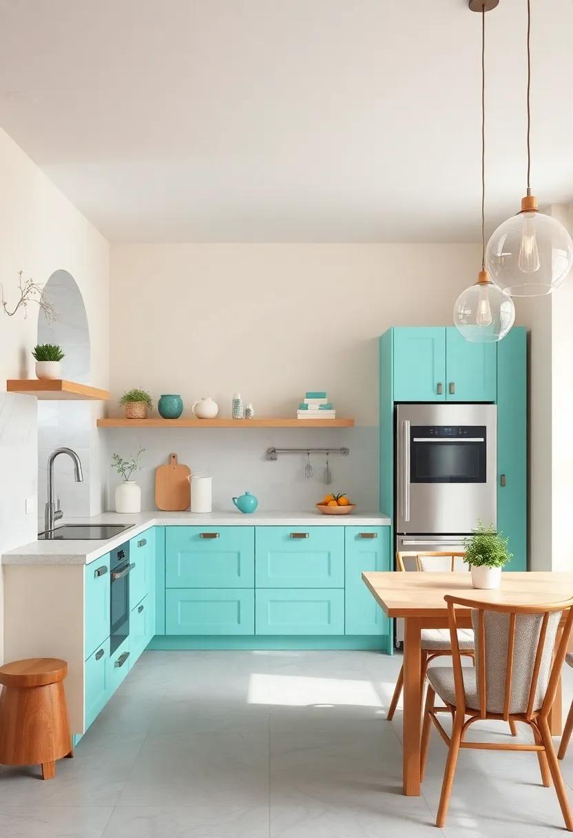
Inject fresh vibrancy into your small kitchen by pairing cool, bright turquoise with the gentle embrace of warm cream. This combination balances energy and comfort, where the light turquoise pulls your eyes forward, making the space feel more open and lively, while creamy tones soften the overall look, creating a cozy atmosphere. Imagine turquoise tiles as a backsplash or delicate kitchenware accents balanced by cream cabinetry and walls—this mix ensures your kitchen doesn’t just look bigger but also radiates a friendly, inviting charm.
To maximize this palette’s potential, consider layering textures and materials within these hues.A smooth cream quartz countertop contrasts beautifully with matte turquoise ceramic dishes or soft turquoise textiles like curtains or cushions. Here’s a quick style guide to play with these shades effectively:
| Element | Color | Texture/Material |
|---|---|---|
| Cabinets | Warm Cream | Matte Painted wood |
| Backsplash | Light Turquoise | Glossy Ceramic Tiles |
| Countertop | warm Cream | Quartz Stone |
| Accents | Light Turquoise | Glass or Porcelain Accessories |
- Incorporate turquoise through small appliances or utensil holders for a pop of color without overwhelm.
- Use warm cream on larger surfaces to keep the space feeling open and airy.
- Add natural light-enhancing elements like open shelving or glass cabinet doors to let the palette shine.
- Keep metallic fixtures in brushed gold or brass to complement the warmth of cream tones.
Soft Peach and Misty White – Peachy hues paired with misty white surfaces elevate the kitchen’s openness
Infusing your kitchen with soft peach tones creates an inviting warmth that feels both fresh and subtle.When these delicate hues dance alongside misty white surfaces, they effortlessly amplify natural light, making the space appear larger and more open. The gentle peach provides a cozy backdrop, while the crisp whiteness acts as a clean canvas that highlights architectural details and countertops. This harmonious blend creates an airy atmosphere that invites lingering conversations and inspired cooking sessions.
To enhance this luminous palette, consider incorporating light wooden accents or brushed gold hardware, which complement the peachy undertones without overwhelming the serene vibe. White subway tiles or matte misty white cabinetry maintain that sense of spaciousness, while peach-colored accessories like ceramics or textiles provide pops of cheerful color. This combination is perfect for those who want a kitchen that balances warmth and brightness—transforming every meal prep into a fresh and uplifting experience.
Light Sage and Off-White – Sage green brings a hint of nature indoors without sacrificing lightness
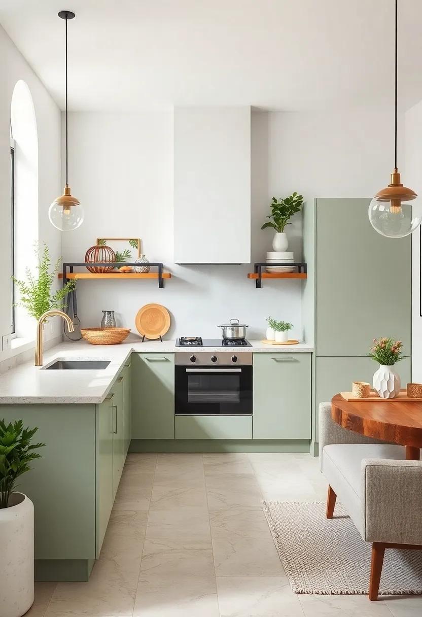
Pairing the soft, muted tones of sage green with the creamy neutrality of off-white creates a fresh and airy atmosphere, perfect for compact kitchen spaces. This combination effortlessly invites the tranquility of nature indoors, while maintaining a clean and bright aesthetic that reflects light and visually expands the room. The delicate green acts as a subtle statement color,adding personality without overwhelming the senses,while off-white keeps everything balanced and timeless.
To maximize this palette, consider these styling tips:
- Cabinets: Opt for sage green cabinets with matte finishes to add texture and depth.
- Walls: Paint walls in off-white to enhance natural light and create a crisp backdrop.
- Accents: Introduce sage-toned ceramics, textiles, or greenery to reinforce the natural vibe.
- Hardware: Choose brushed nickel or antique brass for a subtle contrast and warmth.
| Element | Recommended Shade | Effect |
|---|---|---|
| Cabinetry | Soft sage green | Natural, calming focus |
| Walls | Warm off-white | Brightens & enlarges |
| Accents | Mixed sage hues | Depth and interest |
| Hardware | Brushed nickel | Subtle contrast |
Baby Blue and Linen White – Baby blue cabinetry paired with linen white walls enhances the sense of airiness
Baby blue cabinetry injects a serene and refreshing vibe into your kitchen, making it feel like a peaceful retreat even in the smallest of spaces. When combined with linen white walls, the palette creates a subtle contrast that brightens the entire room, reflecting natural light and amplifying the sense of space. This gentle duo strikes the perfect balance between soft color and neutral backdrop, enhancing openness without overwhelming the senses.
To elevate the look further, consider incorporating these complementary features:
- Light wood countertops for warmth and texture.
- Brushed nickel hardware that maintains a cool and clean aesthetic.
- Minimalistic open shelving painted in baby blue to unify the design.
| Element | Recommended Finish | Effect |
|---|---|---|
| Cabinetry | Matte baby blue | Soft, calming presence |
| Walls | Linen white matte | Airy, reflective surface |
| Countertops | Light oak veneer | Natural warmth and contrast |
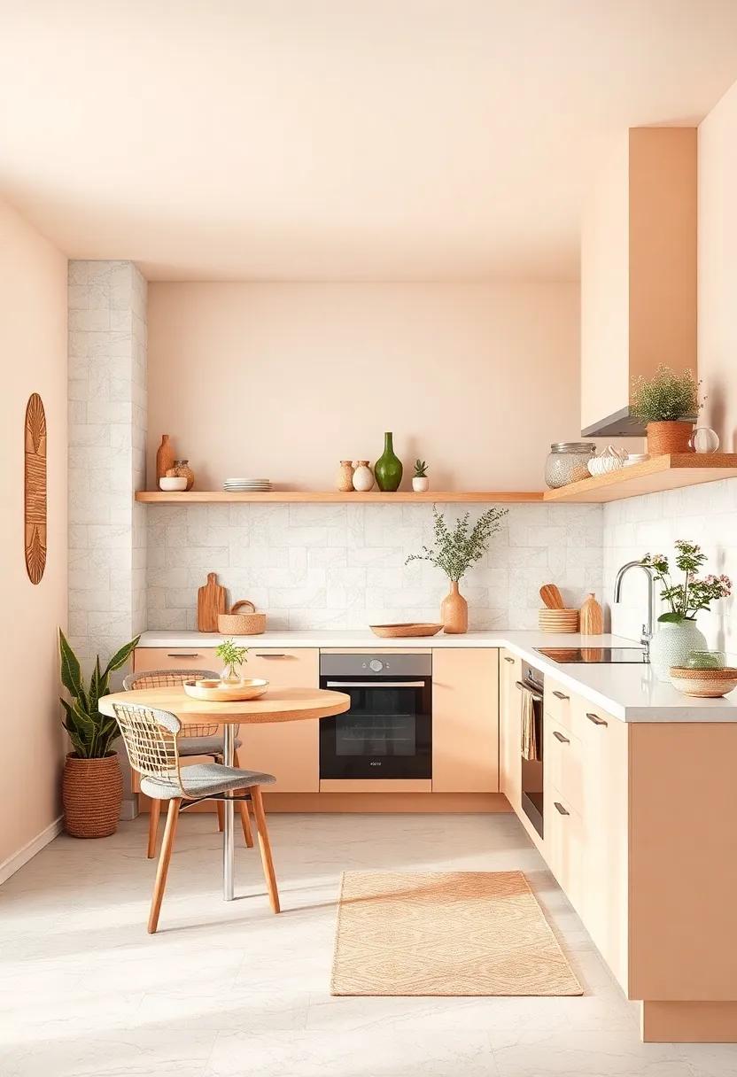
Sunny Apricot and Pale Sand – Apricot’s warmth combined with pale sand gives a welcoming, sunny feel
Infusing your kitchen with the cheerful glow of apricot paired with the understated elegance of pale sand creates a space that feels both inviting and effortlessly bright. The apricot’s warm,sunny undertones bring a lively energy,while pale sand offers a soft,grounding balance that prevents the vibrancy from overwhelming the room. Together, they conjure a fresh ambiance that can transform a compact kitchen into an airy retreat, perfect for both morning coffees and evening gatherings.
- Apricot Cabinets: Opt for apricot-toned cabinetry to add a radiant focal point without overcrowding the space.
- Pale Sand Walls: Keep walls subtle with pale sand to reflect light and create an expansive feel.
- Natural Accents: Incorporate light wood or wicker accessories to complement the palette’s warm neutrality.
- Bright Accessories: Splash hints of fresh herbs or colorful ceramics to maintain the welcoming, lively vibe.
Powder Pink and Cloud White – Powder pink adds gentle color while cloud white amplifies light and space
Powder pink brings a whisper of warmth and softness that subtly enlivens your kitchen without overwhelming the senses. This delicate hue offers a sweet, nurturing vibe that complements natural light, turning even the smallest spaces into inviting retreats. When paired with airy cloud white, it creates a harmonious balance that maximizes brightness and enhances the feeling of openness. Together, these shades breathe life into cabinets, backsplashes, or walls while maintaining a clean, elegant look.
This palette is perfect for those who want to infuse personality into their kitchen without sacrificing the crucial element of space. Use powder pink accents in textiles, such as curtains or seat cushions, and let cloud white serve as the canvas for countertops and shelving. The result? A cheerful,fresh environment that feels expansive and uncluttered,inviting you to cook,entertain,and relax.
| Element | Suggested Color | Effect |
|---|---|---|
| Cabinets | Cloud White | Enhances brightness, reflects light |
| backsplash | powder Pink | Adds subtle warmth and interest |
| accessories | Powder Pink | Softens and personalizes space |
| countertops | cloud White | Creates sleek and spacious feel |
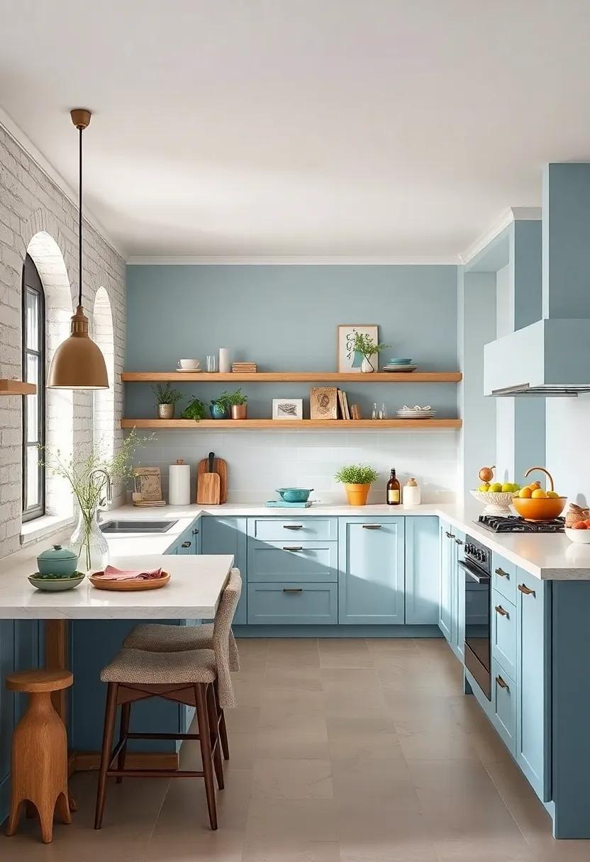
Ice Blue and light Beige – Crisp ice blue mixed with light beige creates a clean and expansive environment
Imagine stepping into a kitchen bathed in the serene glow of crisp ice blue walls, perfectly contrasted by the warm, welcoming touch of light beige cabinetry and countertops. This combo not only refreshes the space visually but also expands it, making every corner feel airy and open. The cool undertones of ice blue evoke calmness and clarity, while the beige adds a subtle grounding warmth, creating an inviting atmosphere where you’ll love to cook and socialize.
to enhance this delightful palette, incorporate accessories and fixtures in natural materials like maple wood, brushed nickel, or frosted glass. Consider white or pale gray tiles for backsplashes to keep light bouncing around without overwhelming the senses. Here’s a simple way to balance the shades:
| Element | Color Suggestion | Effect |
|---|---|---|
| cabinets | Light Beige | Warmth & Comfort |
| Walls | Ice Blue | Expansiveness & serenity |
| Countertops | Soft White | Brightness & Cleanliness |
| Accents | Natural Wood / Nickel | Texture & Visual Interest |
Soft Lemon and White Smoke – A soft lemon hue contrasted with white smoke shades brightens and opens the kitchen
Infusing your kitchen with a tender wash of soft lemon breathes instant life into the space, evoking the gentle warmth of early morning sunlight. When paired with the cool, muted tones of white smoke, this combination creates a breathtaking balance between warmth and tranquility. The lemon’s subtle vibrancy brightens the room without overwhelming it, while the white smoke’s soft neutrality adds depth and modern sophistication. Together, they invite an airy, open atmosphere that visually expands even the coziest of kitchens.
This palette works brilliantly with natural materials and minimalist designs, enhancing the sense of space and cleanliness. Consider painting your walls in white smoke to form a delicate canvas, then highlight cabinetry or open shelving in soft lemon for pops of inviting color. Accessorize further with:
- Matte gold hardware to complement the lemon’s warmth
- textured white ceramics for subtle contrast
- Light wood accents to maintain organic balance
| Element | Recommended Shade | Effect |
|---|---|---|
| Wall Color | White Smoke (#F5F5F5) | Brightens and opens space |
| Cabinetry | Soft Lemon (#FFFACD) | Warmth and cheerful accents |
| Countertops | Light Quartz | Clean, polished look |
Pale Coral and Warm Gray – Coral offers cheerfulness, balanced by warm gray’s understated elegance
Infuse your kitchen with a fresh burst of energy by pairing the lively tones of pale coral with the calming neutrality of warm gray. This dynamic duo strikes an inviting balance, where coral’s natural cheerfulness enlivens the space without overwhelming it, while warm gray provides a sophisticated backdrop that allows the lighter shade to truly shine. Ideal for cabinetry, backsplash tiles, or even bar stools, this palette creates a harmonious space that feels both uplifting and grounded, making your kitchen the heart of your home.
To maintain openness and light, consider incorporating the following elements alongside this palette:
- Soft white countertops to reflect natural light and add crispness.
- Matte brass fixtures for a subtle touch of warmth and texture.
- Natural wood accents to enhance the cozy yet airy ambiance.
- Minimalistic, open shelving to prevent visual clutter and promote spaciousness.
| Element | Color/Material | Effect |
|---|---|---|
| Walls | Warm gray | Creates a calm and elegant backdrop |
| Cabinetry | Pale Coral | Adds playful cheerfulness |
| Countertops | Soft White Quartz | Enhances brightness and clean lines |
| Hardware | Matte Brass | Infuses subtle warmth and luxury |
Light aqua and Creamy White – Aqua tones bring freshness, softened by creamy white finishes
Infusing your kitchen with shades of light aqua creates an immediate sense of clarity and vitality. This color channels the tranquil hues of clear tropical waters, invigorating the space without overwhelming it. When paired with creamy white finishes—like ivory cabinetry or smooth countertops—the effect is a soft, airy ambiance that balances freshness with a cozy warmth.This duo works especially well in compact kitchens, where the aqua’s coolness expands the visual field and the creamy white prevents the palette from feeling sterile.
Consider incorporating these elements for a harmonious balance:
- Aqua glossy tiles: Reflect light and add subtle depth to backsplashes or accent walls.
- Creamy white matte cabinets: Offer a soft contrast that complements aqua without competing.
- Natural wood accents: Light oak or maple touches ground the palette, lending an earthy counterpoint.
- Soft aqua textiles: Curtains or rugs introduce texture and repeat the color gently.
| Element | Color | effect |
|---|---|---|
| Wall paint | #A7D8DE (Light Aqua) | brightens & refreshes |
| Cabinet finish | #F5F1E9 (Creamy White) | Softens & warms |
| Countertop | White Marble with gray veins | Elegance & light reflection |
Pastel Mint and Snowy White – Retro mint shades combined with snowy white create a nostalgic yet spacious feel

Infusing your kitchen with a soft pastel mint pairs beautifully with crisp snowy white, evoking a charming retro vibe while maintaining a clean and airy atmosphere. This combination not only brightens up tight spaces but also taps into a sense of nostalgia reminiscent of vintage diners and classic ice cream parlors. The gentle mint hues bring a hint of color without overwhelming the senses, making every corner feel fresh and inviting. Meanwhile,the snowy white foundation amplifies natural light,enhancing the kitchen’s openness and balance.
To enhance this palette, consider incorporating:
- Matte mint cabinetry paired with glossy white countertops for texture contrast
- White ceramic subway tiles for a timeless backsplash that reflects light
- Open white shelving to prevent visual clutter and emphasize space
- Subtle pastel mint accents through kitchenware and textiles for cohesive color flow
| Element | Recommended Shade | Effect |
|---|---|---|
| cabinetry | Soft Pastel Mint | Retro charm with a soft pop of color |
| Countertops | Snowy White | Brightens and enlarges perceived space |
| Backsplash | Glossy White Subway Tile | Reflects light, adds texture |
| Accessories | Mint & White Accents | Creates harmony and visual interest |
In Summary
With these 25 light and bright color palettes at your fingertips, transforming your small kitchen into a more spacious and cheerful haven is easier than ever.Whether you lean toward soft pastels, crisp neutrals, or playful pops of color, the right palette can open up your space and uplift your daily routine. So go ahead—mix, match, and experiment to find the combination that turns your kitchen into a radiant heart of your home. After all, a little color can make all the difference.
As an Amazon Associate I earn from qualifying purchases.