27 Stunning Bedroom Paint Colors to Transform Your Space with Style and Serenity
Looking to refresh yoru personal sanctuary with a splash of colour that speaks to both style and serenity? You’re in the right place. In this carefully curated list of 27 stunning bedroom paint colors, we explore hues that not only elevate the aesthetic of your space but also create a calming atmosphere perfect for rest and relaxation. From soft neutrals and muted pastels to bold jewel tones and modern moody shades, each color is chosen to inspire your next makeover. Whether you want to make a subtle change or a dramatic transformation, this guide will help you discover the perfect palette to turn your bedroom into a stylish retreat that feels uniquely yours.
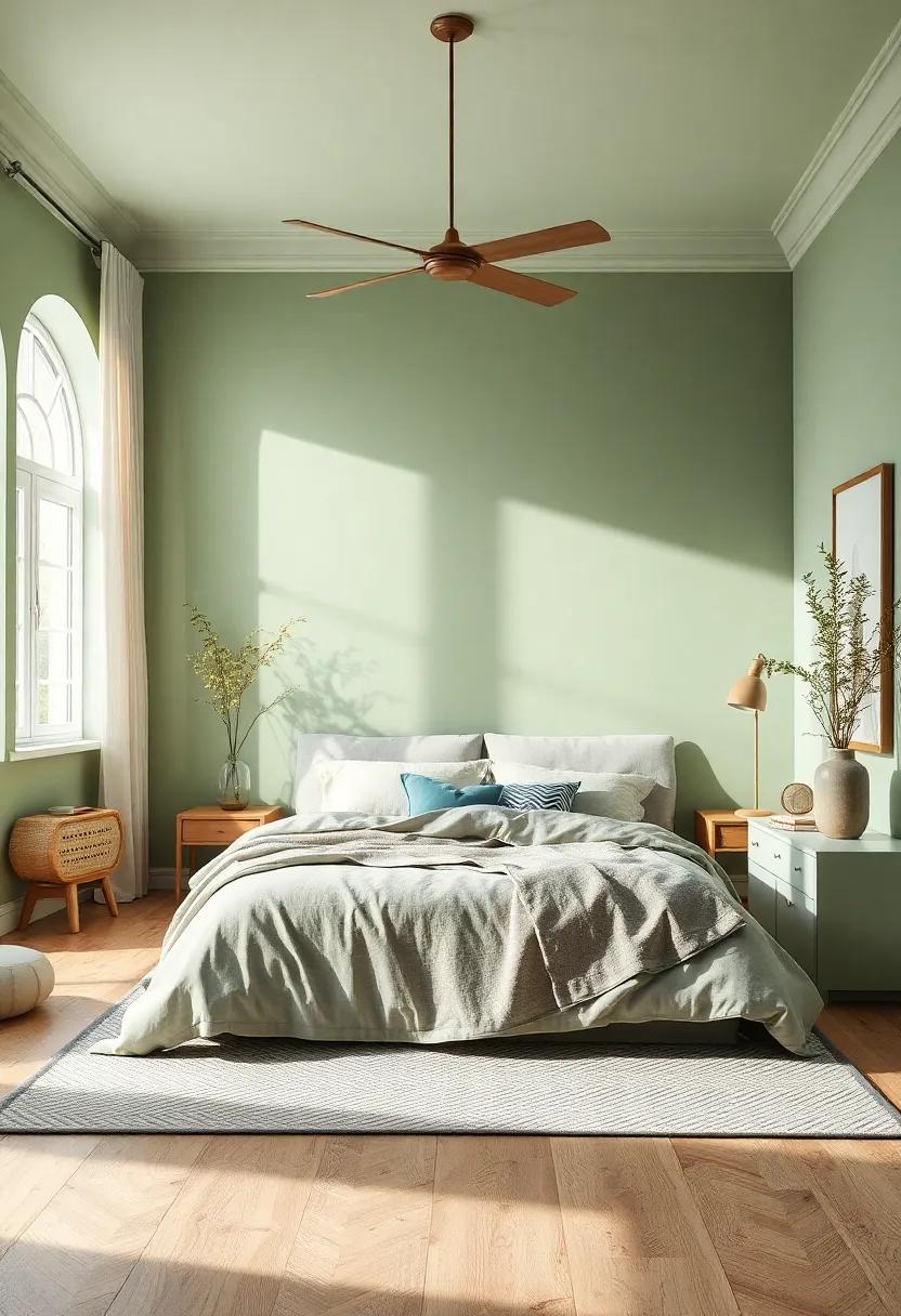
Tranquil Seafoam Green – evoke calm and freshness with this soft green hue that breathes life into any bedroom
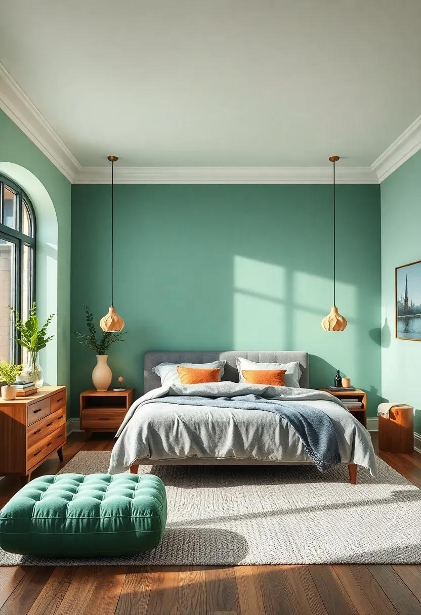
Step into a sanctuary of serenity by choosing seafoam green as your bedroom’s main color. This gentle shade perfectly balances the freshness of green with a calming pastel tone, making it ideal for creating a restful retreat. Whether paired with crisp whites or soft neutral furnishings, the color effortlessly lifts the atmosphere, infusing your space with an airy, peaceful vibe that encourages relaxation. Seafoam green acts as a natural enhancer for light, reflecting a soothing ambiance that’s both energizing and tranquil.
- Pairs beautifully with natural wood accents and light linens
- Complements metallic touches in gold or brushed nickel
- Creates a harmonious backdrop for minimalist or coastal-inspired decor
- Works well with plants to bring subtle botanical freshness indoors
| Complementary Colors | Recommended Materials | Lighting Tips |
|---|---|---|
| Warm taupe, soft coral | Bamboo, linen, cotton | Natural light with soft white bulbs |
| Muted peach, creamy beige | Matte ceramics, jute rugs | Layered lamps for cozy ambiance |
Classic Dove Gray – A timeless and versatile shade that creates a soothing backdrop perfect for relaxation
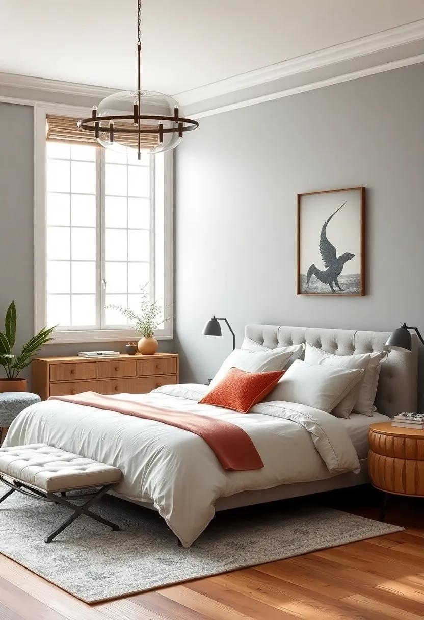
Dove Gray stands out as an evergreen choice for those seeking a peaceful sanctuary within their bedrooms. Its subtle blend of soft grays with gentle warm undertones offers a perfect balance that neither overwhelms nor fades into the background. This shade effortlessly harmonizes with both modern and traditional décor, allowing you to experiment freely with textures and accent colors. Whether paired with crisp white trim for a clean, airy feel or mixed with richer wood tones for cozy elegance, dove gray establishes a calming ambiance conducive to restful sleep and quiet reflection.
Beyond its soothing qualities, dove gray serves as an exceptional canvas that enhances other design elements without competing for attention. Use it to complement plush bedding, sleek metallic fixtures, or vibrant artwork, as it adapts beautifully to a variety of palettes. Here’s what makes this color a must-try for your bedroom makeover:
- Versatility: Works well with cool and warm accents alike.
- Timeless Appeal: Steers clear of fleeting trends, remaining stylish year after year.
- Light Reflectance: Enhances natural light, making spaces feel larger and more inviting.
- Calming Influence: Encourages relaxation and mental clarity.
Warm terracotta – Add earthy warmth to your space with this rich, inviting terracotta tone that feels both modern and cozy
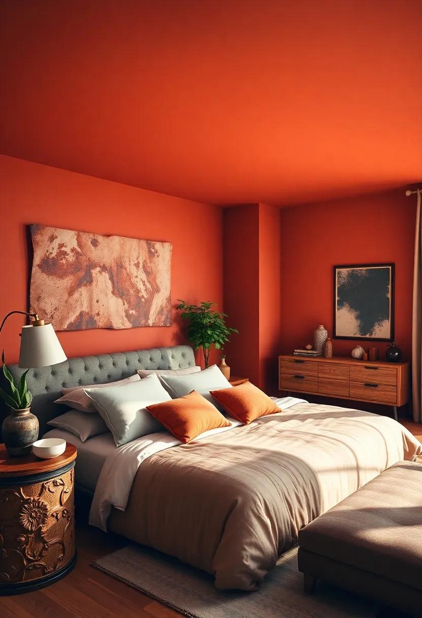
Embrace the comforting allure of terracotta—a hue that effortlessly blends the rustic charm of nature with a modern edge. This rich, earthy shade invites a sense of grounding and tranquility, making it perfect for creating a cozy retreat in your bedroom.Whether you opt for an accent wall or paint the entire room, its warm undertones enhance wooden furnishings and natural textiles, crafting a harmonious space that feels both vibrant and relaxing.
Pair this inviting tone with soft neutrals like creamy whites and muted beiges for a balanced backdrop, or contrast it with deeper blues and charcoal grays to inject depth and sophistication. Use textured wall décor, woven rugs, and terracotta or clay accessories to amplify the organic feel and bring your sanctuary to life.
| Feature | Why It Works |
|---|---|
| earthy Undertones | Creates warmth and coziness |
| Versatile Pairings | Complements both neutrals and bold colors |
| Textural Potential | enhances natural decor elements |
Dusty Lavender – Infuse subtle elegance and serenity with a muted lavender that’s gentle on the eyes
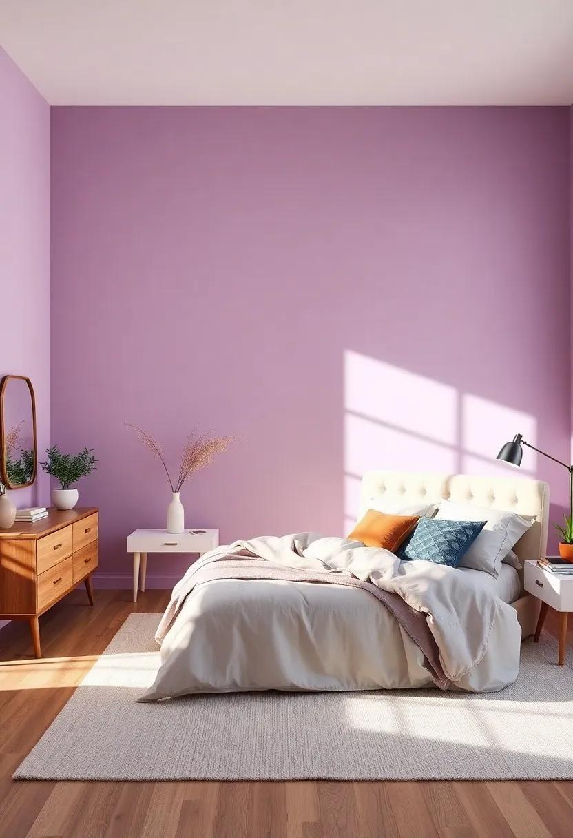
Dusty Lavender offers a beautifully muted shade of purple that strikes the perfect balance between sophistication and calmness. Its soft, gray undertones make it an ideal choice for bedrooms seeking a touch of understated elegance without overwhelming the senses. This color creates a tranquil retreat, promoting restful nights and peaceful mornings. Pair this hue with crisp white linens or soft blush accents to enhance its serene appeal and maintain a fresh atmosphere throughout the space.
To make the most of dusty lavender’s subtle charm, consider these complementary design elements:
- Natural wood finishes: Warm oak or walnut balances the coolness of the lavender, adding warmth and texture.
- Matte or eggshell paint finishes: These finishes soften the light reflection, enhancing the color’s gentle feel.
- Minimalist furnishings: Clean-lined furniture lets the hue shine while keeping the room airy and open.
Misty Blue – Bring a touch of calming sky blues into your room to promote peacefulness and restful sleep
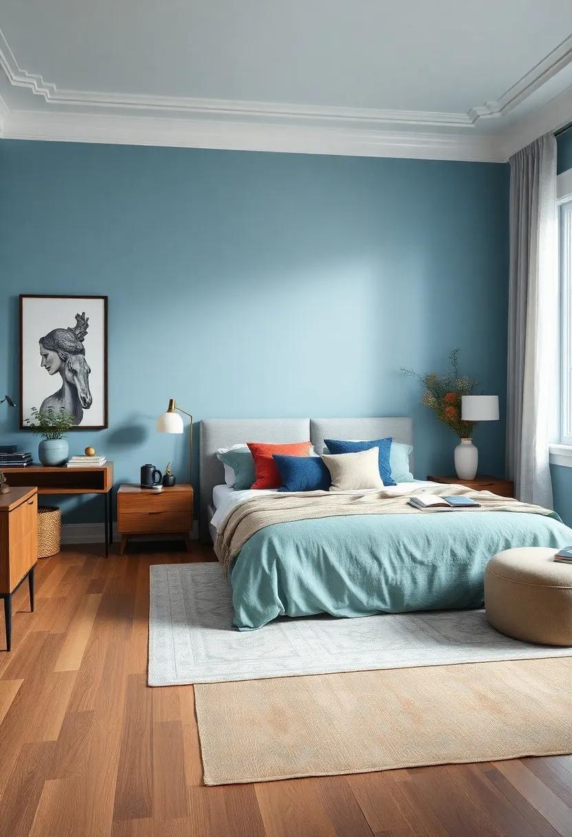
Imagine stepping into a sanctuary where the walls emulate the soft haze of an early morning sky, wrapping you in layers of serene misty blue. This gentle hue doesn’t just paint your room; it cultivates an atmosphere of tranquility that gently lulls the mind into a state of calm. Whether paired with crisp white linens or warm wooden accents, misty blue effortlessly balances coolness with comfort, making it an ideal choice for bedrooms that aim to nurture restful sleep and peaceful moments.
To enhance the dreamy quality of misty blue, consider incorporating the following elements that harmonize beautifully with its soothing tone:
- Soft gray bedding for understated elegance and depth
- natural textures like rattan or jute to add warmth and tactile richness
- Silver or matte brass accents for a touch of understated glamour
- Pale blush or lavender throw pillows for subtle pops of complementary color
| Feature | Benefit |
|---|---|
| low Visual Noise | Helps reduce mental clutter for better relaxation |
| Versatility | Pairs well with both modern and traditional decor styles |
| Light Reflectivity | Brightens the space without overwhelming |
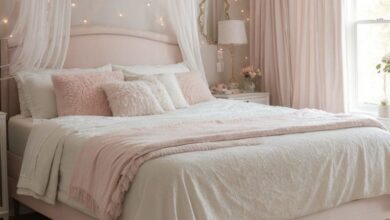
Soft Blush Pink – A delicate and romantic shade that adds warmth without overpowering your retreat
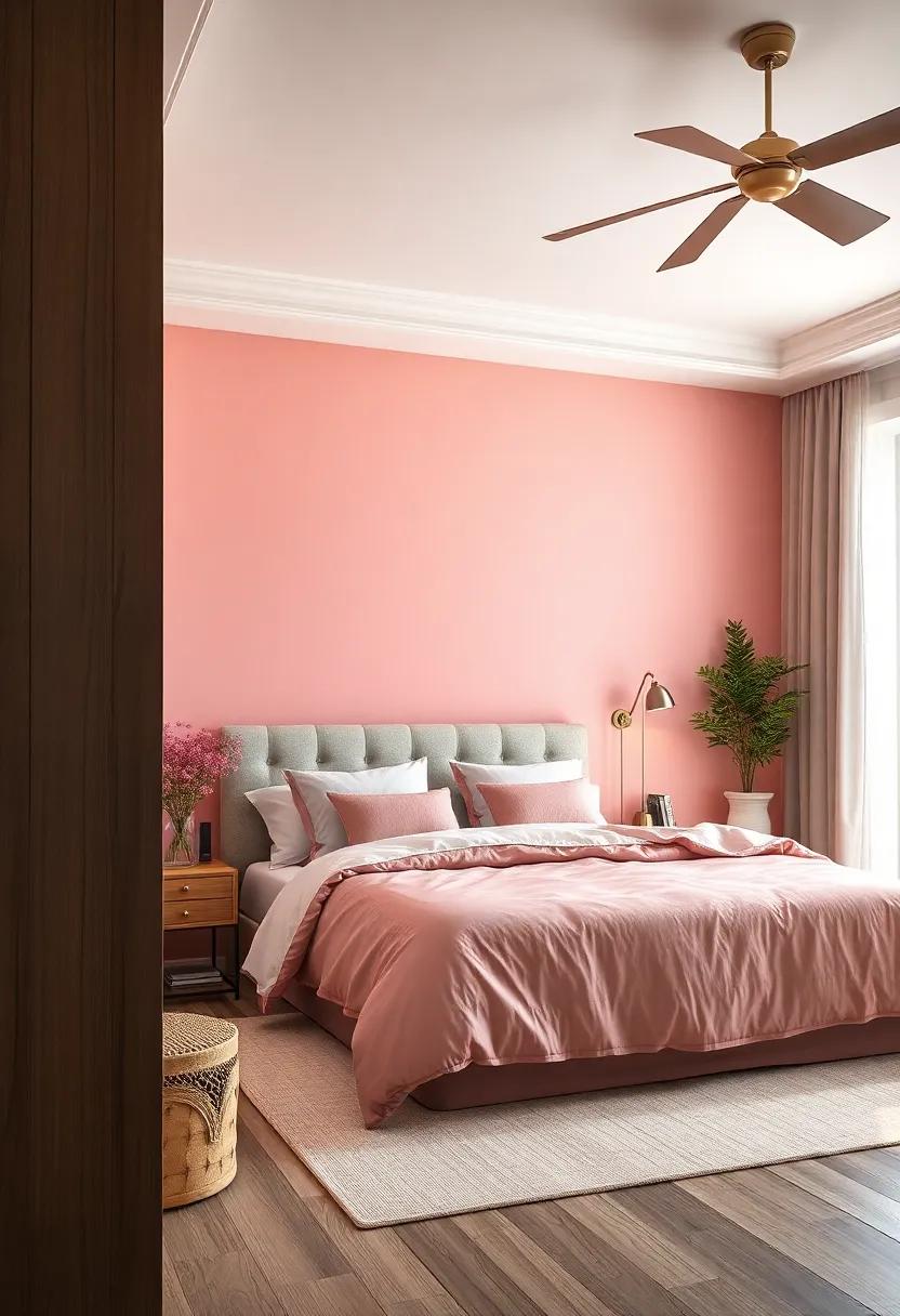
Soft blush pink is the perfect hue for those seeking a bedroom color that breathes gentle warmth and subtle sophistication into the space. This tender shade evokes feelings of calm and tenderness, turning any retreat into a serene haven where relaxation flows effortlessly. Whether paired with crisp whites or delicate grays, it offers a romantic yet refined backdrop that complements a variety of décor styles—from modern minimalism to vintage elegance.
Embracing this gentle tone can also introduce depth and dimension when layered with textures and accent pieces. Consider incorporating plush textiles, natural wood elements, or metallic accents in rose gold and warm brass to elevate the softness without overwhelming the room’s atmosphere. The versatility of blush pink means it gracefully balances warmth with neutrality, making it an excellent choice for creating a bedroom that feels inviting all year round.
Cozy Taupe – Blend comfort and sophistication with this muted neutral that pairs well with various decor styles
Embrace a warm and inviting atmosphere with taupe’s understated charm. This muted neutral acts as the perfect backdrop, effortlessly balancing comfort and refinement. whether you lean towards a modern minimalist look or a more traditional aesthetic, taupe’s versatility shines through. Its gentle warmth adds depth to your bedroom, creating a serene space that feels both grounded and elegant.
Styling tips to maximize taupe’s potential:
- Pair with crisp white linens and natural wood for an organic, spa-like vibe.
- Incorporate plush textures like velvet or faux fur to elevate coziness.
- Add metallic accents—think bronze or brushed gold—for a touch of glamour.
- Complement with soft blush or sage green accessories to introduce subtle pops of color.
Deep Charcoal – For a bold yet refined atmosphere, deep charcoal creates depth while maintaining a modern feel
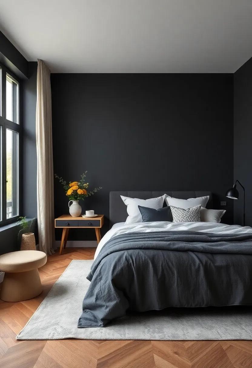
When you’re aiming to elevate your bedroom with a color that exudes both sophistication and modern elegance, deep charcoal is an exceptional choice. This rich, dark shade wraps your space in a cozy yet dynamic aura, offering a bold backdrop that highlights your furnishings and accents without overpowering them. It effortlessly complements metallic finishes, crisp whites, and natural wood tones, adding an air of polished confidence to your sanctuary. Whether paired with plush linens or sleek décor, deep charcoal sets the stage for a refined retreat that feels together grounded and contemporary.
One of the advantages of choosing this shade is its versatility in adapting to various design styles.From industrial lofts to minimalist bedrooms, the charcoal tone creates depth and visual interest that transforms plain walls into conversation pieces. To enhance this effect, consider integrating textures such as velvet cushions, matte black fixtures, or woven rugs that play beautifully against the charcoal canvas. For a balanced color palette, use the following combinations:
| Accent Colors | Materials | Lighting Styles |
|---|---|---|
| Blush Pink | Brushed brass | Warm Edison Bulbs |
| Soft Ivory | Raw Wood | Minimalist Pendant Lights |
| Mustard Yellow | Leather | Adjustable Wall Sconces |
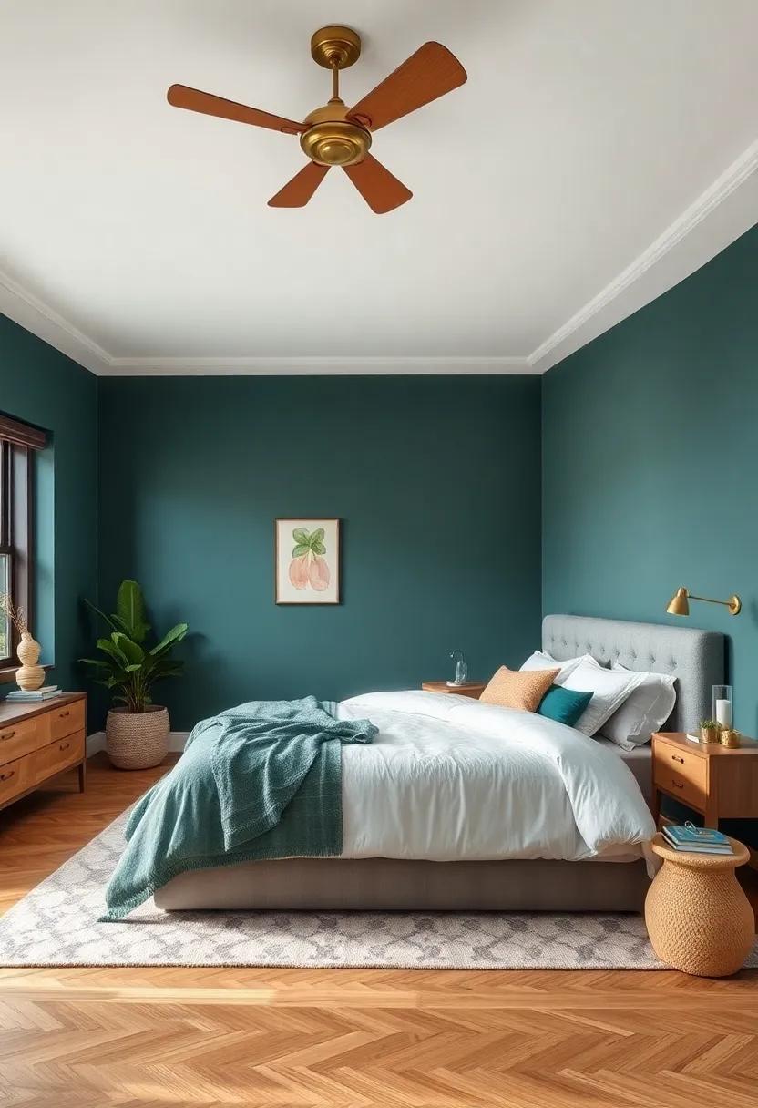
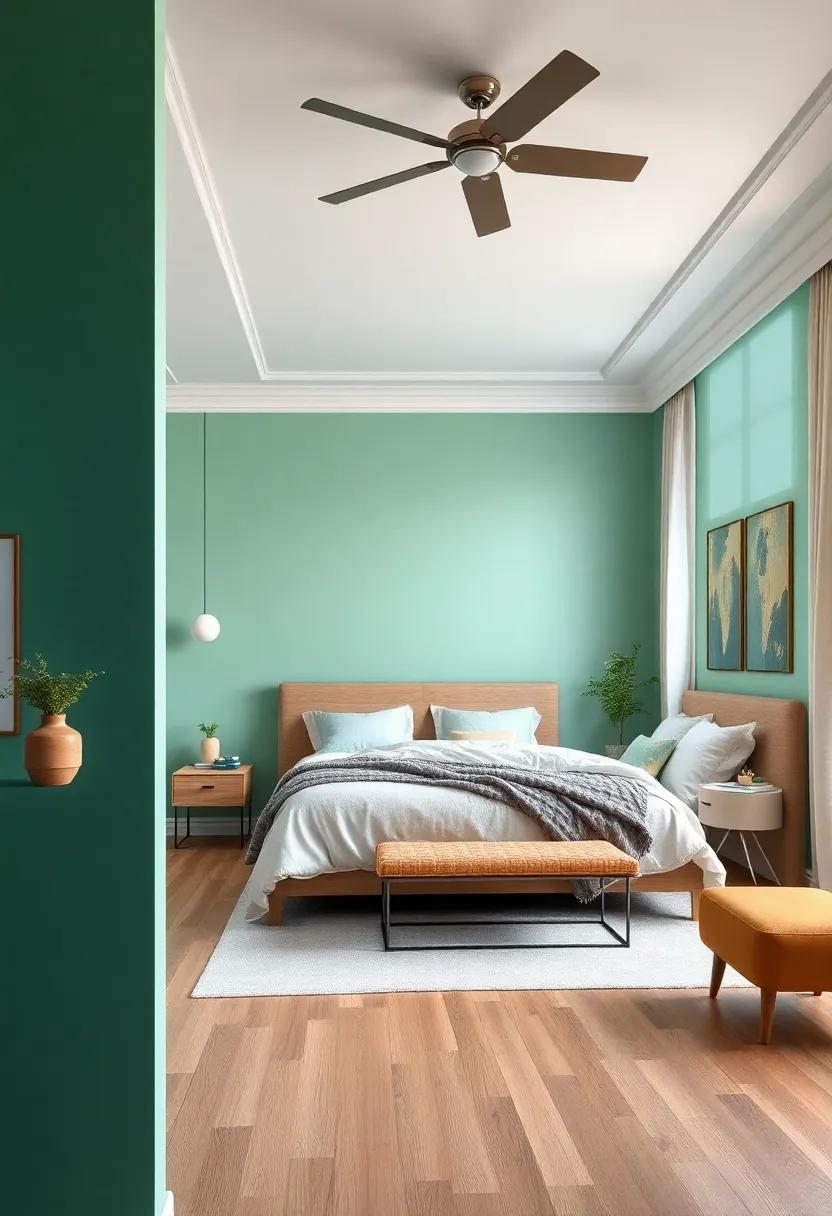
sage Green – This gray-tinged green delivers a natural, grounding ambiance perfect for unwinding
Sage green effortlessly marries the tranquility of nature with a sophisticated, muted palette that soothes both mind and body. Its subtle gray undertones create a calming surroundings, ideal for bedrooms where relaxation and rejuvenation reign supreme. This unique shade works beautifully as a backdrop for natural wood accents, cream linens, and soft metallic finishes, helping to craft a serene sanctuary that feels both fresh and timeless.
When styling a bedroom with this color, consider layering textures to enhance the cozy, grounded effect. Think plush rugs, linen curtains, and woven baskets to complement the understated hue. Below is a fast guide to pairing sage green successfully in your space:
| Complementary Elements | Why They Work |
|---|---|
| Warm Wood Tones | Add natural warmth and organic texture |
| Soft Neutrals (Beige, Cream) | Create a light and airy contrast |
| Muted Gold or Brushed Brass | Introduce subtle elegance and shine |
| earthy textiles (Jute, Linen) | Enhance grounding, tactile comfort |
Creamy Ivory – Brighten your bedroom with this warm off-white that keeps your space feeling airy and serene

Creamy Ivory envelopes your bedroom with a gentle warmth that breathes life into every corner while maintaining a crisp, airy atmosphere. This warm off-white hue acts as the perfect canvas for both minimalist and eclectic decor styles. It subtly reflects natural light, creating a sun-kissed glow that elevates the mood of your space without overwhelming your senses. Pair it with soft textures like linen curtains, woven rugs, and light wood furniture to amplify the tranquil vibe.
Its versatility allows you to incorporate pops of color through accessories or statement pieces without clashing.Consider breaking up the neutral backdrop with:
- Muted sage green pillows and throws
- matte gold or brass fixtures for a touch of elegance
- Soft pastel artwork that enhances calmness
Here’s a quick guide to designing with Creamy Ivory in your bedroom:
| Element | Recommended Color/Material | Effect |
|---|---|---|
| Wall Paint | Creamy Ivory | Brightens & softens space |
| Accent Pieces | Muted Sage, Soft Rose | Adds subtle depth |
| Furniture | Natural Wood or white | Keeps look airy & modern |
| Lighting | Warm LED or Brass Fixtures | Enhances cozy ambiance |
Pale Peach – Infuse subtle warmth and cheerfulness without overwhelming your bedroom’s calm vibe

soft and inviting, pale peach brings a gentle kiss of warmth to your bedroom without stealing its tranquility. This understated hue works beautifully with neutral palettes, allowing you to layer textures and patterns that whisper relaxation rather than shout vibrancy. Imagine walls bathed in pale peach, subtly glowing under natural sunlight or soft bedside lamps, creating a cocoon of serenity fused with a hint of cheerfulness.
Pair this delightful shade with:
- Whisper-white linens for crisp, clean contrast
- Muted sage greens to enhance the organic and calming vibe
- Natural wood accents to add earthiness and warmth
- Matte gold fixtures for a touch of understated elegance
| Feature | Effect in Bedroom |
|---|---|
| Light Reflection | Softens harsh lighting with gentle diffusion |
| Mood Influence | Boosts optimism subtly, creating a happy haven |
| Versatility | Pairs well with pastels and earth tones alike |
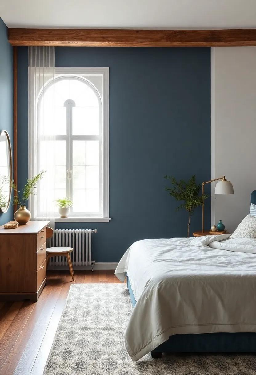
Moody Navy – A deep navy backdrop adds drama and elegance while still offering a serene environment
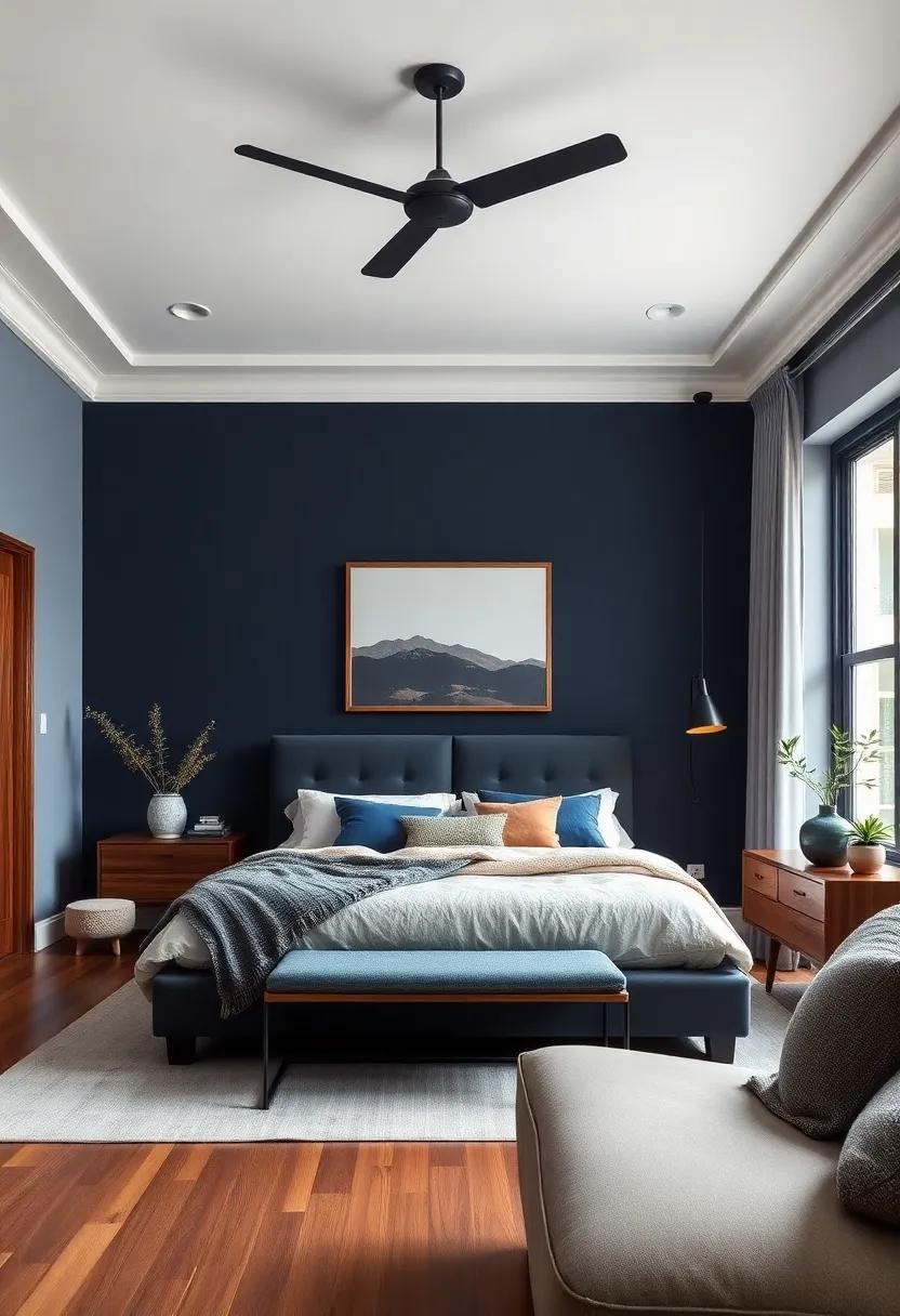
Embracing a rich, deep navy in your bedroom walls creates a sanctuary that balances dramatic flair with tranquil vibes. This shade’s profound depth anchors the room, offering a calming canvas that invites rest and relaxation. paired with soft linens and touches of metallic accents, navy serves as a perfect backdrop to both contemporary and classic decor styles. Its versatility allows for bold color pops or subtle, tonal layering, ensuring a personalized retreat that feels both sophisticated and soothing.
- Enhances natural light: Deep navy contrasts beautifully with natural sunlight,brightening the room during the day.
- Works with warm and cool accents: complements golds, blush pinks, and crisp whites effortlessly.
- Creates visual depth: The dark tone expands the perception of space without overwhelming.
| Pairing | Effect | Best Use |
|---|---|---|
| Brushed Gold | Elevates elegance | Light fixtures & accessories |
| Soft gray | Balances cool with comfort | Bedding & rugs |
| Crisp White | Sharp contrast for freshness | Trim & ceiling |
Soft Mauve – This gentle purple hue introduces sophistication with a tranquil twist
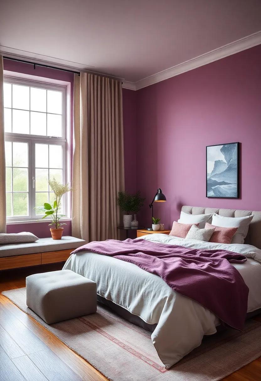
Soft Mauve effortlessly blends the calming essence of lavender with subtle pink undertones, crafting a palette that feels both refined and soothing. This delicate shade acts as a perfect backdrop for bedrooms aiming to evoke relaxation without sacrificing personality.Whether paired with crisp white linens or warm wooden accents, it gently elevates the space, making it feel cozy yet fashion-forward. The beauty of this hue lies in its versatility; it harmonizes with metallic finishes like brushed gold or matte brass, adding just the right amount of glamour without overwhelming the senses.
To maximize the tranquil charm of this hue,consider layering textures and materials that echo its softness.Plush velvet throw pillows, light linen curtains, or a woolen bedside rug invite a touch of tactile luxury that complements the visual serenity. Soft Mauve also shines in rooms with abundant natural light, as sunlight amplifies its muted vibrancy and produces an inviting glow. For those seeking an easy way to breathe new life into their bedrooms, this gentle purple is an exquisite choice— subtle enough for serenity but bold enough to whisper sophistication.
Gentle Mint – Refresh your space with this crisp yet soft mint green for an energizing calm
Soft yet invigorating, this delicate shade of mint effortlessly breathes new life into your bedroom. Its crisp undertones evoke a sense of freshness, while the muted softness provides a calming backdrop, ideal for creating a sanctuary where tranquility and energy coexist. Whether paired with natural wood furnishings or crisp white linens, this hue enhances natural light, making your room feel airy and inviting. The gentle mint hue also acts as a versatile canvas that complements both contemporary and vintage décor, making it an enduring choice for anyone seeking stylish serenity.
Why choose this shade?
- Invigorates the space without overwhelming the senses
- Promotes relaxation & mental clarity
- Works beautifully with metallic accents like gold or brushed nickel
- Pairs seamlessly with soft pastels or deep contrasting shades for a balanced look
| Tip | Best Complementary Decor | Lighting Effect |
|---|---|---|
| Use matte finishes | Natural wood & linen fabrics | Soft, diffused natural light accentuates mint’s softness |
| Add houseplants | White or cream-colored furniture | Shining LED lights highlight mint’s crisp undertones |
| Incorporate silver accents | pastel pink or lavender in accessories | Warm lighting gives a cozy glow without dulling the color |
Warm Sand – Mimic the soothing tones of the beach with a light, warm beige that invites relaxation
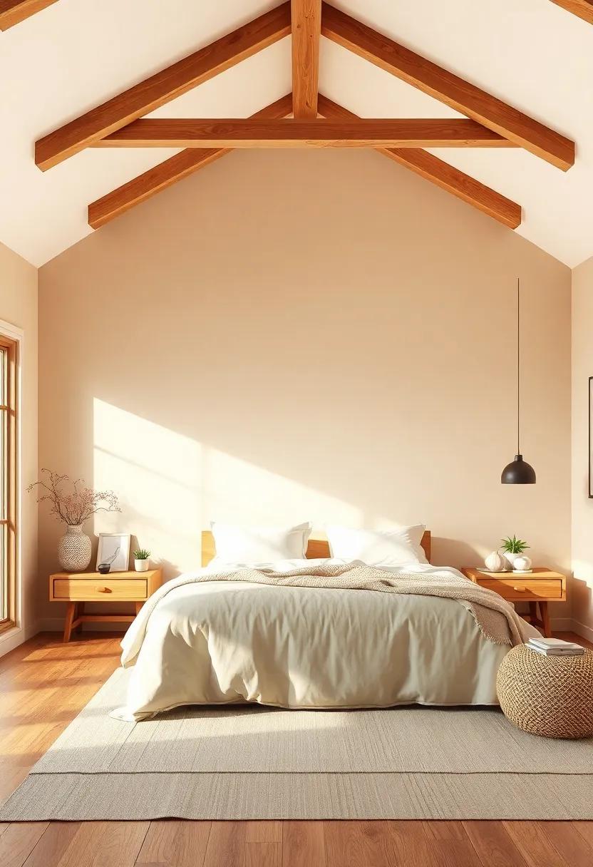
Embrace the tranquil vibe of coastal afternoons by choosing a soft, warm beige that reflects the gentle embrace of sun-kissed shores. This hue doesn’t just paint your walls; it infuses your bedroom with a sense of calm, instantly turning the space into a serene retreat.The subtle warmth of this shade complements natural textures like woven baskets, linen curtains, and light wood furnishings, creating an atmosphere that invites you to unwind and breathe deeply.
Beyond its soothing aesthetic, this color anchors a versatile palette—pair it with crisp whites for a timeless look, or add pops of muted turquoise and coral for a hint of beach-inspired charm.Perfect for both modern and rustic styles, this tone works beautifully with layered lighting and plush textiles, making every morning feel like a peaceful seaside awakening.
slate Blue – A restrained, muted blue that balances tranquility and understated style
Slate Blue is the perfect choice for those seeking a bedroom color that whispers rather than shouts. This muted, soft blue shade exudes a sense of calm that effortlessly transforms your space into a restful haven. Its subtle gray undertones give it a sophistication that works beautifully in modern and classic interiors alike.Whether paired with crisp white trim for a fresh look or natural wood accents for warmth, this color adds depth without overwhelming the senses—making it ideal for bedrooms where tranquility is key.
Designing with this hue opens up versatile styling options.You might want to consider soft linens and plush throw pillows in complementary tones such as:
- Warm taupe or beige for coziness
- Muted mustard for a pop of warmth
- charcoal gray for structured elegance
its understated charm also pairs well with metallic accents like brushed nickel or matte gold, injecting subtle luxury to your sanctuary. slate blue offers a beautifully balanced backdrop that encourages relaxation while maintaining an effortlessly chic aesthetic.
Powder Gray – Soft and airy, powder gray acts as the perfect neutral canvas for layered bedroom decor
Powder gray brings a gentle whisper of color to your bedroom, effortlessly balancing warmth and coolness. Its soft, muted tone serves as an ideal backdrop that enhances rather than overwhelms, allowing your personal style to shine through. Whether you’re drawn to minimalist designs or prefer a more eclectic mix, this versatile shade adapts seamlessly, lending a sense of airy calmness that helps create a serene sanctuary. Layered textures and richer accents pop beautifully against this subtle hue, giving the room dimension without sacrificing tranquility.
- Neutral foundation: Creates a clean slate for colorful artwork or patterned bedding.
- Light-enhancing: Reflects natural light softly,brightening the space without harshness.
- Pairing pleasant: works perfectly with pastels, deep blues, and natural wood tones.
| Best Accent Colors | Recommended Textures |
|---|---|
| Dusty Rose | Velvet Throws |
| Slate Blue | Linen Curtains |
| Warm Taupe | Woven Rugs |
light Olive – Earthy and calming, light olive adds a touch of nature-inspired serenity

Light olive is a wonderfully understated hue that channels the peacefulness of nature right into your bedroom. Its soft green undertones evoke the gentle whisper of leaves in a calm forest, making it an ideal choice for those seeking a tranquil retreat from the hustle of daily life. This shade pairs beautifully with natural wood accents, creamy whites, and warm neutrals, creating a harmonious palette that soothes the senses without overwhelming the space.
Enhance the calming effect by incorporating textures like linen or woven baskets, which deepen the earthy vibe. Light olive’s versatility also allows it to work well with metallic touches—think brushed gold or matte black fixtures—that add subtle sophistication.Ideal for both minimalist and bohemian decor styles, this muted green effortlessly transforms bedrooms into serene sanctuaries that invite rest and renewal.
Honey Gold – subtle golden tones bring warmth and a touch of understated luxury
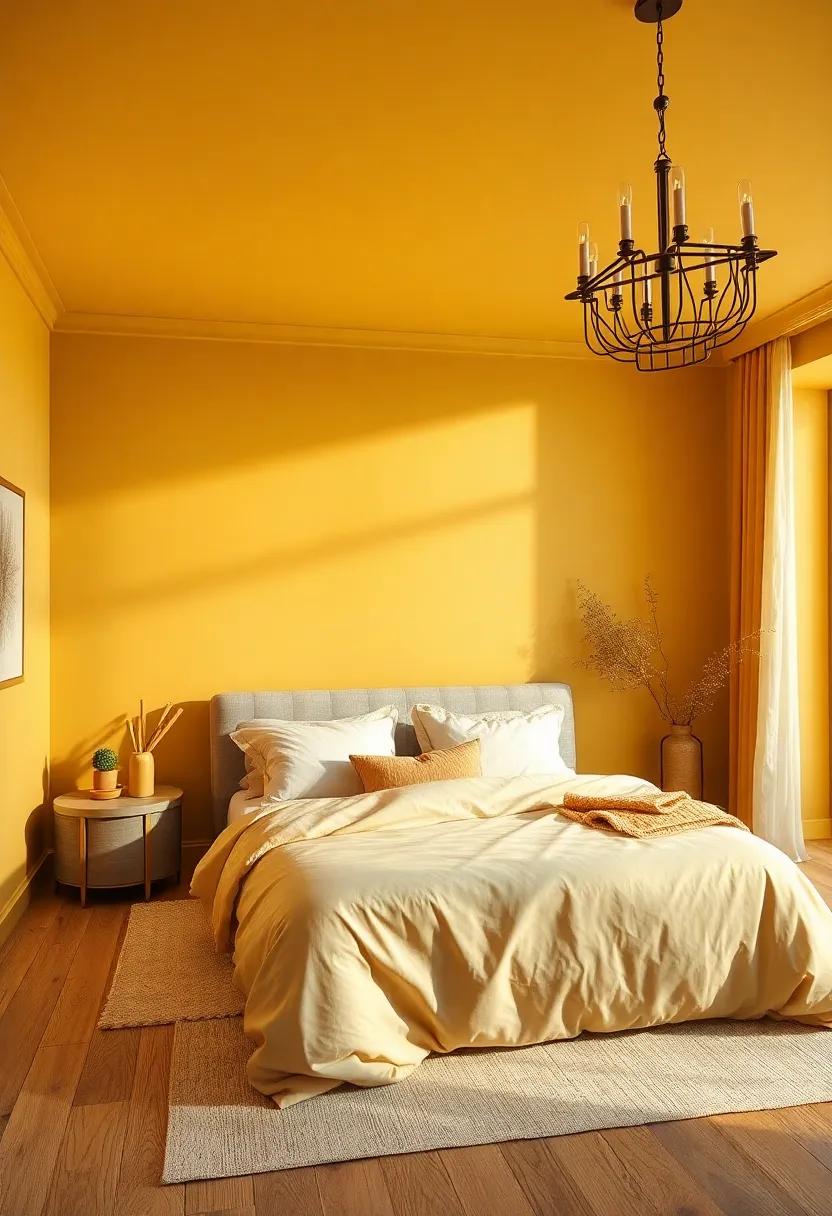
embracing Honey Gold in your bedroom palette invites a serene warmth that feels both inviting and effortlessly luxurious. This shade captures the soft glow of sunlight filtering through amber-hued glass, creating a tranquil ambiance that soothes the senses.Ideal for those seeking a color that balances subtle richness with an air of understated elegance, Honey Gold enhances natural light beautifully, adding depth without overpowering the space.
Pair this versatile tone with soft neutrals like cream and taupe or contrast it against deep charcoals and forest greens to create a harmonious yet dynamic setting. Incorporate textures such as woven linens, velvet cushions, or polished wood accents to highlight the golden hues and bring an organic richness that feels warm and welcoming.
Pale Coral – A muted coral tint that enlivens your space while maintaining softness and calm

Pale Coral gracefully balances warmth and subtlety, creating an inviting atmosphere that feels both fresh and soothing.Its muted undertones offer a refreshing choice to louder, more vibrant corals, allowing your bedroom to radiate gentle energy without overwhelming the senses. This versatile shade pairs beautifully with natural textures like linen, rattan, or soft wood finishes, enhancing a space that encourages relaxation as well as quiet inspiration. Ideal for those seeking a breath of color that remains elegant and understated, this hue effortlessly bridges contemporary style with timeless comfort.
to maximize the calming effect of this tone, consider integrating accents in complementary colors such as soft grays, sandy beiges, or powder blues. The subtle glow of pale coral also works wonderfully when highlighted with warm metallics like brushed gold or copper, adding a layer of sophistication to your design. Below is a quick overview of styling ideas that bring out the best in this gentle shade:
| Element | Suggested Colors/Materials | Effect |
|---|---|---|
| Wall Paint | Pale coral | Soft, welcoming backdrop |
| Textiles | Beige, cream, light gray | Cozy layering to soften space |
| Decor accents | Brushed gold, copper | Warmth and subtle shimmer |
| Furniture | Natural wood, rattan | Earthy, grounded feel |
Whisper White – A pure, clean white with just a hint of warmth to avoid starkness and foster peace
Soft yet sophisticated, this shade strikes the perfect balance between an icy white and a cozy cream. Its subtle warmth softens the intensity of pure white,creating an inviting atmosphere that feels effortlessly fresh. Ideal for those who seek a canvas that breathes tranquility, it brightens the room without overwhelming the senses, making it perfect for restful evenings and waking up refreshed.
Pairing beautifully with natural wood tones, muted pastels, and gentle grays, this color enhances textures and minimalist décor alike. Whether you’re accenting with linen drapes or brushed metal fixtures, it acts as a silent partner to elevate every detail. To help you visualize its versatility, here’s a quick reference of complementary palettes:
| Palette | Key Colors | Style Vibe |
|---|---|---|
| Nature’s Calm | Olive Green, Warm Taupe, Soft White | Earthy & Serene |
| Coastal Breeze | Sky Blue, Driftwood Gray, Pale Sand | Light & Airy |
| Modern Minimal | Charcoal, Blush Pink, Matte Black | Clean & Chic |
Soft Slate Green – A muted green with hints of blue and gray for a serene, sophisticated touch
Soft Slate Green is the perfect balance between nature and tranquility, subtly infused with cool undertones of blue and gray. This muted shade brings a calming sophistication to any bedroom, creating a sanctuary that feels both fresh and timeless. Ideal for those seeking a peaceful retreat, its gentle palette complements natural wood accents, crisp whites, and soft linens, making it a versatile choice for modern, rustic, or minimalist aesthetics.
Its understated elegance makes Soft Slate Green a dream canvas for bedroom decor. Pair it with warm metals like brushed brass or matte gold to add a touch of luxury, or keep the vibe earthy with woven textures and plants. Below is a quick guide to ideal color pairings that highlight this hue’s serene charm:
| Accent Color | Style Effect | Best Uses |
|---|---|---|
| Soft Taupe | Warm & Cozy | Throw pillows, rugs |
| Muted Navy | Elegant Contrast | Bed linens, artwork |
| Matte Gold | Subtle Glamour | Light fixtures, hardware |
| Natural Jute | Earthy & Organic | Area rugs, baskets |
Blush Beige – Combining the best of pink warmth and beige neutrality, this shade creates cozy calm

Blush Beige is an inviting color that effortlessly strikes the perfect balance between gentle pink hues and the grounding neutrality of beige. Its soft, muted undertones introduce a warm embrace that calms the senses, making it an excellent choice for bedrooms designed to foster relaxation and tranquility. This shade works especially well in spaces where you want to combine a subtle touch of romance without overwhelming the peaceful atmosphere with bright or overly bold tones.
Pairing blush beige with natural textures and materials can elevate its cozy effect. Consider incorporating linen bedding, woven rugs, or wooden furniture to complement the shade’s understated warmth. Here’s a quick palette to enhance a bedroom painted in blush beige:
- Soft white: for crisp, clean trims and ceilings
- Warm taupe: accents through throw pillows or curtains
- Dusty rose: subtle decorative elements to deepen color interest
- Matte gold: lighting fixtures and hardware to add elegance
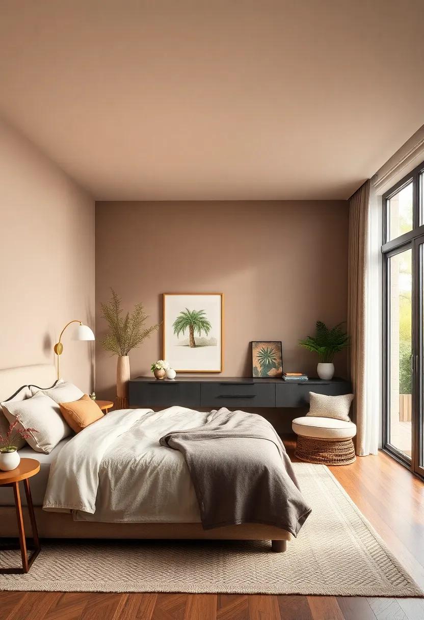
Warm Gray Brown – This grounding tone anchors your bedroom with warmth and a modern, organic feel

Warm gray brown serves as the perfect foundation for a bedroom that embraces both comfort and contemporary elegance.This muted,organic hue effortlessly balances the coolness of gray with the earthiness of brown,creating a space that feels inviting yet sophisticated. Whether paired with soft linens, natural wood accents, or brushed metal fixtures, it provides a versatile backdrop that supports a wide range of design choices without overwhelming the senses.
To elevate the ambiance, consider layering textures and subtle pops of color alongside this grounding tone. Shades like dusty rose, sage green, or creamy ivory complement its understated richness, while materials such as woven baskets, linen curtains, or leather upholstery add depth and tactile interest. Use this color to craft a serene sanctuary where modern style meets nature-inspired warmth—perfect for unwinding and recharging at the end of the day.
Serene Sky Blue – Evoke open skies and endless tranquility with this light, airy blue shade
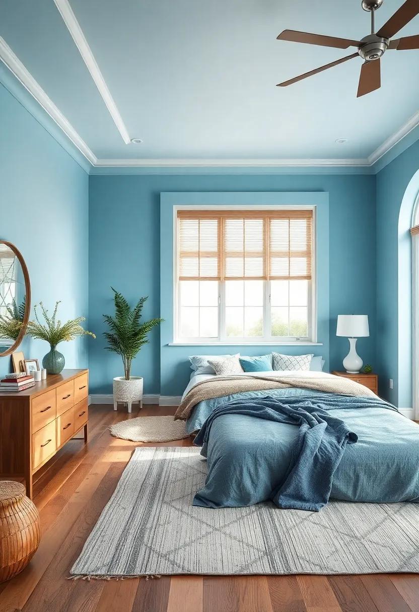
Serene Sky Blue invites the calm expansiveness of the open sky right into your bedroom, wrapping your space in a whisper-light hue that soothes the mind and body. This gentle, airy blue acts as a perfect backdrop for both minimalist and eclectic decor, enhancing natural light and creating an illusion of spaciousness. Paired with soft whites and muted sandy tones, it evokes an effortless, tranquil ambiance that encourages restful sleep and peaceful mornings. Its subtle, cool undertones balance warmth in your room, making it a versatile choice for any season.
Choosing accent pieces in shades of coral, lemon, or sage can add unexpected pops of color while maintaining the serene vibe. Consider mixing textures like plush linens, woven throws, and sleek ceramics to deepen the sensory experience without overpowering the calmness. For a cohesive look, here’s a quick style guide to harmonize your bedroom decor with this refreshing blue tone:
| Element | Recommended Colors | Effect |
|---|---|---|
| Bedding | Soft White, Light gray | Enhances airy, crisp feel |
| Accent Pillows | Coral, Blush Pink | Adds warmth and subtle energy |
| Rugs | Natural Jute, Cream | Grounds the space naturally |
| Decor | Matte Gold, Sage Green | Invokes elegance and nature |
Pale Lilac – A dreamy pastel purple that softens your bedroom ambiance with gentle charm
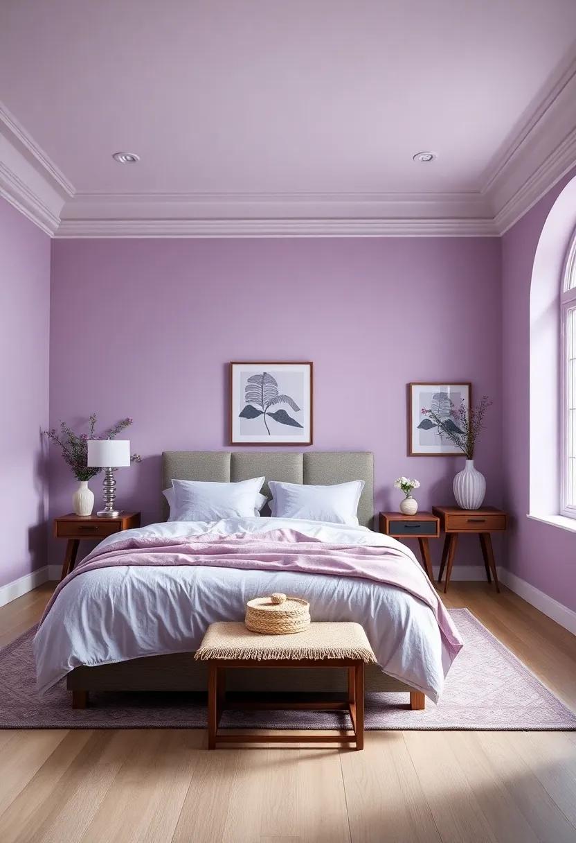
Pale Lilac invites a serene and whimsical aura into your bedroom,wrapping the walls in a tender wash of pastel purple that feels both soothing and sophisticated. This delicate hue offers the perfect balance between subtlety and character, making it an ideal choice for those seeking to cultivate a tranquil retreat without sacrificing style. Pair it with soft whites and muted greys to enhance its calming effect, or introduce warm metallic accents like rose gold or copper to add a hint of luxury and depth.
Beyond aesthetics, Pale Lilac complements a wide array of décor styles, from modern minimalist sanctuaries to vintage-inspired cozy nooks. Its gentle charm softly reflects natural light, brightening your space while maintaining a restful atmosphere — perfect for unwinding at the end of the day. For a carefully curated look, consider combining Pale Lilac with textures like plush velvet throws or linen drapes to create layers of comfort and elegance.
Warm Mushroom – Earthy and elegant, this soft grayish-brown creates a relaxing, nature-inspired retreat

Subtle yet sophisticated, this intriguing hue blends muted gray with warm brown undertones, creating a soothing backdrop that invites calm and comfort. Its soft, organic tones evoke the feeling of forest floors and cozy cabins, making it an ideal choice for bedrooms that aim to reconnect with nature without overpowering the senses. Pair it with textured linens, woven baskets, and leafy plants to elevate the natural vibe and add depth to your sanctuary.
Complementary decor ideas:
- Warm ivory or creamy white bedding for gentle contrast
- Deep green accents to amplify the earthy essence
- Natural wood furniture with rich grain patterns
- Bronze or matte gold lighting fixtures to add subtle elegance
| element | Recommended Options |
|---|---|
| Accent Pillows | Olive green, soft beige, terracotta |
| Wall Art | Botanical prints, abstract earth tones |
| Flooring | Light oak hardwood or neutral jute rugs |
| Window Treatments | Sheer curtains or linen drapes in warm neutrals |
The Way Forward
No matter your taste or mood, these 27 stunning bedroom paint colors offer the perfect palette to transform your space into a haven of style and serenity. Whether you seek calming neutrals, bold statements, or soft pastels, your dream bedroom is just a brushstroke away. Ready to refresh your retreat? Pick your favorite hue and let your walls tell your story.
As an Amazon Associate I earn from qualifying purchases.