25 Stunning Two-Tone Garden Fence Designs to Elevate Your Outdoor Space Elegantly
A garden fence does more than mark the boundaries of yoru outdoor space — it sets the tone for your entire garden’s aesthetic. If you’re looking to add a touch of sophistication and visual interest, two-tone garden fences offer the perfect blend of style and function. In this curated list of 25 stunning two-tone garden fence designs, you’ll discover a variety of creative ideas that elevate any landscape, from subtle contrasts to bold statements. Whether you prefer classic combinations or modern twists, this collection will inspire you to transform your garden perimeter into a striking centerpiece that complements your outdoor oasis with elegance and charm.
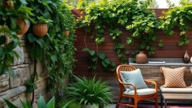
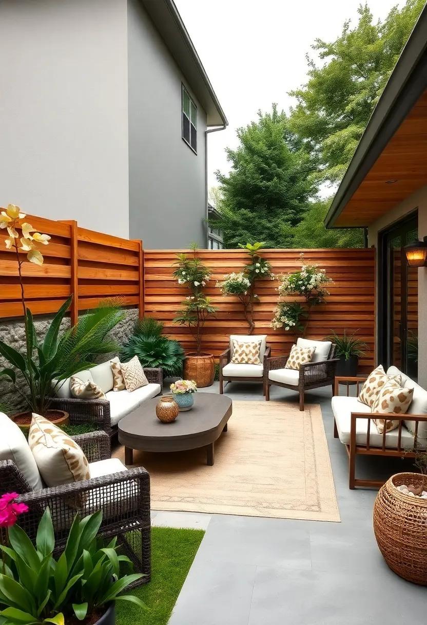
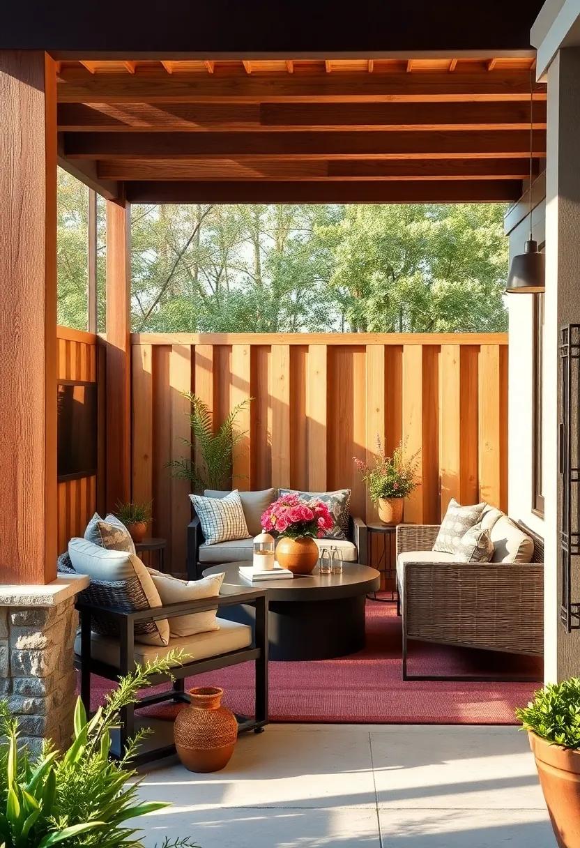
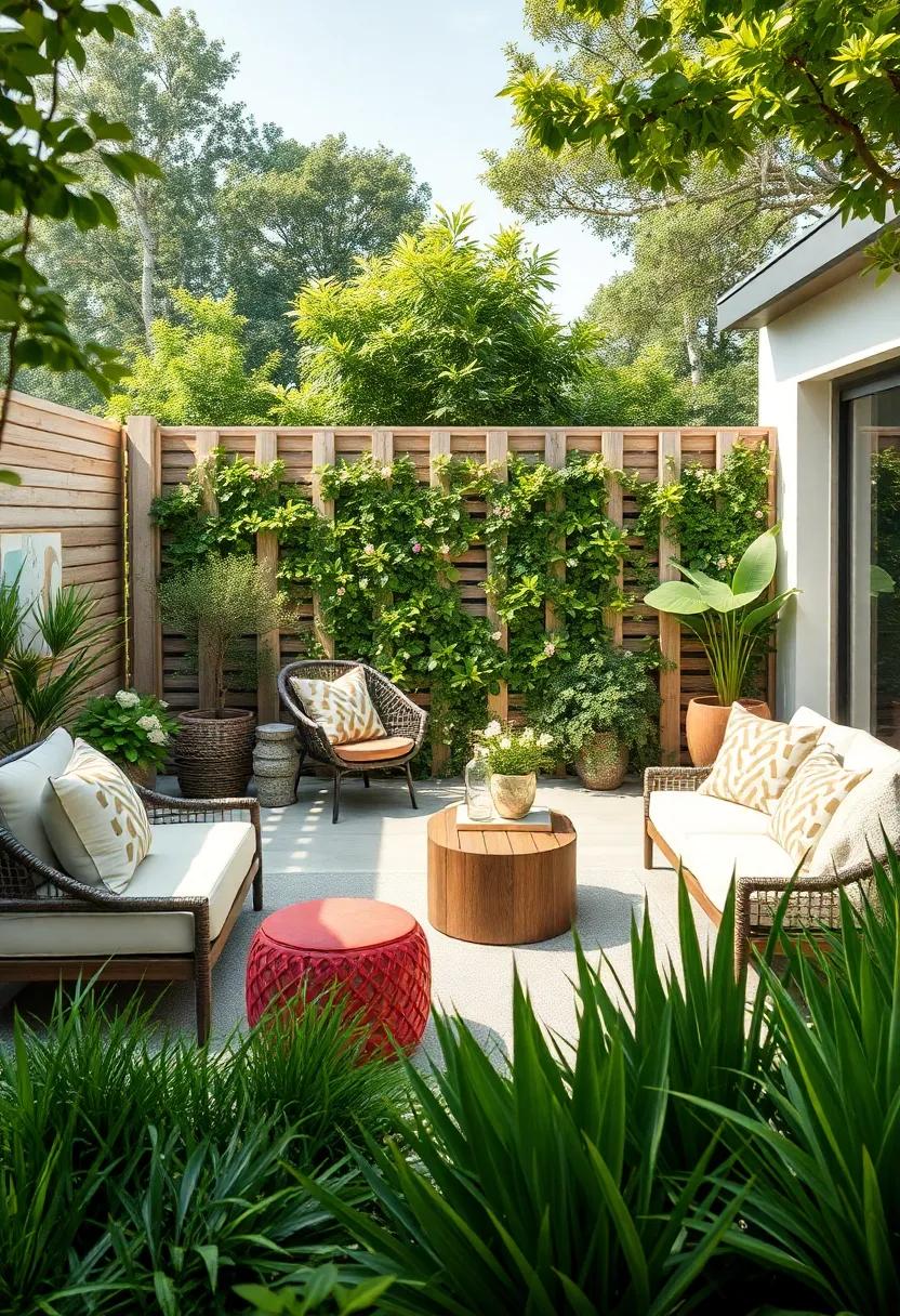
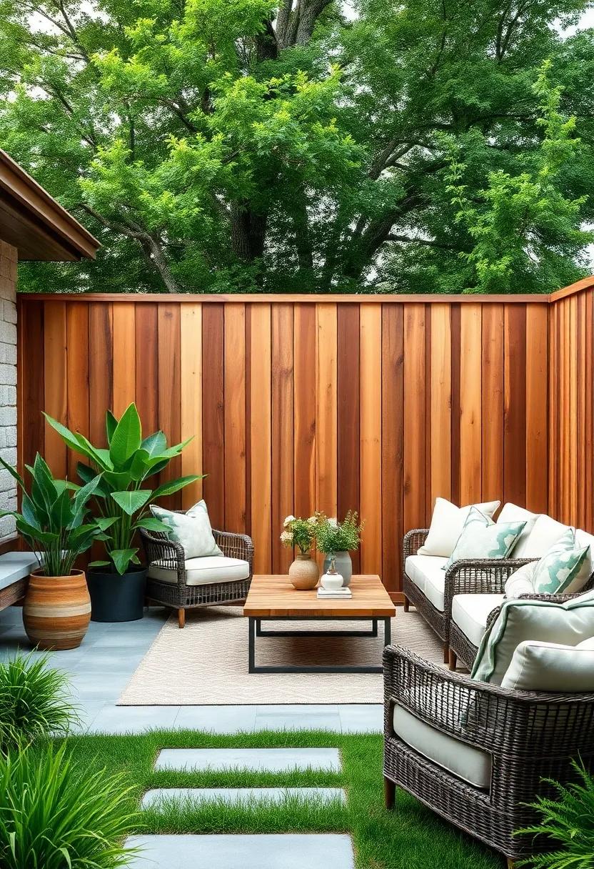
Classic White and Natural Wood: A timeless blend that brings warmth and brightness to any garden setting

Combining the crispness of white paint with the organic texture of natural wood creates a garden fence that is both refreshing and inviting. This design flawlessly balances brightness and warmth,making your outdoor area feel open and serene throughout every season. The white elements brighten the space and provide a clean backdrop, while the natural wood sections add depth and rustic charm. Whether crafted from cedar, pine, or oak, the wood’s grain becomes a subtle statement piece, celebrating nature’s artistry in a sophisticated frame.
Consider featuring alternating horizontal slats or vertical posts to emphasize the contrast, or incorporate a natural wood top rail with smooth white pickets below for a classic touch. This pairing works beautifully with a variety of garden styles, from cottage and coastal to contemporary minimalist. It’s also an excellent canvas for landscaping details such as climbing vines or colorful flower beds, enhancing your outdoor ambiance with a refreshing yet timeless aesthetic.
- Versatile styles: picket, horizontal, lattice
- Wood options: cedar, teak, redwood
- Maintenance tips: weather-resistant finishes, annual touch-ups
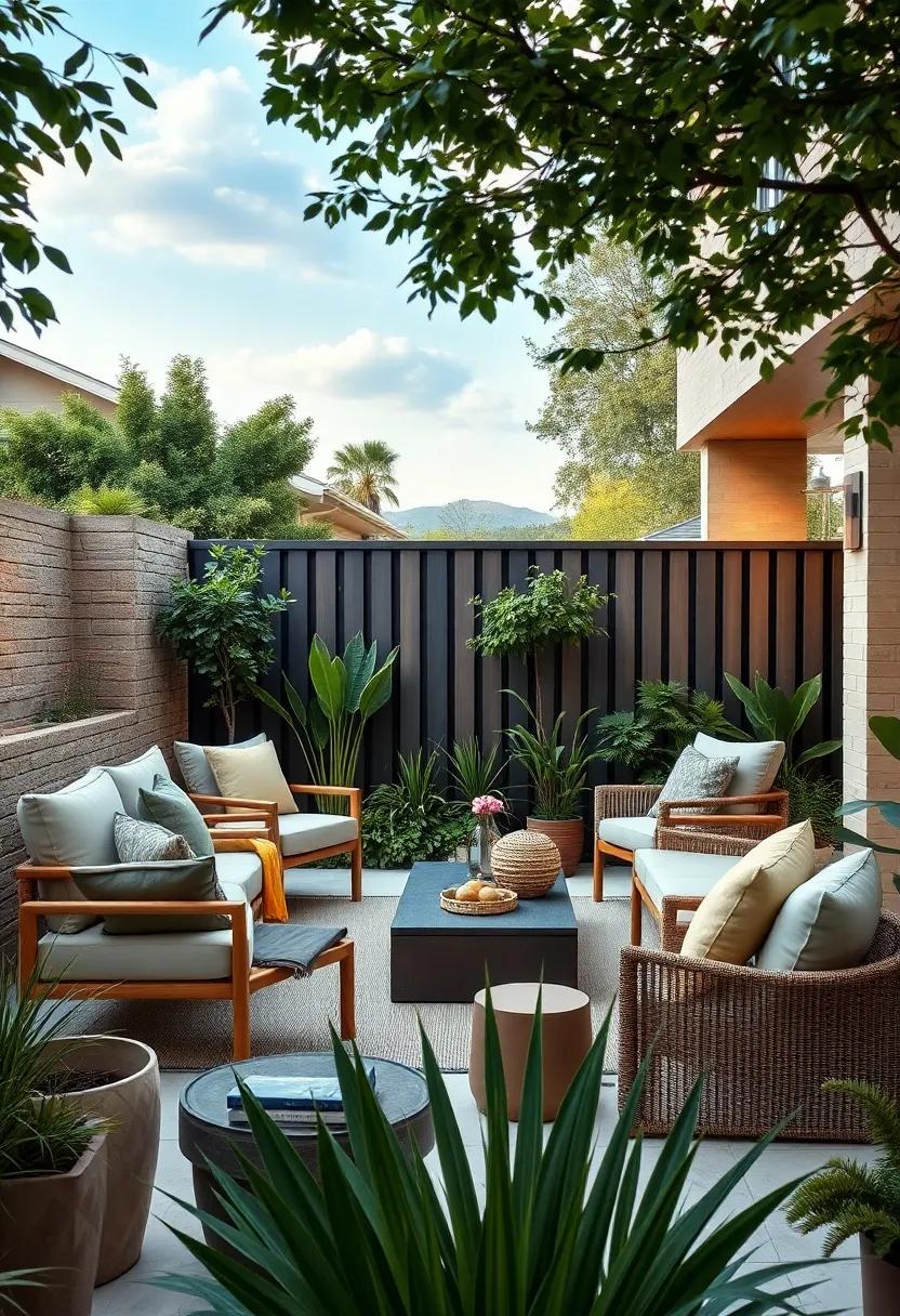
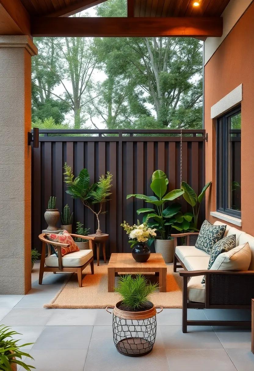
Charcoal Gray and Light Cedar: Modern contrast with a rustic touch for contemporary outdoor spaces

Charcoal gray combined with the warm hues of light cedar creates a striking visual balance that effortlessly blends modern sophistication with rustic charm. This pairing works beautifully in outdoor spaces, where the deep, muted tone of charcoal introduces a sleek, contemporary edge, while the natural, honey-like cedar infuses warmth and texture. Use charcoal gray as the primary fence color to establish a bold framework, accented by horizontal or vertical cedar slats that soften the overall appearance and enhance the inviting vibe of your garden. This dynamic duo suits minimalist landscaping and greenery-filled retreats alike, offering a versatile backdrop for flowers, shrubs, and outdoor furniture to truly shine.
To elevate the design further,consider incorporating subtle details like matte black metal fixtures or integrated lighting that complements both colors without overpowering them. The contrast between the cool gray and the organic cedar grain also lends itself well to innovative patterns—think alternating panels or staggered heights—that add depth and dimension to your fence. Below is a simple comparison to highlight how each tone contributes to the aesthetic and practical qualities of the fence.
| Feature | Charcoal Gray | light Cedar |
|---|---|---|
| Visual Impact | Modern, bold, sleek | Warm, natural, inviting |
| Texture | Smooth, matte finish | Grainy, organic |
| durability | Low maintenance, weather-resistant paint | Natural resilience with proper sealing |
| Design Use | Framing and structure | Accents and panels |
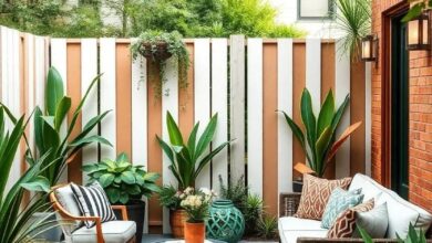
Black and Natural Bamboo: Sleek and sustainable, this pairing adds a chic vibe with eco-friendly flair
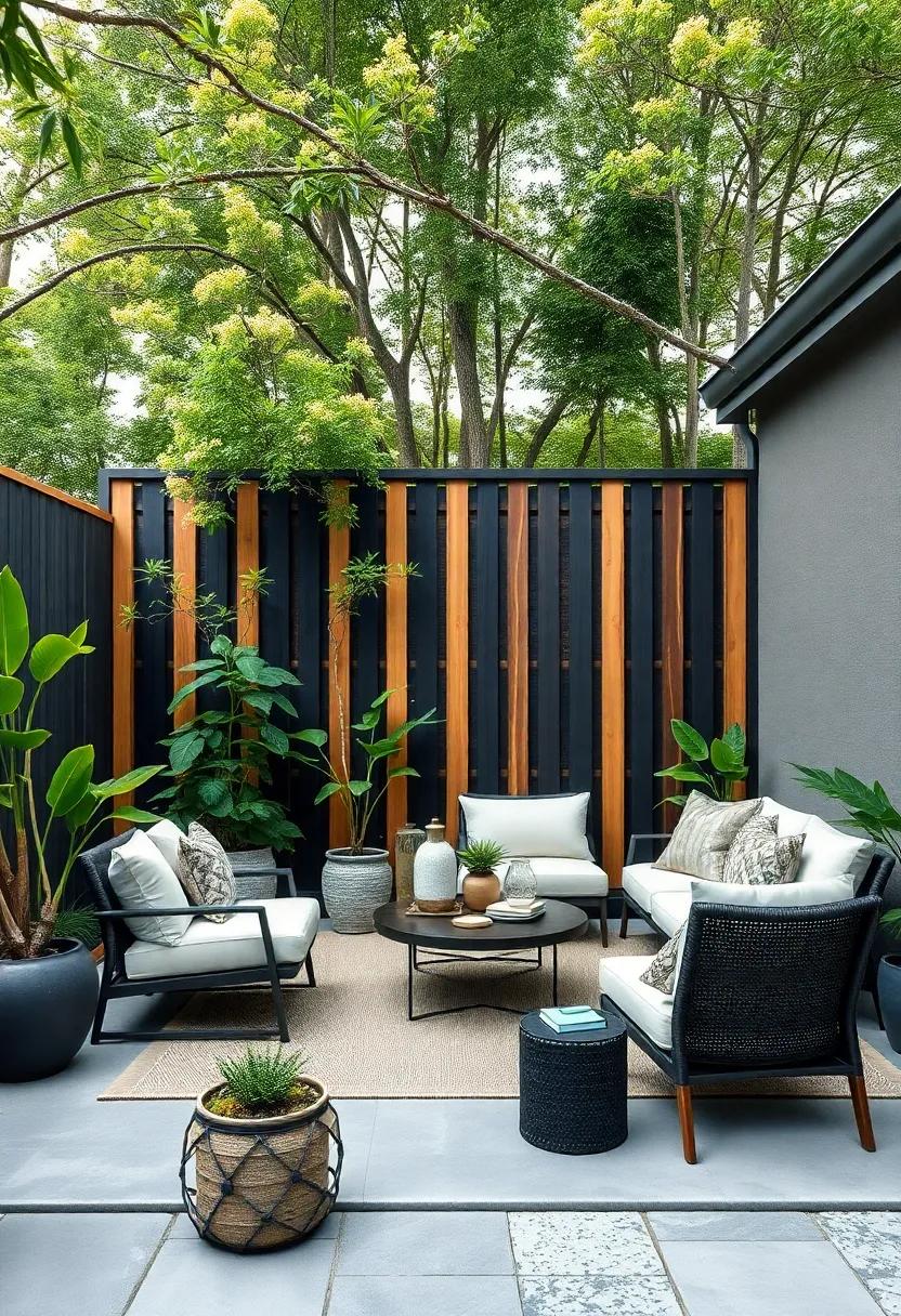
Combining the deep, rich tones of black with the natural warmth of bamboo creates a garden fence design that’s both modern and rooted in sustainability. The stark contrast between these hues instantly elevates any outdoor space, offering a sleek silhouette against lush greenery. Bamboo slats framed or accented by black steel or timber bring a minimalist yet eye-catching aesthetic, perfect for homeowners who want to make a bold statement without sacrificing eco-conscious choices.
Beyond its visual appeal,this pairing is incredibly durable and environmentally friendly. Bamboo grows rapidly and requires minimal resources,making it a prime choice for those mindful of their ecological footprint. Meanwhile, the black elements often involve powder-coated metals or sustainably sourced woods, ensuring longevity and resistance to the elements. Together, they form a harmonious blend of style and sustainability that effortlessly enhances privacy and adds a touch of sophistication to your garden fence.
Navy Blue and Whitewashed Oak: Nautical inspiration meets farmhouse charm for a serene backyard retreat
Bring a breath of coastal breeze to your garden with the harmonious blend of navy blue and whitewashed oak. This dual-tone fence style captures the crisp freshness of nautical design while infusing the warmth and rustic appeal of farmhouse charm. The navy blue slats serve as a bold, grounding base that contrasts beautifully with the weathered, soft grain of whitewashed oak panels. Together, they conjure images of serene seaside cottages and sun-dappled porches, making your outdoor space feel like a tranquil escape by the shore.
Perfectly suited for those desiring a peaceful, inviting ambiance, this design pairs exceptionally well with natural landscaping elements such as creeping ivy, wildflowers, and driftwood accents. Consider mixing matte navy paint with raw textured oak finishes to enhance tactile depth and visual intrigue. For an elevated touch,incorporate decorative hardware in brushed nickel or rustic bronze.This combo not onyl celebrates the charm of coastal simplicity but also offers a versatile backdrop that complements both modern and customary outdoor living spaces.
Matte Black and Warm Walnut: Bold and elegant, perfect for making a sophisticated statement

Combining the striking depth of matte black with the comforting richness of warm walnut creates a garden fence that exudes both modernity and timeless charm. This pairing highlights the sleek silhouette of black metal framing against the natural grains of walnut wood panels, offering a captivating contrast that catches the eye without overwhelming the senses. Ideal for those who appreciate subtle luxury, this duo works beautifully in contemporary gardens or classic outdoor settings, effortlessly enhancing the ambiance with a hint of sophistication.
Key features of the matte black and warm walnut fence design:
- Durable powder-coated black metal for weather resistance and longevity
- Warm walnut planks treated for enhanced grain texture and natural appeal
- Customizable heights and panel widths for privacy and style balance
- Minimalist design accents complementing both geometric and organic landscaping
| Feature | Benefit |
|---|---|
| Matte Black Frame | Offers sleek elegance and resists fading or chipping |
| Warm Walnut Panels | Add warmth and inviting natural textures |
| Modular Design | Enables easy installation and future customization |
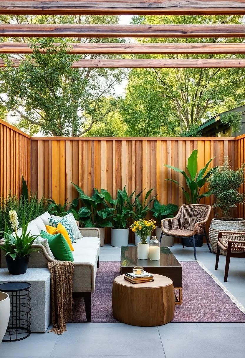
Olive Green and Natural Pine: Earthy tones that harmonize beautifully with lush greenery

Bringing together the warm, muted richness of olive green with the soft, natural hue of pine wood creates a garden fence that feels like a seamless extension of your outdoor surroundings.This color combination works wonders in lush garden settings, where the olive subtly mirrors the greenery while the natural pine adds texture and a hint of rustic charm. Whether you opt for vertical slats or a lattice design, the contrast between these earthy tones adds depth without overpowering the flora, making your fence a quiet yet sophisticated statement piece.
Incorporating these shades into your fence design can also enhance the overall ambiance of your garden. Olive green provides a serene backdrop that visually recedes, allowing the plants to shine, while the natural pine** breaks up the palette with its organic warmth. This duo pairs beautifully with climbing vines like jasmine or wisteria, accentuating the greenery’s vibrancy. Below is a quick guide on how to balance these tones for different fence styles:
| Fence Style | Olive Green Usage | Natural Pine Usage | Ideal Complement |
|---|---|---|---|
| Slatted Vertical | Frames and posts | Slats | Climbing ivy |
| Lattice Panels | Outer border | Cross-hatch pattern | Flowering vines |
| Half-Height Fence | Bottom half | Top trellis | Hanging planters |
Soft Cream and Dark Mahogany: Subtle luxury that adds depth and refinement to your garden perimeter
Embracing a palette of soft cream and dark mahogany brings a timeless sophistication to your garden perimeter that whispers elegance without shouting for attention. The gentle warmth of cream paints a serene backdrop, while deep mahogany injects a grounded, natural richness—together crafting a visual harmony that effortlessly blends with both contemporary and classic landscapes. This duo elevates simple fence designs into architectural statements, offering a tactile play of light and shadow that shifts throughout the day, inviting quiet contemplation and understated grandeur.
Beyond aesthetics, this color combination offers practical benefits that enhance your outdoor sanctuary:
- Versatility: Complements a wide range of greenery and flowers, allowing your garden’s natural beauty to shine.
- Durability: Dark mahogany tones frequently enough mask minor dirt and weathering,reducing maintenance needs.
- Depth Perception: The contrast visually expands the perimeter,making smaller yards feel more inviting and expansive.
- Timeless Appeal: Both colors transcend trends, promising that your fence remains stylish for years to come.
Slate Blue and Honey Beechwood: cool and inviting colors that create a calming outdoor ambiance

Slate Blue brings a serene, almost ethereal quality to garden fencing, making it an ideal choice for creating a tranquil backdrop. Its cool undertones evoke a sense of calm, seamlessly blending with natural greenery while providing a subtle pop of color.When paired with Honey Beechwood,the warmth of the rich,golden wood contrasts beautifully with the cool blue,lending the fence an inviting yet sophisticated aura.This combination is perfect for gardens designed as peaceful retreats, where every detail fosters relaxation and balance.
- Slate Blue’s muted depth enhances the lushness of plants without overwhelming the space.
- Honey beechwood’s natural grain adds texture and warmth that complements the cool tone perfectly.
- This duo works exceptionally well in coastal or woodland-inspired garden settings.
Imagine a fence where the upper panels showcase the velvety finish of Slate Blue,while the posts and lower rails flaunt the inviting glow of Honey Beechwood. This two-tone arrangement not only elevates the visual interest but also frames your outdoor space with a soft, welcoming charm. Whether your garden hosts quiet mornings with a cup of tea or lively gatherings at dusk, this color pairing instills an ambiance that is both calming and enticing.
Espresso Brown and Ivory: Rich and bright contrast that enhances garden textures and colors
Combining the deep, grounding espresso brown with the soft brightness of ivory creates a garden fence that beautifully balances warmth and light. This duo doesn’t just frame your garden—it accentuates every leaf, bloom, and shadow by providing a rich, neutral backdrop that allows natural textures to pop. The dark espresso planks bring depth and sophistication, while the ivory highlights inject a fresh, airy feel that prevents the design from becoming too heavy or monotonous.
Ideal for gardens bursting with colors or those with subtle, leafy greens, this combination enhances contrast without overpowering the natural palette. Consider alternating vertical espresso panels with ivory horizontal slats or vice versa to create eye-catching geometric patterns that add dimension and movement. The tactile interplay between the warm wood tones and pristine ivory finish works harmoniously with a variety of plants—from velvety ferns to glossy succulents—offering an elegant, timeless elegance that complements both modern and rustic outdoor spaces.
- Espresso Brown: Adds warmth, depth, and a modern edge.
- Ivory: Brings brightness, contrast, and a subtle softness.
- Texture Amplification: Enhances bark patterns, leaf veins, and flower details.
- Versatility: Matches with metal, stone, and natural wood accessories seamlessly.
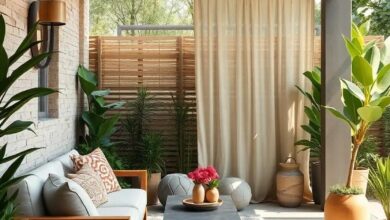
Teal and Driftwood Gray: A coastal-inspired duo that infuses freshness and character
Combining the tranquil depth of teal with the understated elegance of driftwood gray creates a garden fence that breathes coastal charm into any outdoor space. This refreshing duo evokes the essence of ocean breezes and sandy shores, offering a serene backdrop that complements lush greenery and vibrant blooms. Ideal for seaside cottages or urban gardens longing for a touch of nature’s calm, the interplay of these colors balances boldness with subtlety, making your fence not just a boundary but a statement piece.
Incorporate textured finishes like weathered wood or matte paint for added dimension, enhancing the organic feel that these hues inspire. Accentuate the design further with subtle decorative elements—such as nautical rope ties or minimalist post caps in brushed metal—that harmonize effortlessly with the palette. This pairing also works wonderfully with mixed materials, like metal framing or stone bases, to anchor your garden’s fresh character in both visual and tactile appeal.
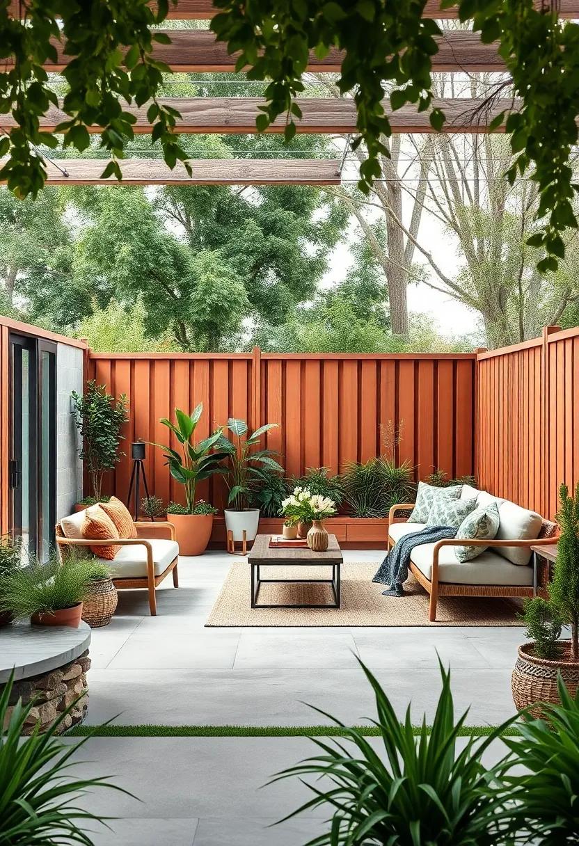
Burnt Sienna and Pale Birch: Warm, autumnal tones that evoke a cozy, natural feel
Combining Burnt Sienna with Pale birch introduces a warm, inviting vibe to your garden fence, perfectly capturing the essence of autumn. The rich, earthy hues of burnt sienna bring depth and vibrancy, reminiscent of falling leaves and crisp, woodsy air.Paired with the subtle, creamy tones of pale birch, this duo softens the boldness, offering a balanced aesthetic that exudes comfort and natural elegance. This color combination works remarkably well in outdoor spaces surrounded by greenery, as it complements the foliage without overpowering it.
For a seamless look, consider using burnt sienna on the main fence panels while applying pale birch to the posts and trim. This approach highlights architectural details and adds visual interest with subtle contrast.to inspire your design choices, here’s a quick reference table showcasing ideal pairings for different fence materials:
| Fence Material | Burnt Sienna Usage | Pale Birch Usage |
|---|---|---|
| Wooden Slats | Vertical Panels | Horizontal Rails & Posts |
| Composite | Front Facing Panels | Top Caps & Trim |
| Metal Frame | Fence Panels | Base & Accent Strips |
Charcoal and Frosty White: Crisp dichotomy that defines modern elegance and clean lines
Achieving a balance between boldness and subtlety, the interplay of charcoal and frosty white in garden fence designs offers a visual narrative of modern sophistication.Charcoal’s deep, grounding hue forms a striking backdrop that enhances the purity of frosty white accents. this contrast not only accentuates the clean lines of contemporary fences but also adds depth and dimension to outdoor boundaries. The resulting aesthetic is one of crisp dichotomy—where dark and light coexist seamlessly, defining spaces that exude both strength and serenity.
- Charcoal panels provide durability and a timeless matte finish that resists weathering.
- Frosty white rails or trims amplify the structure’s geometry with a fresh, clean edge.
- Textured wood or composite materials in these tones bring tactile interest to minimalist designs.
| Design Element | Charcoal | Frosty White |
|---|---|---|
| Visual Impact | Bold, grounding | Bright, accentuating |
| Maintenance | Low visibility of dirt | Requires regular cleaning |
| Best Materials | Metal, composite wood | Painted timber, vinyl |
Forest Green and Raw bamboo: Deep natural hues embody an organic, woodland aesthetic
Infuse your outdoor sanctuary with the serene essence of a lush forest by combining forest green and raw bamboo tones in your garden fence design. This duo perfectly captures the spirit of woodland tranquility, offering a deep, organic atmosphere that complements natural landscapes. The rich green hues echo the vibrant foliage, while untreated bamboo elements introduce a warm, raw texture—bringing a tactile depth that feels both earthy and refined. This color pairing doesn’t just create boundaries; it crafts an immersive experience, inviting the outdoors in and softening transitions between your garden and its surroundings.
Beyond aesthetics,this palette lends itself to environmentally conscious styles and sustainable materials. Versatile and timeless, fences in these hues coordinate beautifully with:
- Wildflower beds and native shrubs
- Stone pathways and natural rock features
- Woodland-inspired garden decor like lanterns and birdhouses
The contrast of deep green paint against the subtle golden streaks of bamboo manifests a subtle visual rhythm, evoking calm and harmony in your outdoor space. Whether crafted as a solid panel or slatted design, this combination serves as a statement piece that blends functionality with the rustic allure of untouched nature.
Soft Lavender and Weathered Gray: unique, subtle pops of color paired with muted tones for a gentle charm

Introducing a delicate interplay of hues, this pairing brings an effortless elegance to any garden fence. The soft lavender offers just a hint of floral inspiration, evoking images of tranquil fields and subtle blooms, while the weathered gray grounds the design with a rustic, time-worn charm. Together, they create a balanced ambiance that feels both fresh and cozy, perfect for those seeking an understated statement that doesn’t overpower the natural beauty surrounding it.
Key Features:
- Soft lavender panels providing a gentle splash of calm color
- Weathered gray slats or posts adding muted texture and depth
- Ideal for cottage-style or modern rustic gardens
- Complements greenery without clashing or fading into the background
| Material | Finish | Best Use |
|---|---|---|
| Cedar Wood | Matte weathered gray | Posts and frame |
| Hardwood Panels | Soft lavender stain | Fence infill |
| Metal accents | Brushed silver | Hinges and latches |
Deep Burgundy and Light Maple: Rich and inviting, evoking a sense of timeless beauty
Combining the deep, velvety hues of burgundy with the soft, natural warmth of light maple creates a garden fence design that exudes sophistication and comfort. This pairing invites the eye to linger, blending the boldness of the rich red tones with the subtlety of the pale wood to craft an outdoor boundary that’s both striking and welcoming.Picture the dark burgundy slats acting as a dramatic backdrop,while the light maple accents highlight intricate details or frame the fence panels,adding depth and intricate texture to the overall look.
The charm of this duo lies in its timeless appeal—perfect for traditional gardens yearning for a touch of classic charm,yet versatile enough to complement modern landscaping styles. When illuminated by natural sunlight, the fence transforms throughout the day, with the burgundy deepening in the golden hours and the maple brightening, infusing your outdoor space with a dynamic, ever-changing aura of elegance. Consider pairing this color combination with lush evergreens or flowering shrubs to maximize visual contrast and create a sanctuary that feels rooted in nature yet impeccably styled.
- Visual Appeal: Bold contrast balancing warmth and depth
- Versatility: Suits both classic and contemporary garden styles
- Material Options: Stained hardwood, cedar, or durable composites
- Complementary Plants: Evergreens, hydrangeas, and dark-leaved shrubs
| Characteristic | deep Burgundy | Light Maple |
|---|---|---|
| Visual Impact | Rich & dramatic | Soft & airy |
| Weathering | Retains color well | Develops gentle patina |
| Maintenance | Requires periodic staining | Needs occasional sealing |
| Style Compatibility | Traditional & rustic | Modern & natural |
Mustard Yellow and Rustic Oak: Cheerful warmth combined with classic texture for lively garden borders
Bring an invigorating splash of sunshine to your garden with mustard yellow paired alongside the deep,earthy tones of rustic oak. This combination merges the bright cheeriness of mustard—a hue that instantly lifts spirits—with the grounding, tactile appeal of natural wood textures. The vibrant yellow panels or slats serve as bold highlight streaks, catching light and eyes alike, while rustic oak frames or posts anchor the design in timeless elegance. This fusion not only enlivens garden borders but also creates a welcoming transition from lush greenery to structured space, making your fence a true outdoor centerpiece.
Embrace the versatility of this palette for diverse fence styles, from sleek horizontal lays to charming picket forms.Consider adding subtle decorative elements such as woven texture inserts or staggered heights to amplify visual interest without overwhelming the senses. Below is a quick guide to balance these colors effectively for maximum impact:
| Element | Color Application |
|---|---|
| Main Panels | Mustard Yellow (60%) |
| Support Posts | Rustic Oak (40%) |
| Accent Features | Woven Oak Inserts |
- Durability Tip: Seal and varnish your rustic oak components to weatherproof without dulling the rich hues.
- Contrast Play: Use matte finish for the mustard yellow panels to prevent glare and keep a warm glow.
- Complementary Planting: Pair with flowering shrubs like marigolds or sunflowers to mirror the fence’s uplifting vibe.
Smoky Blue and Soft Sand: A soothing combination reminiscent of desert landscapes

Infuse your garden with the tranquil beauty of nature’s own palette by combining smoky blue with soft sand hues. This pairing evokes the serene vastness of desert landscapes,offering a subtle yet striking aesthetic that brings peace and harmony to your outdoor haven. Imagine a fence where muted blue slats blend effortlessly with sand-colored posts or panels, creating a visual rhythm that mimics endless dunes under a hazy sky.
Besides its calming effect, this color duo lends itself perfectly to a variety of garden styles—from modern minimalist to rustic bohemian. Use this combination to:
- Enhance natural landscaping with a grounded, organic vibe.
- Highlight green foliage and vibrant blooms by contrast.
- Craft a subtle backdrop that lets other design elements shine.
| Feature | Benefit |
|---|---|
| Color Harmony | Balance between cool and warm tones enhances visual interest |
| Material Compatibility | Ideal for wood, metal, or composite fencing materials |
| Style Flexibility | Works with both sleek contemporary and natural rustic designs |
Blackened Steel and Birchwood: Industrial meets natural for an edgy yet approachable fence design
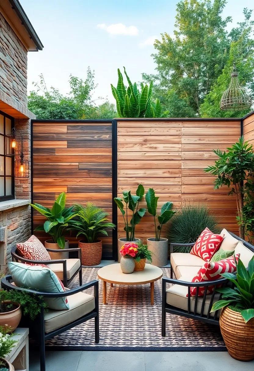
Marrying the raw intensity of blackened steel with the warm, inviting tones of birchwood, this fence design strikes a perfect balance between industrial grit and natural charm. The deep, matte finish of the steel frames or vertical slats offer structural rigidity and a dramatic, urban edge, while the birchwood panels soften the overall aesthetic.This combination is ideal for homeowners seeking to make a bold statement without compromising approachability or warmth. The natural grain of birchwood introduces subtle texture and life, contrasting beautifully with the steel’s sleek, almost sculptural presence.
Incorporating this two-tone design into your garden transforms ordinary boundaries into living artworks. Its versatility makes it suitable for a variety of outdoor settings—from modern minimalist estates to rustic cottages craving a contemporary update. You can customize the width and spacing of the steel and wood sections to play with light and privacy, creating a dynamic fence that changes with the seasons. Consider pairing this with steel hardware or birchwood seating to amplify the cohesive, thoughtfully curated look.
Coral Pink and Driftwood: Unexpected and playful, adding a dash of vibrancy to your outdoor space
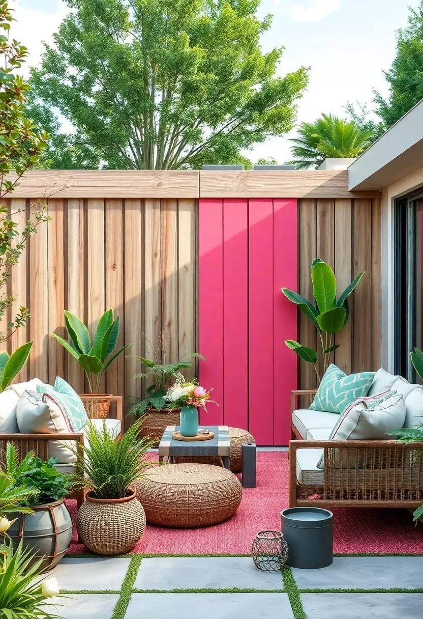
Inject a playful twist into your garden aesthetic by pairing coral pink with the understated charm of driftwood gray. This unexpected duo brings a refreshing contrast where the warmth and cheerfulness of coral pink create pops of lively energy against the calming, textured backdrop of weathered driftwood tones. Whether applied as alternating panels or a subtle gradient, this combination beautifully balances vibrancy and rustic elegance, making your fence not just a boundary, but a bold artistic statement.
- Visual Impact: Coral pink panels draw the eye, while driftwood softens with organic imperfection.
- Material Harmony: Complement the hues with natural wood finishes or matte metal accents for cohesion.
- Seasonal Versatility: Both colors work harmoniously across all seasons, enhancing blooming gardens and autumnal shades alike.
| Feature | Coral Pink | Driftwood Grey |
|---|---|---|
| Mood | Energetic, Warm | Calming, Earthy |
| Best Finish | Semi-gloss to highlight color | Matte or distressed wood |
| Pairing Tips | Fresh greenery, light stone | Natural textures, soft neutrals |
Moss Green and White Pine: Fresh and natural, seamlessly blending with any garden style
Pairing the deep, earthy hues of moss green with the soft, muted tones of white pine creates a fence design that’s both refreshing and timeless.This combination evokes a strong connection to nature, seamlessly integrating with lush garden foliage or minimalist landscapes alike. Whether your outdoor space leans toward rustic charm or modern simplicity, this two-tone scheme amplifies the sense of tranquility and organic beauty, making the boundary an extension of your garden rather than a barrier.
Beyond aesthetics, choosing moss green and white pine lends itself well to durability and versatility. The white pine’s pale texture brightens shaded areas, while the moss green adds depth and visual interest. consider incorporating these colors through alternating panels or horizontal slats to create subtle contrast without overpowering the natural setting. Below is a quick glance at the benefits this duo offers for your garden fence:
| Feature | Moss Green | White Pine |
|---|---|---|
| Visual Effect | Earthy, grounding | Light, airy |
| garden Style Fit | Rustic, woodland | Modern, minimalist |
| Maintenance | Fade-resistant | Requires periodic sealing |
Graphite and Light Ash: Sleek, contemporary tones that give a polished, sophisticated look
Combining the deep, velvety depths of graphite with the airy softness of light ash creates a striking contrast that promptly elevates any garden fence design. This duo offers a refined balance between bold and subtle, making your outdoor space feel both modern and inviting. Ideal for minimalist gardens or urban settings, the interplay of charcoal hues with gentle ash highlights clean lines and enhances architectural features without overpowering the natural surroundings.
Beyond aesthetics, this color pairing lends itself beautifully to various materials like metal, wood, and composite panels. Consider integrating sleek, dark graphite slats framed with pale ash supports for a dynamic visual rhythm. Here are a few creative ideas to maximize their potential:
- Vertical stripes: Alternate narrow graphite and light ash panels for a subtle pattern that elongates space.
- Frame accentuation: Use graphite as the primary fence color with light ash outlining edges and posts for a seamless, polished appearance.
- Textural blend: Pair smooth graphite metal panels with rougher ash wood to add tactile interest.
| Material | Graphite Finish | Light Ash Finish | Visual Effect |
|---|---|---|---|
| Wood | Matte charcoal stain | Brushed pale gray | Warm yet contemporary contrast |
| Metal | Powder-coated dark gray | Raw aluminum or silver paint | Industrial chic with depth |
| Composite | Satin graphite gray | Soft-light ash texture | Durable and sleek harmony |
Terracotta and Pale Spruce: Earthy and subtle, offering warmth without overpowering the surroundings
Combining the rich, grounded hues of terracotta with the soft, muted tones of pale spruce, this color pairing creates a garden fence that whispers warmth and calm. The terracotta injects a rustic vibrancy reminiscent of sunbathed earth, while pale spruce introduces a cool, subtle contrast that prevents the fence from overwhelming the natural beauty surrounding it. This duo works exceptionally well in gardens with abundant greenery, allowing the fence to blend in while still standing out as an elegant architectural detail.
Ideal for both modern and traditional outdoor spaces, the blend balances warmth and subtlety, making it a versatile choice. Use terracotta on the main panels to create a striking yet natural presence, then frame them with pale spruce for a delicate outline that enhances depth and dimension. The effect is effortlessly sophisticated, allowing your garden’s colors to pop without competing for attention.
| Feature | Terracotta | Pale Spruce |
|---|---|---|
| Atmosphere | Warm,earthy,inviting | Cool,soft,calming |
| Best For | Sunlit gardens,rustic homes | Contemporary,minimalist settings |
| Complementary Elements | Terracotta pots,natural stone | Soft textiles,light wood accents |
Rustic Red and Cream: Classic country charm with a bright twist to invigorate your garden
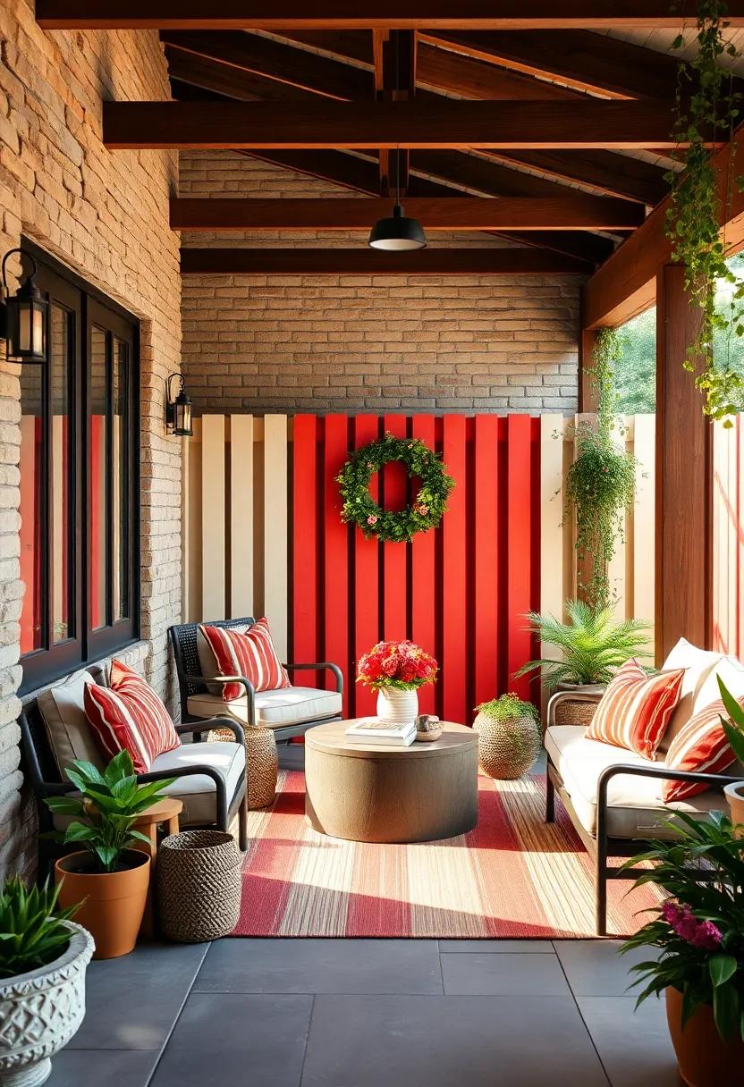
Infuse your garden with timeless appeal by pairing rustic red with a crisp cream hue, creating a vibrant yet classic fence design that reflects the heart of country living. This two-tone combination balances warmth and brightness, making your outdoor space inviting and full of character. Whether crafted from weathered wood panels or textured pickets,the rich red tones ground the structure in tradition,while the cream accents highlight architectural details and provide a cheerful contrast that brightens up the greenery around it.
Elevate this look by incorporating subtle finishes like aged metal fixtures or hand-painted motifs in your two-tone fence. Consider a layout featuring vertical cream pickets bordered by broad rustic red rails, or alternate slats for a dynamic interplay of color and texture. Below is a simple guide to effectively balancing these hues:
| Design Element | Rustic Red | Cream |
|---|---|---|
| Main Body | Fence posts & bottom panels | Pickets & decorative trims |
| Texture Finish | Distressed wood or matte paint | Smooth,glossy accents |
| Complementary Details | Rustic metal hinges | Light-reflecting caps |
Navy and Burnt umber: Deep,luxurious colors perfect for a stately garden fence presence
When it comes to creating an aura of sophistication and timeless elegance around your garden, pairing navy with burnt umber sets a compelling visual tone. This duo evokes a sense of depth and warmth, making your fence not just a boundary but a statement piece. The rich, inky blue of navy acts as a cool, grounding backdrop, while burnt umber introduces an earthy contrast that feels both inviting and stately. Together,they complement natural foliage beautifully,enhancing greenery with bursts of color that never overwhelm.
To achieve a balanced look, consider using navy for the larger fence panels or slats, and implement burnt umber for posts, trims, or decorative accents. This approach allows the burnt orange undertones to pop against the dark blue, adding texture and dimension to the structure. The combination works especially well in classic and rustic garden themes, but also adapts effortlessly to modern designs where understated luxury is key.
| Color | Visual Effect | Best Application |
|---|---|---|
| Navy | Calm, deep, Grounding | Fence Panels, Main Body |
| Burnt Umber | Warm, Earthy, Inviting | Posts, Trims, Decorative Highlights |
- Tip: Use matte finishes to amplify the depth of colors and avoid glare under sunlight.
- Tip: Integrate natural wooden textures or stone pathways to complement the burnt umber accents.
- Tip: Add climbing vines with warm-toned flowers to harmonize with the burnt umber and contrast gently with navy.
soft Peach and Weathered Cedar: Delicate hues paired with rugged textures for a beautifully balanced design
There’s somthing undeniably charming about the juxtaposition of soft peach tones with the rich,tactile appeal of weathered cedar. This duo brings together warmth and texture in a way that feels both inviting and artisanal. The gentle blush of peach subtly brightens the rustic grains and knots of cedar, creating a visual dialogue that softens the rugged exterior. It’s a perfect balance that invites the eye to linger, making your garden fence not only a boundary but a beautiful statement piece that complements natural greenery and floral arrangements.
Incorporating this palette into your fencing can transform an ordinary outdoor space into a serene retreat. Consider using soft peach on vertical slats or panels to add a touch of lightness,while the cedar frames and horizontal beams root the design firmly in nature. Mix and match with minimalist planters, aged metal fixtures, or stone accents for a harmonious overall look. For a quick reference, here’s a simple guide to pairing these elements:
| Element | Recommended Hue/Texture | Effect |
|---|---|---|
| Fence Slats | Soft Peach Paint | Adds airiness and warmth |
| Support Beams | Weathered Cedar | Provides rugged structure and depth |
| Decorative Accents | Matte Black Metal | Creates elegant contrast |
| Plants & Greenery | Lush Greens & Pastel Blooms | Complements softness and texture alike |
To Conclude
With these 25 stunning two-tone garden fence designs, your outdoor space is ready to transform from ordinary to extraordinary. Whether you prefer subtle contrasts or bold statements, these styles offer a perfect blend of functionality and artistry to elevate your garden’s allure. Embrace the beauty of dual tones and let your fence become the frame that highlights the natural masterpiece beyond it. Your garden’s next chapter awaits—with elegance,color,and charm woven into every panel.
As an Amazon Associate I earn from qualifying purchases.