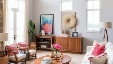
Timeless Elegance: Exploring Art Deco-Inspired Color Palettes for Design
in the realm of design, certain styles transcend time, captivating generations with their distinctive charm and sophistication. Among these, Art Deco stands as a beacon of elegance, blending bold geometry with luxurious details to create a visual language that is both striking and refined.Central to this enduring appeal are the color palettes that define the era—vibrant yet balanced,dramatic yet harmonious.This article delves into the world of Art Deco-inspired color schemes, exploring how these timeless combinations continue to influence contemporary design, offering a palette rich with history, glamour, and versatility. Whether reviving vintage flair or infusing modern spaces with classic allure, these hues invite designers and enthusiasts alike to rediscover the power of color in crafting timeless elegance.
The Rich Contrast of Black and Gold Illuminating Timeless Art Deco Glamour
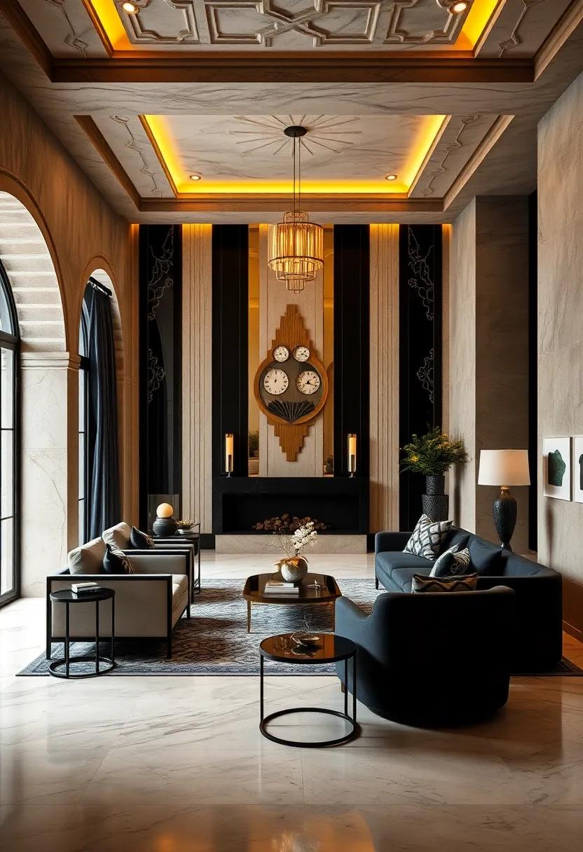
The interplay between deep black and radiant gold evokes a sense of opulence that transcends time. This duo captures the essence of Art Deco’s luxurious spirit, where sleek black surfaces act as a perfect canvas, allowing the shimmering gold accents to shine with bold intensity. The contrast creates a dynamic visual tension,balancing mystery and extravagance,making it a favourite for designers who seek to infuse their spaces with a dramatic yet refined ambiance.
When incorporating this palette, consider its versatility through various mediums and textures:
- Glossy black lacquer walls paired with matte gold fixtures enhance depth and sophistication.
- Black marble details with gold veining bring natural elegance to furniture or countertops.
- Gold leaf patterns on black fabrics add a tactile richness perfect for upholstery and drapery.
| Element | Black Finish | Gold Accent |
|---|---|---|
| Lighting | Matte black pendant | Polished brass lampshade |
| Furniture | Black velvet upholstery | Antique gold legs |
| Decor | Black ceramic vases | gold-trimmed mirrors |
Sophisticated Jewel Tones Evoking the Classic Elegance of art Deco Design
Embodying the allure of the Jazz Age, these deep, saturated jewel tones create an atmosphere of timeless grandeur and refined luxury. Think of the gleam of emeralds, the richness of sapphire blues, and the warmth of garnet reds—each hue carefully chosen to echo the lavish materials and bold geometric patterns characteristic of Art Deco interiors.their striking vibrancy is softened by balanced metallic accents like gold and bronze, which not only enhance the palette’s opulence but also bring a dynamic interplay of light and shadow to any design composition.
When integrating these palettes, consider pairing colors such as:
- Deep Emerald with soft champagne gold
- Midnight sapphire alongside muted brass tones
- Garnet Red contrasted with sleek black lacquer finishes
These combinations evoke a sophisticated mood without overpowering the space. To visualize their harmonious yet powerful impact, the following table outlines ideal pairings along with their suggested applications:
| Jewel Tone | Metallic Accent | Best Use |
|---|---|---|
| Emerald Green | Antique Gold | Accent walls & upholstery |
| Sapphire Blue | Brushed Bronze | Lighting fixtures & cabinetry |
| Garnet Red | Polished Brass | Decorative accessories & trims |
Opulent Metallic finishes Reflecting the Luxurious spirit of Art Deco Style
In the realm of Art Deco design,shining metallics become the ultimate expression of glamour and sophistication. Drawing from the era’s love for rich textures and bold contrasts, finishes in gold, brass, chrome, and copper not only illuminate spaces but also infuse them with an undeniable aura of opulence.These lustrous accents serve as a foundation for layering sumptuous colors,creating a dynamic interplay between light and shadow that defines the movement’s visual richness. When strategically incorporated, metallics transform ordinary surfaces into architectural statements, whether in lighting fixtures, furniture trims, or decorative detailing.
Key Metallic Finishes in Art deco Interiors:
- Gold: Radiates warmth and grandeur,frequently enough used in gilded moldings and mirrors.
- Brass: Offers a subtle glow, perfect for hardware and lighting elements.
- Chrome: Delivers a sleek, polished surface that epitomizes modernity and elegance.
- copper: Brings an earthy richness that complements jewel tones and deep hues.
| Finish | Characteristic | Best Paired Colors |
|---|---|---|
| Gold | Warm, Reflective | Navy, Emerald, Black |
| Brass | Softly Lustrous | Teal, Burgundy, Cream |
| chrome | Cool, Sleek | White, Charcoal, Sapphire |
| Copper | rich, Rustic | Mustard, Forest Green, Plum |
Vibrant Emerald and Sapphire Hues Creating a Regal Art Deco Ambiance
incorporating rich emerald and deep sapphire shades into an Art Deco palette instantly transports a space to an era of opulence and sophistication. These jewel tones, saturated and striking, form the perfect backdrop for geometric patterns and gilded accents that define the style. By balancing the lush vibrancy of emerald green with the cool depth of sapphire blue,designers craft environments that feel both regal and inviting—a testament to the timeless allure of the 1920s glamour.
Key elements that enhance this luxurious ambiance include:
- Metallic finishes: Gold,brass,or chrome fixtures amplify the lushness of the jewel tones.
- Textural contrasts: Velvet upholstery paired with polished marble or lacquered surfaces adds tactile richness.
- Geometric motifs: Sunbursts, zigzags, and chevrons emphasize the architectural elegance intrinsic to Art Deco.
| Hue | Design Impact | Complementary Materials |
|---|---|---|
| Emerald Green | Creates a lush, grounding effect | Velvet, Gold Leaf, Marble |
| sapphire Blue | Adds depth and cool refinement | Lacquer, Chrome, Glossy Wood |
Muted Pastels Infused with Art Deco geometry for a Delicate Modern Twist
Embracing a palette of muted pastels breathes new life into the structured boldness synonymous with Art Deco. Soft blushes, powder blues, and subtle sage greens harmonize gracefully with the era’s signature geometric motifs, creating an ambiance that feels both vintage and fresh. This fusion allows designers to balance restraint with opulence,offering spaces and visuals that whisper elegance rather than shout it. The interplay between gentle hues and sharp lines lends itself beautifully to interiors, branding, and fashion, where the past effortlessly compliments the present.
Key elements to consider when blending these styles include:
- Incorporating angular patterns like chevrons, fans, and sunbursts in soft colorways
- Utilizing matte and satin finishes to amplify pastel tones without overpowering the geometric design
- Pairing delicate colors with metallic accents such as brushed gold or aged bronze
- Balancing bold shapes with understated textures for visual depth
Below is a simple guide that pairs muted postels with corresponding Art Deco shapes for inspiration:
| Pastel Shade | Associated Geometry | Ideal Use |
|---|---|---|
| Blush Pink | Fan Motif | Accent walls, logos |
| Powder Blue | Chevron Pattern | Textiles, packaging |
| Sage Green | Sunburst Design | Furniture inlays, stationary |
| Soft Lavender | Octagonal Shapes | Tiles, digital backgrounds |
The Intersection of Bold Geometrics and Deep Mahogany Browns in Art Deco Schemes
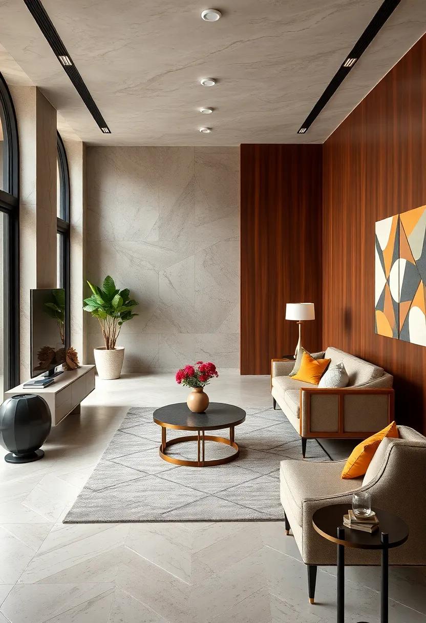
Art Deco design thrives on the dynamic tension between bold geometric patterns and the warmth of rich,deep mahogany browns. This marriage creates an evocative visual language where angular forms and luxurious textures coexist, offering both structure and sensuality to any space. Imagine sleek, repetitive chevrons or sunburst motifs in contrasting shades, perfectly set against the grounding backdrop of mahogany finishes—walls, furniture, or paneling—with their natural grain amplifying the sense of depth and sophistication.
Incorporating this palette into your interiors or artwork means embracing elements that stand the test of time, yet feel undeniably fresh.Consider these key features when crafting your design:
- Geometric Shapes: Triangles, zigzags, and hexagons forming striking visual rhythms
- Deep Mahogany Tones: Rich, warm browns that bring an earthy elegance
- Metallic Accents: Gold, brass, or chrome details to highlight and contrast
- Contrasting Textures: Smooth lacquered surfaces paired with tactile wood grains
| Design Element | Effect |
|---|---|
| bold Geometric Pattern | Creates visual momentum and repetition |
| Mahogany Brown | Adds warmth and timeless richness |
| Metallic Highlights | Injects glamour and depth |
| Textural contrast | Invites tactile engagement and dimension |
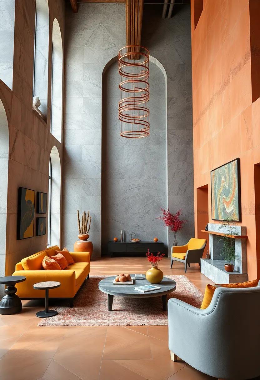
Gilded Sunbursts and Radiant Yellows Channeling the Roaring Twenties’ Energy
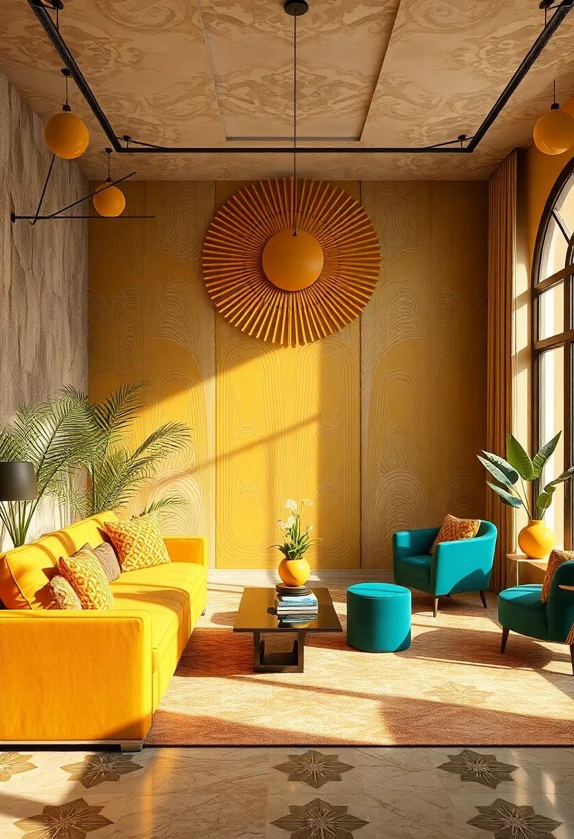
Embody the spirit of the Jazz Age by incorporating gilded sunbursts and radiant yellows into your design palettes, evoking the vibrant energy and opulence that defined the Roaring twenties. These luminous hues capture the era’s enthusiasm, inspiring a sense of optimism and dynamism. Use shimmering golds paired with bold yellows to create focal points that demand attention while maintaining an air of sophistication. This rich color duo can be balanced with deep charcoals or crisp blacks, reinforcing the geometric clarity and sharp contrasts typical of Art Deco aesthetics.
Integrating these tones into your design projects not only honors the past but also brings a fresh vitality to modern spaces. Consider these combinations for interiors, branding, or fashion statements that seek to blend ancient flair with contemporary elegance:
- metallic gold accents on matte yellow backgrounds for a luxurious yet grounded feel
- Sunburst motifs in radiant yellow against dark navy or emerald for striking contrast
- Gradient blends transitioning from soft gold to bold sunflower tones for visual movement
| Color | Mood | Typical Application |
|---|---|---|
| Gilded Gold | Luxury & Glamour | Accent trims, lighting |
| Sunburst Yellow | Warmth & Energy | feature walls, upholstery |
| Charcoal Black | Contrast & Sophistication | Frames, base colors |
Soft Neutrals paired with Sharp Chrome Accents for a Balanced Art Deco Palette
Embracing the allure of soft neutrals creates a calming canvas that echoes the understated glamour of the Art Deco era. Think warm beiges, gentle taupes, and pale greys that soothe the senses while inviting sophistication. These hues serve as the perfect base, allowing the boldness of metallic accents to shine without overwhelming. When paired thoughtfully, the softness of these neutrals balances the inherent sharpness of chrome elements, producing a timeless palette that feels both luxurious and approachable.
To elevate your design with this refined contrast, consider integrating:
- Chrome light fixtures with sleek geometric shapes
- Mirror finishes that reflect ambient light and expand space
- Streamlined furniture accented with polished metal trims
- Subtle textured fabrics in neutral shades to add depth
The dynamic interplay between the muted and the metallic not only emphasizes the architectural qualities of Art Deco design but also ensures a harmonious and inviting habitat where elegance meets modernity.
| Element | Soft Neutral Examples | Chrome Accent ideas |
|---|---|---|
| walls | Warm Beige, Light Taupe | Chrome Sconces, Metallic Trims |
| Furniture | Soft Gray Linen, Cream Velvet | Polished Chrome Legs, Mirror Insets |
| Accessories | Ivory Ceramics, Sand Textures | Chrome Frames, Reflective Trays |
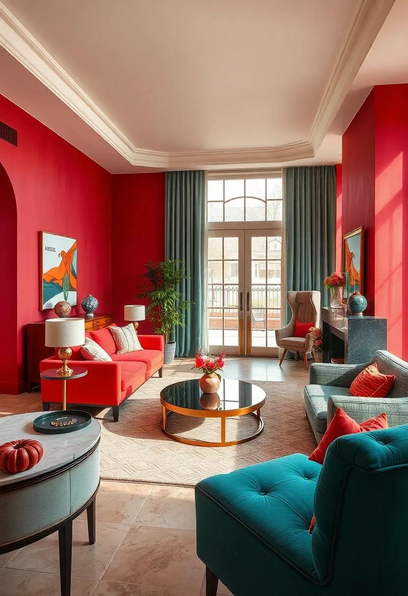
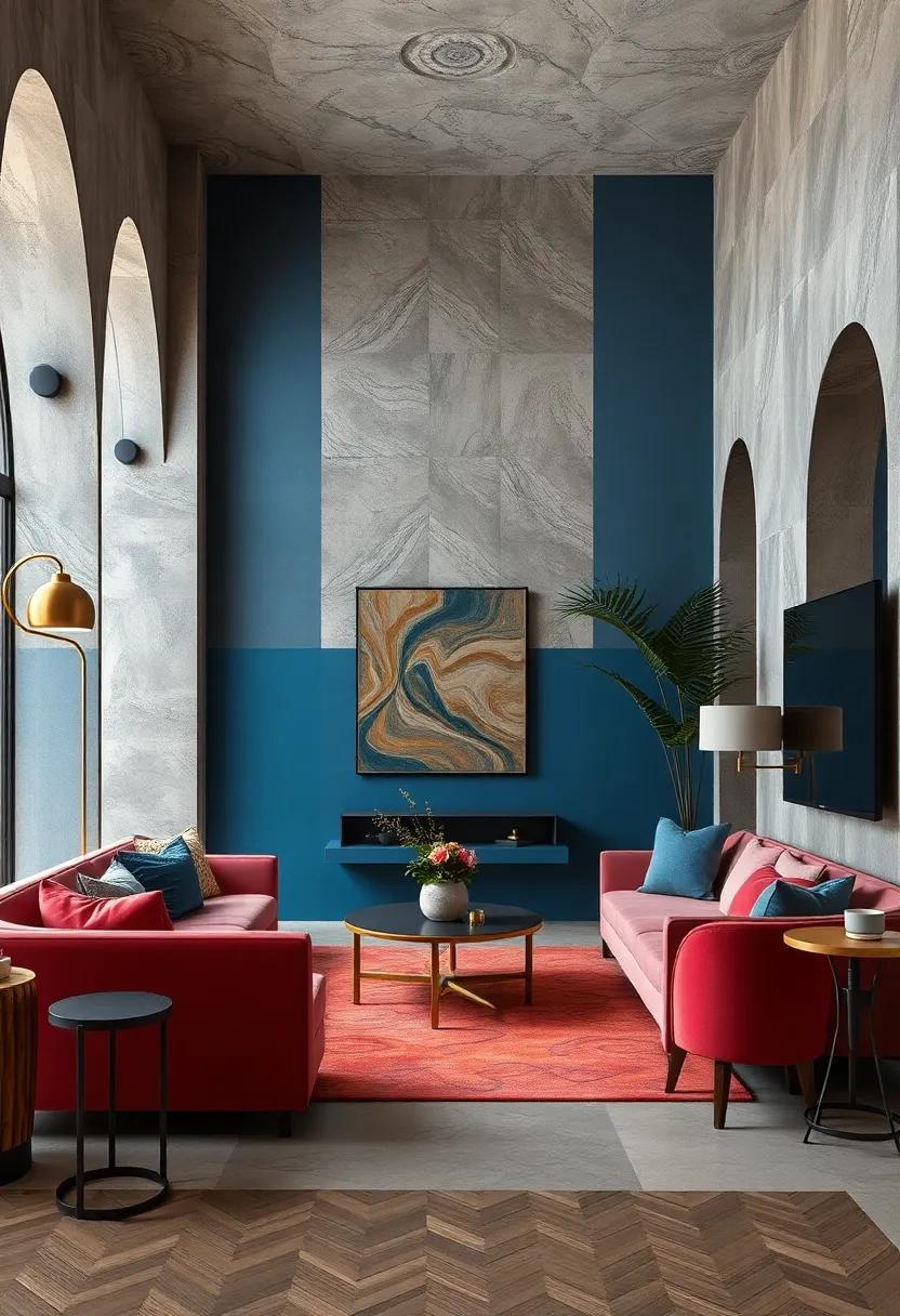
The Electric Blue and Rich Burgundy Fusion Inspired by Vintage Art Deco Posters
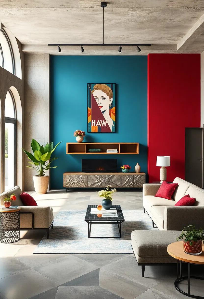
The marriage of electric blue and rich burgundy breathes new life into modern design through the lens of vintage Art Deco posters. This striking duo captures the era’s essence—bold yet refined, dynamic yet harmonious. imagine the vivid luminescence of electric blue energizing the deep warmth of burgundy, creating a palette that exudes both sophistication and vibrancy. This color fusion works marvelously in spaces and visuals that seek to command attention while preserving an air of timeless class.
Designers often pair these hues with subtle accents to balance intensity and depth. Some essential elements to consider in this palette include:
- Metallic gold highlights for luxury and sparkle
- Matte black to ground the composition
- ivory or cream backgrounds to soften contrast and add elegance
| Color | Mood/Effect | Usage |
|---|---|---|
| Electric Blue | Energetic, dynamic | Focal points, accents |
| Rich Burgundy | Warm, luxurious | Backgrounds, large surfaces |
| Metallic Gold | Elegant, dazzling | Trims, details |
Ivory and Bronze color Pairings Offering a Subtle Yet lavish art Deco Look
Blending ivory’s soft, creamy tones with the rich, metallic allure of bronze creates a visual harmony that feels both understated and indulgent. This combination encapsulates the essence of Art Deco’s love for contrast—balancing light and shadow, warmth and coolness—while evoking a sense of refined luxury. Use ivory as a calming backdrop that accentuates the lustrous sheen of bronze accents, whether in furniture, lighting fixtures, or decorative details. The juxtaposition creates depth without overwhelming the space, offering a timeless elegance that feels inviting yet grand.
To evoke this sophisticated interplay in your design, consider these pairing ideas:
- Ivory walls paired with bronze geometric mirrors or frames
- Bronze light fixtures casting a warm glow against ivory textiles
- Ivory marble surfaces accented with bronze hardware
- Mixed metallic decor combining matte bronze with polished ivory ceramics
| element | Ivory Treatment | Bronze Accent |
|---|---|---|
| living Room | Velvet ivory sofa | Bronze floor lamp |
| Dining Area | Ivory silk drapes | Bronze chandelier |
| Accessories | Ivory ceramic vases | Bronze geometric sculptures |
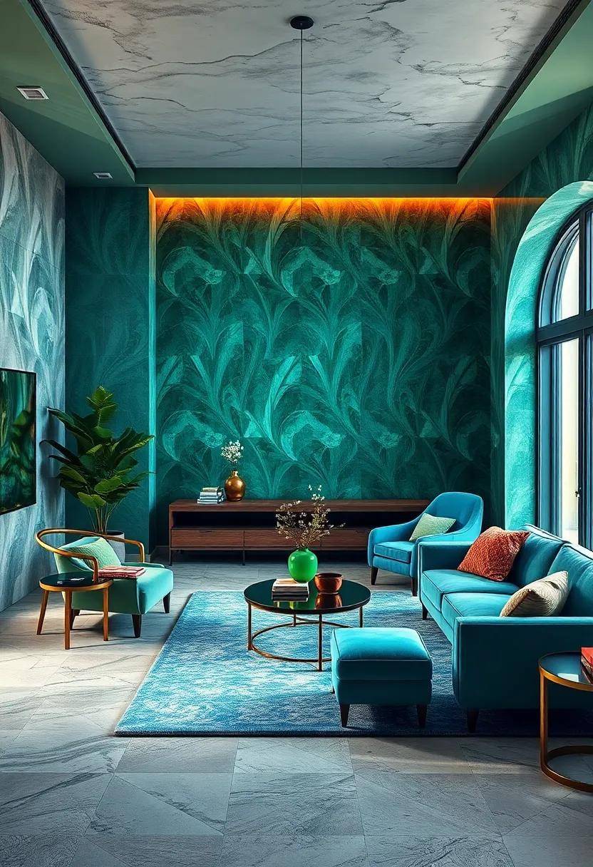
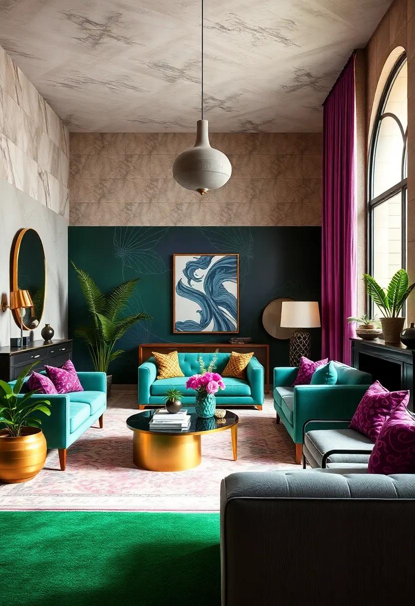
Saturated Ruby reds and deep Teals Conveying the drama of Art Deco Interiors
Infusing interiors with saturated ruby reds and deep teals instantly evokes the opulence and glamour synonymous with the Art Deco era. These bold hues create a striking backdrop that commands attention, setting a dramatic tone without overwhelming the space.Whether it’s a plush velvet sofa in ruby or accent walls painted in rich teal, these colors bring depth and warmth, encouraging a luxurious yet intimate ambiance. The interplay between these shades adds a dynamic richness, highlighting the intricate geometric patterns and metallic accents characteristic of the style.
- Ruby Red: Symbolizes passion, luxury, and energy, perfect for upholstery and statement pieces.
- Deep Teal: Evokes mystery and sophistication, ideal for cabinetry or wall treatments.
- Complementary Metallics: Brass, gold, and chrome enhance these colors by adding reflective brilliance.
| Element | recommended Shade | Effect in Space |
|---|---|---|
| Upholstery | Saturated Ruby Red | Bold and luxurious, creates a focal point |
| Walls | Deep Teal | Calming yet dramatic, adds depth |
| Metal Accents | Brushed Gold | Injects warmth and shimmer |
Cool Silver Tones Blending with Warm Brass for a Futuristic Art Deco Impression
The fusion of cool silver tones with warm brass creates a magnetic contrast that channels both sophistication and innovation. Silver’s sleek, reflective quality imparts a sense of modernity, while brass introduces a rich, inviting glow reminiscent of vintage glamour. Together,they craft an engaging visual narrative that feels simultaneously futuristic and grounded in the iconic aesthetics of the Art Deco period. This blend works superbly in interiors and graphic designs where metallic finishes highlight geometric forms, elevating the overall composition with an elegant interplay of light and shadow.
Incorporating these metals into your color palette means embracing versatility and depth. Consider pairing brushed brass accents with matte silver surfaces to balance warmth and coolness without overwhelming the senses. Use them in strategic bursts within minimalist layouts or as framing elements that guide the viewer’s eye. Below is a fast reference guide for combining these hues with complementary colors to maximize the Art Deco vibe:
| Color Pairing | Effect | Application Ideas |
|---|---|---|
| Deep Navy Blue | Enhances depth and drama | Feature walls, upholstery |
| Emerald Green | Adds luxurious vibrancy | Accent cushions, ceramic decor |
| Creamy Ivory | Softens the metallic sheen | Backgrounds, drapery |
Peacock Greens and Plum Purples Intertwined in a Lush Art Deco Color Story
The fusion of peacock greens and plum purples creates a daring yet refined palette that captures the very essence of Art Deco sophistication. These colors don’t just coexist; they dance together, offering depth and vibrancy to any design project. The rich jewel tones echo the opulence of the Roaring Twenties, making spaces feel both lavish and inviting. When paired with metallic accents—like brass or gold—the colors evoke a sense of glamour and timeless luxury, perfect for interiors, branding, or fashion inspired by the era.
To balance these bold hues,consider incorporating the following elements for a cohesive look:
- Matte black or charcoal backgrounds to ground the palette
- Creamy neutrals to soften and provide contrast
- Geometric patterns in gold or bronze for that iconic Art Deco touch
- Plush textures such as velvet or satin that highlight the richness of the colors
| Color | Hex Code | Design Use |
|---|---|---|
| Peacock Green | #004D40 | Accent Walls,Upholstery |
| Plum Purple | #6A0DAD | Textiles,Decorative Items |
| Brass gold | #B8860B | Fixtures,Frames |
| Cream Neutral | #F5F5DC | Backgrounds,Linens |
Crisp Whites Highlighted by Bold Negro and metallic Lines in Art Deco Compositions
In the sophisticated world of Art Deco, crisp whites serve as the perfect canvas, allowing the eye to rest while emphasizing geometric precision. These pristine whites are anything but plain; they capture light and create a sense of spaciousness and refinement. When paired with bold negro accents, the contrast becomes a visual symphony of sharpness and clarity. The deep black lines act as defining borders and rhythmical elements, guiding the gaze through the composition with an elegant firmness unique to the Art Deco era.
Adding to this dynamic interplay are metallic lines—often in gleaming golds, bronzes, or silvers—that inject a sense of opulence and movement. These metallic details are more than decorative; they function as a luxurious highlight, catching light and adding depth and dimension. Together, the interplay of whites, blacks, and metallics creates balance and drama, reflecting the tension between simplicity and extravagance that is the hallmark of Art Deco design.
- Whites: Clean, pure, and spacious
- Negro: Strong, grounding, geometric
- Metallics: Glamorous, reflective, textural
| Element | visual Role | Typical Color |
|---|---|---|
| Base | Backdrop / Neutral space | Bright White |
| accent | Structural emphasis | Deep Black (Negro) |
| Highlight | Luxurious detail | Gold, Bronze, silver |
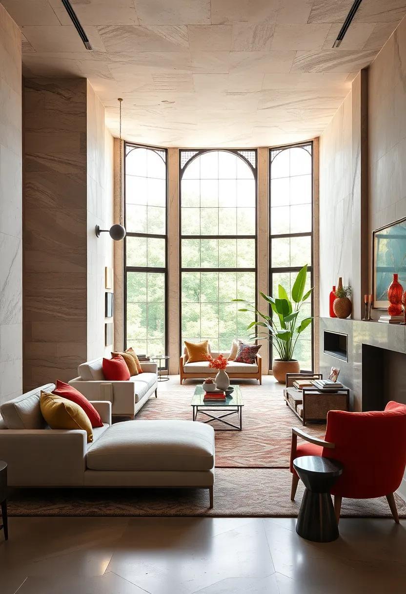
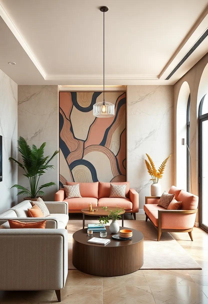
Sunset Oranges and Maroon Reds Creating a Warm, Retro Art Deco Atmosphere
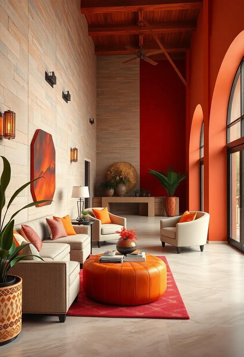
Radiating a nostalgic charm, the interplay of sunset oranges with deep maroon reds evokes a cozy yet bold ambiance reminiscent of classic Art Deco interiors. These hues, saturated and warm, create a visual warmth that speaks to evenings drenched in golden light, offering designers a palette that feels both inviting and sophisticated. Pairing these tones with geometric patterns or luxurious metallic accents amplifies the retro vibe, making spaces feel timeless yet fresh, perfect for those who seek to balance flamboyance with understated elegance.
Consider integrating this color duo through key elements such as upholstered furniture,statement walls,or decorative details. The combination thrives when contrasted with subtle neutrals like creamy ivories or muted taupes, lending depth without overpowering. For a cohesive design approach, explore these essential components:
- Sunset Orange: Use as accent upholstery or feature lighting to evoke warmth.
- Maroon Red: Ideal for bold wallpaper patterns or velvet draperies for richness.
- Metallic Gold: Incorporate in fixtures or trims to emphasize Art Deco’s signature glam.
- Textures: Velvet, lacquered surfaces, and mirrored elements enhance depth and luxury.
| design Element | color Application | Effect |
|---|---|---|
| Accent Wall | Deep maroon Red | Creates focal drama and depth |
| Throw Pillows | Sunset orange | Adds warmth and inviting contrast |
| Lighting Fixtures | Gold Metallic | Highlights textures and enhances opulence |
soft Blush Pinks Contrasted with Strong Geometric Patterns in Art deco Artistry
There’s a unique charm in pairing the delicate, ethereal hues of soft blush pinks with the commanding presence of bold geometric shapes characteristic of the Art Deco movement. This combination elegantly balances femininity with strength,creating a visual tension that captivates and engages. soft blush tones bring warmth and subtlety, offering a gentle canvas that allows sharp, angular motifs and intricate patterns to stand out without overwhelming the senses. Whether it’s in textiles, interiors, or graphic design, this contrast imbues the space with a refined yet dynamic energy.
When exploring this palette, consider incorporating elements such as:
- Chevron and zigzag patterns that add rhythm and movement
- Fan-shaped motifs to invoke the classic Art Deco fanlights
- Metallic accents in gold or brass to elevate the softness with glamour
- Contrasting textures like matte blush backgrounds paired with glossy geometric details
| Design Element | Effect | Suggested Use |
|---|---|---|
| Blush Pink Base | Soft, calming foundation | Walls, upholstery, or backgrounds |
| Bold Geometric Patterns | visual contrast and structure | Wallpaper, rugs, decorative accents |
| Metallic Highlights | Luxurious sparkle | Fixtures, frames, trim |
Spiraling lines and Rich Ochers Imagining the Vibrancy of Art Deco Architecture
Envision the essence of Art Deco’s allure through spiraling lines that effortlessly guide the eye across spaces, evoking a sense of dynamic movement frozen in time. These curves, combined with geometric precision, create an artistic rhythm reminiscent of the bold architectural motifs that defined the early 20th century. When paired with the warm depth of rich ochers, the design palette transforms into a party of both nature and craftsmanship, balancing organic earthiness with the exuberance of urban glamour.
Incorporating these tones and forms into modern design challenges creators to embrace contrast and harmony simultaneously. Consider the following elements that highlight this interplay:
- Ochre hues ranging from golden yellows to deep burnt siennas, which evoke warmth and permanence.
- Metallic accents like bronze or aged gold to echo the lavishness of the era.
- Repetitive curved patterns that imitate the rhythmic spirals found in iconic facades.
| Color | Mood | Common Usage |
|---|---|---|
| Golden Ochre | Warmth & energy | Accent Walls, Upholstery |
| Burnt Sienna | Earthy Stability | Flooring, Decorative Tiles |
| Bronze Metallic | Luxury & depth | Hardware, Light Fixtures |
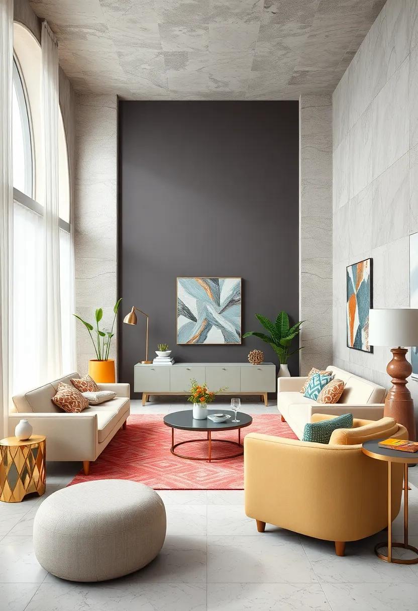
Deep Charcoal Grays Accented with Opulent Rose Gold Embodying Art Deco sophistication
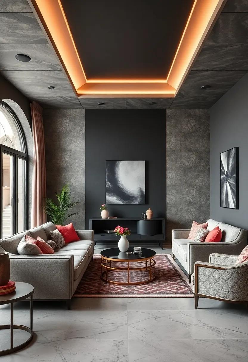
The rich, deep tones of charcoal gray serve as a dramatic canvas, evoking the bold geometry and luxurious textures synonymous with Art Deco design. when paired with the warm, lustrous sheen of rose gold accents, this color palette captures an exquisite balance between modern sophistication and vintage glamour. The dark gray hues ground the aesthetic, creating a sense of depth and mystery, while the opulent rose gold injects a radiant vibrancy that elevates every element it touches—whether in furniture, fixtures, or decorative details.
Designers often leverage this pairing to highlight architectural features or emphasize metallic finishes, effectively weaving a narrative of elegance and refinement. key elements to incorporate include:
- geometric patterns: Repeated motifs in wallpaper or textiles amplify the Art Deco appeal.
- Reflective surfaces: Mirrored tables and rose gold lamps enhance light play and visual interest.
- Plush textures: Velvet cushions and silk drapes in complementary shades enrich tactile luxury.
| Element | Charcoal Gray | Rose Gold Accent |
|---|---|---|
| Wall Finish | matte charcoal paint | Rose gold trim |
| Lighting | Black metal fixtures | Rose gold pendant lights |
| Furniture | Charcoal velvet upholstery | Rose gold legs & hardware |
The harmony of Cool Aquamarines and Champagne Gold in Art Deco Color Narratives
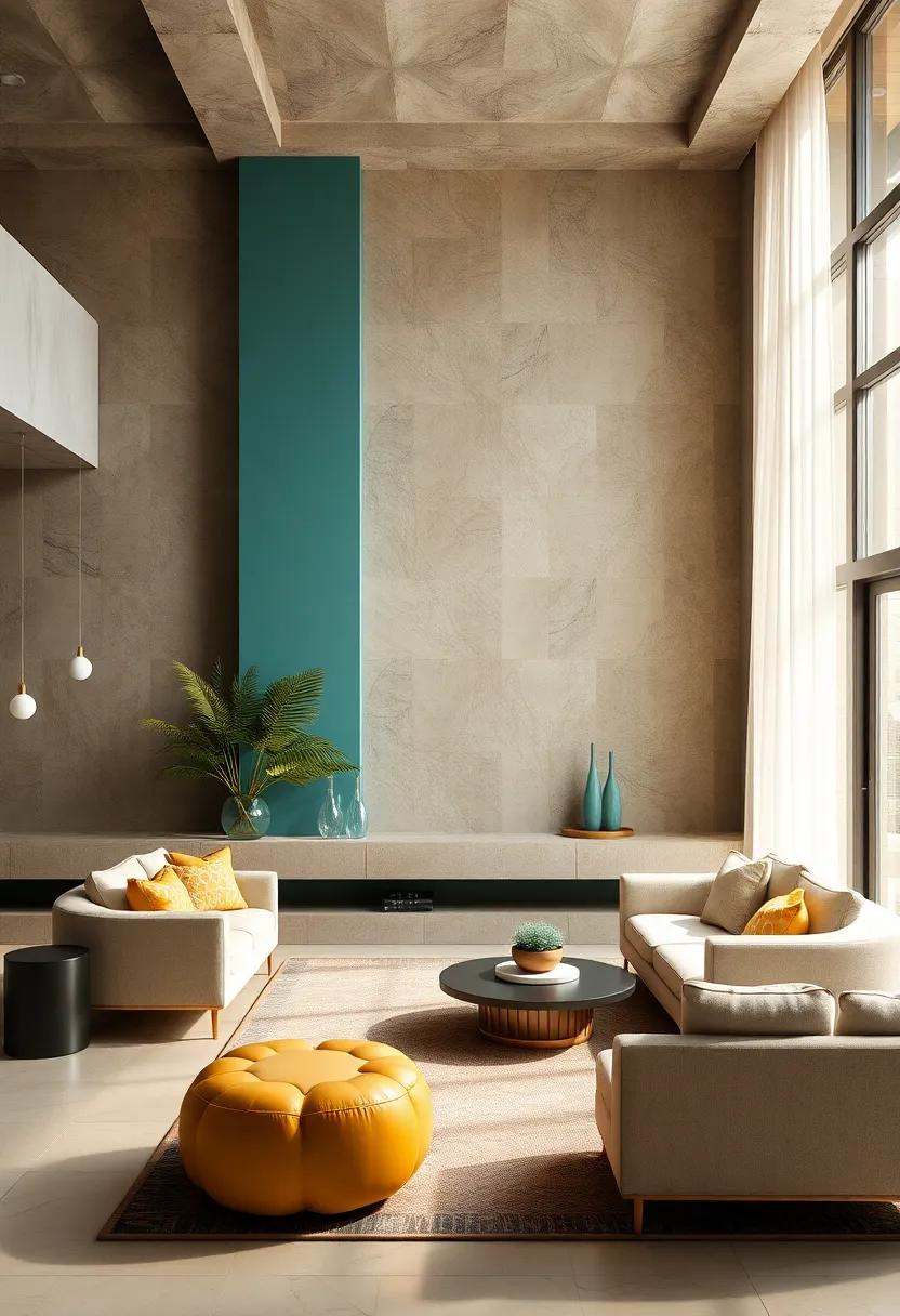
in the realm of Art Deco design, the interplay between cool aquamarines and the warm allure of champagne gold crafts a mesmerizing visual dialog. These shades do more than just complement each other; they embody the essence of 1920s luxury and sophistication. The crisp,refreshing quality of aquamarine evokes calmness and modernity,while the opulent glow of champagne gold injects a sense of timeless grandeur. Together,they create a balance between tranquility and exuberance,perfect for spaces and products that aspire to evoke a vintage yet contemporary feel.
When deploying this palette, designers often draw from key attributes that emphasize contrast and harmony. Consider the following elements:
- Textural Richness: Satin finishes and metallic sheens amplify the luster of the palette.
- Geometric Patterns: Iconic zigzags and stepped motifs resonate deeply when paired with these colors.
- Accent Usage: Champagne gold used sparingly against aquamarine backgrounds can elevate focal points effectively.
| Element | Effect |
|---|---|
| Satin Drapery (aquamarine) | Soft,calming flow with subtle sheen |
| Metallic Gold Fixtures | Luxurious highlights & refined detailing |
| Geometric Wallpaper | Dynamic rhythm with bold,structured lines |
Brilliant Topaz and Midnight blue blending Dynamic Energy with Art Deco Refinement
Combining the electrifying hue of Brilliant Topaz with the deep, mysterious depths of Midnight Blue creates a color duo that pulses with both vitality and sophistication. This pairing draws inspiration from the lavish spirit of the Art Deco era,channeling its passion for bold contrasts and geometric precision.Brilliant Topaz injects a luminous warmth, reminiscent of golden city lights against the night sky, while Midnight Blue anchors the palette with an elegant gravitas. Together, they evoke a visual narrative that’s both dynamic and harmonious, perfect for designers seeking to balance energy and refinement in their projects.
When incorporating these colors into your design, consider juxtaposing them with subtle metallic accents and symmetrical patterns characteristic of Art Deco aesthetics. Use Brilliant topaz as an accent color to highlight focal points or key elements, while Midnight Blue can serve as the grounding background or base. To help refine your approach, here’s a quick reference table showcasing their potential applications:
| Color | Suggested Use | Effect |
|---|---|---|
| Brilliant Topaz | Accent trims, focal icons, highlights | Energetic, Invigorating |
| Midnight Blue | Backgrounds, typography, large surfaces | Stable, Sophisticated |
- Texture Mixing: Pair glossy finishes with matte surfaces to enhance the light interplay between these colors.
- Geometry: Utilize clean lines, chevrons, and stepped forms to emphasize classic Deco motifs.
- Contrast Play: Balance high contrast with thoughtfully placed negative space for visual relief.
The Allure of Smoky Quartz Paired with creamy Whites in Subdued Art Deco settings
Subtle sophistication emerges when the rich, earthy tones of smoky quartz meet the soft, inviting hues of creamy whites.This harmonious pairing evokes the glamour of the Art Deco period, where contrast was key to visual impact but always executed with a tactile softness. The deep, translucent grays of smoky quartz capture the essence of polished stone surfaces and antique glass, grounding designs in a grounded, almost hypnotic depth. Paired against creamy whites—reminiscent of delicate alabaster or smooth ivory—this color duo creates a serene yet striking foundation that allows intricate geometric patterns and metallic accents to breathe without overwhelming the space.
Design elements inspired by this palette often leverage texture and sheen to elevate the overall aesthetic. Consider the following textures and finishes that reinforce this mood:
- Matte alabaster walls providing a gentle backdrop
- Polished smoky quartz tabletops adding reflective allure
- Brushed nickel or antique brass fixtures that anchor the look with subtle metallic warmth
- Velvet upholstery in creamy tones for plush comfort juxtaposed with sleek surfaces
| Element | Material | Effect |
|---|---|---|
| Flooring | Smoky quartz-inspired terrazzo | Depth and pattern complexity |
| Lighting | Frosted glass fixtures in creamy white | Soft ambient glow |
| Accent | Brushed brass trim | Warm metallic contrast |
In Summary
As we conclude this journey through the luminous world of Art Deco-inspired color palettes, it becomes clear that timeless elegance is more than just a style—it’s a statement. By embracing the bold contrasts, rich jewel tones, and metallic accents that defined an era of innovation and glamour, designers today can craft spaces and creations that resonate with both history and modernity. Whether you’re drawn to the sleek sophistication of deep emeralds paired with gold or the vibrant energy of coral and turquoise, these palettes offer a versatile foundation for bringing Art Deco’s enduring spirit into your own design narrative. In celebrating this iconic aesthetic, we not only honor the past but inspire the future—one color at a time.
As an Amazon Associate I earn from qualifying purchases.